Rhode Island School of Design
Creating a Scalable, Flexible Design System for Online College Publications
view live site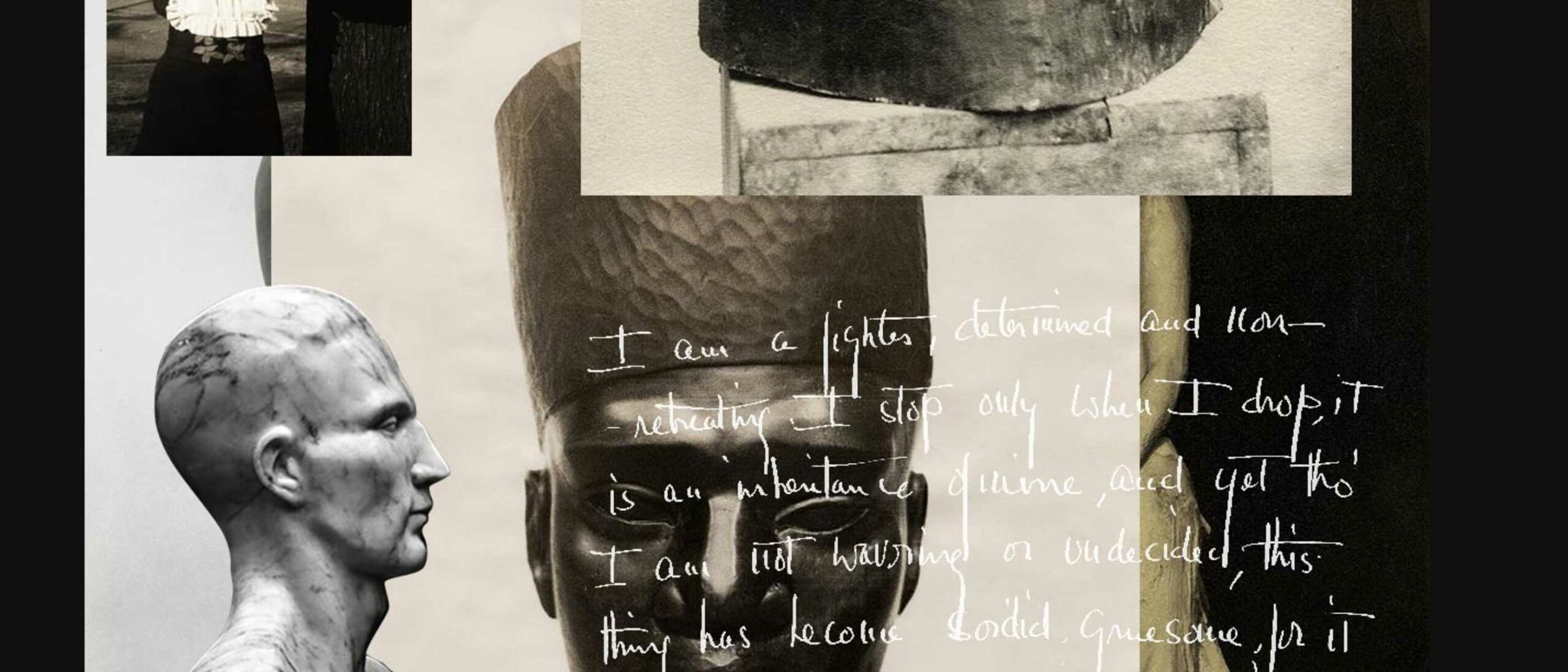
industry
Cultural Institutions
Higher Education
category
Design & UI
Digital Engineering
Research & Strategy
User Experience
capability
Drupal
Mobile & Responsive
Technical Architecture
User Research
The strength of a solution lies in its ability to solve problems that don’t exist yet. With Ziggurat, the RISD Museum wanted a publication platform to create academic and interactive content for museum exhibitions. They got the online exhibition platform they didn’t know they needed instead.
THE BRIEF
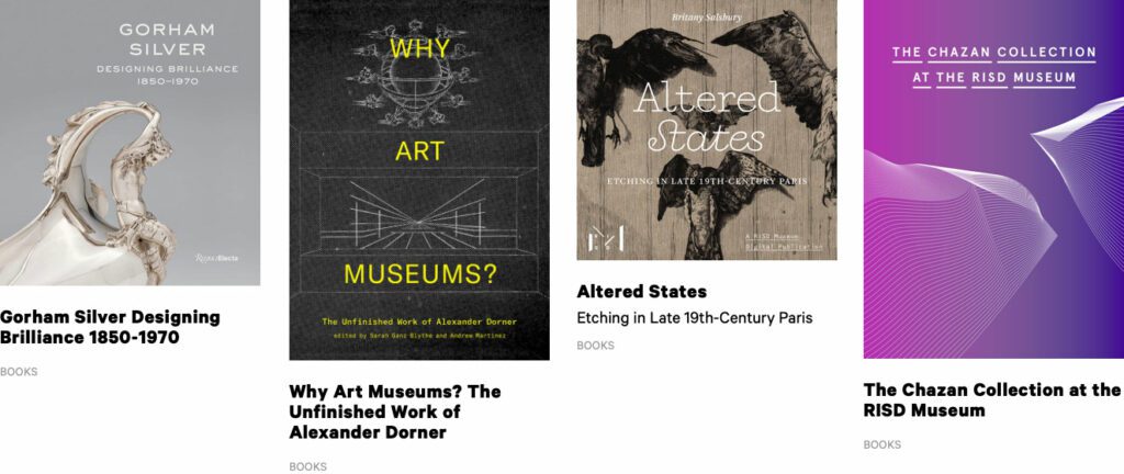
The RISD Museum publishes a document for every exhibition in the museum. Most of them are scholarly essays about the historical context around a body of work. Some of them are interviews with the artist or a peek into the process behind the art. Until very recently, they have not had a web component.
The time, energy, and investment in creating a print publication was becoming unsustainable. The limitations of the printed page in a media-driven culture are a large drawback as well. For the last printed exhibition publication, the Museum created a one-off web experience — but that was not scalable.
The Museum was ready for a modern publishing platform that could be a visually-driven experience, not one that would require coding knowledge. They needed an authoring tool that emphasized time-based media — audio and video — to immediately set it apart from printed publications of their past. They needed a visual framework that could scale and produce a publication with 4 objects or one with 400.
THE APPROACH
A Flexible Design System
Ziggurat was born of two parents — Oomph provided the design system architecture and the programmatic visual options while RISD provided creative inspiration. Each team influenced the other to make a very flexible system that would allow any story to work within its boundaries. Multimedia was part of the core experience — sound and video are integral to expressing some of these stories.
The process of talking, architecting, designing, then building, then using the tool, then tweaking the tool pushed and pulled both teams into interesting places. As architects, we started to get very excited by what we saw their team doing with the tool. The original design ideas that provided the inspiration got so much better once they became animated and interactive.
Design/content options include:
- Multiple responsive column patterns inside row containers
- Additionally, text fields have the ability to display as multiple columns
- “Hero” rows where an image is the primary design driver, and text/headline is secondary. Video heroes are possible
- Up to 10-colors to be used as row backgrounds or text colors
- Choose typefaces from Google Fonts for injection publication-wide or override on a page-by-page basis
- Rich text options for heading, pull-quotes, and text colors
- Video, audio, image, and gallery support inside any size container
- Video and audio player controls in a light or dark theme
- Autoplaying videos (where browsers allow) while muted
- Images optionally have the ability to Zoom in place (hover or touch the image to see the image scale by 200%) or open more
There are 8 chapters total in RAID the Icebox Now and four supporting pages. For those that know library systems and scholarly publications, notice the Citations and credits for each chapter. A few liberally use the footnote system. Each page in this publication is rich with content, both written and visual.
RAPID RESPONSE
An Unexpected Solution to a New Problem
The story does not end with the first successful online museum publication. In March of 2020, COVID-19 gripped the nation and colleges cut their semesters short or moved classes online. Students who would normally have an in-person end-of-year exhibition in the museum no longer had the opportunity.
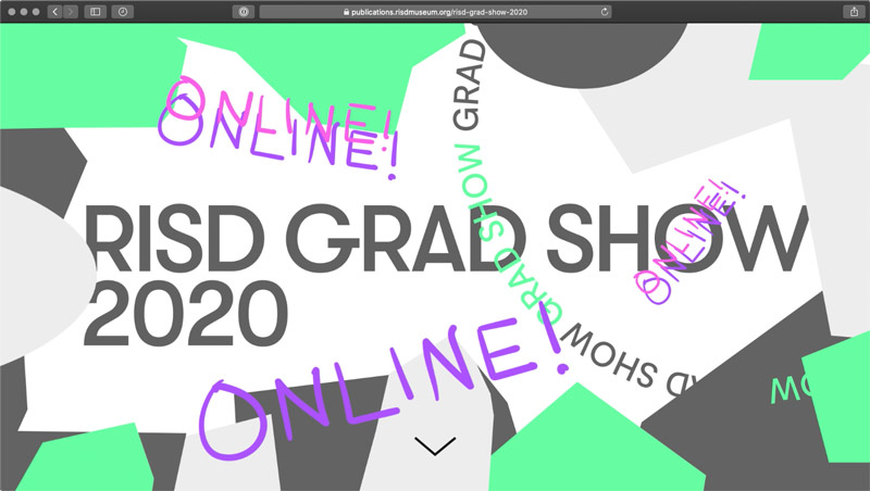
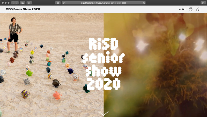
Spurred on by the Museum, the university invested in upgrades to the Publication platform that could support 300+ new authors in the system (students) and specialized permissions to limit access only to their own content. A few new features were fast-tracked and an innovative ability for some authors to add custom javascript to Department landing pages opened the platform up for experimentation. The result was two online exhibitions that went into effect 6 weeks after the concepts were approved — one for 270+ graduate students and one for 450+ undergraduates.
AWARDS & RECOGNITION
