Brown University Health
Transforming Brown Health’s Intranet into an Award-Winning Employee Experience

category
Accessibility
Compliance
Design & UI
Digital Engineering
Research & Strategy
User Experience
capability
Acquia
APIs
Content Management System
Drupal
Flexible Page Building
Information Architecture
Intranet
Migration
Mobile & Responsive
Personalization
User Research
industry
Health & Wellness
Half a million patients are cared for annually within Lifespan, a not-for-profit academic hospital system. To provide efficient and effective patient care, 17,000+ employees use the Lifespan intranet every day, from doctors and nurses to administrative staff and 3rd-party vendors. The tools and information in the system range from resources for critical patient care to news and events that promote a healthy work culture. Oomph’s redesign and rebuild kept this critical resource performing at the highest levels.
The Brief
Oomph has worked with Lifespan since 2010 and created the second version of their intranet on Drupal 7. A critical tool like an intranet needs regular maintenance. Even with regular updates, there comes a time when the whole platform needs a re-architecture to be flexible, secure, and performant.
In 2021, it was time to plan the next phase of the intranet on Drupal 9. Lifespan used the redesign as an opportunity to realign the employee journeys with the evolution of their work. And COVID-19 had provided an opportunity to reevaluate whether a security-first, HIPAA-compliant intranet could be available to those working from home.
Departments
Job & Clinical Tools
Staff Contacts
Critical Top-Tasks
The Oomph team ran a Discovery and research phase to gather requirements and understand employee expectations. We ran workshops with client stakeholders, identified important work tasks and created 5 employee personas, conducted one-on-one interviews with key persona types, and gathered feedback from employees with an online and email survey.
Through this research, we started to see two different types of tasks emerge: those that required speed to a destination and those that required exploration and unstructured browsing.
Tasks requiring speed to completion:
- Access health and safety policies
- Access a staff directory and immediately contact high-value individuals
- Access job tools, which are often 3rd-party digital services, for everything from timesheets to diagnostics to general education
- Access online forms to request items and services
- Access HR and employment benefits
Tasks requiring unstructured browsing:
- Access Department sites, particularly my department for relevant news & events
- Be exposed to company culture through up-to-date news and events, videos, seminars, and important business announcements or press coverage
- Access the internal job board to find advancement opportunities
- If I am a new employee, or a new manager, access onboarding material and quick links for new individuals
- Visit and browse the Bulletin Board
It became clear through our process that Lifespan employees needed to move quickly and slowly, often in the same session, depending on the important tasks they needed to complete. The intranet needed to support both types of journeys to remain a successful platform for getting work done and absorbing company culture.
The Approach
A Focused Priority on Search
Expectations about fast and accurate search are high because of you know who. When designing search for an employee intranet, the baseline requirements are even higher. We knew that we had to get the design and implementation of search right.
We took a learn-once, use-everywhere approach when it came to search interfaces. Search would be a core part of finding many types of content — tools, forms, people, departments, locations, and more. Each had to have a similar structure and set of filtering options to be the most useful.
The list of tools, locations, or people needed smart defaults. Before someone conducts their own search, each screen displays popular searches and the common content people need to access. In some cases, an employee does not even need to search in order to find what they need.
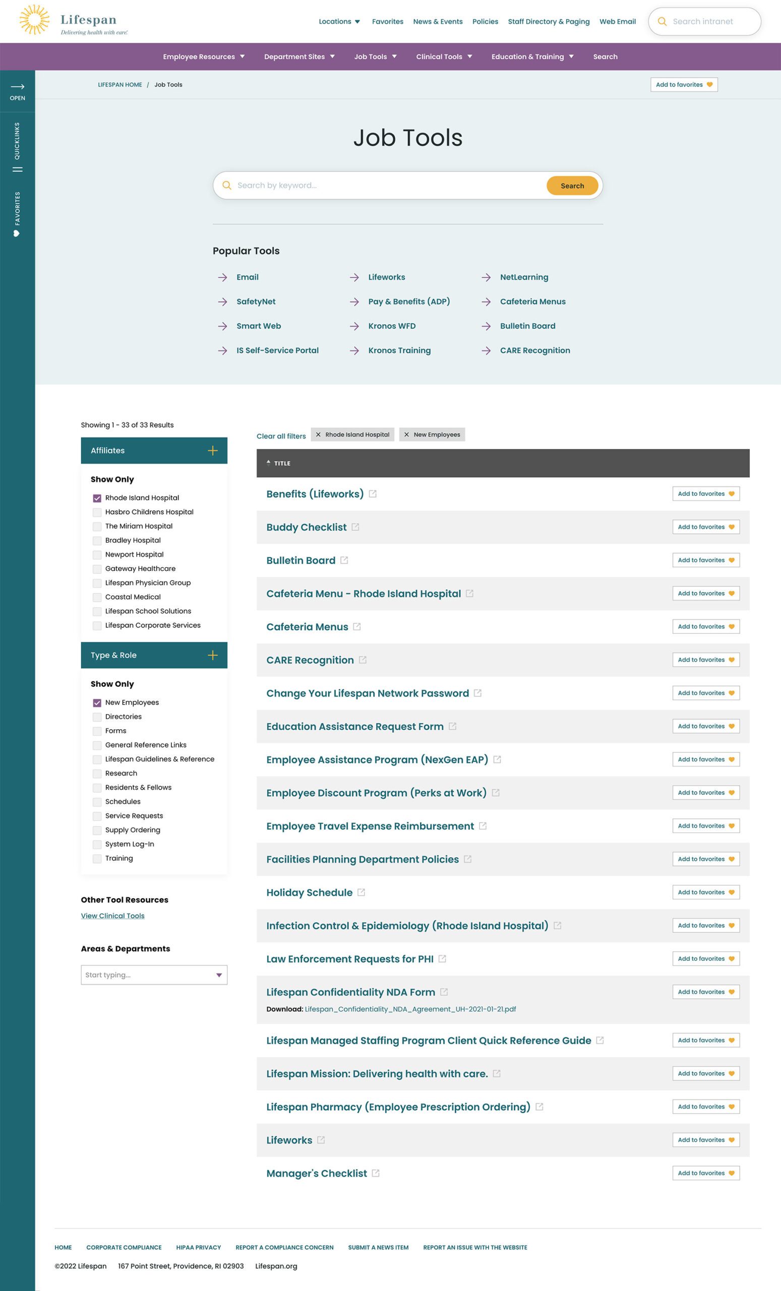
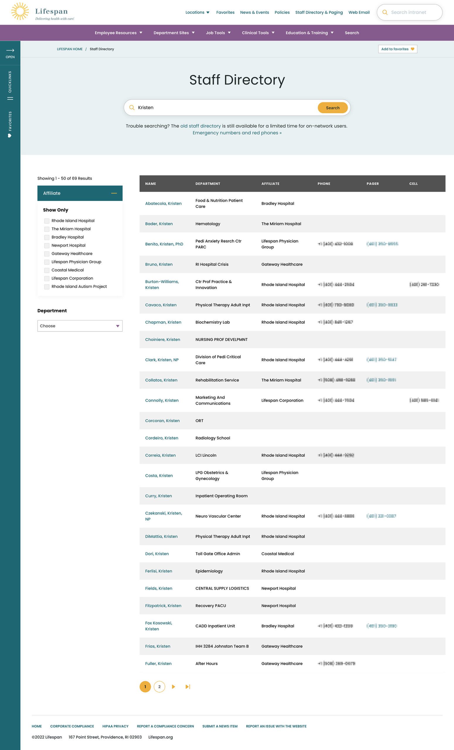
Two search pages, similar interfaces: The Job Tools search and Staff Directory follow similar patterns, adhering to our “learn once, use everywhere” rule
Personalization that follows Employees from Device to Device
Personalization had to be a part of our solution as well. Employees are able to use S.S.O. to access the intranet from their personal devices or workstation computers in the hospitals. Workstations are often shared between multiple clinical staff, therefore, our system needed to support stopping one task on on device and picking it back up on another.
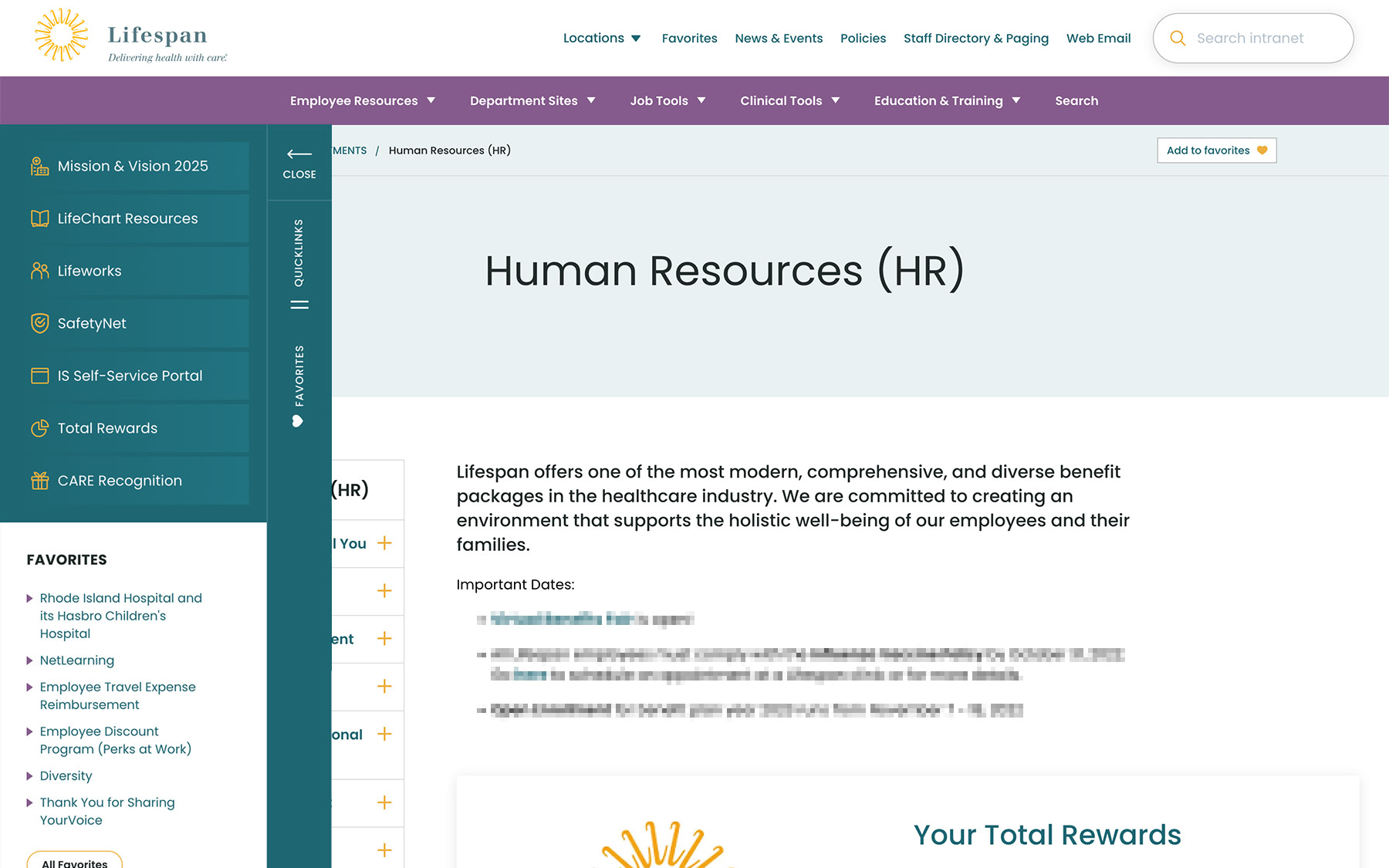
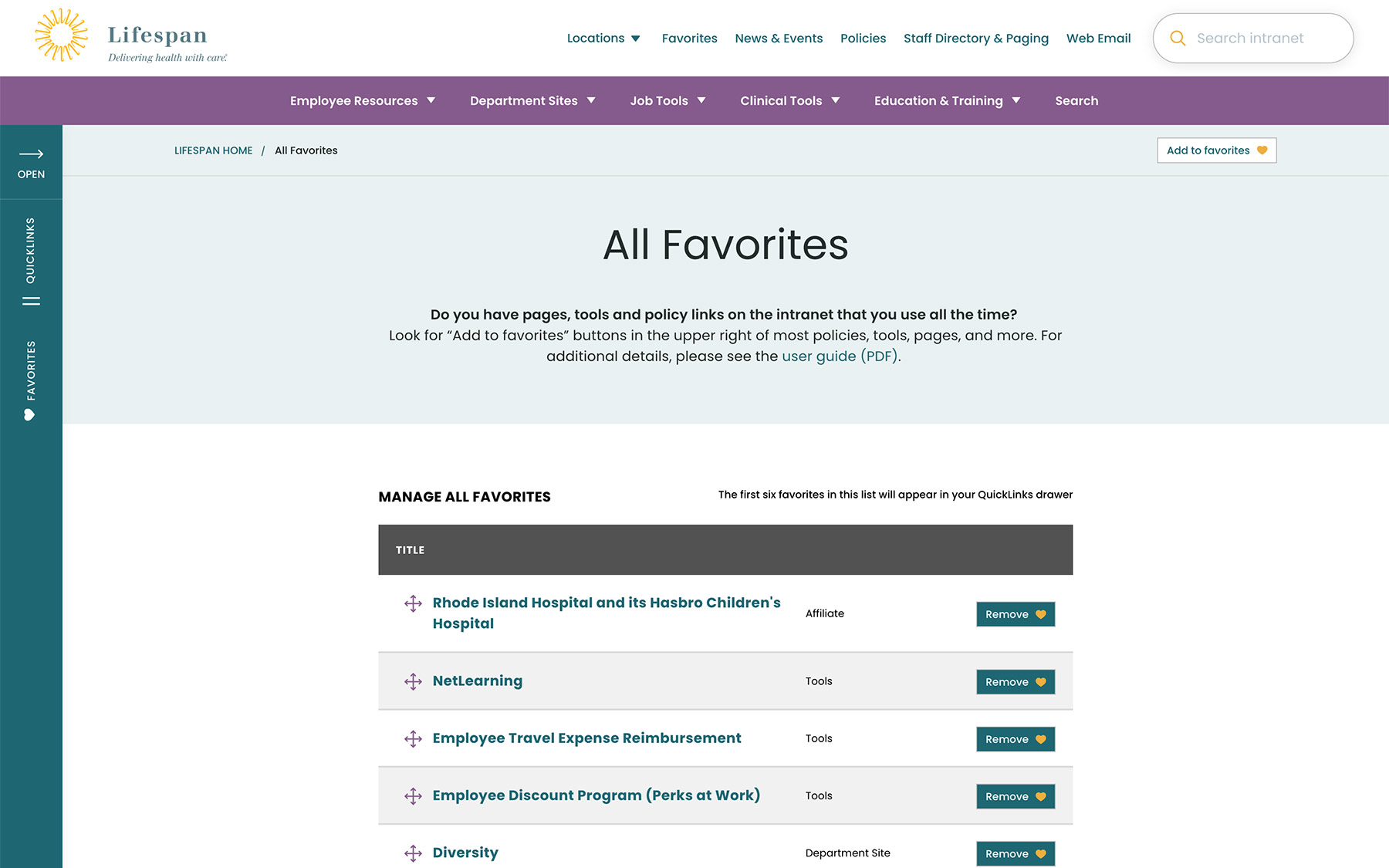
A Favorites feature allows employees to create their own transportable bookmarks. Almost everything on the site can be bookmarked, reducing the need to search for commonly used content and tools. Six custom favorites are available from the left drawer at all times, while the entire list of favorites is one more click away.
Supporting Speed and Engagement
Speed is at the heart of critical tasks and high-quality patient care. A nurse, at a shared workstation, needs to log in quickly, find the tool they need, and administer care. Time is critical. They don’t want extra clicks, a search that doesn’t work intuitively, or slow page load times. Staff don’t want it, and management doesn’t want it, either.
Engagement is slower and the intention is different. Speed is for tasks. Engagement is for exploring. This is how company culture is communicated and absorbed. This is when people catch up with department and company news, find events to attend, view a photo gallery from an event they missed, or browse a bulletin board to swap items with other employees. You can’t have an intranet that is ALL business just like you can’t have an intranet that is NO business.
A Dashboard Built for Speed or Browsing
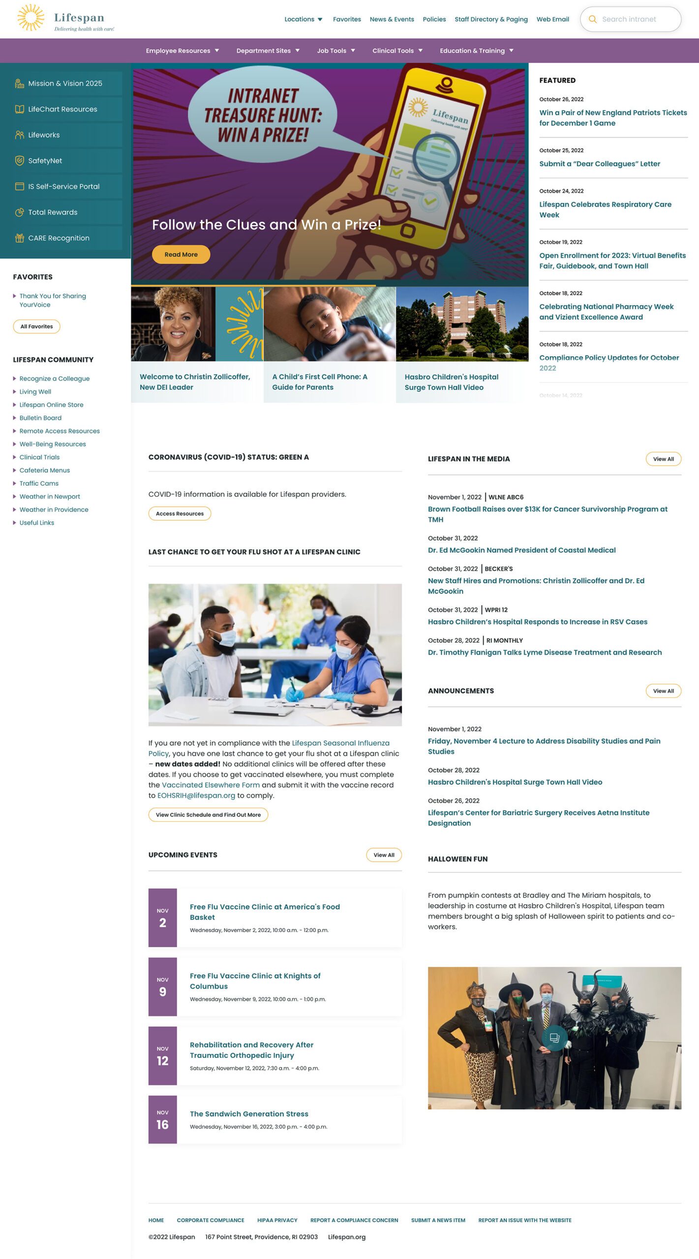
On the starting page, an employee might be in need for something immediate or might have time to explore. We do not know their intention, therefore, this page needs to support both.
The left drawer is open to employees on the dashboard. It is open to show them what it contains and to remove a click when accessing the important common destinations within. The first seven links are common items for any employee, curated by the Lifespan team. They are a mixture of tactical items — like time sheets — and company culture items — like the CARE recognition program.
Below that are the employee Favorites. The first six favorites are shown while all are available with an extra click.
The top navigation supports speed to common destinations, some of which are search interfaces and others which are built for browsing.
The rest of the page showcases engagement and company culture. Featured news stories with images are balanced with quick news and event lists. Flexible content sections allow authors to add and remove content blocks as new items are required.
Other content pages that were focused on engagement are the deeper News and Events pages, customized Location pages (for each major hospital location), and a community Bulletin Board.
The Results
Smooth Onboarding and Acceptance
No matter how confident our teams were, we didn’t really know if the redesign was a success until employees moved from the older tools they were familiar with. The Lifespan team did a fantastic job creating walk through videos ahead of the launch. Old tools and directories stayed available for a period of overlap, but our teams saw quick adoption into the new tools in favor of the familiar.
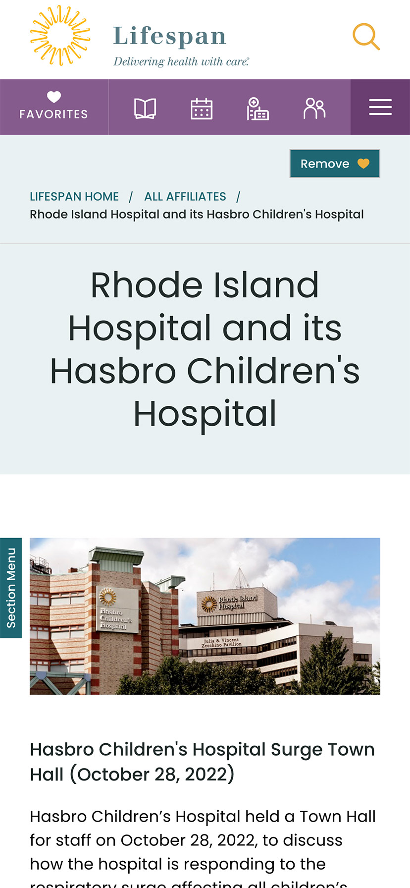
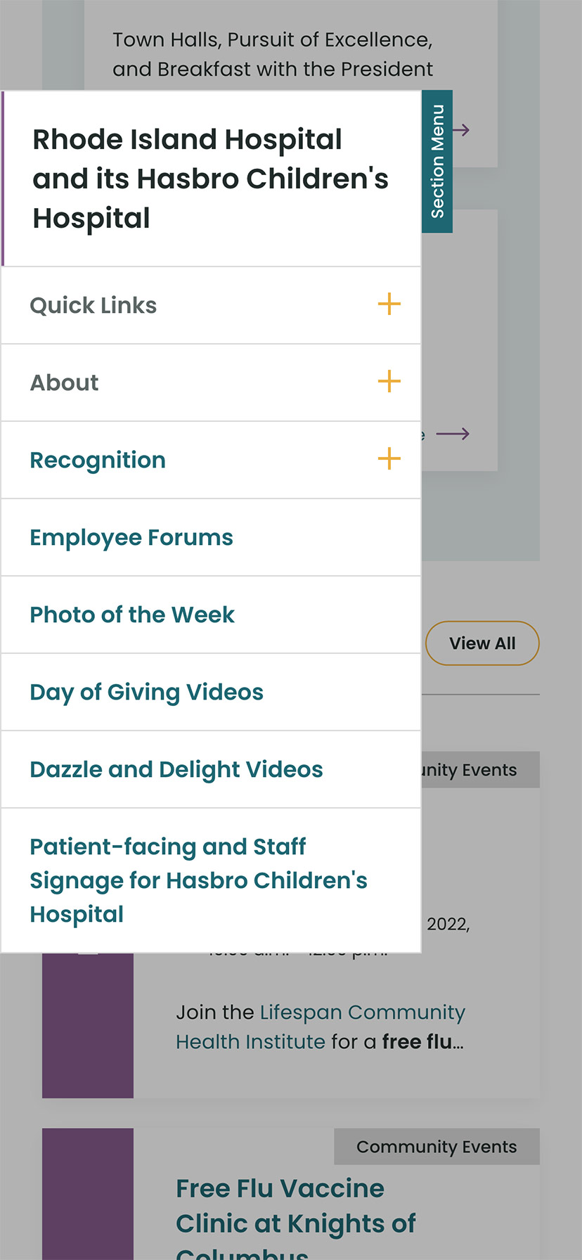
Since the intranet is now available off of the closed Lifespan network, we have seen mobile traffic increase dramatically. The responsive design is an improved experience over the previous intranet and the numbers prove it. In fact, we have found that more employees engage in company culture content on their personal devices, while using the company workstations for their tasks.
Oomph is very proud to have worked with one of the largest private employers in the state, and we are very proud to have our work used by over 17,000 people every day. Oomph continues to support the Lifespan team and the intranet project, iteratively improving the features and evolving the toolset to be effective for all.
AWARDS & RECOGNITION


