New Open Source Web Accessibility Tool comes out of Recent Hack Day
Once a quarter, Oomph holds its Hack Day. Open to the entire company, Hack Day is a great opportunity for everyone to stretch their mental muscles and get a fresh perspective.
For some it’s simply a chance to try something new. For others, it’s all about having fun interacting with our co-workers in out-of-the-ordinary ways. For still others, it’s the perfect time to nurture the seed of an idea that might have sprouted during the course of client work. From there, we can sprinkle some fertilizer on it in the form of peer collaboration and grow it into a minimum viable product (MVP) by day’s end (but that is not the only goal).
To give you an idea of some of the fruits of these unorthodox labors, we’ve seen Slack integrations, a video game with team members as playable characters, Arduino robots, 3-D printed pancakes (yes, you read that right), a Boomerang-heavy Dunder Mifflin-style marketing video, and lots more. It’s not always about making something useful, but sometimes it is.
This is exactly the case for ColorCube, the project that I was involved in this past Hack Day. With much of our recent client work having a keen focus on website accessibility, it’s been a conversation that has been at the forefront of our minds. Even if our client work doesn’t specifically require it, we see the truth in the mantra that accessible design and development benefits all users.
That said, ensuring accessibility can be a bit of a tumble down the rabbit hole and, as such, we’ve been keyed into finding tools that help make accessibility easier. For instance, we’re great fans of Lea Verou’s Contrast Ratio, Contrast Checker, Colour Contrast Checker, and Color Safe, which helps you generate an accessible color palette based on a color you provide.
While we these tools, we wanted a tool that our designers could turn to in the early stages of a project that could tell them how well a slate of possible — or, in many cases, existing — brand colors would play together. We thought it would be valuable for designers to follow their normal design process, but then be able to get some good direction on how far they would have to tweak their choices to make them accessible.
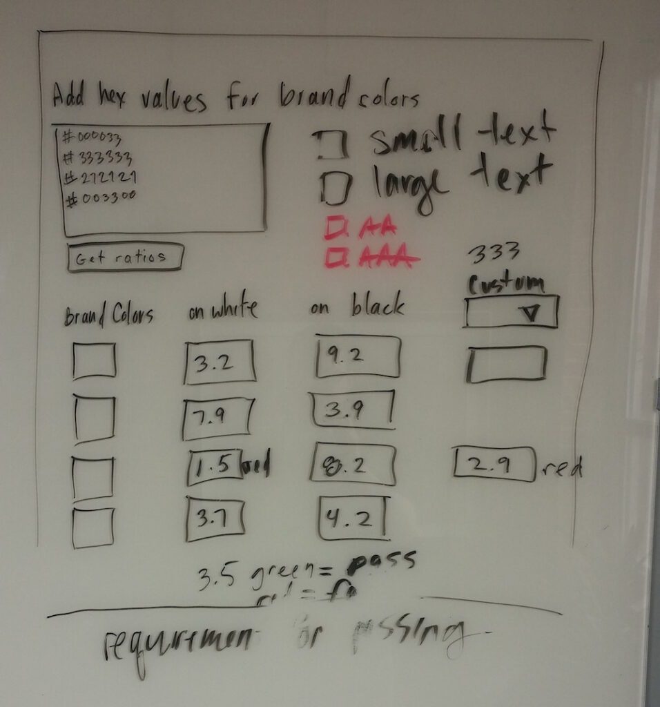
To start the day and in order to bootstrap ColorCube, we looked into Color Safe’s GitHub page and found that it leverages the TinyColor JavaScript library. We liked what we saw as far as functions that would be integral to what we were offering, so, after some discussion of division of labor (seeing as we happened to be a front-end heavy team) and some whiteboarding, we were off and running.

We decided that our MVP would:
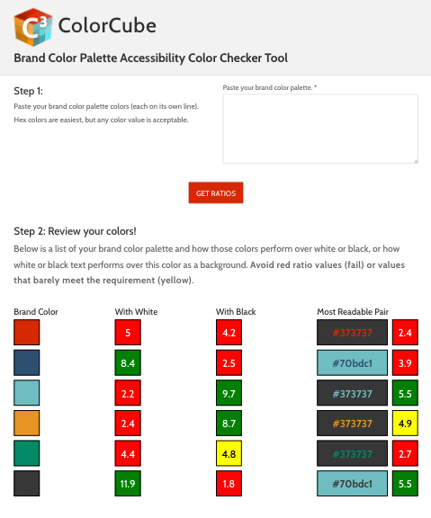
- let a user submit any number of hex colors. It should also,
- display those same colors,
- display the ratio of each color compared to white,
- display the ratio of each color compared to black, and
- color-code the ratio output according to if was passing, failing, or close to failing according to WCAG AA standards.
We identified two more items as nice-to-haves but not within our MVP:
- display the most legible color from the provided list to pair with the current color and
- the ratio of those two colors.
Thanks to TinyColor’s excellent documentation and with two people tackling the HTML, one doing the designing and styling, and one working through the vanilla JS, we were able to get to a workable version of our MVP by 2 p.m. Since we had more time before the 4:30 show-and-tell, we went ahead with items 6 and 7 and did some refactoring, too.

While we see this as a valuable tool as it is, we also have hopes for its expansion, as it was easy to dream up its further usefulness as we brainstormed in the morning. For instance, right now the ratios are considered passing or failing according to AA standards — and we are assuming “normal” text, so a ratio of 4.5:1. In a future version, we’d like to let the user decide if she would like to measure her colors against AA or AAA, or simply display both. In the same vein, giving the user the option of specifying font size would also be useful. We’d also love to be able to provide tools to nudge a non-passing color into an accessible color right in the browser.
For now, it’s a good start and a worthy addition to our list of Hack Day accomplishments. And, of course, we hope it proves useful to others as well. Feel free to give it a try, and if you find yourself coming back to it, let us know!


