Accessibility is not only for Disabilities
This is Part 1 of our three-part Accessibility series. Jump to the end to see an overview of Parts 2 & 3.
When talking about the web, “accessibility” means “make it easy for people of different abilities to use your web-based product or service”. The Web is an increasingly important resource in many aspects of life, and therefore, it only makes sense that business owners and web developers strive to make it as inclusive as possible.
But a business might argue, “My customers are well-bodied people. My service isn’t a need for those who are blind, deaf, or have limited motor function.” To that, we say, “Oh really?”
Consider these scenarios. Do these people have disabilities?
- John fractured two fingers on his dominant right hand, which makes using a touchscreen or trackpad difficult. They will heal in four weeks, but in the meantime, he is learning to navigate with his left hand and the keyboard.
- Maryanne is partially color-blind, but she does not know it (only 0.5% of females are affected, as compared to 8% of males). She finds most websites hard to read, but chalks it up to the visual trends of the day.
- Jennifer has age-related macular degeneration. There are dark spots in the middle of everything she looks at. She can see, but it will take her longer to consume information or fill out forms, constantly moving her head to the screen and back to keyboard, trying to see with her peripheral vision.
- Robert has 1 year old twins. He’s a stay at home Dad and freelance writer. Lately, his sleep deprivation makes him easily frustrated with the web and his devices. He has a hard time working his phone while holding a child because important actions are at the top of the screen, and he can’t easily stretch his thumb to access them.
Some of these might be familiar to you — if you think about it, you can probably replace these sample names with people you know. Do they fit the description of people you usually think about when you think of people with disabilities? Probably not, but they are just as important to consider as anyone else.
The Numbers are Higher than you Think
From a Census report in 2010, 19% of the U.S population has some form of broadly defined disability — nearly 1 in every 5 Americans, or about 57 million people. About half of those reported their disability as severe (about 10% of people). Disabilities can range from non-permanent—temporary vision or hearing loss, loss of mobility in hands or arms—to permanent—blind, deaf, cognitive impairment, limited mobility, etc…
One in five Americans self-identify as disabled. From our previous list of examples, only Jennifer would consider her macular degeneration a disability. What about the others? One person will heal in a month, another doesn’t know they are missing something, and another wouldn’t use the term “disabled”. But they all have different challenges when accessing content on the web.
What does an Accessible Site Look Like?
Accessibility does not look different from what you are already used to seeing or using, and in many ways it will make the web better for ALL users and your business. Here are some examples:
- Higher contrast ratios for text or text over images — better legibility for all!
- Keyboard navigation with landmarks and focus styles — make it easy and quick for someone to use ANY device to navigate a site, and that means keyboard and mouse, but also touch, stylus and voice commands.
- Adaptable content (different ways to view and consume the same content) — this is easy! Responsive mobile design is part of this, but semantic HTML lends itself to other formats as well, such as machine-readable content outlines.
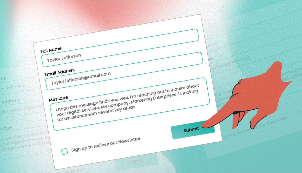
- Visible and clear form labels, landmarks, and error messages — improves ease of use for all users (and improve conversion rates if this is a checkout form)!
- Flashing elements limited to three flashes per second for users with photosensitive epilepsy or vestibular disorders — who wouldn’t want fewer flashing images?
- Screen Reader content and context for visually impaired users — a little more work to think about and implement, but, the result is typically a clearer workflow for any user, and improves SEO because of tightly structured and semantic content with additional meta data.
- Transcripts for audio or video content — again, a little more work, but the result is better searchability (and SEO) by text when a transcript is present.
Assess Your Site’s Accessibility
There are many ways to assess your current site’s accessibility. Some of them require a little bit of technical knowledge, or at least, some knowledge to understand what to look for and what the results mean. For those of you that have sites built on WordPress or Drupal, the good news is that quite a bit of basic accessibility is baked in. A firm that builds and maintains your custom theme, though, could have done a lot or very little to support additional accessibility.
The simplest way is to try to use a keyboard to tab through your site’s pages. Can you move the mouse cursor’s focus from one area of the page to another? Can you get into forms to fill them out? Or does tabbing jump from the top of the page (navigation) down to the bottom, and skip the content entirely?
A tool that we recommend for functional analysis is Tota11y, a browser extension that adds a layer of diagnostics to any site. It is easy to read and use, and offers some explanation as to why the problems it encounters could be a big deal for someone using assistive technology.
These methods will give you a baseline idea of what issues exist on your site. For a more in-depth analysis, contact us for a full audit of your site code and functionality.
Planning accessibility from the beginning of a major redesign is the most cost effective way to achieve a broader range of accessibility, but it is not the only way. Much can be done to improve a site’s accessibility one feature at a time.
Accessible for All
There are solid business reasons why accessibility is a good idea. More visitors that can use your site with any device and a broader range of abilities means more traffic and potentially more revenue (more on that in the next article). And beyond that, a more accessible web is a great thing to support, and everyone has something to gain.
Have questions? Wondering how to more deeply assess your site’s accessibility? Give us a call or drop us an email, we are always happy to assist.
This is the first in a series of articles about accessibility and the web. Check back often for additional articles on this topic.
Our Accessibility Series
+ Part 2: The ADA Applies Accessibility Rules to Websites — Dive into the history of the ADA, Section 508, and the WCAG. In context, review some recent litigation that makes brick-and-mortar stores liable under the ADA for accessibility within their “integrated” online experiences. + Part 3: Accessibility by the Numbers: How it Helps your Business — Outline how an ecommerce business can increase revenue if it invests in making its checkout forms more accessible.
Resources
- The Alphabet of Accessibility by Anne Gibson, from the Pastry Box Project
- Differences between Accessibility, Usability and Inclusion from the WC3’s Web Accessibility Standards (WAI)


