
The Brief
Oomph has worked with Lifespan since 2010 and created the second version of their intranet on Drupal 7. A critical tool like an intranet needs regular maintenance. Even with regular updates, there comes a time when the whole platform needs a re-architecture to be flexible, secure, and performant.
In 2021, it was time to plan the next phase of the intranet on Drupal 9. Lifespan used the redesign as an opportunity to realign the employee journeys with the evolution of their work. And COVID-19 had provided an opportunity to reevaluate whether a security-first, HIPAA-compliant intranet could be available to those working from home.
Departments
Job & Clinical Tools
Staff Contacts
Critical Top-Tasks
The Oomph team ran a Discovery and research phase to gather requirements and understand employee expectations. We ran workshops with client stakeholders, identified important work tasks and created 5 employee personas, conducted one-on-one interviews with key persona types, and gathered feedback from employees with an online and email survey.
Through this research, we started to see two different types of tasks emerge: those that required speed to a destination and those that required exploration and unstructured browsing.
Tasks requiring speed to completion:
- Access health and safety policies
- Access a staff directory and immediately contact high-value individuals
- Access job tools, which are often 3rd-party digital services, for everything from timesheets to diagnostics to general education
- Access online forms to request items and services
- Access HR and employment benefits
Tasks requiring unstructured browsing:
- Access Department sites, particularly my department for relevant news & events
- Be exposed to company culture through up-to-date news and events, videos, seminars, and important business announcements or press coverage
- Access the internal job board to find advancement opportunities
- If I am a new employee, or a new manager, access onboarding material and quick links for new individuals
- Visit and browse the Bulletin Board
It became clear through our process that Lifespan employees needed to move quickly and slowly, often in the same session, depending on the important tasks they needed to complete. The intranet needed to support both types of journeys to remain a successful platform for getting work done and absorbing company culture.
The Approach
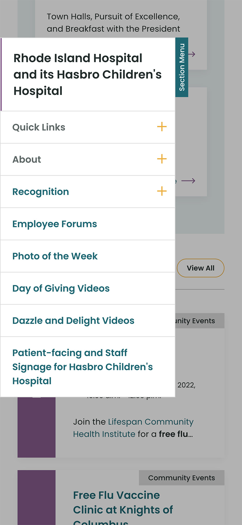
A Focused Priority on Search
Expectations about fast and accurate search are high because of you know who. When designing search for an employee intranet, the baseline requirements are even higher. We knew that we had to get the design and implementation of search right.
We took a learn-once, use-everywhere approach when it came to search interfaces. Search would be a core part of finding many types of content — tools, forms, people, departments, locations, and more. Each had to have a similar structure and set of filtering options to be the most useful.
The list of tools, locations, or people needed smart defaults. Before someone conducts their own search, each screen displays popular searches and the common content people need to access. In some cases, an employee does not even need to search in order to find what they need.
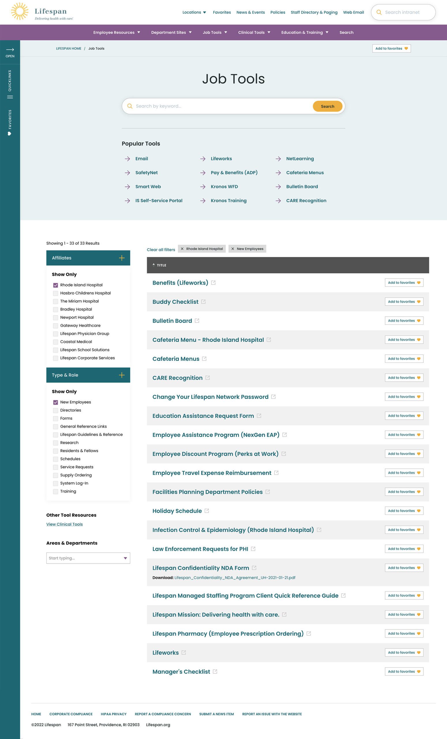


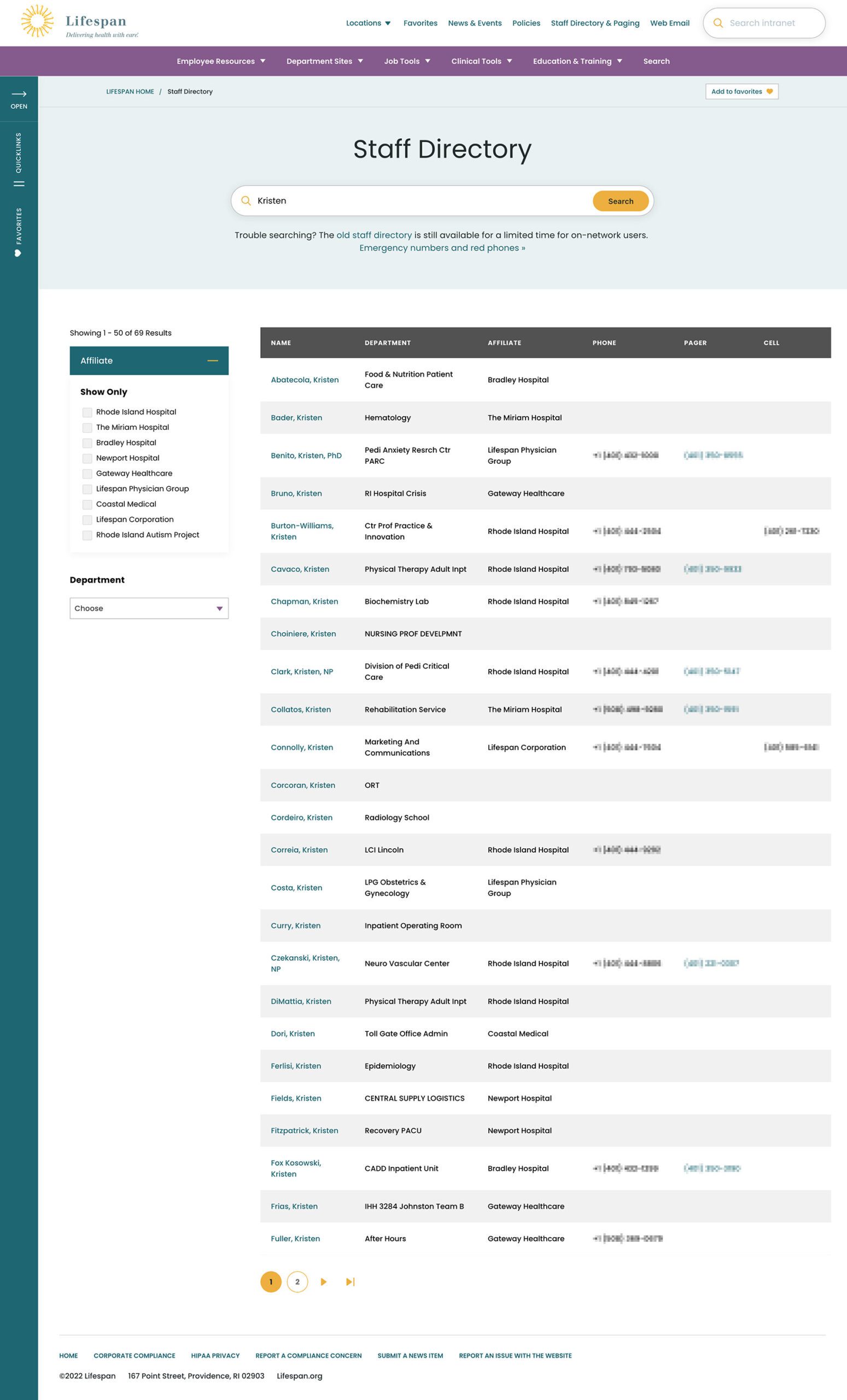
Two search pages, similar interfaces: The Job Tools search and Staff Directory follow similar patterns, adhering to our “learn once, use everywhere” rule
Personalization that follows Employees from Device to Device
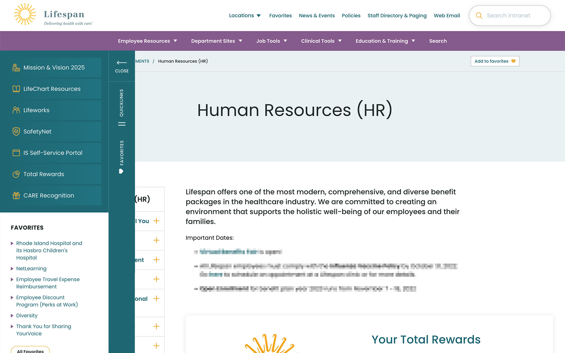
Personalization had to be a part of our solution as well. Employees are able to use S.S.O. to access the intranet from their personal devices or workstation computers in the hospitals. Workstations are often shared between multiple clinical staff, therefore, our system needed to support stopping one task on on device and picking it back up on another.
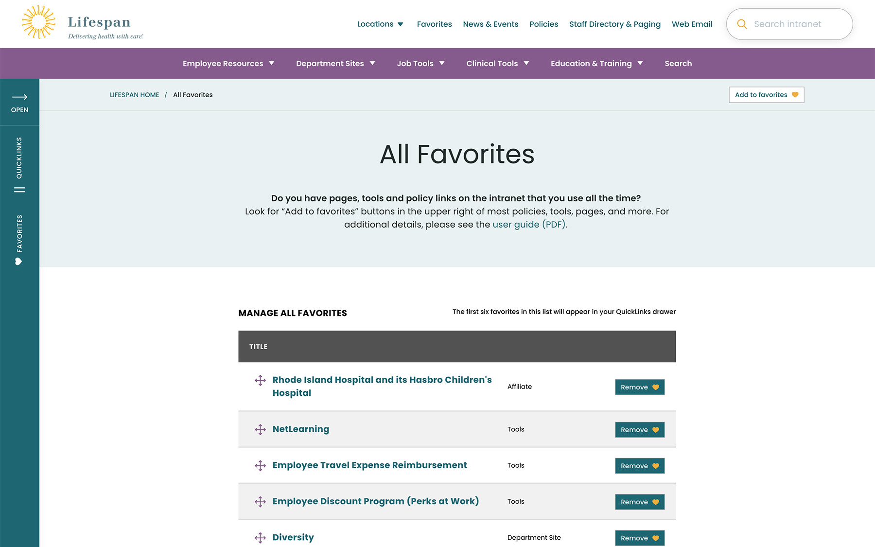
A Favorites feature allows employees to create their own transportable bookmarks. Almost everything on the site can be bookmarked, reducing the need to search for commonly used content and tools. Six custom favorites are available from the left drawer at all times, while the entire list of favorites is one more click away.
Supporting Speed and Engagement
Speed is at the heart of critical tasks and high-quality patient care. A nurse, at a shared workstation, needs to log in quickly, find the tool they need, and administer care. Time is critical. They don’t want extra clicks, a search that doesn’t work intuitively, or slow page load times. Staff don’t want it, and management doesn’t want it, either.
Engagement is slower and the intention is different. Speed is for tasks. Engagement is for exploring. This is how company culture is communicated and absorbed. This is when people catch up with department and company news, find events to attend, view a photo gallery from an event they missed, or browse a bulletin board to swap items with other employees. You can’t have an intranet that is ALL business just like you can’t have an intranet that is NO business.

A Dashboard Built for Speed or Browsing
On the starting page, an employee might be in need for something immediate or might have time to explore. We do not know their intention, therefore, this page needs to support both.
The left drawer is open to employees on the dashboard. It is open to show them what it contains and to remove a click when accessing the important common destinations within. The first seven links are common items for any employee, curated by the Lifespan team. They are a mixture of tactical items — like time sheets — and company culture items — like the CARE recognition program.
Below that are the employee Favorites. The first six favorites are shown while all are available with an extra click.
The top navigation supports speed to common destinations, some of which are search interfaces and others which are built for browsing.
The rest of the page showcases engagement and company culture. Featured news stories with images are balanced with quick news and event lists. Flexible content sections allow authors to add and remove content blocks as new items are required.
Other content pages that were focused on engagement are the deeper News and Events pages, customized Location pages (for each major hospital location), and a community Bulletin Board.

The Results
Smooth Onboarding and Acceptance
No matter how confident our teams were, we didn’t really know if the redesign was a success until employees moved from the older tools they were familiar with. The Lifespan team did a fantastic job creating walk through videos ahead of the launch. Old tools and directories stayed available for a period of overlap, but our teams saw quick adoption into the new tools in favor of the familiar.
Since the intranet is now available off of the closed Lifespan network, we have seen mobile traffic increase dramatically. The responsive design is an improved experience over the previous intranet and the numbers prove it. In fact, we have found that more employees engage in company culture content on their personal devices, while using the company workstations for their tasks.
Oomph is very proud to have worked with one of the largest private employers in the state, and we are very proud to have our work used by over 17,000 people every day. Oomph continues to support the Lifespan team and the intranet project, iteratively improving the features and evolving the toolset to be effective for all.
Oomph has been quiet about our excitement for artificial intelligence (A.I.). While the tech world has exploded with new A.I. products, offerings, and add-ons to existing product suites, we have been formulating an approach to recommend A.I.-related services to our clients.
One of the biggest reasons why we have been quiet is the complexity and the fast-pace of change in the landscape. Giant companies have been trying A.I. with some loud public failures. The investment and venture capitalist community is hyped on A.I. but has recently become cautious as productivity and profit have not been boosted. It is a familiar boom-then-bust of attention that we have seen before — most recently with AR/VR after the Apple Vision Pro five months ago and previously with the Metaverse, Blockchain/NFTs, and Bitcoin.
There are many reasons to be optimistic about applications for A.I. in business. And there continue to be many reasons to be cautious as well. Just like any digital tool, A.I. has pros and cons and Oomph has carefully evaluated each. We are sharing our internal thoughts in the hopes that your business can use the same criteria when considering a potential investment in A.I.
Using A.I.: Not If, but How
Most digital tools now have some kind of A.I. or machine-learning built into them. A.I. has become ubiquitous and embedded in many systems we use every day. Given investor hype for companies that are leveraging A.I., more and more tools are likely to incorporate A.I.
This is not a new phenomenon. Grammarly has been around since 2015 and by many measures, it is an A.I. tool — it is trained on human written language to provide contextual corrections and suggestions for improvements.
Recently, though, embedded A.I. has exploded across markets. Many of the tools Oomph team members use every day have A.I. embedded in them, across sales, design, engineering, and project management — from Google Suite and Zoom to Github and Figma.
The market has already decided that business customers want access to time-saving A.I. tools. Some welcome these options, and others will use them reluctantly.
Either way, the question has very quickly moved from should our business use A.I. to how can our business use A.I. tools responsibly?
The Risks that A.I. Pose
Every technological breakthrough comes with risks. Some pundits (both for and against A.I. advancements) have likened its emergence to the Industrial Revolution of the early 20th century. And a high-level of positive significance is possible, while the cultural, societal, and environmental repercussions could also follow a similar trajectory.
A.I. has its downsides. When evaluating A.I. tools as a solution to our client’s problems, we keep this list of drawbacks and negative effects handy, so that we may review it and think about how to mitigate their negative effects:
- A.I. is built upon biased and flawed data
- Bias & flawed data leads to the perpetuation of stereotypes
- Flawed data leads to Hallucinations & harms Brands
- Poor A.I. answers erode Consumer Trust
- A.I.’s appetite for electricity is unsustainable
We have also found that our company values are a lens through which we can evaluate new technology and any proposed solutions. Oomph has three cultural values that form the center of our approach and our mission, and we add our stated 1% For the Planet commitment to that list as well:
- Smart
- Driven
- Personal
- Environmentally Committed
For each of A.I.’s drawbacks, we use the lens of our cultural values to guide our approach to evaluating and mitigating those potential ill effects.
A.I. is built upon biased and flawed data
At its core, A.I. is built upon terabytes of data and billions, if not trillions, of individual pieces of content. Training data for Large Language Models (LLMs) like Chat GPT, Llama, and Claude encompass mostly public content as well as special subscriptions through relationships with data providers like the New York Times and Reddit. Image generation tools like Midjourney and Adobe Firefly require billions of images to train them and have skirted similar copyright issues while gobbling up as much free public data as they can find.
Because LLMs require such a massive amount of data, it is impossible to curate those data sets to only what we may deem as “true” facts or the “perfect” images. Even if we were able to curate these training sets, who makes the determination of what to include or exclude?
The training data would need to be free of bias and free of sarcasm (a very human trait) for it to be reliable and useful. We’ve seen this play out with sometimes hilarious results. Google “A.I. Overviews” have told people to put glue on pizza to prevent the cheese from sliding off or to eat one rock a day for vitamins & minerals. Researchers and journalists traced these suggestions back to the training data from Reddit and The Onion.
Information architects have a saying: “All Data is Dirty.” It means no one creates “perfect” data, where every entry is reviewed, cross-checked for accuracy, and evaluated by a shared set of objective standards. Human bias and accidents always enter the data. Even the simple act of deciding what data to include (and therefore, which data is excluded) is bias. All data is dirty.
Bias & flawed data leads to the perpetuation of stereotypes
Many of the drawbacks of A.I. are interrelated — All data is dirty is related to D.E.I. Gender and racial biases surface in the answers A.I. provides. A.I. will perpetuate the harms that these biases produce as they become easier and easier to use and more and more prevalent. These harms are ones which society is only recently grappling with in a deep and meaningful way, and A.I. could roll back much of our progress.
We’ve seen this start to happen. Early reports from image creation tools discuss a European white male bias inherent in these tools — ask it to generate an image of someone in a specific occupation, and receive many white males in the results, unless that occupation is stereotypically “women’s work.” When AI is used to perform HR tasks, the software often advances those it perceives as males more quickly, and penalizes applications that contain female names and pronouns.
The bias is in the data and very, very difficult to remove. The entirety of digital written language over-indexes privileged white Europeans who can afford the tools to become authors. This comparably small pool of participants is also dominantly male, and the content they have created emphasizes white male perspectives. To curate bias out of the training data and create an equally representative pool is nearly impossible, especially when you consider the exponentially larger and larger sets of data new LLM models require for training.
Further, D.E.I. overflows into environmental impact. Last fall, the Fifth National Climate Assessment outlined the country’s climate status. Not only is the U.S. warming faster than the rest of the world, but they directly linked reductions in greenhouse gas emissions with reducing racial disparities. Climate impacts are felt most heavily in communities of color and low incomes, therefore, climate justice and racial justice are directly related.
Flawed data leads to “Hallucinations” & harms Brands
“Brand Safety” and How A.I. can harm Brands
Brand safety is the practice of protecting a company’s brand and reputation by monitoring online content related to the brand. This includes content the brand is directly responsible for creating about itself as well as the content created by authorized agents (most typically customer service reps, but now AI systems as well).
The data that comes out of A.I. agents will reflect on the brand employing the agent. A real life example is Air Canada. The A.I. chatbot gave a customer an answer that contradicted the information in the URL it provided. The customer chose to believe the A.I. answer, while the company tried to say that it could not be responsible if the customer didn’t follow the URL to the more authoritative information. In court, the customer won and Air Canada lost, resulting in bad publicity for the company.
Brand safety can also be compromised when a 3rd party feeds A.I. tools proprietary client data. Some terms and condition statements for A.I. tools are murky while others are direct. Midjourney’s terms state,
“By using the Services, You grant to Midjourney […] a perpetual, worldwide, non-exclusive, sublicensable no-charge, royalty-free, irrevocable copyright license to reproduce, prepare derivative works of, publicly display, publicly perform, sublicense, and distribute text and image prompts You input into the Services”
Midjourney’s Terms of Service Statement
That makes it pretty clear that by using Midjourney, you implicitly agree that your data will become part of their system.
The implication that our client’s data might become available to everyone is a huge professional risk that Oomph avoids. Even using ChatGPT to provide content summaries on NDA data can open hidden risks.
What are “Hallucinations” and why do they happen?
It’s important to remember how current A.I. chatbots work. Like a smartphone’s predictive text tool, LLMs form statements by stitching together words, characters, and numbers based on the probability of each unit succeeding the previously generated units. The predictions can be very complex, adhering to grammatical structure and situational context as well as the initial prompt. Given this, they do not truly understand language or context.
At best, A.I. chatbots are a mirror that reflects how humans sound without a deep understanding of what any of the words mean.
A.I. systems are trying its best to provide an accurate and truthful answer without a complete understanding of the words it is using. A “hallucination” can occur for a variety of reasons and it is not always possible to trace their origins or reverse-engineer them out of a system.
As many recent news stories state, hallucinations are a huge problem with A.I. Companies like IBM and McDonald’s can’t get hallucinations under control and have pulled A.I. from their stores because of the headaches they cause. If they can’t make their investments in A.I. pay off, it makes us wonder about the usefulness of A.I. for consumer applications in general. And all of these gaffes hurt consumer’s perception of the brands and the services they provide.
Poor A.I. answers erode Consumer Trust
The aforementioned problems with A.I. are well-known in the tech industry. In the consumer sphere, A.I. has only just started to break into the public consciousness. Consumers are outcome-driven. If A.I. is a tool that can reliably save them time and reduce work, they don’t care how it works, but they do care about its accuracy.
Consumers are also misinformed or have a very surface level understanding of how A.I. works. In one study, only 30% of people correctly identified six different applications of A.I. People don’t have a complete picture of how pervasive A.I.-powered services already are.
The news media loves a good fail story, and A.I. has been providing plenty of those. With most of the media coverage of A.I. being either fear-mongering (“A.I. will take your job!”) or about hilarious hallucinations (“A.I. suggests you eat rocks!”), consumers will be conditioned to mistrust products and tools labeled “A.I.”
And for those who have had a first-hand experience with an A.I. tool, a poor A.I. experience makes all A.I. seem poor.
A.I.’s appetite for electricity is unsustainable
The environmental impact of our digital lives is invisible. Cloud services that store our lifetime of photographs sound like featherly, lightweight repositories that are actually giant, electricity-guzzling warehouses full of heat-producing servers. Cooling these data factories and providing the electricity to run them are a major infrastructure issue cities around the country face. And then A.I. came along.
While difficult to quantify, there are some scientists and journalists studying this issue, and they have found some alarming statistics:
- Training GPT-3 required more than 1,200 MWh which led to 500 metric tons of greenhouse gas emissions — equivalent to the amount of energy used for 1 million homes in one hour and the emissions of driving 1 million miles. GPT-4 has even greater needs.
- Research suggests a single generative A.I. query consumes energy at four or five times the magnitude of a typical search engine request.
- Northern Virginia needs the equivalent of several large nuclear power plants to serve all the new data centers planned and under construction.
- In order to support less consumer demand on fossil fuels (think electric cars, more electric heat and cooking), power plant executives are lobbying to keep coal-powered plants around for longer to meet increased demands. Already, soaring power consumption is delaying coal plant closures in Kansas, Nebraska, Wisconsin, and South Carolina.
- Google emissions grew 48% in the past five years in large part because of its wide deployment of A.I.
While the consumption needs are troubling, quickly creating more infrastructure to support these needs is not possible. New energy grids take multiple years and millions if not billions of dollars of investment. Parts of the country are already straining under the weight of our current energy needs and will continue to do so — peak summer demand is projected to grow by 38,000 megawatts nationwide in the next five years.
While a data center can be built in about a year, it can take five years or longer to connect renewable energy projects to the grid. While most new power projects built in 2024 are clean energy (solar, wind, hydro), they are not being built fast enough. And utilities note that data centers need power 24 hours a day, something most clean sources can’t provide. It should be heartbreaking that carbon-producing fuels like coal and gas are being kept online to support our data needs.
Oomph’s commitment to 1% for the Planet means that we want to design specific uses for A.I. instead of very broad ones. The environmental impact of A.I.’s energy demands is a major factor we consider when deciding how and when to use A.I.
Using our Values to Guide the Evaluation of A.I.
As we previously stated, our company values provide a lens through which we can evaluate A.I. and look to mitigate its negative effects. Many of the solutions cross over and mitigate more than one effect and represent a shared commitment to extracting the best results from any tool in our set
Smart
- Limit direct consumer access to the outputs of any A.I. tools, and put a well-trained human in the middle as curator. Despite the pitfalls of human bias, it’s better to be aware of them rather than allow A.I. to run unchecked
- Employ 3rd-party solutions with a proven track-record of hallucination reduction
Driven
- When possible, introduce a second proprietary dataset that can counterbalance training data or provide additional context for generated answers that are specific to the client’s use case and audience
- Restrict A.I. answers when qualifying, quantifying, or categorizing other humans, directly or indirectly
Personal
- Always provide training to authors using A.I. tools and be clear with help text and microcopy instructions about the limitations and biases of such datasets
1% for the Planet
- Limit the amount of A.I. an interface pushes at people without first allowing them to opt in — A.I. should not be the default
- Leverage “green” data centers if possible, or encourage the client using A.I. to purchase carbon offset credits
In Summary
While this article feels like we are strongly anti-A.I., we still have optimism and excitement about how A.I. systems can be used to augment and support human effort. Tools created with A.I. can make tasks and interactions more efficient, can help non-creatives jumpstart their creativity, and can eventually become agents that assist with complex tasks that are draining and unfulfilling for humans to perform.
For consumers or our clients to trust A.I., however, we need to provide ethical evaluation criteria. We can not use A.I. as a solve-all tool when it has clearly displayed limitations. We aim to continue to learn from others, experiment ourselves, and evaluate appropriate uses for A.I. with a clear set of criteria that align with our company culture.
To have a conversation about how your company might want to leverage A.I. responsibly, please contact us anytime.
Additional Reading List
- “The Politics of Classification” (YouTube). Dan Klyn, guest lecture at UM School of Information Architecture. 09 April 2024. A review of IA problems vs. AI problems, how classification is problematic, and how mathematical smoothness is unattainable.
- “Models All the Way Down.” Christo Buschek and Jer Thorp, Knowing Machines. A fascinating visual deep dive into training sets and the problematic ways in which these sets were curated by AI or humans, both with their own pitfalls.
- “AI spam is already starting to ruin the internet.” Katie Notopoulos, Business Insider, 29 January 2024. When garbage results flood Google, it’s bad for users — and Google.
- Racial Discrimination in Face Recognition Technology, Harvard, 24 October 2020. The title of this article explains itself well.
- Women are more likely to be replaced by AI, according to LinkedIn, Fast Company, 04 April 2024. Many workers are worried that their jobs will be replaced by artificial intelligence, and a growing body of research suggests that women have the most cause for concern.
- Brand Safety and AI, Writer.com. An overview of what brand safety means and how it is usually governed.
- AI and designers: the ethical and legal implications, UX Design, 25 February 2024. Not only can using training data potentially introduce legal troubles, but submitting your data to be processed by A.I. does as well.
- Can Generative AI’s Hallucination Problem be Overcome? Louis Poirier, C3.ai. 31 August 2023. A company claims to have a solution for A.I. hallucinations but doesn’t completely describe how in their marketing.
- Why AI-generated hands are the stuff of nightmares, explained by a scientist, Science Focus, 04 February 2023. Whether it’s hands with seven fingers or extra long palms, AI just can’t seem to get it right.
- Sycophancy in Generative-AI Chatbots, NNg. 12 January 2024. Human summary: Beyond hallucinations, LLMs have other problems that can erode trust: “Large language models like ChatGPT can lie to elicit approval from users. This phenomenon, called sycophancy, can be detected in state-of-the-art models.”
- Consumer attitudes towards AI and ML’s brand usage U.S. 2023. Valentina Dencheva, Statistica. 09 February 2023
- What the data says about Americans’ views of artificial intelligence. Pew Research Center. 21 November 2023
- Exploring the Spectrum of “Needfulness” in AI Products. Emily Campbull, The Shape of AI. 28 March 2024
- AI’s Impact On The Future Of Consumer Behavior And Expectations. Jean-Baptiste Hironde, Forbes. 31 August 2023.
- Is generative AI bad for the environment? A computer scientist explains the carbon footprint of ChatGPT and its cousins. The Conversation. 23 May 2023
THE BRIEF
Wingspans’ primary audience is digital natives — young, tech-savvy users who expect fast, frictionless interactions and relevant content. Fail to deliver, and they’ll abandon you in a heartbeat.
The new platform needed to provide a scalable, flexible foundation for a range of content and tools being developed by the Wingspans team. We had to turn a collection of disparate pieces — story content, user data, school information, and more — into a cohesive digital framework that could grow and evolve. Above all, Wingspans needed a design-first approach, wrapping the educational aspects in an intuitive, engaging digital experience.
THE APPROACH
While storytelling formed the heart of the Wingspans platform, the site’s interactive features would be crucial for getting students to explore and engage with the content. Building on Lindsay’s familiarity with the educational market, we mapped out the content architecture, workflows, and functions for a host of interactive features to keep students engaged.
For the tech stack, we turned to a mix of microservices to provide a stable, flexible, and scalable architecture with lightning-fast performance. These included a Gatsby front end, Firebase database, AWS cloud storage, Algolia site search, Cosmic JS content management system, and more. We also worked to ensure the technology reflected Lindsay’s empathy-driven approach. For instance, we customized Algolia to deliver search results specifically tailored to a student’s profile and interests—in other words, an encyclopedia that understood its users and presented its information in a distinctly human way.
THE RESULTS
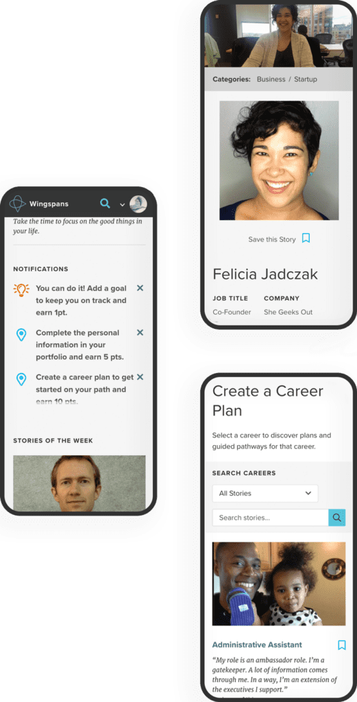
The platform’s most impactful feature is how easily students can find and bookmark career stories that resonate with who they are. With over 700 stories and 40 mini-documentaries available, each with an associated set of lessons, the site’s personalized search function and ultrafast content delivery are key. On the backend, the customized CMS and robust content architecture make it easy for the Wingspans team to align content with users’ profiles and browsing activity.
Bringing it all together, the Career Builder feature lets students select stories and content to create a customized career roadmap that they can share with parents, teachers, and counselors. A core element of the platform’s personalized user experience, the Career Builder brings Wingspans’ central premise to life: If you can see it, you can be it.
Oomph really fulfilled their commitment to building an immersive and radically personal platform that brought my vision to life.
— Lindsay Kuhn, Wingspans Founder and CEO
There’s a new acronym on the block: MACH (pronounced “mock”) architecture.
But like X is to Twitter, MACH is more a rebrand than a reinvention. In fact, you’re probably already familiar with the M, A, C, and H and may even use them across your digital properties. While we’ve been helping our clients implement aspects of MACH architecture for years, organizations like the MACH Alliance have recently formed in an attempt to provide clearer definition around the approach, as well as to align their service offerings with the technologies at hand.
One thing we’ve learned at Oomph after years of working with these technologies? It isn’t an all-or-nothing proposition. There are many degrees of MACH adoption, and how far you go depends on your organization and its unique needs.
But first, you need to know what MACH architecture is, why it’s great (and when it’s not), and how to get started.
What Is MACH?
MACH is an approach to designing, building, and testing agile digital systems — particularly websites. It stands for microservices, APIs, cloud-native, and headless.
Like a composable business, MACH unites a few tried-and-true components into a single, seamless framework for building modern digital systems.
The components of MACH architecture are:
- Microservices: Many online features and functions can be separated into more specific tasks, or microservices. Modern web apps often rely on specialized vendors to offer individual services, like sending emails, authenticating users, or completing transactions, rather than a single provider to rule them all.
- APIs: Microservices interact with a website through APIs, or application programming interfaces. This allows developers to change the site’s architecture without impacting the applications that use APIs and easily offer those APIs to their customers.
- Cloud-Native: A cloud-based environment hosts websites and applications via the Internet, ensuring scalability and performance. Modern cloud technology like Kubernetes, containers, and virtual machines keep applications consistent while meeting the demands of your users.
- Headless: Modern Javascript frameworks like Next.js and Gatsby empower intuitive front ends that can be coupled with a variety of back-end content management systems, like Drupal and WordPress. This gives administrators the authoring power they want without impacting end users’ experience.
Are You Already MACHing?

Even if the term MACH is new to you, chances are good that you’re already doing some version of it. Here are some telltale signs:
- You have one vendor for single sign-on (SSO), one vendor to capture payment information, another to handle email payment confirmations, and so on.
- You use APIs to integrate with tech solutions like Hubspot, Salesforce, PayPal, and more.
- Your website — or any website feature or application — is deployed within a cloud environment.
- Your website’s front end is managed by a different vendor than its back end.
If you’re doing any of the above, you’re MACHing. But the magic of MACH is in bringing them all together, and there are plenty of reasons why companies are taking the leap.
5 Benefits of MACH Architecture
If you make the transition to MACH, you can expect:
- Choice: Organizations that use MACH don’t have to settle for one provider that’s “good enough” for the countless services websites need. Instead, they can choose the best vendor for the job. For example, when Oomph worked with One Percent for America to build a platform offering low-interest loans to immigrants pursuing citizenship, that meant leveraging the Salesforce CRM for loan approvals, while choosing “Click and Pledge” for donations and credit card transactions.
- Flexibility: MACH architecture’s modular nature allows you to select and integrate individual components more easily and seamlessly update or replace those components. Our client Leica, for example, was able to update its order fulfillment application with minimal impact to the rest of its Drupal site.
- Performance: Headless applications often run faster and are easier to test, so you can deploy knowing you’ve created an optimal user experience. For example, we used a decoupled architecture for our client Wingspans to create a stable, flexible, and scalable site with lightning-fast performance for its audience of young career-seekers.
- Security: Breaches are generally limited to individual features or components, keeping your entire system more secure.
- Future-Proofing: A MACH system scales easily because each service is individually configured, making it easier to keep up with technologies and trends and avoid becoming out-of-date.
5 Drawbacks of MACH Architecture
As beneficial as MACH architecture can be, making the switch isn’t always smooth sailing. Before deciding to adopt MACH, consider these potential pitfalls.
- Complexity: With MACH architecture, you’ll have more vendors — sometimes a lot more — than if you run everything on one enterprise system. That’s more relationships to manage and more training needed for your employees, which can complicate development, testing, deployment, and overall system understanding.
- Challenges With Data Parity: Following data and transactions across multiple microservices can be tricky. You may encounter synchronization issues as you get your system dialed in, which can frustrate your customers and the team maintaining your website.
- Security: You read that right — security is a potential pro and a con with MACH, depending on your risk tolerance. While your whole site is less likely to go down with MACH, working with more vendors leaves you more vulnerable to breaches for specific services.
- Technological Mishaps: As you explore new solutions for specific services, you’ll often start to use newer and less proven technologies. While some solutions will be a home run, you may also have a few misses.
- Complicated Pricing: Instead of paying one price tag for an enterprise system, MACH means buying multiple subscriptions that can fluctuate more in price. This, coupled with the increased overhead of operating a MACH-based website, can burden your budget.
Is MACH Architecture Right for You?
In our experience, most brands could benefit from at least a little bit of MACH. Some of our clients are taking a MACH-lite approach with a few services or apps, while others have adopted a more comprehensive MACH architecture.
Whether MACH is the right move for you depends on your:
- Platform Size and Complexity: Smaller brands with tight budgets and simple websites may not need a full-on MACH approach. But if you’re managing content across multiple sites and apps, managing a high volume of communications and transactions, and need to iterate quickly to keep up with rapid growth, MACH is often the way to go.
- Level of Security: If you’re in a highly regulated industry and need things locked down, you may be better off with a single enterprise system than a multi-vendor MACH solution.
- ROI Needs: If it’s time to replace your system anyway, or you’re struggling with internal costs and the diminishing value of your current setup, it may be time to consider MACH.
- Organizational Structure: If different teams are responsible for distinct business functions, MACH may be a good fit.
How To Implement MACH Architecture
If any of the above scenarios apply to your organization, you’re probably anxious to give MACH a go. But a solid MACH architecture doesn’t happen overnight. We recommend starting with a technology audit: a systematic, data-driven review of your current system and its limitations.
We recently partnered with career platform Wingspans to modernize its website. Below is an example of the audit and the output: a seamless and responsive MACH architecture.
The Audit
- Surveys/Questionnaires: We started with some simple questions about Wingspan’s website, including what was working, what wasn’t, and the team’s reasons for updating. They shared that they wanted to offer their users a more modern experience.
- Stakeholder Interviews: We used insights from the surveys to spark more in-depth discussions with team members close to the website. Through conversation, we uncovered that website performance and speed were their users’ primary pain points.
- Systems Access and Audit: Then, we took a peek under the hood. Wingspans had already shared its poor experiences with previous vendors and applications, so we wanted to uncover simpler ways to improve site speed and performance.
- Organizational Structure: Understanding how the organization functions helps design a system to meet those needs. The Wingspans team was excited about modern technology and relatively savvy, but they also needed a system that could accommodate thousands of authenticated community members.
- Marketing Plan Review: We also wanted to understand how Wingspans would talk about their website. They sought an “app-like” experience with super-fast search, which gave us insight into how their MACH system needed to function.
- Roadmap: Wingspans had a rapid go-to-market timeline. We simplified our typical roadmap to meet that goal, knowing that MACH architecture would be easy to update down the road.
- Delivery: We recommended Wingspans deploy as a headless site (a site we later developed for them), with documentation we could hand off to their design partner.
The Output
We later deployed Wingspans.com as a headless site using the following components of MACH architecture:
- Microservices: Wingspans leverages microservices like Algolia Search for site search, Amazon AWS for email sends and static site hosting, and Stripe for managing transactions.
- APIs: Wingspans.com communicates with the above microservices through simple APIs.
- Cloud-Native: The new website uses cloud-computing services like Google Firebase, which supports user authentication and data storage.
- Headless: Gatsby powers the front-end design, while Cosmic JS is the back-end content management system (CMS).
Let’s Talk MACH
As MACH evolves, the conversation around it will, too. Wondering which components may revolutionize your site and which to skip (for now)? Get in touch to set up your own technology audit.
In our previous post we broadly discussed the mindset of composable business. While “composable” can be a long term company-wide strategy for the future, companies shouldn’t overlook smaller-scale opportunities that exist at every level to introduce more flexibility, longevity, and reduce costs of technology investments.
For maximum ROI, think big, then start small
Many organizations are daunted by the concept of shifting a legacy application or monolith to a microservices architecture. This is exacerbated when an application is nearing end of life.
Don’t discount the fact that a move to a microservices architecture can be done progressively over time, unlike the replatform of a monolith which is a huge investment in both time and money that may not be realized for years until the new application is ready to deploy.
A progressive approach allows organizations to:
- Move faster and allow for adjustments as needed
- Begin realizing returns on investments faster
- Reduce risk by making smaller investments and deployments
- Ease budgeting process by funding an overhaul in stages
- Improve quality by minimizing the scope of tests
- Save money on initial investment and maintenance where services are centralized
- Benefit from longevity of a component-based system
Prioritizing the approach by aligning technical architecture with business objectives
As with any application development initiative, aligning business objectives with technology decisions is essential. Unlike replatforming a monolith, however, prioritizing and planning the order of development and deployments is crucial to the success of the initiative.
Start with clearly defining your application with a requirements and feature matrix. Then evaluate each using three lenses to see priorities begin to emerge:
- With a current state lens, evaluate each item. Is it broken? Is it costly to maintain? Is it leveraged by multiple business units or external applications?
- Then with a future state lens, evaluate each item. Could it be significantly improved? Could it be leveraged by other business units? Could it be leveraged outside the organization (partners, etc…)? Could it be leveraged in other applications, devices, or locations?
- Lastly, evaluate the emerging priority items with a cost and effort lense. What is the level of effort to develop the feature as a service? What is the likely duration of the effort?
Key considerations when planning a progressive approach
Planning is critical to any successful application development initiative, and architecting a microservices based architecture is no different. Be sure to consider the following key items as part of your planning exercises:
- Remember that rearchitecting a monolith feature as a service can open the door to new opportunities and new ways of thinking. It is helpful to ask “If this feature was a stand alone service, we could __”
- Be careful of designing services that are too big in scope. Work diligently to break down the application into the smallest possible parts, even if it is later determined that some should be grouped together
- Keep security front of mind. Where a monolith may have allowed for a straightforward security management policy with everything under one roof, a services architecture provides the opportunity for a more customized security policy, and the need to define how separate services are allowed to communicate with each other and the outside world
In summary
A microservices architecture is an approach that can help organizations move faster, be more flexible and agile, and reduce costs on development and maintenance of software applications. By taking a progressive approach when architecting a monolith application, businesses can move quickly, reduce risk, improve quality, and reduce costs.
If you’re interested in introducing composability to your organization, we’d love to help! Contact us today to talk about your options.
Many organizations today, large and small, have a digital asset problem. Companies are amassing huge libraries of images, videos, audio recordings, documents, and other files — while relying on shared folders and email to move them around the organization. As asset libraries explode, digital asset management (DAM) is crucial for keeping things accessible and up to date, so teams can spend more time getting work done and less time hunting for files.
First Things First: DAM isn’t Dropbox
Some folks still equate DAM with basic digital storage solutions, like Dropbox or Google Drive. While those are great for simple sharing needs, they’re essentially just file cabinets in the cloud.
DAM technology is purpose-built to optimize the way you store, maintain, and distribute digital assets. A DAM platform not only streamlines day-to-day content work; it also systematizes the processes and guidelines that govern content quality and use.
Today’s DAMs have sophisticated functionality that offers a host of benefits, including:
- Providing efficient access for internal and external teams
- Streamlining workflows for sharing drafts and getting approvals
- Serving images in multiple sizes and formats, reducing duplication
- Enabling AI-powered categorization, tagging, and license tracking
- Preventing versioning and legal issues around asset use
Is it time for your business to invest in a DAM? Let’s see if you recognize the pain points below:
The 5 Signs You Need a DAM
There are some things you can’t afford not to invest in if they significantly impact your team’s creativity and productivity and your business’s bottom line. Here are some of the most common signs it’s time to invest in a DAM:
It takes more than a few seconds to find what you need.
As your digital asset library grows, it’s harder to keep sifting through it all to find things — especially if you’re deciphering other people’s folder systems. If you don’t know the exact name of an asset or the folder it’s in, you’re often looking for a needle in a haystack.
Using a DAM, you can tag assets with identifying attributes (titles, keywords, etc.) and then quickly search the entire database for the ones that meet your criteria. DAMs also offer AI- and machine-learning–based tagging, which automatically adds tags based on the content of an image or document. Voila! A searchable database with less manual labor.
You have multiple versions of documents — in multiple places.
Many of our clients, including universities, healthcare systems, libraries, and nonprofits, have large collections of policy documents. These files often live on public websites, intranets, and elsewhere, with the intent that staff can pull them up as needed.
Problem is, if there’s a policy change, you need to be sure that anywhere a document is accessed, it’s the most current version. And you can’t just delete old files on a website, because any previous links to them will go up in smoke.
DAMs are excellent at managing document updates and variations, making it easy to find and replace old versions. They can also perform in-place file swaps without breaking the connections to the pieces of content that refer to a particular file.
You’re still managing assets by email.
With multiple team members or departments relying on the same pool of digital assets for a variety of use cases, some poor souls will spend hours every day answering email requests, managing edits, and transferring files. The more assets and channels you’re dealing with, the more unwieldy this gets.
DAMs facilitate collaboration by providing a single, centralized platform where team members can assign tasks, track changes, and configure permissions and approval processes. As a result, content creators know they’re using the most up-to-date, fully approved assets.
Your website doubles as a dump bin.
If your website is the source of assets for your entire organization, it can be a roadblock for other departments that need to use those assets in other places. They need to know how to find assets, download copies, and obtain sizes or formats that differ from the web-based versions… and there may or may not be a web team to assist.
What’s more, some web hosting providers offer limited storage space. If you have a large and growing digital library, you’ll hit those limits in no time.
A DAM provides a high-capacity, centralized location where staff can easily access current, approved digital assets in various sizes and formats.
You’re duplicating assets you already have.
How many times have you had different teams purchase assets like stock photography and audio tracks, when they could have shared the files instead? Or, maybe your storage folders are overrun with duplicates. Instead of relying on teams to communicate whenever they create or use an asset, you could simplify things with a DAM.
Storing and tagging all your assets, in various sizes and formats, in a DAM enables your teams to:
- Make the most of the assets you own
- Avoid creating unnecessary copies
- Access optimized versions for different applications
- Keep track of how many times each asset is used
When Should You Implement a DAM?
You can implement a DAM whether you have an existing website or you’re building a new one. DAM technology easily complements platform builds or redesigns, helping to make websites and intranets even more powerful. Organizing all of your assets in a DAM before launching a web project also makes it easier to migrate them to your new platform and helps ensure that nothing gets lost.
Plus, we’ve seen companies cling to old websites when too many departments are still using assets that are hosted on the site. Moving your assets out of your website and into a DAM frees you up to move on.
If you’re curious about your options for a DAM platform, there are a number of solutions on the market. Our partner Acquia offers an excellent DAM platform with an impressive range of functions for organizing, accessing, publishing, and repurposing assets, automating manual processes, and monitoring content metrics.
Other candidates to consider include Adobe Experience Manager Assets, Bynder, PicturePark, Canto, Cloudinary, Brandfolder, and MediaValet.
Given the number of DAMs on the market, choosing the right solution is a process. We’re happy to share our experience in DAM use and implementation, to help you find the best one for your needs. Just get in touch with any questions you have.
While the terminology was first spotlighted by IBM back in 2014, the concept of a composable business has recently gained much traction, thanks in large part to the global pandemic. Today, organizations are combining more agile business models with flexible digital architecture, to adapt to the ever-evolving needs of their company and their customers.
Here’s a high-level look at building a composable business.
What is a Composable Business?
The term “composable” encompasses a mindset, technology, and processes that enable organizations to innovate and adapt quickly to changing business needs.
A composable business is like a collection of interchangeable building blocks (think: Lego) that can be added, rearranged, and jettisoned as needed. Compare that with an inflexible, monolithic organization that’s slow and difficult to evolve (think: cinderblock). By assembling and reassembling various elements, composable businesses can respond quickly to market shifts.
Gartner offers four principles of composable business:
- Discovery: React faster by sensing when change is happening.
- Modularity: Achieve greater agility with interchangeable components.
- Orchestration: Mix and match business functions to respond to changing needs.
- Autonomy: Create greater resilience via independent business units.
These four principles shape the business architecture and technology that support composability. From structural capabilities to digital applications, composable businesses rely on tools for today and tomorrow.
So, how do you get there?
Start With a Composable Mindset…
A composable mindset involves thinking about what could happen in the future, predicting what your business may need, and designing a flexible architecture to meet those needs. Essentially, it’s about embracing a modular philosophy and preparing for multiple possible futures.
Where do you begin? Research by Gartner suggests the first step in transitioning to a composable enterprise is to define a longer-term vision of composability for your business. Ask forward-thinking questions, such as:
- How will the markets we operate in evolve over the next 3-5 years?
- How will the competitive landscape change in that time?
- How are the needs and expectations of our customers changing?
- What new business models or new markets might we pursue?
- What product, service, or process innovations would help us outpace competitors?
These kinds of questions provide insights into the market forces that will impact your business, helping you prepare for multiple futures. But you also need to adopt a modular philosophy, thinking about all the assets in your organization — every bit of data, every process, every application — as the building blocks of your composable business.
…Then Leverage Composable Technology
A long-term vision helps create purpose and structure for a composable business. Technology is the tools that bring it to life. Composable technology begets sustainable business architectures, ready to address the challenges of the future, not the past.
For many organizations, the shift to composability means evolving from an inflexible, monolithic digital architecture to a modular application portfolio. The portfolio is made up of packaged business capabilities, or PBCs, which form the foundation of composable technology.
The ABCs of PBCs
PBCs are software components that provide specific business capabilities. Although similar in some respects to microservices, PBCs address more than technological needs. While a specific application may leverage a microservice to provide a feature, when that feature represents a business capability beyond just the application at hand, it is a PBC.
Because PBCs can be curated, assembled, and reassembled as needed, you can adapt your technology practically at the pace of business change. You can also experiment with different services, shed things that aren’t working, and plug in new options without disrupting your entire ecosystem.
When building an application portfolio with PBCs, the key is to identify the capabilities your business needs to be flexible and resilient. What are the foundational elements of your long-term vision? Your target architecture should drive the business outcomes that support your strategic goals.
Build or Buy?
PBCs can either be developed internally or sourced from third parties. Vendors may include traditional packaged-software vendors and nontraditional parties, such as global service integrators or financial services companies.
When deciding whether to build or buy a PBC, consider whether your target capability is unique to your business. For example, a CMS is something many businesses need, and thus it’s a readily available PBC that can be more cost-effective to buy. But if, through vendor selection, you find that your particular needs are unique, you may want to invest in building your own.
Real-World Example
While building a new member retention platform for a large health insurer, we discovered a need to quickly look up member status during the onboarding process. Because the company had a unique way of identifying members, it required building custom software.
Although initially conceived in the context of the platform being created, a composable mindset led to the development of a standalone, API-first service — a true PBC providing member lookup capability to applications across the organization, and waiting to serve the applications of the future.
A Final Word
Disruption is here to stay. While you can’t predict every major shift, innovation, or crisis that will impact your organization, you can (almost) future-proof your business with a composabile approach.
Start with the mindset, lay out a roadmap, and then design a step-by-step program for digital transformation. The beauty of an API-led approach is that you can slowly but surely transform your technology, piece by piece.
If you’re interested in exploring a shift to composability, we’d love to help. Contact us today to talk about your options.
Second chances are expensive. Why? Because it takes five positive experiences to counterbalance the effects of a negative one. If someone’s first experience with your platform is disappointing, you have a long way to go to win back their confidence — if they even complete your sign-up form.
More than 67% of site visitors will completely abandon a sign-up process if they encounter any complications. If you’re lucky, maybe 20% of them will follow up with your company in some way. Whether you’re trying to get people to sign up for your mobile app, e-commerce platform, or company intranet, you must make the process as seamless as possible.
Here are six tips to reduce sign-up friction for your platform.
1. Use a Single Sign On Service
This is crucial for larger platforms that are part of a vast ecosystem with multiple logins, like a complex hospital platform providing access to multiple systems. On the other hand, for a basic paywall, you may want to manage user info yourself. The key is to think strategically about what your systems may look like down the road and how unwieldy your sign-up process may become.
Here are a few things to consider:
Pros
- Single Sign On (SSO) reduces password fatigue and simplifies password management for users
- It allows businesses to quickly provide or revoke employees’ system access
- It lowers the security risk for customers, vendors, and partners
- It improves identity protection with the ability to add multi-factor verification
- The number of available off-the-shelf SSO products makes it more cost effective to implement
Cons
- When SSO is down, access to all platform systems becomes more difficult
- It may introduce a security flaw, as a stolen password from a single user can provide access to multiple systems — which makes multi-factor verification more important
- SSO using social network sign in may not work in corporate systems where social media platforms are blocked by IT
In the end, the advantages of SSO significantly outweigh the downsides. But you’ll likely need expert guidance when planning and implementing SSO to ensure you reap the benefits while minimizing the risks.
2. Keep It Short
More than a quarter of users who abandon online forms do so because they’re too long. To maximize the number of sign-ups, minimize the steps involved.
How do you decide which fields to keep? Try asking, “If I didn’t have this piece of information, would I still be able to provide a good customer experience?” If it’s something you don’t really need to know, then don’t ask.
Here are two more ways to shorten form length:
- Use only required fields. Save anything optional for after sign-up, with prompts to help users “complete” their profile. Hide any repeated fields, like email or password verification. Display one email field, then, once it’s being entered, display the second one below it. Better yet, don’t force people to type things twice.
- Still having a hard time cutting fields? Consider this: Expedia dropped one form field and gained $12 million per year. If a piece of data is labelled as optional, it shouldn’t be in your sign-up form.
3. Use a Single Column Layout
In general, your form should adhere to this core UX principle:
Make the user experience smoother, faster, and better; not messier, slower, and worse.
The simpler the flow of your form, the faster and easier it feels to fill out. Here are a few tips:
- Put all your fields in a logical order.
- Make it easy to read and enter information in a smooth flow from top to bottom.
- Put labels above the input fields, not to the left (as many forms do).
- Avoid placing fields side by side, except for items where it tends to be the norm, such as city, state, and zip code.
4. Play Nice with Autofill
Nothing makes our sanguine CEO spout expletives faster than a platform that doesn’t allow browser-suggested passwords. While many of those suggested passwords are long strings of characters saved securely to the browser, the letter/number/special character combination may not meet your platform’s arbitrary standards.
In addition, some accessibility checkers will flag fields where autofill is turned off, indicating a possible issue for people with disabilities.
Here are a few more ways to make the experience smoother:
- In phone input fields, automatically fill in dashes. In date fields, fill in slashes
- Transition from one field or step to the next automatically
- Don’t use select lists for date values like months or years
And, don’t forget to test the autofill function on both a desktop and phone — the experience can be very different between the two.
5. Allow Guest Checkout for eCommerce
To put it bluntly, don’t get in the way of someone spending money on your site. Instead, make it easy to open an account just by creating a password. Or, create a new user account automatically with the info you have, then send users an email with instructions on how to finalize the sign-up process.
What we’ve seen work well: after a successful shopping experience, follow up with an email to the customer that sells the benefits of having an account and asks if they would like to activate theirs.
6. Don’t Use a CAPTCHA
That’s right, we said it. It’s time to get rid of CAPTCHA on your sign-up form. Here are three good reasons why:
- There are too many ways to counter CAPTCHA, especially as AI evolves
- CAPTCHA puzzles are getting harder and harder for humans to solve
- Use of CAPTCHA has been shown to increase form abandonment
Instead, confirm any new account the tried-and-true way: with an email to the registered address. And consider if there are ways to clean up your security features on the back end, instead of presenting barriers to customers upon sign-up.
Don’t put the onus on the people who are trying to give you money. Put it on your systems instead.
You Only Get a First Impression Once
As the gateway to onboarding users, the sign-up process is the most crucial piece of your user experience to get right. Whether your goal is to acquire and retain customers, or to engage and inform employees, your success depends on getting your target audience past the initial sign-up hurdle. If their first task is difficult, it doesn’t bode well for the rest of the experience.
Don’t let your sales and marketing be better than your user onboarding. Once someone has decided your platform offers what they need, you’re more than halfway to converting them into a user. Just make sure your sign-up process lives up to your marketing promises.
Why are microservices growing in popularity for enterprise-level platforms? For many organizations, a microservice architecture provides a faster and more flexible way to leverage technology to meet evolving business needs. For some leaders, microservices better reflect how they want to structure their teams and processes.
But are microservices the best fit for you?
We’re hearing this question more and more from platform owners across multiple industries as software monoliths become increasingly impractical in today’s fast-paced competitive landscape. However, while microservices offer the agility and flexibility that many organizations are looking for, they’re not right for everyone.
In this article, we’ll cover key factors in deciding whether microservices architecture is the right choice for your platform.
What’s the Difference Between Microservices and Monoliths?
Microservices architecture emerged roughly a decade ago to address the primary limitations of monolithic applications: scale, flexibility, and speed.
Microservices are small, separately deployable, software units that together form a single, larger application. Specific functions are carried out by individual services. For example, if your platform allows users to log in to an account, search for products, and pay online, those functions could be delivered as separate microservices and served up through one user interface (UI).
In monolithic architecture, all of the functions and UI are interconnected in a single, self-contained application. All code is traditionally written in one language and housed in a single codebase, and all functions rely on shared data libraries.
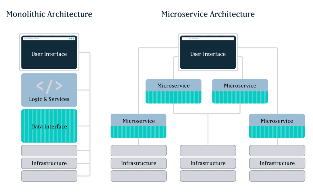
Essentially, with most off-the-shelf monoliths, you get what you get. It may do everything, but not be particularly great at anything. With microservices, by contrast, you can build or cherry-pick optimal applications from the best a given industry has to offer.
Because of their modular nature, microservices make it easier to deploy new functions, scale individual services, and isolate and fix problems. On the other hand, with less complexity and fewer moving parts, monoliths can be cheaper and easier to develop and manage.
So which one is better? As with most things technological, it depends on many factors. Let’s take a look at the benefits and drawbacks of microservices.
Advantages of Microservices Architecture
Companies that embrace microservices see it as a cleaner, faster, and more efficient approach to meeting business needs, such as managing a growing user base, expanding feature sets, and deploying solutions quickly. In fact, there are a number of ways in which microservices beat out monoliths for speed, scale, and agility.
Shorter time to market
Large monolithic applications can take a long time to develop and deploy, anywhere from months to years. That could leave you lagging behind your competitors’ product releases or struggling to respond quickly to user feedback.
By leveraging third-party microservices rather than building your own applications from scratch, you can drastically reduce time to market. And, because the services are compartmentalized, they can be built and deployed independently by smaller, dedicated teams working simultaneously. You also have greater flexibility in finding the right tools for the job: you can choose the best of breed for each service, regardless of technology stack.
Lastly, microservices facilitate the minimum viable product approach. Instead of deploying everything on your wishlist at once, you can roll out core services first and then release subsequent services later.
Faster feature releases
Any changes or updates to monoliths require redeploying the entire application. The bigger a monolith gets, the more time and effort is required for things like updates and new releases.
By contrast, because microservices are independently managed, dedicated teams can iterate at their own pace without disrupting others or taking down the entire system. This means you can deploy new features rapidly and continuously, with little to no risk of impacting other areas of the platform.
This added agility also lets you prioritize and manage feature requests from a business perspective, not a technology perspective. Technology shouldn’t prevent you from making changes that increase user engagement or drive revenue—it should enable those changes.
Affordable scalability
If you need to scale just one service in a monolithic architecture, you’ll have to scale and redeploy the entire application. This can get expensive, and you may not be able to scale in time to satisfy rising demand.
Microservices architecture offers not only greater speed and flexibility, but also potential savings in hosting costs, because you can independently scale any individual service that’s under load. You can also configure a single service to add capability automatically until load need is met, and then scale back to normal capacity.
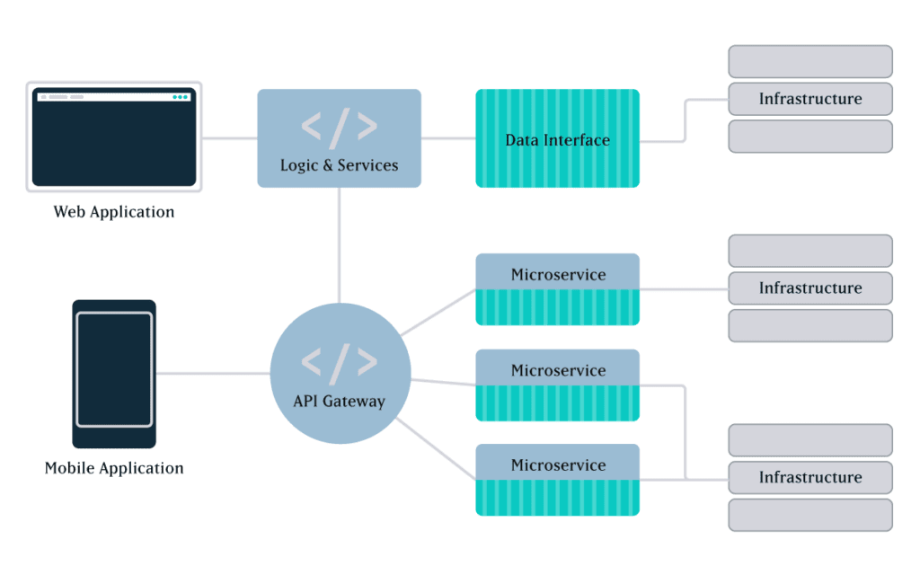
More support for growth
With microservices architecture, you’re not limited to a UI that’s tethered to your back end. For growing organizations that are continually thinking ahead, this is one of the greatest benefits of microservices architecture.
In the past, websites and mobile apps had completely separate codebases, and launching a mobile app meant developing a whole new application. Today, you just need to develop a mobile UI and connect it to the same service as your website UI. Make updates to the service, and it works across everything.
You have complete control over the UI — what it looks like, how it functions for the customer, etc… You can also test and deploy upgrades without disrupting other services. And, as new forms of data access and usage emerge, you have readily available services that you can use for whatever application suits your needs. Digital signage, voice commands for Alexa… and whatever comes next.
Optimal programming options
Since monolithic applications are tightly coupled and developed with a single stack, all components typically share one programming language and framework. This means any future changes or additions are limited to the choices you make early on, which could cause delays or quality issues in future releases.
Because microservices are loosely coupled and independently deployed, it’s easier to manage diverse datasets and processing requirements. Developers can choose whatever language and storage solution is best suited for each service, without having to coordinate major development efforts with other teams.
Greater resilience
For complex platforms, fault tolerance and isolation are crucial advantages of microservices architecture. There’s less risk of system failure, and it’s easier and faster to fix problems.
In monolithic applications, even just one bug affecting one tiny part of a single feature can cause problems in an unrelated area—or crash the entire application. Any time you make a change to a monolithic application, it introduces risk. With microservices, if one service fails, it’s unlikely to bring others down with it. You’ll have reduced functionality in a specific capacity, not the whole system.
Microservices also make it easier to locate and isolate issues, because you can limit the search to a single software module. Whereas in monoliths, given the possible chain of faults, it’s hard to isolate the root cause of problems or predict the outcome of any changes to the codebase.
Monoliths thus make it difficult and time-consuming to recover from failures, especially since, once an issue has been isolated and resolved, you still have to rebuild and redeploy the entire application. Since microservices allow developers to fix problems or roll back buggy updates in just one service, you’ll see a shorter time to resolution.
Faster onboarding
With smaller, independent code bases, microservices make it faster and easier to onboard new team members. Unlike with monoliths, new developers don’t have to understand how every service works or all the interdependencies at play in the system.
This means you won’t have to scour the internet looking for candidates who can code in the only language you’re using, or spend time training them in all the details of your codebase. Chances are, you’ll find new hires more easily and put them to work faster.
Easier updates
As consumer expectations for digital experiences evolve over time, applications need to be updated or upgraded to meet them. Large monolithic applications are generally difficult, and expensive, to upgrade from one version to the next.
Because third-party app owners build and pay for their own updates, with microservices there’s no need to maintain or enhance every tool in your system. For instance, you get to let Stripe perfect its payment processing service while you leverage the new features. You don’t have to pay for future improvements, and you don’t need anyone on staff to be an expert in payment processing and security.
Disadvantages of Microservices Architecture
Do microservices win in every circumstance? Absolutely not. Monoliths can be a more cost-effective, less complicated, and less risky solution for many applications. Below are a few potential downsides of microservices.
Extra complexity
With more moving parts than monolithic applications, microservices may require additional effort, planning, and automation to ensure smooth deployment. Individual services must cooperate to create a working application, but the inherent separation between teams could make it difficult to create a cohesive end product.
Development teams may have to handle multiple programming languages and frameworks. And, with each service having its own database and data storage system, data consistency could be a challenge.
Also, when you choose to leverage numerous 3rd party services, this creates more network connections as well as more opportunities for latency and connectivity issues in your architecture.
Difficulty in monitoring
Given the complexity of microservices architecture and the interdependencies that may exist among applications, it’s more challenging to test and monitor the entire system. Each microservice requires individualized testing and monitoring.
You could build automated testing scripts to ensure individual applications are always up and running, but this adds time and complexity to system maintenance.
Added external risks
There are always risks when using third-party applications, in terms of both performance and security. The more microservices you employ, the more possible points of failure exist that you don’t directly control.
In addition, with multiple independent containers, you’re exposing more of your system to potential attackers. Those distributed services need to talk to one another, and a high number of inter-service network communications can create opportunities for outside entities to access your system.
On an upside, the containerized nature of microservices architecture prevents security threats in one service from compromising other system components. As we noted in the advantages section above, it’s also easier to track down the root cause of a security issue.
Potential culture changes
Microservices architecture usually works best in organizations that employ a DevOps-first approach, where independent clusters of development and operations teams work together across the lifecycle of an individual service. This structure can make teams more productive and agile in bringing solutions to market. But, at an organizational level, it requires a broader skill set for developing, deploying, and monitoring each individual application.
A DevOps-first culture also means decentralizing decision-making power, shifting it from project teams to a shared responsibility among teams and DevOps engineers. The goal is to ensure that a given microservice meets a solution’s technical requirements and can be supported in the architecture in terms of security, stability, auditing, etc…
3 Paths Toward Microservices Transformation
In general, there are three different approaches to developing a microservices architecture:
1. Deconstruct a monolith
This kind of approach is most common for large enterprise applications, and it can be a massive undertaking. Take Airbnb, for instance: several years ago, the company migrated from a monolith architecture to a service-oriented architecture incorporating microservices. Features such as search, reservations, messaging, and checkout were broken down into one or more individual services, enabling each service to be built, deployed, and scaled independently.
In most cases, it’s not just the monolith that becomes decentralized. Organizations will often break up their development group, creating smaller, independent teams that are responsible for developing, testing, and deploying individual applications.
2. Leverage PBCs
Packaged Business Capabilities, or PBCs, are essentially autonomous collections of microservices that deliver a specific business capability. This approach is often used to create best-of-breed solutions, where many services are third-party tools that talk to each other via APIs.
PBCs can stand alone or serve as the building blocks of larger app suites. Keep in mind, adding multiple microservices or packaged services can drive up costs as the complexity of integration increases.
3. Combine both types
Small monoliths can be a cost-effective solution for simple applications with limited feature sets. If that applies to your business, you may want to build a custom app with a monolithic architecture.
However, there are likely some services, such as payment processing, that you don’t want to have to build yourself. In that case, it often makes sense to build a monolith and incorporate a microservice for any features that would be too costly or complex to tackle in-house.
A Few Words of Caution
Even though they’re called “microservices”, be careful not to get too small. If you break services down into many tiny applications, you may end up creating an overly complex application with excessive overhead. Lots of micro-micro services can easily become too much to maintain over time, with too many teams and people managing different pieces of an application.
Given the added complexity and potential costs of microservices, for smaller platforms with only one UI it may be best to start with a monolithic application and slowly add microservices as you need them. Start at a high level and zoom in over time, looking for specific functions you can optimize to make you stand out.
Lastly, choose your third party services with care. It’s not just about the features; you also need to consider what the costs might look like if you need to scale a particular service.
Final Thoughts: Micro or Mono?
Still trying to decide which architecture is right for your platform? Here are some of the most common scenarios we encounter with clients:
- If time to market is the most important consideration, then leveraging 3rd party microservices is usually the fastest way to build out a platform or deliver new features.
- If some aspect of what you’re doing is custom, then consider starting with a monolith and either building custom services or using 3rd parties for areas that will help suit a particular need.
- If you don’t have a ton of money, and you need to get something up quick and dirty, then consider starting with a monolith and splitting it up later.
Here at Oomph, we understand that enterprise-level software is an enormous investment and a fundamental part of your business. Your choice of architecture can impact everything from overhead to operations. That’s why we take the time to understand your business goals, today and down the road, to help you choose the best fit for your needs.
We’d love to hear more about your vision for a digital platform. Contact us today to talk about how we can help.
How we leveraged Drupal’s native API’s to push notifications to the many department websites for the State.RI.gov is a custom Drupal distribution that was built with the sole purpose of running hundreds of department websites for the state of Rhode Island. The platform leverages a design system for flexible page building, custom authoring permissions, and a series of custom tools to make authoring and distributing content across multiple sites more efficient.
Come work with us at Oomph!
VIEW OPEN POSITIONS
The Challenge
The platform had many business requirements, and one stated that a global notification needed to be published to all department sites in near real-time. These notifications would communicate important department information on all related sites. Further, these notifications needed to be ingested by the individual websites as local content to enable indexing them for search.
The hierarchy of the departments and their sites added a layer of complexity to this requirement. A department needs to create notifications that broadcast only to subsidiary sites, not the entire network. For example, the Department of Health might need to create a health department specific notification that would get pushed to the Covid site, the RIHavens site, and the RIDelivers sites — but not to an unrelated department, like DEM.
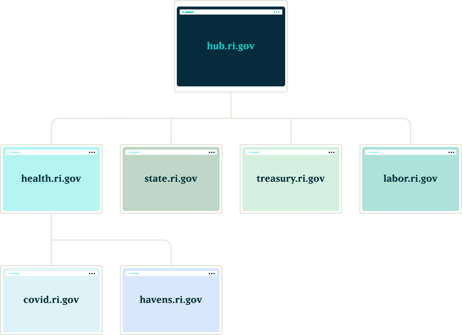
Exploration
Aggregator:
Our first idea was to utilize the built in Drupal aggregator module and pull notifications from the hub. A proof of concept proved that while it worked well for pulling content from the hub site, it had a few problems:
- It relied heavily on the local site’s cron job to pull updates, which led to timing issues in getting the content — it was not in near real-time. Due to server limitations, we could not run cron as often as would be necessary
- Another issue with this approach was that we would need to maintain two entity types, one for global notifications and a second for local site notifications. Keeping local and global notifications as the same entity allowed for easier maintenance for this subsystem.
Feeds:
Another thought was to utilize the Feeds module to pull content from the hub into the local sites. This was a better solution than the aggregator because the nodes would be created locally and could be indexed for local searching. Unfortunately, feeds relied on cron as well.
Our Solution
JSON API
We created a suite of custom modules that centered around moving data between the network sites using Drupal’s JSON API. The API was used to register new sites to the main hub when they came online. It was also used to pass content entities from the main hub down to all sites within the network and from the network sites back to the hub.
Notifications
In order to share content between all of the sites, we needed to ensure that the data structure was identical on all sites in the network. We started by creating a new notification content type that had a title field, a body field, and a boolean checkbox indicating whether the notification should be considered global. Then, we packaged the configuration for this content type using the Features module.
By requiring our new notification feature module in the installation profile, we ensured that all sites would have the required data structure whenever a new site was created. Features also allowed us to ensure that any changes to the notification data model could be applied to all sites in the future, maintaining the consistency we needed.
Network Domain Entity
In order for the main hub, ri.gov, to communicate with all sites in the network, we needed a way to know what Drupal sites existed. To do this, we created a custom configuration entity that stored the URL of sites within the network. Using this domain entity, we were able to query all known sites and passed the global notification nodes created on ri.gov to each known site using the JSON API.
Queue API:
To ensure that the notification nodes were posted to all the sites without timeouts, we decided to utilize Drupal’s Queue API. Once the notification content was created on the ri.gov hub, we queried the known domain entities and created a queue item that would use cron to actually post the notification node to each site’s JSON API endpoint. We decided to use cron in this instance to give us some assurance that a post to many websites wouldn’t timeout and fail.
Batch API
To allow for time sensitive notifications to be pushed immediately, we created a custom batch operation that reads all of the queued notifications and pushes them out one at a time. If any errors are encountered, the notification is re-queued at the end of the stack and the process continues until all notifications have been posted to the network sites.
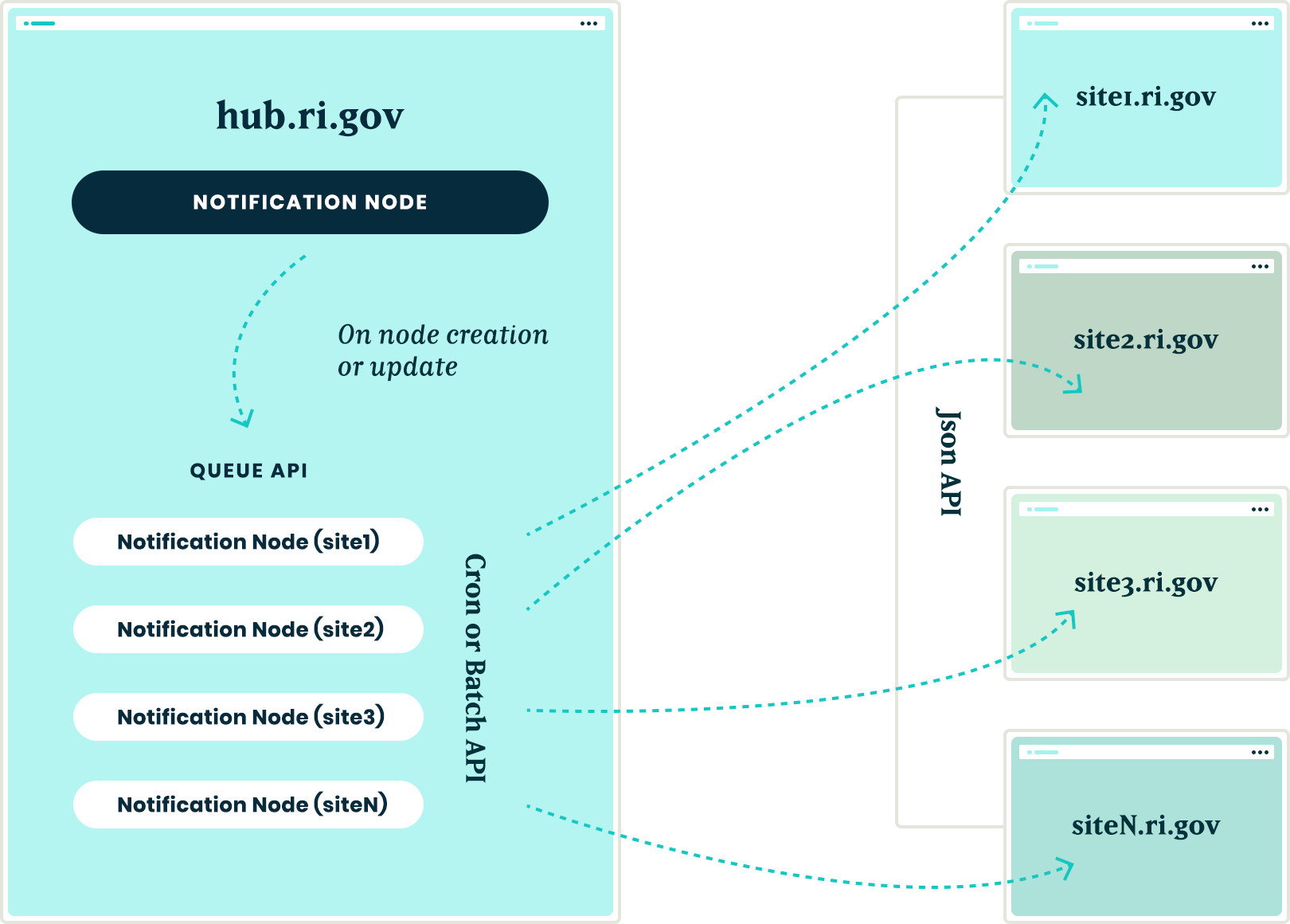
New site registrations
In order to ensure that new sites receive notifications from the hub, we needed a site registration process. Whenever a new site is spun up, a custom module is installed that calls out to the hub using JSON API and registers itself by creating a new network domain entity with it’s endpoint URL. This allows the hub to know of the new site and can push any new notifications to this site in the future.
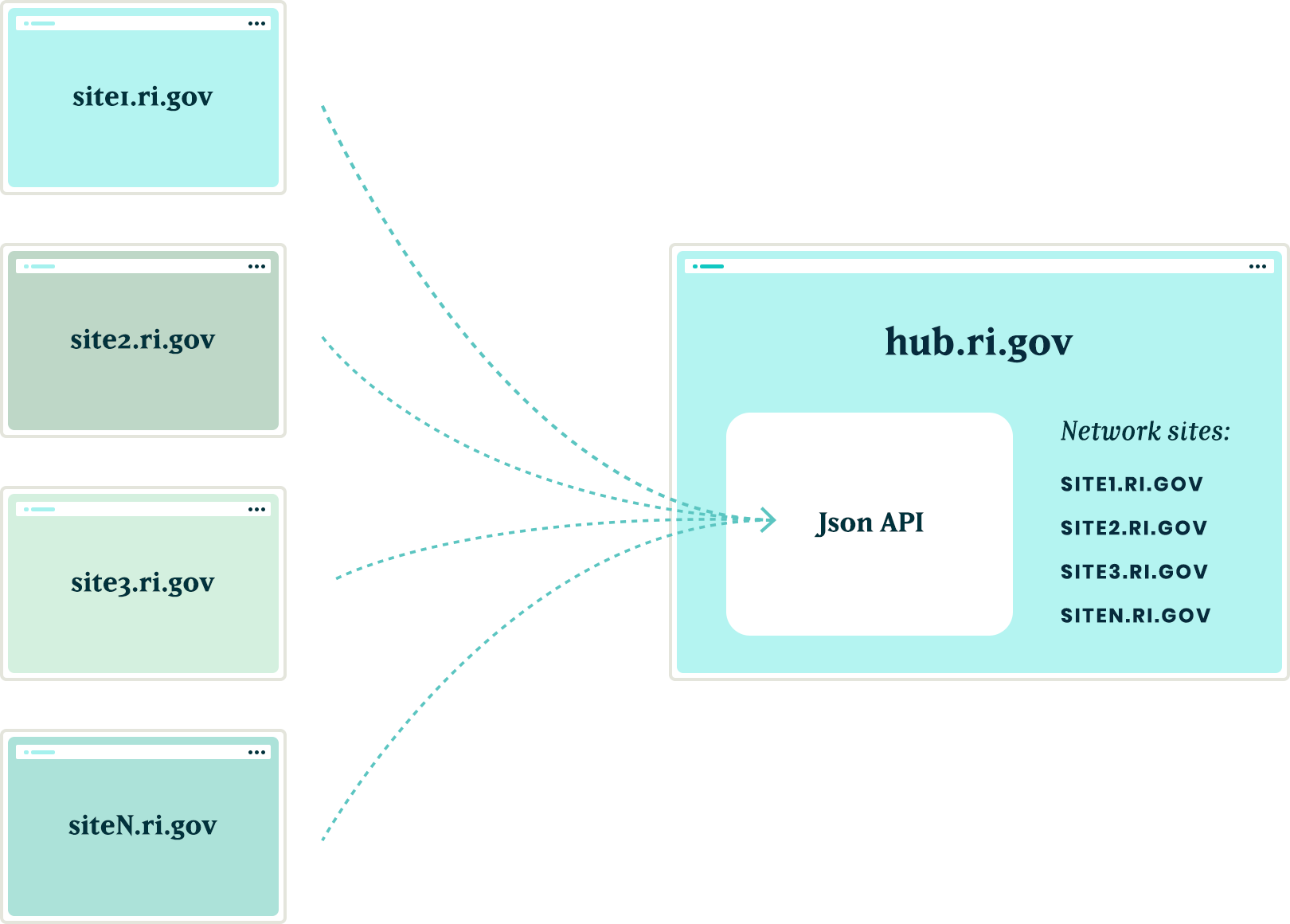
The installation process will also query the hub for any existing notifications and, using the JSON API, get a list of all notification nodes from the hub to add them to it’s local queue for creation. Then, the local site uses cron to query the hub and get the details of each notification node to create it locally. This ensured that when a new site comes online, it will have an up to date list of all the important notifications from the hub.
Authentication
Passing this data between sites is one challenge, but doing it securely adds another layer of complexity. All of the requests going between the sites are authenticating with each other using the Simple Oauth module. When a new site is created, an installation process creates a dedicated user in the local database that will own all notification nodes created with the syndication process. The installation process also creates the appropriate Simple OAuth consumers which allows the authenticated connections to be made between the sites.
Department sites
Once all of the groundwork was in place, with minimal effort, we were able to allow for department sites to act as hubs for their own department sites. Thus, the Department of Health can create notifications that only go to subsidiary sites, keeping them separate from adjacent departments.
Translations
The entire process also works with translations. After a notification is created in the default language, it gets queued and sent to the subsidiary sites. Then, a content author can create a translation of that same node and the translation will get queued and posted to the network of sites in the same manner as the original. All content and translations can be managed at the hub site, which will trickle down to the subsidiary sites.
Moving in the opposite direction
With all of the authorization, queues, batches, and the API’s in place, the next challenge was making this entire system work with a Press Release content type. This provided two new challenges that we needed to overcome:
- Instead of moving content from the top down, we needed to move from the bottom up. Press release nodes get created on the affiliate sites and would need to be replicated on the hub site.
- Press release nodes were more complex than the notification nodes. These content types included media references, taxonomy term references and toughest of all, paragraph references.
Solving the first challenge was pretty simple – we were able to reuse the custom publishing module and instructed the queue API to send the press release nodes to the hub sites.
Getting this working with a complex entity like the press release node meant that we needed to not only push the press release node, but we also needed to push all entities that the initial node referenced. In order for it all to work, the entities needed to be created in reverse order.
Once a press release node was created or updated, we used the EntityInterface referencedEntities() method to recursively drill into all of the entities that were referenced by the press release node. In some cases, this meant getting paragraph entities that were nested two, three, even four levels deep inside of other paragraphs. Once we reached the bottom of the referenced entity pile, we began queuing those entities from the bottom up. So, the paragraph that was nested four levels deep was the first to get sent and the actual node was the last to get sent
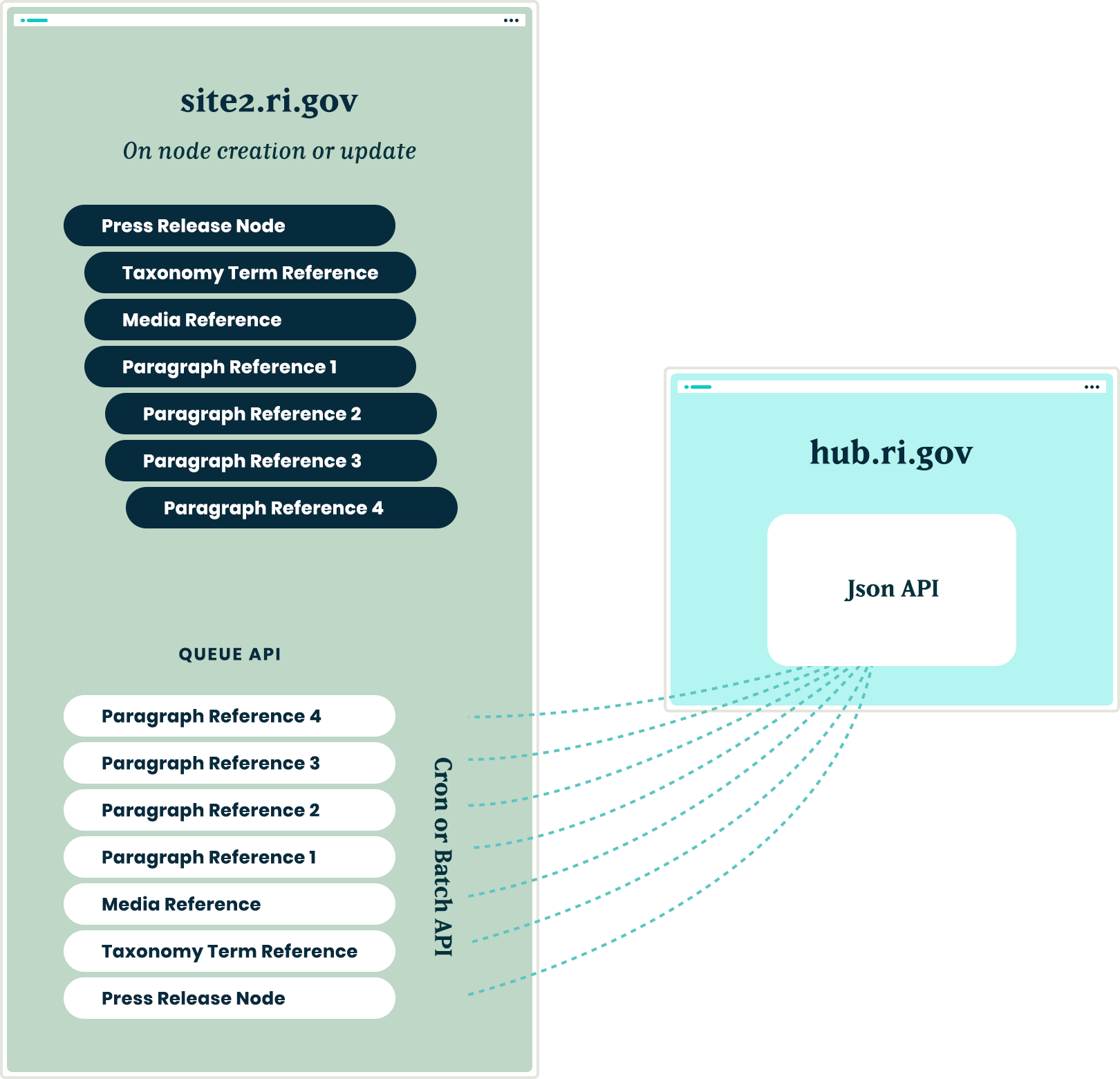
Are you a developer looking to grow your skills? Join our team.
Conclusion
Drupal’s powerful suite of API’s gave us all the tools necessary to come up with a platform that will allow the State of Rhode Island to easily keep their citizens informed of important information, while allowing their editing team the ease of a create once and publish everywhere workflow.
If you live in an area with a lot of freight or commuter trains, you may have noticed that trains often have more than one engine powering the cars. Sometimes it is an engine in front and one in back, or in the case of long freight lines, there could be an engine in the middle. This is known as “Distributed power” and is actually a recent engineering strategy. Evenly distributed power allows them to carry more, and carry it more efficiently.1
When it comes to your website, the same engineering can apply. If the Content Management System (CMS) is the only source of power, it may not have enough oomph to load pages quickly and concurrently for many users. Not only that, but a single source of power may slow down innovation and delivery to multiple sources in today’s multi-channel digital ecosystems.
One of the benefits of decoupled platform architecture is that power is distributed more evenly across the endpoints. Decoupled means that the authoring system and the rendering system for site visitors are not the same. Instead of one CMS powering content authoring and page rendering, two systems handle each task discreetly.
Digital properties are ever growing and evolving. While evaluating how to grow your own system, it’s important to know the difference between coupled and decoupled CMS architectures. Selecting the best structure for your organization will ensure you not only get what you want, but what is best for your entire team — editors, developers, designers, and marketers alike.
Bombardier Zefiro vector graphic designed for Vexels
What is a traditional CMS architecture?
In a traditional, or coupled, CMS, the architecture tightly links the back-end content administration experience to the front-end user experience.
Content creation such as basic pages, news, or blog articles are created, managed, and stored along with all media assets through the CMS’s back end administration screens. The back end is also where site developers create and store customized applications and design templates for use by the front-end of the site.
Essentially, the two sides of the CMS are bound within the same system, storing content created by authenticated users and then also being directly responsible for delivering content to the browser and end users (front end).
From a technical standpoint, a traditional CMS platform is comprised of:
- A private database-driven CMS in which content editors create and maintain content for the site, generally through some CMS administration interfaces we’re used to (think WordPress or Drupal authoring interfaces)
- An application where engineers create and apply design schemas. Extra permissions and features within the CMS give developers more options to extend the application and control the front end output
- A public front end that displays published content on HTML pages
What is a decoupled CMS architecture?
Decoupled CMS architecture separates, or decouples, the back-end and front-end management of a website into two different systems — one for content creation and storage, and another for consuming content and presenting it to the user.
In a decoupled CMS, these two systems are housed separately and work independently of the other. Once content is created and edited in the back end, this front-end agnostic approach takes advantage of flexible and fast web services and APIs to deliver the raw content to any front-end system on any device or channel. It is even possible that an authoring system delivers content to more than front-end (i.e. an article is published in the back-end and pushed out to a website as well as a mobile App).
From a technical standpoint, a decoupled CMS platform is comprised of:
- A private database-driven CMS in which content editors create and maintain content for the site, generally through the same CMS administration interfaces we’re used to — though it doesn’t have to be2
- The CMS provides a way for the front-end application to consume the data. A web-service API — usually in a RESTful manner and in a mashup-friendly format such as JSON — is the most common way
- Popular front-end frameworks such as React, VueJS, or GatsbyJS deliver the public visitor experience via a Javascript application rendering the output of the API into HTML
Benefits of decoupled
By moving the responsibility for the user experience completely into the browser, the decoupled model provides a number of benefits:
Push the envelope
Shifting the end-user experience out of the conventions and structures of the back-end allows UX Engineers and front-end masterminds to push the boundaries of the experience. Decoupled development gives front-end specialists full control using their native tools.
This is largely because traditional back-end platforms have been focused on the flexibility of authoring content and less so on the experience of public visitors. Too often the programming experience slows engineers down and makes it more difficult to deliver an experience that “wows” your users.
Need for speed
Traditional CMS structures are bogged down by “out-of-the-box” features that many sites don’t use, causing unnecessary bloat. Decoupled CMS structures allow your web development team to choose only what code they need and remove what they don’t. This leaner codebase can result in faster content delivery times and can allow the authoring site to load more quickly for your editors.
Made to order
Not only can decoupled architecture be faster, but it can allow for richer interactions. The front-end system can be focused on delivering a truly interactive experience in the form of in-browser applications, potentially delivering content without a visitor reloading the page.
The back-end becomes the system of record and “state machine”, but back-and-forth interaction will happen in the browser and in real-time.
Security Guard
Decoupling the back-end from the front-end is more secure. Since the front-end does not expose its connection to the authoring system, it makes the ecosystem less vulnerable to hackers. Further, depending on how the front-end communication is set up, if the back-end goes offline, it may not interrupt the front-end experience.
In it for the long haul
Decoupled architectures integrate easily with new technology and innovations and allow for flexibility with future technologies. More and more, this is the way that digital platform development is moving. Lean back-end only or “flat file” content management systems have entered the market — like Contentful and Cosmic — while server hosting companies are dealing with the needs of decoupled architecture as well.
The best of both worlds
Decoupled architecture allows the best decisions for two very different sets of users. Content editors and authors can continue to use some of the same CMSs they have been familiar with. These CMSs have great power and flexibility for content modelling and authoring workflows, and will continue to be useful and powerful tools. At the same time, front-end developers can get the power and flexibility they need from a completely different system. And your customers can get the amazing user experiences they have come to expect.
The New Age of Content Management Systems
Today’s modern CMS revolution is driving up demand for more flexible, scalable, customizable content management systems that deliver the experience businesses want and customers expect. Separating the front- and back-ends can enable organizations to quicken page load times, iterate new ideas and features faster, and deliver experiences that “wow” your audience.
- Great article on the distributed power of trains: Why is there an engine in the middle of that train?
- Non-monolithic CMSs have been hitting the market lately, and include products like Contentful, CosmicJS, and Prismic, among others.
Test Driven Development (TDD) facilitates clean and stable code. Drupal 8 has embraced this paradigm with a suite of testing tools that allow a developer to write unit tests, functional tests, and functional JavaScript tests for their custom code. Unfortunately, there is no JavaScript unit testing framework readily available in Drupal core, but don’t fret. This article will show you how to implement JavaScript unit testing.
Why unit test your JavaScript code?
Testing units of code is a great practice, and also guarantees that any future developer doesn’t commit a regression to your logic. Adding unit coverage for JavaScript code is helpful for testing specific logical blocks of code quickly and efficiently without the overhead both in development time and testing time of functional tests.
An example of JavaScript code that would benefit from unit testing would be an input field validator. For demonstration purposes, let’s say you have a field label that permits certain characters, but you want to let the user know immediately if they entered something incorrectly, maybe with a warning message.
Here’s a crude example of a validator that checks an input field for changes. If the user enters a value that is not permitted, they are met with an error alert.
(($, Drupal) => {
  Drupal.behaviors.labelValidator = {
    attach(context) {
      const fieldName = "form.form-class input[name=label]";
      const $field = $(fieldName);
      $field.on("change", () => {
        const currentValue = $field.val();
        if (currentValue.length > 0 && !/^[a-zA-Z0-9-]+$/.test(currentValue)) {
          alert("The value you entered is incorrect!");
        }
      });
    }
  };
})(jQuery, Drupal);
JavaScript
We only allow letters, numbers, and hyphens in this sample validator. We now have a good idea of test data we can create for our test.
Setting up JS Unit Testing
In the world of JavaScript unit testing, Jest has a well-defined feature set, a large community, and is the most popular choice among developers. To begin using Jest, add jest as a development dependency in your favorite manager. Then create a Jest config file, and add your directories for testing. I recommend enabling lcov ; a test coverage reporter that converts test results into local HTML pages.
Writing a Test
We want to test our Drupal behavior, but we need jQuery and the global Drupal object. Have no fear! We can mock all of this. For simplicity’s sake, we can mock both jQuery and Drupal to test the code we want. The point here is to collect the validation logic and run it on our test cases.
There are a couple of different techniques we can use to meet our requirements. You can create a test DOM using a library like JSDOM and require the jQuery library. This gives you the ability to simulate HTML and DOM events. This approach is fine, but our goal is to test our custom validation logic, not to test third-party libraries, or simulate the DOM. Similar to mocking classes and methods in PHPUnit, we can do the same with jest.
Our testing environment is Node, so we can leverage the global object to mock Drupal, jQuery, and even the alert function. Please see Node’s global variable documentation for more information on this object. We can do this in the setup logic of jest with beforeAll:
beforeAll(() => {
  global.alert = jest.fn();
  global.Drupal = {
    behaviors: {}
  };
  global.jQuery = jest.fn(selector => ({
    on(event, callback) {
      validator = callback;
    },
    val() {
      return fieldValue;
    }
  }));
  const behavior = require("label-validator.es6.js");
  Drupal.behaviors.labelValidator.attach();
});
JavaScript
This makes our behavior available to the global Drupal object. We also have mocked jQuery, so we can collect the callback on which we want to run the tests. We run the attach method on the behavior to collect the callback. You may have noticed that we never declared the validator or fieldValue variables; we do this at the top of our test so we have them available in our tests.
// The validation logic we collect from the `change` event.
let validator = () => "";

// The value of the input we set in our tests.
let fieldValue = "";
JavaScript
With the intention of cleanup, we want to unset all the global objects after we have run our tests. In our case, the globals we are mocking do not exist in Node, so it is safe to set them to null. In cases in which we are mocking defined values, we would want to save a backup of that global and then mock it. After we are done testing, we would set the backup back to its corresponding global. There are also many techniques related to mocking globals and even core Node libraries. For an example, check out the documentation on the jest website.
Here is our tear-down logic. We use the jest function afterAll to achieve this:
afterAll(() => {
  global.Drupal = null;
  global.jQuery = null;
  global.alert = null;
});
JavaScript
We need to create an array of values that we know should pass validation and fail validation. We will call them validLabels and invalidLabels, respectively:
/**
 * List of valid labels for the input.
 *
 * @type {string[]}
 */
const validLabels = [
  "123ABVf123",
  "123",
  "AB",
  "1",
  "",
  "abcdefghijklmnop12345678910",
  "ab-3-cd"
];

/**
 * List of invalid labels for the input.
 *
 * @type {string[]}
 */
const invalidLabels = [
  "!@#fff",
  "test test",
  "(123)",
  "ABCDEF123!",
  "^Y1",
  " ",
  "'12346'",
];
JavaScript
Finally, we are ready to start writing our tests. We can use jest’s provided test function, or we can use the “describe it” pattern. I prefer the “describe it” pattern because you can provide detailed information on what you are testing and keep it in the same test scope.
Firstly, we want to test our valid data, and we know that these values should never trigger an alert. We will call the validator on each test value and set the expectation that the alert function is never called. But before we write the test, we want to make sure to clear all our mocks between tests to prevent mock pollution. We can achieve this with beforeEach:
beforeEach(() => {
  jest.clearAllMocks();
});
JavaScript
After writing our valid data test, we will write our invalid data test. This test should expect an alert for each invalid value sent. Putting it all together we have:
describe("Tests label validation logic", () => {
  beforeEach(() => {
    jest.clearAllMocks();
  });
  it("valid label test", () => {
    validLabels.forEach(value => {
      fieldValue = value;
      validator();
    });
    expect(global.alert.mock.calls.length).toBe(0);
  });
  it("invalid label test", () => {
    invalidLabels.forEach(value => {
      fieldValue = value;
      validator();
    });
    expect(global.alert.mock.calls.length).toBe(invalidLabels.length);
  });
});
JavaScript
After writing our tests, we can check our coverage and see we have hit 100%!
Jest is extremely flexible and has a large ecosystem. There are many different ways we could have achieved the above results; hopefully this gives you some useful ideas on how to unit test your javascript code.
The entire sample Jest test:
/* global test expect beforeEach afterAll beforeAll describe jest it */
// The validation logic we collect from the `change` event.
let validator = () => "";
// The value of the input we set in our tests.
let fieldValue = "";
// the setup function where we set our globals.
beforeAll(() => {
  global.alert = jest.fn();
  global.Drupal = {
    behaviors: {}
  };
  global.jQuery = jest.fn(selector => ({
    on(event, callback) {
      validator = callback;
    },
    val() {
      return fieldValue;
    }
  }));
  const behavior = require("label-validator.es6.js");
  Drupal.behaviors.labelValidator.attach();
});
// Global tear down function we use to remove our mocks.
afterAll(() => {
  global.Drupal = null;
  global.jQuery = null;
  global.alert = null;
});
/**
 * List of valid labels for the input.
 *
 * @type {string[]}
 */
const validLabels = [
  "123ABVf123",
  "123",
  "AB",
  "1",
  "",
  "abcdefghijklmnop12345678910",
  "ab-3-cd"
];
/**
 * List of invalid labels for the input.
 *
 * @type {string[]}
 */
const invalidLabels = [
  "!@#fff",
  "test test",
  "(123)",
  "ABCDEF123!",
  "^Y1",
  " ",
  "'12346'",
];
// The tests.
describe("Tests label validation logic", () => {
  beforeEach(() => {
    jest.clearAllMocks();
  });
  it("valid label test", () => {
    validLabels.forEach(value => {
      fieldValue = value;
      validator();
    });
    expect(global.alert.mock.calls.length).toBe(0);
  });
  it("invalid label test", () => {
    invalidLabels.forEach(value => {
      fieldValue = value;
      validator();
    });
    expect(global.alert.mock.calls.length).toBe(invalidLabels.length);
  });
});
JavaScript
Resources
- Jest javascript testing framework – jest
- NPM trends JS testing framework popularity – npm trends js testing
- Jest configuration file documentation – https://jestjs.io/docs/en/configuration.html
- A JS DOM testing library – JSDOM
- Jest mocking documentation – jestjs.io/docs/en/manual-mocks