
THE BRIEF
Connecting People and Planet
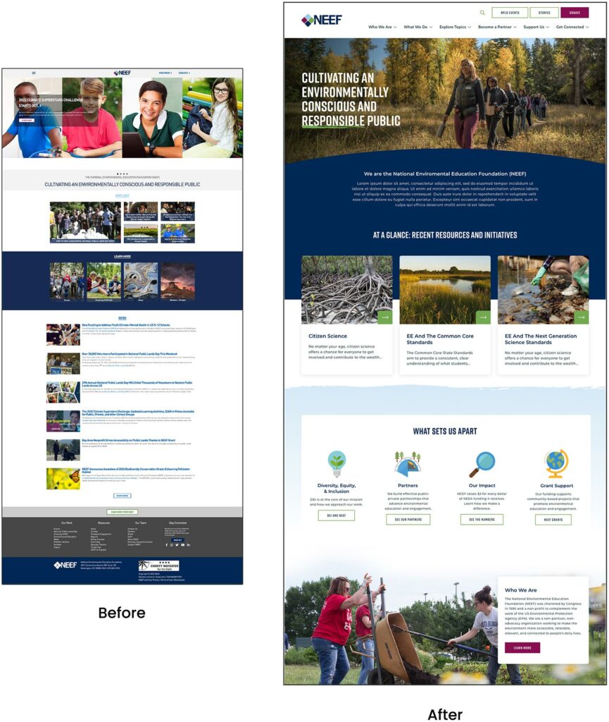
NEEF’s website is the gateway that connects its audiences to a vast array of learning experiences – but its existing platform was falling short. The organization needed more visually interesting resources and content, but it also knew its legacy Drupal site couldn’t keep up.
NEEF wanted to build a more powerful platform that could seamlessly:
- Communicate its mission and showcase its impact to inspire potential funders
- Broaden its audience reach through enhanced accessibility, content, and SEO
- Be a valuable resource by providing useful and engaging content, maps, toolkits, and online courses
- Build relationships by engaging users on the front end with easy-to-use content, then seamlessly channeling that data into back-end functionality for user-based tracking
THE APPROACH
Strategy is the foundation for effective digital experiences and the intuitive designs they require. Oomph first honed in on NEEF’s key goals, then implemented a plan to meet them: leveraging existing features that work, adding critical front- and back-end capabilities, and packaging it all in an engaging, user-centric new website.
Information architecture is at the core of user experience (UX). We focused on organizing NEEF’s information to make it more accessible and appealing to its core audiences: educators, conservationists, nonprofits, and partners. Our designers then transformed that strategy into strategic wireframes and dynamic designs, all of which we developed into a custom Drupal site.
The New NEEF: User-Centered Design
A Custom Site To Fuel Connection
NEEF needed a digital platform as unique as its organization, which is why Oomph ultimately delivered a suite of custom components designed to accommodate a variety of content needs.
Engaging and thoughtful design
NEEF’s new user experience is simple and streamlined. Visual cues aid in wayfinding (all Explore pages follow the same hero structure, for example), while imagery, micro-interactions (such as hover effects) and a bold color palette draw the user in. The UX also emphasizes accessibility and inclusivity; the high contrast between the font colors and the background make the website more readable for people with visual impairments, while people with different skin tones can now see themselves represented in NEEF’s new library of 100 custom icons.
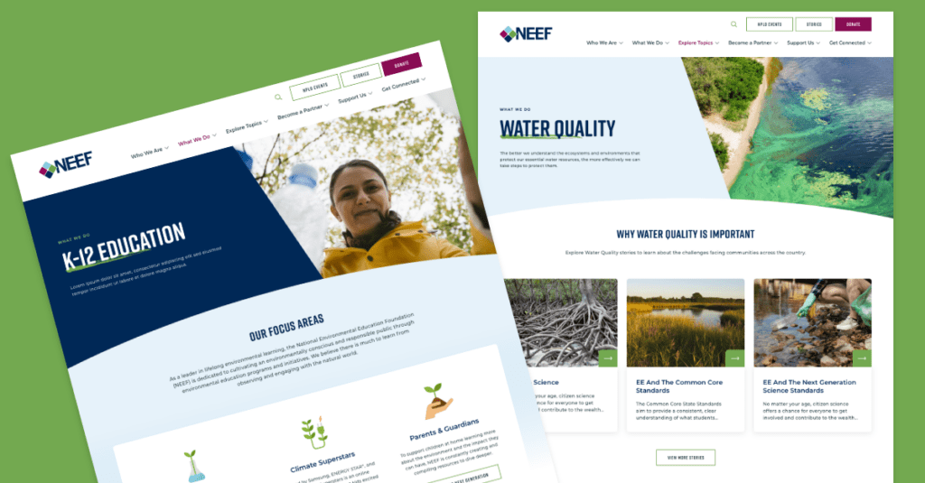
Topic-based browsing
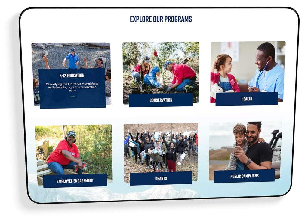
From water conservation to climate change, visitors often come to the NEEF site to learn about a specific subject. We overhauled NEEF’s existing site map to include topic-based browsing, with pages that roll resources, storytelling, and NEEF’s impact into one cohesive package. Additional links in the footer also make it easier for specific audiences to find information, such as nonprofits seeking grants or teachers looking for educational materials.
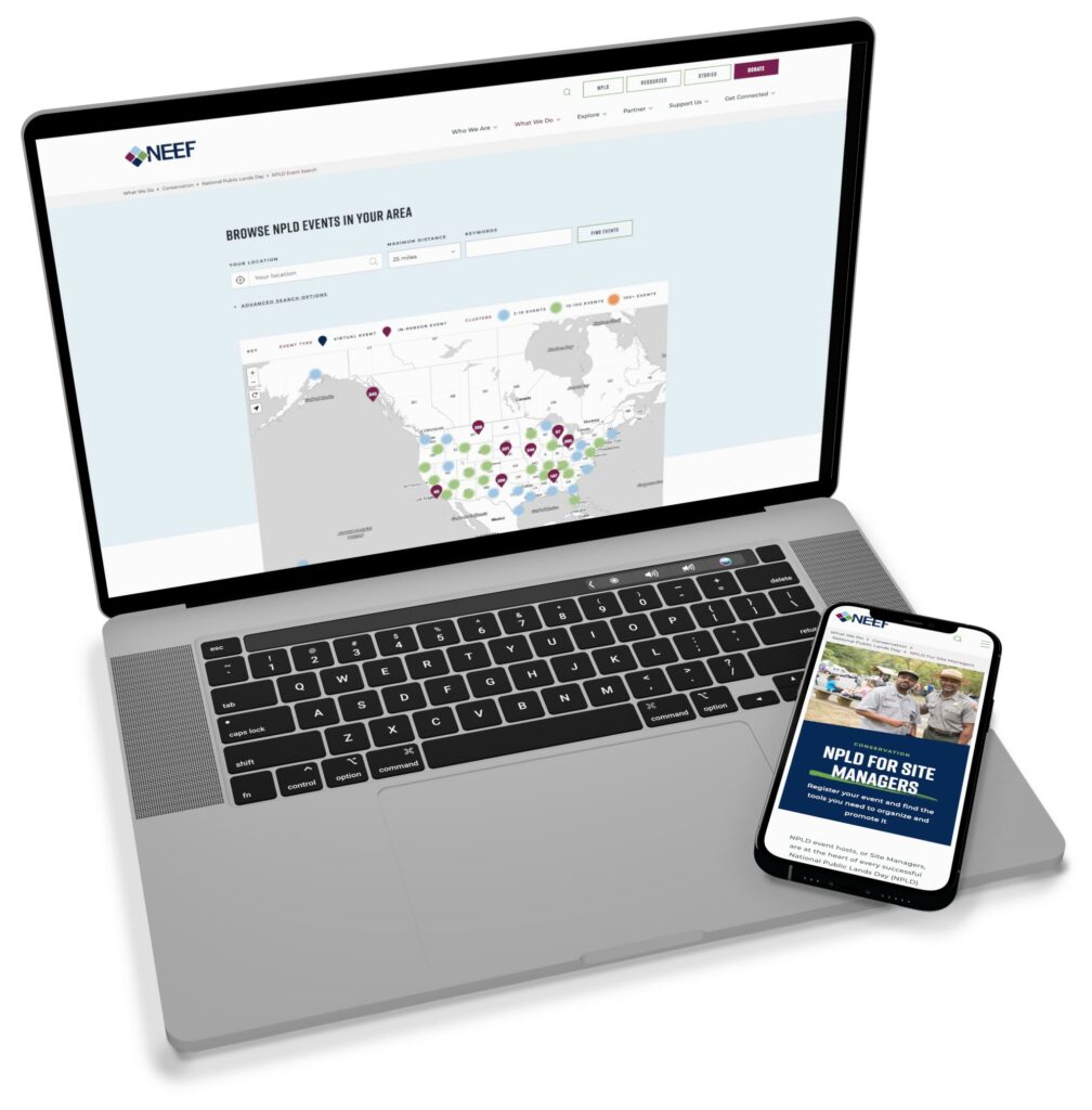
NPLD-hosted resources and event locator
Oomph refreshed existing components and added new ones to support one of NEEF’s flagship programs, National Public Lands Day (NPLD). People interested in hosting an event could use the new components to easily set one up, have their own dashboard to manage, and add their event to NEEF’s event locator. Once the event has passed, it’s automatically unlisted from the locator — but archived so hosts can duplicate and relaunch the event in future years.
THE RESULTS
Protecting the Planet, One User at a Time
Oomph helped NEEF launch its beautiful, engaging, and interactive site in May 2023. Within three months, NEEF’s team had built more than 100 new landing pages using the new component library, furthering its goal to build deeper connections with its audiences.
As NEEF’s digital presence continues to grow, so will its impact — all with the new custom site as its foundation.
THE APPROACH
Rapid Discovery with a Cohort Analysis
Oomph hit the ground running, bringing our human-centered design expertise and passion for environmental causes to strategize a solution. We knew that balancing rigor and speed would be critical – how could we design a site positioned for success without over-investing in features that might need to change later? Through market and user research, rapid prototyping, and close collaboration with Rare and development partner Adapt, we swiftly moved from vision to reality.
Surveying the Landscape
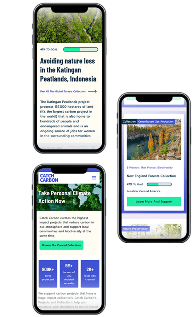
While purchasing carbon credits is similar to making a nonprofit donation in some ways, it also blends elements of investing and crowdfunding in a distinct experience. Oomph first conducted a cohort analysis of more than 20 platforms, from other emerging carbon credit marketplaces to crowdfunding sites like Kickstarter and Kiva. The process uncovered some promising initial approaches, but also underscored the lack of best practices in the space. Ultimately, we determined that Catch Carbon needed to emphasize real-world impact: giving like-minded supporters a place to rally behind a shared cause and directly see the positive effects of their dollars.
Creating Connection and Credibility with Users
Building on Rare’s insights into its audience – climate-concerned citizens eager to be part of the solution – we knew that Catch Carbon would primarily draw users interested in taking personal action to reduce carbon impacts. User journey mapping allowed us to anticipate the visitor’s thoughts and feelings at every stage – curious as they enter the site, inspired as they browse projects, proud after deciding to purchase – and make design choices to guide them along the way. Our strategy included:
- Synthesizing project data to showcase the total impact of Catch Carbon’s work, helping to build trust and motivate users
- Each item needs its own line
- Simplifying the primary navigation and standardizing project descriptions to help users easily discover, compare, and support projects that matched their interests
- Creating user-friendly naming conventions for project types, including “Collections,” which bundle multiple projects like a mutual fund so users can make their dollars go even further
A Collaborative Design Process
With a solid strategy in place, Oomph dove in to bring the design to life. We led Rare through a 20-second design “gut check” workshop to develop a shared design language, then used style tiles to quickly hone in on the design aesthetic. As we moved into full page designs, we worked hand in hand with Adapt and Rare to test an internal API system that would populate project data, refining the design in real-time as we determined which information was possible to include.
THE RESULTS
Just seven weeks after project kickoff, the Catch Carbon site debuted to the public. Its launch marked a major step forward for the voluntary carbon credit market, democratizing access for consumers and setting new standards for project transparency and quality. As a member of 1% for the Planet, Oomph is personally invested in sustaining our world for generations to come – making our work with Rare especially meaningful.
In addition to bringing Rare’s bold new idea to the public quickly, we equipped the organization with a set of KPIs to measure the effectiveness of specific design choices. By understanding factors like site traffic patterns and drop-off rates, Rare can test and iterate with precision.
Climate change is an insurmountable challenge to solve alone, but together, our efforts can make a difference. The Catch Carbon marketplace brings everyday people closer to carbon reduction solutions than ever before, spurring the behavioral change that’s at the heart of Rare’s mission.
In our previous post we broadly discussed the mindset of composable business. While “composable” can be a long term company-wide strategy for the future, companies shouldn’t overlook smaller-scale opportunities that exist at every level to introduce more flexibility, longevity, and reduce costs of technology investments.
For maximum ROI, think big, then start small
Many organizations are daunted by the concept of shifting a legacy application or monolith to a microservices architecture. This is exacerbated when an application is nearing end of life.
Don’t discount the fact that a move to a microservices architecture can be done progressively over time, unlike the replatform of a monolith which is a huge investment in both time and money that may not be realized for years until the new application is ready to deploy.
A progressive approach allows organizations to:
- Move faster and allow for adjustments as needed
- Begin realizing returns on investments faster
- Reduce risk by making smaller investments and deployments
- Ease budgeting process by funding an overhaul in stages
- Improve quality by minimizing the scope of tests
- Save money on initial investment and maintenance where services are centralized
- Benefit from longevity of a component-based system
Prioritizing the approach by aligning technical architecture with business objectives
As with any application development initiative, aligning business objectives with technology decisions is essential. Unlike replatforming a monolith, however, prioritizing and planning the order of development and deployments is crucial to the success of the initiative.
Start with clearly defining your application with a requirements and feature matrix. Then evaluate each using three lenses to see priorities begin to emerge:
- With a current state lens, evaluate each item. Is it broken? Is it costly to maintain? Is it leveraged by multiple business units or external applications?
- Then with a future state lens, evaluate each item. Could it be significantly improved? Could it be leveraged by other business units? Could it be leveraged outside the organization (partners, etc…)? Could it be leveraged in other applications, devices, or locations?
- Lastly, evaluate the emerging priority items with a cost and effort lense. What is the level of effort to develop the feature as a service? What is the likely duration of the effort?
Key considerations when planning a progressive approach
Planning is critical to any successful application development initiative, and architecting a microservices based architecture is no different. Be sure to consider the following key items as part of your planning exercises:
- Remember that rearchitecting a monolith feature as a service can open the door to new opportunities and new ways of thinking. It is helpful to ask “If this feature was a stand alone service, we could __”
- Be careful of designing services that are too big in scope. Work diligently to break down the application into the smallest possible parts, even if it is later determined that some should be grouped together
- Keep security front of mind. Where a monolith may have allowed for a straightforward security management policy with everything under one roof, a services architecture provides the opportunity for a more customized security policy, and the need to define how separate services are allowed to communicate with each other and the outside world
In summary
A microservices architecture is an approach that can help organizations move faster, be more flexible and agile, and reduce costs on development and maintenance of software applications. By taking a progressive approach when architecting a monolith application, businesses can move quickly, reduce risk, improve quality, and reduce costs.
If you’re interested in introducing composability to your organization, we’d love to help! Contact us today to talk about your options.
“Inclusive design” may sound like vague, trendy, technical jargon. But inclusive design isn’t a trend — it’s the world catching up on the kind of digital experiences that should have been part of the web from the beginning.
Inclusive design is a crucial part of nearly every digital platform, be it website, app, or intranet.
Inclusive design as a concept and practice is broad and deep — this article barely scratches the surface, but will help you understand the mindset required. We’ll cover what it is, why it matters for your business, and some ways to assess whether your digital platform could be more inclusive.
- What does “inclusive design” mean?
- What are the benefits of inclusive design?
- How are inclusive design and accessibility different?
- How can you make your platform more inclusive?
What does “inclusive design” mean?
The Inclusive Design Research Center defines inclusive design as “design that considers the full range of human diversity with respect to ability, language, culture, gender, age and other forms of human difference.” Adding to that, Nielsen Norman calls it creating products that “understand and enable people of all backgrounds and abilities,” including economic situation, geography, race, and more.
Essentially, you’re aspiring to create interfaces that reflect how people from all walks of life interact with the world.
Inclusive design allows people to use a digital platform with ease, whatever their needs or point of view. Looking at characteristics like race, abilities, or geography helps us identify key areas where friction can occur between humans and the web.
In the end, it’s about designing for everyone.
What are the benefits of inclusive design?
Inclusive design isn’t just about recognizing and accommodating diversity; it also creates business advantages for organizations that are willing to invest in an inclusive approach. Here are a few key areas where inclusive design can give your digital platform an edge:
Grow your customer base. By understanding the best way to connect with a wider target audience, your team can create digital experiences that attract the most possible users.
Increase user engagement. Engagement goes up when platforms are welcoming and easy to use. Inclusive web design removes barriers and creates motivation for people to engage with your brand.
Spark innovation. Inclusive solutions have a history of spawning innovation that goes beyond the initial intended audience (think closed-captioning-turned-subtitles on Netflix). Sometimes, when you aim to solve a specific usability issue, you end up creating an entirely new market solution.
Motivate your team. The way a digital platform is designed affects all audiences, even employees. Designing with inclusivity in mind can also have a positive influence on your own team. Engaging employees in your efforts to build an inclusive digital platform can help create a sense of shared purpose — one many people are likely to rally around.
How are inclusive design and accessibility different?
You may have heard these terms used in similar contexts. While they overlap in meaning, they’re not the same thing.
By definition, accessibility focuses on accommodating people with varying physical and mental abilities. Accessible websites are measured by their conformance with Web Content Accessibility Guidelines, which pertain to things like auditory, cognitive, physical, and visual disabilities. Accessibility tests typically cover code-level issues that can be fixed in the source code of a site.
Inclusive design is about accommodating the entire spectrum of human diversity. It involves a variety of viewpoints, including those of people with disabilities. Inclusive solutions can involve anything from back-end coding to the way headlines are worded.
In a nutshell: An accessible site is one of the outcomes of an inclusive design, whereas inclusive design is the overall approach to creating accessibility.
Consider these examples:
- You’re filling out a form, and because you have a visual impairment, you’re using the keyboard to move through it. When you get to the end, you discover the form can’t be submitted because you left a few areas blank — even though you filled out every question asked. Turns out the keyboard had skipped past a few required fields. What a pain!
- While filling out a form, you’re asked to select your ethnicity from a list. As you read the options, you discover that yours is not listed, or that you identify with more than one. You feel like the “other,” compared to everyone else, leaving you frustrated about the task and… maybe even about the company too.
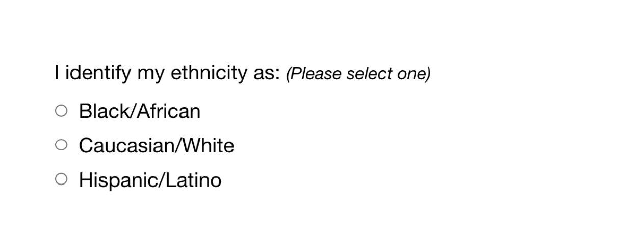
While both issues are addressed by inclusive design, the first issue relates to ability and can be fixed within the code, while the second relates to diversity and will take additional measures to address.
How Can You Make Your Platform More Inclusive?
The ethnicity example raises some interesting questions, such as:
- How do you know which ethnicities to add?
- How many do you need to account for?
- Should you just change the way the question is worded?
- Do you need to ask the question at all?
Mainly, this raises a bigger question: how do you maintain an inclusive site when there are so many important and broad variables (ability, language, culture, gender, age, etc.) — especially when that list of variables continues to grow and change?
The best way to get started is to arm yourself with knowledge and create a plan.
1. Identify the problems to solve.
Start by identifying opportunities for improvement in your current user experience (UX) by collecting quantitative and qualitative research with tools like UX audits, user interviews, user recordings, and heatmaps. Keep an eye out for areas where users seem confused, backpedal, or struggle to complete tasks. The more information you gather, the better!
2. Determine the best solutions.
Your user research will likely uncover many possible paths to change. This may include adding more categories to a list, creating an “Other” field users can type any answer into, or adding options to gather additional information.
Note: It’s common for areas that need improvement to hit on sensitive topics, things you may not fully figure out through data and research. Remember that the goal is understanding. Don’t be afraid to reach out to others for their thoughts and opinions.
3. Measure the results.
Some measures of success are easy to determine from user data in Google Analytics or changes in heatmaps and user recordings. Further data can come from users via surveys asking how your audience feels about the changes. The key is to stay continuously informed and aware of what your users are experiencing.
Note: One helpful tool for checking whether your design is, in fact, inclusive is Cards for Humanity. It offers a fun way to make sure you’re not missing anyone or anything in the spectrum of inclusivity.
Remember that the process of creating an inclusive design doesn’t end with implementation. Inclusive design is a work in progress. As a field, inclusive design is always evolving and requires continuous research to develop best practices.
We can’t predict what kind of mismatched interactions users will face in the years to come. But, with an open mind and a desire to learn and grow, we can continually adapt to meet them.
We’ve only scratched the surface of inclusive design! If you have any questions about inclusive design, we’d love to chat. Contact us anytime.
THE BRIEF
AskRI is a digital platform providing Rhode Island residents with free access to some of the top educational and research tools, along with links to many state resources. A collaboration among the state government and various libraries and agencies, AskRI is essentially a 24/7 help desk for Rhode Islanders.
The platform’s structure has three main approaches:
Databases
Online portals provide free access to premium third-party tools and services, including research platforms and libraries, online learning and tutoring platforms, and consumer resources for health, jobs, and more.
Audiences
AskRI curates information and resources for specific audiences, including K-12 students and teachers, parents, non-native-English speakers, and adults seeking continuing education.
FAQs
Supporting local librarians with ready-made links, the FAQ section answers crowd-sourced questions about a variety of government services (how to get a green card, where to get a fishing permit, etc…).
Fundamentally, it’s an incredible resource! But, as AskRI grew over time, it became increasingly difficult for users to find the information they needed — and harder for site managers to organize, update, and expand the content.
Aiming to make the platform more user-friendly all around, its owners opted for a comprehensive redesign with a few primary goals:
- Refresh the branding to re-energize the service internally and externally
- Provide more flexible and efficient content management tools
- Increase usage of the platform’s resources across all target audiences
THE APPROACH
Through a quick Discovery phase, we uncovered a diverse user base with a broad range of needs. Our next challenge was to create an energetic brand identity and a more intuitive way to organize the platform.
Visual Branding
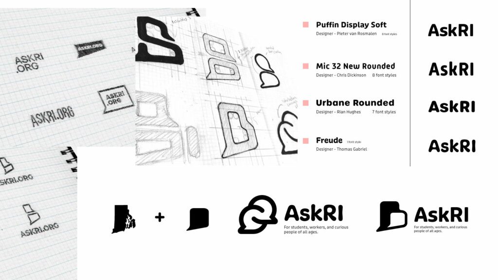
Rhode Island is a small but unique place, and its residents are proud of their state. We wanted the new branding to leverage a more modern, yet uniquely Rhode Island, identity. It could also evoke a sense of engagement, reinforcing the platform’s two-way interaction.
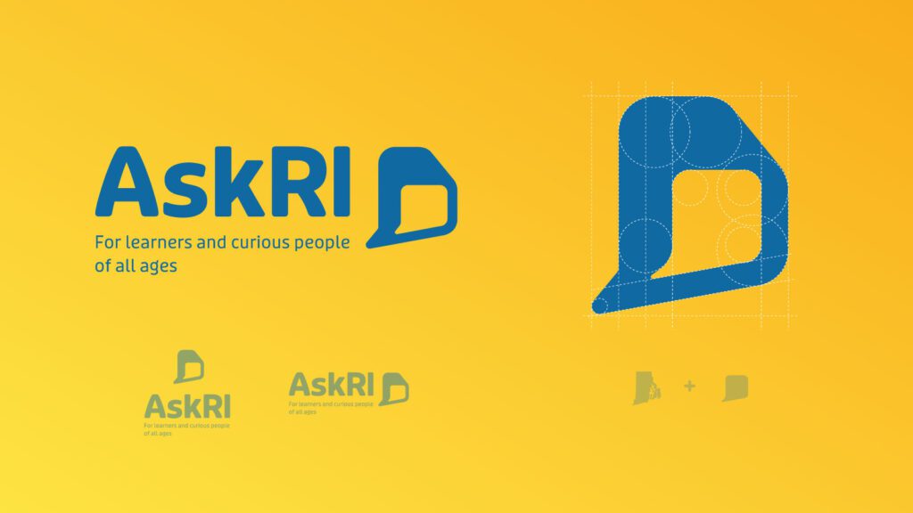
Over several design rounds, we explored logos that would represent two-way conversations while suggesting Rhode Island’s distinct shape. We also introduced a new, brighter color palette.
Digital Platform
Redesigning the platform came down to an exercise in information architecture: What was the best way to organize the content so users could quickly find the tools and resources that were most relevant to them?
We knew only a small segment of the target audience would know exactly what they were looking for and be able to search for it directly. Most users would be on a mission of discovery, needing a way to browse the content. Then there was the FAQ section, where users might expect to find answers about the platform itself — but in its current form, the FAQs were confusingly broad and hard to find.
Our solution addressed all three areas:
- Knowing that frequent users would want to get to familiar databases quickly, we incorporated tried-and-true search and filter tools
- For those needing more guidance, we created a persona-based architecture with curated lists of content that addressed each persona’s unique needs
- By making the platform simpler and more intuitive, we removed the need for an FAQ section. We replaced it instead with a more interactive feature
THE RESULTS
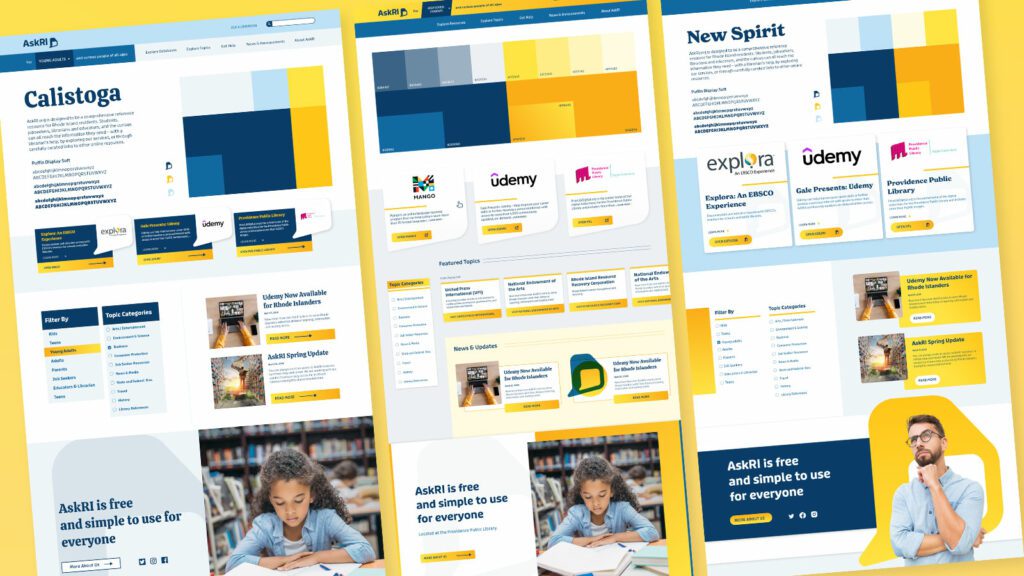
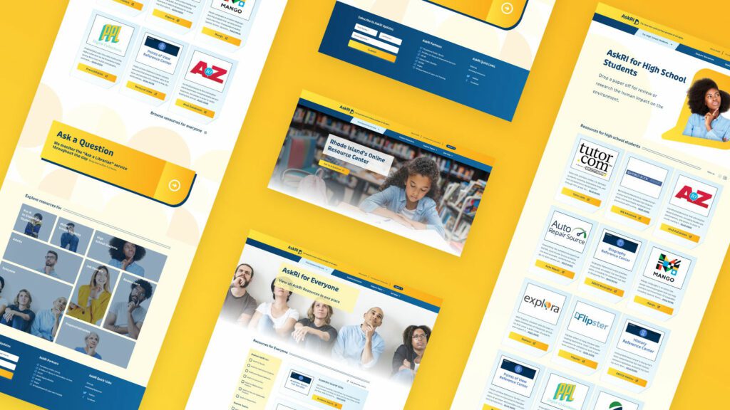
These relatively simple changes brought powerful results, creating a more engaging and intuitive platform. The fresh branding celebrates inquisitiveness and interaction, while the redesigned content is much easier for users to navigate and for authors to organize and expand.
The AskRI team loved the new brand identity, which evokes curiosity with visual elements that represent thinking and asking questions. Two thought bubbles form the shape of Rhode Island for the logo, while images of inquisitive people are featured throughout the site. In addition, the new colors bring fresh energy to the brand while preserving a sense of trust and authority.
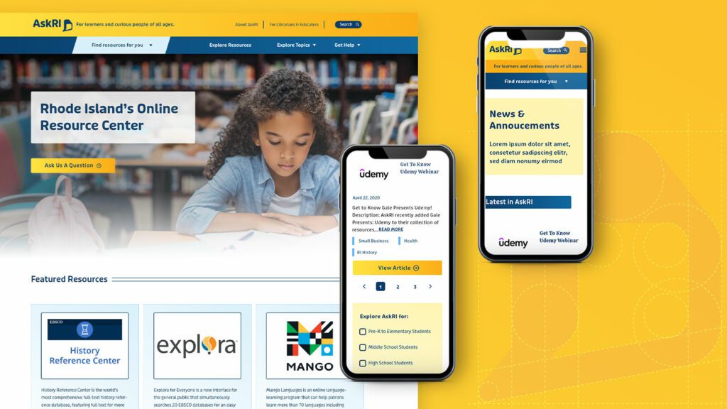
The redesign not only improved the content’s organization and accessibility, it also fosters a greater sense of interaction with platform users. Visual personas provide an intuitive starting point for exploration, backed up with curated resource lists. A new dropdown menu titled “Find Resources for You” speaks directly to target audiences, while a new “Explore Topics” section offers lists of state resources grouped by user needs (small business, health, families, etc.).
Finally, as the most interactive part of the platform, the redesigned FAQs section is now the “Ask a Librarian” page, where users can submit questions on any topic. The most common platform-related questions get published to the site as a list of answers that users can browse. Input from users will not only inform the kinds of content that goes on the site, but may also spur access to new tools and databases.
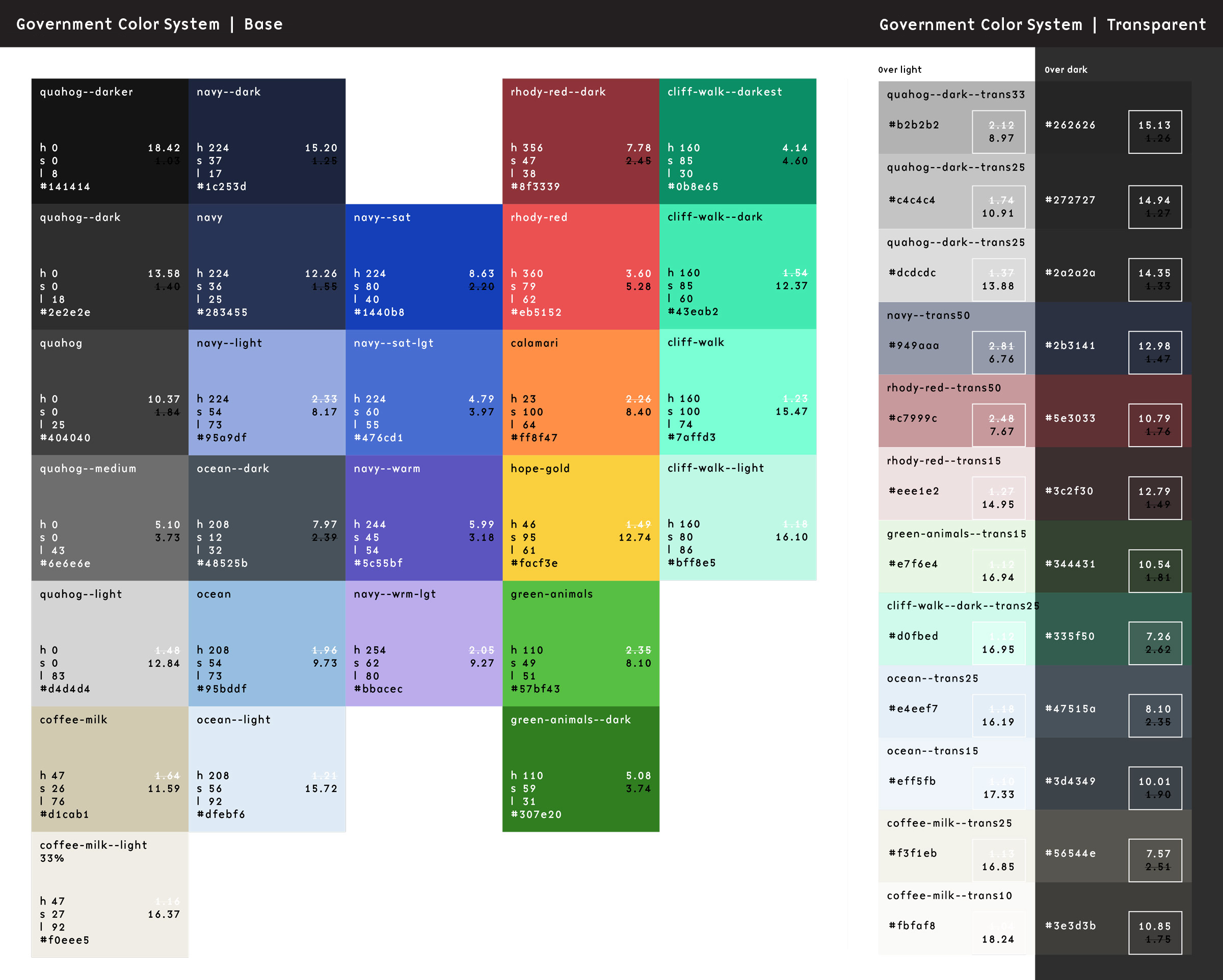
Our team recently worked through the first phase of a large government platform run by a component design system. The goals were to create a set of visual themes that could support accessibility, native light- and dark-mode switching, and a set of content components that were flexible enough to support more than 70 government agencies. There is quite a bit of complexity to the system, but what we’d like to focus on right now is how we are managing the color system.
The sites are still evolving, but the current count is five color themes, each with a light- and dark-mode, using a total of 46 colors. We decided to use PatternLab to manage our design patterns, which means that each component is comprised of its own Sass, JS, and Twig files packaged together in a portable way. It also means that we could leverage custom Gulp processes to make some pretty cool stuff happen.
First, our goals of using PatternLab and creating a single source of truth:
- Define a color once and in one place and make its definition available to Sass and Twig
- Define color themes once and in one place and make those definitions available to Sass, Twig, and PHP
- Define colors in HSL(), which is more human-readable, making it easy to understand the relationships between colors, while allowing conversion to whatever color space we might need
For the government employee using this system, our goals were to:
- Allow authors the choice of background colors from defined theme options without controlling foreground colors — this takes the ability to create inaccessible color combinations out of their hands
- Allow authors to design content for their own preferred color scheme (light or dark) and be confident that it will look great for those who use the other mode
And for the end-user viewing any of these sites, we wanted to support:
- A minimum color contrast ratio of 4.5 for accessibility in menus and design components but a higher contrast for main content
- A dark mode that responds to a viewer’s system preference but can also be overridden with local site controls
Here’s how we were able to achieve those goals.
One (H)JSON file to rule them all
We decided that our single source of truth needed to be in a flexible and simple format. JSON fit our needs the best with its ability to support nested relationships and arrays. The only thing it didn’t allow was comments, which can add legibility and documentation. We found that HJSON was a great compromise, and used Gulp to convert our master HJSON file to JSON as part of the build process1.
The HJSON file is one large array. Colors are defined one level deep alongside themes, which are also one level deep. The first level of the structure looks like this:
{
  "colors": { … }
  "themes": [ … }
}
JSON
Color Definitions
Simple so far. Inside the colors array, individual definitions are structured as a single-depth array:
{
  "colors":
    # Medium blue
    "ocean--dark": {
      "name": "Ocean State dark",
      "hue": "medium blue",
      "hsl": "hsl(208, 12%, 32%)",
      "needs": "light-text"
    },
    "ocean": {
      "name": "Ocean State",
      "hue": "medium blue",
      "hsl": "hsl(208, 54%, 73%)",
      "needs": "dark-text"
    },
    "ocean--light": {
      "name": "Ocean State light",
      "hue": "light blue",
      "hsl": "hsl(208, 58%, 92%)",
      "needs": "dark-text"
    },
    "ocean--trans25": {
      "name": "Ocean State 25% transparent",
      "hue": "medium blue",
      "hsl": "hsla(208, 54%, 73%, 0.25)",
      "needs": "dark-text"
    }
  }
}
JSON
There are 46 colors total, but they all follow this pattern2. The first key is the name of the color, written in a slug form that will work in Sass and Twig. We like BEM, so the naming of our colors follow a similar idea. We tried to keep naming things easy, so once a color name is established, its variations are “–darker”, “–dark”, “–light”, with some colors using variations like “–bright” or “–trans25”.
Within each color definitions are the following bits of data:
- name: A human-readable name that can be used in a select list
- hue: How the color might be described
- hsl: The actual color definition in either the HSL() or the HSLA() color space
- needs: What color text would this color need? Light or dark are the values we expect here
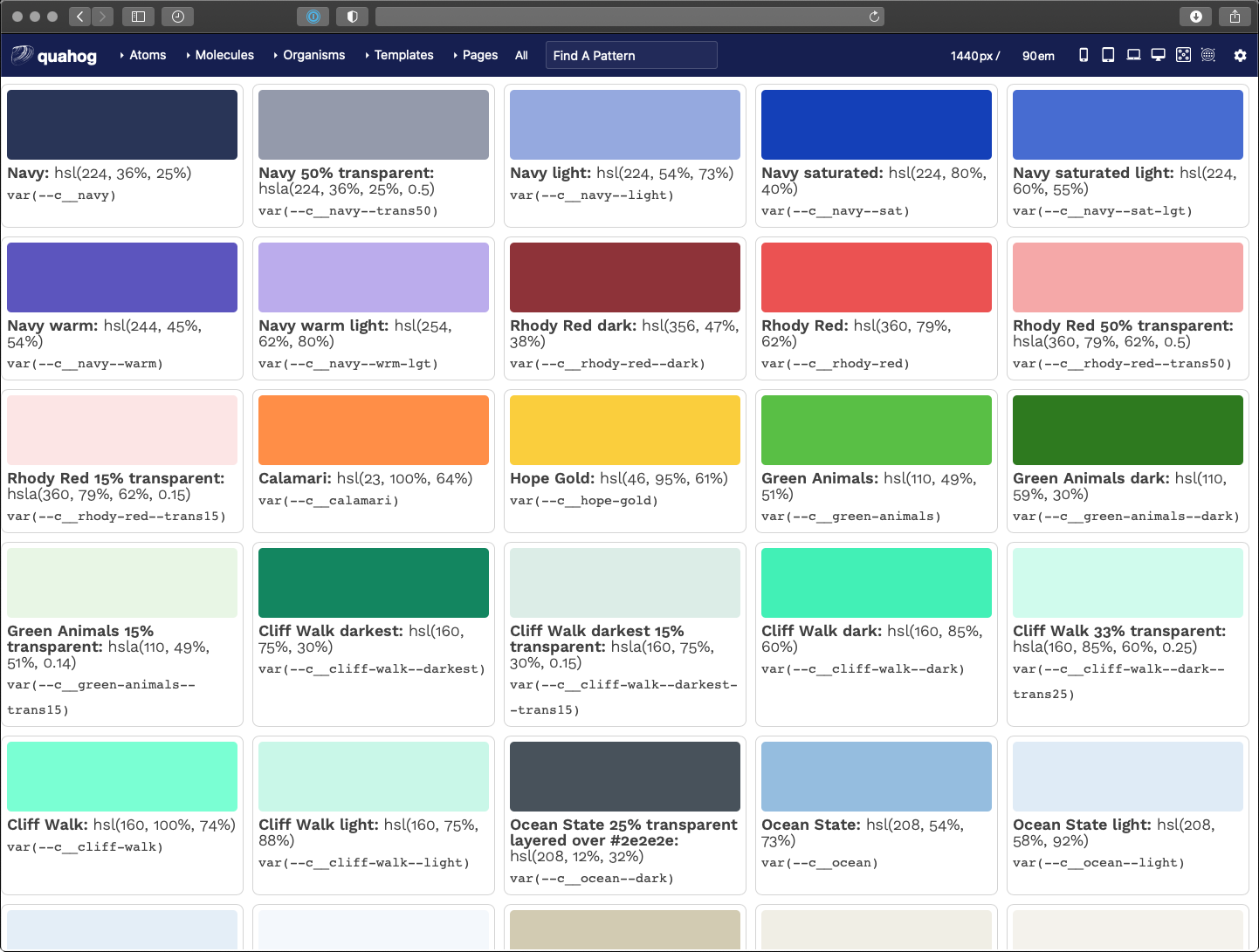
Outside of Pattern Lab, the colors in our system are represented by this preview from our documentation:
Turning HJSON Colors into Sass
Now the fun begins.
With our custom Gulp process, these HJSON definitions get turned into minified JSON. This happens as part of the initial build time. Once that JSON is created, when our Sass is saved and a new compilation happens, the contents of that JSON file are available to the Sass build process as a large Sass array. That allows a Sass file to define all of these colors as custom properties:
In a file called _colors.scss, we use an @each loop to write them all into our stylesheet as CSS custom properties on the HTML element3:
html {
  /* Default color CSS vars */
  @each $key, $value in $colors {
    --c__#{$key}: #{map-get($value, hsl)};
  }
}
Sass (Scss)
The output looks as you might expect. The Gulp process converts the colors from the HSL color space into the more typical Hexidecimal and RGBA color spaces:
html {
  --c__ocean--dark: #48525b;
  --c__ocean: #95bddf;
  --c__ocean--light: #dfebf6;
  --c__ocean--trans25: rgba(149, 189, 223, 0.25);
}
CSS
Turning HJSON Colors into Twig
That’s pretty cool, but it gets cooler. In a design system tool like Pattern Lab, we want to display swatches of these colors to end users of the design system. This is where the same ideas as converting JSON to Sass can be applied inside Twig files. The JSON file is read into and available as an array as well, which allows a colors.twig file to do this:
<ul class="sg-colors">
  {% for key, color in colors %}
    <li>
      <span class="sg-swatch" style="background: {{ color.hsl }};"></span>
      <span class="sg-label"><b>{{ color.name }}:</b> {{ color.hsl }}</span>
      <span class="sg-code"><code>var(--c__{{ key }})</code></span>
    </li>
  {% endfor %}
</ul>
Twig
A for loop in Twig iterates on the array and outputs a color swatch, a human-readable label, and the name of the CSS custom property. Pretty neat! Now we can update our colors in the HJSON file and those changes trickle down to the Sass definition and the Twig preview as well as our CSS stylesheet.
But that’s not all…
Theme Definitions
The second array in our HJSON file controls our themes — again, five different color themes each with a light- and dark-mode. To manage these effectively, we had to make some architectural decisions. Here is where we landed:
- Break the theme down into components, like “header”, “nav-main”, and “default” among others
- Name these theme colors with a functional component name — i.e., in the main navigation, a color name might be
var(--fc__nav-main__fg)which representsfunctional color, navigation main, foreground - Define functional colors in themes as a reference to the colors array
This structure allows a front-end developer to only concern themselves with the functional color name — i.e., --fc__nav-main__link. They don’t need to know what color that maps to as long as it has been defined in the theme. The theme designer is the one that focuses on making colors available and controlling the accessibility of those color combinations.
Define the Themes
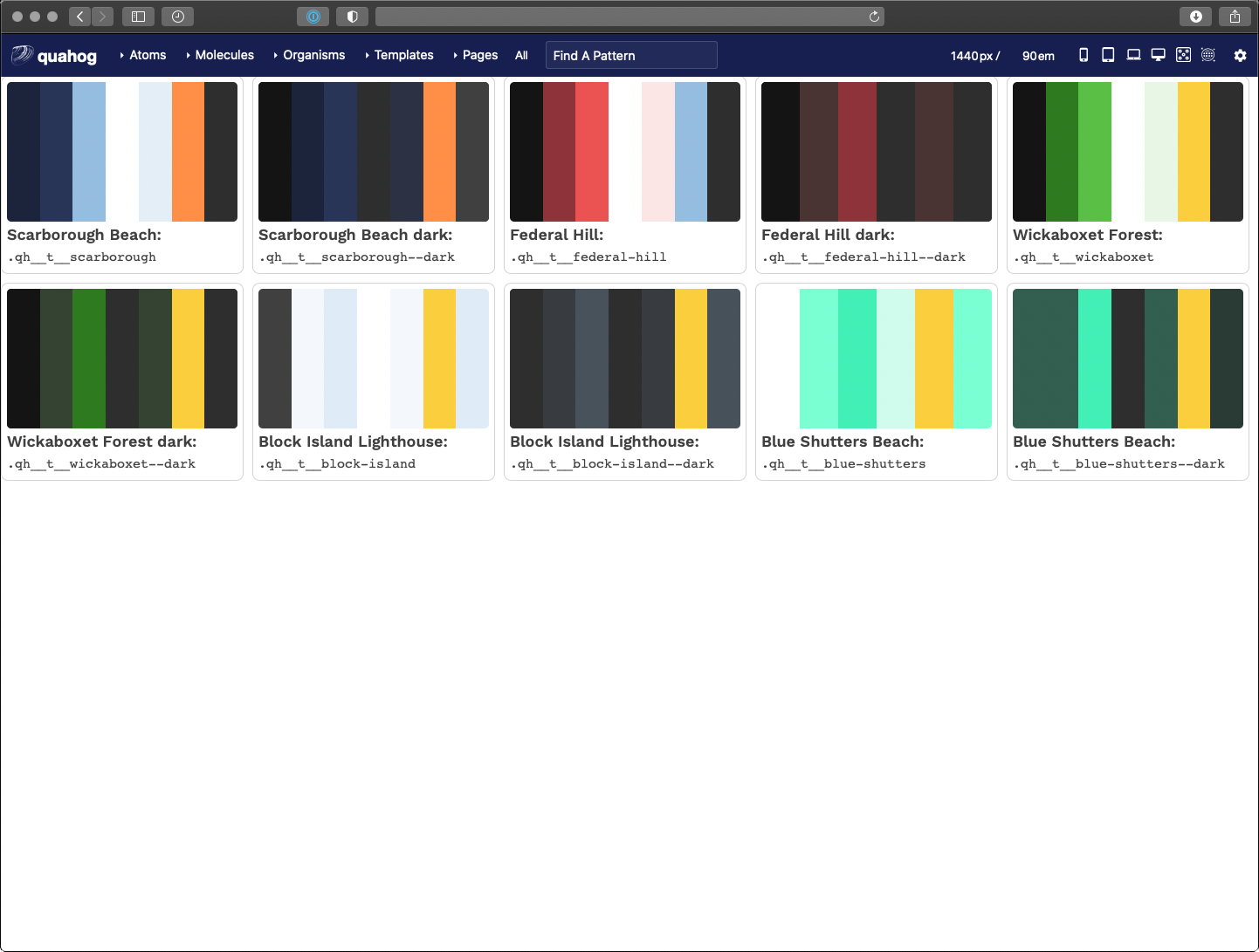
Much like our color definitions, the top depth of the array defines our color theme
"palettes": {
  "scarborough": {
      "humanName": "Scarborough Beach",
      "values": { … }
  }
}
JSON
We only need a slug, which is the array key, and a humanName. The slug will be used to output a list of colors per theme. The human-readable name is used in a dynamically-generated list of available themes through the authoring admin screens (more to come on that later).
Define the Components
Inside the values array, each component definition is included. The list is long, but a sample of it looks like this (with our inline comments allowed by HJSON):
"header": [
  { "fnName": "fg", "colorName": "white" },
  { "fnName": "bg", "colorName": "navy" },
  { "fnName": "link", "colorName": "white" },
  { "fnName": "link--hover", "colorName": "ocean" },
  { "fnName": "social__link", "colorName": "ocean" },
  # Hover should be the same as the default accent color
  { "fnName": "social__link--hover", "colorName": "hope-gold" }
]
JSON
These compile to a list of color definitions per component. The final color variables look like this:
html {
  /* Default functional colors used by the header component */
  --fc__header__fg: white;
  --fc__header__bg: #293557;
  --fc__header__link: white;
  --fc__header__link--hover: #95bddf;
  --fc__header__social__link: #95bddf;
  --fc__header__social__link--hover: #face3d;
}
CSS
Output the theme components
Our themes are controlled by overriding the functional color definitions with specificity. A loop in our colors.scss file renders all the colors and all the themes as CSS variables. The first theme definition serves as our default, while additional definitions with a class present on the <body> override those definitions.
It makes more sense in CSS. Here is a full example of only the header component:
html {
  /* Default functional colors used by the header component */
  --fc__header__fg: white;
  --fc__header__bg: #293557;
  --fc__header__link: white;
  --fc__header__link--hover: #95bddf;
  --fc__header__social__link: #95bddf;
  --fc__header__social__link--hover: #face3d;
}
/* Default colors for dark mode (overrides only) */
html.dark {
  --fc__header__bg: #1b243b;
}
@media (prefers-color-scheme: dark) {
  html:not(.light) {
    --fc__header__bg: #1b243b;
  }
}
/* Component colors when a theme class is present (overrides only) */
html .qh__t__federal-hill {
    --fc__header__bg: #8e3339;
    --fc__header__link--hover: #face3d;
    --fc__header__social__link: white;
}
/* Component colors when a theme class is present AND it is dark mode (overrides only) */
html.dark .qh__t__federal-hill {
    --fc__header__bg: rgba(235, 82, 82, 0.15);
    --fc__header__social__link: #eb5252;
}
@media (prefers-color-scheme: dark) {
  html:not(.light) .qh__t__federal-hill {
      --fc__header__bg: rgba(235, 82, 82, 0.15);
      --fc__header__social__link: #eb5252;
  }
}
CSS
The power of CSS specificity helps us here. The top of the file is our fallback for any functional color in our default theme — they all need to be present here. Any additional definitions only need to change those colors. Anything in html.dark overrides the colors in html4. Anything in html .qh__t__federal-hill overrides colors in html with specific theme colors. And anything in html.dark .qh__t__federal-hill overrides colors in html .qh__t__federal-hill when dark mode is present.
Outputting Visual Theme Previews
Similar to the Twig for loop for color swatches, we created a loop in Pattern Lab that renders a visual swatch to represent a theme. I won’t go into all the code here, but the trick we used was to create stripes of color using an inline CSS linear-gradient(). The result looks like this:
Taking it a Step Further for Accessibility
We decided that the theme designer would be responsible for providing accessible color contrast ratios (CCR) when defining --bg and --fg colors. It is up to them to choose which combinations to use, but with 46 colors, that’s 2,116 possible combinations! How can a theme designer know which combinations pass which CCRs?
Through the power of programming, we created another Twig file that leverages a nested for loop to create a large table. Across the top are our 46 colors and down the side are our 46 colors again. In the middle where a color row intersects a color column, we render enough data on the table cell to allow a Javascript loop to calculate the CCR for that combination of colors.
The result is a data table that shows every color combination and how that combination passes or does not conform to WCAG CCR thresholds. The power of for loops!
Here is what that looks like:
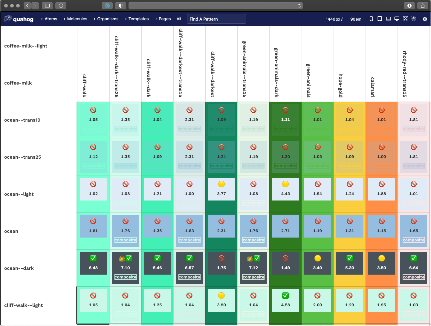
A fun little thing here is that we used emojis as our visual output. Anything under 3.0 is not allowed, anything 3.0 to 4.5 is passable under certain conditions, while anything over 4.5 is great and anything over 7.0 is royalty.
function setMessage(ccr) {
  var message = '';
  if (ccr >= 7.0) {
    messge = '👑';
  }
  if (ccr >= 4.5) {
    message = message + '✅';
  }
  if (ccr < 4.5 && ccr >= 3.0) {
    message = '🟡';
  }
  if (ccr < 3.0) {
    message = '🚫';
  }
  return message;
}
JavaScript
Another trick here was how to calculate CCR when one or more of the colors are transparent. In short, we had to do some JS that was aware of the background color — therefore, view this table in light mode AND dark mode to get the fullest amount of data around transparent color combinations.
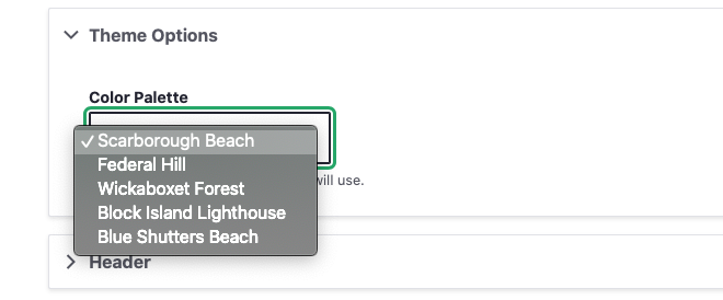
Displaying a Theme Selection
The final step of making our HJSON file control colors and themes from end to end is getting the list of themes into the admin of the site. With this, a site author can choose a color theme for their site, and further, when we add a new theme, that setting is available as soon as there is a new design system deployment.
A bit of PHP in the Drupal theme-settings.php file cycles through our JSON to render the select list of theme names. The end result of that looks like this:
Wrapping it all Up
In an extreme example of the DRY principle (Don’t Repeat Yourself), we’ve set up a system where one file rules all of our color definitions. A JSON array can render the following data through a Gulp process:
- Custom CSS properties for color definitions in Sass
- A Twig file with a visual preview of all colors
- Custom CSS properties for functional component colors within defined color themes for light and dark modes
- A Twig file with a visual preview of all themes
- A Twig file with a data table calculating color contrast ratios for all colors in the system, and
- A dynamic drop-down menu in the admin of the sites that allows a site author to choose a color theme
A HJSON to JSON/Sass/Twig/PHP workflow is certainly a great foundation. While this file manages only colors and themes, the same workflow could manage font-families, font-sizes, spacing values, and more. For now, we are taking it one step at a time but this certainly gives us some ideas to expand upon in the future.
- Yes, we could have added a comment field to our JSON structure, but we wanted more than that. Commenting individual lines with a hash character (“#”) was very helpful when we got to defining entire color themes
- Is this article actually about the new hotness, “design tokens”? Yes, in some ways, it is. Rather than being prescriptive about what and how to use design tokens, though, we concentrate on how we use them for this project. If you want to call them design tokens, that’s fine with us — but it’s not the main point.
- Why html and not
:root? Solely because the Javascript polyfill we use to support CSS variables with Internet Explorer 11 requires definitions on the HTML orbodyelement, and does not work if we use:root - Too bad about the media query for
prefers-color-schemeneeding to be declared in its own group. The repetition hurts a little bit but luckily the lists of colors are small.
As a project manager, I’ve learned that almost nothing can impact a budget quicker than iterative creative design. After all, we do this type of work every day, but our clients may only work on these types of projects once every few years. This can, unfortunately, lead to unnecessary feedback loops, lack of alignment on design direction, and delays in timelines.
Yet with some simple coaching and guidance, getting timely, thoughtful, and actionable feedback should be a breeze. Below are 9 of my favorite tips I’ve compiled over the years to help achieve this goal. This not only sets our agency and project up for success, but it also ensures our clients are happy and feel heard.
#1: Clearly identify business goals
Having clearly identified goals and objectives can act as a north star for your project. Sometimes I find that clients want to explore different ideas and directions that don’t necessarily relate back to the core goals of a project. And while there’s nothing inherently wrong with that, how might it impact the budget or the timeline? If it’s a problem, you can always point back to the core goals and let your client know “we don’t need to explore custom avatar design for the meet the team page because this is an ecommerce store, as an example. Let’s focus on putting time and effort into the shopping experience.”
#2: Invite all client stakeholders to participate in the creative Discovery process
The Discovery process is a meeting of the minds that allows the collective group to peel back the layers and discover the true project objectives, challenges, and desired outcomes. This is the time where all parties are heard (especially stakeholders who may not be consulted again) and aligns everyone on the goals and priorities. Everyone has the opportunity to weigh in and offer their pain points early, and start to shed light on their creative preferences.
Additionally, this gives the creative team the chance to dig in and explore these creative preferences and gets everyone speaking the same language. For example, if the client says they want a “clean and modern” design, the creative team can ask insightful questions to ensure they know what the client means by “clean and modern”.
For more about the Discovery process and the exercises we use to keep conversations moving, read our article about Discovery.
#3: Get client buy-in on a detailed project timeline
First, make sure you know what is driving a client’s desired timeline. Is it a product launch or a major event? Is is a “nice-to-have by this date?” Share a detailed timeline with the client before kicking off the project to ensure it aligns with their expectations. Thorough timelines should integrate each step of the workflow, from internal and client kickoffs, all the way through to final delivery of materials or post-launch support. Be sure to clearly state when client feedback is due and how it will impact the timeline if it’s missed.
Setting clear expectations at the onset of a project helps align everyone towards a common goal and keeps the teams focused each step of the way. You’ll be less likely to receive staggered or late feedback from stakeholders when the client is aware of the expectations, milestones, and the impact of delays.
#4: Determine one client point of contact to be the project owner
This will be your day to day contact to help the project along. Preferably, this person is one of the primary decision-makers. If you can swing it, put it in your contract that this is the person who has the authority to sign off on designs. If this isn’t the case, make sure that you understand the approval process within your client’s organization so you don’t get stuck later waiting for an unknown stakeholder to provide feedback or approvals.
The client project owner should solicit feedback from the primary decision-makers and provide consolidated feedback to the agency, whether it be a marked-up document, an email, comments directly on the deliverable, etc…
Consolidating the feedback gives the client project owner the opportunity to resolve conflicting comments received by the larger stakeholder team and/or seek clarification prior to providing feedback to the agency. In the scenario that the feedback trickles in, remind the client how many revisions are included in the SOW. Late or last-minute feedback will impact the final delivery date and budget.
Make it easy for this client project owner to gather and provide their feedback. At Oomph, we currently like to use Adobe XD because it allows our clients to add pins to specific areas of the design where they have feedback and then provide a written description of what they like or don’t like about it.
#5: Always present designs in person or over video
Seeing a person’s non-verbal expressions is important to help catch any subtleties or thoughts a client may not feel comfortable putting into words, for fear of offending the design team. We encourage all feedback. This is the time that matters most, so it’s not about feeling like the client has to like what we create, it’s about being constructive and working together to get the best possible outcome!
A meeting also helps to ensure aesthetics and creative thinking can be shared with the client, and enables the creative team to get quick feedback and thoughts. Further, a meeting helps the client project owner relay the design team’s decision-making process to the rest of their team. They become an advocate for the design when showing it to others.
Give the client the option to discuss their feedback in a follow-up meeting or call, or proactively schedule a follow-up meeting if their feedback isn’t clear. Be sure to have targeted questions prepared to help guide the conversation.
#6: Ask for negative feedback during creative reviews
Have you ever had a client that only has positive things to say about the designs? I’m sure your design team is good, but are they really that good? This can be a major red flag (particularly in early rounds) that either the client doesn’t know how or feel comfortable giving your team constructive feedback, even if it might be negative, and could eventually lead to a quietly unhappy client.
If you find yourself in this situation, ask the client, “If you had to change at least one thing about this design, what would you change?” It may even help if the project manager or someone else on the team starts to poke some holes in the design to spark conversation. Ultimately this may set the client at ease and help them to appreciate that we want and value their comments. The more communication and mentoring between the agency and client, the less room there is for ambiguity and misunderstanding.
#7: Help the client focus their attention by staggering creative deliverables
Deliver a few creative components or pages to the client at a time. This enables the client to give their undivided attention to a handful of items instead of being overwhelmed by too many things to review at once. For example, when designing a website, we like to deliver 2-3 wireframes instead of the entire website at once. The same concept can be applied to copy and design. The client may get hung up on a design element such as a button and completely miss the call to action language.
As a bonus, you’ll be able to apply the feedback received to future deliverables moving forward.
#8: The final product is the final design
This might be the most important tip. Sometimes clients get caught up in the minute details of a design deliverable. What they may not realize is that these details are subject to change in the development process — the design is a guide, but it is not the final product. Clients need to be educated that the final product is the final design.
What I mean by that is the final product will not be a pixel-perfect replica of the design files. Some aspects of the design may be a bit complicated to implement and so we leave it to our UX engineers to make the best use of the budget when implementing the design. Also, a design file is flat and lacks interactivity. Once you can see it come to life on a website or app, we will need to apply subtle changes that enhance the user experience. This is when we can work out some of the minutiae of spacing, hover interactions, or what something really feels like once you have real content in place.
#9: Stay agile
As the project progresses, deliverables or requirements may change. If new high-value deliverables are identified, work with your client to add more budget or adjust the scope of the project to deprioritize less impactful work. Ultimately, it’s our goal to provide clients and their end-users with the best possible product we can create for their budget.
These nine tips are part of the framework we use to keep communication flowing, move projects along their track, and build trusting relationships as we move from UX and design into development. We have found success with clients that have visually savvy marketing teams, but more importantly, we have found great success with teams that only approach a design project once in a while. Setting the right expectations early, making sure the right stakeholders are at the table, probing for meaningful feedback, staying nimble, and advocating for the end-users will always be a successful recipe for outstanding outcomes.
Your visitor’s experience with your brand goes beyond a website. If you have a social media channel, or a customer support line, or if you send email to your customers, each of these contributes to an ecosystem that should feel seamless and consistent for your audience.
We use a Customer Journey map as a framework for Project Discovery. Researching and creating a Journey will often be more insightful than user personas and will lead to better conversations. With those in mind, our team can create a stronger project roadmap for a more successful outcome.
Documenting Your Customer’s Journey
A Customer Journey is a way to investigate tasks, workflows or an entire interaction experience over time. Here are some examples of three distinct customer journey types: Tasks, Workflows, and Relationships.
Consider this example of a Relationship:
- A customer will compare products online, deciding which one to purchase, create an account or log into an existing account, potentially use a “Forgot Password” link, purchasing the product, and then may need to call customer service to return the product if it was defective or not what was expected.
This large relationship takes place over multiple communication channels — the website, email, and phone. It may take place over the course of a week or more as well. Within this example are individual workflows — ecommerce checkout workflow, forgot password workflow, customer service workflow — as well as smaller tasks within each workflow.
This is how our team can lay out all the steps involved with something as important as purchasing a product on a website. And just as a workflow like this touches multiple channels, it also touches multiple internal teams from marketing to sales to inventory to customer service. Mapping journeys like this can help align these departments towards the common goal of selling products within a memorable customer experience.
How we create a Customer Journey
Customer Journeys require research into how workflows are performing with real customers, how business goals are being met, and how internal teams are supporting or hindering those goals. We use both quantitative (analytics, scroll maps, heat maps, user surveys) and qualitative data (field studies, diary studies, video studies) to gather insights and start documenting existing conditions.
To be useful, a Customer Journey should show the current state but also the ideal state that all teams should work towards supporting. Improvements to workflows will cross over multiple teams of stakeholders, which is why it is important for conversations to happen around current conditions. All participants should agree that yes, these are the current conditions, yes, we see where the problems are, and yes, our team agrees to play our part in solving those problems.
What can we learn from a Journey Map
Communicate the Big Picture
For stakeholders that are focused only on one communication channel, a journey map can make clear how different parts of an organization are connected. Seeing how many sectors of an organization support successful business goals can help drive internal alignment.
Uncover Inefficiency and Frustration
Improving a problematic journey can reduce customer service support time and increase conversions. When friction can be removed from a process, organizations can see cost-savings and income-increases. For the customer, their long-term relationship with the brand improves when they have greater success.
Create a Guiding Star
The inefficiency and frustration that a Customer Journey Map may uncover won’t always be solved quickly. Problems might be systemic, deep-rooted, or require large organizational change to fully address. In these cases, the map can become a North Star for the organization to drive change over a long period of time.
Let’s Start the Journey
An impactful Customer Journey Map is rooted in research and constantly evaluated for new areas to streamline and test. It can be evaluated before putting its recommendations into action. It can give smaller internal business groups the perspective they need to see how their efforts drive larger business goals and outcomes. It can be a snapshot of current conditions but can also be a guiding star that will help drive system-wide change.
For a customer, successful implementation of an efficient Journey can drive satisfaction and increase brand loyalty. In short, for a business, a Customer Journey can be a roadmap to success and may uncover ways in which teams can design for delight.
Just like trees, site maps need pruning. It’s easy to add new pages to existing navigation without much thought. Lists of pages in drop-down menus get longer, a page here, a few pages there, and pretty soon, the site map is overgrown.
Most organizations revisit and prune their site map once every few years when a major site redesign is underway. Often the site map is completely reimagined — the tree is reshaped, entire branches are replaced, and smaller branches are pruned away. But one does not need to wait so long to gain the benefits of a leaner, more efficient site map. Like a good gardener, constant care and delicate pruning can ensure that a site map flourishes between redesigns.
Step 1: Revisit Best Practices
The Words in your Navigation Matter
The site navigation is often the first thing people read when they land on a site along with the logo. It’s right there at the top of the page. These navigation section labels are important microcopy — small bits of content that convey the voice and tone of the brand. They should explain everything that a visitor can do on the site and what product or service a company offers. A great first step is to revisit whether or not those labels are still relevant.
Words in the main navigation should work with each other. If your company has section labels like “Products” and “Services,” those two work together. This company offers a list of Services and a list of Products, and I should not find the same item in both menus. The content should be distinct.
Conversely, if site navigation has a section label “Company” as well as “About,” there might be some confusion. What will I find in About that I won’t find in Company, and vice versa? The two labels are not distinct enough. Look for these kinds of issues to keep your site map flourishing.
No More than 10 Pages per Drop Down Menu
This is not a hard and fast rule, but it is one to be aware of. A person’s short term memory is not great about storing more than 10 things at a time — think of 10-digit phone numbers and how hard they can be to remember. Therefore, items in the middle of a long drop down menu will get overlooked, while items at the top and bottom are more easily remembered. This can negatively impact traffic to those items in the middle.
Consider Moving some Main Section items into a Utility Menu
Does your site have a Utility menu? What people in the industry call a Utility menu is a smaller set of links, usually right at the top of the page and aligned to the right (for laptop and desktop computers). It might also be called a “Global Navigation.”
A good example of this was a recent client of ours. They had six items in their main navigation and wanted to add one more. We both wanted to remove one so we could retain six items and not make it seven. We decided to remove the “blog” link from the main navigation and bring it up into the Utility menu. There were a few good reasons: First, “blog” did not have any children pages in a drop-down menu — it was a single link. Therefore it was an easy move. Second, blog content was used throughout the site as topical content; going to the blog was not as necessary — we were bringing the blog content to the visitor where it was most relevant.
Another way to think about them is this — utility links are not special, they are useful. They are the items that visitors expect to see, but that do not add any brand value, like “About,” “Search,” and “Contact.”
Step 2: Read the Analytics Tea Leaves
If your site has any kind of analytics reporting, take a look at the top visited pages. In Google Analytics, take a look at the list of “All pages.” These are the pages that people come to most often throughout their exploration. These have content that is performing well and is useful to visitors, so don’t change where they are in your site map unless there is a major redesign underway.
On the flip side, take a look at which pages are at the bottom of the list. Your audience is finding very little value in these pages. It’s time to evaluate if these pages should be removed or if their content should be consolidated with similar pages.
It’s also helpful to review your “Content drilldown” data report. This will show which groups of pages are most popular. For example, your “Services” parent page may not be in your top ten of the “All pages” report, but the “/services/” content area could very well be in the top 10. This is important to review because you do not want to remove an entire menu item that is performing well only because the parent item is performing poorly.
Step 3: Use more Data to Show What Needs Pruning
Once Steps 1 and 2 are followed, you are ready to leverage additional data to highlight areas that need pruning. There are a few tools that we can recommend:
Hotjar
Hotjar is great tool and recommend it to clients all the time. With its heatmap, mouse movement, and scroll map snapshots we can quickly see where people are clicking or tapping — and therefore, where they are not clicking. The data here should supplement your existing Analytics data. The visuals are a great way to find areas that need further investigation before taking pages out of your site map.
Hotjar works well if your site gets moderate to high traffic. We recommend starting with the free trial and a test on a high-traffic page. It could take a few weeks for Hotjar to collect the recommended 1000 sessions on some sites. Be patient, and review the data once that threshold has been reached to get a more complete picture.
Treejack from Optimal Workshop
We are also fans of an information architecture testing tool called Treejack. It can be used to test existing site maps or new ones. Its workflow is task-based — a study participant is given a task to perform and uses your site map to find a page they think would accomplish that task. It’s real people and real tasks tested against your site map with no design or other context in place.
Treejack would be a good tool to leverage if you were considering a larger change to the site map and the main navigation language. It would take a little bit of effort to set up, but the insights that it offers might prevent changes to the site that would have a negative effect on your users and your traffic.
Google Optimize
You are probably using Google Analytics already because it’s free. Did you know that Google had an A/B Platform as well? Google Optimize is an add-on that can run tests on little things like the language or design of navigation labels and calls to action. It’s a powerful tool that has a learning curve, but can help gather some insightful data to drive effective pruning. Additionally, it integrates directly with your Google Analytics so you can review the feedback in your Behavior reports on GA.
Other Tools
For a small team to perform routine trimming and feeding of their growing site map, platforms like UsabilityHub offer Five-second Tests and First-click Tests. These are relatively easy to create and recruit participants to engage with — people in your office or social circle are good participants, though they may be too close to the content. Using social media and small rewards is another good way to attract participants. If any of those fail, many testing platforms offer ways to purchase participant involvement with your test.
Sharpen those Shears, Get to Pruning
Your site map and main navigation are an integral part of the first impression that your digital property needs to make. That language communicates so much in the first few seconds of a new visit — make sure they are the right words, they are distinct, and they are effective.
Look at your site’s traffic data monthly or at least quarterly. Set aside time every six months to trim the dead leaves and branches from your site tree. If you need more data to drive decision-making, investigate our toolset as a first step.
Finally, and most importantly, don’t wait years and years between redesigns to fertilize or prune your site map. As your business evolves, so should the navigation. Incremental changes at least twice a year will also make it easier when it comes time to redesign. You’ll be equipped with your user data and a deeper understanding of what your audience finds to be the most valuable from your site.
Need some gardening assistance? Oomph offers an array of strategy services to help any organization get the most out of their content.
THE BRIEF
The American Veterinary Medical Association (AVMA) advocates on behalf of 91,000+ members — mostly doctors but some veterinary support staff as well. With roots as far back as 1863, their mission is to advance the science and practice of veterinary medicine and improve animal and human health. They are the most widely recognized member organization in the field.
Make the Brand Shine
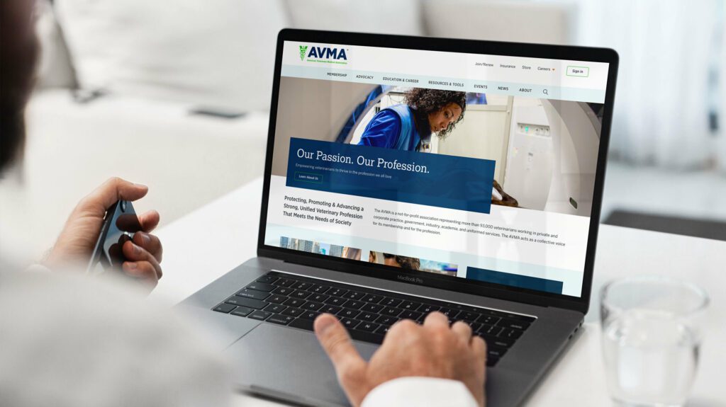
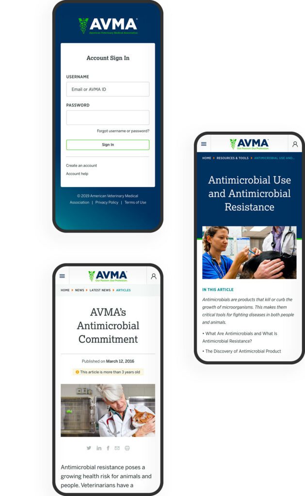
The AVMA website is the main communications vehicle for the organization. But the framework was very out of date — the site was not mobile-friendly and some pages were downright broken. The brand was strong, but the delivery on screen was weak and the tools reflected poorly.
Our goals were to:
IMPROVE THE SITE MAP
Content bloat over the years created a site tree that was in bad need of pruning.
IMPROVE SEARCH
When a site has so much content to offer, search can be the quickest way to find relevant information for a motivated user. Our goals were to make search more powerful while maintaining clarity of use.
COMMUNICATE THE VALUE OF MEMBERSHIP
Resources and benefits that come with membership were not clearly illustrated and while members were renewing regularly, they were not interacting with the site as a resource as often as they could.
STRENGTHEN THE BRAND
If the site was easier to navigate and search, if it had a clear value proposition for existing and prospective members, and if the visual design were modern and device-friendly, the brand would be stronger.
THE APPROACH
Put Members First
Oomph embarked on an extensive research and discovery phase which included:
- A competitor Analysis of 5 groups in direct competition and 5 similar membership-driven organizations
- An online survey for the existing audience
- A content and SEO audits
- Several in-person workshops with stakeholder groups, including attendance at their annual convention to conduct on-the-spot surveys
- More phone interviews with volunteers, members, and additional stakeholders
With a deep bed of research and personal anecdotes, we began to architect the new site. Communication was high as well, with numerous marketing, communications, and IT team check-ins along the way:
- An extensive card sort exercise for information architecture improvements — 200+ cards sorted by 6 groups from throughout the organization
- A new information architecture and audience testing
- A content modeling and content wireframe exercises
- A brand color accessibility audit
- Over a dozen wireframes
- Three style tiles (mood boards) with revisions and refinements
- Wireframe user testing
- A set of deep-dive technical audits
- Several full design mockups with flexible component architecture
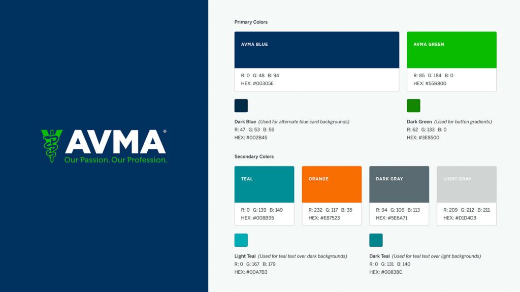
Several rounds of style tiles explored a new set of typefaces to support a modern refresh of the brand. Our ideas included darkening colored typography to meet WCAG thresholds, adding more colored tints for design variability, and designing a set of components that could be used to create marketing pages using Drupal’s Layout Builder system.
THE RESULTS
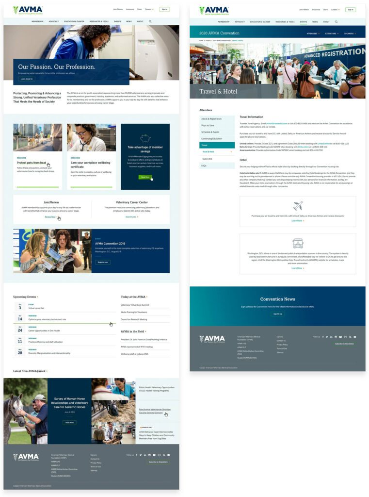
The design update brought the main brand vehicle fully into the modern web. Large headlines and images, chunks of color, and a clearer hierarchy of information makes each pages’ purpose shine. A mega-menu system breaks complex navigation into digestible parts, with icons and color to help differentiate important sections. The important yearly convention pages got a facelift as well, with their own sub-navigation system.
FINAL THOUGHTS
Supporting Animals & Humans Alike
Membership to the AVMA for a working veterinary doctor is an important way to keep in touch with the wider community while also learning about the latest policy changes, health updates, and events. The general public can more easily find information about common pet health problems, topical issues around animal well-being during natural disasters, and food and toy recalls. The goal of supporting members first while more broadly providing value to prospective members and non-members alike has coalesced into this updated digital property.
We look forward to supporting animal health and human safety as we continue to support and improve the site over the next year.