
Vision impairments are widespread and will affect different populations more than others. According to the CDC, 6% of Americans have self-reported vision impairment. Add to that 8.5% of the population with a form of color blindness. Add to that 3% who are legally blind. Depending on the state and the age range we are talking about, anywhere between 14-20% of the population is affected by a partial or full vision impairment.
Unless you yourself have vision trouble, it is a silent, personal disability. Making sure your brand colors meet minimum guidelines for accessibility is an important step towards making a website more inclusive. Luckily, there are many tools and guidelines that can help. Oomph has created a color tool as well, and we’d like to describe how easy it can be to evaluate your own color palette.
Why are Color Contrast Ratios Important?
A contrast ratio is a mathematical difference between a foreground color (text, typically) and a background color. If there is not a high-enough contrast, anyone will have a hard time reading the content. Low contrast is 0.0 and the highest contrast (black over white) is 21.0.
A minimum contrast ratio is necessary for all readers of all abilities, but very necessary if they are color blind, near-sighted, far-sighted, or have degenerative vision conditions.
We have all encountered text that is too light on a white background or too dark on a dark background. Older or tired eyes that have been staring at a screen all day have an even harder time than younger and “fresher” eyes.
Here are some examples:
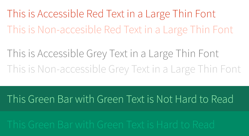
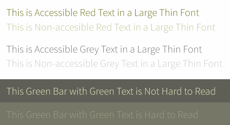
The first row in each of the three groups passes the recommended color contrast ratios. The second in each does not. Even a well-sighted person might find them hard to read. Below is the same image with a filter applied to show what it looks like to someone with the most common form of color blindness, Deuteranopia (also referred to as green color blindness):
The same problems are present — there is not enough contrast between the foreground and the background. But also note a tangential issue — there is little to no visual difference between red text and green text. If a page on your site has instructions that refer to the color of text — click on the green button,
for example — some of your visitors may not be able to tell what the instructions are referring to.
The colors I have selected for the example look basically the same for another rarer type of color blindness, Protanopia (red color blindness). The rarest form of color blindness, Tritanopia (blue-yellow color blindness), looks a bit different:
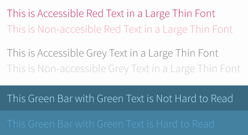
Notice that the red looks basically normal, but now the green looks blue. Yellow for this condition looks pale purple as well. This form is very rare, with 1 in 10,000 persons affected and can affect men or women equally. The other two conditions affect mostly men and only a small percentage of women.
Color blindness is relatively easy to experience thanks to various software simulators. Adobe products have a color blindness preview mode and accessible color contrast plug-ins as well. Other degenerative vision conditions are a bit harder to visualize, but these tools can help:
Impairment simulators and testing tools:
- Who can Use, a tool which breaks down who might have trouble with certain color combinations
- Simulator for glaucoma, cataracts, diabetic retinopathy, and macular degeneration at Versant Health
- A Chrome store plugin to simulate conditions on top of existing web pages
- A set of downloadable software for Windows and Mac to simulate common vision problems
The Guidelines: Minimum Color Contrast Ratios
Because of these differences in the ways in which people can see, the Web Content Accessibility Guidelines (WCAG) have a set of recommendations. There are two levels of conformance and two targets within each level. They break down like this:
Level AA recommended minimum contrast ratios:
For all text or images of text, a ratio of 4.5:1 is required, except for the following:
- Large Text: Text 24px and larger or bold text 19px and larger, a ratio of 3.0:1 is required
- Incidental: Text or images of text that are part of an inactive user interface component — that are pure decoration — have no contrast requirement
- Logotypes: Text that is part of a logo or brand name have no contrast requirement
Level AAA (enhanced) recommended minimum contrast ratios:
For all text or images of text, a ratio of 7.0:1 is required, except for the following:
- Large Text: Text 24px and larger or bold text 19px and larger, a ratio of 4.5:1 is required
- Incidental: Text or images of text that are part of an inactive user interface component — that are pure decoration — have no contrast requirement
- Logotypes: Text that is part of a logo or brand name have no contrast requirement
The rules in plainer English are as follows:
- All text color over a background color should have a contrast ratio of 4.5. If the text is larger than 23px, or bold and larger than 18px, it can have a contrast ratio of 3.0
- For sites where accessibility is very important — think banking, healthcare, and government websites — the higher levels of 7.0 and 4.5 should be used. respectively
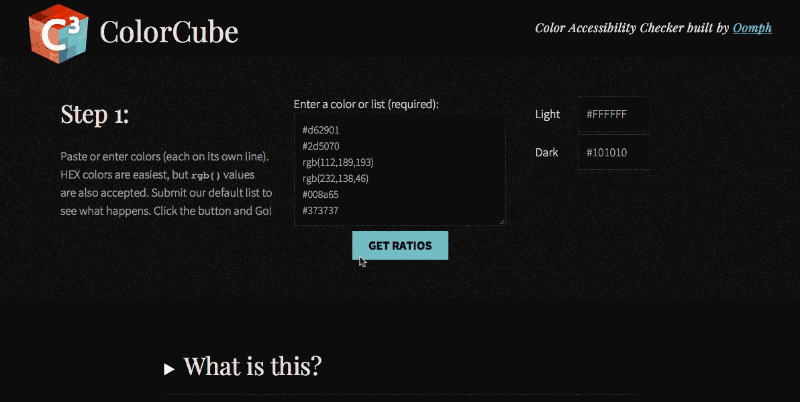
Our ColorCube tool’s feedback includes success or failure criteria for all three contrast levels. No matter the target your project needs to hit, it will show how each color fares with each level of conformance.
The HSL Color Space
When a color combination does not meet a contrast threshold, what can you do? At Oomph, we like to adjust colors using the HSL color format. HSL stands for Hue, Saturation, and Lightness. By using only the Saturation and Lightness factors and keeping the Hue the same, we only darken or lighten the color without changing what kind of color it is.
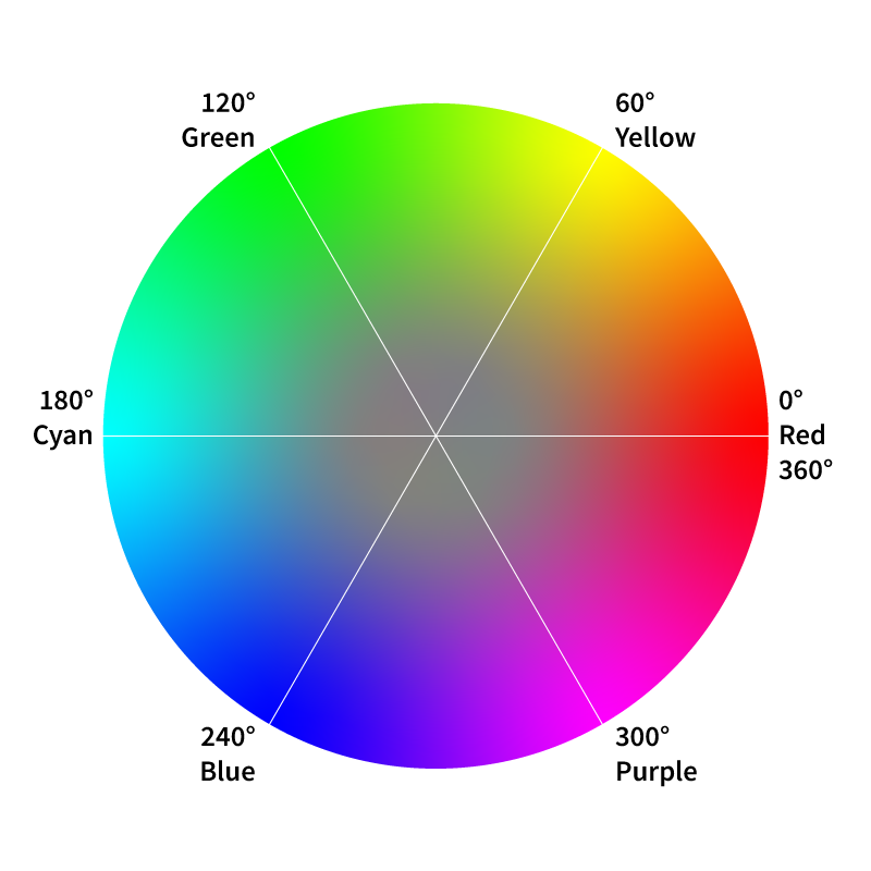
Hue
The HSL color space is represented by a color wheel. Hue is numerically a value on a circle, from 0° to 360°. The beginning and end of the color wheel are the same — Zero degrees and 360° are both red. Every 60 degrees is a new primary color — 60° is yellow, 120° is green, 180° is cyan, 240° is blue, and 300° is purple. Hue is what makes red a red or yellow a yellow. Change the Hue and you change where on the rainbow the color falls — you change the fundamental nature of the color.
Saturation
Saturation can be thought of as the purity of a color. In the wheel, it reflects the distance from the center to the outside perimeter. Closer to the center, and the more of the other colors are mixed in. Closer to the outside of the wheel, and the more “pure” the color is. Values of 0% saturation and 50% lightness would result in a gray — all the colors are mixed together in equal amounts. Values of 100% saturation and 50% of lightness would result in the brightness version of that color — one without any of the other colors in the wheel.
Lightness
Lightness refers to how much black or white is being used in the color. Along with saturation, lightness can greatly change the perception of the hue. Values of 100% saturation and 0% lightness would result in black, while 100% saturation and 100% lightness would result in white. 100% saturation and 50% lightness values are the purest form of the color where no black or white is introduced.
A great 2 minute video of how HSL color and the color wheel works can be seen at the Khan Academy.
Adjusting an Example Brand Color to Pass Contrast Ratios
Say a company uses red as a brand color — as we do. That color passes Level AA when used over white but not when used with almost black. What should we do to make that color pass Level AA criteria?
First, we load up the colors in ColorCube (the demonstration color palette already contains the red we are discussing). We can see that it does not pass over black #101010. It fails by 0.72 with a color contrast of 3.78. We need it to pass 4.5. The HSL values for this red are H11 S99 L42. We don’t want to change the kind of red this is, so we do not touch the hue controls. We are already at almost 100% saturation, so making the color more pure will not help. Instead, we increase the lightness value from 42 to 50.
Second, we click the up arrow in the L field (or use our arrow up key) to see the test results update in real time. The results move from failing to “edge” to passing once we hit 50% lightness and a passing contrast ratio of 5.12. The new hex value has also been updated, and we can cut and paste that into our CSS code.
Most people will not notice that the red color has changed slightly over a dark background. In the image below we show the original color over white and the new color over black. Because the backgrounds are so different, it is hard to perceive a change in the base color.
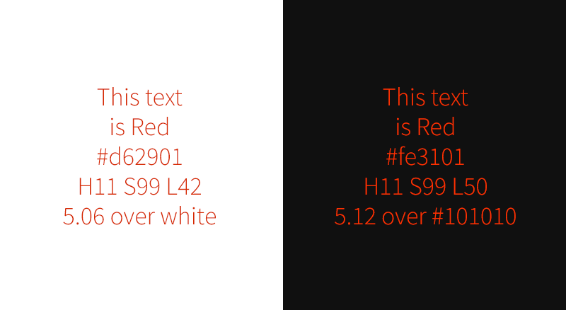
This is why we prefer to use the HSL color space. Unlike RGB, it is more intuitive. It is easier to change only saturation or lightness to get a failing color to pass. And most people won’t even notice that there was a color change.
Create Accessible Color Palettes with ColorCube
ColorCube delivers maximum functionality in minimum space. Detailed color contrast test results for each color against three of the WCAG contrast minimums. HSL adjustment tools quickly change and retest colors without affecting the original intention of the color — unless you want to. A third color takes custom color combinations to test something specific. Plus, white or black values can be customized before testing.
We hope you find our tool useful, and most of all, we hope it helps teams build more accessible digital products. Be inclusive — test, adjust, and implement accessible color palettes with ColorCube.
Reach out to J. Hogue on Twitter or email or drop an issue into GitHub. Contributions are welcome!
Over the past week Kathy Beck and I have had the pleasure of touring a talk that we have prepared around Drupal 8’s Layout Builder. We aren’t the only ones talking about it, of course, but it is a set of tools in Drupal core that have lately found new interest in the community. More and more developers are discovering and using the tool, which makes it an exciting bit of technology to talk about.
We recently had great success with Layout Builder on a new project. What was a really nice was that our design system paradigm from previous projects was easily portable into this new Layout Builder tool. So our UX thinking was solid, and this was a solid tool that could continue to support that way of working.
Moving into Layout Builder also gave us some additional advantages:
- Layout Builder is a core part of Drupal. Other similar tools are contributed modules, which means they could fail to keep up with security or compatibility issues or die on the vine all together
- Layout Builder plays more nicely with Drupal’s core Translation methods
- Layout Builder has better performance that some similar solutions in the contributed module world
- And Layout Builder has built-in template control
What Template Control in Layout Builder looks like
For most projects, the key advantage to Layout Builder is that it puts the creation and “design” of a content type’s main template in the admin experience. Drupal already puts many controls in the Admin experience, allowing site builders to create content types, configure the fields that they use, and even configure some of the ways in which that data will be displayed to users. With that, it makes sense that Layout Builder provides way in which site builders can create visual templates.
This reduces the need for front-end templates in Twig. Again, since a site builder is the one to configure a new content type directly in the admin, they can now also create that default template in the admin as well. Just like theming in Twig, though, if a site builder makes a change to the main template, any piece of content created with that template will also update. Its a powerful way to edit and control templates per content type.
What’s really cool is that we as the site builders can decide which content type template’s an author has access to override the layout of. The scenario is this: An article content type is locked down, and the author can only access the fields to update title, image, and body content. But a “Marketing page” content type has that restriction removed, so an author has access to “Layout”, and therefore they can make as many changes to that page as they want. They can add new content components, they can delete others, change color, column design, and anything else that we create to modify designs.
Watch the Videos
With that explanation, our talks go into more detail about how this all works and what problems we wanted to try to solve. The first video that we have ready to view was geared towards a design audience. Another one to come along soon was geared towards a more technical, Drupal-knowledgable audience. Pick the one that is right for you!
Oh, and as a “cool to know”, the presentation deck itself was built in Layout Builder!
Presentation in front of a Developer Audience for DrupalCamp Atlanta:
Presentation in front of a Design Audience for DesignWeek RI:
In this video from New England Drupal Camp, November 17, 2018, Director of Design & UX J. Hogue reviews how we approach building a flexible set of components for our clients using Drupal 8 and the popular Paragraphs Module. These component-based design systems make it easier to administrate complex landing pages, quicker for the author to design with their content, all within a brand-aware design system that keeps the visuals consistent for the consumer.
Through five projects (and growing), our internal design framework allows our team to craft new design systems for clients that can grow with their content. The design systems we create offer variety within constraints — that is what Paragraphs does so well. Why is a design system so important for clients authoring new content? Because ideally, it removes the pressure from thinking about what the content should look like, and instead, allows the author to focus on which components should I use to tell the best story with my content?
Paragraphs offer the most visual flexibility for the client and the most design-system control for the development team. If you haven’t yet been convinced, this talk just might make you a believer, too.
Real-world Application
We’ve seen this be true for a client earlier this year. We were given about 10 weeks to design and implement two different reports that took the form of long scrolling pages. These reports needed to have some visual distinction from each other — they should have a “family” resemblance, but they also had different audiences so a certain amount of visual distinction was needed. And, oh by the way, the content was not entirely written yet. And they wanted to get started on design now.
How were we going to solve this? How were we going to get 2500 words with images, videos, and testimonials onto two different pages with different look-n-feels? A design system seemed like the best answer.
Myself and our Senior Drupal Architect got together and collaborate on a technical design solution. We whiteboarded some ideas, and what started to emerge was what I am presenting here today. We broke things down into an abstract system first — one that would work within Drupal and Paragraphs, and then applied a visual design on top. Along the way, we identified configuration options that should shift, expand, or contract. We added an animation system. We added custom CK Editor styles for greater typographic control and custom element support. In short, we developed, designed, prototyped, and received client approval in tandem. We met our 10 week deadline and learned a ton in the process.
Our Legos
The pieces we use to design a page are simple in that they have a minimum of configuration needed to work. Any embellishments become visual, not functional, and therefore the author has to only concentrate on their content and how best to present it.
Our system is row-based, with a basic Row and a Hero Row forming the basis of the organization. We then have content components — a WYSIWYG component, a Testimonial, an Accordion, and Media in the form of an Image and a Video.
Our design options are many — horizontal and vertical alignment, 18 different layouts, background colors, background images, borders, animations, and some extras. Don’t worry, the video goes over all of these options in a visual way to make it easier to understand how flexible this system really is.
Getting started with Oomph Paragraphs
For the developers in the audience, our team has rolled out this framework into a public Drupal Module that we have created for ourselves to achieve consistency between projects. Even though it is an internal project, we released it publicly and are working to follow all Module best practices because we think this is a great way to jumpstart development with a solid foundation for a design system. Contributions and feedback are welcome.
Engagement is a hot metric and measure of a website’s success. It’s like capturing a visitor’s attention and holding it hostage. Why has it become so important? One reason might be how easy it is to measure and declare success — high time-on-site, high page views per session, and low bounce rates mean high engagement. A high number of shares, comments, and backlinks don’t hurt either.
Engagement has become the only measure of success that people are willing to talk about. In client pitch meetings, engagement as a project goal comes up again and again. But now we think the word — and metric — has lost its meaning. Why? Because human psychology is relatively easy to manipulate. Have you heard the term clickbait? This term and terms like it have become part of the social consciousness as people have realized how they are being manipulated. It’s an icky feeling, and one which visitors try to avoid.
We need more ways to gauge whether or not our sites are delivering value to visitors. We need to decide what kind of sites we are designing, what are the goals, and what is the best experience for a visitor; only then can we figure out how to measure it.
The opposite of engagement might be speed — one of low time on site, low number of pages per visit, and a high bounce rate. We should measure how quickly a site can help a visitor accomplish a goal. Get a user to their goal, and then let them go about the rest of their day. This quick, helpful experience can contribute to a lot of brand positivity — in some case, a lot more so than “engagement” ever could. We have started to call this the Content Performance Quotient, or CPQ.
Think of CPQ as the “Speed to Usefulness”
Jeffrey Zeldman coined the term in a blog post titled “Beyond Engagement: The Content Performance Quotient”:
“The content performance quotient is an index of how quickly you get the right answer to the individual customer, allowing her to act on it or depart and get on with her day. It is a measurement of your value to the customer. […] From the organization’s point of view, CPQ can be the time it takes for a specific customer to find, receive, and absorb your most important content.”
At its heart, it a pretty simple idea. It requires a few things, however, to prepare for thinking in this way. A site must be evaluated and the goals must be defined as ones that need to perform vs. engage because the two modes are almost complete opposites.
To achieve high CPQ, a site should:
- Be transactional in nature — sharply defined tasks that we would like a user to accomplish
- Be as simple as possible, with clear and concise language
- Provide smart defaults to save users time, but not add to frustration (better to make no assumption than a bad assumption)
- Provide failure and success criteria when online form actions are involved
A site with high CPQ will see low time-on-site, fewer page views, and a higher bounce rate. On the other side, engagement is still a valuable metric for some types of sites.
A high CPQ site is not:
- Editorial in nature — news sites exist to disseminate timely content, therefore engagement is still a solid metric
- Social in nature — Social media websites are designed to be engaging (in the worst way, sometimes) and aim to suck away those 20 minutes you have standing in line at the grocery store. Engagement is still the right metric to use for success
There is always a Gray Area
In between a site that is very transactional, like a bank, and a site that is very engaging, like Instagram, are sites that need to have a little bit of both. We think that is perfectly fine, as long as we can identify it ahead of time. Properly understanding when a task needs to have high CPQ and when another task needs to have a low CPQ will be critical, both for the design of that task as well as the measurement of its success.
Example: A SaaS Product Site
Whether or not we know them by this name, we are all familiar with a Software as a Service (SaaS) site. A popular example would be something like Microsoft Outlook.
When a service costs money, the job of the website is to prove to the visitor that this thing is worth the price. It needs to outline all the major features, offer customer testimonials, show that there is real human support when needed, and be clear and upfront about pricing.
The site needs to engage the user for the time needed to make a decision and then get them through the signup process quickly. The site needs to inform the user (potential customer) of product features and keep them on the site, if possible, while they weigh the value of the product. Then the site needs to get out of the way and allow a smooth and quick transaction to a paid plan. It needs to have low CPQ at the front and high CPQ at the back.
For a scenario like this, it makes more sense to use more than one metric to measure success.
Google Analytics and other tools can be set up to have more than one set of data to look at while reviewing success. One View might track the transactional pages and therefore be concerned with low time on site and high goal completion. Another View under the same Property can track the features and pricing pages to measure high time on site, high number of pages per visit, and low bounce.
Its OK to do both![1].
Achieve High CPQ by Removing, Reducing, and Clarifying
The mobile web ushered a sea change in the web industry. Suddenly we had to fit all the same stuff that we were cramming onto a large desktop monitor into a much smaller handheld screen. It created some splinter groups — one that fought for mobile-specific sites, another that advocated for responsive design, and still others on the fringes shouting about what to do to handle it all.
Thankfully, in our minds, responsive design won. But it did have a problematic side effect. Moving multiple columns into a single column allowed designers to get all of the same information in front of people regardless of the size of the screen, which led to many clients shaking our hands and saying “job well done.” What we never did was revisit the content and ask the harder questions: “Is this really needed? Can we say it more simply?”
To achieve a high CPQ, we will need to ask these more difficult questions of our clients:
- Can we reduce the number of calls to action to one or two important, impactful ones?
- Can we reduce the amount of language on a page? Can we say these things more simply and still accomplish the goals?
- Can we change some business needs to achieve greater simplicity? Can we reduce that form from ten fields to four?
In short, we need to ask “why” more often. If the answer does not help achieve one of the business goals, then the item in question should be removed.
Again, in his talk, Mr. Zeldman makes this great observation: We do it for shopping carts. We can do it for content.
We relentlessly chop and chop away to simplify the shopping cart experience for our users because simplification leads to a very measurable bottom line — fewer abandoned carts. We can clearly see the business goals even though some changes to business practices to gain efficiencies can be painful. We can make the same sacrifices for clearer and more concise content.
Let’s Start Measuring CPQ
At the center of this idea is a simple observation that visitor engagement need not be the only measure of success in our industry. Seldom are we building the next Instagram or Twitter. Instead, we are probably building a SaaS service site that needs to do both, and the design team and the client team need to be aware of what we are doing, who it serves, and how we are going to measure success — perhaps in two different and opposite modes.
In the scenarios in which we are building a truly transactional tool or service — a banking site, shopping site, or healthcare insurance provider — both the design and client teams need to admit when engagement isNOT the objective. We would serve the customers (users) best if we made tools to help them complete their tasks and move on with their lives… have them spend less time on your site, give them a satisfying customer experience, and allow them to get back to scrolling on Instagram.
Related Links and Research:
- Follow the concept on Twitter: twitter.com/DesignCPQ
- Mr. Zeldman uses a screenshot of the BCBS.com homepage (slide 9) to illustrate a site that starting him thinking about this concept of high CPQ: noti.st/zeldman/vn6YlR#sYBxNLQ
- Another Jeffrey Zeldman idea — a design that is faster for people trying to get things done, and slower for people trying to comprehend. Sheesh, it’s like that guy knows a thing or two. Return ⤴
THE BRIEF
Supporting the Organizations You Love Should Be as Easy as Banking Online
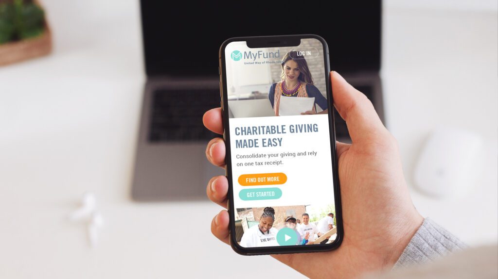
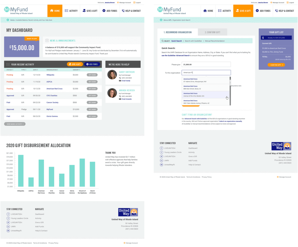
After a successful redesign experience for their main property, United Way Rhode Island (UWRI) came to Oomph with an idea — modernize and rebrand their philanthropic giving platform as a mobile-responsive web app. They already had the software team building back-office integrations, but what they didn’t have was the all-important name, URL and brand.
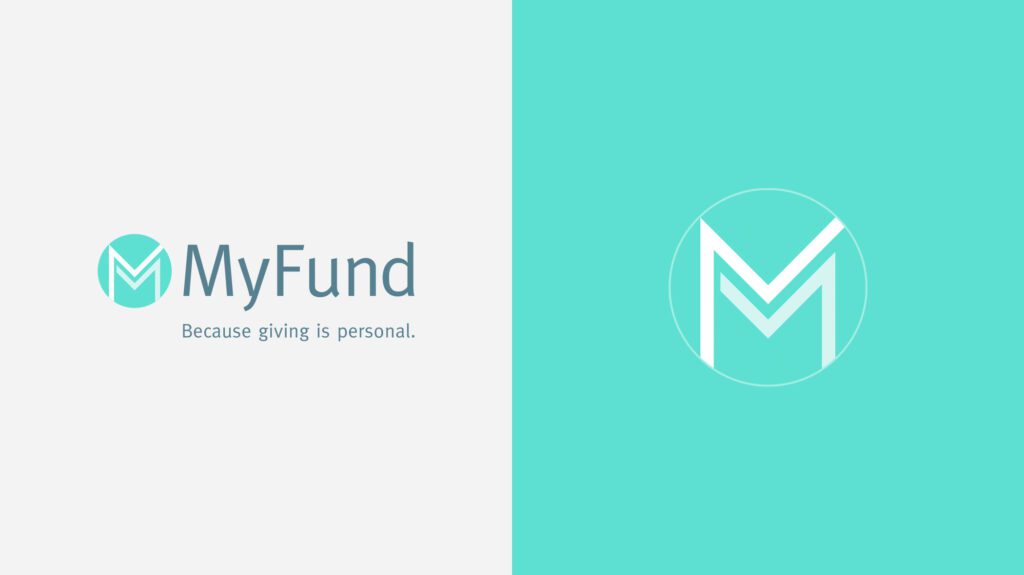
The name set the tone for the platform — easily understood, distinct in the marketplace, and personal. UWRI prides itself on being a personal organization, helping Rhode Islanders who need it most. And giving one’s time, one’s energy, and one’s assets is as personal as it gets. After some research into competitors, the banking space, logo and app naming trends, plus a whiteboard full of other ideas, a clear winner emerged — MyFund.
THE NEW BRAND
A New Sibling for a Recognizable Community Organizer
There is great public trust in UWRI that a new brand should leverage. After visual explorations, we decided to make the connection in a subtle way. The main color scheme borrowed from the recent redesign of UWRI’s website, using a highlight color of light teal as its primary color. The main typeface was Meta, which is the secondary typeface for much of UWRI’s print collateral. These subtle connections helped maintain a family resemblance, while allowing MyFund to stand on its own.
The simple circle with “M” mark abstractly suggests two bodies, side by side and with linked arms. The tagline, “Because Giving is Personal,” was the result of one of those serendipitous moments during an all-hands meeting. Someone floated it to the group and everyone just lit up and exclaimed, “That’s it!” Along the way, the name, the logo, the colors, the typeface, and the tagline just felt right. We all felt it, and it was very exciting to be a part of it.
THE RESULTS
Web-app Interface Design
The interface was designed to follow many conventions of online banking in order to leverage customers’ intuition and expectations, but the result is softer and less like a typical financial institution. The concept of MyFund is similar to online banking in that the customer can make a donation through an online portal from a predetermined balance. The differences are in the workflow; MyFund transactions occur both on and offline. All transactions are guaranteed to go to registered 501c3 organizations in good standing with the IRS, therefore, when a request is made to send money to an organization, the final check is cut by a person. A customer may cancel a transaction before it has been fully processed but the back-office may also cancel it if the organization is not compliant. These nuances needed to be clear in the interface and messaging.
All along the way, the wireframes and designs were verified with real people. At the early stages, wireframes and workflows were tested with online tools and an HTML prototype. This not only gave the development team a live example of a customer’s workflow, but it gave the entire team a clear picture of how the responsive site was going to work.
The Marketing Site
While the software was nearing completion and a beta launch, Oomph began work on a marketing site to promote the new web app. We were involved in writing the copy and crafting the story for prospective customers.
We scripted a series of videos to help explain how individual features worked, while one explainer video on the marketing site gave new customers a broad overview of why this platform is such a great idea. A list of primary features as well as some social proof in the form of personal testimonials help frame the platform as more than just a convenience — it can really help you make a difference in your community.
See the marketing site in action at MyFund.org.
The world of UX and UI has been rapidly expanding in 2017 and is ready to continue to grow beyond our expectations. These yearly look-backs peppered with predictions for the future are getting harder and harder to write because of the sheer pace of change in the industry. The products that help designers design and the new talent that turns tried and true design patterns on their head will continue to drive new ideas to market in 2018. People — real users — are the ones who ultimately decide if an idea fails or sets a new set of trends the rest of the marketplace will aspire to.
The bots are rising
Chatbots and AI were on the rise in 2016 and 2017 cemented their place in new product design and drove new devices to dominance. Amazon and Google sold about 7.5 million voice-activated assistants in 2016 and have sold more than 25 million units this year, with more personal assistants in development from Apple, Samsung, Alibaba, and Microsoft.
Consider this: the rapid growth of chatbots is akin to another bit of technology that changed the game — the iPhone sold about 11 million devices in 2008, the year after its release in 2007, and 20 million in 2009. There is no question that Chatbots (another way to describe these voice-activated personal assistants) are going to be the next digital device that everyone will have in the home.
The inevitable rise of devices that have no visual user interface is a challenge that many design teams have already taken on. The need to understand “no-UI” continues to present challenges, but with a number of successful models to look at, it is an area that will continue to mature in 2018.
A11y will be your ally
Accessibility (a11y) continues to be at the top of many designers’ minds, as it should. More and more UX professionals recognize the need to stop creating products and interfaces that can be used by a smaller percentage of the population than the whole. The investment in better a11y pays off very quickly when it is done correctly.
That said, many large product groups, start-ups, and design agencies are still figuring out how to make a11y an integrated part of their process — not a stand-alone service or add-on. Some are grappling with how to price projects with a11y added, how to ensure that it is included early in the design process (and how to change the habits of designers to check color contrast more often instead of relying on their instincts).
Making a11y your true ally will take conscious practice to break out from bad habits, but the desire to get there exists and is widespread.
Design tools in the cloud = more collaboration
Design tools are coming off of the desktop and onto mobile devices and tablets via web apps. This is not a new trend either, but 2017 saw the widespread acceptance of these types of tools in agencies and internal product teams. Tools like Figma and UXPin are gaining ground, while other platforms like InVision are set to roll out their own authoring tools in 2018.
The benefit that these tools offer is much like the open source collaboration tools that engineers take for granted — think code reviews à la GitHub for visual design. Multiple authors can contribute to a single file, revisions are tracked on the fly, team members can review and offer feedback, and the all important hand-off documentation is stored alongside external assets, ready to be implemented into a coded site.
Designers don’t have to hole themselves up in a room with a disconnected application like Photoshop, churning out visuals that have to be emailed or posted in chat rooms for team review. An art director doesn’t have to come and sit over someone else’s shoulder for real time feedback and collaboration. Its an exciting landscape with various options for your own team’s needs.
Design systems aren’t for big brands anymore
It used to be that only large brands or product groups had the luxury of cataloguing their design system and exposing it to the world. A properly documented system will make the user experience more consistent and keep both the design teams and the developer teams on the same page. As tools move into this space to make the management of large design systems easier, the luxury of maintaining a design system becomes more and more accessible to smaller and smaller teams.
Again, not a new concept in 2017, but one that has really staked a claim in the UX space. Many teams aspire to have design and front-end developer guides as impressive and comprehensive as the big brands, and it is easier to achieve. See styleguides.io for some design system inspiration.
What about visual trends?
Visual trends come and go so quickly these days, as influenced by tools, peers, and the capabilities of our front-end stack. 2017 saw Brutalism appear, get co-opted rather quickly, and perhaps start to die off before the next trend appeared — which might be Mondrianism. Flat design was cool again, then it wasn’t, now it is again. Tastes change and, more than anything, I think people are ready for variety when it does not get in the way of the tools and sites that we rely on for work and entertainment.
Generally, I see the same trends moving forward with variations spreading wide and far — larger typography, more animation, more video, maybe VR will become even more mainstream in 2018 (not just for games, but for generally immersive experiences). The web is becoming more diverse as our front-end stack becomes more reliable across browsers.
On the more technical side, a new method of layout in web browsers called CSS-Grid will continue to gain ground in 2018. With it comes a lot more flexibility with row and column-based layouts, and we are likely to see more and more experiments in legibility for the web because of this flexibility. Designers might start to look back at groundbreaking print design in the 70s, 80s, and 90s as inspiration for what can be done on the web. Need a better understanding of what CSS-Grid can do? Check out this great little game that goes through the basics.
AI creeps into design tools (oh my!)
Pervasive AI has already come to our devices, but mostly in the form of personal assistants. They are here to help, they say. Many companies are built upon or are experimenting with AI to do any number of things, from recommending what shows to watch to predicting daily traffic patterns and recommending alternate routes.
Of course, there are many applications for AI, but the creative art of visual problem-solving is one which I hope machine learning methods stay away from. This prediction from Scott Belsky of Adobe, for example, made me cringe:
[…] imagine if your tools could guess what you’re trying to do and proactively suggested short-cuts, preventing repetitive and mundane tasks; you’d be 10x more productive!
Umm, no thanks.
There is something to be said for trying things, sketching, reframing, and iterating that goes into understanding a problem before creating the right solution. I don’t want a machine to do that work for me. Will I be able to see the value of their recommendation if I didn’t go through all the work myself? Will “happy accidents” be removed completely? I’d like to make executing the solution faster and easier, but coming up with the solution needs to be a slower process.
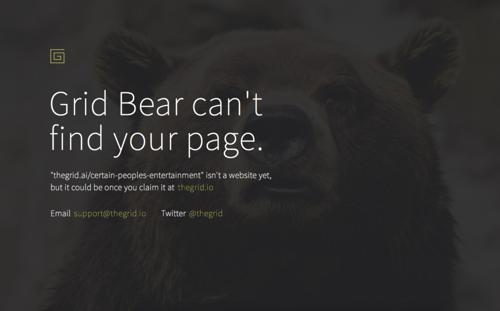
A failed AI intrusion into UX design was The Grid. Using AI to layout visual elements has some merit, and the project is still active with a number of users, but the layouts that are produced are not better, or even interesting. They are simply done without a human involved. What it is missing is the ability for individuals to express their individuality, which seems like it should have been more obvious. Instead, the algorithms make everyone look basically the same.
While there will continue to be a need for AI to make processes more efficient behind the scenes, for now I think the job of a strategist, designer, or developer is still best left in the hands of a human. Which leads me to the last trend for 2018 that (hopefully) will continue far beyond…
Communication, luckily, has not gone out of style
I’d like to end on a value that has not changed in 2017, and will continue to drive ground-breaking products and interfaces in 2018. While the tools have made collaboration easier, while bots are ready to listen for our next command, and while data drives design more than opinion, we all still have to communicate person to person.
We need to explain this evolving landscape to clients, we need to set expectations, and we need to help everyone figure out what users should be able to do (and how to do it). We need to educate everyone about the importance of a11y, when a chatbot or AI solution is right for their product and their audience, and what the ethical or social ramifications of these decisions might be.
All of this needs to be done human to human, in plain language, by listening, asking, and balancing the needs of the business and the people they want to entertain, assist, or inspire.
With that in mind, make sure that your business relationships are true partnerships, and continue to nurture them — because we can make great things together.
What is Website Information Architecture (IA)? Simply put, it’s the practice of deciding how to arrange the parts of something (in this case, content on a website or blog) so users can understand where they are, what they are looking at, and how to get where they want to go. And whether or not it’s something you stop to think about, Information Architecture is everywhere — both online and in the real world.
For example, in the real world, IA appears in the form of flight schedules and gate numbers in an airport, or “This Way to the Lions” and “Concession” signs at the zoo. When you have good IA, people understand their surroundings. They can find what they’re looking for with ease. When you have bad IA, people end up at the gate for Barcelona when they wanted to fly to Bermuda, or in the lion’s den looking for something to eat when it’s actually you on the menu.
It’s really not too different online. A website with poorly constructed IA usually leads to visitors who simply don’t. They don’t buy the product because they can’t find it. They don’t fill out your lead form because they don’t have what they need to feel comfortable sharing their info with you. And they don’t read and share your content. Instead, they leave your website.
So what are some of the key components of your website information architecture and contribute to helping your visitors find what they are looking for? These would include:
- Navigation: including top-nav, breadcrumbs, sub-navigation
- Site Search: typeahead suggestions (this is what happens when you go to Google and type in “How to make…” and it comes up with everything from “…money online” to “…fluffy slime” to “…french toast,” depending on your personal profile)
- Taxonomies: categories and tags, especially in your blog
- Attributes: colors, sizes, options, for product-based websites
- Relationships: related products, posts, or events
Challenges in Creating IA Online
Multiple Entry Points
Imagine an architect designing a new hospital. She presents a blueprint, complete with entry points for ambulatory patients, emergency patients, clinic patients, hospital departments, and visitors. There are multiple access points, and each one is intuitively designed and clearly signed, so that people can easily navigate the hospital through any door. Then the client says, Wait! Some of our patients come in other ways. Can you make sure they can get to the E.R. if they come in from the ninth-floor window on the northwest corner of the building?
That’s your website.
On average, only 50% of your visitors land on your homepage. Every page on your website is an unlocked door. Whether your users enter your world through the About Us page or your 100th blog post, you need to make sure they can find what they’re looking for — as well as what you want them to find.
Multiple Screens
We live in a multi-screen world. Very few people research products and services exclusively on a desktop computer or even a laptop. They’re checking on their grocery delivery order while standing in the bank line, or doing their online banking while they’re standing in line at the grocery store. They might make their buying decision over several searches on different screens. They may research on their laptop, but buy on their phone, or vice versa.
With people trying to access information on different devices at different times, consider whether your website makes it easy for them to do so. Can they find the content they want to read or buy the product they’ve been reading about when they switch from screen to screen?
Same Journey, Different Paths
Even though the information may be the same, people often prefer different methods of finding it. Some like to browse, looking through pictures or descriptions as if they’re flipping through a catalog. Others prefer searching, to find an item quickly. Still others may try a variety of ways to find one piece of information.
Think about when a friend recommends a book and you can’t recall the exact title. You may search the title you think it might be and come up with options. But the options aren’t the one you’re thinking of. So you click on one of the closest options, and it leads to more options you can browse. Still can’t find it, so you select categories to jog your memory, thinking: Bestsellers…Books by Female Authors…was the author Kate Simpson or Kat Sampson? I’ll know it when I see it!
Here are 3 Steps to Creating a Killer IA for your Website:
Now that you know what IA is, and the potential challenges, how do you make sure your website’s IA works for your users?
Step 1: Gather and Audit your Content
If you’re redesigning your site, run a crawler like Screaming Frog to get all your content into one place, then perform a content audit to decide what you need to keep, remove, or rewrite. Engagement stats like bounce rates, time on page, inbound links, etc., will help you make these decisions. But they aren’t the last word on the subject — tests and surveys of your current users will also provide valuable input. Once you know what to do with your current content, identify gaps where you’ll need to create new content.
If you’re creating a new site, begin by identifying your target audience(s) and their needs. What is the goal of your website? Are you selling a product online, educating your visitors, or generating leads? What are your competitors doing (or not doing)? Your content strategy should satisfy the needs of your visitor while achieving your goals. You don’t need all the content written in order to create your IA. Start with a brief description of each page’s purpose.
Step 2: Organize your Content into Categories
Categories are like buckets each drop of content falls into. We suggest keeping content in no more than 7 or 8 top-level buckets. Here, you need to think like your customer. Ask yourself how the customer accesses the site, what paths they will likely take. This will help determine the labels, nomenclature, and type of organization you need for your content.
One trick we often use is to begin the IA process by focusing first on the information that is most important to users on a mobile device. From there, you will identify what is most critical to your visitors, then add supplemental information. For example, if a visitor is researching a restaurant, they’ll need menus, location, and a phone number or link to make a reservation.
You can also use a card sorting session as a process to help organize content. Best done with an internal focus group of staff or trusted customers, a card sort allows participants to organize and rank content in categories that make sense to them. They can organize the content with labels you supply, or offer a label they feel best describes the content they will find on each page.
A word about nomenclature: don’t get too “cute” or rely on company or industry terminology. Standard conventions use labels that people are already familiar with, which creates a smoother IA. If you go overboard with unique names or industry jargon for your navigation and other categories, you’ll end up with a confused user leaving your site because the IA is too quirky to be clear.
Step 3: Test your Assumptions
Once you have completed your card sort, you can use the results to organize your content into your first version of a sitemap. We recommend using a tool like SlickPlan to help get a visual representation of the navigation paths and funnels on your site. You can also start to add calls to action and note opportunities for relational data, so that visitors can navigate your site in a way that is natural and easy for them.
Finally, test, test, and test again. Start with a navigational test without any design elements to see if users can easily find the information they need with very little information or visual cues. Treejack is a great tool for this test; we use it often to see how content navigation in an IA stands on its own.
Once the site is designed, keep testing. You can use split testing tools to constantly test new variations of your navigation, taxonomies, attributes, and relationships to learn how to improve your IA. Use heat and click mapping tools to assess where people are getting tripped up, so you can fix it. Your website IA can (and should) evolve as you understand more about how your visitors use it.
Conclusion
Information Architecture is important, and building a good IA is achievable with the simple strategies we’ve outlined here. Gather your content, get it organized, and test, test, test. You’ll create a killer IA that welcomes your website visitors, guides them, and converts them into customers. Wondering about how we can help create a killer IA for your website? Give us a call; we’d be happy to talk about it.
In the age of responsive websites, web designers love the interface unit called “The Card”. You’ve seen them, and chances are good that your website uses them, too.
While they are great for organizing information, they are not always so great for the mobile experience.
On a larger desktop screen they might organize items in a nice grid, but on a small screen, they can make the user feel like they are stuck in a stream of sameness with no end in sight. With short attention spans to battle and lots of competing sources of information, we need to hang onto every user as long as we can.
If your site has “cards” that consist of:
- An article summary with headline, date and image
- A product, with purchase button, description and link for more details
- A user bio, with headshot and contact details
- Any design pattern that repeats in long lists or grids
…than it is worth evaluating if your site design contributes to a high bounce rate, low time on site or a decrease in mobile traffic.
A Quick History and Definition of The Card
What’s this thing called the Card, anyway? An example might be a typical story from a news site, consisting of headline, maybe a date, an image, and a summary with a “Read More” link. We’ve all seen lots of these, as the Card quickly became a de facto unit of interfaces as responsive design started to take over. In short, a card is a compact summary of information in a stream of similar items.
Designers prefer to work with Cards as a user can easily discern that all of these similar things are the same type of content. That can be useful if you are looking for recent news, for example. Now you can scan a section of the homepage to see all the recent news, and it is ok that they follow the same format, because it is easy to see where this section of similar content begins and ends. If you are not looking for recent news, your eyes can skip over the entire section.
A Card is a useful device for repetitive content. But they are not without their pitfalls. The problem comes when designers shrink this grid or list of Cards down for mobile devices.
The easy design decision is to make that grid of Cards stack in a single column, one on top of the other, taking up the full width of the screen. The result is a list of items that look the same and seem to go on forever. A mobile screen isn’t big enough to show all of them and allow quick scanning, and the user has no idea how many of them are in the list. And guess what? Users see this and think that nothing else on the page is special, and they leave.
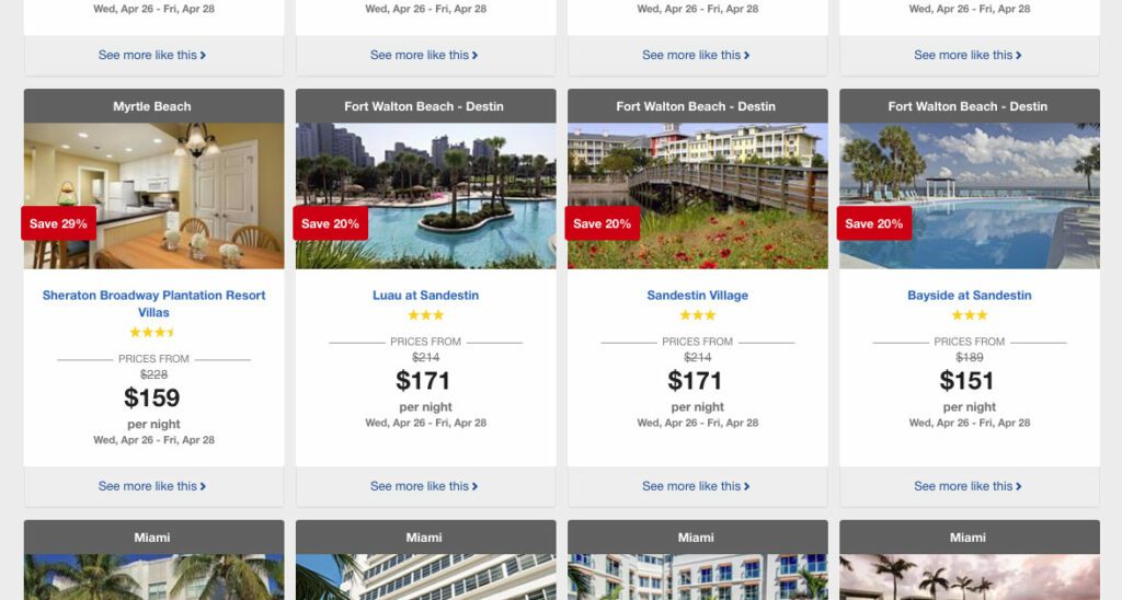
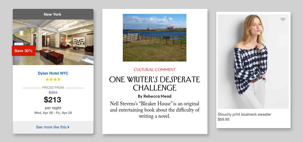
Travelocity made a mistake of letting their desktop card design change very little when it comes to mobile. A potential customer on their site is price-centric, and this design does not let them see more than one price at a time. That puts a significant amount of cognitive load in short term memory. Did I see this same travel deal for a lower price further up on the screen? Did that lower price have a high star rating as well? Were the available dates the same? A mobile user might abandon the site more quickly, frustrated that they can not comparison shop as they can on the desktop site.
Impatience is Human
We’re all impatient, and it’s getting worse. The last measure put our 8-second attention span under that of a goldfish. Web design has given users quick and easily understandable patterns to make disseminating content easier, but I believe that the standardized use of a Card has made some designers lazy as well—design a Card once, repeat it and forget about it. Mobile users? Let them scroll and scroll and scroll…
Now, I believe in scrolling. Scrolling is a necessity and people will do it. But, I do not believe in site designs that fail to engage an audience and causes people to leave a site because they were bored by seeing the same design pattern over and over again, to the point where they thought that it may never end.
Design Better Mobile Cards
How do you:
- Increase engagement on mobile devices, and get viewers to stay longer?
- Increase clicks on your content and exploration while on site?
- Get more users to consume your content and share it?
A simple solution is to think a little harder about what a mobile user wants to scan and engage with. What do they absolutely need? If your Card has a date, headline, image and blurb for desktop, is the date and blurb really needed for mobile? Does the image really need to be full screen? Will other things like color provide the visual variety that a user needs to remain interested?
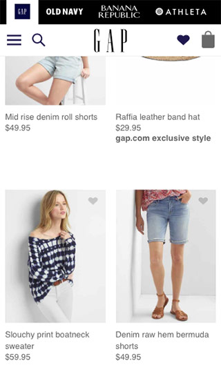
Like a lot of other sites, both the New Yorker and The Gap use Cards in their design — one is a news content site and the other is ecommerce. Still, they both realize that the mobile user needs to be able to scan quickly to find what interests them. The New Yorker decided that the images were not as important as their headlines, which makes perfect sense for them. The Gap leaned more heavily on images — clothes shopping is very visual, of course — but made sure to fit more of them on the screen.
There could be other, more interactive solutions as well:
- Hide additional card content (like the summary) off screen and make it accessible via a swipe. The user can still get a little more detail before deciding to dive into the full content.
- Use a layered approach, where the cards can stack on top of each other for quick scanning, but then a single tap can reveal the entire card and a second tap can take the user to the full content.
- Ditch the image all together. Sure, people click interesting images, but for a mobile device, if you have a user on your site, they are there for content. Drop the image and let them focus on the headlines instead (just make sure you have really good content, too)
In conclusion
Cards are an organizing principle that are not going away soon. When thinking about making iterative improvements to your website’s performance, security, and SEO, don’t forget to review the mobile design of your Cards. Could they contributing to visitors leaving too soon? Would you be willing to scroll through a list of the same Card design over and over again[1]? Make the mobile experience better for your users, because, after all, a happy user is a return user.
Related Links and Research:
- Nielsen Norman Group: Mobile Navigation: Image Grids or Text Lists?
- Nielsen Norman Group: Mobile Content: If in Doubt, Leave It Out
- Oliver Brooks for MetaLab: Mobile First, Desktop Worst, a rant about how mobile paradigms on desktop are a UI problem. Tangential, but related.
Footnotes
- Facebook and other social media networks are given credit for really starting the Card design pattern. Facebook’s activity stream uses them exclusively, and people stay on that site for a long time. But think about it… your site is probably not Facebook, which has a certain built-in voyeurism that taps into our human need to know what other people are doing. And if you really think about it, they have introduced design elements to vary cards. How about the new gradient messages? Return ⤴
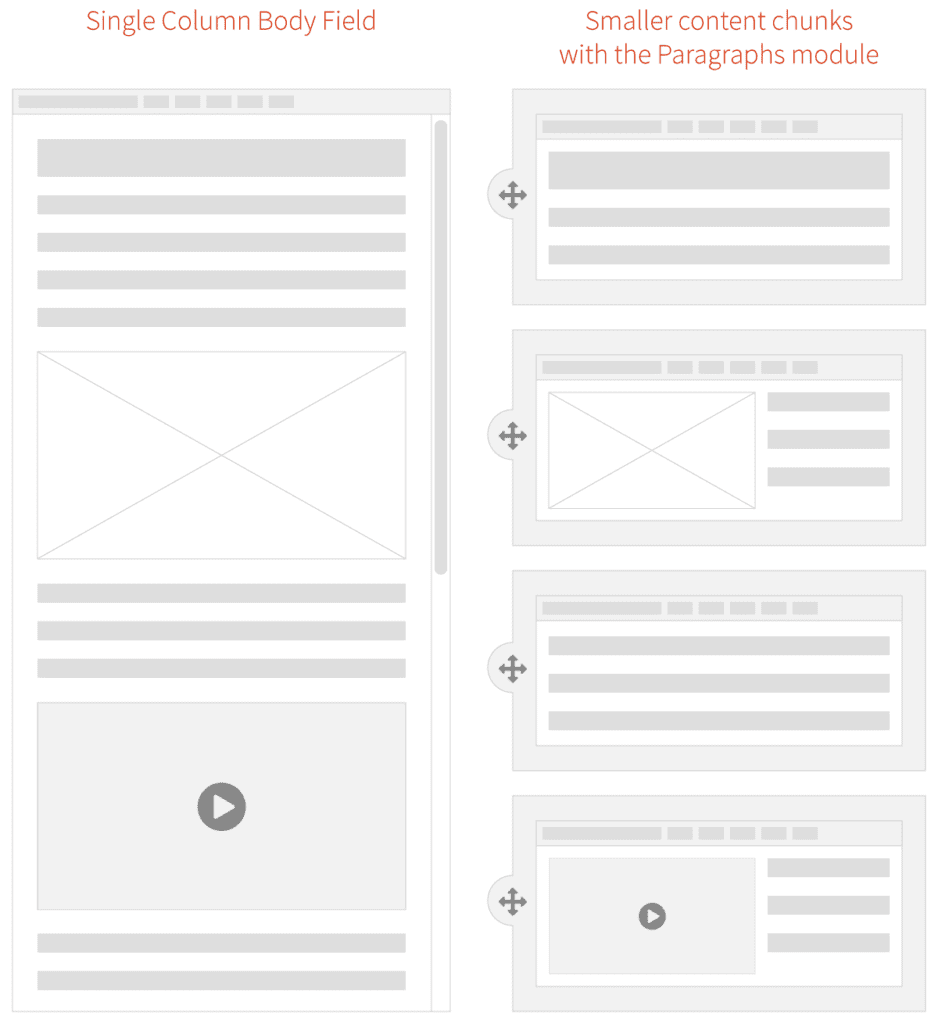
Traditional pages should be a thing of the past. The modern web experience is composed of small pieces of content arranged into a cohesive story. For an author, a single content area is fine for a blog post—a single story that expounds upon one thought. But for a modern website with many landing pages—places where the user needs to decide what they want to do next—a single content column will no longer suffice. We need modular content and a better way to manage its creation.
At An Event Apart this April, Ethan Marcotte was talking about the future of design and User Experience in a multi-device world. Specifically, he said that we should:
[…] design networks of content that are composed of patterns. These patterns, which are small responsive patterns themselves, can be stitched together to create composite experiences like pages.
In other words, the idea of “pages” needs to be blown apart into smaller patterns. Break free from the single content area and create compelling experiences for a modern audience!
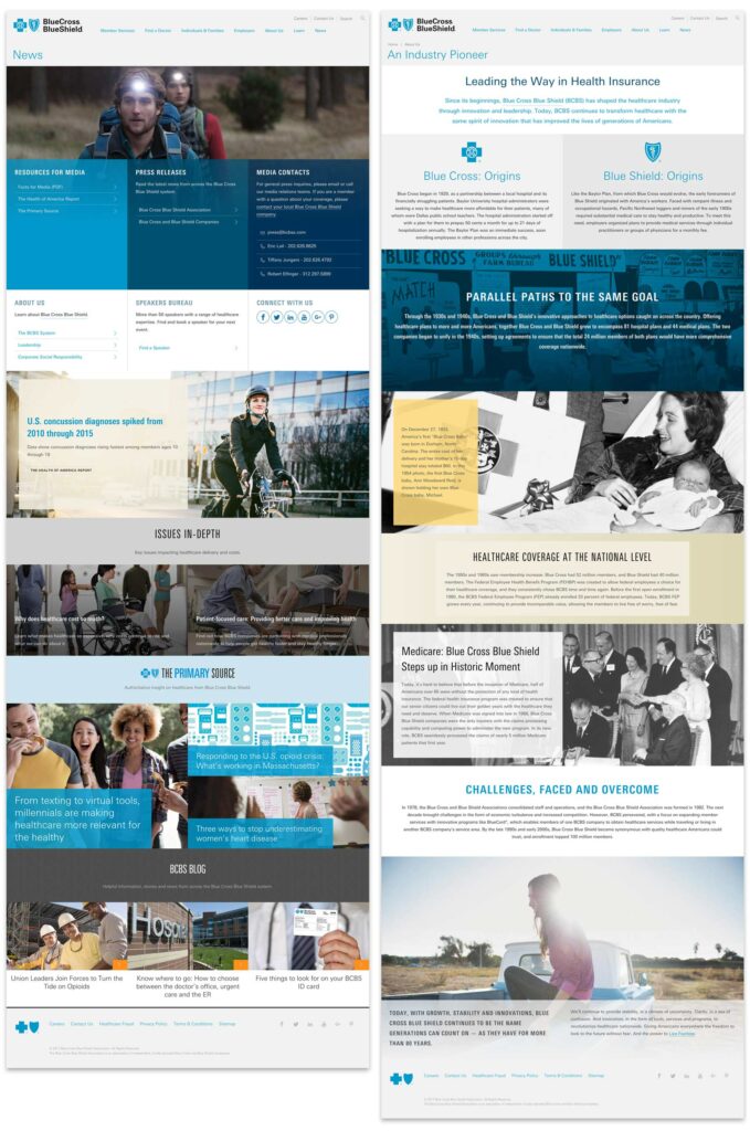
We at Oomph agree, and the roadmap that we drew last summer while designing and developing the new BCBS.com (launched in November, 2016) was already blowing the old idea of pages apart with a modular content system.
How did we get here?
Why have we been bound by a single content area? This all goes back to the prevalence of blogs and content management systems (CMSs), which, for ease of use, created just one main content area. For an author of a blog post, one content area is enough as they are writing a single story. But for business sites that need to market a product or service, it is usually not enough.
For Blue Cross and Blue Shield Association, when we were discovering ways in which we could redesign their site, we recognized that they needed to break out from the constraints of the single content area provided by CMSs. The new BCBS.com was going to be built on Drupal 8, so we needed to think about solutions within that ecosystem.
Why we Chose the Drupal Paragraphs Module
Modern CMSs have started to handle multiple chunks of content, and within the Drupal community there are a few ways to address it. The downfall—in our minds—with a few of these solutions is that they put all of the power into the hands of the authors. If you have a team of savvy people that understand interface design, responsive design, and are not afraid to get their hands dirty with some HTML, that can work. In our experience, though, it is too much power and authors are more liable to break something—either break the rendering of the page or break too far outside the brand guidelines. These solutions are difficult to use and typically get abandoned by the author.
Instead of unlimited options, what we as the design and development team wanted was the ability to define our own set of options that we could then expose to the authors. We’d build each set of options into a small responsive pattern, which allows the author to concentrate on their content and how they want to tell a story.
The Paragraphs Module can do exactly that. It adds a new field type that works like Entity References, and with it, we can define all sorts of Paragraph Types and configurable options to give to authors. For the end viewer, the experience has visual variety, but it never veers off brand or looks broken. For the author, they have many options but do not need to think about what happens to their content for mobile or tablet. Those decisions have been baked into each Paragraph Type.
What we Built for BCBSA
We based our modular design patterns on a simple “card” consisting of an optional icon, an optional background (could be color, image, or gradient), and a WYSIWYG content field. These elements had many, many options associated with them:
- 300+ icons to choose from
- 6 buttons styles in 3 different sizes
- 20 background colors
- 3 background gradients
- 11 Header styles
- 5 sizes for body copy with fluid responsive sizing
- 6 body copy colors
- Width pairings for multi-card rows
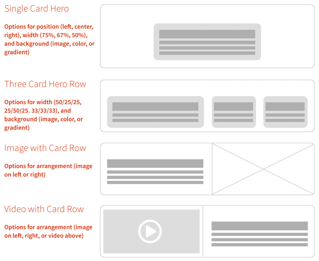
From here, we defined 10 different Paragraph “Rows” of cards and other types of content. Each of these bundles have responsive design built in — they are small responsive patterns that can be stitched together to create pages:
- Single, Two and Three Card “Heros” — text over a background color or image
- Two, Three, and Four Card Rows
- Image Card Row
- Video Card Row
- Image Gallery Row
- iFrame Row
- Wayfinding Row—a way to insert and control jump links (anchors) on a page
With these options and rows together, the BCBSA team can create fantastic long-form content pages as well as complex landing pages that can still use Drupal’s Body Content area, Featured Images, and even Blocks and Views.
Oomph & BCBSA ❤ Paragraphs
With Drupal and Paragraphs, both the Oomph and BCBSA teams are very excited about the extensive possibilities of a curated system of modular components, options, and rows. Authors have a large but controlled set of options which makes every page feel unique but on brand, and the viewers get a fully responsive experience without any additional work.
We’ve become believers in this kind of system and have already started adapting it to other clients who need to solve a similar problem. We could design a custom system of Paragraphs and options for you, too.
Resources:
- A joint presentation at Drupalcon North America, 2017 by John Eckroth, Director of Digital Experience and Strategy at Blue Cross Blue Shield Association and J. Hogue, Director of Design & UX at Oomph, Inc. (with video)
- Video of the presentation on YouTube (voiceover on top of the slide deck)
- Drupal’s Paragraphs Module page
- Psychological statistics about reading and visual comprehension, in a marketing context
- Jason Santa Maria musing on the growing prevalence of long-form content back in 2014