
We are thrilled to share that our client, Lifespan, has been named to the Nielsen Norman Group 2023 list of the ten best employee intranets in the world. Award winners are recognized worldwide for their leadership in defining the field of UX. NN/g is dedicated to improving the everyday experience of using technology. The company has evaluated thousands of websites and applications and consulted for leading brands in virtually every industry since 2001 to select the 10 best intranets annually.
A Collaborative Process
Lifespan collaborated with our team on strategy, stakeholder management, UX research, UI design, and development. We developed the intranet’s information architecture and prototyped and tested tablet versions of the mobile intranet. Our engineering team conducted a technical discovery and completed the full intranet development, which included the intranet’s custom features and integrations. The result was an intranet that met employees’ personal needs while building a sense of community across Lifespan’s large organization.
“It’s wonderful to see the culmination of so much research, feedback, conversation, and collaboration be recognized and placed among some of the best brands in the world,” said Oomph’s Director of Design & UX, J. Hogue. “This intranet required 18 months of employee-focused strategy, research, design, testing, and development with the latest technology, security best practices, and accessibility design. The result supports employees and positive patient outcomes across the hospital system. We are intensely proud of the tailored approach the teams used to create a digital experience that reflects Lifespan’s company culture.”
Helping to Connect a Remote Workforce
Lifespan is a digital workplace, and the intranet is the hub that connects employees to the hundreds of digital tools and resources they need to deliver health with care every day. Most of Lifespan’s 16,000+ employees use the intranet on a daily basis to complete their work tasks, find information about benefits, and/or read the latest news. The intranet routinely sees more than 1M page views each month. Physicians, nurses, allied professionals, and clinical support staff often use the intranet to access policies and job tools that are critical for patient care and often needed immediately. Administrative support staff rely on the intranet to access information and third-party tools that are critical to such business operations as purchasing, finance, materials management/supply chain operations, and facilities maintenance to name a few. For all users, the intranet is a central hub for department information, professional education and training, news and events, the staff directory, HR and payroll information, digital tools request services throughout the organization (both clinical and administrative), and remote access to email. Most importantly, the intranet provides a place where employees can learn what’s happening across the Lifespan system and at each individual affiliate location.
“The team responded to the importance of communication and connectedness and used those themes as the guiding strategy when redesigning the intranet. They made it more accessible, user-friendly, and contemporary, thanks to their vision, planning, and execution,” said Lifespan Senior Vice President, Marketing and Communications, Jane Bruno. “Winning this award is a testament to the hard work of Lifespan’s marketing and communications and information services teams, and their collaboration with Lifespan’s digital design and development partner, Oomph.”
There’s no doubt that all of us at Oomph are extremely proud of the outcome as well and it’s even more gratifying to work side-by-side with an organization that’s so committed to improving the employee experience. After an award-winning collaboration like this, we look forward to continuing our partnership in the years to come.
More information about the 2023 winners is on the NN/g website. The winning intranets are also featured in the NN/g’s publication, Intranet Design Annual 2023: Year’s 10 Best Intranets. The publication includes a detailed case study on Lifespan’s intranet project and the vision, working methods, and management strategies underpinning its success.
Past recipients of the top 10 intranet award include BNY Mellon, Korn Ferry, The United Nations, Barclays, 3M, The Estée Lauder Companies Inc., International Business Machines Corporation (IBM), Princeton University, and JetBlue.
Interested in learning more about Oomph’s award-winning work? Take a look at some of our favorite projects and see how we make a difference for clients nationwide.
The full press release can be found at: https://www.lifespan.org/news/lifespan-named-top-10-best-intranets-world-nielsen-norman-group-nng
THE BRIEF
Connecting People and Planet
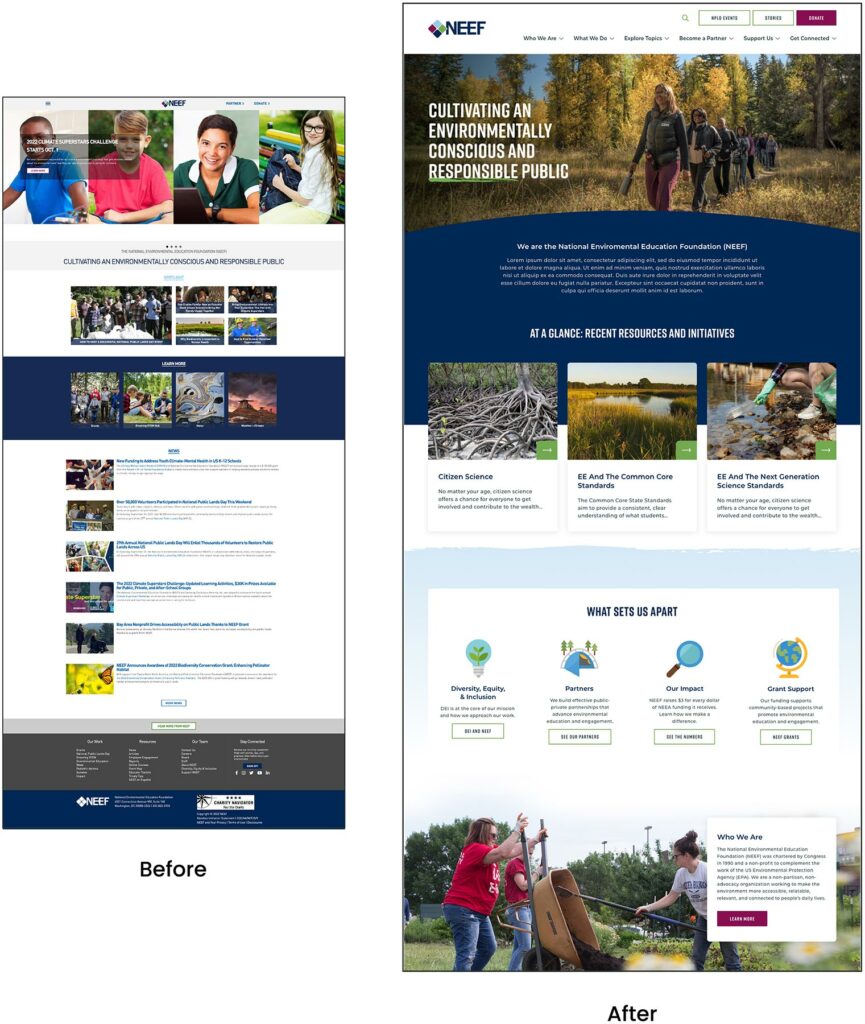
NEEF’s website is the gateway that connects its audiences to a vast array of learning experiences – but its existing platform was falling short. The organization needed more visually interesting resources and content, but it also knew its legacy Drupal site couldn’t keep up.
NEEF wanted to build a more powerful platform that could seamlessly:
- Communicate its mission and showcase its impact to inspire potential funders
- Broaden its audience reach through enhanced accessibility, content, and SEO
- Be a valuable resource by providing useful and engaging content, maps, toolkits, and online courses
- Build relationships by engaging users on the front end with easy-to-use content, then seamlessly channeling that data into back-end functionality for user-based tracking
THE APPROACH
Strategy is the foundation for effective digital experiences and the intuitive designs they require. Oomph first honed in on NEEF’s key goals, then implemented a plan to meet them: leveraging existing features that work, adding critical front- and back-end capabilities, and packaging it all in an engaging, user-centric new website.
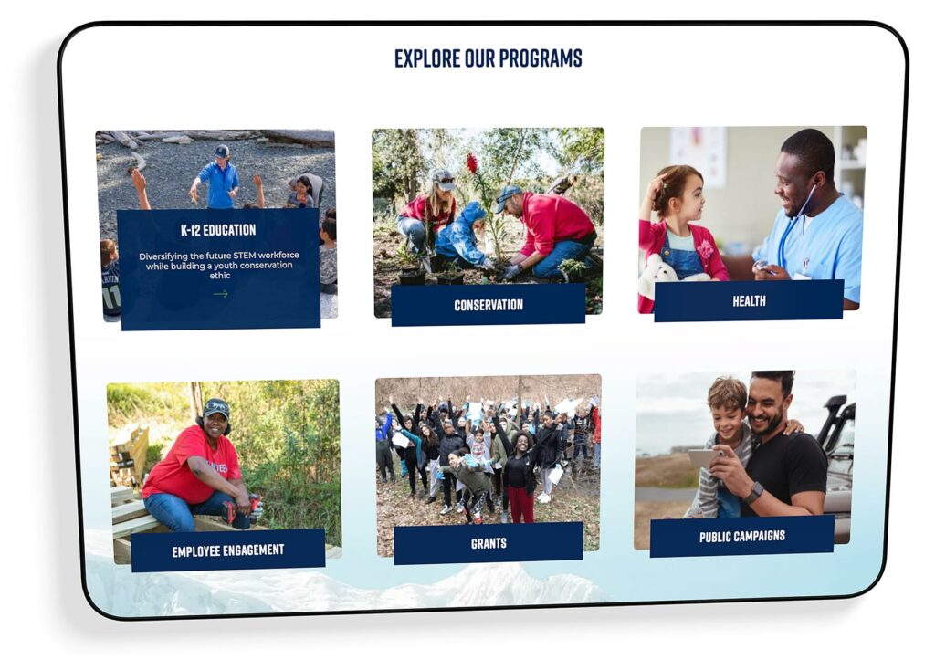
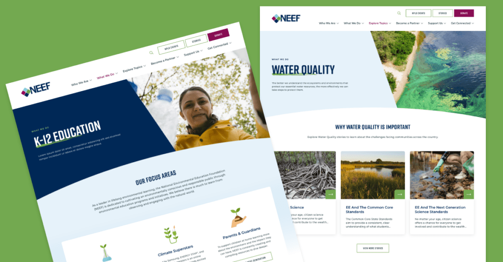
Information architecture is at the core of user experience (UX). We focused on organizing NEEF’s information to make it more accessible and appealing to its core audiences: educators, conservationists, nonprofits, and partners. Our designers then transformed that strategy into strategic wireframes and dynamic designs, all of which we developed into a custom Drupal site.
The New NEEF: User-Centered Design
A Custom Site To Fuel Connection
NEEF needed a digital platform as unique as its organization, which is why Oomph ultimately delivered a suite of custom components designed to accommodate a variety of content needs.
Engaging and thoughtful design
NEEF’s new user experience is simple and streamlined. Visual cues aid in wayfinding (all Explore pages follow the same hero structure, for example), while imagery, micro-interactions (such as hover effects) and a bold color palette draw the user in. The UX also emphasizes accessibility and inclusivity; the high contrast between the font colors and the background make the website more readable for people with visual impairments, while people with different skin tones can now see themselves represented in NEEF’s new library of 100 custom icons.
Topic-based browsing
From water conservation to climate change, visitors often come to the NEEF site to learn about a specific subject. We overhauled NEEF’s existing site map to include topic-based browsing, with pages that roll resources, storytelling, and NEEF’s impact into one cohesive package. Additional links in the footer also make it easier for specific audiences to find information, such as nonprofits seeking grants or teachers looking for educational materials.
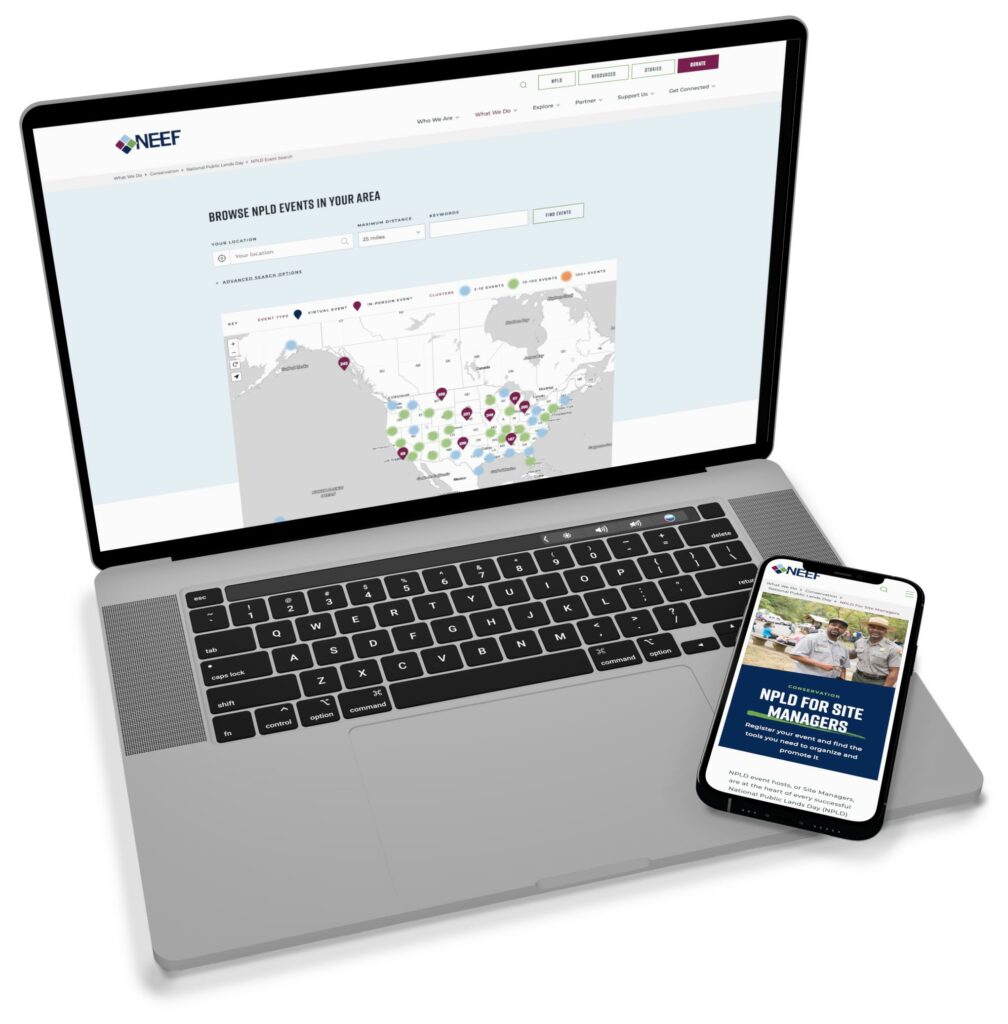
NPLD-hosted resources and event locator
Oomph refreshed existing components and added new ones to support one of NEEF’s flagship programs, National Public Lands Day (NPLD). People interested in hosting an event could use the new components to easily set one up, have their own dashboard to manage, and add their event to NEEF’s event locator. Once the event has passed, it’s automatically unlisted from the locator — but archived so hosts can duplicate and relaunch the event in future years.
THE RESULTS
Protecting the Planet, One User at a Time
Oomph helped NEEF launch its beautiful, engaging, and interactive site in May 2023. Within three months, NEEF’s team had built more than 100 new landing pages using the new component library, furthering its goal to build deeper connections with its audiences.
As NEEF’s digital presence continues to grow, so will its impact — all with the new custom site as its foundation.
We are thrilled to share that Oomph has been recognized as an Acquia Certified Drupal Cloud Practice for completing Acquia’s rigorous evaluation program, which recognizes the highest standards of technical delivery on the platform.
To earn Drupal Cloud Practice Certification, Acquia partners must meet a stringent set of technical criteria. These requirements include a core team of Acquia certified developers, significant hands-on experience delivering Acquia Drupal Cloud products to clients, and a meticulous company review with Acquia partner specialists.
“I am incredibly proud that our team has achieved this Acquia Practice Certification” said Christopher Murray, CEO at Oomph. “We have a long history of delivering impactful client solutions around Drupal and Acquia and we are passionate and excited about extending our work within the Acquia ecosystem.”
The Acquia Practice Certification Program rewards partners who demonstrate a mastery of Acquia’s Cloud Platform in three separate areas: Drupal Cloud, Marketing Cloud and DXP. These certifications are awarded to organizations with a proven record of technical achievement, and a commitment to driving transformative business engagements on the Acquia Platform.
As a Certified Drupal Cloud Practice, Oomph receives the benefits of a deeper working relationship with Acquia, and heightened visibility as a trusted technical partner.
“We’re proud to recognize Oomph as a certified Drupal Cloud Practice,” said Mark Royko, Director of Practice Development at Acquia. “At Acquia, we continually strive to serve more customers while helping our valued partners grow their businesses. With Drupal Cloud certification, we know we can count on partners like Oomph to help us reach those goals.”
This honor is one of several Acquia accolades that Oomph has achieved since becoming an Acquia Partner in 2012. This year Oomph won a 2022 Acquia Engage Award for our work designing and building the platform that powers many of the websites operated by the state of Rhode Island.
“These certifications are awarded to organizations with a proven record of technical achievement, and a commitment to driving transformative business engagements on the Acquia Platform. It helps more customers realize the tremendous value of working with Acquia’s Drupal Cloud.”
— Christopher Murray, CEO
We’re always looking to expand our Acquia knowledge to help our partners make the most of their Drupal websites. Our team leads the way on emerging Drupal practices so we can advise our clients how to build innovative websites that help them forge the best connections with their audiences.
As an Acquia Partner we are excited to help you deliver great Drupal experiences. Start by reaching out. Contact us today to connect with an expert!
How we leveraged Drupal’s native API’s to push notifications to the many department websites for the State.RI.gov is a custom Drupal distribution that was built with the sole purpose of running hundreds of department websites for the state of Rhode Island. The platform leverages a design system for flexible page building, custom authoring permissions, and a series of custom tools to make authoring and distributing content across multiple sites more efficient.
Come work with us at Oomph!
VIEW OPEN POSITIONS
The Challenge
The platform had many business requirements, and one stated that a global notification needed to be published to all department sites in near real-time. These notifications would communicate important department information on all related sites. Further, these notifications needed to be ingested by the individual websites as local content to enable indexing them for search.
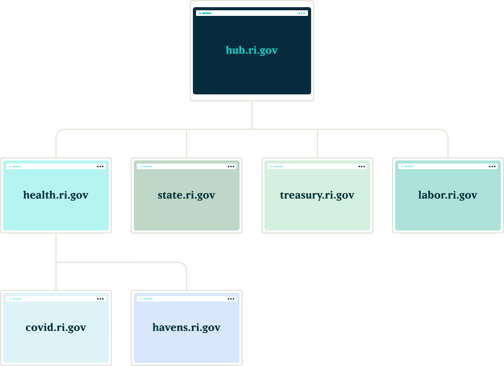
The hierarchy of the departments and their sites added a layer of complexity to this requirement. A department needs to create notifications that broadcast only to subsidiary sites, not the entire network. For example, the Department of Health might need to create a health department specific notification that would get pushed to the Covid site, the RIHavens site, and the RIDelivers sites — but not to an unrelated department, like DEM.
Exploration
Aggregator:
Our first idea was to utilize the built in Drupal aggregator module and pull notifications from the hub. A proof of concept proved that while it worked well for pulling content from the hub site, it had a few problems:
- It relied heavily on the local site’s cron job to pull updates, which led to timing issues in getting the content — it was not in near real-time. Due to server limitations, we could not run cron as often as would be necessary
- Another issue with this approach was that we would need to maintain two entity types, one for global notifications and a second for local site notifications. Keeping local and global notifications as the same entity allowed for easier maintenance for this subsystem.
Feeds:
Another thought was to utilize the Feeds module to pull content from the hub into the local sites. This was a better solution than the aggregator because the nodes would be created locally and could be indexed for local searching. Unfortunately, feeds relied on cron as well.
Our Solution
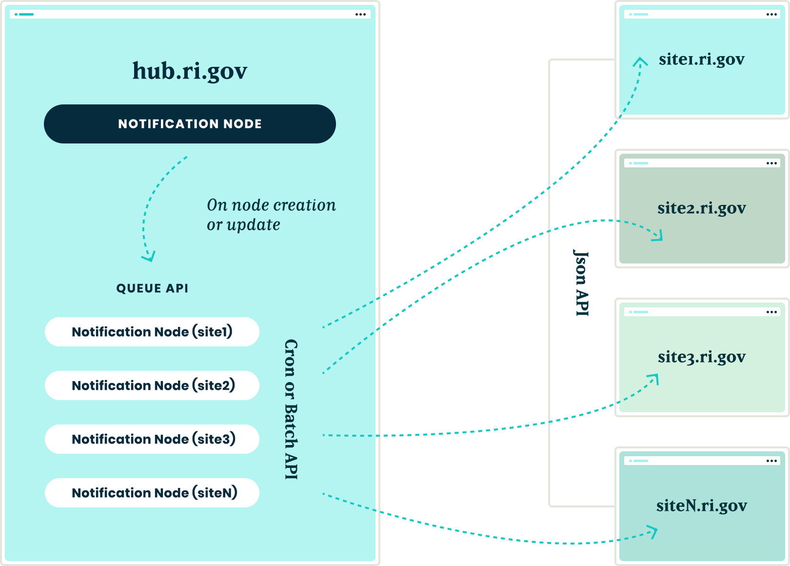
JSON API
We created a suite of custom modules that centered around moving data between the network sites using Drupal’s JSON API. The API was used to register new sites to the main hub when they came online. It was also used to pass content entities from the main hub down to all sites within the network and from the network sites back to the hub.
Notifications
In order to share content between all of the sites, we needed to ensure that the data structure was identical on all sites in the network. We started by creating a new notification content type that had a title field, a body field, and a boolean checkbox indicating whether the notification should be considered global. Then, we packaged the configuration for this content type using the Features module.
By requiring our new notification feature module in the installation profile, we ensured that all sites would have the required data structure whenever a new site was created. Features also allowed us to ensure that any changes to the notification data model could be applied to all sites in the future, maintaining the consistency we needed.
Network Domain Entity
In order for the main hub, ri.gov, to communicate with all sites in the network, we needed a way to know what Drupal sites existed. To do this, we created a custom configuration entity that stored the URL of sites within the network. Using this domain entity, we were able to query all known sites and passed the global notification nodes created on ri.gov to each known site using the JSON API.
Queue API:
To ensure that the notification nodes were posted to all the sites without timeouts, we decided to utilize Drupal’s Queue API. Once the notification content was created on the ri.gov hub, we queried the known domain entities and created a queue item that would use cron to actually post the notification node to each site’s JSON API endpoint. We decided to use cron in this instance to give us some assurance that a post to many websites wouldn’t timeout and fail.
Batch API
To allow for time sensitive notifications to be pushed immediately, we created a custom batch operation that reads all of the queued notifications and pushes them out one at a time. If any errors are encountered, the notification is re-queued at the end of the stack and the process continues until all notifications have been posted to the network sites.
New site registrations
In order to ensure that new sites receive notifications from the hub, we needed a site registration process. Whenever a new site is spun up, a custom module is installed that calls out to the hub using JSON API and registers itself by creating a new network domain entity with it’s endpoint URL. This allows the hub to know of the new site and can push any new notifications to this site in the future.
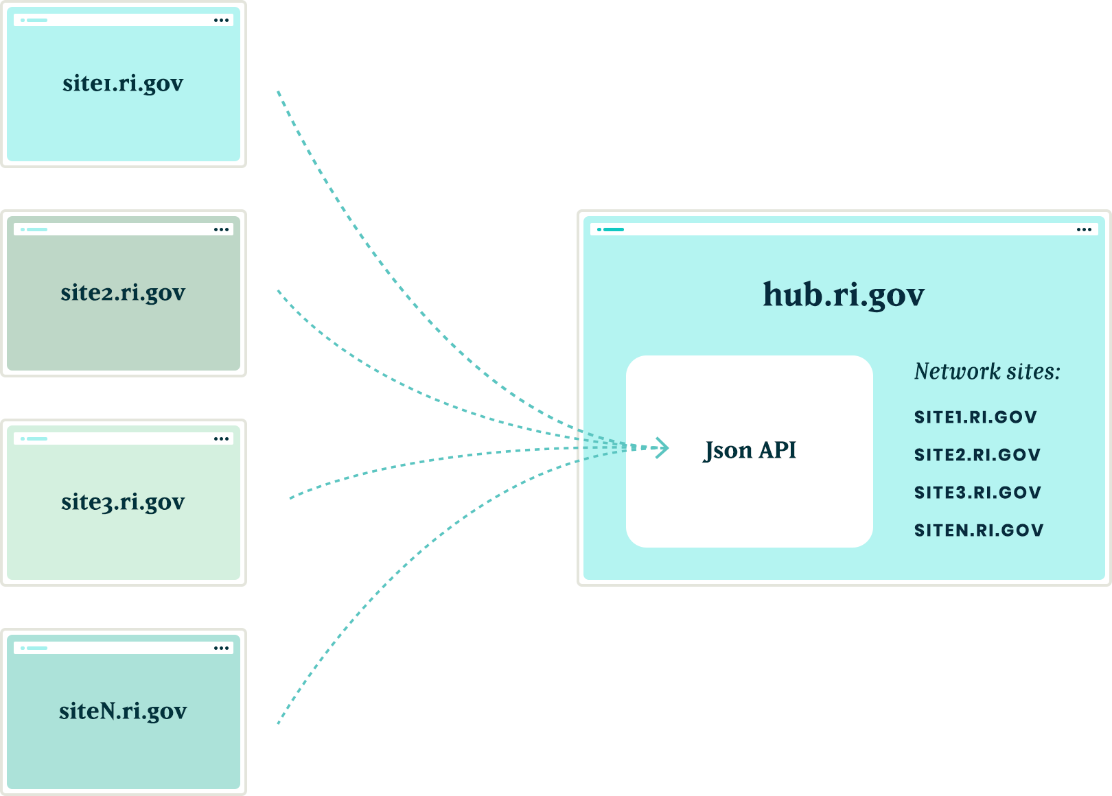
The installation process will also query the hub for any existing notifications and, using the JSON API, get a list of all notification nodes from the hub to add them to it’s local queue for creation. Then, the local site uses cron to query the hub and get the details of each notification node to create it locally. This ensured that when a new site comes online, it will have an up to date list of all the important notifications from the hub.
Authentication
Passing this data between sites is one challenge, but doing it securely adds another layer of complexity. All of the requests going between the sites are authenticating with each other using the Simple Oauth module. When a new site is created, an installation process creates a dedicated user in the local database that will own all notification nodes created with the syndication process. The installation process also creates the appropriate Simple OAuth consumers which allows the authenticated connections to be made between the sites.
Department sites
Once all of the groundwork was in place, with minimal effort, we were able to allow for department sites to act as hubs for their own department sites. Thus, the Department of Health can create notifications that only go to subsidiary sites, keeping them separate from adjacent departments.
Translations
The entire process also works with translations. After a notification is created in the default language, it gets queued and sent to the subsidiary sites. Then, a content author can create a translation of that same node and the translation will get queued and posted to the network of sites in the same manner as the original. All content and translations can be managed at the hub site, which will trickle down to the subsidiary sites.
Moving in the opposite direction
With all of the authorization, queues, batches, and the API’s in place, the next challenge was making this entire system work with a Press Release content type. This provided two new challenges that we needed to overcome:
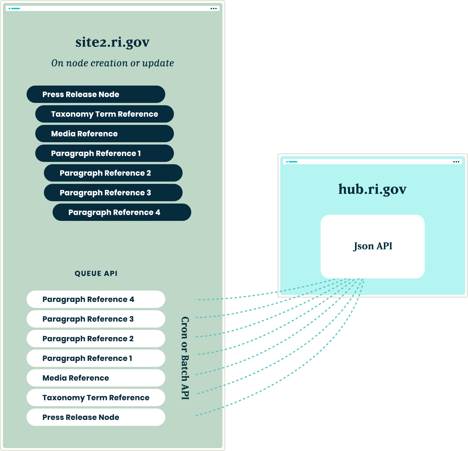
- Instead of moving content from the top down, we needed to move from the bottom up. Press release nodes get created on the affiliate sites and would need to be replicated on the hub site.
- Press release nodes were more complex than the notification nodes. These content types included media references, taxonomy term references and toughest of all, paragraph references.
Solving the first challenge was pretty simple – we were able to reuse the custom publishing module and instructed the queue API to send the press release nodes to the hub sites.
Getting this working with a complex entity like the press release node meant that we needed to not only push the press release node, but we also needed to push all entities that the initial node referenced. In order for it all to work, the entities needed to be created in reverse order.
Once a press release node was created or updated, we used the EntityInterface referencedEntities() method to recursively drill into all of the entities that were referenced by the press release node. In some cases, this meant getting paragraph entities that were nested two, three, even four levels deep inside of other paragraphs. Once we reached the bottom of the referenced entity pile, we began queuing those entities from the bottom up. So, the paragraph that was nested four levels deep was the first to get sent and the actual node was the last to get sent
Are you a developer looking to grow your skills? Join our team.
Conclusion
Drupal’s powerful suite of API’s gave us all the tools necessary to come up with a platform that will allow the State of Rhode Island to easily keep their citizens informed of important information, while allowing their editing team the ease of a create once and publish everywhere workflow.
The Challenge
Execute on a digital platform strategy for a global private equity firm to create a centralized employee destination to support onboarding, create interpersonal connections between offices, and drive employee satisfaction.
The key components would be an employee directory complete with photos, bios, roles and organizational structure; News, events, and other communications made easily available and organized per location as well as across all locations; The firm’s investment portfolio shared through a dashboard view with all pertinent information including the team involved.
These components, and the expected tactical assets that an intranet provides, would help the firm deepen connections with and among employees at the firm, accelerate onboarding, and increase knowledge sharing.
The Approach
Supporting Multiple Intentions: Browsing vs. Working
An effective employee engagement platform, or intranet, needs to support two distinct modes — task mode and explore mode. In task mode, employees have access to intuitive navigation, quick page loading, and dynamic search or filtering while performing daily tasks. They get what they need fast and proceed with their day.
At the same time, a platform must also encourage and enable employees to explore company knowledge, receive company-wide communications, and connect with others. For this firm, the bulk of content available in explore mode revolves around the firm’s culture, with a special focus on philanthropic initiatives and recognition of key successes.
Both modes benefit from intuitive searching and filtering capabilities for team members, news, events, FAQs, and portfolio content. News and events can be browsed in a personalized way — what is happening at my location — or a global way — what is happening across the company. For every interaction within the platform, the mode was considered and influential of nearly all design decisions.
From a technical standpoint, the private equity firm needed to support security by hosting the intranet on their own network. This and the need to completely customize the experience for close alignment with their brand meant that no off-the-shelf pre-built intranet solution would work. We went with Drupal 8 to make this intranet scalable, secure, and tailor-made to an optimal employee experience.
The Results
The platform deployment came at a time when it was most needed, playing a crucial role for the firm during a global pandemic that kept employees at home. What was originally designed as a platform to deepen employee connections between offices quickly became the firm’s hub for connecting employees within an office. As many businesses are, the firm is actively re-evaluating its approach to the traditional office model, and the early success of the new platform indicates that it is likely to play an even larger role in the future.
THE BRIEF
Transform the Experience
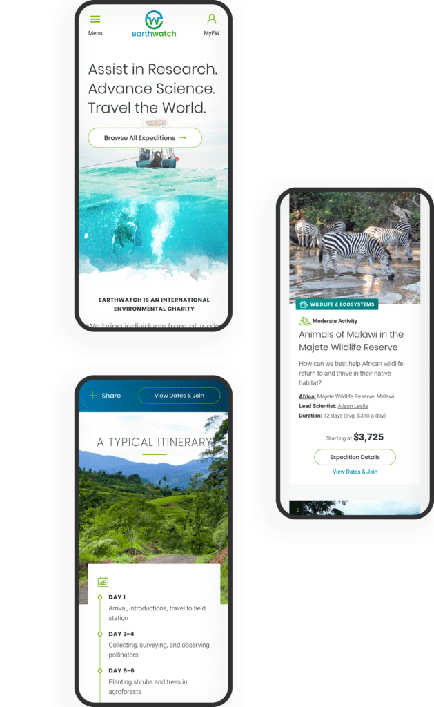
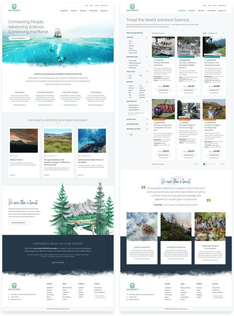
The core Earthwatch experience happens outdoors in the form of an expedition — usually for about a week and far away from technology in locations like the Amazon Basin, Uganda, or the Great Barrier Reef. But before this in-person experience happens, an expedition volunteer encounters a dizzying array of digital touchpoints that can sow confusion and lead to distrust. Earthwatch needed “Experience Transformation.”
SURVEY THE LANDSCAPE
Starting with a deep strategy and research engagement, Oomph left no stone unturned in cataloging users and their journeys through a decade’s worth of websites and custom applications. We were able to conduct multiple interview sessions with engaged advocates of the organization. Through these interviews, the Earthwatch staff learned how to conduct more interviews themselves and listen to their constituents to internalize what they find wonderful about the experience as well as what they find daunting.
CREATE THE MAP
With a high-level service blueprint in place, Oomph then set out to transform the digital experiences most essential to the organization: the discovery and booking journey for individuals and the discovery, research, and inquiry journey for corporate sustainability programs.
The solution took shape as an overhaul and consolidation of Earthwatch’s public-facing websites.
THE RESULTS
The Journey Before the Journey
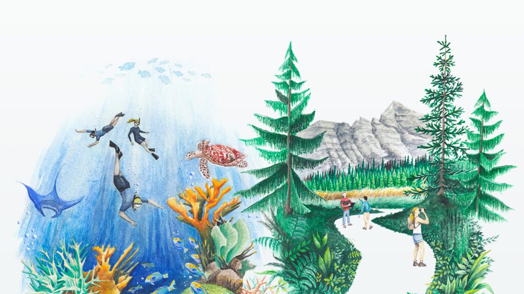
A fresh design approach that introduces new colors, beautiful illustrations, and captivating photography.
Expedition discovery, research, and booking was transformed into a modern e-commerce shopping experience.
Corporate social responsibility content architecture was overhauled with trust-building case studies and testimonials to drive an increase in inquiries.
IN THEIR WORDS
The Oomph team far surpassed our (already high!) expectations. As a nonprofit, we had a tight budget and knew it would be a massive undertaking to overhaul our 7-year-old site while simultaneously launching an organizational rebrand. Oomph helped to guide us through the entire process, providing the right level of objective, data-driven expertise to ensure we were implementing user experience and design best practices. They listened closely to our needs and helped to make the website highly visual and engaging while streamlining the user journey. Thanks to their meticulous project management and time tracking, we successfully launched the site on time and exactly on budget.
ALIX MORRIS MHS, MS, Director of Communications, Earthwatch
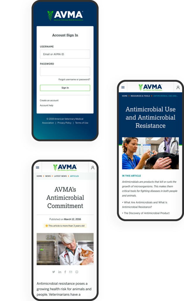
THE BRIEF
The American Veterinary Medical Association (AVMA) advocates on behalf of 91,000+ members — mostly doctors but some veterinary support staff as well. With roots as far back as 1863, their mission is to advance the science and practice of veterinary medicine and improve animal and human health. They are the most widely recognized member organization in the field.
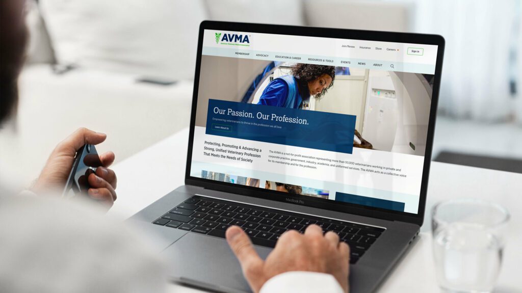
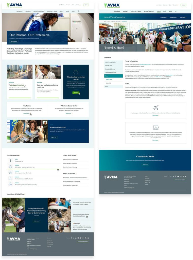
Make the Brand Shine
The AVMA website is the main communications vehicle for the organization. But the framework was very out of date — the site was not mobile-friendly and some pages were downright broken. The brand was strong, but the delivery on screen was weak and the tools reflected poorly.
Our goals were to:
IMPROVE THE SITE MAP
Content bloat over the years created a site tree that was in bad need of pruning.
IMPROVE SEARCH
When a site has so much content to offer, search can be the quickest way to find relevant information for a motivated user. Our goals were to make search more powerful while maintaining clarity of use.
COMMUNICATE THE VALUE OF MEMBERSHIP
Resources and benefits that come with membership were not clearly illustrated and while members were renewing regularly, they were not interacting with the site as a resource as often as they could.
STRENGTHEN THE BRAND
If the site was easier to navigate and search, if it had a clear value proposition for existing and prospective members, and if the visual design were modern and device-friendly, the brand would be stronger.
THE APPROACH
Put Members First
Oomph embarked on an extensive research and discovery phase which included:
- A competitor Analysis of 5 groups in direct competition and 5 similar membership-driven organizations
- An online survey for the existing audience
- A content and SEO audits
- Several in-person workshops with stakeholder groups, including attendance at their annual convention to conduct on-the-spot surveys
- More phone interviews with volunteers, members, and additional stakeholders
With a deep bed of research and personal anecdotes, we began to architect the new site. Communication was high as well, with numerous marketing, communications, and IT team check-ins along the way:
- An extensive card sort exercise for information architecture improvements — 200+ cards sorted by 6 groups from throughout the organization
- A new information architecture and audience testing
- A content modeling and content wireframe exercises
- A brand color accessibility audit
- Over a dozen wireframes
- Three style tiles (mood boards) with revisions and refinements
- Wireframe user testing
- A set of deep-dive technical audits
- Several full design mockups with flexible component architecture
Several rounds of style tiles explored a new set of typefaces to support a modern refresh of the brand. Our ideas included darkening colored typography to meet WCAG thresholds, adding more colored tints for design variability, and designing a set of components that could be used to create marketing pages using Drupal’s Layout Builder system.
THE RESULTS
The design update brought the main brand vehicle fully into the modern web. Large headlines and images, chunks of color, and a clearer hierarchy of information makes each pages’ purpose shine. A mega-menu system breaks complex navigation into digestible parts, with icons and color to help differentiate important sections. The important yearly convention pages got a facelift as well, with their own sub-navigation system.
FINAL THOUGHTS
Supporting Animals & Humans Alike
Membership to the AVMA for a working veterinary doctor is an important way to keep in touch with the wider community while also learning about the latest policy changes, health updates, and events. The general public can more easily find information about common pet health problems, topical issues around animal well-being during natural disasters, and food and toy recalls. The goal of supporting members first while more broadly providing value to prospective members and non-members alike has coalesced into this updated digital property.
We look forward to supporting animal health and human safety as we continue to support and improve the site over the next year.