
As a back-end developer, I’m used to building stuff that people interact with every day but never actually see. I create that layer beneath the surface that makes things work the way people expect them to — and I’m the one who gets called in when something goes wrong. Either way, I spend a lot of time unraveling puzzles and reimagining solutions, forever pushing the limits of what software can do.
I make things work; that’s what I love about my job. It’s also the reason why I like being part of the Open Source Software (OSS) community. OSS offers nearly infinite opportunities to solve problems or build things that didn’t exist before.
Plus, as an open source contributor, by writing one little fix you could be helping hundreds or thousands of digital platforms.
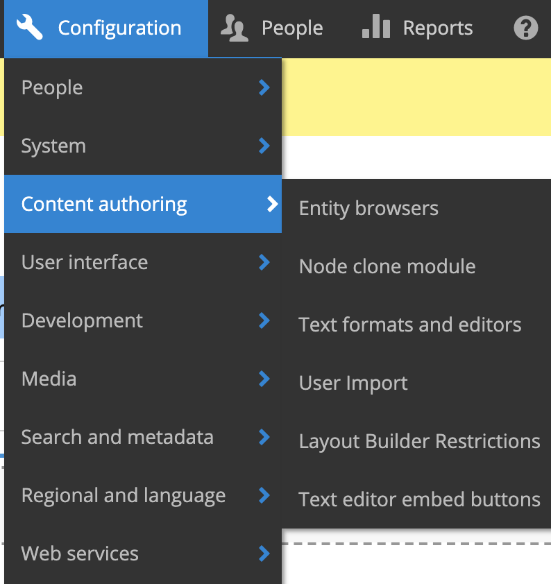
Why Open Source Matters to Me
I first got involved with OSS back in 2007, when I used Drupal CMS for a client project. I spent a few years getting comfortable with the software and kind of dipping a toe in the community aspect. After a while, I’d been consuming Drupal so much that I started to feel bad about using all that free software and not giving anything back.
Then I had a project come along that needed a custom feature for Drupal that didn’t exist yet in the open source space. I wrote the module and gave it back to the community, working through other open source contributors who needed it too. That’s when I discovered how rewarding it is when you build something and people actually use it.
When you’re working on a project and you find a problem, you could just fix it and move on. But when you say, “Hey, somebody else might find this useful,” and you take that extra 30 minutes to give the code back to the community, you make everybody better.
I love the feeling that giving back gives you, especially when you fix something that thousands of other people use.
From Dipping a Toe to the Deep End
For me, being an OSS contributor comes with a sense of responsibility. It’s rewarding when you fix an issue for other developers, but it also makes you not want to screw up something that thousands of other sites report using. So I’m always mindful of releasing quality code. Maybe that’s also why I became a maintainer.
Years ago, I was using a contributed theme that someone else had written as a starting point for a lot of the projects I worked on. Then the sole maintainer passed away, and a lot of us still wanted to use the theme. So a coworker and I offered to maintain it — I couldn’t just walk away from something I’d been benefiting from for so long.
Today, I regularly submit code to open source communities, and I’m a maintainer of nine different open source modules. How did that happen, you ask? Well… sometimes I’ll recommend that a client uses an unmaintained module in their application, and then, you know, somebody’s got to take care of it.
What can I say? I also feed the stray cats in my neighborhood.
I Get to Do This for Work?!
Problem-solving is the best part of my job. And with OSS, you’re always going to have a problem to solve, or a bug to fix, or a new feature to build every time someone says, “You know, it would be great if this module did this.” That’s when my teammates and I roll up our sleeves and say, “Okay, how are we going to make this work?” When we find a solution, we give it back.
Fortunately, I work at an agency that actively encourages us to make open source contributions. We recognize the value we get from OSS, and that’s why we go the extra mile to support the community. I can build OSS fixes while I’m working on client projects, or take professional growth days to focus on open source work.
I don’t know if that’s true of all agencies, but I’m lucky enough to work somewhere that believes in making an impact.
Want to come build things with us? Check out our open positions.
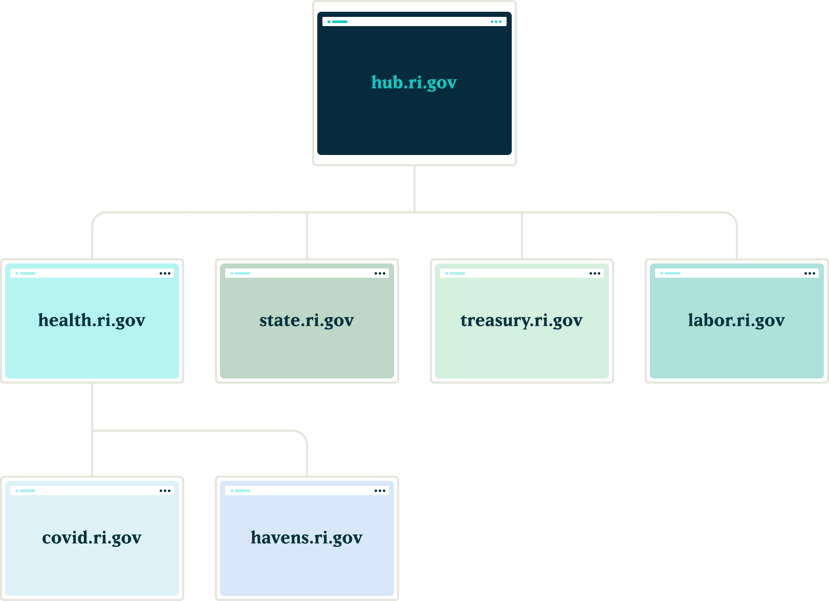
How we leveraged Drupal’s native API’s to push notifications to the many department websites for the State.RI.gov is a custom Drupal distribution that was built with the sole purpose of running hundreds of department websites for the state of Rhode Island. The platform leverages a design system for flexible page building, custom authoring permissions, and a series of custom tools to make authoring and distributing content across multiple sites more efficient.
Come work with us at Oomph!
VIEW OPEN POSITIONS
The Challenge
The platform had many business requirements, and one stated that a global notification needed to be published to all department sites in near real-time. These notifications would communicate important department information on all related sites. Further, these notifications needed to be ingested by the individual websites as local content to enable indexing them for search.
The hierarchy of the departments and their sites added a layer of complexity to this requirement. A department needs to create notifications that broadcast only to subsidiary sites, not the entire network. For example, the Department of Health might need to create a health department specific notification that would get pushed to the Covid site, the RIHavens site, and the RIDelivers sites — but not to an unrelated department, like DEM.
Exploration
Aggregator:
Our first idea was to utilize the built in Drupal aggregator module and pull notifications from the hub. A proof of concept proved that while it worked well for pulling content from the hub site, it had a few problems:
- It relied heavily on the local site’s cron job to pull updates, which led to timing issues in getting the content — it was not in near real-time. Due to server limitations, we could not run cron as often as would be necessary
- Another issue with this approach was that we would need to maintain two entity types, one for global notifications and a second for local site notifications. Keeping local and global notifications as the same entity allowed for easier maintenance for this subsystem.
Feeds:
Another thought was to utilize the Feeds module to pull content from the hub into the local sites. This was a better solution than the aggregator because the nodes would be created locally and could be indexed for local searching. Unfortunately, feeds relied on cron as well.
Our Solution
JSON API
We created a suite of custom modules that centered around moving data between the network sites using Drupal’s JSON API. The API was used to register new sites to the main hub when they came online. It was also used to pass content entities from the main hub down to all sites within the network and from the network sites back to the hub.
Notifications
In order to share content between all of the sites, we needed to ensure that the data structure was identical on all sites in the network. We started by creating a new notification content type that had a title field, a body field, and a boolean checkbox indicating whether the notification should be considered global. Then, we packaged the configuration for this content type using the Features module.
By requiring our new notification feature module in the installation profile, we ensured that all sites would have the required data structure whenever a new site was created. Features also allowed us to ensure that any changes to the notification data model could be applied to all sites in the future, maintaining the consistency we needed.
Network Domain Entity
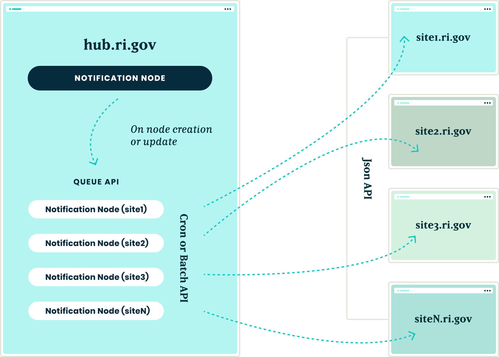
In order for the main hub, ri.gov, to communicate with all sites in the network, we needed a way to know what Drupal sites existed. To do this, we created a custom configuration entity that stored the URL of sites within the network. Using this domain entity, we were able to query all known sites and passed the global notification nodes created on ri.gov to each known site using the JSON API.
Queue API:
To ensure that the notification nodes were posted to all the sites without timeouts, we decided to utilize Drupal’s Queue API. Once the notification content was created on the ri.gov hub, we queried the known domain entities and created a queue item that would use cron to actually post the notification node to each site’s JSON API endpoint. We decided to use cron in this instance to give us some assurance that a post to many websites wouldn’t timeout and fail.
Batch API
To allow for time sensitive notifications to be pushed immediately, we created a custom batch operation that reads all of the queued notifications and pushes them out one at a time. If any errors are encountered, the notification is re-queued at the end of the stack and the process continues until all notifications have been posted to the network sites.
New site registrations
In order to ensure that new sites receive notifications from the hub, we needed a site registration process. Whenever a new site is spun up, a custom module is installed that calls out to the hub using JSON API and registers itself by creating a new network domain entity with it’s endpoint URL. This allows the hub to know of the new site and can push any new notifications to this site in the future.
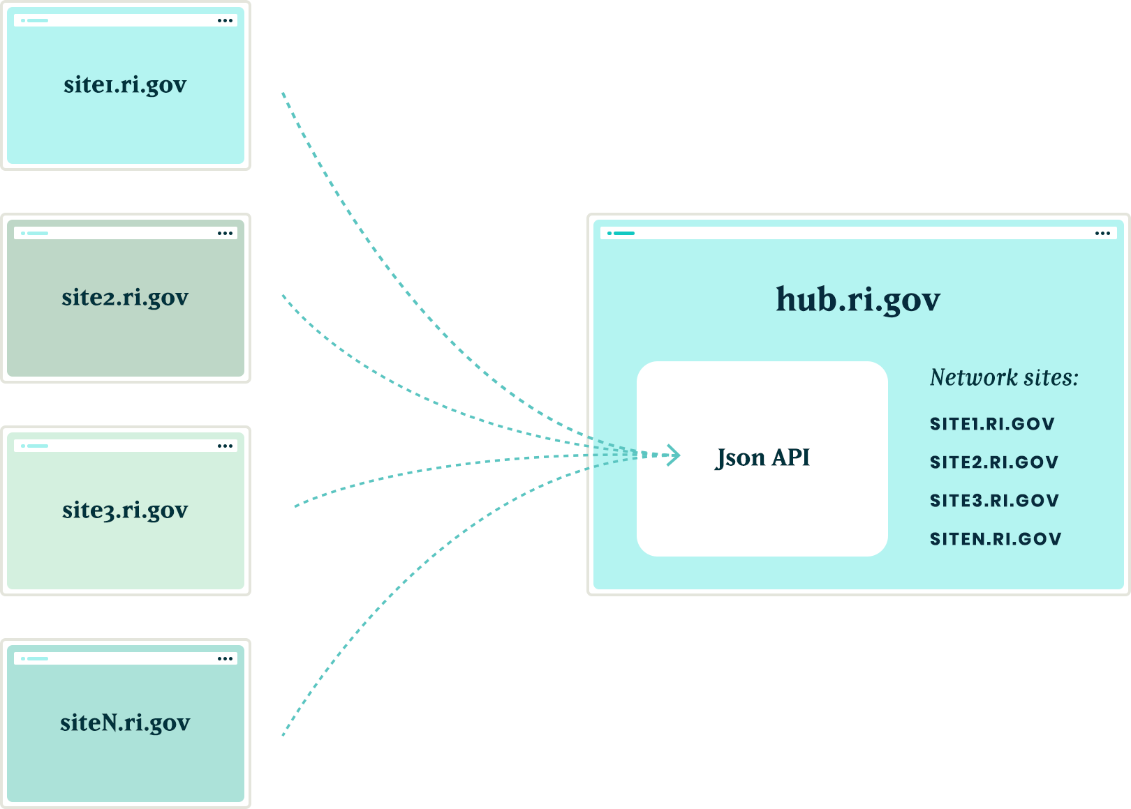
The installation process will also query the hub for any existing notifications and, using the JSON API, get a list of all notification nodes from the hub to add them to it’s local queue for creation. Then, the local site uses cron to query the hub and get the details of each notification node to create it locally. This ensured that when a new site comes online, it will have an up to date list of all the important notifications from the hub.
Authentication
Passing this data between sites is one challenge, but doing it securely adds another layer of complexity. All of the requests going between the sites are authenticating with each other using the Simple Oauth module. When a new site is created, an installation process creates a dedicated user in the local database that will own all notification nodes created with the syndication process. The installation process also creates the appropriate Simple OAuth consumers which allows the authenticated connections to be made between the sites.
Department sites
Once all of the groundwork was in place, with minimal effort, we were able to allow for department sites to act as hubs for their own department sites. Thus, the Department of Health can create notifications that only go to subsidiary sites, keeping them separate from adjacent departments.
Translations
The entire process also works with translations. After a notification is created in the default language, it gets queued and sent to the subsidiary sites. Then, a content author can create a translation of that same node and the translation will get queued and posted to the network of sites in the same manner as the original. All content and translations can be managed at the hub site, which will trickle down to the subsidiary sites.
Moving in the opposite direction
With all of the authorization, queues, batches, and the API’s in place, the next challenge was making this entire system work with a Press Release content type. This provided two new challenges that we needed to overcome:
- Instead of moving content from the top down, we needed to move from the bottom up. Press release nodes get created on the affiliate sites and would need to be replicated on the hub site.
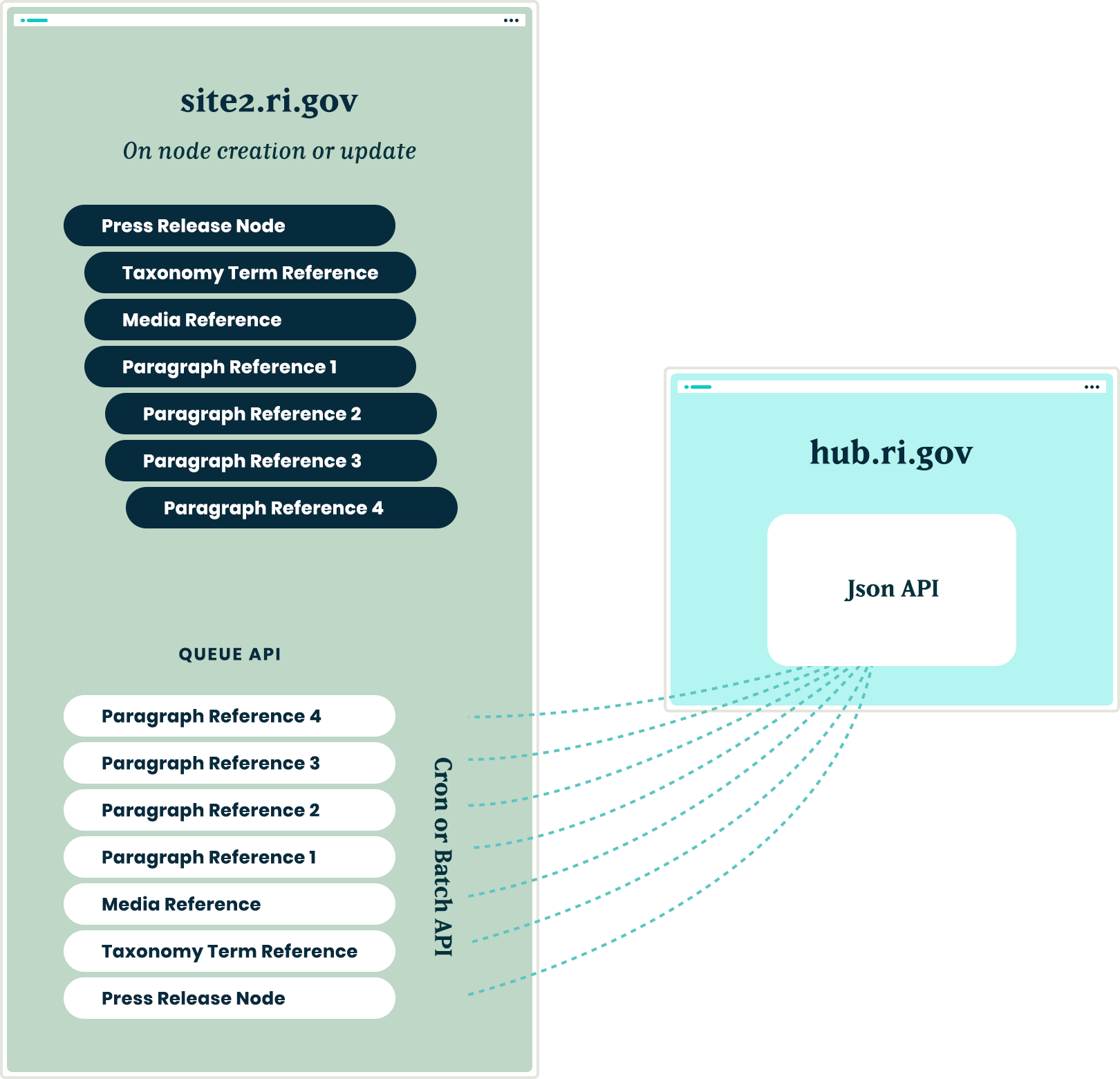
- Press release nodes were more complex than the notification nodes. These content types included media references, taxonomy term references and toughest of all, paragraph references.
Solving the first challenge was pretty simple – we were able to reuse the custom publishing module and instructed the queue API to send the press release nodes to the hub sites.
Getting this working with a complex entity like the press release node meant that we needed to not only push the press release node, but we also needed to push all entities that the initial node referenced. In order for it all to work, the entities needed to be created in reverse order.
Once a press release node was created or updated, we used the EntityInterface referencedEntities() method to recursively drill into all of the entities that were referenced by the press release node. In some cases, this meant getting paragraph entities that were nested two, three, even four levels deep inside of other paragraphs. Once we reached the bottom of the referenced entity pile, we began queuing those entities from the bottom up. So, the paragraph that was nested four levels deep was the first to get sent and the actual node was the last to get sent
Are you a developer looking to grow your skills? Join our team.
Conclusion
Drupal’s powerful suite of API’s gave us all the tools necessary to come up with a platform that will allow the State of Rhode Island to easily keep their citizens informed of important information, while allowing their editing team the ease of a create once and publish everywhere workflow.
Each spring, students at the Rhode Island School of Design (RISD) exhibit their undergraduate and master’s thesis projects at the RISD Museum. Due to Covid-19, they were unable to prepare and stage physical exhibits in the spring of 2020.
Not to be deterred, the school and museum agreed to host the student work online as fully digital exhibits. The Museum previously partnered with Oomph to build out the award-winning “Raid the Icebox” online publication using Drupal and Layout Builder, so it felt familiar and natural to build out similar features for university student projects.
The necessary work involved extending the existing online gallery features to hundreds of additional artists, so we needed to build a system that could scale. Along the way, while we were at it, we were tasked with adding additional features to the platform. Why not have lofty goals?
The Timeline
We kicked off the first stage of the project on April 20, 2020, aiming for a two-staged release. Most of the new code would need to be deployed by the last week of May, with the additional features released two weeks later. The basic infrastructure would have to be established along with the custom permissions for artists, editors, and museum administrators. A second stage would add refinement to font selection and color palette.
What the Artists Needed
- A platform for routine editor tasks such as editing content, uploading media, altering the layout, and resources to perform many tasks outside the usual scope of content editors.
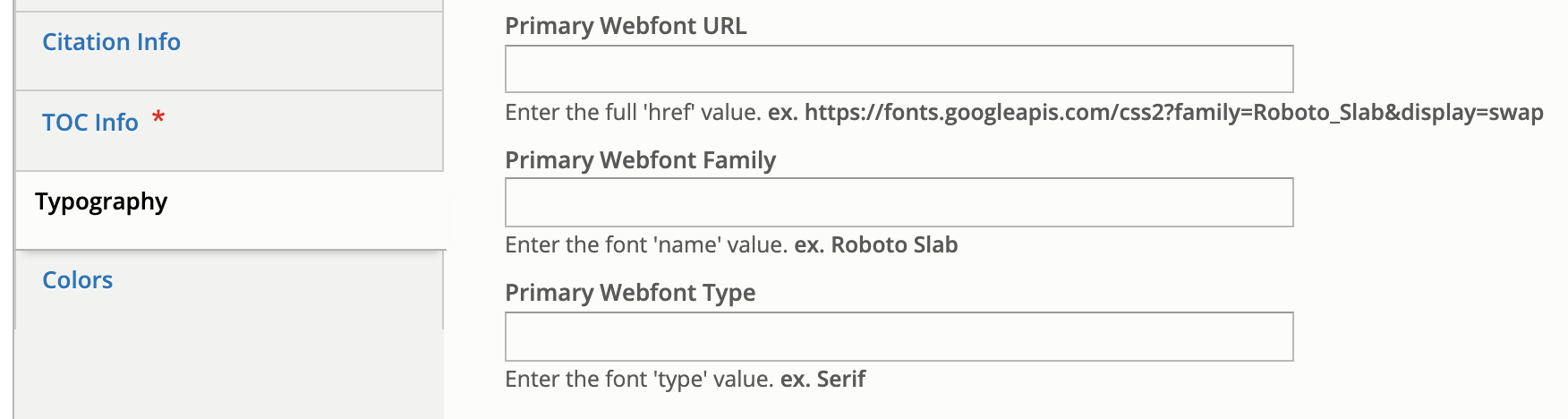
- The ability to add primary, secondary, and system webfonts to custom content types as well as their associated layout builder templates.
- A custom color palette whose colors were chosen by an admin user. This kind of style addition had to be available through Layout Builder for new publication nodes.
- A few trusted student authors also needed the ability to add JavaScript directly1 into page content. This was an intimidating requirement from a security standpoint, but the end results were highly engaging.

What the Staff Needed
- A robust set of permissions to enable multiple departments to have ownership and administrative controls over their particular domains, including:
- Bulk upload of new users in anticipation of needing to add hundreds of students.
- Node clone functionality (the ability to duplicate pages) to speed up time creating new pieces of content.
- Custom permissions for trusted editors for all content in a particular section.
- Enabling those editors to grant artists permission to view, edit, and access Layout Builder for a particular node.
A Deeper Dive
Overall Approach
We leveraged Drupal to build out our new features “the Drupal way.” The Node Clone and Bulk User Import modules could be installed and enabled with our Composer workflow and used right out of the box to offer additional powerful functionality. Now a user with the Editor role could craft a meticulously designed template and then clone it for other school departments. A user with the Web Administrator role would not have to add users one-by-one through the user interface but could import large numbers of new users — while specifying the user role — with CSV files.
We added the new custom fields, content types, user roles, and text formats manually through Drupal’s UI. We could later use preprocess functions in the theme and Twig templates to render content as needed.
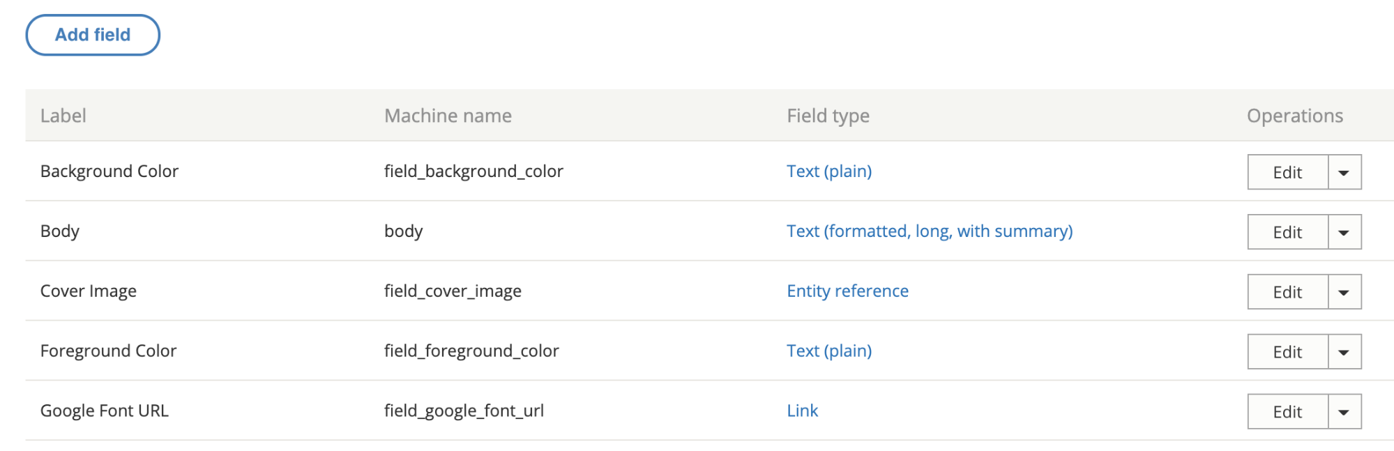
There were a lot of fields needed, covering different aspects of the typography. Here are a few:RISD
Since it was a Drupal 8 project, we made extensive use of config sync to export and import config files. The front-end and back-end developers could work independently until it was time to merge branches for testing. Then we were able to seamlessly push changes to higher environments as part of our deploy process.
Note: As a rule, we recommend setting config to read-only, especially on projects that have many web admin users.
Custom Webfont Example
With those new fields in place, a user sees text input fields on the node edit view of each publication to enter in custom font URLs or names.
In terms of rendering to the page when someone is viewing the node, this requires both a preprocess hook in the [custom_theme].theme file and changes to the Twig template.
Note: Please be aware that allowing hundreds of users to input free text is not an ideal situation, and that security measures should be taken when processing free text.
Here is what the preprocess hook looks like for the mytheme.theme file:
use Drupal\node\Entity\Node;
use Drupal\taxonomy\TermStorage;

/**
 * Implements hook_preprocess_HOOK().
 */
function mytheme_preprocess_html(array &$variables) {
  $routeMatch = Drupal::routeMatch();
  $node = $routeMatch->getParameter('node');

  if ($node instanceof Node && $node->getType() === 'publication’) {

    if (isset($node->field_primary_webfont_url) && !$node->field_primary_webfont_url->isEmpty()) {
      $variables['primary_webfont_url'] = $node->field_primary_webfont_url->value;
      $variables['primary_webfont_family'] = $node->field_primary_webfont_family->value;
      $variables['primary_webfont_type'] = $node->field_primary_webfont_type->value;
    }
PHP
Then in the Twig template, which is at this path: myproject/docroot/themes/custom/mytheme/templates/layout/html.html.twig
<!DOCTYPE html>
<html{{ html_attributes }}>
  <head>
    <title>{{ head_title }}</title>

    {% if primary_webfont_url|length %}
      <link rel="stylesheet prefetch" media="screen" href="{{ primary_webfont_url }}">
      <style type="text/css">
        :root {
          --ff__serif: '{{ primary_webfont_family }}', {{ primary_webfont_type }};
        }
      </style>
    {% endif %}

    {% if secondary_webfont_url|length %}
      <link rel="stylesheet prefetch" media="screen" href="{{ secondary_webfont_url }}">
      <style type="text/css">
        :root {
          --ff__sans: '{{ secondary_webfont_family }}', {{ secondary_webfont_type }};
        }
      </style>
    {% endif %}

    {% if background_color_override|length and foreground_color_override|length %}
      <style type="text/css">
        :root {
          --c__primary--bg: {{ background_color_override }};
          --c__primary--fg: {{ foreground_color_override }};
        }
      </style>
    {% endif %}

  </head>
  <body{{ attributes }}>
    {{ page_top }}
    {{ page }}
    {{ page_bottom }}
  </body>
</html>
HTML
Finally, here is what someone viewing a page would see:

Most of the creative work for each piece of content happened behind the scenes in Layout Builder. Each block or section could be configured individually, which gave the artists a lot of ability to customize their online territories to the fullest extent possible.
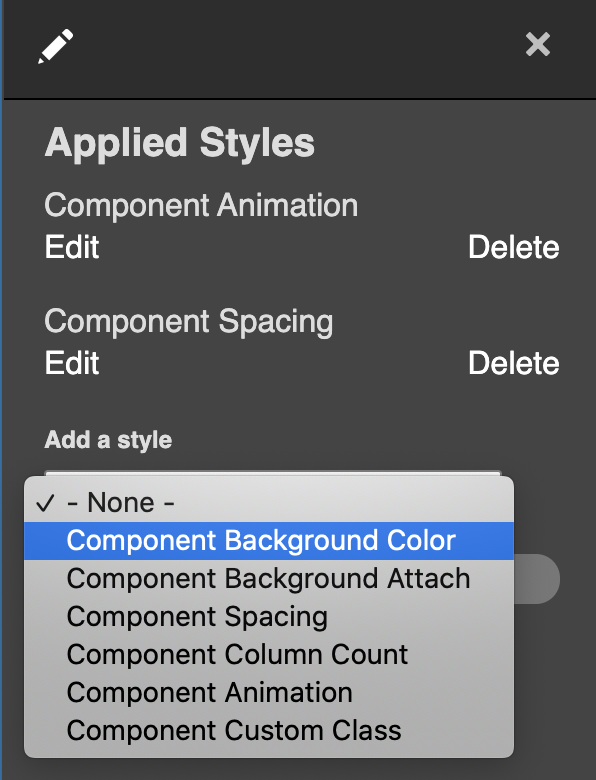
In addition to being able to choose a foreground or background color on the node level, an artist or editor can choose to change the color of just one block in Layout Builder simply by clicking on the “Style Settings” link.
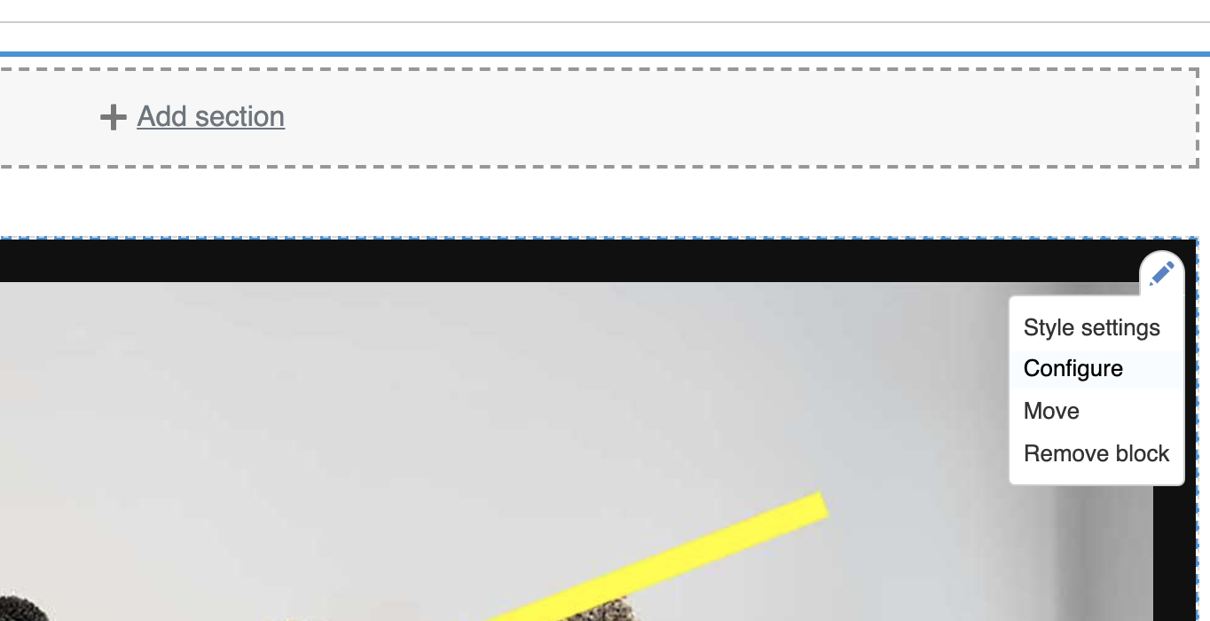
Another inline-editing window will pop up with additional options. In the “Add a style” dropdown menu, the artist or editor can select “Component Background Color,” click “Add Styles,” and choose from one of the colors in the palette to be applied to the block.
Along with the preprocessing described in the previous section, we extended Layout Builder’s features with a custom module to alter layouts. The plugin class lives at: docroot/modules/custom/my_module/Plugin/Layout/LayoutBase.php
<?php

namespace Drupal\my_module\Plugin\Layout;

use Drupal\Core\Form\FormStateInterface;
use Drupal\Core\Layout\LayoutDefault;
use Drupal\Core\Plugin\PluginFormInterface;

/**
 * Provides a layout base for custom layouts.
 */
abstract class LayoutBase extends LayoutDefault implements PluginFormInterface {

  public const NO_BACKGROUND_COLOR = 0;

  public function build(array $regions): array {
    $build = parent::build($regions);
    $backgroundColor = $this->configuration['background_color'];
    if ($backgroundColor) {
      $build['#attributes']['class'][] = 'rpp__bg-color--' . $backgroundColor;
    }
    return $build;
  }

  public function defaultConfiguration(): array {
    return [
      'background_color' => NO_BACKGROUND_COLOR,
      'id' => NULL,
      'background_color_override' => NULL,
    ];
  }

  public function buildConfigurationForm(array $form, FormStateInterface $form_state): array {
    $form['background'] = [
      '#type' => 'details',
      '#title' => $this->t('Background'),
      '#open' => TRUE,
      '#weight' => 20,
    ];
    $form['background']['background_color'] = [
      '#type' => 'radios',
      '#default_value' => $this->configuration['background_color'],
    ];
    $form['background']['overrides'] = [
      '#type' => 'fieldset',
      '#title' => $this->t('Overrides'),
    ];
    $form['background']['overrides']['background_color_override'] = [
      '#type' => 'textfield',
      '#title' => $this->t('Background Color'),
      '#default_value' => $this->configuration['background_color_override'],
      '#attributes' => [
        'placeholder' => '#000000',
      ],
    ];
    return $form;
  }

  public function submitConfigurationForm(array &$form, FormStateInterface $form_state) {
    $values = $form_state->getValues();
    $this->configuration['background_color'] = $values['background']['background_color'];
    $this->configuration['id'] = $values['extra']['attributes']['id'];
    $this->configuration['background_color_override'] = $values['background']['overrides']['background_color_override'];
  }

}
PHP
The Background Color form gets inserted into the Layout Builder form, and the user’s color selections get submitted and saved to configuration in the submitConfigurationForm() method.
The custom layout needs to be registered, so it should be added in a file called: my_module.layouts.yml and looks like:
layout_base:
  label: 'New Layout'
  category: 'Custom Layouts'
  template: templates/layout-base
  default_region: main
  regions:
    main:
      label: Main content
PHP
Now this custom layout with color overrides and whatever else you want to add will be available for users with the appropriate permissions to edit content in Layout Builder.
Conclusion
Jeremy Radtke, Assistant Director of Digital Initiatives at the RISD Museum, said in a recent presentation to the Museum Publishing Digital Interest Group that RISD sees the museum as a site of creative collaboration. In terms of the end-of-year digital showcase, this is demonstrated in the emphasis on student artists having a high degree of creative control over their projects. They were able to radically alter the existing layout templates offered to them, changing fonts, colors, and other elements of the theme. They were able to configure blocks to add static images, animated gifs, and other media files such as short films to stretch the limits of the digital space.
There were a total of 700 undergraduates and grads featured in the online exhibit, which featured 16 departments. The art school is attached to the RISD Museum, and Radtke said the museum’s style is very much along the lines of an art school, in that it employs critique — asking questions and solving problems is strongly emphasized. This project was about content delivery, but also how to generate content. Oomph was proud to be part of that collective journey of exploration and experimentation.
Related Resources
- Oomph case study about Ziggurat and “RAID the Icebox”
- Museum Publishing Digital Interest Group presentation on RISD Museum online exhibits
The Challenge
Execute on a digital platform strategy for a global private equity firm to create a centralized employee destination to support onboarding, create interpersonal connections between offices, and drive employee satisfaction.
The key components would be an employee directory complete with photos, bios, roles and organizational structure; News, events, and other communications made easily available and organized per location as well as across all locations; The firm’s investment portfolio shared through a dashboard view with all pertinent information including the team involved.
These components, and the expected tactical assets that an intranet provides, would help the firm deepen connections with and among employees at the firm, accelerate onboarding, and increase knowledge sharing.
The Approach
Supporting Multiple Intentions: Browsing vs. Working
An effective employee engagement platform, or intranet, needs to support two distinct modes — task mode and explore mode. In task mode, employees have access to intuitive navigation, quick page loading, and dynamic search or filtering while performing daily tasks. They get what they need fast and proceed with their day.
At the same time, a platform must also encourage and enable employees to explore company knowledge, receive company-wide communications, and connect with others. For this firm, the bulk of content available in explore mode revolves around the firm’s culture, with a special focus on philanthropic initiatives and recognition of key successes.
Both modes benefit from intuitive searching and filtering capabilities for team members, news, events, FAQs, and portfolio content. News and events can be browsed in a personalized way — what is happening at my location — or a global way — what is happening across the company. For every interaction within the platform, the mode was considered and influential of nearly all design decisions.
From a technical standpoint, the private equity firm needed to support security by hosting the intranet on their own network. This and the need to completely customize the experience for close alignment with their brand meant that no off-the-shelf pre-built intranet solution would work. We went with Drupal 8 to make this intranet scalable, secure, and tailor-made to an optimal employee experience.
The Results
The platform deployment came at a time when it was most needed, playing a crucial role for the firm during a global pandemic that kept employees at home. What was originally designed as a platform to deepen employee connections between offices quickly became the firm’s hub for connecting employees within an office. As many businesses are, the firm is actively re-evaluating its approach to the traditional office model, and the early success of the new platform indicates that it is likely to play an even larger role in the future.
Test Driven Development (TDD) facilitates clean and stable code. Drupal 8 has embraced this paradigm with a suite of testing tools that allow a developer to write unit tests, functional tests, and functional JavaScript tests for their custom code. Unfortunately, there is no JavaScript unit testing framework readily available in Drupal core, but don’t fret. This article will show you how to implement JavaScript unit testing.
Why unit test your JavaScript code?
Testing units of code is a great practice, and also guarantees that any future developer doesn’t commit a regression to your logic. Adding unit coverage for JavaScript code is helpful for testing specific logical blocks of code quickly and efficiently without the overhead both in development time and testing time of functional tests.
An example of JavaScript code that would benefit from unit testing would be an input field validator. For demonstration purposes, let’s say you have a field label that permits certain characters, but you want to let the user know immediately if they entered something incorrectly, maybe with a warning message.
Here’s a crude example of a validator that checks an input field for changes. If the user enters a value that is not permitted, they are met with an error alert.
(($, Drupal) => {
  Drupal.behaviors.labelValidator = {
    attach(context) {
      const fieldName = "form.form-class input[name=label]";
      const $field = $(fieldName);
      $field.on("change", () => {
        const currentValue = $field.val();
        if (currentValue.length > 0 && !/^[a-zA-Z0-9-]+$/.test(currentValue)) {
          alert("The value you entered is incorrect!");
        }
      });
    }
  };
})(jQuery, Drupal);
JavaScript
We only allow letters, numbers, and hyphens in this sample validator. We now have a good idea of test data we can create for our test.
Setting up JS Unit Testing
In the world of JavaScript unit testing, Jest has a well-defined feature set, a large community, and is the most popular choice among developers. To begin using Jest, add jest as a development dependency in your favorite manager. Then create a Jest config file, and add your directories for testing. I recommend enabling lcov ; a test coverage reporter that converts test results into local HTML pages.
Writing a Test
We want to test our Drupal behavior, but we need jQuery and the global Drupal object. Have no fear! We can mock all of this. For simplicity’s sake, we can mock both jQuery and Drupal to test the code we want. The point here is to collect the validation logic and run it on our test cases.
There are a couple of different techniques we can use to meet our requirements. You can create a test DOM using a library like JSDOM and require the jQuery library. This gives you the ability to simulate HTML and DOM events. This approach is fine, but our goal is to test our custom validation logic, not to test third-party libraries, or simulate the DOM. Similar to mocking classes and methods in PHPUnit, we can do the same with jest.
Our testing environment is Node, so we can leverage the global object to mock Drupal, jQuery, and even the alert function. Please see Node’s global variable documentation for more information on this object. We can do this in the setup logic of jest with beforeAll:
beforeAll(() => {
  global.alert = jest.fn();
  global.Drupal = {
    behaviors: {}
  };
  global.jQuery = jest.fn(selector => ({
    on(event, callback) {
      validator = callback;
    },
    val() {
      return fieldValue;
    }
  }));
  const behavior = require("label-validator.es6.js");
  Drupal.behaviors.labelValidator.attach();
});
JavaScript
This makes our behavior available to the global Drupal object. We also have mocked jQuery, so we can collect the callback on which we want to run the tests. We run the attach method on the behavior to collect the callback. You may have noticed that we never declared the validator or fieldValue variables; we do this at the top of our test so we have them available in our tests.
// The validation logic we collect from the `change` event.
let validator = () => "";

// The value of the input we set in our tests.
let fieldValue = "";
JavaScript
With the intention of cleanup, we want to unset all the global objects after we have run our tests. In our case, the globals we are mocking do not exist in Node, so it is safe to set them to null. In cases in which we are mocking defined values, we would want to save a backup of that global and then mock it. After we are done testing, we would set the backup back to its corresponding global. There are also many techniques related to mocking globals and even core Node libraries. For an example, check out the documentation on the jest website.
Here is our tear-down logic. We use the jest function afterAll to achieve this:
afterAll(() => {
  global.Drupal = null;
  global.jQuery = null;
  global.alert = null;
});
JavaScript
We need to create an array of values that we know should pass validation and fail validation. We will call them validLabels and invalidLabels, respectively:
/**
 * List of valid labels for the input.
 *
 * @type {string[]}
 */
const validLabels = [
  "123ABVf123",
  "123",
  "AB",
  "1",
  "",
  "abcdefghijklmnop12345678910",
  "ab-3-cd"
];

/**
 * List of invalid labels for the input.
 *
 * @type {string[]}
 */
const invalidLabels = [
  "!@#fff",
  "test test",
  "(123)",
  "ABCDEF123!",
  "^Y1",
  " ",
  "'12346'",
];
JavaScript
Finally, we are ready to start writing our tests. We can use jest’s provided test function, or we can use the “describe it” pattern. I prefer the “describe it” pattern because you can provide detailed information on what you are testing and keep it in the same test scope.
Firstly, we want to test our valid data, and we know that these values should never trigger an alert. We will call the validator on each test value and set the expectation that the alert function is never called. But before we write the test, we want to make sure to clear all our mocks between tests to prevent mock pollution. We can achieve this with beforeEach:
beforeEach(() => {
  jest.clearAllMocks();
});
JavaScript
After writing our valid data test, we will write our invalid data test. This test should expect an alert for each invalid value sent. Putting it all together we have:
describe("Tests label validation logic", () => {
  beforeEach(() => {
    jest.clearAllMocks();
  });
  it("valid label test", () => {
    validLabels.forEach(value => {
      fieldValue = value;
      validator();
    });
    expect(global.alert.mock.calls.length).toBe(0);
  });
  it("invalid label test", () => {
    invalidLabels.forEach(value => {
      fieldValue = value;
      validator();
    });
    expect(global.alert.mock.calls.length).toBe(invalidLabels.length);
  });
});
JavaScript
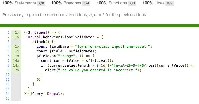
After writing our tests, we can check our coverage and see we have hit 100%!
Jest is extremely flexible and has a large ecosystem. There are many different ways we could have achieved the above results; hopefully this gives you some useful ideas on how to unit test your javascript code.
The entire sample Jest test:
/* global test expect beforeEach afterAll beforeAll describe jest it */
// The validation logic we collect from the `change` event.
let validator = () => "";
// The value of the input we set in our tests.
let fieldValue = "";
// the setup function where we set our globals.
beforeAll(() => {
  global.alert = jest.fn();
  global.Drupal = {
    behaviors: {}
  };
  global.jQuery = jest.fn(selector => ({
    on(event, callback) {
      validator = callback;
    },
    val() {
      return fieldValue;
    }
  }));
  const behavior = require("label-validator.es6.js");
  Drupal.behaviors.labelValidator.attach();
});
// Global tear down function we use to remove our mocks.
afterAll(() => {
  global.Drupal = null;
  global.jQuery = null;
  global.alert = null;
});
/**
 * List of valid labels for the input.
 *
 * @type {string[]}
 */
const validLabels = [
  "123ABVf123",
  "123",
  "AB",
  "1",
  "",
  "abcdefghijklmnop12345678910",
  "ab-3-cd"
];
/**
 * List of invalid labels for the input.
 *
 * @type {string[]}
 */
const invalidLabels = [
  "!@#fff",
  "test test",
  "(123)",
  "ABCDEF123!",
  "^Y1",
  " ",
  "'12346'",
];
// The tests.
describe("Tests label validation logic", () => {
  beforeEach(() => {
    jest.clearAllMocks();
  });
  it("valid label test", () => {
    validLabels.forEach(value => {
      fieldValue = value;
      validator();
    });
    expect(global.alert.mock.calls.length).toBe(0);
  });
  it("invalid label test", () => {
    invalidLabels.forEach(value => {
      fieldValue = value;
      validator();
    });
    expect(global.alert.mock.calls.length).toBe(invalidLabels.length);
  });
});
JavaScript
Resources
- Jest javascript testing framework – jest
- NPM trends JS testing framework popularity – npm trends js testing
- Jest configuration file documentation – https://jestjs.io/docs/en/configuration.html
- A JS DOM testing library – JSDOM
- Jest mocking documentation – jestjs.io/docs/en/manual-mocks
Continuous integration and delivery (CI/CD) is an important part of any modern software development cycle. It ensures code quality remains high, helps keep applications secure, and bridges the gap between everyday work and your visitors’ experience.
Nowadays it’s a given that a CI/CD pipeline will be part of a workflow, but choosing a provider and/or platform can be difficult. Oomph has made use of a number of CI/CD tools over the years: DeployBot, Jenkins, and Travis CI have all made appearances. Most of our projects in the last few years have used Travis, but more recently we’ve found it to be unreliable. Just as we began searching for a new provider, full CI/CD support was announced for GitHub Actions.
We immediately added Actions to the list of providers we were interested in, and after some comparison, we began migrating projects to it. Overall we’ve found it to be beneficial — the syntax is well-designed, workflows are extensible and modular, the platform is reliable and performant, and we’ve experienced no major trouble.
There are already plenty of good guides and articles on how to use GitHub Actions; we won’t repeat that here. Instead, we’ll look at a few gotchas and issues that we’ve encountered while using the platform, to give an accurate picture of things you may come across while implementing GitHub Actions.
Considerations
The team behind GitHub Actions knew what they were doing, and it’s clear they learned from and improved on previous CI/CD implementations. This is most obvious in the clear structure of the syntax, the straightforward pricing model, and the useful feature set. However, Actions’ in-progress state is apparent in some areas.
Artifact Storage and Billing
GitHub provides a generous amount of free build time for all repositories and organizations. Storage, though, is much more limited — only 2GB is included for GitHub Teams organizations. If you want to store build artifacts for all of your CI/CD jobs (a good idea for testing and repeatability) you may need to configure a “spending limit” — i.e. a maximum amount you’re willing to spend each month on storage. GitHub charges $0.25/GB for storage beyond the included 2GB.
Artifact storage is still rudimentary. Jobs can upload artifacts for download by other jobs later in the workflow, but the lifetime of those artifacts cannot be configured; they will expire after 90 days and the only way to delete them beforehand is manual. Manual deletions will also take some time to free up storage space.
We also experienced an issue where our reported usage for Actions storage was greatly (~500%) exaggerated, putting us far past our spending limit and breaking builds. When we reached out to GitHub’s support, though, they responded quickly to let us know this was a system-wide issue and they were working on it; the issue was resolved some days later and we were not charged for the extra storage. We were able to work around it in the meantime by extending our spending limit.
Restarting and Debugging Jobs
If a workflow fails or is canceled, it can be restarted from the workflow page. However, it’s not yet possible to restart certain jobs; the entire workflow has to be run again. GitHub is working on support for job-specific restarts.
Debugging job failures also is not yet officially supported, but various community projects make this possible. We’ve used Max Schmitt’s action-tmate to debug our builds, and that does the job. In fact, I prefer this approach to the Travis method; with this we can specify the point of the workflow where we want to start debugging, whereas Travis always starts debugging at the beginning of the build.
Log Output
GitHub Actions has an excellent layout for viewing the output of jobs. Each job in a workflow can be viewed and within that each step can be expanded on its own. The output from the current step can also be seen in near-real-time. Unfortunately, this last bit has been somewhat unreliable for us, lagging behind by a bit or failing to show the output for short steps. (To be fair to GitHub, I have never used a CI/CD platform where the live output worked flawlessly.) Viewing the logs after completion has never been a problem.
Configuring Variables/Outputs
GitHub Actions allows you to configure outputs for an action, so a later step can use some value or outcome from an earlier step. However, this only applies to packaged actions that are included with the uses method.
To do something similar with a free-form step is more convoluted. First, the step must use some odd syntax to set an output parameter, e.g.:
- name: Build
  id: build
  run: |
    ./scripts/build.sh
    echo "::set-output name=appsize::$(du -csh --block-size=1G  build/ | tail -n1 | cut -d$'\t' -f1)"
YAML
Then a later step can reference this parameter with the steps context:
- name: Provision server
  run: terraform apply -var “app_ebs_volume_size=${{ steps.build.outputs.appsize }}”
YAML
However, the scope of the above is limited to the job it takes place inside of. To reference values across jobs you must also set the values within the outputs map in the jobs context, e.g.:
jobs:
  build:
    runs-on: ubuntu-latest
    outputs:
      appsize: ${{ steps.step1.outputs.appsize }}
    steps:
    - name: Build
      id: build
      run: |
        ./scripts/build.sh
        echo "::set-output name=appsize::$(du -csh --block-size=1G  build/ | tail -n1 | cut -d$'\t' -f1)"
  infra:
    runs-on: ubuntu-latest
    needs: build
    steps:
    - run: terraform apply -var “app_ebs_volume_size=${{ needs.build.outputs.appsize }}”
YAML
Importantly, the outputs map from a previous job is only made available to jobs that require it with the needs directive.
While this setup is workable, the syntax feels a little weird, and the lack of documentation on it makes it difficult to be certain of what you’re doing. This is evolving, as well; the jobs.<jobs_id>.outputs context was only released in early April. Before that was added, persisting data across jobs required the use of build artifacts, which was clunky and precluded its use for sensitive values.
Self-hosted Runners
Sometimes security or access requirements prohibit a cloud-hosted CI/CD runner from reaching into an environment to deploy code or provision resources, or some sensitive data needs to be secured. For these scenarios, GitHub provides the ability to self-host Actions runners. Self-hosted runners can instead run the CI/CD process from an arbitrary VM or container within the secured network or environment. You can use them alongside cloud-hosted runners; as an example, in some situations we use cloud-hosted runners to test and validate builds before having the self-hosted runners deploy those builds to an environment.
This feature is currently in beta, but it has proven reliable and extremely useful in the places we’ve needed them.
Reliability and Performance
Overall GitHub Actions has been very reliable for us. There have been periods of trouble here and there but GitHub is open about the issues and generally addresses them in short order. We have not (yet) been seriously impeded by any outages or degradation, which is a significant improvement over our previous CI/CD situation.
Overall Experience
In general, the switch to GitHub Actions has been a positive experience. We have made significant improvements to our CI/CD workflows by switching to Actions; the platform has some great features and it has certainly been beneficial for our development lifecycle. While Actions may have a few quirks or small issues here and there we wouldn’t hesitate to recommend it as a CI/CD platform.
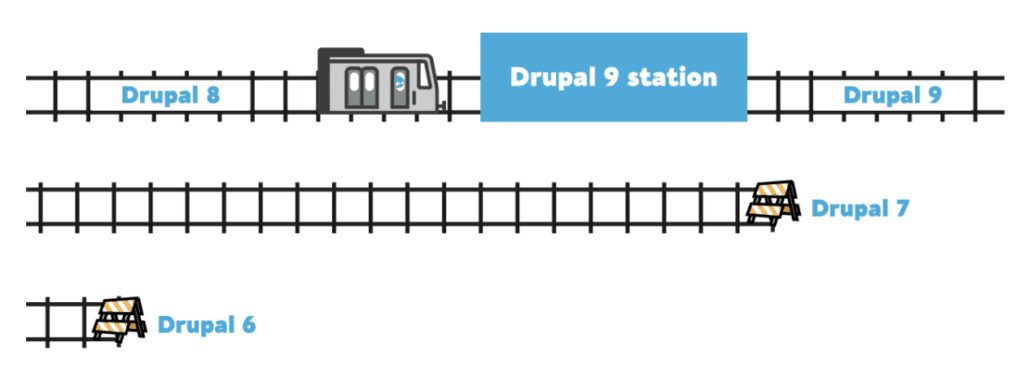
The first stable release for Drupal 9 shipped right on schedule — June 3, 2020. The Drupal 8.9.0 release was available the same day, and that means end-of-life for 8.7.x.
Since we all have migrated our sites from Drupal 7 to 8.9.x already (right??), it should be a fairly straightforward process to port everything from 8 to 9 when the time comes. This article covers what is involved with the 8 to 9 migration, sharing some of the gotchas we encountered in the hopes that you can have a smooth transition.
Are you familiar with what is coming in Drupal 9? How can you assess what is needed? How do you know what code needs to be updated? What other steps are involved?
This will help prepare you when it comes time to make the leap and to reassure you that this should be a straightforward and painless process.
Drupal 9
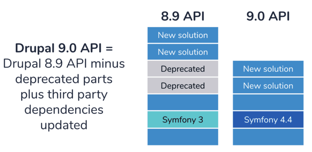
Drupal 9 is not being built in a different codebase than Drupal 8, so all new features will be backward-compatible. That is a significant departure if you recently went through a Drupal 6 to 7, or Drupal 7 to 8 migration. You won’t have to map content types and fields using migration modules or custom migration plugins and you won’t have to restructure your custom modules from scratch. This is really good news for companies and organizations who want to port sites before Drupal 8 end of life in November 2021 and who want to avoid or minimize the disruption that can come with a complicated migration.
In terms of what the code looks like, Drupal 9 will be the same as the last Drupal 8 minor release (which is set to be 8.9), with deprecated code removed and third-party dependencies updated. Upgrading to Drupal 9 should be like any other minor upgrade, so long as you have removed or replaced all deprecated code.
The Drupal.org documentation visualizes the differences between Drupal 8.9 and 9 with this image:
Upgrades
Symfony 3 -> 4.4
The biggest change for third party dependencies is the use of Symfony 4.4 for Drupal 9. Drupal 8 relies on Symfony 3, and to ensure security support, Symfony will have to be updated for Drupal 9.
Twig 1 -> 2
Drupal 9 will use Twig 2 instead of Twig 1 (Drupal 8). CKEditor 5 is planned to be used for a future version of Drupal 9; this issue references 9.1.x for the transition. Drupal 9 will still depend on jQuery, but most components of jQuery UI will be removed from core.
PHPUnit 6 -> 7
For testing, PHPUnit 7 will be used instead of version 6. The Simpletest API will be deprecated in Drupal 9 and PHPUnit is recommended in its place. If you have an existing test suite using PHPUnit, you might have to replace a lot of deprecated code, just as you will do for custom modules.
6 Month release schedule
Along the lines of how Drupal 8 releases worked, Drupal 9.1.0, 9.2.0, and so on, will each contain new backwards-compatible features for Drupal 9 every six months after the initial Drupal 9.0 release. The list of Strategic Initiatives gives a detailed overview of major undertakings that have been completed for Drupal 8 or are proposed and underway for Drupal 9. We might see automatic updates for 9.1, or drush included in core.
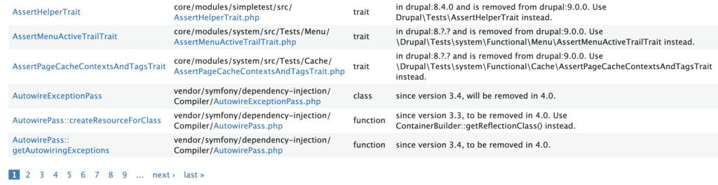
How can you assess what is needed to upgrade?
There are some comprehensive guides available on Drupal.org that highlight the steps needed for Drupal 9 readiness. A lot of functions, constants, and classes in Drupal core have been deprecated in Drupal 9.
Some deprecations call for easy swap-outs, like the example below:
Call to deprecated method url() of class Drupal\file\Entity\File. Deprecated in drupal:8.0.0 and is removed from drupal:9.0.0. Please use toUrl() instead.
You can see a patch that has been created that swaps out url() with toUrl() straightforwardly:
-  $menuItem['thumbnail_url'] = file_url_transform_relative($imageFile->Url());
+  $menuItem['thumbnail_url'] = file_url_transform_relative($imageFile->toUrl()->toString());
Some deprecations are more involved and do require some code rewrites if your custom modules are relying on the outdated code.
Example:
Call to deprecated function pagerdefaultinitialize() in drupal:8.8.0 and is removed from drupal:9.0.0. Use \Drupal\Core\Pager\PagerManagerInterface->defaultInitialize() instead.
There is an active issue in the Drupal core issue queue for this deprecation. Rewriting outdated code sometimes requires going through issue queue comments and doing some research to figure out how the core module has been reconfigured. Often it is easiest to look at the core code itself, or to grep for that function in other core modules to see how they have handled the deprecation.
This is how I ended up replacing the pagerdefaultinitialize() deprecated function for the limit() method in our custom module:
use Drupal\Core\Database\Query\PagerSelectExtender;
+ use Drupal\Core\Pager\PagerManagerInterface;
+ use Drupal\Core\Pager;

class CountingPagerSelectExtender extends PagerSelectExtender {
  /**
   * {@inheritdoc}
   */
  public function limit($limit = 10) {
    parent::limit($limit);
     + /** @var \Drupal\Core\Pager\PagerManage $pagerManager */+ $pager_manager = \Drupal::service('pager.manager');

    if (empty($this->limit)) {
      return $this;
    }

    $this
      ->ensureElement();
    $total_items = $this
      ->getCountQuery()
      ->execute()
      ->fetchField();
     - $current_field = pager_default_initialize($total_items, $this->limit, $this->element);
     + $pager = $pager_manager->createPager($total_items, $this->limit, $this->element);
     + $current_page = $pager->getCurrentPage();
    $this
      ->range($current_page * $this->limit, $this->limit);
    return $this;
  }
How do you know what code needs to be updated?
Fortunately, as is usually the case with Drupal, there is a module for that! Upgrade Status
This contributed module allows you to scan all the code of installed modules. Sometimes a scan can take a while, so it might make sense to scan custom modules one by one if you want to step through your project. Upgrade Status generates reports on the deprecated code that must be replaced and can be exported in HTML format to share with others on your team.
If you are using a composer-based workflow, install Upgrade Status using the following command:
composer require 'drupal/upgrade_status:^2.0'
YAML
You might also need the Git Deploy contributed module as a dependency. Our projects did.
The Upgrade Status module relies on a lot of internals from the Drupal Check package. You can install Drupal Check with composer and run it if you want a quicker tool in the terminal to go through the codebase to identify code deprecations, and you don’t care about visual reporting or the additional checks offered by Upgrade Status.
Tools such as Upgrade Status and Drupal Check are extremely useful in helping to pinpoint which code will no longer be supported once you upgrade your project to Drupal 9. The full list of deprecated code was finalized with the Drupal 8.8.0 release in December 2019. There could be some future additions but only if absolutely necessary. The Drupal Core Deprecation Policy page goes into a lot more detail behind the justification for and mechanics of phasing out methods, services, hooks, and more.
@deprecated in drupal:8.3.0 and is removed from drupal:9.0.0.
Use \Drupal\Foo\Bar::baz() instead.
@see http://drupal.org/mode/the-change-notice-nid
YAMLThe deprecation policy page explains how the PHPdoc tags indicate deprecated code
For the most part, all deprecated APIs are documented at: api.drupal.org/api/drupal/deprecated
Since so many maintainers are currently in the process of preparing their projects for Drupal 9, there is a lot of good example code out there for the kinds of errors that you will most likely see in your reports.
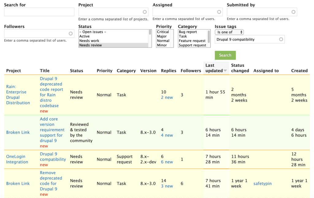
Check out the issues on Drupal.org with Issue Tag “Drupal 9 compatibility”, and if you have a few thousand spare hours to wade through the queues, feel free to help contributed module maintainers work towards Drupal 9 readiness!
Upgrade Status note
My experience was that I went through several rounds of addressing the errors in the Upgrade Status report. For several custom modules, after I cleared out one error, re-scanning surfaced a bunch more. My first pass was like painting a wall with a roller. The second and third passes entailed further requirements and touch-ups to achieve a polished result.
What about previous Drupal releases?
Drupal 8 will continue to be supported until November 2021, since it is dependent on Symfony 3, which has an end-of-life at the same time.
Drupal 7 will also continue to be supported by the community until November 2021, with vendor extended support offered at least until 2024.
Now is a good time to get started on preparing for Drupal 9!
This post will assume you have already completed the base setup of enabling Layout Builder and added the ability to manage layouts to one of your content types. If you are not to this point check out Drupal.orgs documentation on layout builder or this article by Tyler Fahey which goes over setup and some popular contrib module enhancements.
As we mentioned in part 1 of this series, you should expect a little DIY with Layout Builder. So far the best way we have found to theme Layout Builder is by creating a custom module to provide our own custom layouts and settings. By defining custom layouts in a custom module we get the ability to control each layout’s markup as well as the ability to add/remove classes based on the settings we define.
Writing the custom layout module
Setup the module
Start by creating your custom module and providing the required .info.yml file.
demo_layout.info.yml:
name: Demo Layout
description: Custom layout builder functionality for our theme.
type: module
core: 8.x
package: Demo

dependencies:
  - drupal:layout_builder
YAML
Remove default core layouts
Layout Builder comes with some standard layouts by default. There’s nothing wrong with these, but generally for our clients, we want them only using our layouts. This hook removes those core layouts, leaving only the layouts that we will later define:
demo_layout.module
/**
 * Implements hook_plugin_filter_TYPE__CONSUMER_alter().
 */
function demo_layout_plugin_filter_layout__layout_builder_alter(array &$definitions): void {
  // Remove all non-demo layouts from Layout Builder.
  foreach ($definitions as $id => $definition) {
    if (!preg_match('/^demo_layout__/', $id)) {
      unset($definitions[$id]);
    }
  }
}
PHP
Register custom layouts and their regions
The next step is to register the custom layouts and their respective regions. This process is well documented in the following drupal.org documentation: https://www.drupal.org/docs/8/api/layout-api/how-to-register-layouts
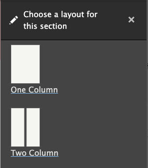
For this particular demo module we are going to define a one column and a two column layout. These columns will be able to be sized later with the settings we provide.
demo_layout.layouts.yml
demo_layout__one_column:
  label: 'One Column'
  path: layouts/one-column
  template: layout--one-column
  class: Drupal\demo_layout\Plugin\Layout\OneColumnLayout
  category: 'Columns: 1'
  default_region: first
  icon_map:
    - [first]
  regions:
    first:
      label: First

demo_layout__two_column:
  label: 'Two Column'
  path: layouts/two-column
  template: layout--two-column
  class: Drupal\demo_layout\Plugin\Layout\TwoColumnLayout
  category: 'Columns: 2'
  default_region: first
  icon_map:
    - [first, second]
  regions:
    first:
      label: First
    second:
      label: Second
YAML
Pay close attention to the path, template, and class declarations. This determines where the twig templates and their respective layout class get placed.
Creating the base layout class
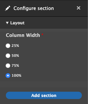
Now that we have registered our layouts, it’s time to write a base class that all of the custom layouts will inherit from. For this demo we will be providing the following settings:
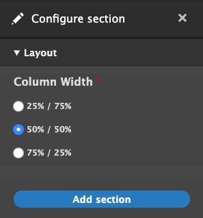
- Column width
- Column padding (top and bottom)
- Background color
- Custom classes
However, there is a lot of PHP to make this happen. Thankfully for the most part it follows a general pattern. To make it easier to digest, we will break down each section for the Column Width setting only and then provide the entire module at the end which has all of the settings.
src/Plugin/Layout/LayoutBase.php
<?php
  declare(strict_types = 1);

  namespace Drupal\demo_layout\Plugin\Layout;

  use Drupal\demo_layout\DemoLayout;
  use Drupal\Core\Form\FormStateInterface;
  use Drupal\Core\Layout\LayoutDefault;

  /**
   * Provides a layout base for custom layouts.
   */
  abstract class LayoutBase extends LayoutDefault {

  }
PHP
Above is the layout class declaration. There isn’t a whole lot to cover here other than to mention use Drupal\demo_layout\DemoLayout;. This class isn’t necessary but it does provide a nice one-stop place to set all of your constant values. An example is shown below:
src/DemoLayout.php
<?php

declare(strict_types = 1);

namespace Drupal\demo_layout;

/**
 * Provides constants for the Demo Layout module.
 */
final class DemoLayout {

  public const ROW_WIDTH_100 = '100';

  public const ROW_WIDTH_75 = '75';

  public const ROW_WIDTH_50 = '50';

  public const ROW_WIDTH_25 = '25';

  public const ROW_WIDTH_25_75 = '25-75';

  public const ROW_WIDTH_50_50 = '50-50';

  public const ROW_WIDTH_75_25 = '75-25';

}
PHP
The bulk of the base class logic is setting up a custom settings form using the Form API. This form will allow us to formulate a string of classes that get placed on the section or to modify the markup depending on the form values. We are not going to dive into a whole lot of detail as all of this is general Form API work that is well documented in other resources.
Setup the form:
/**
   * {@inheritdoc}
   */
  public function buildConfigurationForm(array $form, FormStateInterface $form_state): array {

    $columnWidths = $this->getColumnWidths();

    if (!empty($columnWidths)) {
      $form['layout'] = [
        '#type' => 'details',
        '#title' => $this->t('Layout'),
        '#open' => TRUE,
        '#weight' => 30,
      ];

      $form['layout']['column_width'] = [
        '#type' => 'radios',
        '#title' => $this->t('Column Width'),
        '#options' => $columnWidths,
        '#default_value' => $this->configuration['column_width'],
        '#required' => TRUE,
      ];
    }

    $form['#attached']['library'][] = 'demo_layout/layout_builder';

    return $form;
  }

 /**
   * {@inheritdoc}
   */
  public function validateConfigurationForm(array &$form, FormStateInterface $form_state) {
  }

  /**
   * {@inheritdoc}
   */
  public function submitConfigurationForm(array &$form, FormStateInterface $form_state) {
    $this->configuration['column_width'] = $values['layout']['column_width'];
  }

 /**
   * Get the column widths.
   *
   * @return array
   *   The column widths.
   */
  abstract protected function getColumnWidths(): array;
PHP
Finally, we add the build function and pass the column width class:
/**
   * {@inheritdoc}
   */
  public function build(array $regions): array {
    $build = parent::build($regions);

    $columnWidth = $this->configuration['column_width'];
    if ($columnWidth) {
      $build['#attributes']['class'][] = 'demo-layout__row-width--' . $columnWidth;
    }

    return $build;
  }
PHP
Write the column classes
Now that the base class is written, we can write column-specific classes that extend it. These classes are very minimal since most of the logic is contained in the base class. All that is necessary is to provide the width options for each individual class.
src/Plugin/Layout/OneColumnLayout.php
<?php

declare(strict_types = 1);

namespace Drupal\demo_layout\Plugin\Layout;

use Drupal\demo_layout\DemoLayout;

/**
 * Provides a plugin class for one column layouts.
 */
final class OneColumnLayout extends LayoutBase {

  /**
   * {@inheritdoc}
   */
  protected function getColumnWidths(): array {
    return [
      DemoLayout::ROW_WIDTH_25 => $this->t('25%'),
      DemoLayout::ROW_WIDTH_50 => $this->t('50%'),
      DemoLayout::ROW_WIDTH_75 => $this->t('75%'),
      DemoLayout::ROW_WIDTH_100 => $this->t('100%'),
    ];
  }

  /**
   * {@inheritdoc}
   */
  protected function getDefaultColumnWidth(): string {
    return DemoLayout::ROW_WIDTH_100;
  }
}
PHP
src/Plugin/Layout/TwoColumnLayout.php
<?php

declare(strict_types = 1);

namespace Drupal\demo_layout\Plugin\Layout;

use Drupal\demo_layout\DemoLayout;

/**
 * Provides a plugin class for two column layouts.
 */
final class TwoColumnLayout extends LayoutBase {

  /**
   * {@inheritdoc}
   */
  protected function getColumnWidths(): array {
    return [
      DemoLayout::ROW_WIDTH_25_75 => $this->t('25% / 75%'),
      DemoLayout::ROW_WIDTH_50_50 => $this->t('50% / 50%'),
      DemoLayout::ROW_WIDTH_75_25 => $this->t('75% / 25%'),
    ];
  }

  /**
   * {@inheritdoc}
   */
  protected function getDefaultColumnWidth(): string {
    return DemoLayout::ROW_WIDTH_50_50;
  }
}
PHP
We can now check out the admin interface and see our custom form in action.
One column options:
Two column options:
Add twig templates
The last step is to provide the twig templates that were declared earlier in the demo_layout.layouts.yml file. The variables to be aware of are:
- Content: contains the block content for this layout separated by region
- Attributes: contains the custom classes that were passed in the base class build function.
- Settings:contains the submitted form values from the settings form.
src/layouts/one-column/layout–one-column.html.twig
{#
/**
 * @file
 * Default theme implementation to display a one-column layout.
 *
 * Available variables:
 * - content: The content for this layout.
 * - attributes: HTML attributes for the layout <div>.
 * - settings: The custom form settings for the layout.
 *
 * @ingroup themeable
 */
#}

{%
  set row_classes = [
    'row',
    'demo-layout__row',
    'demo-layout__row--one-column'
  ]
%}

{% if content %}
  <div{{ attributes.addClass( row_classes|join(' ') ) }}>
    <div {{ region_attributes.first.addClass('column', 'column--first') }}>
      {{ content.first }}
    </div>
  </div>
{% endif %}
Twig
src/layouts/two-column/layout–two-column.html.twig
{#
/**
 * @file
 * Default theme implementation to display a two-column layout.
 *
 * Available variables:
 * - content: The content for this layout.
 * - attributes: HTML attributes for the layout <div>.
 * - settings: The custom form settings for the layout.
 *
 * @ingroup themeable
 */
#}

{# Get the column widths #}
{% set column_widths = settings.column_width|split('-') %}

{%
  set row_classes = [
    'row',
    'demo-layout__row',
    'demo-layout__row--two-column'
  ]
%}

{% if content %}
  <div{{ attributes.addClass( row_classes|join(' ') ) }}>

    {% if content.first %}
      <div {{ region_attributes.first.addClass('column', 'column--' ~ column_widths.0, 'column--first') }}>
        {{ content.first }}
      </div>
    {% endif %}

    {% if content.second %}
      <div {{ region_attributes.second.addClass('column', 'column--' ~ column_widths.1, 'column--second') }}>
        {{ content.second }}
      </div>
    {% endif %}

    </div>
  </div>
{% endif %}
Twig
Notice settings.column_width was passed with a string: 75-25. We need to split it and place each value on our column which results in the following output.
<div class="demo-layout__row-width--75-25 row demo-layout__row demo-layout__row--two-column ">
  <div class="column column--75 column--first"></div>
  <div class="column column--25 column--second"></div>
</div>
HTML
Since these are custom classes, and we haven’t written any CSS, these columns do not have any styling. Depending on your preference, you can implement your own custom column styles or wire up a grid framework such as Bootstrap in order to get the columns to properly size themselves.
Wrapping it up
You should be at a point where you have an idea of how to create custom settings in order to theme layout builder sections. You can take this method and extend it however you need to for your particular project. There’s no definitive best way to do anything in the world of web development, and Layout Builder is no exception to that rule. It’s a great addition to Drupal’s core functionality, but for larger sites, it likely won’t be and shouldn’t be the only way you handle layout. Much like Drupal itself though, as more and more people use it, Layout Builder will only become stronger, more robust, more fully-featured, and better documented. If it doesn’t seem like a good fit for you right now, it may become a better fit as it grows. If it does seem like a good fit, be ready to get your hands dirty!
The full demo layouts module with all of the custom settings is available here: https://github.com/oomphinc/layout-builder-demo/tree/master/moduleexamples/demolayout
With the release of Drupal 8.7 in May of 2019 came the rollout of the much-anticipated Layout Builder core module. According to Drupal.org, Layout Builder allows content editors and site builders to easily and quickly create visual layouts for displaying content by providing the ability to drag and drop site-wide blocks and content fields into regions within a given layout. Drupalists were excited about it, and so were we.
For a long time, we developed and came to heavily rely on our own extension of the Paragraphs module to give content managers the power to build and modify flexible layouts. When we heard that there would now be an equivalent option built right into core, we thought, “could this be the end of Paragraphs?” Well, the only way to find out is to dig in and start using it in some real-world scenarios.
Layout Builder is still new enough that many how-to guides only focus on installing it and enabling it on a content type or two and overviews of options that are available right out of the box. That’s probably fine if your use-case is something akin to Umami, Drupal.org’s example recipe site. But if you want to use it in a significant way on a larger site, it probably won’t be long before you want to customize it to fit your situation. Once you get to that point, documentation becomes scant. If you’ve already got some experience rolling your own extension of a module or at least writing preprocesses, you’re more likely to get better mileage out of your experience with Layout Builder.
First, let’s take a look at some of the pros and cons of using Layout Builder. If there are any deal-breakers for you, it’s better to identify them sooner than later.
Layout Builder Pros:
1. All core code
Yes, the fact that Layout Builder is a core initiative that will continue to get attention and updates is fantastic no matter how stable similar module initiatives might be. As it’s core, you get great integration for language translation.
2. Block-based, but supports fields as well
Blocks are a familiar core Drupal content paradigm. They can be used as one-off content containers or as repeatable containers for content that appears in multiple places but should be edited from a single location. Fields can also be placed as content into a layout, which makes building custom templates that can continue to leverage fields very flexible.
3. Better WYSIWYG authoring experience
End-users will be much happier with the (not quite) WYSIWYG editing experience. While it is not directly one-to-one, it is much better than what we have seen with Paragraphs, which is a very “Drupal” admin experience. In many ways, previously, Preview was needed to know what kind of design your content was creating.
4. Supports complex design systems with many visual options
Clients can get quite a bit of design control and can see the effects of their decisions very quickly. It makes building special landing pages very powerful.
5. Plays nice with Clone module
While custom pages described in Pro #4 are possible, they are time-consuming to create. The Clone module is a great way to make copies of complex layouts to modify instead of starting from scratch each time.
6. “Locked” Layouts are the default experience
While complex custom pages are possible, they are not the default. Layout Builder might have been intended to replace custom template development, because by default when it is applied to a content type, the option to override the template on a node-by-node basis is not turned on. A site builder needs to decide to turn this feature on. When you do, proceed with caution.
Layout Builder Cons
1. Lack of Documentation
Since LB is so relatively new, there is not an abundance of documentation in the wild. People are using it, but it is sort of still the Wild Wild West. There are no established best practices on how to use it yet. Use it with Paragraphs? Maybe. Use it for the entire page, including header and footer? You can. Nest it in menus? We’ve done it. Should we have done it? Time will tell.
2. More time is required to do it well
Because of Con #1, it’s going to take more time. More time to configure options, more time to break designs down into repeatable components, and more time to test all the variations and options that design systems present.
3. Admin interface can conflict with front-end styles
While Pro #3 is a great reason to use LB, it should be known that some extra time will be needed to style the admin mode of your content. There is some bleeding together of admin and non-admin front-end styles that could cause your theme build to take longer.
An example: We created a site where Layout Builder custom options could control the animation of blocks. Great for the front-end, but very annoying for the backend author when blocks would animate while they were trying to edit.
4. Admin editing experience still in its infancy
Again, while Pro #3 is significant, the current admin editing experience is not the best. We know it is being worked on, and there are modules that help, but it is something that could tip the scales depending on the project and the admin audience.
5. Doesn’t play nice with other template methods
Which is to say that you can’t easily have a page that is partially LB and partially a templated View or something else. You can create a View that can be placed into a Block that is placed via Layout Builder, but you can’t demarcate LB to one section of a page and have a View or the body field in the other.
6. Content blocks do not export with configuration
As blocks go, the configuration of a block is exportable, but the content isn’t. Same with the blocks that Layout Builder uses, which can make keeping staging/production environments in sync frustrating. Just like with Paragraphs or custom blocks, you’ll have to find a reliable way of dealing with this.
7. Overriding a default layout has consequences
We have seen this ourselves first-hand. The design team and client want a content type to be completely flexible with Layout Builder, so the ability for an author to override the default template is turned on. That means the node is now decoupled from the default template. Any changes to the default will not propagate to those nodes that have been decoupled and modified. For some projects, it’s not a big deal, but for others, it might become a nightmare.
8. The possibility of multiple design options has a dark side
Too many options can be a bad thing. It can be more complex for authors than necessary. It can add a lot more time to theming and testing the theme when options create exponential possibilities. And it can be very hard to maintain.
With great power comes great responsibility. Layout Builder certainly gives the Drupal community great power. Are we ready for the caveats that come with that?
Ready to tackle customizing Layout Builder? Watch for Part Two, where we’ll dive into defining our own layouts and more.
As everyone is aware, the world is in the grips of a crushing global health crisis. Our day-to-day lives have changed dramatically. Our children are learning from computers at home, some of us are without work, and others are working from home for the first time. Events and social gatherings have been canceled or are going digital. Without a doubt, the global business climate has changed. This is no different for non-profit organizations like the Drupal Association (DA).
At the end of March, Drupal Association Executive Director Heather Rocker posted on the DA blog — Drupal Association Statement re: Financial Effects of COVID-19. This post outlines the DA’s financial impact if the Association could not host DrupalCon this year. With the rapid changes and stay-at-home orders, the Association is potentially on the hook for event fees whether or not attendees showed up — this is all dependent on force majeure being activated. She calls for support from the community to help us close this gap so we may continue to support Drupal, thrive and serve you.
A second post from Drupal Project Founder Dries Buytaert titled Sustaining The Drupal Association in Uncertain Times highlighted the need for the community to step up and help.
Dries and his wife Vanessa pledged to match individual contributions up to $100,000. And last week Oomph and nearly thirty other businesses in the Drupal community stepped up with a pledge to triple match individual donations. Listen to Chris Murray, CEO of Oomph and Matt Westgate of Lullabot discuss this fundraising effort on Talking Drupal #245.
At Oomph we feel it’s our responsibility to answer this call from the Drupal Association and support a community that has supported our work through the years. This support will be in addition to our previously committed community support efforts. We will still be the event sponsor of the New England Drupal Camp, sending Oomphers to attend and speak at conferences and camps, committing patches and fixes to issues on Drupal.org, and continuing to help in any way we can.
If you are feeling inspired by this news, please join us in supporting the Drupal Association. Visit the #DrupalCares page on drupal.org for more information on ways to give.
Our hope is that you (as we do) will feel it is your duty to support the Drupal Association. We all benefit from this great open source community and we pay nothing to be part of it. Dries reminds us in his post how “Drupal has weathered many storms.” Drupal and the Drupal Association will come out of this stronger and that will be in large part to the community of individuals and organizations helping to support this effort.
Join with Oomph in its support of this community! After all, we come for the code and stay for the community!
THE BRIEF
Transform the Experience
The core Earthwatch experience happens outdoors in the form of an expedition — usually for about a week and far away from technology in locations like the Amazon Basin, Uganda, or the Great Barrier Reef. But before this in-person experience happens, an expedition volunteer encounters a dizzying array of digital touchpoints that can sow confusion and lead to distrust. Earthwatch needed “Experience Transformation.”
SURVEY THE LANDSCAPE
Starting with a deep strategy and research engagement, Oomph left no stone unturned in cataloging users and their journeys through a decade’s worth of websites and custom applications. We were able to conduct multiple interview sessions with engaged advocates of the organization. Through these interviews, the Earthwatch staff learned how to conduct more interviews themselves and listen to their constituents to internalize what they find wonderful about the experience as well as what they find daunting.
CREATE THE MAP
With a high-level service blueprint in place, Oomph then set out to transform the digital experiences most essential to the organization: the discovery and booking journey for individuals and the discovery, research, and inquiry journey for corporate sustainability programs.
The solution took shape as an overhaul and consolidation of Earthwatch’s public-facing websites.

THE RESULTS
The Journey Before the Journey
A fresh design approach that introduces new colors, beautiful illustrations, and captivating photography.

Expedition discovery, research, and booking was transformed into a modern e-commerce shopping experience.
Corporate social responsibility content architecture was overhauled with trust-building case studies and testimonials to drive an increase in inquiries.
IN THEIR WORDS
The Oomph team far surpassed our (already high!) expectations. As a nonprofit, we had a tight budget and knew it would be a massive undertaking to overhaul our 7-year-old site while simultaneously launching an organizational rebrand. Oomph helped to guide us through the entire process, providing the right level of objective, data-driven expertise to ensure we were implementing user experience and design best practices. They listened closely to our needs and helped to make the website highly visual and engaging while streamlining the user journey. Thanks to their meticulous project management and time tracking, we successfully launched the site on time and exactly on budget.
ALIX MORRIS MHS, MS, Director of Communications, Earthwatch