
Drupal 8 is amazing and the cache improvements it provides are top-notch. However, what happens when you need to display a cached page that shows the same entity with personalized content to different users?
Why would you need to do this? Perhaps you need to show user statistics on a dashboard. Maybe a control panel needs to show information from a 3rd party system. Maybe you need to keep track of a user’s progress as they work through an online learning course. Anytime you want to reuse the UI/layout of an entity, but also want to display dynamic/personalized information alongside that entity, this could work for you.
The Challenge
In a recent project, we needed to create a view of taxonomy terms showing courses to which a user was enrolled. The taxonomy terms needed to show the user’s current progress in each course and this status would be different for each user. Taking that a step further, each course had lesson nodes that referenced it and each of those lesson nodes needed to display a different status based on the user. To add a little more complexity, the status on the lesson nodes would show different information depending on the user’s permissions. 😱
The challenge was how to display this highly personalized information to different users while still maintaining Drupal’s internal and dynamic page caching.
The Solution
Computed fields
First, we relied on computed fields that would allow us to dynamically get information for individual entities and output those fields in the render array of the entity.
To create a computed field for the course taxonomy term you first need to:
1. Generate a computed field item list in /modules/custom/mymodule/src/Plugin/Field/TermStatusItemList.php:
<?php
  namespace Drupal\mymodule\Plugin\Field;

  use Drupal\Core\Field\FieldItemList;
  use Drupal\Core\Field\FieldItemListInterface;
  use Drupal\Core\TypedData\ComputedItemListTrait;

  /**
   * TermStatusItemList class to generate a computed field.
   */
  class TermStatusItemList extends FieldItemList implements FieldItemListInterface {
    use ComputedItemListTrait;

    /**
     * {@inheritdoc}
     */
    protected function computeValue() {
      $entity = $this->getEntity();

      // This is a placeholder for the computed field.
      $this->list[0] = $this->createItem(0, $entity->id());
    }
  }
PHP
All Drupal fields can potentially have an unlimited cardinality, and therefore need to extend the FieldItemList class to provide the list of values stored in the field. The above is creating the item list for our computed field and is utilizing the ComputedItemListTrait to do the heavy lifting of the requirements for this field.
2. Next, generate a custom field formatter for the computed field:
<?php
  namespace Drupal\mymodule\Plugin\Field\FieldFormatter;

  use Drupal\Core\Field\FormatterBase;
  use Drupal\Core\Field\FieldItemListInterface;

  /**
   * Plugin implementation of the mymodule_term_status formatter.
   *
   * @FieldFormatter(
   *   id = "mymodule_term_status",
   *   module = "mymodule",
   *   label = @Translation("Display a personalized field"),
   *   field_types = {
   *     "integer"
   *   }
   * )
   */
  class TermStatusFormatter extends FormatterBase {

    /**
     * {@inheritdoc}
     */
    public function viewElements(FieldItemListInterface $items, $langcode) {
      $elements = [];

      foreach ($items as $delta => $item) {
        $entity_id = $item->getValue();
        if (is_array($entity_id)) {
          $entity_id = array_shift($entity_id);
        }
        // Show the request time for now.
         $elements[] = [
          '#markup' => \Drupal::time()->getRequestTime(),
        ];
      }

      return $elements;
    }
  }
PHP
The formatter handles the render array that is needed to display the field. Here we are looping through the items that were provided in the computeValue method from earlier and generating a render array for each value. We are using the requestTime() method to provide a dynamic value for this example.
3. Let Drupal know about our new computed field with hook_entity_base_field_info:
<?php

  use Drupal\Core\Entity\EntityTypeInterface;
  use Drupal\Core\Field\BaseFieldDefinition;

  /**
   * Implements hook_entity_base_field_info().
   */
  function mymodule_entity_base_field_info(EntityTypeInterface $entity_type) {
  if ($entity_type->id() === 'taxonomy_term') {
    $fields['mymodule_term_status'] = BaseFieldDefinition::create('integer')
      ->setName('mymodule_term_status')
      ->setLabel(t('My Module Computed Status Field'))
      ->setComputed(TRUE)
      ->setClass('\Drupal\mymodule\Plugin\Field\TermStatusItemList')
      ->setDisplayConfigurable('view', TRUE);

    return $fields;
  }
}
PHP
Now that we have the field and formatter defined, we need to attach it to the appropriate entity. The above uses hook_entity_base_field_info to add our field to all entities of type taxonomy_term. Here we give the field a machine name and a label for display. We also set which class to use and whether a user can manage display through the UI.
4. Next you need to define a display mode and add the new computed field to the entity’s display:
Since this example used the integer BaseFieldDefinition, default formatter is of the type integer. Change this to use the new formatter type:
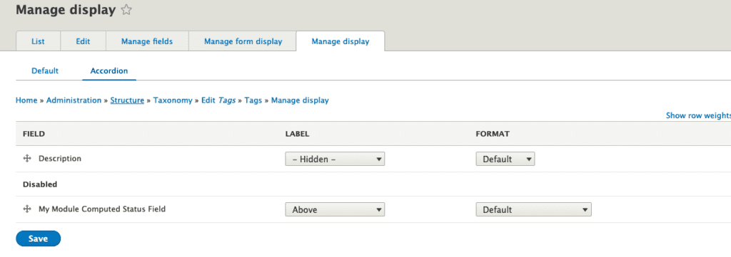
Now, when you view this term you will see the request time that the entity was first displayed.
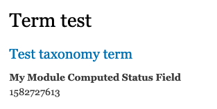
Great… but, since the dynamic page cache is enabled, every user that views this page will see the same request time for the entity, which is not what we want. We can get a different results for different users by adding the user cache context to the #markup array like this:
$elements[] = [
  '#markup' => \Drupal::time()->getRequestTime(),
  '#cache' => [
    'contexts' => [
      'user',
    ],
  ],
];
PHP
This gets us closer, but we will still see the original value every time a user refreshes this page. How do we get this field to change with every page load or view of this entity?
Lazy Builder
Lazy builder allows Drupal to cache an entity or a page by replacing the highly dynamic portions with a placeholder that will get replaced very late in the render process.
Modifying the code from above, let’s convert the request time to use the lazy builder. To do this, first we update the field formatter to return a lazy builder render array instead of the #markup that we used before.
1. Convert the #markup from earlier to use the lazy_builder render type:
/**
 * {@inheritdoc}
 */
public function viewElements(FieldItemListInterface $items, $langcode) {
  $elements = [];

  foreach ($items as $delta => $item) {
    $entity_id = $item->getValue();
    if (is_array($entity_id)) {
      $entity_id = array_shift($entity_id);
    }
    $elements[] = [
      '#lazy_builder' => [
        'myservice:getTermStatusLink,
        [$entity_id],
      ],
      '#create_placeholder' => TRUE,
    ];
  }
  return $elements;
}
PHP
Notice that the #lazy_builder type accepts two parameters in the array. The first is a method in a service and the second is an array of parameters to pass to the method. In the above, we are calling the getTermStatusLink method in the (yet to be created) myservice service.
2. Now, let’s create our service and getTermStatusLink method. Create the file src/MyService.php:
<?php
  namespace Drupal\mymodule;

  class MyService {

    /**
     * @param int $term_id
     *
     * @return array
     */
    public function getTermStatusLink(int $term_id): array {
      return ['#markup' => \Drupal::time()->getRequestTime()];
    }
  }
PHP
3. You’ll also need to define your service in mymodule.services.yml
services:
  myservice:
    class: Drupal\mymodule\MyService
YAML
After clearing your cache, you should see a new timestamp every time you refresh your page, no matter the user. Success!?… Not quite 😞
Cache Contexts
This is a simple example that currently shows how to setup a computed field and a simple lazy builder callback. But what about more complex return values?
In our original use case we needed to show four different statuses for these entities that could change depending on the user that was viewing the entity. An administrator would see different information than an authenticated user. In this instance, we were using a view that had a user id as the contextual filter like this /user/%user/progress. In order to accommodate this, we had to ensure we added the correct cache contexts to the computed field lazy_builder array.
$elements[] = [
  '#lazy_builder' => [
    'myservice:getTermStatusLink,
    [
      $entity_id,
      $user_from_route,
    ],
  ],
  '#create_placeholder' => TRUE,
  '#cache' =>; [
    'contexts' => [
      'user',
      'url',
    ],
  ],
];
PHP
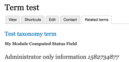
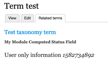
Now, to update the lazy builder callback function to show different information based on the user’s permissions.
/**
 * @param int $term_id
 * @return array
 */
public function getCourseStatusLink(int $term_id): array {
  $markup = [
    'admin' => [
      '#type' => 'html_tag',
      '#tag' => 'h2',
      '#access' => TRUE,
      '#value' => $this->t('Administrator only information %request_time', ['%request_time' => \Drupal::time()->getRequestTime()]),
    ],
    'user' => [
      '#type' => 'html_tag',
      '#tag' => 'h2',
      '#access' => TRUE,
      '#value' => $this->t('User only information %request_time', ['%request_time' => \Drupal::time()->getRequestTime()]),
    ],
  ];

  if (\Drupal::currentUser()->hasPermission('administer users')) {
    $markup['user']['#access'] = FALSE;
  }
  else {
    $markup['admin']['#access'] = FALSE;
  }

  return $markup;
}
PHP
The callback function will now check the current user’s permissions and show the appropriate field based on those permissions.
There you have it, personalized content for entities while still allowing Drupal’s cache system to be enabled. 🎉
Final Notes
Depending on the content in the render array that is returned from the lazy builder callback, you’ll want to ensure the appropriate cache tags are applied to that array as well. In our case, we were using custom entities in the callback so we had to ensure the custom entities cache tags were included in the callback’s render array. Without those tags, we were seeing inconsistent results, especially once the site was on a server using Varnish.
Download the source for the above code: github.com/pfrilling/personalized-content-demo
Thanks for reading and we hope this helped someone figure out how to work towards a personalized but performant digital product.
Note: This blog post is NOT about Voting in Iowa and an App that failed to do its job. But if anyone wants an opinion on how that App should have been built and how much it should have cost, drop us a line 🙂
The great thing about the open source community around Drupal is the range of complex features that already exist. Sometimes, though, the documentation on how to use those pre-built pieces of functionality is lacking. That’s a situation we found ourselves in recently with Drupal’s Voting API.
We found a great tutorial for implementing the Voting API without any customization. Drupalize.Me also has helpful instructional video and text. But if you want to extend the module programmatically, there is very little material online to help guide the way.
The Problem to Solve
Oomph needed to launch a national crowd-sourcing contest for a long-time client. We had to provide visitors with a chance to submit content, and we needed to enable a panel of judges to vote on that content and determine a winner. But behind the scenes, we had to add functionality to enable voting according to specific criteria that our client wanted to enforce. For moderation, there would be an admin page that displays all entries, the scores from all judges, and the ability to search and sort.
Oh, and we had to turn it around in three months — maybe we should have led with that requirement. 😊
Architecting the Solution
Drupal 8 was a natural fit for rendering forms to the user and collecting the input for judging. A few contributed modules got us closer to the functionality we wanted — webform, webformcontentcreator, fivestar, votingapi, and votingapi_widgets.
The robust framework of the Voting API has been around since Drupal 4, so it was a great foundation for this project. It made no sense to build our own voting system when one with a stable history existed. Customizing the way that the API worked put up some roadblocks for our engineering team, however, and the lack of documentation around the API did not help. We hope that by sharing what we learned along the way, we can support the community that maintains the Voting API.
The Lifecycle of the Contest
Submission
The submission form we created is, at its base, a multi-step Webform. It is divided into three pages of questions and includes input for text, images, and video. The form wizard advances users from page to page, with the final submittal kicking off additional processes. A visitor can save an incomplete submission and return to it later. The Webform module contains all of these features, and it saved our team a lot of work.
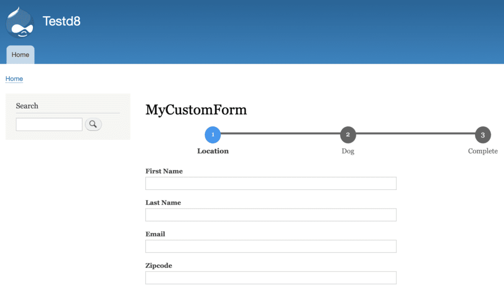
After pressing Submit, there is some custom pre-processing that happens. In this case, we needed to execute a database lookup for one of the submitted fields. Below is an example of code that can be added to a custom module to look up a value and save it to the recently submitted webform. This is a basic code template and won’t include sanitizing user input or all the checks you might need to do on a production-level implementation.
The code snippet and other examples from this blog post are available on Github as a Gist: gist.github.com/bookworm2000/cd9806579da354d2dd116a44bb22b04c.
use \Drupal\webform\Entity\WebformSubmission;
/**
* Implements hook_ENTITY_TYPE_presave().
*/
function mymodule_webform_submission_presave(WebformSubmission $submission) {
// Retrieve the user input from the webform submission.
$submitted_data = $submission->getData();
$zipcode = $submitted_data['zipcode'];
// Retrieve the state name from the database custom table.
// This is calling a service included in the mymodule.services.yml file.
$state_lookup = \Drupal::service('mymodule.state_lookup');
$state_name = $state_lookup->findState($zipcode);
if ($state_name) {
// Update the webform submission state field with the state name.
$submitted_data['state'] = $state_name;
$submission-&gt;setData($submitted_data);
}
}
PHP
Content Entry
The Webform Content Creator module allows you to map fields from a submission to a specified content type’s fields. In our case, we could direct all the values submitted by the contestant to be mapped to our custom Submission content type — every time a user submitted an entry, a new node of content type Submission was created, with all the values from the webform populated.
id: dog_contest_submission_content_creator
title: 'Dog Contest Submission Content Creator'
webform: mycustomform
content_type: dog_contest_submission
field_title: 'Dog Contest - [webform_submission:values:name]'
use_encrypt: false
encryption_profile: ''
elements:
  field_email:
    type: false
    webform_field: email
    custom_check: false
    custom_value: ''
  field_dog_breed:
    type: false
    webform_field: dog_breed
    custom_check: false
    custom_value: ''
  field_dog_name:
    type: false
    webform_field: dog_name
    custom_check: false
    custom_value: ''
  field_dog_story:
    type: false
    webform_field: the_funniest_thing_my_dog_ever_did
    custom_check: false
    custom_value: ''
YAML
Voting
The main technical obstacle was that there were no voting widgets that fit the project requirements exactly:
- The client wanted a voting field to display on each submission with a dropdown list of numbers 1 through 10
- The default value for the field should be 1 on the first time a judge accessed the submission page
- Any other time the judge viewed the submission, the voting field value should default to the number the judge gave (i.e. 9 out of 10)
- The voting had to support multiple judges, such that the field value would display with the individual score given by each individual judge
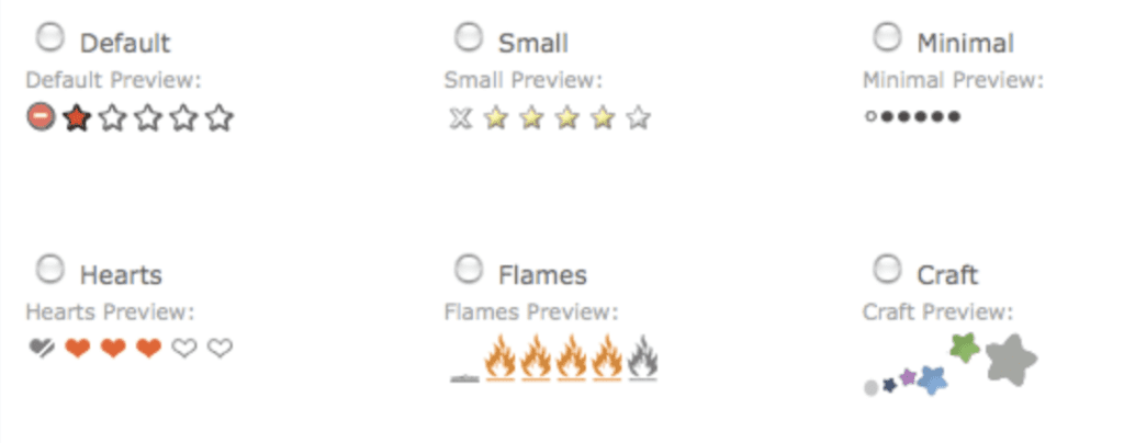
The Fivestar contributed module is the module used most often on Drupal sites to implement the Voting API. It is extensible enough to allow developers or designers to add custom icons and customized CSS. The basic structure of the widget is always the same, unfortunately, and was not suitable for our contest. The available widget options are default stars, small stars, small circles, hearts, flames, or “Craft,” as shown:
We enabled the Fivestar module and opted to override the base widget in order to implement a new one.
Technical Deep Dive
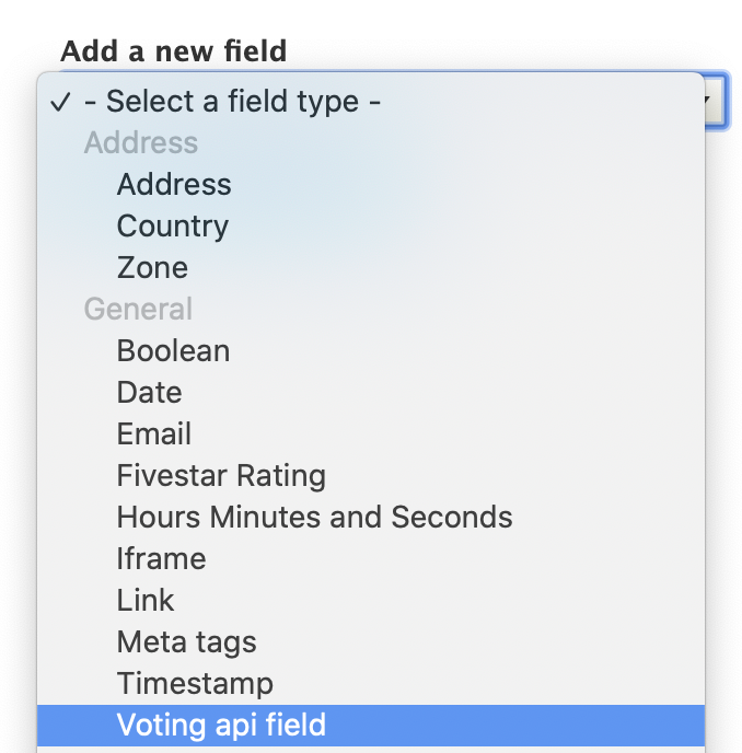
After enabling the Voting API Widgets module, we could now add our voting field to the submission content type. (Add a field of type “Fivestar Rating” if you want to try out the Fivestar module’s custom field.)
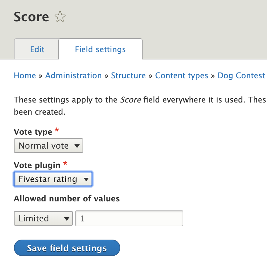
Note: we used the Voting API Widgets 8.x-1.0-alpha3 release. There is now already an alpha5 release that introduces some structural (breaking!) changes to the base entity form that conflict with our custom solution. Job security!
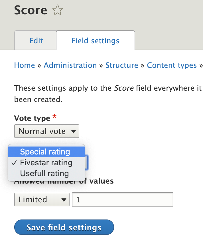
In the field settings for the new Voting API field, the only plugin choices available are plugins from the Fivestar module.
We could not use those plugins for our use case, so we went ahead and built a custom plugin to extend the VotingApiWidgetBase class. For the purpose of this example, let’s call it “SpecialWidget.”
Additionally, we needed to have the ability to set defaults for the voting widget. For that, we had to add a custom form that extends the BaseRatingForm class. The example class here is called “TenRatingForm,” since the voting widget will display a 1-to-10 dropdown list for the judges.
The file structure for the directories and files in the custom module reads like this:
modules
- contrib
- custom
-- mymodule
--- src
---- Form
----- TenRatingForm.php
---- Plugin
----- votingapi_widget
------ SpecialWidget.php
---- StateLookup.php
--- mymodule.info.yml
--- mymodule.module
--- mymodule.services.yml
Let’s look at the SpecialWidget.php file in more detail. It is fairly straightforward, composed of a namespace, class declaration, and 2 inherited methods.
The namespace references the custom module. The annotation sets the widget values list, so you can adjust easily to add your own content. It is critical to include a “use” statement to incorporate the VotingApiWidgetBase class, or else the buildForm( and getStyles() methods from the parent class will not be found, and angry error messages will show up when you try to use your new custom voting widget.
namespace Drupal\mymodule\Plugin\votingapi_widget;
use Drupal\votingapi_widgets\Plugin\VotingApiWidgetBase;
    /**
     * Custom widget for voting.
     *
     * @VotingApiWidget(
     *   id = "special",
     *   label = @Translation("Special rating"),
     *   values = {
     *    1 = @Translation("1"),
     *    2 = @Translation("2"),
     *    3 = @Translation("3"),
     *    4 = @Translation("4"),
     *    5 = @Translation("5"),
     *    6 = @Translation("6"),
     *    7 = @Translation("7"),
     *    8 = @Translation("8"),
     *    9 = @Translation("9"),
     *    10 = @Translation("10"),
     *   },
     * )
     */
PHP
The other important section to point out is defining the class and the buildForm() method. The SpecialWidget class will now inherit the methods from VotingApiWidgetBase, so you do not need to copy all of them over.
class SpecialWidget extends VotingApiWidgetBase {
  /**
   * Vote form.
   */
  public function buildForm($entity_type, $entity_bundle, $entity_id, $vote_type, $field_name, $style, $show_results, $read_only = FALSE): array {
    $form = $this->getForm($entity_type, $entity_bundle, $entity_id, $vote_type, $field_name, $style, $show_results, $read_only);
    $build = [
      'rating' => [
        '#theme' => 'container',
        '#attributes' => [
          'class' => [
            'votingapi-widgets',
            'special',
            ($read_only) ? 'read_only' : '',
          ],
        ],
        '#children' => [
          'form' => $form,
        ],
      ],
    ];
    return $build;
  }
}
PHP
One additional crucial step is overriding the order of operations with which the entity builds occur. The Voting API Widgets module takes precedence over custom modules, so it is necessary to strong-arm your module to the front to be able to see changes. Ensure that the custom plugin is being called by the Voting API Widgets module, and then also ensure that the mymodule_entity_type_build() in the custom module takes precedence over the votingapi_widgets_entity_type_build() call. These functions go in the mymodule.module file.
/**
 * Implements hook_entity_type_build().
 */
function mymodule_entity_type_build(array &$entity_types) {
  $plugins = \Drupal::service('plugin.manager.voting_api_widget.processor')->getDefinitions();
  foreach ($plugins as $plugin_id => $definition) {
    // Override the votingapi_widgets form class for the custom widgets.
    if ($plugin_id === 'special') {
      $entity_types['vote']->setFormClass('votingapi_' . $plugin_id,
        'Drupal\mymodule\Form\TenRatingForm');
    }
  }
}

/**
 * Implements hook_module_implements_alter().
 */
function mymodule_module_implements_alter(array &$implementations, string $hook) {
  if ($hook === 'entity_type_build') {
    $group = $implementations;
    $group = $implementations['mymodule'];
    unset($implementations['mymodule']);
    $implementations['mymodule'] = $group;
  }
}
PHP
After adding the custom plugin to the custom module, the option to select the widget will be available for use by the Voting API field. (After clearing all caches, of course.) The field here is called Score.
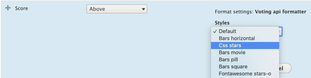
Adjusting the style of the widget can be done in the “Manage Display” section for the content type:
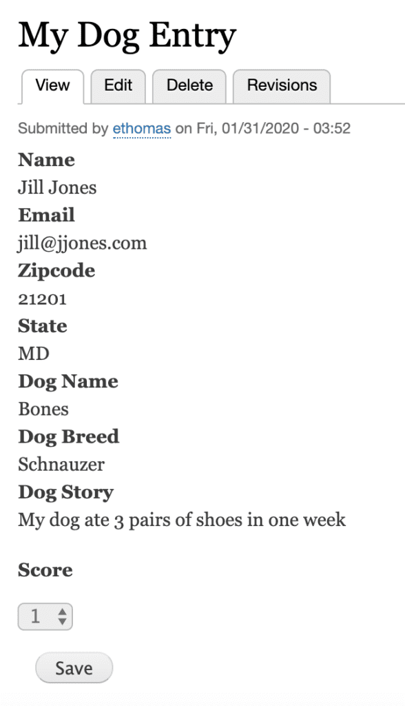
And here is how it looks when the voting field has been added to the Submission content type:
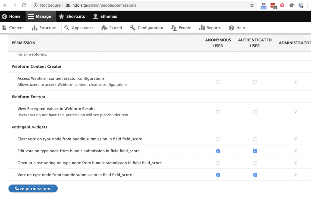
The last piece of the puzzle are the permissions. As with most custom features, your existing user roles and permissions will need to be configured to allow users to vote, change votes, clear votes, etc… — all the features that the Voting API Widgets module provides. Unless the voting will be done by authenticated users, most of the boxes should be checked for anonymous users — the general public.
The judges can now vote on the node. A judge can vote as many times as they want, according to our client’s specs. Each vote will be saved by the Voting API. Depending on how you want to use the voting data, you can opt to display the most recent vote, the average of all votes, or even the sum of votes.
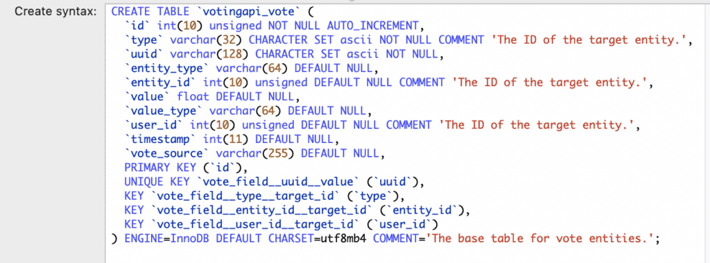
All voting data will be entered into the votingapi_vote table of your Drupal database by the Voting API module.
Success!
To Wrap it All Up
We hope you can appreciate the benefit of leveraging open source software within the Drupal ecosystem to power your projects and campaigns. Between the Voting API and Voting API Widgets modules alone, there were over 5,000 lines of code that our engineers did not have to write. Extending an existing codebase that has been designed with OOP principles in mind is a major strength of Drupal 8.
While not formally decoupled, we were able to separate the webform and submission theming structurally from the voting functionality so that our designers and engineers could work side-by-side to deliver this project. Credit to our team members Phil Frilling and Ben Holt for technical assists. The client rated us 10 out of 10 for satisfaction after voting was formally opened in a live environment!
THE BRIEF
The American Veterinary Medical Association (AVMA) advocates on behalf of 91,000+ members — mostly doctors but some veterinary support staff as well. With roots as far back as 1863, their mission is to advance the science and practice of veterinary medicine and improve animal and human health. They are the most widely recognized member organization in the field.

Make the Brand Shine
The AVMA website is the main communications vehicle for the organization. But the framework was very out of date — the site was not mobile-friendly and some pages were downright broken. The brand was strong, but the delivery on screen was weak and the tools reflected poorly.
Our goals were to:
IMPROVE THE SITE MAP
Content bloat over the years created a site tree that was in bad need of pruning.
IMPROVE SEARCH
When a site has so much content to offer, search can be the quickest way to find relevant information for a motivated user. Our goals were to make search more powerful while maintaining clarity of use.
COMMUNICATE THE VALUE OF MEMBERSHIP
Resources and benefits that come with membership were not clearly illustrated and while members were renewing regularly, they were not interacting with the site as a resource as often as they could.
STRENGTHEN THE BRAND
If the site was easier to navigate and search, if it had a clear value proposition for existing and prospective members, and if the visual design were modern and device-friendly, the brand would be stronger.
THE APPROACH
Put Members First
Oomph embarked on an extensive research and discovery phase which included:
- A competitor Analysis of 5 groups in direct competition and 5 similar membership-driven organizations
- An online survey for the existing audience
- A content and SEO audits
- Several in-person workshops with stakeholder groups, including attendance at their annual convention to conduct on-the-spot surveys
- More phone interviews with volunteers, members, and additional stakeholders
With a deep bed of research and personal anecdotes, we began to architect the new site. Communication was high as well, with numerous marketing, communications, and IT team check-ins along the way:
- An extensive card sort exercise for information architecture improvements — 200+ cards sorted by 6 groups from throughout the organization
- A new information architecture and audience testing
- A content modeling and content wireframe exercises
- A brand color accessibility audit
- Over a dozen wireframes
- Three style tiles (mood boards) with revisions and refinements
- Wireframe user testing
- A set of deep-dive technical audits
- Several full design mockups with flexible component architecture
Several rounds of style tiles explored a new set of typefaces to support a modern refresh of the brand. Our ideas included darkening colored typography to meet WCAG thresholds, adding more colored tints for design variability, and designing a set of components that could be used to create marketing pages using Drupal’s Layout Builder system.
THE RESULTS
The design update brought the main brand vehicle fully into the modern web. Large headlines and images, chunks of color, and a clearer hierarchy of information makes each pages’ purpose shine. A mega-menu system breaks complex navigation into digestible parts, with icons and color to help differentiate important sections. The important yearly convention pages got a facelift as well, with their own sub-navigation system.
FINAL THOUGHTS
Supporting Animals & Humans Alike
Membership to the AVMA for a working veterinary doctor is an important way to keep in touch with the wider community while also learning about the latest policy changes, health updates, and events. The general public can more easily find information about common pet health problems, topical issues around animal well-being during natural disasters, and food and toy recalls. The goal of supporting members first while more broadly providing value to prospective members and non-members alike has coalesced into this updated digital property.
We look forward to supporting animal health and human safety as we continue to support and improve the site over the next year.
Over the past week Kathy Beck and I have had the pleasure of touring a talk that we have prepared around Drupal 8’s Layout Builder. We aren’t the only ones talking about it, of course, but it is a set of tools in Drupal core that have lately found new interest in the community. More and more developers are discovering and using the tool, which makes it an exciting bit of technology to talk about.
We recently had great success with Layout Builder on a new project. What was a really nice was that our design system paradigm from previous projects was easily portable into this new Layout Builder tool. So our UX thinking was solid, and this was a solid tool that could continue to support that way of working.
Moving into Layout Builder also gave us some additional advantages:
- Layout Builder is a core part of Drupal. Other similar tools are contributed modules, which means they could fail to keep up with security or compatibility issues or die on the vine all together
- Layout Builder plays more nicely with Drupal’s core Translation methods
- Layout Builder has better performance that some similar solutions in the contributed module world
- And Layout Builder has built-in template control
What Template Control in Layout Builder looks like
For most projects, the key advantage to Layout Builder is that it puts the creation and “design” of a content type’s main template in the admin experience. Drupal already puts many controls in the Admin experience, allowing site builders to create content types, configure the fields that they use, and even configure some of the ways in which that data will be displayed to users. With that, it makes sense that Layout Builder provides way in which site builders can create visual templates.
This reduces the need for front-end templates in Twig. Again, since a site builder is the one to configure a new content type directly in the admin, they can now also create that default template in the admin as well. Just like theming in Twig, though, if a site builder makes a change to the main template, any piece of content created with that template will also update. Its a powerful way to edit and control templates per content type.
What’s really cool is that we as the site builders can decide which content type template’s an author has access to override the layout of. The scenario is this: An article content type is locked down, and the author can only access the fields to update title, image, and body content. But a “Marketing page” content type has that restriction removed, so an author has access to “Layout”, and therefore they can make as many changes to that page as they want. They can add new content components, they can delete others, change color, column design, and anything else that we create to modify designs.
Watch the Videos
With that explanation, our talks go into more detail about how this all works and what problems we wanted to try to solve. The first video that we have ready to view was geared towards a design audience. Another one to come along soon was geared towards a more technical, Drupal-knowledgable audience. Pick the one that is right for you!
Oh, and as a “cool to know”, the presentation deck itself was built in Layout Builder!
Presentation in front of a Developer Audience for DrupalCamp Atlanta:
Presentation in front of a Design Audience for DesignWeek RI:
There’s a lot changing in the SEO world everyday. Namely, you don’t have to be super focused on the perfect SEO structure on each page and perfect meta information to achieve ideal placement (though it is still important). Instead, you should be focused on making your website ‘search-friendly’ for external users, and creating a positive UX for on-site users.
This talk gives actionable advice on:
- An overview of SEO best practices
- Taking a step back and reviewing SEO in tandem with UX and design; including tips for designers on how to not forget SEO when wireframing and designing pages
- Reviewing how engineers can build and theme Drupal sites without sacrificing SEO
- A review of the Metatags module and what you should be using it for
- Website examples of good and bad SEO
SEO is way more simple than marketers make it out to be, and I want to make sure that all Drupal designers and builders feel confident that their work will be easily found on Google (or Bing if that’s your flavor)!
Watch Designing and Building with SEO in Mind
The authoring experience is core to any content management system. Very few web content admins prefer to work in HTML, so they use a What-You-See-Is-What-You-Get editor nicknamed a WYSIWYG (pronounced whizzy wig
). There are many free and paid WYSIWYG solutions out there, but the big two that have been around for 10 years or more and have been adopted into widely available open source projects are CKEditor and TinyMCE. Drupal and WordPress long ago decided to pick one as their recommended editor, and so WordPress uses TinyMCE and Drupal uses CKEditor[1].
The power of a WYSIWYG like CKEditor is in its ability to be customized. Drupal makes it easy to customize the authoring experience for any user role and in any configuration that a site needs. Super Admins can have access to a fully featured “Full HTML” version of the editor while your content authors have access to a “Basic HTML” version that locks out certain kinds of code that may do harm to a website.
Oomph customizes CKEditor for each custom Drupal (or WordPress) site we build. As a best practice, though, we like to start from the same place. We’d like to share our “default” CKEditor set up as well as the steps that you need to take to customize CKEditor yourself.
Customize CKEditor Text Formats by User Roles
Drupal allows multiple CKEditor configurations, and each can be available per user role — as mentioned previously. To understand the ways in which the editor can be customized, we first need to understand the user roles and default configurations.
User Roles
Drupal ships with three main user roles built in — Administrator, Authenticated User, and Anonymous User. More official documentation about User Roles is available from drupal.org.
An Anonymous user is someone that can’t log in — they can only view content on the front end of the site. To call them a “user” is a bit of a misnomer, but their actions are being tracked to the user ID of zero — therefore, Drupal still considers them a user.
An Authenticated user is someone that can log in but they can do very little. A new Drupal installation gives this user only a few permissions — they view Media, view published content, use shortcuts, and use the Basic HTML text format.
Finally, the Administrator can do everything by default. This was the first user created when a new site was installed, and by default, the account has permissions to do everything.
Many more roles can be created and permissioned of course, but these are the ones that come out of a default Drupal install. We usually create a new “Content Editor” user role for our clients as authors on the site with permissions to create and edit content.
Text Formats and Editors
CKEditor is included in Drupal core, so it comes pre-installed. There are three “text-formats” that the default installation of CKEditor comes with — Full HTML, Basic HTML, and Plain text.
These distinctions are very handy, and also by default, they map nicely to the User Roles we described. Plain text for Anonymous users with no ability to create content, Basic HTML for Authenticated users who might be able to author some content, and Full HTML for Administrators that need to have all of the elements that HTML provides.
The Plain text format is there when there is no other format available to a user — there is no WYSIWYG at all, therefore a <textarea> form element is naked of any formatting embellishments.
It is recommended to keep the Plain text editor plain and edit the format as little as necessary, if at all. When starting a new project, we edit the Basic and Full HTML formats to customize them to our liking.
Basic HTML
The Basic HTML editor comes with a small set of options by default — all the controls that you might expect from a rich text web editor, like heading formats, lists, blockquotes, alignment, bold, italic, and others. These options are a little disorganized, in our opinion[2], but since this is Drupal, we can customize it easily.
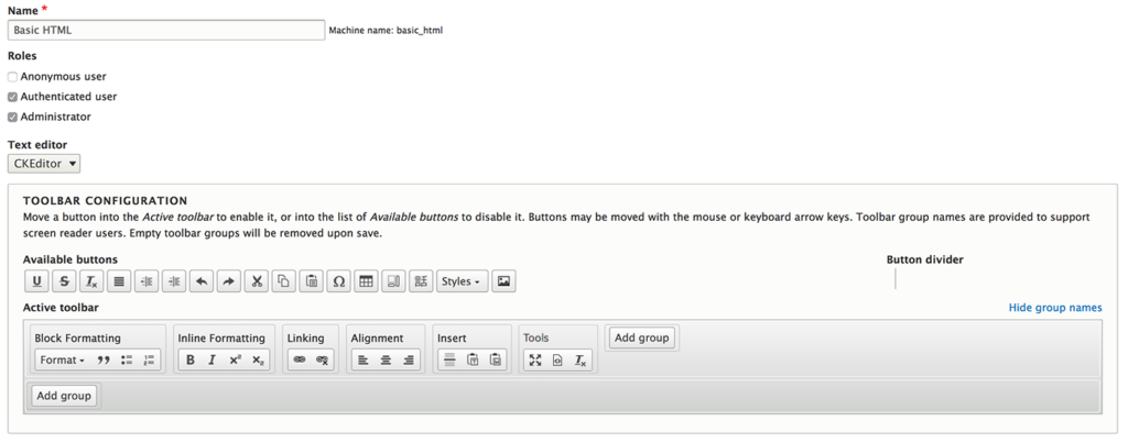
Out of the box, the Basic HTML format looks like this:
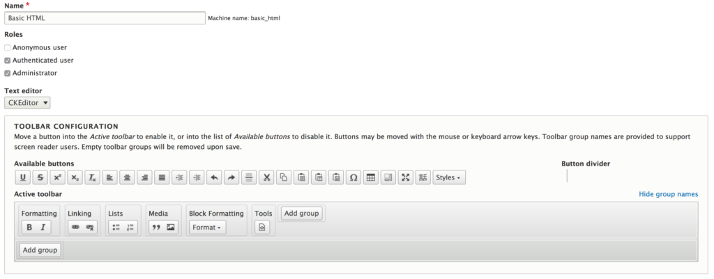
In the Toolbar Configuration area, admins can move “Available buttons” from the top row to the “Active Toolbar” below, and arrange them however they wish. We like to follow this grouping of button options:
- Block formatting: All of the HTML block-level elements — the Format drop down, Blockquote, Unordered list, and Ordered list
- Inline styles: Bold, Italic, Superscript, and Subscript. We don’t use the Strikethrough because it is seldom used and the Underline option because we wouldn’t want a visitor to confuse underlined text as a link if it is not
- Alignment: Left, Center, and Right. We don’t use Justify because it always looks bad (again, in our opinion)
- Linking: Add a link, Remove a link
- Insert: Anything that gets inserted into content — Horizontal rule, Paste plain text, Paste from Word (read an aside about this feature later on in the article). Basic HTML does not include an Image insertion from the Media Library for most sites
- Tools: Options for looking at the content differently — Full screen, Source view, and Remove content formatting
After the changes are made and saved, the Basic HTML text format looks like this:
Much better. From here we will probably customize it further as additional modules or custom features add buttons that we decide to turn on for content authors.
One more thing should be looked at before finishing the Basic HTML Text format. If the “Limit allowed HTML tags and correct faulty HTML” filter is enabled (should be the first checkbox right under the Toolbar configuration), there will also be a Filter Settings area at the bottom of the admin page where the allowed HTML is displayed:
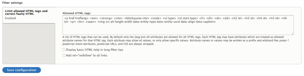
The default allowed HTML for Basic is:
<a href hreflang> <em> <strong> <cite> <blockquote cite> <code> <ul type> <ol start type> <li> <dl> <dt> <dd> <h2 id> <h3 id> <h4 id> <h5 id> <h6 id> <p> <br> <span> <img src alt height width data-entity-type data-entity-uuid data-align data-caption>
We edit ours slightly as follows to be more restrictive:
<a href hreflang target rel> <em> <strong> <cite> <blockquote cite> <code> <ul> <ol start> <li> <dl> <dt> <dd> <h1> <h2> <h3> <h4> <h5> <h6> <p class=""> <br> <img src alt height width> <hr> <sup> <sub> <span lang dir>
Limiting code for the Basic HTML Text format is a good idea. Authors may think that code copied from the web somewhere is fine because it will help them do this one thing, but more often that not it introduces display issues, and at worst, it introduces something malicious.
Full HTML
For Full HTML, the same ideas apply but with a few more options. Again, the default Drupal configuration for the Full HTML text format is this:
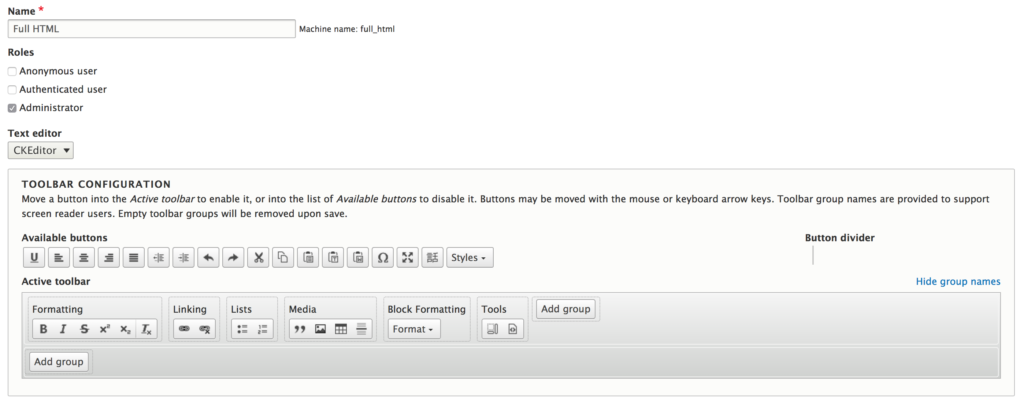
Not very different from the previous text format — a little more robust — and we improve it our own way.
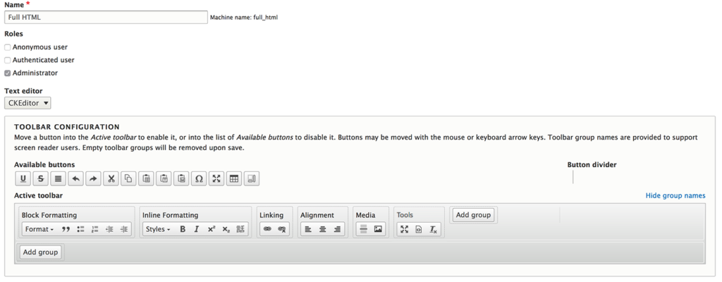
In addition to the same order and grouping as Basic HTML, we:
- Add Indent and Outdent to the Block formatting group. This is not a semantic HTML element but it will affect an entire block element by adding a class to the block HTML item
- Add the Styles drop down menu which enables custom classes for this project. We also add the Language formatting to the Inline group. On a per-project basis, we may decide to give these options to the Basic HTML text format
- Add Media to the Insert grouping and remove the paste options[3]
After adding Styles, Media, and Language, we get additional plugin settings below the Toolbar Configuration. For Media, edit those settings as you see fit. We try to keep uploads small and force Drupal to compress images that are uploaded straight from a camera. For Languages, depending on the site, you might want to enable to full set of language codes rather than the default six official languages of the United Nations.
Custom Theme Classes in CKEditor
To leverage the power of custom author styles, the Styles dropdown plugin setting is super important. This is how you get theme CSS classes into the editor! The list should take the format of [HTML element to apply the class to].[name of class]|[Label to display to user]
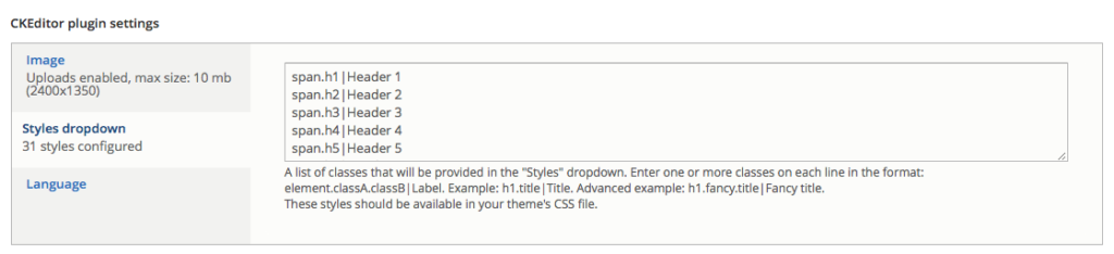
A subset of the styles that we add are as follows, and might look familiar to people that use Bootstrap utility classes:
p.lead|Paragraph Lead
ul.list-unstyled|List unstyled
span.display-1|Display1
span.display-2|Display2
span.display-3|Display3
span.h1|Header 1
span.h2|Header 2
span.h3|Header 3
span.h4|Header 4
span.h5|Header 5
span.h6|Header 6
span.text-small|Text size small
span.text-lowercase|Text Lower case
span.text-uppercase|TEXT ALL CAPS
span.text-abbr|Abbreviations
span.font-weight-light|Text light weight
span.font-weight-normal|Text normal weight
span.font-weight-bold|Text bold weight
Drupal does not allow the CSS * selector, which would mean that the requested class could be added to any HTML element — the rule can’t look like *.class-name|A Universal Style, for instance. That’s too bad, which is why we do the next best thing and apply most of our custom styles to <span> elements.
These settings allow an author to mix visual heading styles without changing the semantics. We find that it works pretty well. Say, for example, someone is designing the content for their page and they understand that an article with an H1 title needs to have subheads that are H2, and between H2s, you should only use an H3, etc… they understand the semantic structure of the page. But visually, maybe they want the H2s to look like H3s, and the H3s to look like H4s. That can be accomplished with the way we have structured our class naming and the application to <span> tags. The resulting HTML might look like this:
<h1>An introduction to CKEditor</h1>
<h2 class="h3">What is CKEditor?</h2>
<h2 class="h3">Customizing CKEditor</h2>
<h3 class="h4">Basic HTML</h3>
<h3 class="h4">Full HTML</h3>
<h2 class="h3">Getting theme CSS into the Editor</h2>
We get the semantics needed for good SEO and great accessibility, and the author gets the page to look they way that they want.
Matching the preview in CKEditor with your Site Theme
To finalize the customization and to give the author a much more complete experience, we add some code to our site’s theme files that injects the custom visual theme into the CKEditor preview pane. The authors, therefore, will get a much better sense of how their content will look because they will see the site’s fonts, colors, and typography styles.
We go from this:
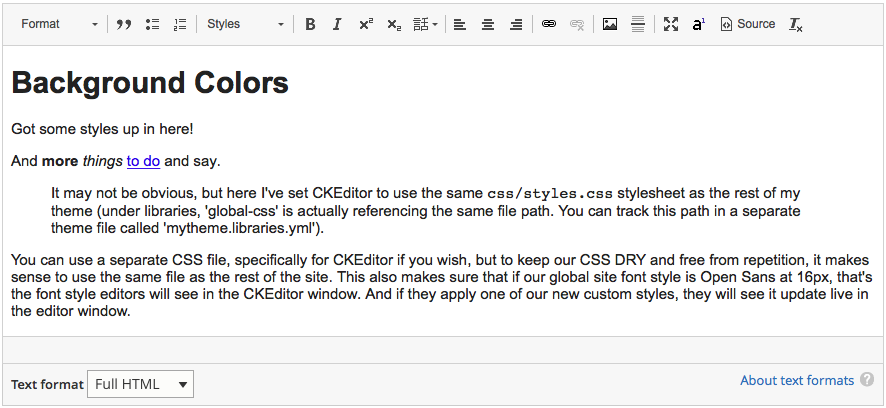
To this:
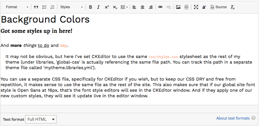
By just adding a little bit of code to the theme’s info file, or themes/custom/yourtheme/yourtheme.info.yml:
ckeditor_stylesheets:
  - assets/styles/main.cs
You can use a separate CSS file specifically for CKEditor if you wish, but to keep our CSS DRY, it makes sense to use the same file as the rest of the site — its already loaded and cached after all. When authors apply one of our new custom styles from the Styles dropdown menu they will see it update live in the editor window before they save and view the content.
And that’s it! Your Drupal 8 project has a customized admin experience with CKEditor sharing the same visual styles as your front end.
# Cleaning Text Pasted from Word
Now for a tangent into the world of pasting content from a Microsoft Word document.
Clients are going to cut and paste text from Word documents; you just can’t stop them. Luckily, CKEditor has a robust scrubber that will remove the junk from this code and maintain the most important styling like bold, italic, and headers (even tables if your editor allows them).
The way it works is pretty transparent, too. We keep the button in place for folks who might have used it before, but with CKEditor version 4, anything on the clipboard pasted into the editor will get scrubbed. When the editor detects code on the clipboard that contains junky content from Word, a little notification will pop up and let the user know that it sees what you are doing (shame shame) but it will clean it for you.

If you press Cancel, the content gets pasted without being scrubbed, while if you press OK, it will. Either way, the paste of new content happens and the allowed tags portion of the Editor configuration will kick in and do its job (which may remove some of the code from Word, but probably not all).
Test it yourself with the sample Word document on this page: ckeditor.com/docs/ckeditor4/latest/features/pastefromword.html
Just one Gotcha
But there is a pretty big catch to all of this. It might seem obvious, but it needs to be stated — don’t expect Paste from Word to work unless “Limit allowed HTML tags and correct faulty HTML” is turned on. If you are using the Full HTML text format, and the format allows any and all HTML code, Paste from Word will do nothing!
We had a scenario in which the client used the Full HTML editor because they needed access to Drupal Tokens and a few custom pieces that are rather advanced. When they pasted content from Word, though, they were getting all of the code that Word exports and the visual experience was not what they expected. When we took a look and saw the source code, we didn’t understand at first why the Paste from Word filter was not working.
What we (at Oomph) should have done was give them these advanced features in the Basic HTML editor, with “Limit allowed HTML tags and correct faulty HTML” turned on and perhaps a more complex and lengthy list of allowed HTML. This would have been a little more work but it would have saved time in the long run.
Sidebar to the Sidebar: Why is content from Word so bad?
You may be wondering, why does this matter? Microsoft Word is publishing software that 83% of the business world uses, how can it be that bad? Well, Word was created for the world of printing documents, not managing content on the web. On the web and in the projects we create, there is a visual theme that should control the look of all the content. The content pasted from Word tries to force its own visual styles over the styles of the custom theme. On top of all that, the code is terribly bloated.
Here is a simple example of a single three-word headline:
<h1 align="center" style="margin:12pt 0in; -webkit-text-stroke-width:0px; text-align:center"><span style="font-size:22pt"><span style="line-height:31.386667251586914px"><span style="break-after:avoid-page"><span style="font-family:"Times New Roman""><span style="font-weight:normal"><span style="caret-color:#000000"><span style="color:#000000"><span style="font-style:normal"><span style="font-variant-caps:normal"><span style="letter-spacing:normal"><span style="orphans:auto"><span style="text-transform:none"><span style="white-space:normal"><span style="widows:auto"><span style="word-spacing:0px"><span style="-webkit-text-size-adjust:auto"><span style="text-decoration:none"><span style="font-family:Georgia"><span style="color:black"> Recognition of Achievement</span></span></span></span></span></span></span></span></span></span></span></span></span></span></span></span></span></span></span></h1>
All this should actually be is:
<h1>Recognition of Achievement</h1>
In performance speak, that’s 922 bytes (one byte is one character) when it should be only 35 — an increase of 2600%!
All of these inline <span> tags with inline “styles” will override the site’s custom theme, making the content of this page look inconsistent. Some of these styles do nothing on the web at all — break-after:avoid-page, orphans:auto, and widows: auto are print styles, and the units pt and in are also for print. Other tags are inefficiently nested — font-family and color are declared twice (the innermost CSS rule wins, by the way). If you want to get really geeky, we discovered that the properties caret-color> and font-variant-caps are not even supported by Microsoft’s own web browser.
So yes, content cut and pasted from Word without any cleanup really is that bad.
What We Learned
- Custom site themes deserve a custom author experience as well
- Drupal 8 makes it easy to tailor the permissions, HTML options, and visual theme for the core of most authoring experiences, the WYSIWYG editor
- Pasting content from Word is terrible and bloated and will try to ruin the nice theme that you may have put in place, so make sure to enable “Limit allowed HTML tags and correct faulty HTML”
And knowing is half the battle… or maybe just one tenth.
Footnotes
- Drupal moved CKEditor into core in version 8. Previously, developers needed to pick their preferred editor and install it as a module. Return ⤴
- Why is Blockquote grouped with Media, like an image? No text alignment? “Formatting” and “Block Formatting” as labels? C’mon Drupal, we can do better. Return ⤴
- Removing the paste option is important as you can read in another section. Since this Text Format allows all HTML, using the paste tools would do nothing to strip content of bad HTML and styles. Return ⤴
In this video from New England Drupal Camp, November 17, 2018, Director of Design & UX J. Hogue reviews how we approach building a flexible set of components for our clients using Drupal 8 and the popular Paragraphs Module. These component-based design systems make it easier to administrate complex landing pages, quicker for the author to design with their content, all within a brand-aware design system that keeps the visuals consistent for the consumer.
Through five projects (and growing), our internal design framework allows our team to craft new design systems for clients that can grow with their content. The design systems we create offer variety within constraints — that is what Paragraphs does so well. Why is a design system so important for clients authoring new content? Because ideally, it removes the pressure from thinking about what the content should look like, and instead, allows the author to focus on which components should I use to tell the best story with my content?
Paragraphs offer the most visual flexibility for the client and the most design-system control for the development team. If you haven’t yet been convinced, this talk just might make you a believer, too.
Real-world Application
We’ve seen this be true for a client earlier this year. We were given about 10 weeks to design and implement two different reports that took the form of long scrolling pages. These reports needed to have some visual distinction from each other — they should have a “family” resemblance, but they also had different audiences so a certain amount of visual distinction was needed. And, oh by the way, the content was not entirely written yet. And they wanted to get started on design now.
How were we going to solve this? How were we going to get 2500 words with images, videos, and testimonials onto two different pages with different look-n-feels? A design system seemed like the best answer.
Myself and our Senior Drupal Architect got together and collaborate on a technical design solution. We whiteboarded some ideas, and what started to emerge was what I am presenting here today. We broke things down into an abstract system first — one that would work within Drupal and Paragraphs, and then applied a visual design on top. Along the way, we identified configuration options that should shift, expand, or contract. We added an animation system. We added custom CK Editor styles for greater typographic control and custom element support. In short, we developed, designed, prototyped, and received client approval in tandem. We met our 10 week deadline and learned a ton in the process.
Our Legos
The pieces we use to design a page are simple in that they have a minimum of configuration needed to work. Any embellishments become visual, not functional, and therefore the author has to only concentrate on their content and how best to present it.
Our system is row-based, with a basic Row and a Hero Row forming the basis of the organization. We then have content components — a WYSIWYG component, a Testimonial, an Accordion, and Media in the form of an Image and a Video.
Our design options are many — horizontal and vertical alignment, 18 different layouts, background colors, background images, borders, animations, and some extras. Don’t worry, the video goes over all of these options in a visual way to make it easier to understand how flexible this system really is.
Getting started with Oomph Paragraphs
For the developers in the audience, our team has rolled out this framework into a public Drupal Module that we have created for ourselves to achieve consistency between projects. Even though it is an internal project, we released it publicly and are working to follow all Module best practices because we think this is a great way to jumpstart development with a solid foundation for a design system. Contributions and feedback are welcome.
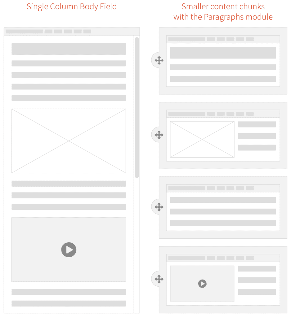
Traditional pages should be a thing of the past. The modern web experience is composed of small pieces of content arranged into a cohesive story. For an author, a single content area is fine for a blog post—a single story that expounds upon one thought. But for a modern website with many landing pages—places where the user needs to decide what they want to do next—a single content column will no longer suffice. We need modular content and a better way to manage its creation.
At An Event Apart this April, Ethan Marcotte was talking about the future of design and User Experience in a multi-device world. Specifically, he said that we should:
[…] design networks of content that are composed of patterns. These patterns, which are small responsive patterns themselves, can be stitched together to create composite experiences like pages.
In other words, the idea of “pages” needs to be blown apart into smaller patterns. Break free from the single content area and create compelling experiences for a modern audience!
We at Oomph agree, and the roadmap that we drew last summer while designing and developing the new BCBS.com (launched in November, 2016) was already blowing the old idea of pages apart with a modular content system.
How did we get here?
Why have we been bound by a single content area? This all goes back to the prevalence of blogs and content management systems (CMSs), which, for ease of use, created just one main content area. For an author of a blog post, one content area is enough as they are writing a single story. But for business sites that need to market a product or service, it is usually not enough.
For Blue Cross and Blue Shield Association, when we were discovering ways in which we could redesign their site, we recognized that they needed to break out from the constraints of the single content area provided by CMSs. The new BCBS.com was going to be built on Drupal 8, so we needed to think about solutions within that ecosystem.
Why we Chose the Drupal Paragraphs Module
Modern CMSs have started to handle multiple chunks of content, and within the Drupal community there are a few ways to address it. The downfall—in our minds—with a few of these solutions is that they put all of the power into the hands of the authors. If you have a team of savvy people that understand interface design, responsive design, and are not afraid to get their hands dirty with some HTML, that can work. In our experience, though, it is too much power and authors are more liable to break something—either break the rendering of the page or break too far outside the brand guidelines. These solutions are difficult to use and typically get abandoned by the author.
Instead of unlimited options, what we as the design and development team wanted was the ability to define our own set of options that we could then expose to the authors. We’d build each set of options into a small responsive pattern, which allows the author to concentrate on their content and how they want to tell a story.
The Paragraphs Module can do exactly that. It adds a new field type that works like Entity References, and with it, we can define all sorts of Paragraph Types and configurable options to give to authors. For the end viewer, the experience has visual variety, but it never veers off brand or looks broken. For the author, they have many options but do not need to think about what happens to their content for mobile or tablet. Those decisions have been baked into each Paragraph Type.
What we Built for BCBSA
We based our modular design patterns on a simple “card” consisting of an optional icon, an optional background (could be color, image, or gradient), and a WYSIWYG content field. These elements had many, many options associated with them:
- 300+ icons to choose from
- 6 buttons styles in 3 different sizes
- 20 background colors
- 3 background gradients
- 11 Header styles
- 5 sizes for body copy with fluid responsive sizing
- 6 body copy colors
- Width pairings for multi-card rows
From here, we defined 10 different Paragraph “Rows” of cards and other types of content. Each of these bundles have responsive design built in — they are small responsive patterns that can be stitched together to create pages:
- Single, Two and Three Card “Heros” — text over a background color or image
- Two, Three, and Four Card Rows
- Image Card Row
- Video Card Row
- Image Gallery Row
- iFrame Row
- Wayfinding Row—a way to insert and control jump links (anchors) on a page
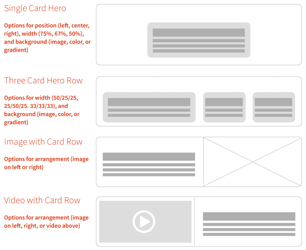
With these options and rows together, the BCBSA team can create fantastic long-form content pages as well as complex landing pages that can still use Drupal’s Body Content area, Featured Images, and even Blocks and Views.
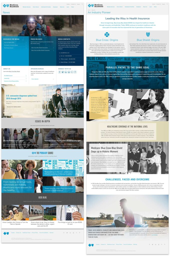
Oomph & BCBSA ❤ Paragraphs
With Drupal and Paragraphs, both the Oomph and BCBSA teams are very excited about the extensive possibilities of a curated system of modular components, options, and rows. Authors have a large but controlled set of options which makes every page feel unique but on brand, and the viewers get a fully responsive experience without any additional work.
We’ve become believers in this kind of system and have already started adapting it to other clients who need to solve a similar problem. We could design a custom system of Paragraphs and options for you, too.
Resources:
- A joint presentation at Drupalcon North America, 2017 by John Eckroth, Director of Digital Experience and Strategy at Blue Cross Blue Shield Association and J. Hogue, Director of Design & UX at Oomph, Inc. (with video)
- Video of the presentation on YouTube (voiceover on top of the slide deck)
- Drupal’s Paragraphs Module page
- Psychological statistics about reading and visual comprehension, in a marketing context
- Jason Santa Maria musing on the growing prevalence of long-form content back in 2014
Amodern design-to-development workflow for the web involves multiple tools for site maps, wireframing, testing, and design before we even start to touch HTML and CSS in a browser. Is there a way to move from low-fidelity responsive wireframes to high-fidelity design in the browser with an HTML prototype?
Whether or not you use a popular CMS to build your sites, getting into coded HTML and CSS early can benefit any project. J. Hogue, Director of Design & UX at Oomph, recently presented “Prototyping Design to Jumpstart Development” at Design Week Rhode Island, during which he discussed new methods we’re using at Oomph to get a project into code as soon as possible.
We are proud to share his well-attended discussion in its entirety, and we invite you to join the conversation.