
THE BRIEF
The RISD Museum publishes a document for every exhibition in the museum. Most of them are scholarly essays about the historical context around a body of work. Some of them are interviews with the artist or a peek into the process behind the art. Until very recently, they have not had a web component.
The time, energy, and investment in creating a print publication was becoming unsustainable. The limitations of the printed page in a media-driven culture are a large drawback as well. For the last printed exhibition publication, the Museum created a one-off web experience — but that was not scalable.
The Museum was ready for a modern publishing platform that could be a visually-driven experience, not one that would require coding knowledge. They needed an authoring tool that emphasized time-based media — audio and video — to immediately set it apart from printed publications of their past. They needed a visual framework that could scale and produce a publication with 4 objects or one with 400.
THE APPROACH
A Flexible Design System
Ziggurat was born of two parents — Oomph provided the design system architecture and the programmatic visual options while RISD provided creative inspiration. Each team influenced the other to make a very flexible system that would allow any story to work within its boundaries. Multimedia was part of the core experience — sound and video are integral to expressing some of these stories.
The process of talking, architecting, designing, then building, then using the tool, then tweaking the tool pushed and pulled both teams into interesting places. As architects, we started to get very excited by what we saw their team doing with the tool. The original design ideas that provided the inspiration got so much better once they became animated and interactive.
Design/content options include:
- Multiple responsive column patterns inside row containers
- Additionally, text fields have the ability to display as multiple columns
- “Hero” rows where an image is the primary design driver, and text/headline is secondary. Video heroes are possible
- Up to 10-colors to be used as row backgrounds or text colors
- Choose typefaces from Google Fonts for injection publication-wide or override on a page-by-page basis
- Rich text options for heading, pull-quotes, and text colors
- Video, audio, image, and gallery support inside any size container
- Video and audio player controls in a light or dark theme
- Autoplaying videos (where browsers allow) while muted
- Images optionally have the ability to Zoom in place (hover or touch the image to see the image scale by 200%) or open more
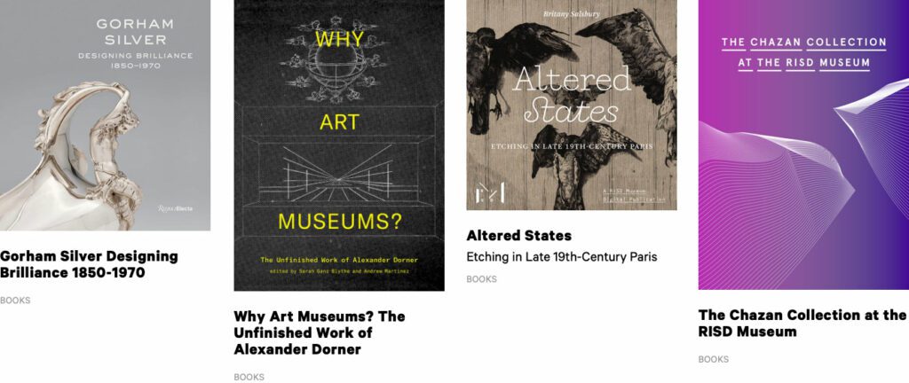
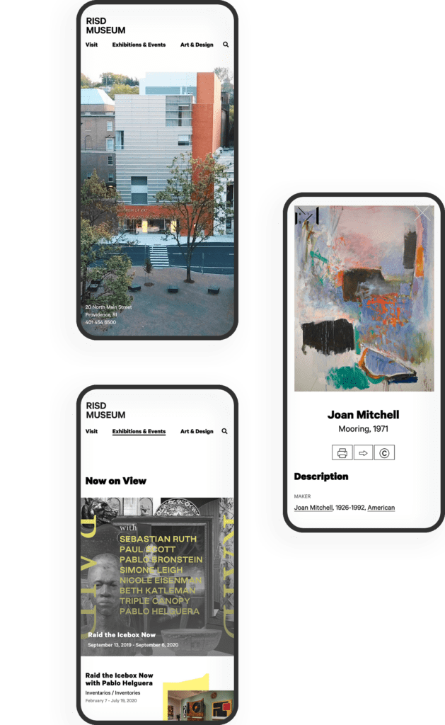
There are 8 chapters total in RAID the Icebox Now and four supporting pages. For those that know library systems and scholarly publications, notice the Citations and credits for each chapter. A few liberally use the footnote system. Each page in this publication is rich with content, both written and visual.
RAPID RESPONSE
An Unexpected Solution to a New Problem
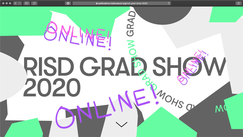
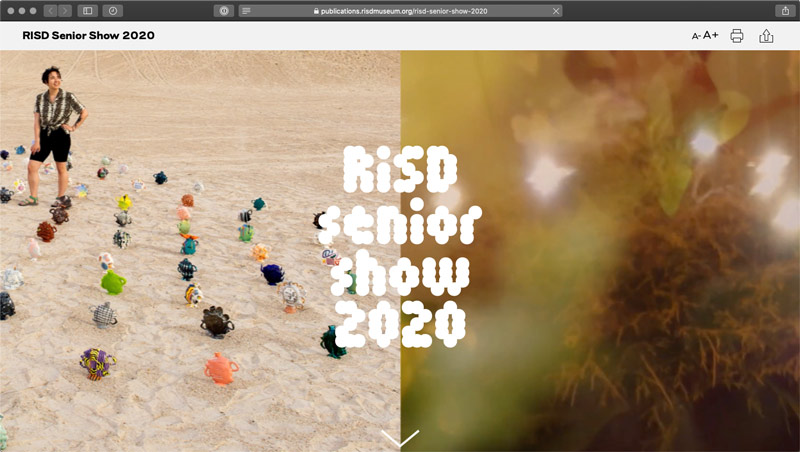
The story does not end with the first successful online museum publication. In March of 2020, COVID-19 gripped the nation and colleges cut their semesters short or moved classes online. Students who would normally have an in-person end-of-year exhibition in the museum no longer had the opportunity.
Spurred on by the Museum, the university invested in upgrades to the Publication platform that could support 300+ new authors in the system (students) and specialized permissions to limit access only to their own content. A few new features were fast-tracked and an innovative ability for some authors to add custom javascript to Department landing pages opened the platform up for experimentation. The result was two online exhibitions that went into effect 6 weeks after the concepts were approved — one for 270+ graduate students and one for 450+ undergraduates.
The Brief
Powering Design With User Feedback
MLH exists to help Massachusetts residents find information to solve common legal issues, like securing public benefits or fighting an eviction. To ensure every aspect of the site was grounded in the audiences’ needs, MLH wanted to incorporate feedback during the discovery and design phases from real people who fit MLH’s primary and secondary audience profiles.
By performing a thorough discovery process — including working group interviews, visitor interviews, cohort site analysis, and wireframe and prototype testing — Oomph was able to create a successful site design dedicated to the needs of visitors.
The Approach
Helping the Audience by Understanding Them
MLH shares insights on heavy topics ranging from housing and homelessness to money, debt, and immigration. The site contains sensitive information that could change their visitors’ lives; by connecting them to domestic violence help or resources to get their children back, for example. When Oomph first jumped into the project, our main goal was to step into the shoes of their user groups to better understand their needs when they seek legal information.
The main audience of MLH is Massachusetts residents who are primarily low-income and may not speak English as a first language. They use the site to become informed about legal issues they’re facing quickly and efficiently. As one visitor stated:
“I’m coming here because I have a problem. I want to know, where’s the search? What can I do here? What can I not do? Don’t waste my time making me read [fluff]…”
To meet this need, the MLH team provides information in plain English at a fourth to sixth-grade reading level, rather than using complicated lawyer jargon, which makes it accessible to a wider group of people. Additionally, many resources have been professionally translated into other languages, such as Spanish.
The secondary audience that visits the site is those who help the primary audience, such as social service providers, legal aid lawyers, and legal librarians. Oomph had to walk a fine line by getting feedback from the secondary audience to help inform information about the primary audience; however, our main goal was to ensure that low-income and non-English-speaking people could find the answers they needed.
Gaining the Audience’s Trust with Thoughtful Design Details
We learned that many visitors found the MLH website by searching Google with their questions. Many primary audience members would visit the site on their mobile phones, perhaps even listening to its content with their text-to-speech tool. This increased the importance of a mobile-first design so the pages loaded quickly, the information was clear, and the experience made sense for mobile browsing.
A Modernized Design
The site’s look was outdated, making some visitors feel that it either lacked credibility or didn’t contain the latest legal rules and laws (even though it’s been actively maintained and added to for the past 15+ years!). For the Oomph team, the final designs had to walk a fine line between being authoritative, trustworthy, and comforting. To achieve this, we retained the blue color palette but created slightly softer tones to help create a calming aesthetic.
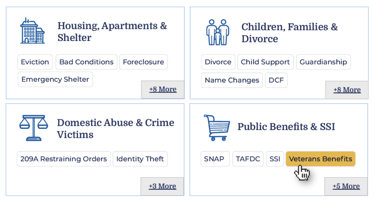
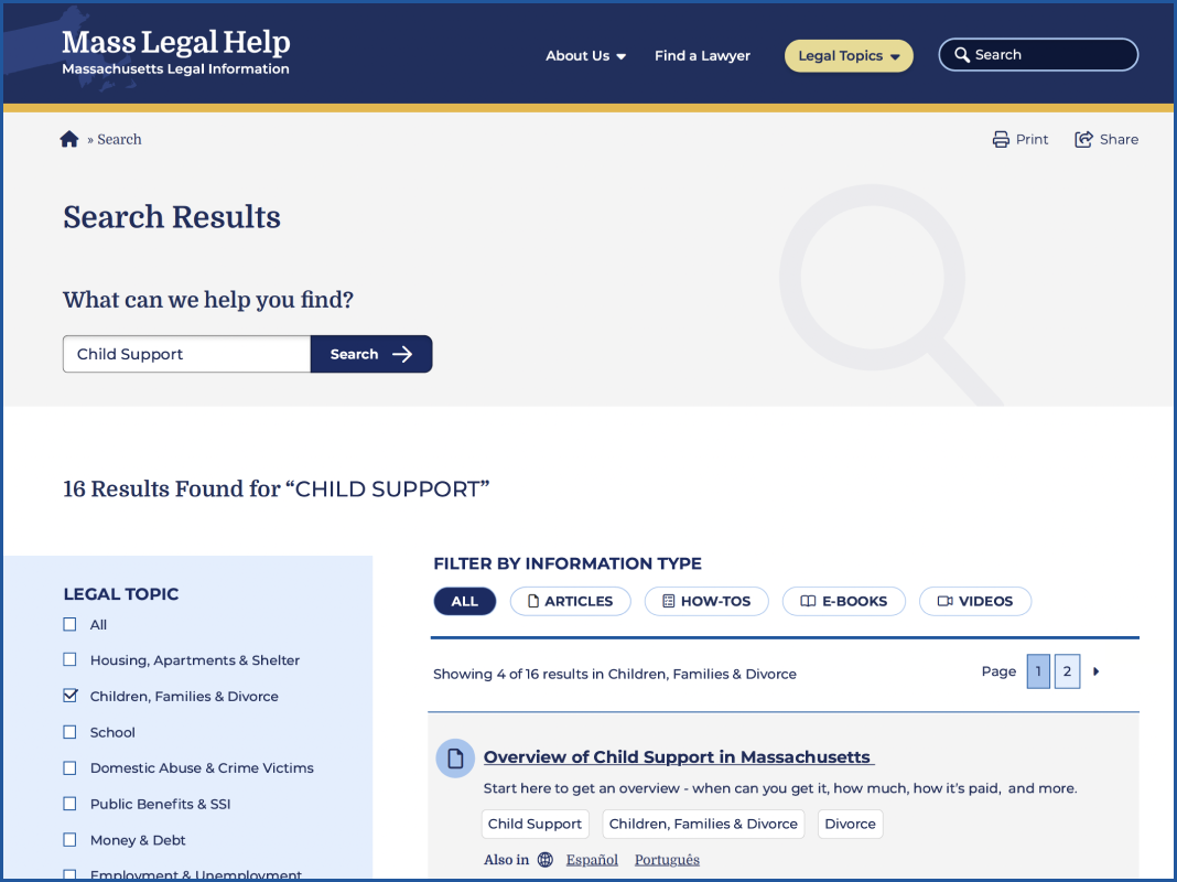
Our team also limited the amount of photography on the site but ensured that any photos we used represented the diverse groups MLH serves. Icons became a tool to guide the visitor through different topics; regardless of the visitor’s language, the icon could help them understand what information may be within that particular topic.
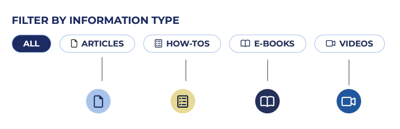
MLH has also accumulated a lot of content over the years. To help organize its search and topic organization feature, we incorporated content filters according to the information type: articles, how-tos, e-books, and videos. Each category has its own icon, and each icon is represented by a color. This helps unify the search based on the type of content the visitor is seeking.
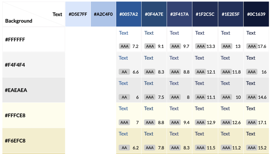
Color Contrast and Accessibility
From the start, MLH made it very clear that their new designs should comply with both 508 and WCAG 2.1 guidelines — ideally conforming to the highest level of contrast, level AAA. As Oomph created the color palette, we were careful to use only high-contrast colors and document how to use them in a system to ensure that the palette satisfied accessibility guidelines.
Supporting the Content With Tools
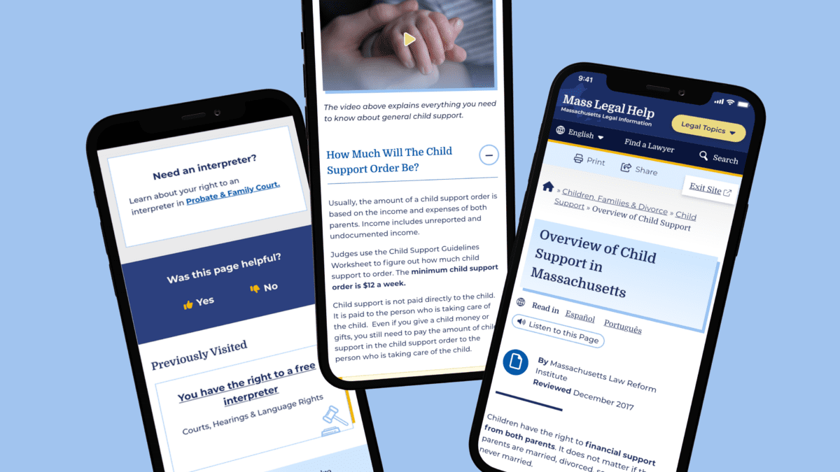
MLH had several existing tools to assist in digesting content. During our discovery phase, we validated the need for these tools and upgraded them. For example, on the content pages, there are options to print, share, listen to the content, and even switch the language as the visitor lands on the page.
Within the main navigation menu, the design included a “Quick Exit” button. This supports visitors who need to abandon the page when, for example, a domestic violence survivor’s abuser re-entered the room.
We cultivated a passion for this feature through our research and have written an article detailing our best practices for implementing a quick exit button. Additionally, we have created a Drupal Module for this feature so that more people can implement this important tool for sites with sensitive content.
Findability of Content Through the Main Menu Navigation
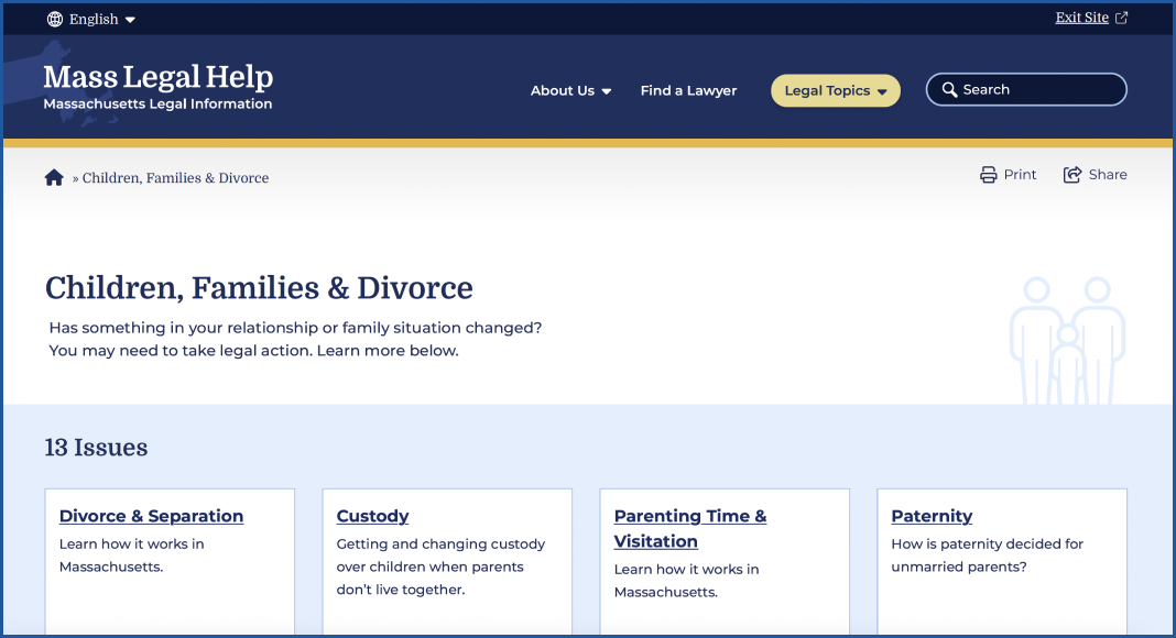
On a larger scale, the primary and secondary navigation menus needed an upgrade. As it stood, the main categories were wall-to-wall across the desktop, and it was hard to determine where a visitor needed to go. The secondary navigation menu read like a table of contents in a chapter book and didn’t allow the visitor to return to other categories.
We solved for this by creating a survey to test a proposed navigation structure and revised the information architecture (IA). This included a new top menu that supported every step of our primary audience’s journey. We also created a level of navigation that directed visitors to the information they were looking for, no matter how they entered the site.
Search
For search, we used a multi-filter approach which allows visitors to search both by topic and by content type. This filtering allowed them to find questions that might belong to multiple categories, and to narrow down content to the types they are willing to review.
Proactive vs. Reactive Enhancements
Analytics and user interview results showed that most visitors start their journey on either the homepage or pages that are three or more levels down the navigation. Many also reach the site via a specific Google search. While it is likely they found what they needed, they may not be aware of other information that can help them. To mitigate the risk of bouncing away from the website, we created a “Viewers also reviewed…” component on answer pages that showcased related content more naturally.
Repeating Help Footer
Above the footer, we created a “safety net” to help visitors who have browsed the site for a long time but have not found what they are looking for. If they reached the end of the page, this footer would direct them to more content that may hold their answers.
Previously Viewed
We added a “Previously Viewed” section at the bottom of content pages to remind visitors of the content they have already reviewed. This reduces the burden on the visitor when they ask themselves, “I think I’ve seen that already, but I can’t remember where I saw it.”
The Results
A Modern, Helpful Website Design
Through prototype testing with our first design mock-up with real visitors, the participants individually determined that the new site’s design and content organization was easy to navigate, gave them a trustworthy impression, and looked appealing. Today, the MLH website is live with a fresh Oomph design. We hope the structure and design will continue to not only keep visitors on the site longer but also help those visitors find the legal answers that they need.
Have a project that requires a human-first, empathetic approach? Consider talking to Oomph about incorporating user feedback into a user experience-focused design project for your next website refresh.
THE BRIEF
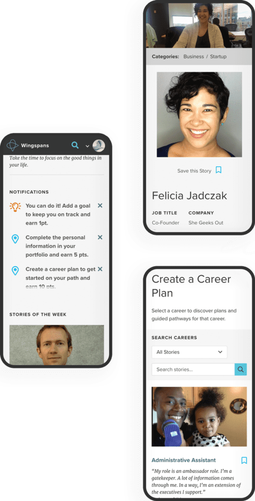
Wingspans’ primary audience is digital natives — young, tech-savvy users who expect fast, frictionless interactions and relevant content. Fail to deliver, and they’ll abandon you in a heartbeat.
The new platform needed to provide a scalable, flexible foundation for a range of content and tools being developed by the Wingspans team. We had to turn a collection of disparate pieces — story content, user data, school information, and more — into a cohesive digital framework that could grow and evolve. Above all, Wingspans needed a design-first approach, wrapping the educational aspects in an intuitive, engaging digital experience.
THE APPROACH
While storytelling formed the heart of the Wingspans platform, the site’s interactive features would be crucial for getting students to explore and engage with the content. Building on Lindsay’s familiarity with the educational market, we mapped out the content architecture, workflows, and functions for a host of interactive features to keep students engaged.
For the tech stack, we turned to a mix of microservices to provide a stable, flexible, and scalable architecture with lightning-fast performance. These included a Gatsby front end, Firebase database, AWS cloud storage, Algolia site search, Cosmic JS content management system, and more. We also worked to ensure the technology reflected Lindsay’s empathy-driven approach. For instance, we customized Algolia to deliver search results specifically tailored to a student’s profile and interests—in other words, an encyclopedia that understood its users and presented its information in a distinctly human way.
THE RESULTS
The platform’s most impactful feature is how easily students can find and bookmark career stories that resonate with who they are. With over 700 stories and 40 mini-documentaries available, each with an associated set of lessons, the site’s personalized search function and ultrafast content delivery are key. On the backend, the customized CMS and robust content architecture make it easy for the Wingspans team to align content with users’ profiles and browsing activity.
Bringing it all together, the Career Builder feature lets students select stories and content to create a customized career roadmap that they can share with parents, teachers, and counselors. A core element of the platform’s personalized user experience, the Career Builder brings Wingspans’ central premise to life: If you can see it, you can be it.
Oomph really fulfilled their commitment to building an immersive and radically personal platform that brought my vision to life.
— Lindsay Kuhn, Wingspans Founder and CEO
THE BRIEF
A Creative Beacon Sets a New Path
The RISD Museum is the 20th largest art museum in the United States with over 100,000 objects in its collection, including Ancient art, costumes, textiles, painting, sculpture, contemporary art, furniture, photography, and more. The museum occupies more than 72,000 square feet in three historic and two contemporary buildings along Providence’s bustling South Main Street and riverfront.
We often say that a website redesign is more like a collective therapy session — it’s an opportunity to air grievances in a safe space, to think about the future untethered to the present situation, and make decisions that could change the course of the organization. Since many websites are more than just a marketing platform, a redesign can affect the entire organization and the way they communicate their value to their own team and the world.
At the heart of this project were large, existential questions:
What does it mean to be a physical institution collecting physical objects in a digital world?
What do viewers want out of a museum experience in an interactive space?
Can a museum be more relaxed about how viewers will interpret the work?
Open Source the Museum’s Entire Collection
Behind the Museum’s initiative to re-platform the website from a closed system to an open source system like Drupal 8 was another, perhaps even larger, initiative: a plan to “open source” the museum’s entire collection. They will bring all 100,000 objects online (they have a little over 13,000 available prior to launch, a mere 13%) and use a Creative Commons license system that allows visitors to download and repurpose high-resolution images whenever the objects are in the public domain. This was the heart of the revolution upon which the RISD Museum was about to embark.
THE APPROACH
MuseumPlus & Drupal 8 equals Open Access
The heavy lift for our engineers was an integration with RISD’s museum software, MuseumPlus. MuseumPlus needed to continue to be the source of truth for any object, artist, or exhibition. The teams again collaborated extensively to work towards an API that could provide all the correct information
between the two databases, and a system of daily jobs and manual overrides to start a synchronization process. As the online connection grows, these connections will be the critical link between the public-facing object data and the internal records.
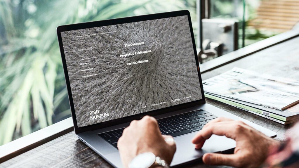
The aesthetics of the site became a structural backdrop for the objects, artwork, and images of people in the physical spaces of the museum.
Gray and white wireframes evolved into a black and white interface that kept information clear and clean while allowing the colors of the artwork to shine through. Language around the site’s architecture was simplified and tested for clarity. An element of time — words like Soon, Upcoming, Now, Ongoing, Past — keeps the visitor grounded around the idea of a physical visit, while open access to objects online serves a whole community of art lovers and historians that may never be able to visit in person.
A bold storytelling idea came out of our collective collaborative process — the homepage experience opens with four videos, a cinematic exterior shot and three interior videos that explore the three main sections of the navigation. The homepage becomes a gateway into the physical space. Choosing a path via the navigation takes the viewer inside to explore the spaces and the objects. Instead of a homepage that assumes a visitor wants to see everything and then choose something to explore deeper, this one introduces them to the content in a way that connects them to the physical space.
THE RESULTS
An Evolving Partnership
Site visit patterns have seen significant improvement — sessions per user and pages per session have increased while bounce rate has decreased. Thanks are due in part to the new hosting environment with Acquia, which has provided hefty speed increases and stability — page load times have decreased, server response time is significantly less, and page download time is far less as well.
As the RISD Museum grows their online collection even further, we have identified a backlog of ideas that we’d love to address, from a more fully featured search, an integrated audio guide, and a more open and collaborative way for users to share back what they have done with the museum’s assets. A new Drupal 8 (now 10) implementation gives the museum plenty of room to grow virtually. The collaborative relationship between Oomph and the RISD Museum is only beginning.
Humans encounter thousands of words every day. As a website owner, that means your site content is vying for your user’s attention alongside emails from their colleagues, the novel on their nightstand, and even the permission slip scrunched at the bottom of their kid’s backpack.
How do you cut through the clutter to create site content that people actually want to read?
While you may already be choosing topics that are the most interesting and relevant for your audience, the structure of your writing may not be optimized for how people read. By understanding your audience’s reading behaviors following best practices for readability and accessibility, you can make sure your content works with people’s natural tendencies – not against them – to create a more engaging digital experience. An added bonus: Google shares many of those same tendencies, so content that’s designed well for humans is also more likely to perform well for organic SEO.
As a digital platform partner to many clients with content-rich sites, Oomph often works with brands to redesign their content for digital success. Here’s a look at the basic principles we apply to any site design – and how you can use them to your advantage.
How People Read Online
When we dive into a book, we typically settle in for a long haul, ready to soak up each chapter one by one. But when we open up a website, it’s more like scanning a newspaper or the entire bookshelf – we’re looking for something specific to catch our eye. We quickly scan, looking for anything that jumps out at us. If we see something interesting, then we’ll slow down and start reading in more detail.
Think of it like an animal following an information “scent,” identifying a mixture of clues that are likely to lead to the content you’re looking for. Most people will decide which pages to visit based on how likely the page will have the answer they’re looking for and how long it’s going to take to get the answer.
Users need to be hooked within a few moments of looking at a website or they’ll move on. They need to be able to identify and understand key factors like:
- The point of the information and why they should keep reading
- Whether they can trust the information and the source
- The type of content provided and any action expected from them, like signing up for an event
- How visually engaging and readable the content is
The takeaway for brands? Writing with your readers’ needs in mind is a way to show them you care and want to help them solve their problem. It’s also the key to achieving your site goals.
Your site content does more than just convey information – it’s about building trust, establishing rapport, and creating a connection that goes beyond the page. Whether you’re trying to sell a product or promote a cause, crafting content around your audience’s needs, desires, and preferences is the most effective way to compel them to take action. Here are four ways to set your website content up for success.
1. Put your data to work.
If you’re looking to refresh your current site, data can help you make informed choices about everything from your content strategy to your layout and design. Use digital reporting tools to answer questions like:
- Is our target audience visiting our site – and are other audiences visiting that we don’t know about yet?
- Which content do visitors download or engage with most frequently?
- What does a typical site visit look like? Are there places where users are getting stuck or bouncing off?
Google Analytics is a go-to tool for understanding the basics of who is visiting your site and how they’re engaging with your content. You can track metrics like session duration, traffic sources, and top-performing pages, all of which can help you better understand what your audience is looking for and what you want to tell them. (If you haven’t made the switch to Google Analytics’ latest platform, GA4, jump-start the process with our 12-step migration guide.)
Additional tools like Screaming Frog and Hotjar can give you even deeper insights, helping you track content structure and real-time user interactions.
2. Create a simple and consistent content structure.
When it comes to site content, consistency is like the foundation of a house (minus the power tools and hard hats).
A well-structured site not only helps users navigate and understand your content more easily, but also enhances the visual appeal and flow of the site. Think of it like a dance floor – you want your users to be able to move smoothly from one section to the next, without any awkward missteps.
That means focusing on shorter sentences, bullet points, and clear subheadings, all backed up by engaging visuals that serve as resting points for the eye. And while you’re at it, don’t forget to declutter your content — users don’t want to wade through a sea of unnecessary words just to find the nuggets of gold.
Ask yourself: Does this content flow smoothly, is it easy to scan, and does it make my key messages stand out? If the answer is yes, then you’re on your way to successful content.
3. Make sure visuals and content play nicely together.
When it comes to enhancing your content with visuals, the key is to strike a balance between style and substance. Your design should complement your content, not compete or distract from it.
Beyond their aesthetic appeal, well-designed visuals are important for creating a sense of credibility with users. Think back to the concept of information scent: If your design looks sloppy or inconsistent, users are less likely to trust the information you’re presenting. So make sure you’re using design elements wisely, creating ample white space, and avoiding anything that makes your content feel like a sales pitch.
4. Focus on accessibility.
When it comes to site content, accessibility can’t be ignored. Content should be engaging and informative and also conform to the , Website Content Accessibility Guidelines (WCAG). Tools like SortSite can help identify these issues and guide you toward accessibility success.
There are a number of things all sites need to consider:
- Using consistent text stylings, including text color, leading, kerning, and tracking.
- Design to support individuals with visual impairments, assistive technology like screen readers, and those that require navigation via the keyboard only
- Following heading orders and grouping content together to make it easier to scan. For example: Following a heading level 2 with a heading level 3 when the ideas are related, but starting with a new heading 2 if changing to a new section of thought.
- Using multiple methods to indicate action items and descriptive text for buttons and alternative text.
- PDFs can be useful, but are also big accessibility red flags, so it’s best to avoid using them when possible. If a PDF is a must, make sure it follows accessibility best practices.
Designing Engaging Content Doesn’t Need To Be a Full-Time Job
If you already have a library of content, auditing the content that already exists can be daunting. And sometimes, you need a little help from your friends. That’s where third-party experts (like us!) come in.
During our website discovery process, we use strategies like content and analytics audits, UX heuristics, and user journey mapping to help position client sites for success. We’ll help you identify areas for improvement, highlight opportunities for growth, and guide you toward achieving content greatness.
Ready for a fresh perspective on your content? We’d love to talk about it.
Have you ever tried to buy tickets to a concert and experienced the frustration and eventual rage of waiting for pages to load, unresponsive pages, unclear next steps, timers counting down, or buttons not working to submit — and you probably still walked away with zero tickets? Yeah, you probably had some choice words, and your keyboard and mouse might have suffered your ire in the process.
As a website owner, you strive to create a seamless user experience for your audience. Ideally, one that doesn’t involve them preparing to star in their own version of the printer scene in Office Space. Despite your best efforts, there will be times when users get frustrated due to slow page loads, broken links, navigation loops, or any other technical issues. This frustration can lead to what the industry calls “rage clicks” and “thrashed cursors.” When your users are driven to these actions, your website’s reputation, engagement, and return visits can be damaged. Let’s dig in to discuss what rage clicks and thrashed cursors are and how to deal with frustrated users.
First of all, what are Rage Clicks?
Rage clicks are when a user repeatedly clicks on a button or link when it fails to respond immediately — the interface offers no feedback that their first click did something. This bad user experience doesn’t motivate them to return for more. These clicks are likely often accompanied by loud and audible sighs, groans, or even yelling. “Come on, just GO!” might ring a bell if you’ve ever been in this situation. Rage clicks are one of the most frustrating things a user can experience when using a website or app.
Rage Clicks are defined technically by establishing that:
- At least three clicks take place
- These three clicks happen within a two-second time frame
- All clicks occur within a 100px radius
Similarly, what is a Thrashed Cursor?
A thrashed cursor is when a user moves the cursor back and forth over a page or element, indicating impatience or confusion. Various issues, including slow page load times, broken links, unresponsive buttons, and unclear navigation, can cause users to exhibit these digital behaviors. It can also indicate the user is about to leave the site if they cannot find that solution quickly.
Thrashed cursors are defined technically by establishing that:
- There is an area on the page where a user was moving their mouse erratically
- An established pattern of “thrashing” occurs around or on specific elements or pages
- Higher rate of user exits from the identified pages
Why do Rage Clicks and Thrashed Cursor happen?
Common reasons rage clicks and thrashed cursors happen are:
- Poor Design: Poor design is one of the most common reasons for rage clicks and thrashed cursors. If the website has a confusing layout or navigation structure, it can be frustrating for users to find what they’re looking for. Or, they may assume an element is clickable; when it’s not, it can be irksome. Underlined text is an excellent example, as users often associate underlines with links.
- Technical Issues: Technical issues such as slow loading times, broken links, or non-responsive buttons can cause rage clicks and thrashed cursors. Users expect the website to work correctly; when it doesn’t, they can become annoyed or frustrated. If they click a button, they expect the button to do something.
- Lack of Clarity: If the website’s content is unclear or poorly written, it can cause confusion and frustration for users. They may struggle to understand the information provided or find it challenging to complete the intended action. Content loops can be a good example of this. Content loops happen when users repeatedly go back and forth between pages or sections of a website, trying to find the information they need. Eventually, they’ll become frustrated, leading to this user leaving the website.

How do you resolve issues that lead to Rage Clicks and Thrashed Cursors?
Now that we know what rage clicks and thrashed cursors are and why they happen, how do you resolve it, you may be asking. Here are a few things an agency partner can help you with that can significantly reduce the risk of your users resorting to these behaviors.
Use Performance Measuring Tools
By employing performance measuring, you can analyze the data collected, gain valuable insights into how users interact with your platform, and identify areas for improvement. For example, if you notice a high number of rage clicks on a specific button or link, it may indicate that users are confused about its functionality or that it’s not working correctly. Similarly, if you see a high number of thrashed cursors on a particular page, it may suggest that users are struggling to navigate or find the information they need.
Tools that support Friction or Frustration measurement:
- Clarity (from Microsoft)
- ContentSquare
- Heap
- HotJar
- Mouseflow
- Quantum Metric
Conduct User Experience Exercises and Testing
Identifying the root causes of rage clicks and thrashed cursors can be done through a UX audit. An agency can examine your website design, functionality, and usability, identifying areas of improvement.
- User Journey Mapping: User journey mapping involves mapping the user’s journey through your website from a starting point to a goal, identifying pain points along the way, and determining where users may get stuck or frustrated.
- Usability Testing: Usability testing involves putting the website in front of real users and giving them tasks to complete. The tester then looks to identify issues, such as slow loading times, broken links, or confusing navigation.
- User Surveys: User surveys can be conducted in various ways, including online surveys, in-person interviews, and focus groups. These surveys can be designed to gather information about users’ perceptions of the website, interactions with the website, and satisfaction levels. Questions can be designed to identify areas of frustration, such as difficult-to-find information, slow page load times, or confusing navigation. It’s wise to keep surveys short, so work with your agency to select the questions to garner the best feedback.
- Heat Mapping: Heat mapping involves analyzing user behavior on your website, identifying where users are clicking, scrolling, and spending their time. This can identify areas of the website that are causing frustration and leading to rage clicks and thrashed cursors.
Focus on Website Speed Optimization
A digital agency can synthesize findings from UX research and performance-measuring tools and work to optimize your website for quicker page loads and buttons or links that respond immediately to user actions.
- Image Optimization: Optimizing images on your website will significantly improve page loading times. An agency can help you optimize server settings and compress images to reduce their size without sacrificing quality.
- Minification: Minification involves reducing the size of HTML, CSS, and JavaScript files by removing unnecessary characters such as white space, comments, and line breaks. This can significantly improve page loading times.
- Caching: Caching involves storing frequently accessed website data on a user’s device, reducing the need for data retrieval and improving website speed.
- Content Delivery Network (CDN): A CDN is a network of servers distributed worldwide that store website data, improving website speed by reducing the distance between the user and the server.
- Server Optimization: Server optimization involves optimizing server settings and configurations, such as increasing server resources, using a faster server, and reducing request response time. Website owners frequently skip this step and don’t select the right hosting plan, which can cost more money through lost users and lower conversions.
Resolve Technical Issues
A web agency can help resolve any technical issues that may be causing frustration for your users. These issues may include broken links or buttons, 404 errors, slow page load times, and server errors. Technical issue resolution can involve various activities, including code optimization, server maintenance, and bug fixes that work to ensure that everything is working correctly and address any issues that arise promptly. The resolution of technical issues will improve website performance, reducing the likelihood of user frustration and rage clicks.
Next Steps
User frustration can negatively impact user satisfaction and business outcomes. Partnering with a digital agency can be a valuable investment to mitigate these issues. Through the use of tools, UX audits, user surveys, website speed optimization, and technical issue resolution, a digital agency can identify and address the root causes of user frustration, improving the overall user experience — leading to an increase in user engagement, satisfaction, and loyalty, which means improved conversion rates, higher customer retention, and ultimately, increased revenue for your business.
If your customers are hulking out, maybe it’s time to call us!
THE BRIEF
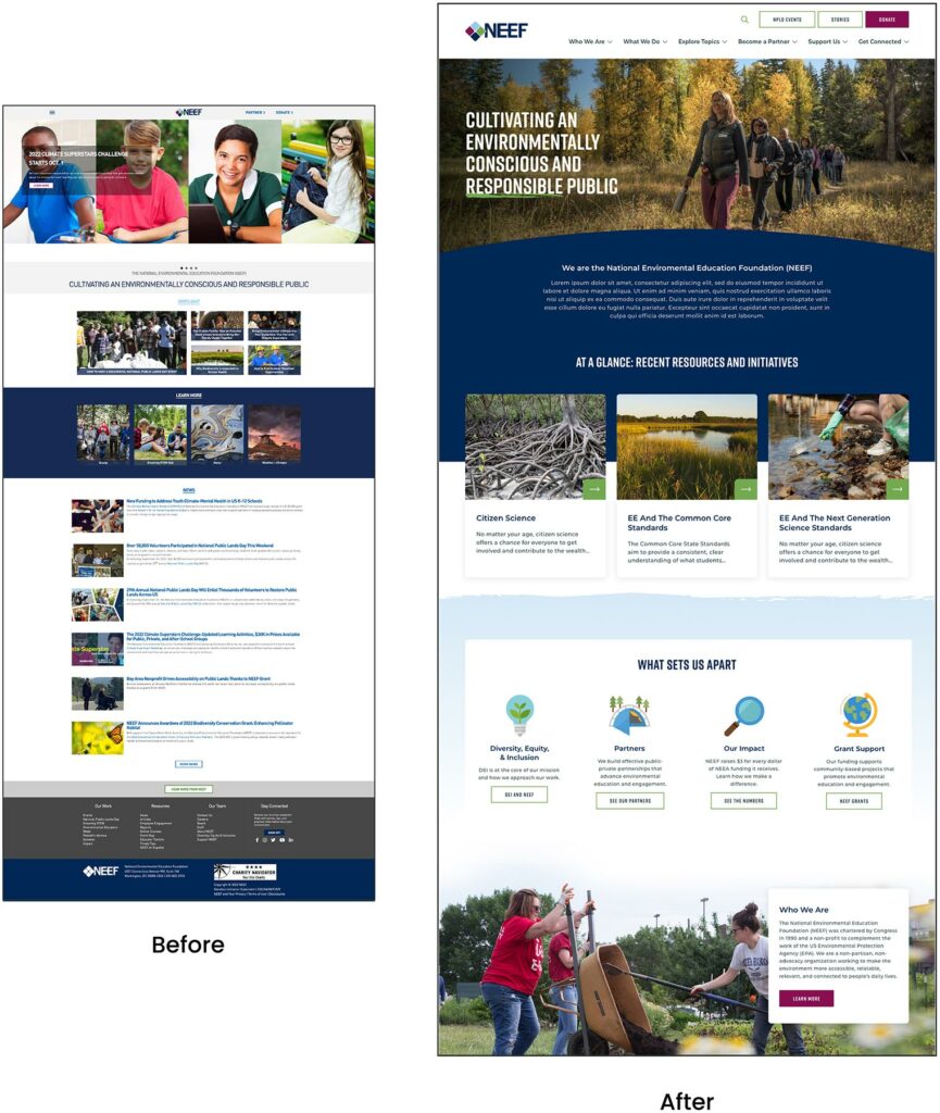
Connecting People and Planet
NEEF’s website is the gateway that connects its audiences to a vast array of learning experiences – but its existing platform was falling short. The organization needed more visually interesting resources and content, but it also knew its legacy Drupal site couldn’t keep up.
NEEF wanted to build a more powerful platform that could seamlessly:
- Communicate its mission and showcase its impact to inspire potential funders
- Broaden its audience reach through enhanced accessibility, content, and SEO
- Be a valuable resource by providing useful and engaging content, maps, toolkits, and online courses
- Build relationships by engaging users on the front end with easy-to-use content, then seamlessly channeling that data into back-end functionality for user-based tracking
THE APPROACH
Strategy is the foundation for effective digital experiences and the intuitive designs they require. Oomph first honed in on NEEF’s key goals, then implemented a plan to meet them: leveraging existing features that work, adding critical front- and back-end capabilities, and packaging it all in an engaging, user-centric new website.
Information architecture is at the core of user experience (UX). We focused on organizing NEEF’s information to make it more accessible and appealing to its core audiences: educators, conservationists, nonprofits, and partners. Our designers then transformed that strategy into strategic wireframes and dynamic designs, all of which we developed into a custom Drupal site.
The New NEEF: User-Centered Design
A Custom Site To Fuel Connection
NEEF needed a digital platform as unique as its organization, which is why Oomph ultimately delivered a suite of custom components designed to accommodate a variety of content needs.
Engaging and thoughtful design
NEEF’s new user experience is simple and streamlined. Visual cues aid in wayfinding (all Explore pages follow the same hero structure, for example), while imagery, micro-interactions (such as hover effects) and a bold color palette draw the user in. The UX also emphasizes accessibility and inclusivity; the high contrast between the font colors and the background make the website more readable for people with visual impairments, while people with different skin tones can now see themselves represented in NEEF’s new library of 100 custom icons.
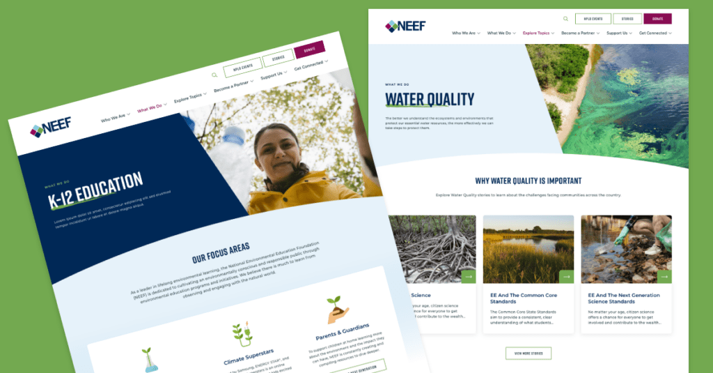
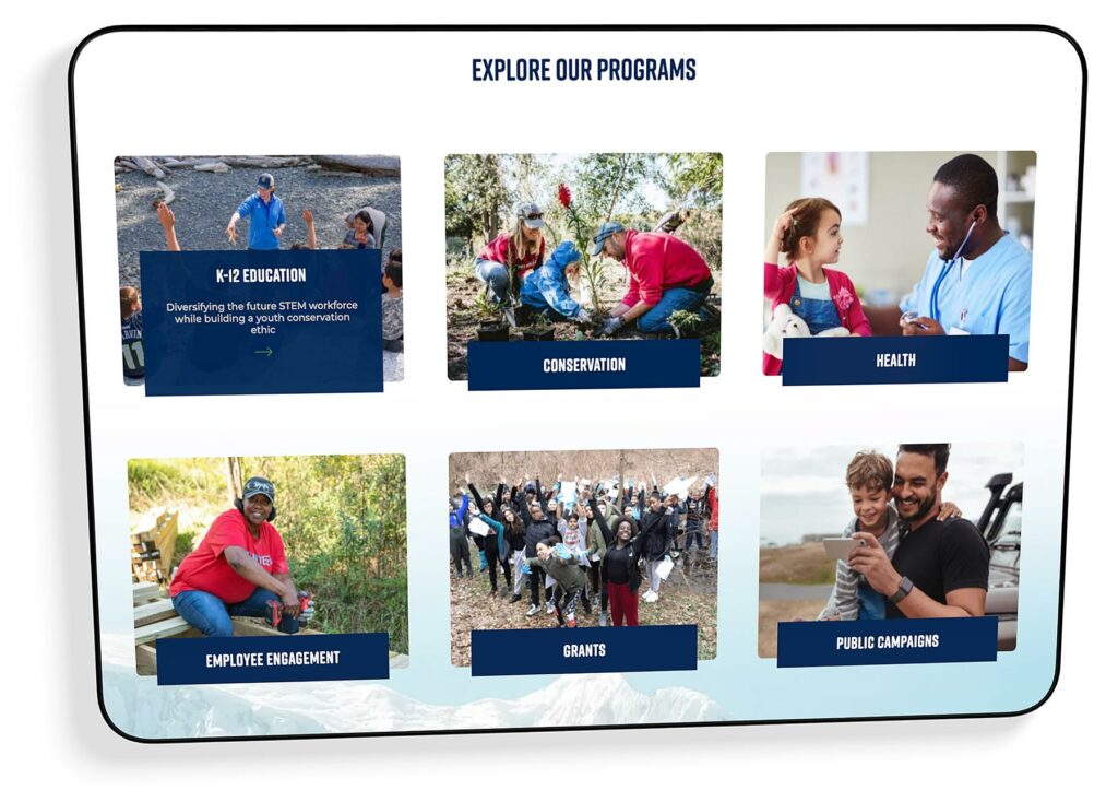
Topic-based browsing
From water conservation to climate change, visitors often come to the NEEF site to learn about a specific subject. We overhauled NEEF’s existing site map to include topic-based browsing, with pages that roll resources, storytelling, and NEEF’s impact into one cohesive package. Additional links in the footer also make it easier for specific audiences to find information, such as nonprofits seeking grants or teachers looking for educational materials.
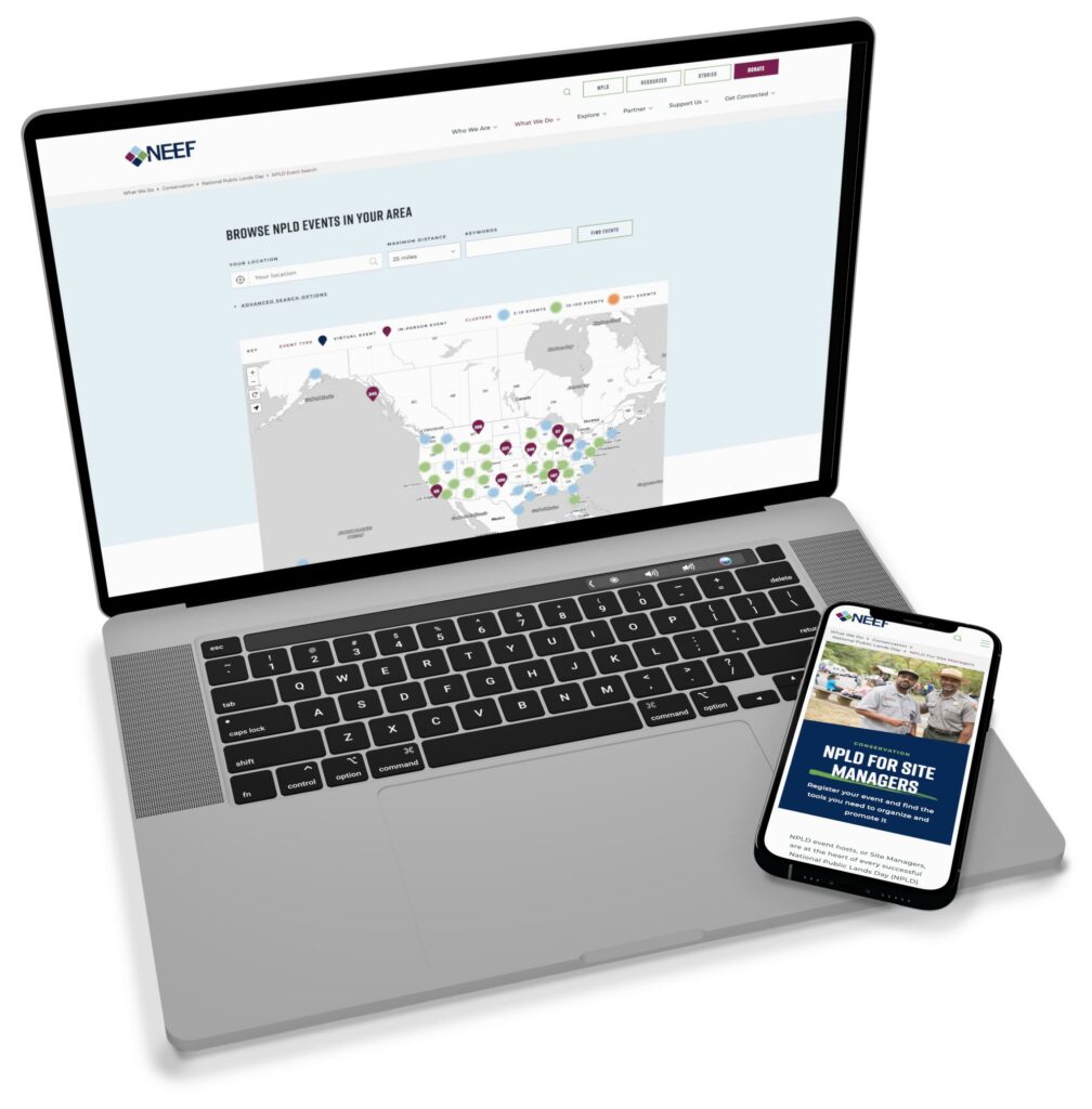
NPLD-hosted resources and event locator
Oomph refreshed existing components and added new ones to support one of NEEF’s flagship programs, National Public Lands Day (NPLD). People interested in hosting an event could use the new components to easily set one up, have their own dashboard to manage, and add their event to NEEF’s event locator. Once the event has passed, it’s automatically unlisted from the locator — but archived so hosts can duplicate and relaunch the event in future years.
THE RESULTS
Protecting the Planet, One User at a Time
Oomph helped NEEF launch its beautiful, engaging, and interactive site in May 2023. Within three months, NEEF’s team had built more than 100 new landing pages using the new component library, furthering its goal to build deeper connections with its audiences.
As NEEF’s digital presence continues to grow, so will its impact — all with the new custom site as its foundation.
“Inclusive design” may sound like vague, trendy, technical jargon. But inclusive design isn’t a trend — it’s the world catching up on the kind of digital experiences that should have been part of the web from the beginning.
Inclusive design is a crucial part of nearly every digital platform, be it website, app, or intranet.
Inclusive design as a concept and practice is broad and deep — this article barely scratches the surface, but will help you understand the mindset required. We’ll cover what it is, why it matters for your business, and some ways to assess whether your digital platform could be more inclusive.
- What does “inclusive design” mean?
- What are the benefits of inclusive design?
- How are inclusive design and accessibility different?
- How can you make your platform more inclusive?
What does “inclusive design” mean?
The Inclusive Design Research Center defines inclusive design as “design that considers the full range of human diversity with respect to ability, language, culture, gender, age and other forms of human difference.” Adding to that, Nielsen Norman calls it creating products that “understand and enable people of all backgrounds and abilities,” including economic situation, geography, race, and more.
Essentially, you’re aspiring to create interfaces that reflect how people from all walks of life interact with the world.
Inclusive design allows people to use a digital platform with ease, whatever their needs or point of view. Looking at characteristics like race, abilities, or geography helps us identify key areas where friction can occur between humans and the web.
In the end, it’s about designing for everyone.
What are the benefits of inclusive design?
Inclusive design isn’t just about recognizing and accommodating diversity; it also creates business advantages for organizations that are willing to invest in an inclusive approach. Here are a few key areas where inclusive design can give your digital platform an edge:
Grow your customer base. By understanding the best way to connect with a wider target audience, your team can create digital experiences that attract the most possible users.
Increase user engagement. Engagement goes up when platforms are welcoming and easy to use. Inclusive web design removes barriers and creates motivation for people to engage with your brand.
Spark innovation. Inclusive solutions have a history of spawning innovation that goes beyond the initial intended audience (think closed-captioning-turned-subtitles on Netflix). Sometimes, when you aim to solve a specific usability issue, you end up creating an entirely new market solution.
Motivate your team. The way a digital platform is designed affects all audiences, even employees. Designing with inclusivity in mind can also have a positive influence on your own team. Engaging employees in your efforts to build an inclusive digital platform can help create a sense of shared purpose — one many people are likely to rally around.
How are inclusive design and accessibility different?
You may have heard these terms used in similar contexts. While they overlap in meaning, they’re not the same thing.
By definition, accessibility focuses on accommodating people with varying physical and mental abilities. Accessible websites are measured by their conformance with Web Content Accessibility Guidelines, which pertain to things like auditory, cognitive, physical, and visual disabilities. Accessibility tests typically cover code-level issues that can be fixed in the source code of a site.
Inclusive design is about accommodating the entire spectrum of human diversity. It involves a variety of viewpoints, including those of people with disabilities. Inclusive solutions can involve anything from back-end coding to the way headlines are worded.
In a nutshell: An accessible site is one of the outcomes of an inclusive design, whereas inclusive design is the overall approach to creating accessibility.
Consider these examples:
- You’re filling out a form, and because you have a visual impairment, you’re using the keyboard to move through it. When you get to the end, you discover the form can’t be submitted because you left a few areas blank — even though you filled out every question asked. Turns out the keyboard had skipped past a few required fields. What a pain!
- While filling out a form, you’re asked to select your ethnicity from a list. As you read the options, you discover that yours is not listed, or that you identify with more than one. You feel like the “other,” compared to everyone else, leaving you frustrated about the task and… maybe even about the company too.
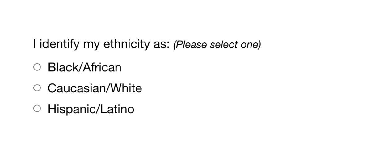
While both issues are addressed by inclusive design, the first issue relates to ability and can be fixed within the code, while the second relates to diversity and will take additional measures to address.
How Can You Make Your Platform More Inclusive?
The ethnicity example raises some interesting questions, such as:
- How do you know which ethnicities to add?
- How many do you need to account for?
- Should you just change the way the question is worded?
- Do you need to ask the question at all?
Mainly, this raises a bigger question: how do you maintain an inclusive site when there are so many important and broad variables (ability, language, culture, gender, age, etc.) — especially when that list of variables continues to grow and change?
The best way to get started is to arm yourself with knowledge and create a plan.
1. Identify the problems to solve.
Start by identifying opportunities for improvement in your current user experience (UX) by collecting quantitative and qualitative research with tools like UX audits, user interviews, user recordings, and heatmaps. Keep an eye out for areas where users seem confused, backpedal, or struggle to complete tasks. The more information you gather, the better!
2. Determine the best solutions.
Your user research will likely uncover many possible paths to change. This may include adding more categories to a list, creating an “Other” field users can type any answer into, or adding options to gather additional information.
Note: It’s common for areas that need improvement to hit on sensitive topics, things you may not fully figure out through data and research. Remember that the goal is understanding. Don’t be afraid to reach out to others for their thoughts and opinions.
3. Measure the results.
Some measures of success are easy to determine from user data in Google Analytics or changes in heatmaps and user recordings. Further data can come from users via surveys asking how your audience feels about the changes. The key is to stay continuously informed and aware of what your users are experiencing.
Note: One helpful tool for checking whether your design is, in fact, inclusive is Cards for Humanity. It offers a fun way to make sure you’re not missing anyone or anything in the spectrum of inclusivity.
Remember that the process of creating an inclusive design doesn’t end with implementation. Inclusive design is a work in progress. As a field, inclusive design is always evolving and requires continuous research to develop best practices.
We can’t predict what kind of mismatched interactions users will face in the years to come. But, with an open mind and a desire to learn and grow, we can continually adapt to meet them.
We’ve only scratched the surface of inclusive design! If you have any questions about inclusive design, we’d love to chat. Contact us anytime.
THE BRIEF
Never Stopping, Always Evolving
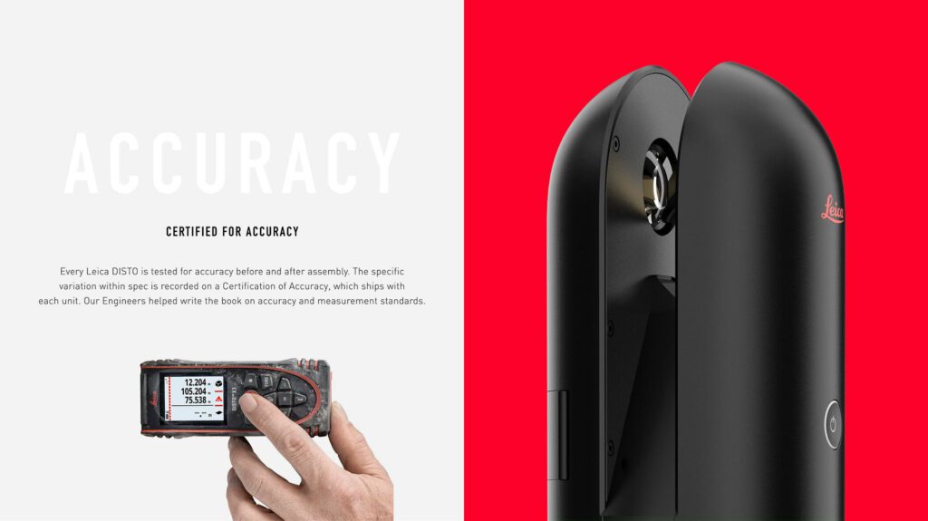
Leica Geosystems was founded on cutting-edge technology and continues to push the envelope with their revolutionary products. Leica Geosystems was founded by Heinrich Wild and made its first rangefinder in 1921. Fast forward to the 21st century, and Leica Geosystems is the leading manufacturer of precision laser technology used for measurements in architecture, construction, historic preservation, and DIY home remodeling projects.
Oomph and Leica collaborated on an initial project in 2014 and have completed multiple projects since. We transitioned the site into a brand new codebase with Drupal 8. With this conversion, Oomph smoothed out the Leica team’s pain points related to a multisite architecture. We created a tightly integrated single site that can still serve multiple countries, languages, and currencies.
THE CHALLENGE
Feeling the Pain-points with Multisite
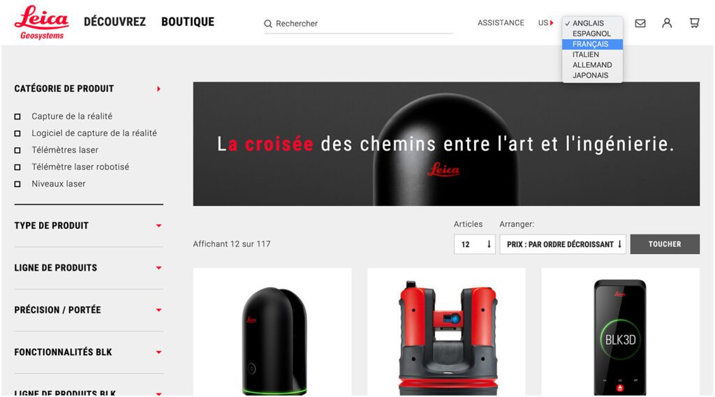
Leica’s e-commerce store is active in multiple countries and languages. Managing content in a Drupal multisite environment meant managing multiple sites. Product, content, and price changes were difficult. It was Oomph’s challenge to make content and product management easier for the Leica team as well as support the ability to create new country sites on demand. Leica’s new e-commerce site needed to support:
MULTIPLE COUNTRIES AND A GLOBAL OPTION
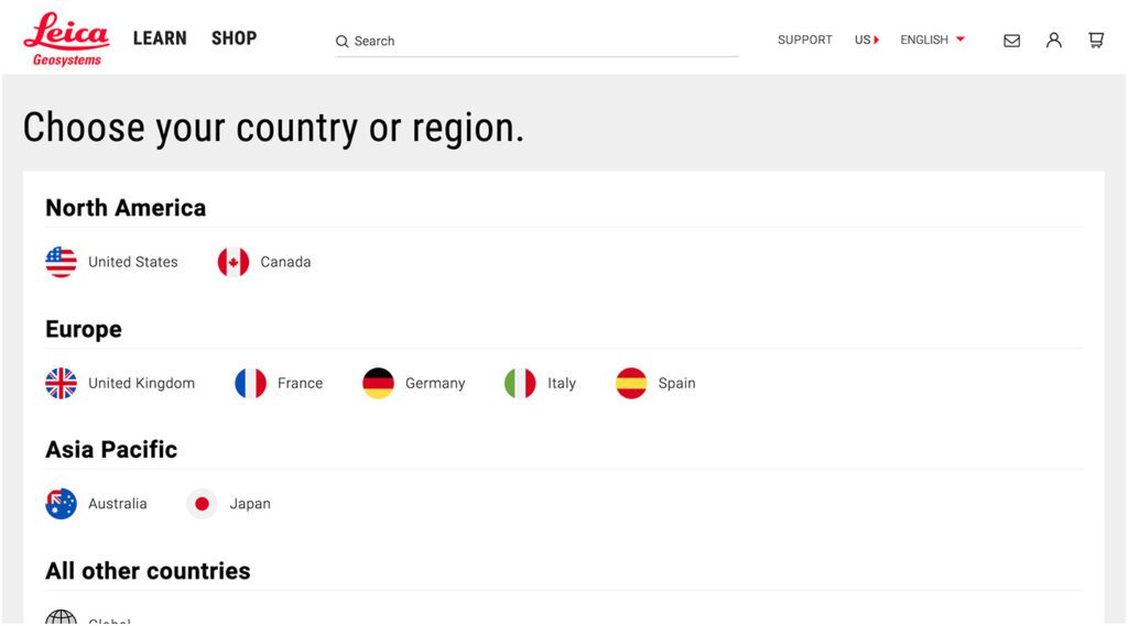
SIX LANGUAGES
MANY 3RD-PARTY INTEGRATIONS
The pain points of the previous Multisite architecture were that each country was a silo:
- No Single Sign On (SSO): Multiple admin log-ins to remember
- Repetitive updates: Running Drupal’s update script on every site and testing was a lengthy process
- Multiple stores: Multiple product lists, product features, and prices
- Multiple sites to translate: each site was sent individually to be translated into one language
THE APPROACH
Creating a Singularity with Drupal 8, Domain Access, & Drupal Commerce
A move to Drupal 8 in combination with some smart choices in module support and customization simplified many aspects of the Leica team’s workflow, including:
- Configuration management: Drupal 8’s introduction of configuration management in core means that point-and-click admin configuration can get exported from one environment and imported into another, syncing multiple environments and saving configuration in our code repository
- One Database to Rule Them All: Admins have a single site to log into and do their work, and developers have one site to update, patch, and configure
- One Commerce Install, Multiple stores: There is one Drupal Commerce 2.x install with multiple stores with one set of products. Each product has the ability to be assigned to multiple stores, and price lists per country control product pricing
- One Page in Multiple Countries and Multiple Languages: The new single site model gives a piece of content one place to live, while authors can control which countries the content is available and the same content is translated into all the languages available once.
- Future proof: With a smooth upgrade path into Drupal 9 in 2020, the Drupal 8 site gives Leica more longevity in the Drupal ecosystem
LEARN VS. SHOP
Supporting Visitor Intention with Two Different Modes
While the technical challenges were being worked out, the user experience and design had to reflect a cutting-edge company. With the launch of their revolutionary product, the BLK 360, in 2018, Leica positioned itself as the Apple of the geospatial measurement community — sleek, cool, cutting-edge and easy to use. While many companies want to look as good as Apple, few of them actually have the content and product to back it up.
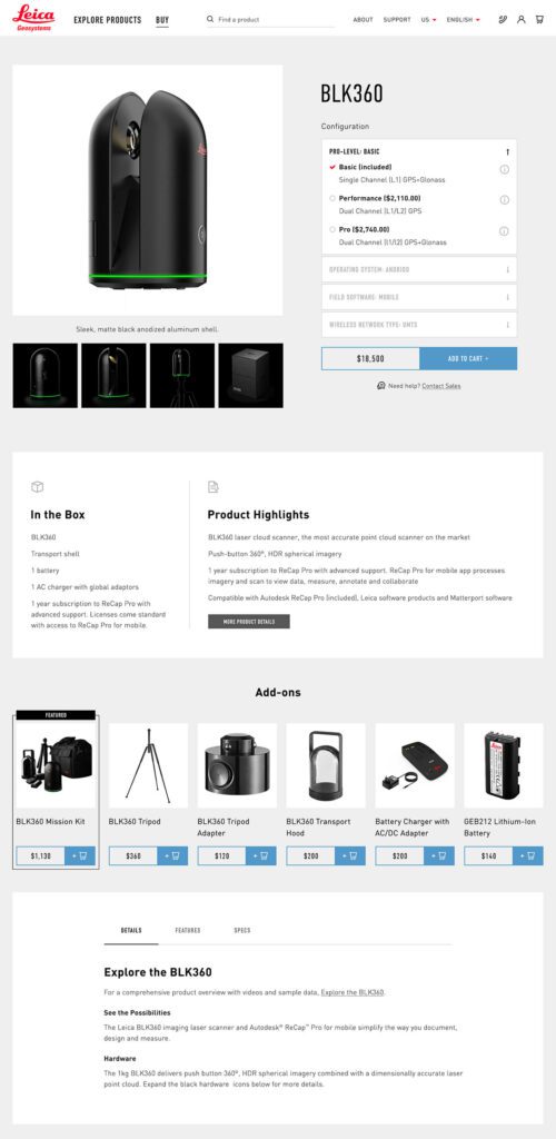
The navigation for the site went through many rounds of feedback and testing before deciding on something radically simple — Learn or Shop. A customer on the website is either in an exploratory state of mind — browsing, comparing, reviewing pricing and specifications — or they are ready to buy. We made it very clear which part of the website was for which.
This allowed us to talk directly to the customer in two very different ways. On the Learn side, the pages educate and convince. They give the customer information about the product, reviews, articles, sample data files, and the like. The content is big, sleek, and leverages video and other embedded content, like VR, to educate.
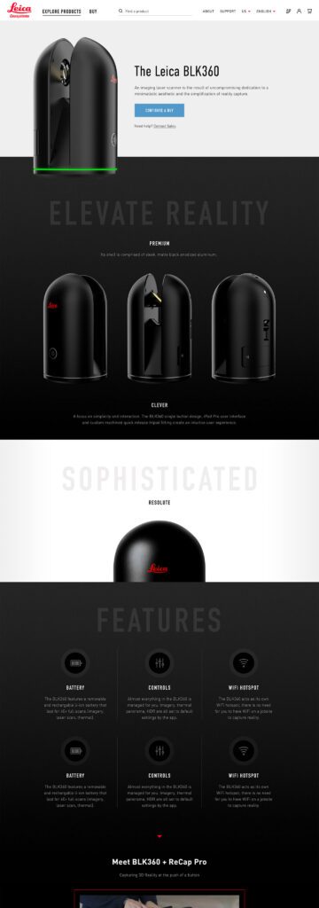
On the Shop side the pages are unapologetically transactional. Give the visitor the right information to support a purchase, clearly deliver specs and options like software and warranties, without any marketing. We could assume the customer was here to purchase, not to be convinced, so the page content could concentrate on order completion. The entire checkout process was simplified as much as possible to reduce friction. Buying habits and patterns of their user base over the past few site iterations were studied to inform our choices about where to simplify and where to offer options.
THE RESULTS
More Nimble Together
The willingness of the Drupal community to support the needs of this project cannot be overlooked, either. Oomph has been able to leverage our team’s commitment to open source contributions to get other developers to add features to the modules they support. Without the give and take of the community and our commitment to give back, many modifications and customizations for this project would have been much more difficult. The team at Centarro, maintainers of the Commerce module, were fantastic to work with and we thank them.
We look forward to continuing to support Leica Geosystems and their product line worldwide. With a smooth upgrade path to Drupal 9 in 2020, the site is ready for the next big upgrade.
THE BRIEF
AskRI is a digital platform providing Rhode Island residents with free access to some of the top educational and research tools, along with links to many state resources. A collaboration among the state government and various libraries and agencies, AskRI is essentially a 24/7 help desk for Rhode Islanders.
The platform’s structure has three main approaches:
Databases
Online portals provide free access to premium third-party tools and services, including research platforms and libraries, online learning and tutoring platforms, and consumer resources for health, jobs, and more.
Audiences
AskRI curates information and resources for specific audiences, including K-12 students and teachers, parents, non-native-English speakers, and adults seeking continuing education.
FAQs
Supporting local librarians with ready-made links, the FAQ section answers crowd-sourced questions about a variety of government services (how to get a green card, where to get a fishing permit, etc…).
Fundamentally, it’s an incredible resource! But, as AskRI grew over time, it became increasingly difficult for users to find the information they needed — and harder for site managers to organize, update, and expand the content.
Aiming to make the platform more user-friendly all around, its owners opted for a comprehensive redesign with a few primary goals:
- Refresh the branding to re-energize the service internally and externally
- Provide more flexible and efficient content management tools
- Increase usage of the platform’s resources across all target audiences
THE APPROACH
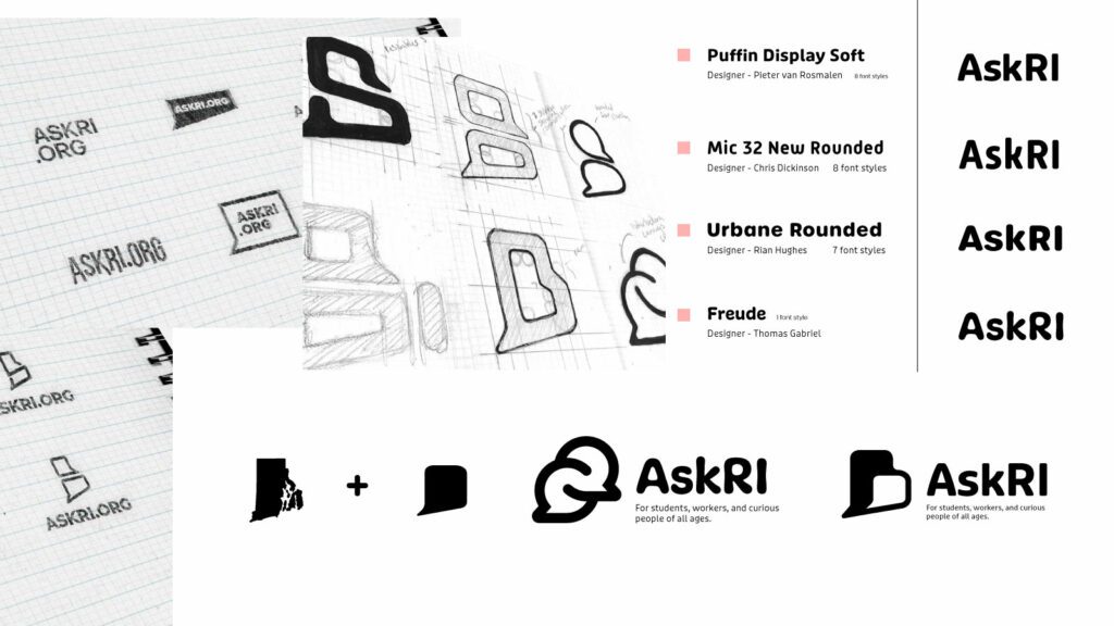
Through a quick Discovery phase, we uncovered a diverse user base with a broad range of needs. Our next challenge was to create an energetic brand identity and a more intuitive way to organize the platform.
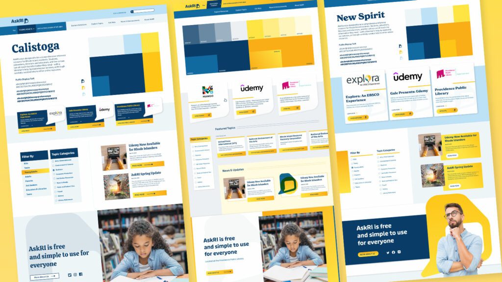
Visual Branding
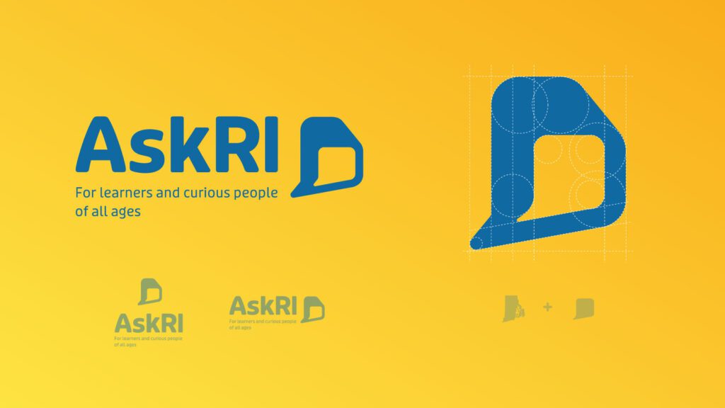
Rhode Island is a small but unique place, and its residents are proud of their state. We wanted the new branding to leverage a more modern, yet uniquely Rhode Island, identity. It could also evoke a sense of engagement, reinforcing the platform’s two-way interaction.
Over several design rounds, we explored logos that would represent two-way conversations while suggesting Rhode Island’s distinct shape. We also introduced a new, brighter color palette.
Digital Platform
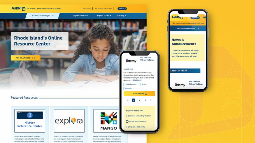
Redesigning the platform came down to an exercise in information architecture: What was the best way to organize the content so users could quickly find the tools and resources that were most relevant to them?
We knew only a small segment of the target audience would know exactly what they were looking for and be able to search for it directly. Most users would be on a mission of discovery, needing a way to browse the content. Then there was the FAQ section, where users might expect to find answers about the platform itself — but in its current form, the FAQs were confusingly broad and hard to find.
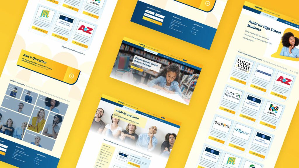
Our solution addressed all three areas:
- Knowing that frequent users would want to get to familiar databases quickly, we incorporated tried-and-true search and filter tools
- For those needing more guidance, we created a persona-based architecture with curated lists of content that addressed each persona’s unique needs
- By making the platform simpler and more intuitive, we removed the need for an FAQ section. We replaced it instead with a more interactive feature
THE RESULTS
These relatively simple changes brought powerful results, creating a more engaging and intuitive platform. The fresh branding celebrates inquisitiveness and interaction, while the redesigned content is much easier for users to navigate and for authors to organize and expand.
The AskRI team loved the new brand identity, which evokes curiosity with visual elements that represent thinking and asking questions. Two thought bubbles form the shape of Rhode Island for the logo, while images of inquisitive people are featured throughout the site. In addition, the new colors bring fresh energy to the brand while preserving a sense of trust and authority.
The redesign not only improved the content’s organization and accessibility, it also fosters a greater sense of interaction with platform users. Visual personas provide an intuitive starting point for exploration, backed up with curated resource lists. A new dropdown menu titled “Find Resources for You” speaks directly to target audiences, while a new “Explore Topics” section offers lists of state resources grouped by user needs (small business, health, families, etc.).
Finally, as the most interactive part of the platform, the redesigned FAQs section is now the “Ask a Librarian” page, where users can submit questions on any topic. The most common platform-related questions get published to the site as a list of answers that users can browse. Input from users will not only inform the kinds of content that goes on the site, but may also spur access to new tools and databases.