
In good times and bad, healthcare is deeply ingrained in our lives. From the beginning to the end, our providers monitor our growth, treat our illnesses and injuries, and keep us as healthy as possible.
But healthcare organizations can no longer take that provider-patient dynamic for granted. In the wake of the COVID-19 pandemic, more patients than ever distrust the healthcare system. The healthcare industry is also working to recover from the $206.2 billion hit it took in 2020, driven largely by forced delays in preventative care and elective surgeries.
As the healthcare sector finds its footing post-COVID, providers have a tremendous opportunity to build stronger patient relationships than ever before. In 2022, 83% of healthcare consumers said they wanted to make their health and wellness a priority again, while another 37% said they wanted to be more engaged with their healthcare. So where should providers start? With a laser focus on user experience (UX).
As telehealth and retail disrupters like CVS and Amazon gain momentum, it’s easier than ever for patients to get a flu shot or a test for strep throat – a convenience that patients love. These healthcare disruptors also have a leg up in the virtual world, since they’re powered by the modern digital platforms that patients have come to expect.
To find a way forward, traditional healthcare organizations need to focus on creating a strong UX and digital presence that can both compete with disruptors and satisfy the regulatory requirements unique to healthcare (we’re looking at you, HIPAA).
Why Your Patients Expect Better UX
Once upon a time, patients believed that doctors knew best. They went to the healthcare provider down the street and trusted that the provider had the expertise to resolve their health woes.
In 2023, patients are informed consumers. 60% of patients research online before choosing a provider, many of whom consult the healthcare organization’s website. If this isn’t reason enough to revamp your digital footprint, 40% of patients also say they prefer to book appointments online.
Together, these statistics illustrate a growing demand among patients for more robust, patient-friendly digital experiences. The issue is that this is exactly what healthcare organizations have struggled to do for years. At Oomph, some of the most common challenges we see among healthcare brands include:
- Exceptionally fragmented platforms and digital presence
- Siloed back-end systems that make it difficult to map and track patient health information (PHI)
- Complex organizational structures that inhibit quick innovation
Yet there are exciting examples of innovation across the industry, too. Forward-thinkers like the Cleveland Clinic are proof that healthcare UX can and should be innovative — largely because better digital capabilities enhance the patient experience, fueling stronger relationships that benefit providers and the patients they serve.
Our healthcare team at Oomph works with providers of all sizes to uncover digital solutions that make sense for their size and structure, budget, and patient needs. Here, Oomph UI Designer Alyssa Varsanyi shares best practices they’ve developed in partnership with our healthcare clients.
Our 4 Healthcare UX Best Practices
1. Be Accessible and Inclusive
Accessibility is non-negotiable for any digital experience. It’s even more important for provider sites, which are likely serving people with a wide range of conditions — all of whom need and deserve complete and immediate access to healthcare.
To create a healthcare UX accessible to all, healthcare organizations should:
- Follow WCAG Guidelines, including color contrast
- Incorporate inclusive language, including diversity, equity, and inclusion principles
- Use plain language standards, which means language that’s clear, concise, and legible for readers of all education levels
2. Create a Safe Space
In healthcare, protecting patient data is table stakes. To create a safe space, you have to think not just about patient confidentiality but also about building trust. A thoughtful digital environment with inclusive language can go a long way to helping patients feel seen, heard, and cared for.
Websites like Cedars-Sinai are a great example of how websites can be built around trust. Their platform exemplifies how language can be the foundation for a credible site, especially when paired with supportive modules like sources and testimonials.
To take the same approach to your site:
- Communicate progress: Patients want to know where they stand. Find ways to reflect the status of their care, whether that’s upcoming appointments or prescriptions in need of renewal.
- Follow conventions: Your patients aren’t visiting your site to learn something new. Keep consistent with healthcare standards and terminology so patients can easily recognize different tools and features.
- Prevent errors: Mistakes happen. Patients enter their birth date incorrectly or accidentally click the “Schedule” button before they’re ready. The best healthcare platforms both eliminate conditions that can lead to errors and add preventative steps, like prompting the patient to confirm their selection.
- Offer solutions: If and when errors occur, explain them in plain language and with a visual treatment so the patient can understand how to fix them without having to call customer support.
3. Make Navigation Easy
Many patients come to healthcare systems with an immediate need — a parent needs to find an open appointment NOW for their child’s pre-season sports physical, or a cooking enthusiast needs to locate an urgent care on a Sunday to patch up the new chopping-related cut on their hand.
In either scenario — and countless others that people face daily — it’s critical that patients can easily find the right information at the right time and in the right way.
To make this a reality, healthcare organizations should strive to:
- Consider specific users: How do they speak? What imagery resonates with them? Speaking your patients’ language will help patients move through your platforms more intuitively.
- Prioritize visibility: Patients shouldn’t have to remember where it was that they could schedule an appointment or view their records. Make important elements and actions easily and frequently accessible.
- Mirror real-world conditions: No one wants to get lost down a digital hallway. Make it simple for patients to find what they need – like bill payment – then easily return to where they started.
As technical as these tactics are, don’t forget to show empathy, too. It is possible to show compassion online, like how Stanford Health poses the question, “What can we help you find?” Emotional asks like this can illustrate an organization’s genuine desire to be helpful to their patients.
4. Build Responsive Experiences
Healthcare needs don’t wait until patients are sitting in front of their computers. Think about an adult child peeking over their senior parent’s shoulder while they search for a specialist, or a new parent scrolling through their phone at midnight while cradling their sick baby.
Now imagine those people frantically pinching at the screen so they can read the entire text block or find the right button. Stressful, right?
Patients should be able to seamlessly access healthcare anytime anywhere, which means designs must be responsive. Keep in mind:
- Device types: Designs need to render and be easy to use on all screen sizes.
- Clean designs: Focus on the most need-to-know information so the design and content don’t distract from the actions and features your patients care about. This also makes your platform more accessible on smaller screens.
What does that look like in practice? Consider the Summit Health website. Its simple navigation makes it easy for patients to find what they’re looking for, while the responsive design enables patients to engage on the go.
Healthcare UX Is a Journey, Not a Destination
At Oomph, we’ve seen firsthand how these healthcare UX best practices transformed the patient experience of our many healthcare clients. Even still, it’s important to note that UX isn’t one-size-fits-all. A national network of hospitals may need a very different digital patient experience than an owner-operated group of general practice clinics.
So how do you start building a UX that works for you and your patients? Research and testing.
UX audits, user research, and usability testing are all keys to the lock that is an effective UX strategy. By identifying what’s working and what’s not, what your patients want and what they don’t, you can put your organization on an evidence-based path to world-class UX.
Interested in exploring ways to improve UX for your own patients? We’re here to help.
Humans encounter thousands of words every day. As a website owner, that means your site content is vying for your user’s attention alongside emails from their colleagues, the novel on their nightstand, and even the permission slip scrunched at the bottom of their kid’s backpack.
How do you cut through the clutter to create site content that people actually want to read?
While you may already be choosing topics that are the most interesting and relevant for your audience, the structure of your writing may not be optimized for how people read. By understanding your audience’s reading behaviors following best practices for readability and accessibility, you can make sure your content works with people’s natural tendencies – not against them – to create a more engaging digital experience. An added bonus: Google shares many of those same tendencies, so content that’s designed well for humans is also more likely to perform well for organic SEO.
As a digital platform partner to many clients with content-rich sites, Oomph often works with brands to redesign their content for digital success. Here’s a look at the basic principles we apply to any site design – and how you can use them to your advantage.
How People Read Online
When we dive into a book, we typically settle in for a long haul, ready to soak up each chapter one by one. But when we open up a website, it’s more like scanning a newspaper or the entire bookshelf – we’re looking for something specific to catch our eye. We quickly scan, looking for anything that jumps out at us. If we see something interesting, then we’ll slow down and start reading in more detail.
Think of it like an animal following an information “scent,” identifying a mixture of clues that are likely to lead to the content you’re looking for. Most people will decide which pages to visit based on how likely the page will have the answer they’re looking for and how long it’s going to take to get the answer.
Users need to be hooked within a few moments of looking at a website or they’ll move on. They need to be able to identify and understand key factors like:
- The point of the information and why they should keep reading
- Whether they can trust the information and the source
- The type of content provided and any action expected from them, like signing up for an event
- How visually engaging and readable the content is
The takeaway for brands? Writing with your readers’ needs in mind is a way to show them you care and want to help them solve their problem. It’s also the key to achieving your site goals.
Your site content does more than just convey information – it’s about building trust, establishing rapport, and creating a connection that goes beyond the page. Whether you’re trying to sell a product or promote a cause, crafting content around your audience’s needs, desires, and preferences is the most effective way to compel them to take action. Here are four ways to set your website content up for success.
1. Put your data to work.
If you’re looking to refresh your current site, data can help you make informed choices about everything from your content strategy to your layout and design. Use digital reporting tools to answer questions like:
- Is our target audience visiting our site – and are other audiences visiting that we don’t know about yet?
- Which content do visitors download or engage with most frequently?
- What does a typical site visit look like? Are there places where users are getting stuck or bouncing off?
Google Analytics is a go-to tool for understanding the basics of who is visiting your site and how they’re engaging with your content. You can track metrics like session duration, traffic sources, and top-performing pages, all of which can help you better understand what your audience is looking for and what you want to tell them.
Additional tools like Screaming Frog and Hotjar can give you even deeper insights, helping you track content structure and real-time user interactions.
2. Create a simple and consistent content structure.
When it comes to site content, consistency is like the foundation of a house (minus the power tools and hard hats).
A well-structured site not only helps users navigate and understand your content more easily, but also enhances the visual appeal and flow of the site. Think of it like a dance floor – you want your users to be able to move smoothly from one section to the next, without any awkward missteps.
That means focusing on shorter sentences, bullet points, and clear subheadings, all backed up by engaging visuals that serve as resting points for the eye. And while you’re at it, don’t forget to declutter your content — users don’t want to wade through a sea of unnecessary words just to find the nuggets of gold.
Ask yourself: Does this content flow smoothly, is it easy to scan, and does it make my key messages stand out? If the answer is yes, then you’re on your way to successful content.
3. Make sure visuals and content play nicely together.
When it comes to enhancing your content with visuals, the key is to strike a balance between style and substance. Your design should complement your content, not compete or distract from it.
Beyond their aesthetic appeal, well-designed visuals are important for creating a sense of credibility with users. Think back to the concept of information scent: If your design looks sloppy or inconsistent, users are less likely to trust the information you’re presenting. So make sure you’re using design elements wisely, creating ample white space, and avoiding anything that makes your content feel like a sales pitch.
4. Focus on accessibility.
When it comes to site content, accessibility can’t be ignored. Content should be engaging and informative and also conform to the , Website Content Accessibility Guidelines (WCAG). Tools like SortSite can help identify these issues and guide you toward accessibility success.
There are a number of things all sites need to consider:
- Using consistent text stylings, including text color, leading, kerning, and tracking.
- Design to support individuals with visual impairments, assistive technology like screen readers, and those that require navigation via the keyboard only
- Following heading orders and grouping content together to make it easier to scan. For example: Following a heading level 2 with a heading level 3 when the ideas are related, but starting with a new heading 2 if changing to a new section of thought.
- Using multiple methods to indicate action items and descriptive text for buttons and alternative text.
- PDFs can be useful, but are also big accessibility red flags, so it’s best to avoid using them when possible. If a PDF is a must, make sure it follows accessibility best practices.
Designing Engaging Content Doesn’t Need To Be a Full-Time Job
If you already have a library of content, auditing the content that already exists can be daunting. And sometimes, you need a little help from your friends. That’s where third-party experts (like us!) come in.
During our website discovery process, we use strategies like content and analytics audits, UX heuristics, and user journey mapping to help position client sites for success. We’ll help you identify areas for improvement, highlight opportunities for growth, and guide you toward achieving content greatness.
Ready for a fresh perspective on your content? We’d love to talk about it.
Have you ever tried to buy tickets to a concert and experienced the frustration and eventual rage of waiting for pages to load, unresponsive pages, unclear next steps, timers counting down, or buttons not working to submit — and you probably still walked away with zero tickets? Yeah, you probably had some choice words, and your keyboard and mouse might have suffered your ire in the process.
As a website owner, you strive to create a seamless user experience for your audience. Ideally, one that doesn’t involve them preparing to star in their own version of the printer scene in Office Space. Despite your best efforts, there will be times when users get frustrated due to slow page loads, broken links, navigation loops, or any other technical issues. This frustration can lead to what the industry calls “rage clicks” and “thrashed cursors.” When your users are driven to these actions, your website’s reputation, engagement, and return visits can be damaged. Let’s dig in to discuss what rage clicks and thrashed cursors are and how to deal with frustrated users.
First of all, what are Rage Clicks?
Rage clicks are when a user repeatedly clicks on a button or link when it fails to respond immediately — the interface offers no feedback that their first click did something. This bad user experience doesn’t motivate them to return for more. These clicks are likely often accompanied by loud and audible sighs, groans, or even yelling. “Come on, just GO!” might ring a bell if you’ve ever been in this situation. Rage clicks are one of the most frustrating things a user can experience when using a website or app.
Rage Clicks are defined technically by establishing that:
- At least three clicks take place
- These three clicks happen within a two-second time frame
- All clicks occur within a 100px radius

Similarly, what is a Thrashed Cursor?
A thrashed cursor is when a user moves the cursor back and forth over a page or element, indicating impatience or confusion. Various issues, including slow page load times, broken links, unresponsive buttons, and unclear navigation, can cause users to exhibit these digital behaviors. It can also indicate the user is about to leave the site if they cannot find that solution quickly.
Thrashed cursors are defined technically by establishing that:
- There is an area on the page where a user was moving their mouse erratically
- An established pattern of “thrashing” occurs around or on specific elements or pages
- Higher rate of user exits from the identified pages
Why do Rage Clicks and Thrashed Cursor happen?
Common reasons rage clicks and thrashed cursors happen are:
- Poor Design: Poor design is one of the most common reasons for rage clicks and thrashed cursors. If the website has a confusing layout or navigation structure, it can be frustrating for users to find what they’re looking for. Or, they may assume an element is clickable; when it’s not, it can be irksome. Underlined text is an excellent example, as users often associate underlines with links.
- Technical Issues: Technical issues such as slow loading times, broken links, or non-responsive buttons can cause rage clicks and thrashed cursors. Users expect the website to work correctly; when it doesn’t, they can become annoyed or frustrated. If they click a button, they expect the button to do something.
- Lack of Clarity: If the website’s content is unclear or poorly written, it can cause confusion and frustration for users. They may struggle to understand the information provided or find it challenging to complete the intended action. Content loops can be a good example of this. Content loops happen when users repeatedly go back and forth between pages or sections of a website, trying to find the information they need. Eventually, they’ll become frustrated, leading to this user leaving the website.

How do you resolve issues that lead to Rage Clicks and Thrashed Cursors?
Now that we know what rage clicks and thrashed cursors are and why they happen, how do you resolve it, you may be asking. Here are a few things a digital partner can help you with that can significantly reduce the risk of your users resorting to these behaviors.
Use Performance Measuring Tools
By employing performance measuring, you can analyze the data collected, gain valuable insights into how users interact with your platform, and identify areas for improvement. For example, if you notice a high number of rage clicks on a specific button or link, it may indicate that users are confused about its functionality or that it’s not working correctly. Similarly, if you see a high number of thrashed cursors on a particular page, it may suggest that users are struggling to navigate or find the information they need.
Tools that support Friction or Frustration measurement:
- Clarity (from Microsoft)
- ContentSquare
- Heap
- HotJar
- Mouseflow
- Quantum Metric
Conduct User Experience Exercises and Testing
Identifying the root causes of rage clicks and thrashed cursors can be done through a UX audit. A partner can examine your website design, functionality, and usability, identifying areas of improvement.
- User Journey Mapping: User journey mapping involves mapping the user’s journey through your website from a starting point to a goal, identifying pain points along the way, and determining where users may get stuck or frustrated.
- Usability Testing: Usability testing involves putting the website in front of real users and giving them tasks to complete. The tester then looks to identify issues, such as slow loading times, broken links, or confusing navigation.
- User Surveys: User surveys can be conducted in various ways, including online surveys, in-person interviews, and focus groups. These surveys can be designed to gather information about users’ perceptions of the website, interactions with the website, and satisfaction levels. Questions can be designed to identify areas of frustration, such as difficult-to-find information, slow page load times, or confusing navigation. It’s wise to keep surveys short, so work with your partner to select the questions to garner the best feedback.
- Heat Mapping: Heat mapping involves analyzing user behavior on your website, identifying where users are clicking, scrolling, and spending their time. This can identify areas of the website that are causing frustration and leading to rage clicks and thrashed cursors.
Focus on Website Speed Optimization
A digital experience consultancy can synthesize findings from UX research and performance-measuring tools and work to optimize your website for quicker page loads and buttons or links that respond immediately to user actions.
- Image Optimization: Optimizing images on your website will significantly improve page loading times. A partner can help you optimize server settings and compress images to reduce their size without sacrificing quality.
- Minification: Minification involves reducing the size of HTML, CSS, and JavaScript files by removing unnecessary characters such as white space, comments, and line breaks. This can significantly improve page loading times.
- Caching: Caching involves storing frequently accessed website data on a user’s device, reducing the need for data retrieval and improving website speed.
- Content Delivery Network (CDN): A CDN is a network of servers distributed worldwide that store website data, improving website speed by reducing the distance between the user and the server.
- Server Optimization: Server optimization involves optimizing server settings and configurations, such as increasing server resources, using a faster server, and reducing request response time. Website owners frequently skip this step and don’t select the right hosting plan, which can cost more money through lost users and lower conversions.
Resolve Technical Issues
A digital experience partner can help resolve any technical issues that may be causing frustration for your users. These issues may include broken links or buttons, 404 errors, slow page load times, and server errors. Technical issue resolution can involve various activities, including code optimization, server maintenance, and bug fixes that work to ensure that everything is working correctly and address any issues that arise promptly. The resolution of technical issues will improve website performance, reducing the likelihood of user frustration and rage clicks.
Next Steps
User frustration can negatively impact user satisfaction and business outcomes. Partnering with a digital experience firm can be a valuable investment to mitigate these issues. Through the use of tools, UX audits, user surveys, website speed optimization, and technical issue resolution, a partner can identify and address the root causes of user frustration, improving the overall user experience — leading to an increase in user engagement, satisfaction, and loyalty, which means improved conversion rates, higher customer retention, and ultimately, increased revenue for your business.
If your customers are hulking out, maybe it’s time to call us!
THE BRIEF
Connecting People and Planet
NEEF’s website is the gateway that connects its audiences to a vast array of learning experiences – but its existing platform was falling short. The organization needed more visually interesting resources and content, but it also knew its legacy Drupal site couldn’t keep up.
NEEF wanted to build a more powerful platform that could seamlessly:
- Communicate its mission and showcase its impact to inspire potential funders
- Broaden its audience reach through enhanced accessibility, content, and SEO
- Be a valuable resource by providing useful and engaging content, maps, toolkits, and online courses
- Build relationships by engaging users on the front end with easy-to-use content, then seamlessly channeling that data into back-end functionality for user-based tracking
THE APPROACH
Strategy is the foundation for effective digital experiences and the intuitive designs they require. Oomph first honed in on NEEF’s key goals, then implemented a plan to meet them: leveraging existing features that work, adding critical front- and back-end capabilities, and packaging it all in an engaging, user-centric new website.
Information architecture is at the core of user experience (UX). We focused on organizing NEEF’s information to make it more accessible and appealing to its core audiences: educators, conservationists, nonprofits, and partners. Our designers then transformed that strategy into strategic wireframes and dynamic designs, all of which we developed into a custom Drupal site.
The New NEEF: User-Centered Design
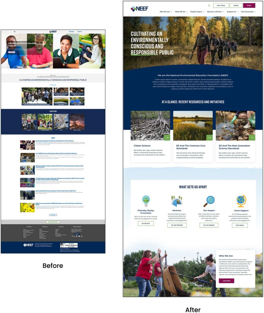
A Custom Site To Fuel Connection
NEEF needed a digital platform as unique as its organization, which is why Oomph ultimately delivered a suite of custom components designed to accommodate a variety of content needs.
Engaging and thoughtful design
NEEF’s new user experience is simple and streamlined. Visual cues aid in wayfinding (all Explore pages follow the same hero structure, for example), while imagery, micro-interactions (such as hover effects) and a bold color palette draw the user in. The UX also emphasizes accessibility and inclusivity; the high contrast between the font colors and the background make the website more readable for people with visual impairments, while people with different skin tones can now see themselves represented in NEEF’s new library of 100 custom icons.
Topic-based browsing
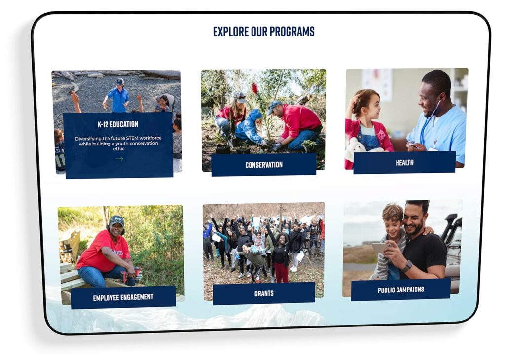
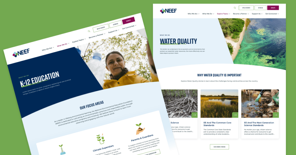
From water conservation to climate change, visitors often come to the NEEF site to learn about a specific subject. We overhauled NEEF’s existing site map to include topic-based browsing, with pages that roll resources, storytelling, and NEEF’s impact into one cohesive package. Additional links in the footer also make it easier for specific audiences to find information, such as nonprofits seeking grants or teachers looking for educational materials.
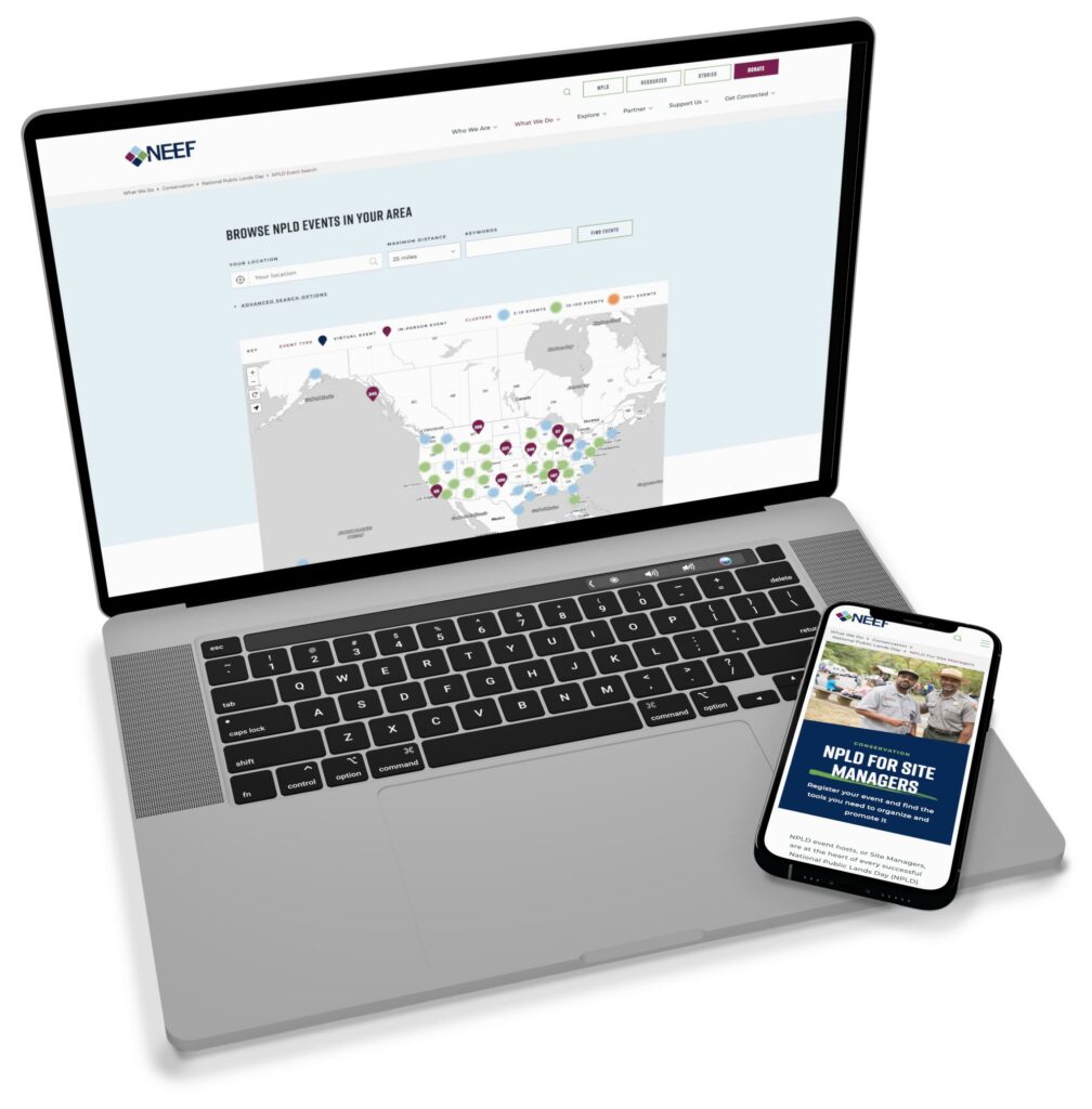
NPLD-hosted resources and event locator
Oomph refreshed existing components and added new ones to support one of NEEF’s flagship programs, National Public Lands Day (NPLD). People interested in hosting an event could use the new components to easily set one up, have their own dashboard to manage, and add their event to NEEF’s event locator. Once the event has passed, it’s automatically unlisted from the locator — but archived so hosts can duplicate and relaunch the event in future years.
THE RESULTS
Protecting the Planet, One User at a Time
Oomph helped NEEF launch its beautiful, engaging, and interactive site in May 2023. Within three months, NEEF’s team had built more than 100 new landing pages using the new component library, furthering its goal to build deeper connections with its audiences.
As NEEF’s digital presence continues to grow, so will its impact — all with the new custom site as its foundation.
Not a lot of people get excited about creating an annual report. Yay! Let’s dive into last year’s operational metrics! If you and your colleagues fall into that camp, this statement should help stoke a little enthusiasm:
A compelling annual report can make the difference in reaching your goals for the coming year — and maybe even exceeding them.
Your annual report (also known as an “impact report” at many nonprofits) can be pivotal in earning the trust and support of key stakeholders. Read on to learn how a strong story, good design, and the right format can transform your company data into an invaluable outreach tool.
Why the Quality of Your Annual Report Matters
A good annual report communicates more than just financial performance and forecasts. It provides stakeholders with a deeper understanding of what you do, why you do it, and how well you do it — and gives them a reason to trust, invest in, and/or work with your brand.
This is crucial for nonprofits that rely heavily on fundraising or volunteers, or for-profit companies that need to attract and retain investors and employees. In the health and wellness sector, it’s a key opportunity for organizations to show how they’ve followed through on their commitments to contribute to the health and wellness of communities.
With an engaging design and thoughtful content, an annual report can be a powerful tool for fundraising, marketing, and recruiting. Done well, it’s also a good way to strengthen your brand reputation.
By contrast, a poorly done annual report can downplay your strengths and successes. It can also diminish your brand image, particularly if your website and other channels are more thoughtfully designed. In that case, the annual report may feel like an afterthought to readers who rely on its information.
How Your Annual Report Can Engage Key Audiences
While current and potential donors or investors tend to be the primary audiences for annual reports, there are a number of other stakeholders to take into account. Employees, customers, alumni, partners, and community leaders are all part of the ecosystem that benefits from, and drives value for, your organization.
Creating a multi-faceted report with content that speaks to different audiences can help you earn the trust and support of a range of key stakeholders. Here’s how.
Strengthen your investor or donor base
With an easy-to-digest record of accomplishments and impact, your annual report can help convince current and potential donors, sponsors, or investors that your organization is a solid investment. It’s also a great way to recognize those who helped you achieve your goals over the year or to reconnect with disengaged supporters.
Motivate your employees or volunteers
An engaging report can congratulate your team on their wins and highlight the innovation, commitment, and cooperation that underpin your success. By showing people how their work affects everything from stock value to community impact, you’ll reinforce why the work they do every day makes a difference and how they fit into the bigger picture.
Capture more customers or clients
Whether they’re buying your products or receiving the benefits of your services, most people want to do business with brands that genuinely care about them. Your annual report can include stories and visuals that showcase your mission and core values, as well as highlighting initiatives that put customers or clients first.
Enhance vendor or partner relationships
External partners want to know what they can expect from you and what’s expected of them — and just about everyone wants to feel appreciated. Your annual report can leverage data to show your financial strength and longevity while highlighting the level of quality and commitment you expect from vendors and partners. It can also spotlight those who went above and beyond, reinforcing those relationships.
6 Best Practices for an Engaging Annual Report
It’s not easy to distill an entire year’s worth of data into a single report that’s digestible, engaging, and convincing. The best annual reports tend to combine clear and purposeful storytelling with a little creativity.
Choose a unifying theme
One of the best ways to craft a cohesive narrative for your annual report is to choose an overarching theme and create relevant content around it. Centralizing your accomplishments around a main message will keep the report focused and better support your core objectives.
Some organizations anchor their reports by opening with their mission statements. Others use marketing-driven catchphrases like “Poised for the 21st Century.” We love the 2021 annual report from AIDS Foundation Chicago — it’s built around the theme “A Better Normal,” opens with a leaders’ letter, and includes a list of strategic priorities linked to different report sections.
Use visual elements to express impact
It’s easy for a message to get lost if it’s not presented in the right way. Design matters! Use things like photos, infographics, and other visual elements to bring your goals and successes to life. This will also help keep readers engaged with your content. In a nutshell: aim for more visuals and fewer words.
The Blue Cross Blue Shield of Rhode Island 2021 Annual Report does a great job of using impactful imagery and colorful visuals to illustrate their mission and key accomplishments.
Make it interactive
At the end of the day, you want people to read what you’ve put together. One of the best ways to keep readers engaged is to create an immersive experience with interactive features. Let your audience click through slides, watch videos, or expand graphics for more information.
TOMS’s 2022 Impact Report combines videos and dynamic visuals with lots of clickable content to cover a ton of info without making readers wade through long blocks of text.
Create a web page, not a PDF
While PDFs are easy to share online or in print, they can be clunky to interact with, they’re hard to read on mobile, and they’re notoriously inaccessible.
Here are some important advantages to building a web page instead:
- Web pages can be optimized for different digital devices
- You can use SEO techniques to help increase exposure
- They can easily meet diverse accessibility needs
Plus, since they’re native to web browsers, web pages make it easier for readers to navigate to additional resources or take action. And, well, PDFs just aren’t as much fun to scroll through as the 2020 Mailchimp Annual Report.
Employ data visualization
Numbers alone are easy to skim right over. Visual representations of data, however, get readers to think about the content in a more constructive way, like identifying trends or significant changes. Visualizations also help transform complex data into easy-to-understand information that’s more enjoyable to read.
Start Network’s 2019 Annual Report shows how to use color, graphics, and animation to bring life to your data.
Connect the data to real people
This is especially important for nonprofits and for-profit social enterprises, where it’s crucial to convey the impact of your work. You can humanize facts and data — and make an emotional connection with readers — by including stories and images showing how your product or service impacted the lives of real people.
For a wonderful example of how to incorporate real stories, check out Fairtrade Foundation’s 2019 Annual Report.
Why It’s All Worth It
Think about all the marketing and outreach methods your team uses to attract support for your organization. Of all those methods, the annual report provides a unique chance to showcase the full breadth of your value and impact. To unabashedly brag about yourselves, if you will.
For health and wellness organizations in particular, an annual report is a great opportunity to share community impact over the past year and highlight important investments or initiatives that impact the health and lives of the individuals they serve.
Is it a significant investment? It can be. But if you invest in making your annual report as engaging and compelling as possible, it can pay for itself by helping to fulfill your fundraising or recruitment goals — and spotlighting the crucial role your organization plays in the world at large.
Need help crafting your next annual report? Reach out to us today.
Digital customer experience (DCX) is fast becoming a key factor in how consumers choose whom to do business with. Every digital interaction contributes to an overall feeling about your brand — which means digital touchpoints like apps and chatbots can play a big part in what customers think of your company.
What story do you want those interactions to tell? What kind of experiences do you want people to share with others?
This article covers five ways to assess and improve your digital customer experience so you can attract, delight, and retain your target customers.
But First – What IS Digital Customer Experience?
Customer experience, or CX, is the perception that customers form based on all of their interactions, in-person or online, with your brand. If CX is about carefully and consistently meeting your customers’ needs, Digital Customer Experience is the online expression of those efforts.
Digital customer experience is the part of your CX journey that involves digital interactions via your website, mobile app, social media accounts, digital kiosks, etc. Wherever your customers are engaging with your people, products, or services through the internet, it’s a digital experience.
DCX is their perception of those moments.
Brands with a great DCX provide a personalized and consistent online experience throughout the customer journey. Whether someone is considering becoming a client, placing an order, or searching for information, every digital interaction has to be easy and enjoyable.
5 Ways to Improve Your Digital Customer Experience
Technology is a wonderful tool for improving the customer experience, whether mining data for customer insights or leveraging AI for personalization. But technology alone can’t deliver an exceptional digital customer experience. Your DCX strategy must include a human component — one that focuses on customer care through empathy and authenticity. Here’s how to ensure your digital customer experience lives up to your users’ expectations.
Know your target audience
To deliver the kind of digital experience your customers will love, you have to know what they want. Who’s buying your product, and why? When they visit your website or app, what are they hoping to accomplish?
Delighting your customers requires knowing their goals, understanding their pain points, and providing interactions that meet their specific needs. The upshot? 68% of customers will spend more money with a brand that understands and treats them like an individual.
Here are three crucial steps:
- Use qualitative and quantitative analyses to learn about your audience. The more you understand their preferences and behaviors, the better you can create an experience that meets their needs.
- Apply a user-centered design process, which relies on deeply understanding your audience to craft usable, accessible digital interfaces.
- Incorporate personalization techniques to adapt the digital experience for individual users. More than anything else, this will help make the customer journey smooth and enjoyable.
Adopt an omnichannel mindset
Customers expect seamless interactions from brands throughout their journey, whether through digital or non-digital channels. In fact, brands with the strongest omnichannel customer engagement strategies retain an average of 89% of their customers, in comparison to 33% of companies with weak strategies.
Knowing that today’s consumers often jump from channel to channel as they browse, buy, or get in touch, DCX leaders embrace an omnichannel strategy. Note that this is different from a multichannel approach, where customers access multiple channels in separate interactions. An omnichannel approach integrates all digital touchpoints to create a seamless, personalized experience.
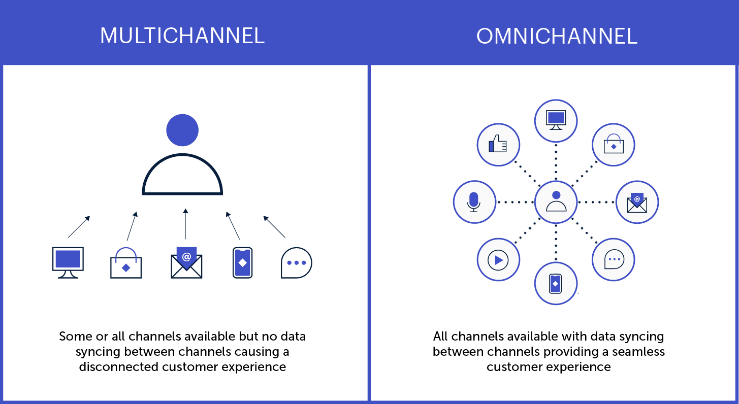
Here are a few key ways to create personalized experiences that resonate across all your digital channels:
- Use instantly recognizable brand elements and visual designs
- Make the transition from one channel to another easier
- Save search history and preferences across devices
- Synchronize ads and other promotional content
Get help from experts
Expert assessments can remove the guesswork around optimizing your digital customer experience. A digital CX audit, for instance, will show you what’s working and what could be better, as well as providing actionable insights and a prioritized roadmap.
CX specialists will look beyond the basic digital experience (clunky design, system bugs, etc…) to assess whether your digital channels are effectively serving your customers’ needs. A professional audit can help determine things like:
- Are there critical issues affecting usability and access?
- What elements of the journey most impact users’ experience?
- What are your competitors doing, and how can you differentiate?
- Where are your greatest strengths and growth opportunities?
Make customer feedback easy
Most companies know that customer feedback is crucial for improving the customer experience. But many fall short in providing easy, effective options for people to reach them.
Offering multiple, easy-to-use communication options across your digital channels is one more way to delight your customers. Help people engage with you via the medium of their choice, so they can communicate through the interface they’re most comfortable with.
That could be a chat function or contact form on your website, or the commenting and messaging features on your social profiles. Or, maybe it’s good old-fashioned phone calls and emails. Whatever the avenue, make it easy to find and intuitive to use.
One more thing: when someone does reach out, respond quickly. The faster a problem is resolved, the better the experience.
Plan for the post-launch reality
You might design and launch an amazing new website, app, or service that delights your customers and sends revenue through the roof. But, without a long-term plan to keep it effective and relevant, your digital CX will likely diminish over time.
To maintain the quality of customer experience across all your digital touchpoints, apply a measurement framework based on the principles above:
- Are you meeting users’ current and evolving needs?
- Do you provide a seamless omnichannel experience?
- Are you gathering — and implementing — user feedback?
Remember, too, that new technological trends are going to keep emerging and influencing consumer expectations. Be prepared to evolve what digital CX looks like for your business, especially if it means extending your digital services to new platforms or devices.
Putting the “C” in Digital CX
Technology has made so many things possible for today’s consumers that, ultimately, the power is in their hands. As digital capabilities continue to evolve, people may become increasingly selective about which brands earn their trust and business — and companies will need to make the digital customer experience more beneficial for both sides.
As you can see from the steps above, the key is putting your customers’ needs above all else.
If you’re not sure where to start, you’re not alone! We’ve helped dozens of clients dive into customer research, omnichannel strategies, and strategic planning for digital platforms. Reaching out to a digital CX expert (like Oomph) can help you do things right the first time, saving you time and money and, most importantly, building a foundation to get results.
Excited about crafting an exceptional DCX? So are we. Check out our DCX audit service to learn how we can help set you up for success.
THE BRIEF
AskRI is a digital platform providing Rhode Island residents with free access to some of the top educational and research tools, along with links to many state resources. A collaboration among the state government and various libraries and agencies, AskRI is essentially a 24/7 help desk for Rhode Islanders.
The platform’s structure has three main approaches:
Databases
Online portals provide free access to premium third-party tools and services, including research platforms and libraries, online learning and tutoring platforms, and consumer resources for health, jobs, and more.
Audiences
AskRI curates information and resources for specific audiences, including K-12 students and teachers, parents, non-native-English speakers, and adults seeking continuing education.
FAQs
Supporting local librarians with ready-made links, the FAQ section answers crowd-sourced questions about a variety of government services (how to get a green card, where to get a fishing permit, etc…).
Fundamentally, it’s an incredible resource! But, as AskRI grew over time, it became increasingly difficult for users to find the information they needed — and harder for site managers to organize, update, and expand the content.
Aiming to make the platform more user-friendly all around, its owners opted for a comprehensive redesign with a few primary goals:
- Refresh the branding to re-energize the service internally and externally
- Provide more flexible and efficient content management tools
- Increase usage of the platform’s resources across all target audiences
THE APPROACH
Through a quick Discovery phase, we uncovered a diverse user base with a broad range of needs. Our next challenge was to create an energetic brand identity and a more intuitive way to organize the platform.
Visual Branding
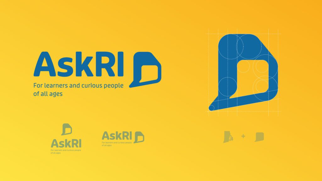
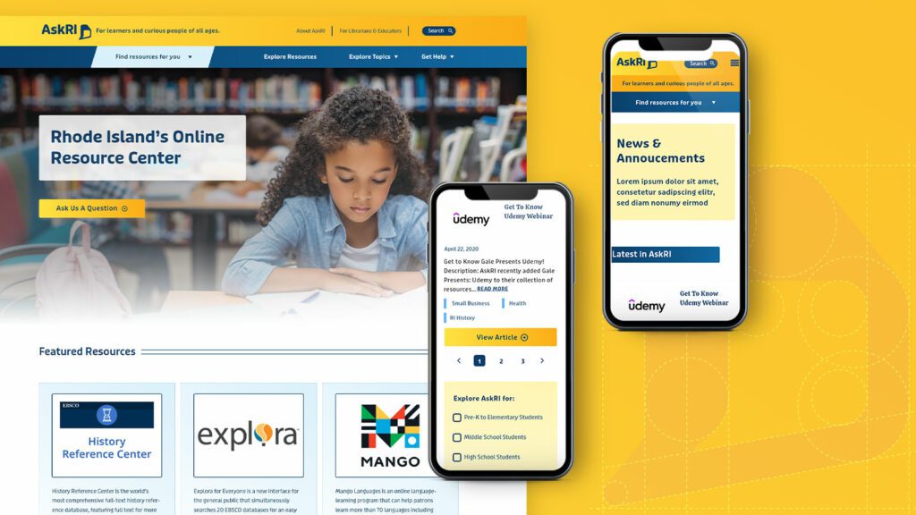
Rhode Island is a small but unique place, and its residents are proud of their state. We wanted the new branding to leverage a more modern, yet uniquely Rhode Island, identity. It could also evoke a sense of engagement, reinforcing the platform’s two-way interaction.
Over several design rounds, we explored logos that would represent two-way conversations while suggesting Rhode Island’s distinct shape. We also introduced a new, brighter color palette.
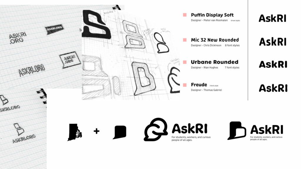
Digital Platform
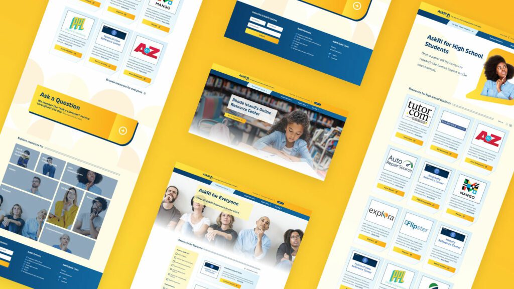
Redesigning the platform came down to an exercise in information architecture: What was the best way to organize the content so users could quickly find the tools and resources that were most relevant to them?
We knew only a small segment of the target audience would know exactly what they were looking for and be able to search for it directly. Most users would be on a mission of discovery, needing a way to browse the content. Then there was the FAQ section, where users might expect to find answers about the platform itself — but in its current form, the FAQs were confusingly broad and hard to find.
Our solution addressed all three areas:
- Knowing that frequent users would want to get to familiar databases quickly, we incorporated tried-and-true search and filter tools
- For those needing more guidance, we created a persona-based architecture with curated lists of content that addressed each persona’s unique needs
- By making the platform simpler and more intuitive, we removed the need for an FAQ section. We replaced it instead with a more interactive feature
THE RESULTS
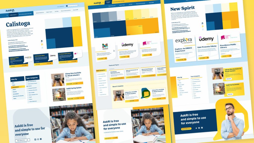
These relatively simple changes brought powerful results, creating a more engaging and intuitive platform. The fresh branding celebrates inquisitiveness and interaction, while the redesigned content is much easier for users to navigate and for authors to organize and expand.
The AskRI team loved the new brand identity, which evokes curiosity with visual elements that represent thinking and asking questions. Two thought bubbles form the shape of Rhode Island for the logo, while images of inquisitive people are featured throughout the site. In addition, the new colors bring fresh energy to the brand while preserving a sense of trust and authority.
The redesign not only improved the content’s organization and accessibility, it also fosters a greater sense of interaction with platform users. Visual personas provide an intuitive starting point for exploration, backed up with curated resource lists. A new dropdown menu titled “Find Resources for You” speaks directly to target audiences, while a new “Explore Topics” section offers lists of state resources grouped by user needs (small business, health, families, etc.).
Finally, as the most interactive part of the platform, the redesigned FAQs section is now the “Ask a Librarian” page, where users can submit questions on any topic. The most common platform-related questions get published to the site as a list of answers that users can browse. Input from users will not only inform the kinds of content that goes on the site, but may also spur access to new tools and databases.
You’ve just rolled out an important new feature on your platform, and it’s time to answer the all-important question: is it getting the results you want? If you’ve set up an analytics tool, you can look at performance indicators like registrations, logins, downloads, or shares. But that kind of quantitative data will only get you so far.
Let’s say that new feature isn’t having the impact you’d hoped for — maybe registrations are lacking or engagement is low. You have a problem you need to solve, but you don’t have any information about why it’s happening. And you may have an entirely different underlying problem you need to address.
Where can you find actionable information? Enter qualitative research.
By answering the why behind what’s happening, qualitative data provides context for problems that surface through quantitative analysis. It helps you uncover the root of the problem you have and can also reveal problems you didn’t even know existed.
In this article, we’ll cover how to use both types of research to inform your platform design.
First, the Numbers: Quantitative Research
When you’re evaluating the performance of a digital platform, a good place to start is the cold, hard numbers. Quantitative research provides numerical data that can indicate, at a glance, whether your platform is meeting your business objectives. It can also show the scale of any problems and help prioritize which ones to address.
One major benefit of quantitative data is benchmarking. Tracking your data over time reveals whether UI changes are producing the results you want — and can help you measure the ROI of your efforts. You can also compare your data to an industry benchmark or a competitor’s stats as a barometer for your own performance.
Here are some examples of quantitative research methods:
Web analytics
This data describes what people are doing with your platform: where they go, what they click on, what features they use. It’s good for finding problems and monitoring the performance of content or features.
A/B testing
Here, you’re using experiments to compare different UI designs. By creating two live versions of the same element, like a call-to-action button, you can see which one performs best. Learn more in our article on A/B testing.
Surveys and questionnaires
Surveys let you gather information about your users’ preferences, attitudes, and behaviors, and they can produce a combination of quantitative and qualitative data. For easy-to-capture numerical data, use techniques like ratings and multiple-choice questions.
Usability testing
By measuring user experience with hard data, you can test how easy (or not) a platform feature is to use. Let’s say you just released a reminder function, and you want to know if users can create a reminder in two minutes or less. You can run a test where you ask participants to set a reminder, and measure what percentage are able to complete the task within two minutes.
Now that you’ve got a sense of what users are doing on your platform, let’s look at ways to learn why and how they’re doing it.
Now for the Words: Qualitative Research
Qualitative research can help you investigate why something is happening, identify ways to fix problems, and even determine whether you should phase out a feature or redesign it. Using detailed, contextual descriptions of users’ experiences, you can dive deeper into exactly which elements are working well and which are problematic.
Quantitative and qualitative research both provide useful data, but they’re more powerful when used together.
Unlike with quantitative research, you don’t need a ton of data points to get usable info. For example, if you see five customers in a row walk into the corner of a display in a retail store’s entrance, you can safely assume that most visitors will do the same thing.
You may be avoiding qualitative data because it seems expensive. And some techniques, like focus groups, require a greater investment than others. But, because you don’t need an enormous amount of data, qualitative research can be very cost-effective. It might even save you money by helping you identify and fix problems faster.
Here are some examples of qualitative research methods:
User Interviews
There are a number of different ways to handle user interviews, depending on the type and specificity of info you’re looking for. Here are a few:
- Talk to a subset of your platform users and ask what they like, don’t like, and why. What could be improved?
- Listen to users narrate their experience as they move through your platform, to learn how they feel about particular elements or tasks.
- Give test subjects a post-task survey, to capture their experiences while they’re fresh.
Focus Groups
These are similar to user interviews, but they’re done in a group setting. The advantage of a group is that it can often generate more feedback, as people tend to open up when they hear the experiences of others. Just be sure you have a moderator who gives everyone a chance to speak.
Field Studies
What people say they do… is often not what they actually do. Watching platform users in their natural environment can reveal gaps in your understanding of the user experience. You can use direct observation, interviews, contextual inquiry, and usability tests to learn how people do things and why they do them in particular ways.
Diary Study
This method asks users to document their experiences over time, making it useful for understanding longer-term behaviors. You can learn things like what motivates people to use certain features, what they’re trying to accomplish, how they feel, and what their overall journey looks like.
User Surveys
As opposed to quantitative surveys, qualitative surveys use open-ended questions to learn what users think and feel in their own words. One common pitfall: avoid leading questions. Instead of asking, say, “How easy was it to find the info you needed?”, ask “Describe your experience looking for that information.”
Like Peanut Butter & Jelly
Quantitative and qualitative research both provide useful data, but they’re more powerful when used together. Remember that quantitative data can tell you when there’s a problem with your platform design, but you’ll need qualitative data to know how to fix it.
Chances are, you’ll use them at different times. Qualitative research can be done during the initial design phase, once you have a working product, or during a redesign. It’s especially valuable at the beginning of a design process because it can help you focus on what your users need and why. Quantitative research is generally done only when you have a working product (either at the beginning or end of a design cycle), so you can measure the results of a design or change.
Want to learn more about how data-driven design can improve your platform performance? We’d love to help. Contact us today to schedule a call.
The Challenge
Execute on a digital platform strategy for a global private equity firm to create a centralized employee destination to support onboarding, create interpersonal connections between offices, and drive employee satisfaction.
The key components would be an employee directory complete with photos, bios, roles and organizational structure; News, events, and other communications made easily available and organized per location as well as across all locations; The firm’s investment portfolio shared through a dashboard view with all pertinent information including the team involved.
These components, and the expected tactical assets that an intranet provides, would help the firm deepen connections with and among employees at the firm, accelerate onboarding, and increase knowledge sharing.
The Approach
Supporting Multiple Intentions: Browsing vs. Working
An effective employee engagement platform, or intranet, needs to support two distinct modes — task mode and explore mode. In task mode, employees have access to intuitive navigation, quick page loading, and dynamic search or filtering while performing daily tasks. They get what they need fast and proceed with their day.
At the same time, a platform must also encourage and enable employees to explore company knowledge, receive company-wide communications, and connect with others. For this firm, the bulk of content available in explore mode revolves around the firm’s culture, with a special focus on philanthropic initiatives and recognition of key successes.
Both modes benefit from intuitive searching and filtering capabilities for team members, news, events, FAQs, and portfolio content. News and events can be browsed in a personalized way — what is happening at my location — or a global way — what is happening across the company. For every interaction within the platform, the mode was considered and influential of nearly all design decisions.
From a technical standpoint, the private equity firm needed to support security by hosting the intranet on their own network. This and the need to completely customize the experience for close alignment with their brand meant that no off-the-shelf pre-built intranet solution would work. We went with Drupal 8 to make this intranet scalable, secure, and tailor-made to an optimal employee experience.
The Results
The platform deployment came at a time when it was most needed, playing a crucial role for the firm during a global pandemic that kept employees at home. What was originally designed as a platform to deepen employee connections between offices quickly became the firm’s hub for connecting employees within an office. As many businesses are, the firm is actively re-evaluating its approach to the traditional office model, and the early success of the new platform indicates that it is likely to play an even larger role in the future.