THE BRIEF
“Out of Home” (OHH) advertising is widely understood as billboards, transit stops, and street furniture. But OHH advertising is also place-based mobile advertising and digital messages that can react to the time of day and weather. These emerging avenues were some of the customer education messages that OUTFRONT Media, one of the top three outdoor advertising companies in the country, needed a new website to convey.
OHH was new to us, but we enjoy diving deep into new industries and absorbing information from all directions. While getting to know OUTFRONT Media during our initial explorations and discovery meetings, Oomph and Straightline Media were surprised to learn:
THE DISCOVERY
Expanding Outfront’s reach from Agencies to Mom-and-Pops
OUR RESEARCH & UNDERSTANDING
“The United States of Audiences” is the demographic landscape made up of microcosms centered around interests and activities. OUTFRONT understands all these niche groups and can hyper target them to get businesses those audiences.
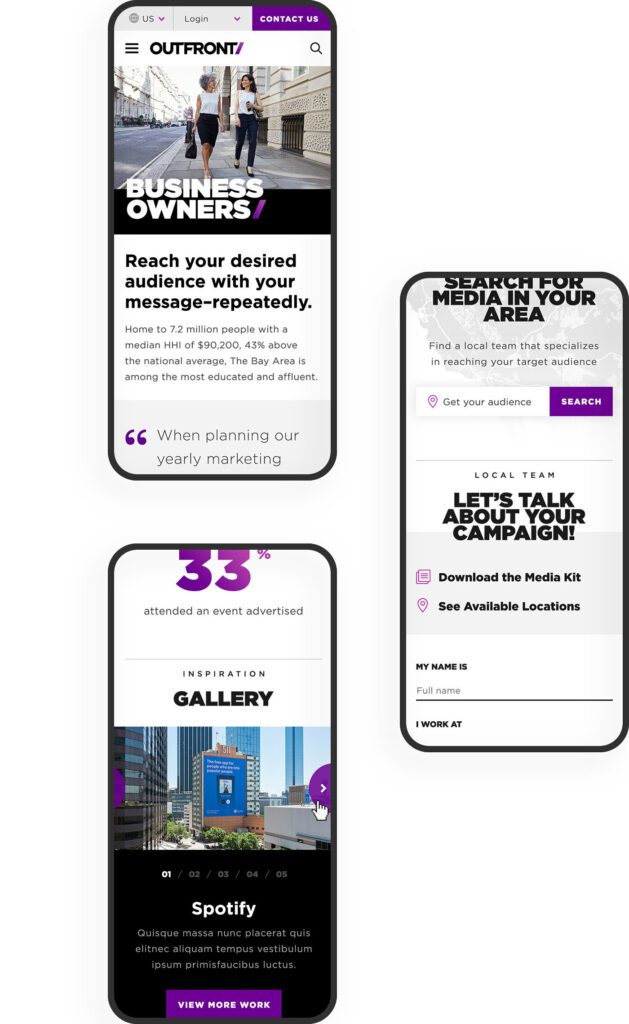
Through information architecture testing, an understanding of their business goals, and internalization of this new brand message, we crafted a main navigation that spoke directly to OUTFRONT’s target audiences. These pages communicate they “get” them in two ways — OUTFRONT understands these audiences’ needs and
CUSTOMER ACTIONS
To buy media placements from OUTFRONT, a business needs to:
- Understand the value of OHH advertising
- Explore the media options in their location
- Investigate the costs of these different options
- Call a sales associate in their area to discuss custom packages
Finding a market lets a potential customer define themselves even further by gathering their location
they can put the right message in front of the right people to get clients new business.
Large brands already understand how important it is to have OHH in their advertising mix. An emerging market for companies like OUTFRONT is actually smaller businesses — local chains and even mom and pop businesses. To court these new customers, OUTFRONT has to create a customer portal that supports do-it-yourself media management, and the website messaging has to educate a small business about the process and how to buy.
data. From here, they can easily access the media that is available specifically to their geographic area. After a sale is made, a customer needs continuing support. The website should:
- Make it easy for a customer to find production specs for various media
- Provide links to a portal that give them analytics and reporting statistics
- Give them a clear path to extending their current campaign or starting a new one
THE APPROACH
Defining Audience Destinations
OUTFRONT narrowed its focus to the audiences that it needs to win and continue to support — new advertisers, new and existing agency relationships, and property owners who lease their real estate to OUTFRONT for displays (these could be individual real estate owners, large municipalities, or large destinations like airports, stadiums, and entire city transit systems). The journey for these new customers is the main navigation, and these journies funnel through the Market Finder to become more personalized.
Returning customers will find inspiration, case studies, galleries, and support resources in the footer navigation. One of the reasons for this bifurcation was the amount of content that OUTFRONT Media needs to manage. Their previous navigation tried to be everything to everyone, and therefore, was confusing. Labels like “Who We Are / What We Do / Where We Are…” contained too much “we” and not enough “you”. A modern customer doesn’t have time to figure out the navigation — it should speak to them directly in language that they understand.
Giving Visitors Clear Directions
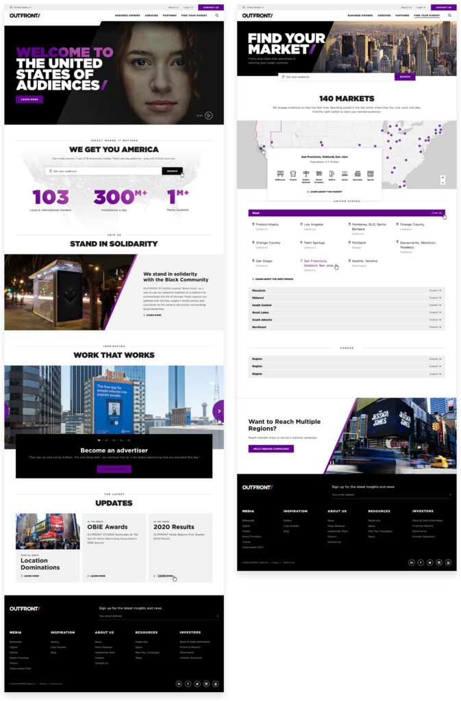
he previous market finder used “inside baseball” language — terms that people at OUTFRONT understand, but that the general populace does not. Markets were labeled by city and state with vague geographic terms like “non-metro”. It was not friendly to the DIY customer. We helped guide technical conversations around how a better flow might work and captured the journey in wireframes and external working examples.
The Market finder is an integral part of the customer journey, so we placed it in page content to support the education process. As a customer understands how OHH and OUTFRONT works, they are prompted to enter their location and get more direct information. As part of wireframes and design, the language was an important aspect to try out and sharpen. Vague button text like “Get Started” was replaced with stronger and more descriptive actions like “Start Building Your Campaign.”
THE RESULTS
Focusing Attention on Results
OHH is a powerful mechanism to reach people even as consumers become blind to advertising in traditional media — a billboard or subway poster can’t be ad-blocked. One of the most powerful ways to tell this story is through data. OUTFRONT has a number of “Insights” but potential customers are less likely to seek this information out themselves. Instead, we made sure to include teasers along their journies that highlight the effectiveness of sample campaigns. These Insights provide powerful results with brands that visitors are familiar with.
The entire journey from discovery to wireframing, testing, and design was an exciting and challenging process that pushed both teams towards an excellent outcome. We hope that the clarity of the navigation, message, and visitor journey continues to get new eyeballs and customers.
THE BRIEF
Supporting the Organizations You Love Should Be as Easy as Banking Online
After a successful redesign experience for their main property, United Way Rhode Island (UWRI) came to Oomph with an idea — modernize and rebrand their philanthropic giving platform as a mobile-responsive web app. They already had the software team building back-office integrations, but what they didn’t have was the all-important name, URL and brand.
The name set the tone for the platform — easily understood, distinct in the marketplace, and personal. UWRI prides itself on being a personal organization, helping Rhode Islanders who need it most. And giving one’s time, one’s energy, and one’s assets is as personal as it gets. After some research into competitors, the banking space, logo and app naming trends, plus a whiteboard full of other ideas, a clear winner emerged — MyFund.
THE NEW BRAND
A New Sibling for a Recognizable Community Organizer
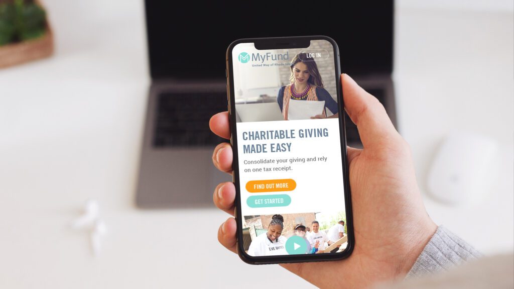
There is great public trust in UWRI that a new brand should leverage. After visual explorations, we decided to make the connection in a subtle way. The main color scheme borrowed from the recent redesign of UWRI’s website, using a highlight color of light teal as its primary color. The main typeface was Meta, which is the secondary typeface for much of UWRI’s print collateral. These subtle connections helped maintain a family resemblance, while allowing MyFund to stand on its own.
The simple circle with “M” mark abstractly suggests two bodies, side by side and with linked arms. The tagline, “Because Giving is Personal,” was the result of one of those serendipitous moments during an all-hands meeting. Someone floated it to the group and everyone just lit up and exclaimed, “That’s it!” Along the way, the name, the logo, the colors, the typeface, and the tagline just felt right. We all felt it, and it was very exciting to be a part of it.
THE RESULTS
Web-app Interface Design
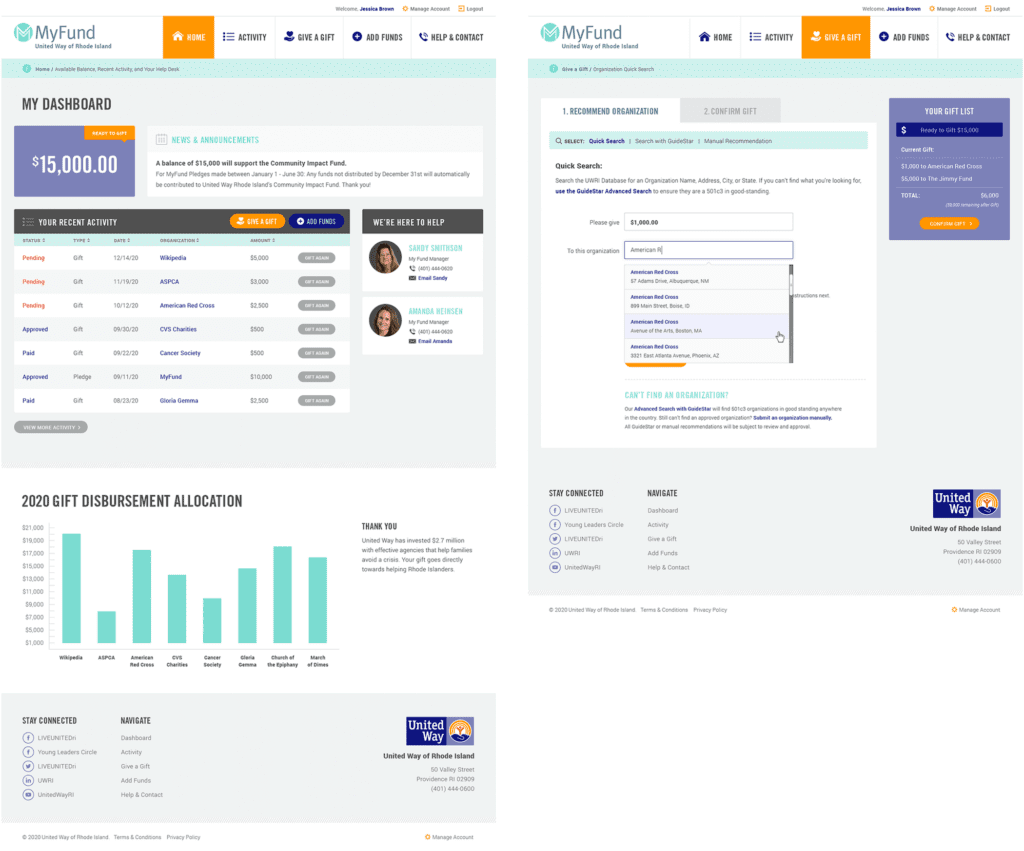
The interface was designed to follow many conventions of online banking in order to leverage customers’ intuition and expectations, but the result is softer and less like a typical financial institution. The concept of MyFund is similar to online banking in that the customer can make a donation through an online portal from a predetermined balance. The differences are in the workflow; MyFund transactions occur both on and offline. All transactions are guaranteed to go to registered 501c3 organizations in good standing with the IRS, therefore, when a request is made to send money to an organization, the final check is cut by a person. A customer may cancel a transaction before it has been fully processed but the back-office may also cancel it if the organization is not compliant. These nuances needed to be clear in the interface and messaging.
All along the way, the wireframes and designs were verified with real people. At the early stages, wireframes and workflows were tested with online tools and an HTML prototype. This not only gave the development team a live example of a customer’s workflow, but it gave the entire team a clear picture of how the responsive site was going to work.
The Marketing Site
While the software was nearing completion and a beta launch, Oomph began work on a marketing site to promote the new web app. We were involved in writing the copy and crafting the story for prospective customers.
We scripted a series of videos to help explain how individual features worked, while one explainer video on the marketing site gave new customers a broad overview of why this platform is such a great idea. A list of primary features as well as some social proof in the form of personal testimonials help frame the platform as more than just a convenience — it can really help you make a difference in your community.
See the marketing site in action at MyFund.org.