
Digital customer experience (DCX) is fast becoming a key factor in how consumers choose whom to do business with. Every digital interaction contributes to an overall feeling about your brand — which means digital touchpoints like apps and chatbots can play a big part in what customers think of your company.
What story do you want those interactions to tell? What kind of experiences do you want people to share with others?
This article covers five ways to assess and improve your digital customer experience so you can attract, delight, and retain your target customers.
But First – What IS Digital Customer Experience?
Customer experience, or CX, is the perception that customers form based on all of their interactions, in-person or online, with your brand. If CX is about carefully and consistently meeting your customers’ needs, Digital Customer Experience is the online expression of those efforts.
Digital customer experience is the part of your CX journey that involves digital interactions via your website, mobile app, social media accounts, digital kiosks, etc. Wherever your customers are engaging with your people, products, or services through the internet, it’s a digital experience.
DCX is their perception of those moments.
Brands with a great DCX provide a personalized and consistent online experience throughout the customer journey. Whether someone is considering becoming a client, placing an order, or searching for information, every digital interaction has to be easy and enjoyable.
5 Ways to Improve Your Digital Customer Experience
Technology is a wonderful tool for improving the customer experience, whether mining data for customer insights or leveraging AI for personalization. But technology alone can’t deliver an exceptional digital customer experience. Your DCX strategy must include a human component — one that focuses on customer care through empathy and authenticity. Here’s how to ensure your digital customer experience lives up to your users’ expectations.
Know your target audience
To deliver the kind of digital experience your customers will love, you have to know what they want. Who’s buying your product, and why? When they visit your website or app, what are they hoping to accomplish?
Delighting your customers requires knowing their goals, understanding their pain points, and providing interactions that meet their specific needs. The upshot? 68% of customers will spend more money with a brand that understands and treats them like an individual.
Here are three crucial steps:
- Use qualitative and quantitative analyses to learn about your audience. The more you understand their preferences and behaviors, the better you can create an experience that meets their needs.
- Apply a user-centered design process, which relies on deeply understanding your audience to craft usable, accessible digital interfaces.
- Incorporate personalization techniques to adapt the digital experience for individual users. More than anything else, this will help make the customer journey smooth and enjoyable.
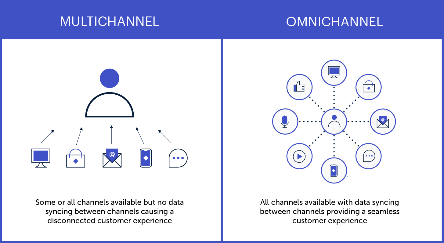
Adopt an omnichannel mindset
Customers expect seamless interactions from brands throughout their journey, whether through digital or non-digital channels. In fact, brands with the strongest omnichannel customer engagement strategies retain an average of 89% of their customers, in comparison to 33% of companies with weak strategies.
Knowing that today’s consumers often jump from channel to channel as they browse, buy, or get in touch, DCX leaders embrace an omnichannel strategy. Note that this is different from a multichannel approach, where customers access multiple channels in separate interactions. An omnichannel approach integrates all digital touchpoints to create a seamless, personalized experience.
Here are a few key ways to create personalized experiences that resonate across all your digital channels:
- Use instantly recognizable brand elements and visual designs
- Make the transition from one channel to another easier
- Save search history and preferences across devices
- Synchronize ads and other promotional content
Get help from experts
Expert assessments can remove the guesswork around optimizing your digital customer experience. A digital CX audit, for instance, will show you what’s working and what could be better, as well as providing actionable insights and a prioritized roadmap.
CX specialists will look beyond the basic digital experience (clunky design, system bugs, etc…) to assess whether your digital channels are effectively serving your customers’ needs. A professional audit can help determine things like:
- Are there critical issues affecting usability and access?
- What elements of the journey most impact users’ experience?
- What are your competitors doing, and how can you differentiate?
- Where are your greatest strengths and growth opportunities?
Make customer feedback easy
Most companies know that customer feedback is crucial for improving the customer experience. But many fall short in providing easy, effective options for people to reach them.
Offering multiple, easy-to-use communication options across your digital channels is one more way to delight your customers. Help people engage with you via the medium of their choice, so they can communicate through the interface they’re most comfortable with.
That could be a chat function or contact form on your website, or the commenting and messaging features on your social profiles. Or, maybe it’s good old-fashioned phone calls and emails. Whatever the avenue, make it easy to find and intuitive to use.
One more thing: when someone does reach out, respond quickly. The faster a problem is resolved, the better the experience.
Plan for the post-launch reality
You might design and launch an amazing new website, app, or service that delights your customers and sends revenue through the roof. But, without a long-term plan to keep it effective and relevant, your digital CX will likely diminish over time.
To maintain the quality of customer experience across all your digital touchpoints, apply a measurement framework based on the principles above:
- Are you meeting users’ current and evolving needs?
- Do you provide a seamless omnichannel experience?
- Are you gathering — and implementing — user feedback?
Remember, too, that new technological trends are going to keep emerging and influencing consumer expectations. Be prepared to evolve what digital CX looks like for your business, especially if it means extending your digital services to new platforms or devices.
Putting the “C” in Digital CX
Technology has made so many things possible for today’s consumers that, ultimately, the power is in their hands. As digital capabilities continue to evolve, people may become increasingly selective about which brands earn their trust and business — and companies will need to make the digital customer experience more beneficial for both sides.
As you can see from the steps above, the key is putting your customers’ needs above all else.
If you’re not sure where to start, you’re not alone! We’ve helped dozens of clients dive into customer research, omnichannel strategies, and strategic planning for digital platforms. Reaching out to a digital CX expert (like Oomph) can help you do things right the first time, saving you time and money and, most importantly, building a foundation to get results.
Excited about crafting an exceptional DCX? So are we. Check out our DCX audit service to learn how we can help set you up for success.
“Inclusive design” may sound like vague, trendy, technical jargon. But inclusive design isn’t a trend — it’s the world catching up on the kind of digital experiences that should have been part of the web from the beginning.
Inclusive design is a crucial part of nearly every digital platform, be it website, app, or intranet.
Inclusive design as a concept and practice is broad and deep — this article barely scratches the surface, but will help you understand the mindset required. We’ll cover what it is, why it matters for your business, and some ways to assess whether your digital platform could be more inclusive.
- What does “inclusive design” mean?
- What are the benefits of inclusive design?
- How are inclusive design and accessibility different?
- How can you make your platform more inclusive?
What does “inclusive design” mean?
The Inclusive Design Research Center defines inclusive design as “design that considers the full range of human diversity with respect to ability, language, culture, gender, age and other forms of human difference.” Adding to that, Nielsen Norman calls it creating products that “understand and enable people of all backgrounds and abilities,” including economic situation, geography, race, and more.
Essentially, you’re aspiring to create interfaces that reflect how people from all walks of life interact with the world.
Inclusive design allows people to use a digital platform with ease, whatever their needs or point of view. Looking at characteristics like race, abilities, or geography helps us identify key areas where friction can occur between humans and the web.
In the end, it’s about designing for everyone.
What are the benefits of inclusive design?
Inclusive design isn’t just about recognizing and accommodating diversity; it also creates business advantages for organizations that are willing to invest in an inclusive approach. Here are a few key areas where inclusive design can give your digital platform an edge:
Grow your customer base. By understanding the best way to connect with a wider target audience, your team can create digital experiences that attract the most possible users.
Increase user engagement. Engagement goes up when platforms are welcoming and easy to use. Inclusive web design removes barriers and creates motivation for people to engage with your brand.
Spark innovation. Inclusive solutions have a history of spawning innovation that goes beyond the initial intended audience (think closed-captioning-turned-subtitles on Netflix). Sometimes, when you aim to solve a specific usability issue, you end up creating an entirely new market solution.
Motivate your team. The way a digital platform is designed affects all audiences, even employees. Designing with inclusivity in mind can also have a positive influence on your own team. Engaging employees in your efforts to build an inclusive digital platform can help create a sense of shared purpose — one many people are likely to rally around.
How are inclusive design and accessibility different?
You may have heard these terms used in similar contexts. While they overlap in meaning, they’re not the same thing.
By definition, accessibility focuses on accommodating people with varying physical and mental abilities. Accessible websites are measured by their conformance with Web Content Accessibility Guidelines, which pertain to things like auditory, cognitive, physical, and visual disabilities. Accessibility tests typically cover code-level issues that can be fixed in the source code of a site.
Inclusive design is about accommodating the entire spectrum of human diversity. It involves a variety of viewpoints, including those of people with disabilities. Inclusive solutions can involve anything from back-end coding to the way headlines are worded.
In a nutshell: An accessible site is one of the outcomes of an inclusive design, whereas inclusive design is the overall approach to creating accessibility.
Consider these examples:
- You’re filling out a form, and because you have a visual impairment, you’re using the keyboard to move through it. When you get to the end, you discover the form can’t be submitted because you left a few areas blank — even though you filled out every question asked. Turns out the keyboard had skipped past a few required fields. What a pain!
- While filling out a form, you’re asked to select your ethnicity from a list. As you read the options, you discover that yours is not listed, or that you identify with more than one. You feel like the “other,” compared to everyone else, leaving you frustrated about the task and… maybe even about the company too.
While both issues are addressed by inclusive design, the first issue relates to ability and can be fixed within the code, while the second relates to diversity and will take additional measures to address.
How Can You Make Your Platform More Inclusive?
The ethnicity example raises some interesting questions, such as:
- How do you know which ethnicities to add?
- How many do you need to account for?
- Should you just change the way the question is worded?
- Do you need to ask the question at all?
Mainly, this raises a bigger question: how do you maintain an inclusive site when there are so many important and broad variables (ability, language, culture, gender, age, etc.) — especially when that list of variables continues to grow and change?
The best way to get started is to arm yourself with knowledge and create a plan.
1. Identify the problems to solve.
Start by identifying opportunities for improvement in your current user experience (UX) by collecting quantitative and qualitative research with tools like UX audits, user interviews, user recordings, and heatmaps. Keep an eye out for areas where users seem confused, backpedal, or struggle to complete tasks. The more information you gather, the better!
2. Determine the best solutions.
Your user research will likely uncover many possible paths to change. This may include adding more categories to a list, creating an “Other” field users can type any answer into, or adding options to gather additional information.
Note: It’s common for areas that need improvement to hit on sensitive topics, things you may not fully figure out through data and research. Remember that the goal is understanding. Don’t be afraid to reach out to others for their thoughts and opinions.
3. Measure the results.
Some measures of success are easy to determine from user data in Google Analytics or changes in heatmaps and user recordings. Further data can come from users via surveys asking how your audience feels about the changes. The key is to stay continuously informed and aware of what your users are experiencing.
Note: One helpful tool for checking whether your design is, in fact, inclusive is Cards for Humanity. It offers a fun way to make sure you’re not missing anyone or anything in the spectrum of inclusivity.
Remember that the process of creating an inclusive design doesn’t end with implementation. Inclusive design is a work in progress. As a field, inclusive design is always evolving and requires continuous research to develop best practices.
We can’t predict what kind of mismatched interactions users will face in the years to come. But, with an open mind and a desire to learn and grow, we can continually adapt to meet them.
We’ve only scratched the surface of inclusive design! If you have any questions about inclusive design, we’d love to chat. Contact us anytime.
THE BRIEF
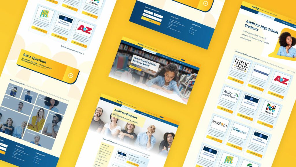
AskRI is a digital platform providing Rhode Island residents with free access to some of the top educational and research tools, along with links to many state resources. A collaboration among the state government and various libraries and agencies, AskRI is essentially a 24/7 help desk for Rhode Islanders.
The platform’s structure has three main approaches:
Databases
Online portals provide free access to premium third-party tools and services, including research platforms and libraries, online learning and tutoring platforms, and consumer resources for health, jobs, and more.
Audiences
AskRI curates information and resources for specific audiences, including K-12 students and teachers, parents, non-native-English speakers, and adults seeking continuing education.
FAQs
Supporting local librarians with ready-made links, the FAQ section answers crowd-sourced questions about a variety of government services (how to get a green card, where to get a fishing permit, etc…).
Fundamentally, it’s an incredible resource! But, as AskRI grew over time, it became increasingly difficult for users to find the information they needed — and harder for site managers to organize, update, and expand the content.
Aiming to make the platform more user-friendly all around, its owners opted for a comprehensive redesign with a few primary goals:
- Refresh the branding to re-energize the service internally and externally
- Provide more flexible and efficient content management tools
- Increase usage of the platform’s resources across all target audiences
THE APPROACH
Through a quick Discovery phase, we uncovered a diverse user base with a broad range of needs. Our next challenge was to create an energetic brand identity and a more intuitive way to organize the platform.
Visual Branding
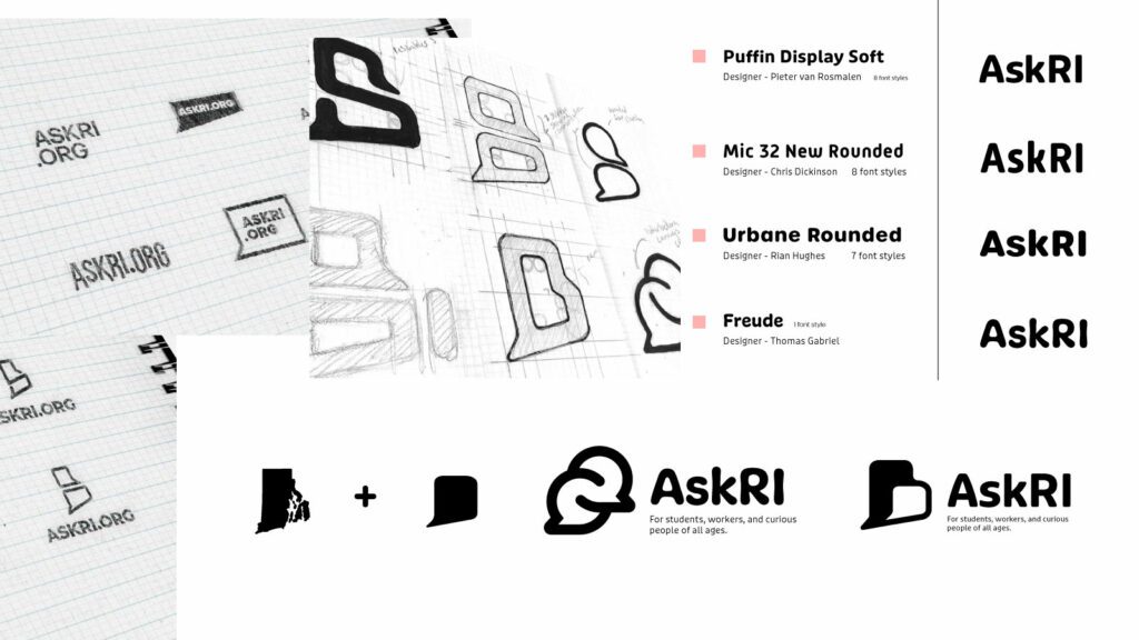
Rhode Island is a small but unique place, and its residents are proud of their state. We wanted the new branding to leverage a more modern, yet uniquely Rhode Island, identity. It could also evoke a sense of engagement, reinforcing the platform’s two-way interaction.
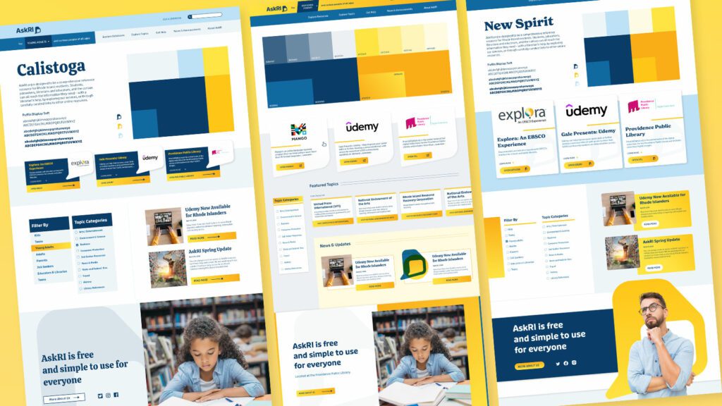
Over several design rounds, we explored logos that would represent two-way conversations while suggesting Rhode Island’s distinct shape. We also introduced a new, brighter color palette.
Digital Platform
Redesigning the platform came down to an exercise in information architecture: What was the best way to organize the content so users could quickly find the tools and resources that were most relevant to them?
We knew only a small segment of the target audience would know exactly what they were looking for and be able to search for it directly. Most users would be on a mission of discovery, needing a way to browse the content. Then there was the FAQ section, where users might expect to find answers about the platform itself — but in its current form, the FAQs were confusingly broad and hard to find.
Our solution addressed all three areas:
- Knowing that frequent users would want to get to familiar databases quickly, we incorporated tried-and-true search and filter tools
- For those needing more guidance, we created a persona-based architecture with curated lists of content that addressed each persona’s unique needs
- By making the platform simpler and more intuitive, we removed the need for an FAQ section. We replaced it instead with a more interactive feature
THE RESULTS
These relatively simple changes brought powerful results, creating a more engaging and intuitive platform. The fresh branding celebrates inquisitiveness and interaction, while the redesigned content is much easier for users to navigate and for authors to organize and expand.
The AskRI team loved the new brand identity, which evokes curiosity with visual elements that represent thinking and asking questions. Two thought bubbles form the shape of Rhode Island for the logo, while images of inquisitive people are featured throughout the site. In addition, the new colors bring fresh energy to the brand while preserving a sense of trust and authority.
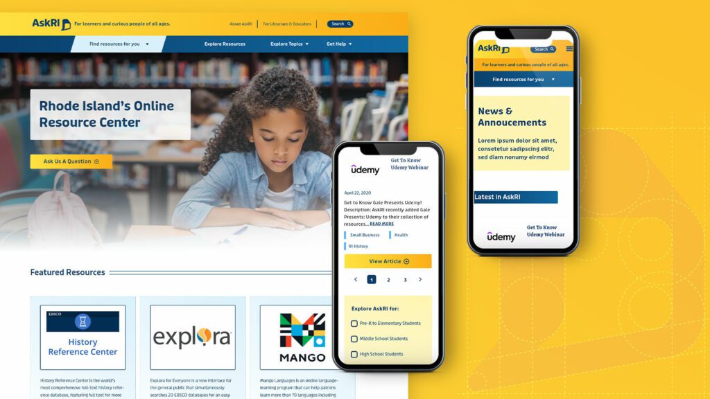
The redesign not only improved the content’s organization and accessibility, it also fosters a greater sense of interaction with platform users. Visual personas provide an intuitive starting point for exploration, backed up with curated resource lists. A new dropdown menu titled “Find Resources for You” speaks directly to target audiences, while a new “Explore Topics” section offers lists of state resources grouped by user needs (small business, health, families, etc.).
Finally, as the most interactive part of the platform, the redesigned FAQs section is now the “Ask a Librarian” page, where users can submit questions on any topic. The most common platform-related questions get published to the site as a list of answers that users can browse. Input from users will not only inform the kinds of content that goes on the site, but may also spur access to new tools and databases.
When companies merge, successfully combining digital assets like websites, intranets, apps, and other platforms takes more than just squishing things together. Poorly merged digital properties can diminish brand equity, squander years of SEO value, and even drive away customers or employees — ultimately tanking the value the merger was supposed to create.
The challenge is that you’re bringing together two end-user communities with different experiences and expectations. And it’s easy to assume the bigger or faster-growing company has the better digital platform, even when there’s a lot you could learn from the smaller company’s practices.
That’s why we recommend a collaborative, UX-centered approach to combining digital properties, to ensure you’re leveraging the best of both worlds. In this article, we’ll share a sample of UX analyses that can help set up a new combined platform for success.
First, let’s talk about leveraging the right mindset.
A Different Approach
Typically, when combining digital platforms, companies tend to take a top-down approach, meaning there’s a hierarchy of decision-making based on which platform is believed to be better. But the calculus can change a lot when those decisions are made from the end users’ point of view instead.
From a practical standpoint, these companies are usually trying to create efficiencies and add new competencies while carefully messaging the benefits of the merger for their customers. They focus on things like branding, SEO, and consolidating social media — all of which are important, and none of which truly shapes the platform user’s experience.
To be fair, before the merger, both companies were likely focused on trying to create the best possible user experience for their customers. Now that they’re joining forces, each brings a unique set of learnings and techniques to the table. Which begs the question: what if your new partner handles some aspects of UX better than you?
Working collaboratively through in-depth Acquisition Analysis gives you an opportunity to extract the best from all digital properties, as either company’s platforms may have features, functionality, or content that does a better job of meeting business goals. How do you know which elements will be more successful? By auditing both platforms with tools like the ones we’ll talk about next.
When merging, don’t assume the bigger company should swallow the smaller and all its digital assets. There might be many things that the smaller company is doing better.
Conducting UX Audits
To preserve SEO value and cull the best-performing content for the new platform, many companies conduct content and SEO audits, often using free or paid tools. These usually involve flagging duplicate content, comparing performance metrics, and using R.O.T. (redundant/outdated/trivial) analyses.
What many organizations miss, however, is the opportunity to conduct UX and customer audits while directly comparing digital platforms. These can provide invaluable insights about the mental models and behaviors of users.
At a minimum, we recommend comparing both platforms using Nielsen Norman Group’s 10 usability heuristics. Setting the standard for user interface design for almost three decades, these guidelines give you a great baseline for identifying which parts of each platform are the most user-friendly. You can also compare heatmaps and scrollmaps to assess which platform does a better job of engaging users in ways that matter to your business goals.
Here are some other examples of UX analyses we conduct for clients when merging digital platforms:
Five second test
With existing customers or representatives of your target audience, ask users to view a page for five seconds and then answer a few questions about it. You’re looking for gut feelings here, as first impressions can tell you a lot about a page’s effectiveness.
Questions might include:
- What does the site tell you about the company’s personality?
- What’s something you think you could do on that website?
- Did anything stand out as new or surprising to you?
This test should be done for multiple pages on a website, not just the homepage. It’s especially valuable for product or service pages, where you can assess whether specific features are easily visible and accessible.
Customer interview comparison
For this assessment, enlist 5 to 10 customers for each business. Have the customers of Company A use Company B’s platform and vice versa, asking them to explain the value each company offers. You can also ask users what’s missing when they use the other company’s website. What’s different and better (or worse) than before? The answers can help you determine which brand and functional elements are essential to the user experience for each platform.
This test can also provide insights about the impact of elements you may not have previously considered, like the quality of photography or the order in which information is presented. These elements can set expectations and affect how people use the platform, all of which contributes to building users’ trust.
For a more in-depth analysis of user engagement and preferences, try gathering a combination of quantitative and qualitative data.
Site map analysis
Given that the merging companies are likely in the same or similar industries, there will probably be overlap between the site maps for each company’s website. But there will also be elements that are unique to each site. To successfully blend the information architecture of both properties, you’ll need to determine which elements work best for your target audience.
In addition to comparing analytics for the different websites to see which elements are most effective, here are a few other research methods we recommend:
Cohort analysis
Looking at other websites in your industry, examine their site structures and the language they use (e.g. “Find a doctor” vs. “Find a provider”). This reflects visitors’ expectations of what information they’ll get and where they can find it. You can also identify areas where you should deviate from the norm, including language that’s more authentic and unique to your brand.
Card sort
Card sorting helps you understand how to structure content in a way that makes sense to your users, so they can find what they’re looking for. Participants group labeled notecards according to criteria they would naturally use. For example, if you have a car rental site, you could ask users to organize different vehicle models into groups that make sense to them. While your company might use terms like “family car” or “executive sedan,” your customers might have completely different perceptions.
Tree testing
Tree testing helps you evaluate a proposed site structure by asking users to find items based solely on the menu structure and terminology. Using an online interface (Treejack is a popular one) that displays only navigation links without layout or design, users are asked to complete a series of 10–15 tasks. This can show you how easy it is for site visitors to find and use information. This test is often used after card sorting sessions to confirm that the findings from the card sorting exercise are correct.
Use Information, Not Intuition
Like we said, just because a larger company acquires a smaller one doesn’t mean its digital properties have nothing to learn from the other’s. Better practices could exist in either place, and it would be a shame to lose any unique value the smaller company’s platform might offer.
With so many robust tools available for UX analysis, there’s no reason not to gather the crucial data that will help you decide which features of each platform will best achieve your business goals. When combining digital properties, the “1 + 1 = 3” trope only works if you truly glean the best of both worlds.
Need help laying the groundwork for merging separate digital platforms? Our strategic UX experts can craft a set of research exercises to help your team make the best possible decisions. Contact us today to learn more.
You’ve just rolled out an important new feature on your platform, and it’s time to answer the all-important question: is it getting the results you want? If you’ve set up an analytics tool, you can look at performance indicators like registrations, logins, downloads, or shares. But that kind of quantitative data will only get you so far.
Let’s say that new feature isn’t having the impact you’d hoped for — maybe registrations are lacking or engagement is low. You have a problem you need to solve, but you don’t have any information about why it’s happening. And you may have an entirely different underlying problem you need to address.
Where can you find actionable information? Enter qualitative research.
By answering the why behind what’s happening, qualitative data provides context for problems that surface through quantitative analysis. It helps you uncover the root of the problem you have and can also reveal problems you didn’t even know existed.
In this article, we’ll cover how to use both types of research to inform your platform design.
First, the Numbers: Quantitative Research
When you’re evaluating the performance of a digital platform, a good place to start is the cold, hard numbers. Quantitative research provides numerical data that can indicate, at a glance, whether your platform is meeting your business objectives. It can also show the scale of any problems and help prioritize which ones to address.
One major benefit of quantitative data is benchmarking. Tracking your data over time reveals whether UI changes are producing the results you want — and can help you measure the ROI of your efforts. You can also compare your data to an industry benchmark or a competitor’s stats as a barometer for your own performance.
Here are some examples of quantitative research methods:
Web analytics
This data describes what people are doing with your platform: where they go, what they click on, what features they use. It’s good for finding problems and monitoring the performance of content or features.
A/B testing
Here, you’re using experiments to compare different UI designs. By creating two live versions of the same element, like a call-to-action button, you can see which one performs best. Learn more in our article on A/B testing.
Surveys and questionnaires
Surveys let you gather information about your users’ preferences, attitudes, and behaviors, and they can produce a combination of quantitative and qualitative data. For easy-to-capture numerical data, use techniques like ratings and multiple-choice questions.
Usability testing
By measuring user experience with hard data, you can test how easy (or not) a platform feature is to use. Let’s say you just released a reminder function, and you want to know if users can create a reminder in two minutes or less. You can run a test where you ask participants to set a reminder, and measure what percentage are able to complete the task within two minutes.
Now that you’ve got a sense of what users are doing on your platform, let’s look at ways to learn why and how they’re doing it.
Now for the Words: Qualitative Research
Qualitative research can help you investigate why something is happening, identify ways to fix problems, and even determine whether you should phase out a feature or redesign it. Using detailed, contextual descriptions of users’ experiences, you can dive deeper into exactly which elements are working well and which are problematic.
Quantitative and qualitative research both provide useful data, but they’re more powerful when used together.
Unlike with quantitative research, you don’t need a ton of data points to get usable info. For example, if you see five customers in a row walk into the corner of a display in a retail store’s entrance, you can safely assume that most visitors will do the same thing.
You may be avoiding qualitative data because it seems expensive. And some techniques, like focus groups, require a greater investment than others. But, because you don’t need an enormous amount of data, qualitative research can be very cost-effective. It might even save you money by helping you identify and fix problems faster.
Here are some examples of qualitative research methods:
User Interviews
There are a number of different ways to handle user interviews, depending on the type and specificity of info you’re looking for. Here are a few:
- Talk to a subset of your platform users and ask what they like, don’t like, and why. What could be improved?
- Listen to users narrate their experience as they move through your platform, to learn how they feel about particular elements or tasks.
- Give test subjects a post-task survey, to capture their experiences while they’re fresh.
Focus Groups
These are similar to user interviews, but they’re done in a group setting. The advantage of a group is that it can often generate more feedback, as people tend to open up when they hear the experiences of others. Just be sure you have a moderator who gives everyone a chance to speak.
Field Studies
What people say they do… is often not what they actually do. Watching platform users in their natural environment can reveal gaps in your understanding of the user experience. You can use direct observation, interviews, contextual inquiry, and usability tests to learn how people do things and why they do them in particular ways.
Diary Study
This method asks users to document their experiences over time, making it useful for understanding longer-term behaviors. You can learn things like what motivates people to use certain features, what they’re trying to accomplish, how they feel, and what their overall journey looks like.
User Surveys
As opposed to quantitative surveys, qualitative surveys use open-ended questions to learn what users think and feel in their own words. One common pitfall: avoid leading questions. Instead of asking, say, “How easy was it to find the info you needed?”, ask “Describe your experience looking for that information.”
Like Peanut Butter & Jelly
Quantitative and qualitative research both provide useful data, but they’re more powerful when used together. Remember that quantitative data can tell you when there’s a problem with your platform design, but you’ll need qualitative data to know how to fix it.
Chances are, you’ll use them at different times. Qualitative research can be done during the initial design phase, once you have a working product, or during a redesign. It’s especially valuable at the beginning of a design process because it can help you focus on what your users need and why. Quantitative research is generally done only when you have a working product (either at the beginning or end of a design cycle), so you can measure the results of a design or change.
Want to learn more about how data-driven design can improve your platform performance? We’d love to help. Contact us today to schedule a call.
If you’ve been tossing around these two terms interchangeably, it’s okay. We won’t hold it against you. With some overlapping features and functionality, websites and digital platforms are easy to confuse at first glance.
In reality, they provide very different user experiences — and knowing the difference can be crucial to meeting your business needs.
How are Websites and Platforms Different?
The fundamental difference between a website and a digital platform lies in how you approach user engagement. Websites provide one-way engagement, with users ingesting whatever content the website delivers. Platforms offer reciprocal engagement, with interactions between a platform and its users generating personalized experiences.
Websites rely on implied audience data capture, meaning that users are grouped into broad buckets. If, say, lots of people click on a particular article, the site will assume that most visitors are interested in that topic and will feature it prominently. Essentially, websites are always working with the majority, not the individual.
By contrast, platforms use expressed data capture, where users provide identifying information by registering and logging in. Once someone becomes an authenticated user, you can learn about them directly through multiple touchpoints. That might include filling out forms, participating in discussions, adding comments, completing quizzes or surveys, or bookmarking content. By supplying a platform with real data, users get experiences tailored specifically for them.
Personalized data also allows platforms to streamline business workflows. Take HR processes, for example. When someone logs into a company intranet, they could receive a reminder to complete any unfinished HR forms — a tool that’s convenient and efficient for both the employee and the HR department.
Website Examples
Users generally can’t personalize anything on websites; they visit them for information. Here a few kinds of traditional websites:
- Editorial news: MSNBC, Buzzfeed, The New York Times
- Non-profits: United Way Worldwide, Tourism Saskatoon, Girls Who Code
- Marketing: Well, this one that you are reading right now 🙂
Platform Examples
Platforms encourage users to actively contribute to the digital experience. Here are some examples of what you can do with a platform:
- Amazon: lets you shop faster and more efficiently with personalized recommendations
- Wingspans: uses personalized content discovery to help students explore careers
- MyFund: an easy-to-use, mobile-friendly web app for charitable donations
- Company intranet: provides digital interactions that enhance company culture
- Mirror: customizes workouts based on your goals, preferences, and performance
The Impact of Engagement
Owners of both websites and platforms are generally aiming to increase engagement as a measure of success. But what does that look like?
For a website, increased engagement is indicated by metrics like increased page views, longer “time on page” stats, lower bounce rates, and higher conversions (such as contact form completions or button clicks). Note that all of those metrics point to things that benefit website owners, not users.
News sites want more page views and longer page sessions so they can sell more advertising. Business sites get people to download whitepapers or fill out contact forms, generating sales leads. These are marketing websites designed to capture users’ interest. When a user clicks on a call to action, it shows they want to know more about what the site is advertising.
Platforms are more likely than websites to turn users into loyal brand ambassadors because they get something of value in return.
Once someone engages with a digital platform’s content, however, a two-way conversation begins. The goal is not to just push out content, but to ensure the audience interacts with it. That’s why platforms measure engagement in terms of personalization, community building, and loyalty metrics — things that indicate whether the platform is meeting the needs of both owner and users.
Platforms are also more likely than websites to turn users into loyal customers and brand ambassadors. To get someone to be an advocate for your company, they need to get something of value in return. Websites provide information that’s convenient, but users aren’t getting anything personal from the experience. A platform, by contrast, provides a highly personal connection between a business and its audience.
Which One is Right For You?
The answer, as with many things business-related, is that it depends on your goals.
The purpose of a website is to get users to consume content and return to the site to consume more. If you mainly need an informational site that serves as marketing for your business, a website is likely a good fit.
But what if you need more than that? Maybe community-building is important for your business, whether you need the network effects of a large user base (like social media) or you’re looking to increase employee engagement (as with an intranet). If your business goals require truly understanding your users and building meaningful two-way relationships, you need a digital platform.
In the end, it comes down to how much you need to personalize the user experience to support your business goals, and whether the extra engagement will provide a real return on investment. If you’re pushing out content for marketing purposes, go with a website. If personalization and loyalty are core factors in your business success, build a digital platform.
Looking for a partner to build the right platform for your business? Contact us today to learn how we can help.
In the age of hyper-personalization by the likes of Amazon and Netflix, customized user experiences are now table stakes for digital platforms. Businesses that invest in personalization are rewarded with loyalty and revenue. Those that don’t, get left behind.
But making that investment isn’t a straightforward affair. Many services that pitch themselves as personalization tools don’t even come close to creating a truly customized experience. And today’s savvy web users aren’t fooled:
- 74% of customers feel frustrated when website content isn’t personalized.
- 84% of consumers say being treated like a person, not a number, is important to winning their business.
Where we’ve seen businesses stumble is in substituting personification for true personalization. While personalization involves tailoring content based on direct personal information, personification is based on categories of consumers, not individual people.
Here’s what you need to know about the difference.
Perils of Personification
Gartner defines personification as “the delivery of relevant digital experiences to individuals based on their inferred membership in a defined customer segment, rather than their personal identity.” It’s the digital equivalent of calling someone “buddy” or “champ” because you can’t remember their name. I know that I know you, but I don’t know who you are.
Personification tools can track user behavior and use AI to place users into, say, one of several marketing personas you’ve developed. But in terms of driving meaningful, personalized interactions with users, personification falls down.
Here are a few critical issues with commonly used personification tools:
User Session Data
Information about a user’s interactions with an application is stored temporarily on the application’s server, not the browser.
EXAMPLE: During this session, I see that you’ve visited a piece of content that falls in a specific category. For the rest of your session, I can serve up other content tagged with the same category (often in Featured, Related, or You May Also Like sections).
PROBLEM 1: As soon as the browser session is closed, the user data is lost.
PROBLEM 2: The moment you switch from one device (e.g. mobile) to another (e.g. tablet) you lose all session data.
Contextual Data
Marketing automation or location intelligence software can use AI to gather environmental data about a user to deliver customized content or services.
EXAMPLE: I see that you’re in Los Angeles, California. Knowing your local weather, time zone, and other regional attributes, I can tailor the content you see to be more specific to your area.
PROBLEM: I have to ask you first if I can track your location, and you might say no.
First Party Cookie Data
By storing information about a user’s behavior directly on a domain, site owners can collect analytics data and remember language settings, among other functions.
EXAMPLE: Last time you visited my website, you commented on a certain piece of content. I may even have asked, “Do you want to see more of this type of content?” Now that you’re back, I can serve up newly published content of the same type. I can even feature it right on the homepage.
PROBLEM 1: I need to ask you if I can use cookies with you, and you can say no.
PROBLEM 2: If you clear the cookies in your browser, I’ll lose that valuable data.
PROBLEM 3: Another family member is using the same application on the same device, and now I’m getting mixed signals. This is completely messing with my AI.
Bottom line: personification is not really personalization. Even worse, you may lose your data and have to start from square one. To deliver true personalization, you need first-party data from authenticated users. Instead of guessing who your customer is, get to know who they really are.
Next-Level Personalization
True personalization is difficult to achieve outside of a digital platform, where people register as users (versus just casually visiting a website). Once someone becomes an authenticated user, it’s easier to learn a number of things about them.
83% of consumers are willing to share their data to enable personalized experiences. Platform users in particular are more open to providing personal information, because they’re specifically looking for a customized experience. With that first-party data, you can track preferences and interactions to improve the user experience. And you’re not going to lose the historical data when a user closes a session or clears their cookies.
Here are some key benefits:
- I actually know who you are, and over time I can continue to learn more about you and your interests. Plus, I’ll only lose that data if you quit my tool, service, or platform.
- Your data follows you across any devices where you use my application (mobile, tablet, desktop, etc.).
- I can start a two-way conversation with you, so you can tell me how you want to personalize your experience and what kind of content you want to see.
- I can reach out to you with personalized suggestions, driving more engagement and giving you a reason to return more often.
- While you can always say no to first-party cookies if you have privacy concerns, by signing up for my platform, you’re indicating a level of trust and consent.
Looking for Middle Ground?
In the end, you’ll deliver the best personalization (and earn the most engagement) by building an interactive platform and leveraging first-party data. But what if you have a decent website, and you’re not ready to shift to a platform?
You could approach it as a testing ground for personalization instead. By creating a series of micro-interactions using personification tools, you can test whether your users actually want a personalized experience, and if so, what they want to personalize.
Let’s say you’re a news outlet. You could just let people come and read your content online. At the next level, you can try to guess who they are through personification (via cookie requests, location prompts, etc.). If users are interacting with your prompts, it’s likely they’re interested in having a personalized experience.
Finally, you could build a platform for registered users and offer true personalization. You’ll not only deliver a better user experience, you’ll increase engagement and return visits — not to mention sales and other revenue.
At whatever level you can, go the extra mile and give your users what they want. We’re happy to help! Contact us today to learn more.
While the terminology was first spotlighted by IBM back in 2014, the concept of a composable business has recently gained much traction, thanks in large part to the global pandemic. Today, organizations are combining more agile business models with flexible digital architecture, to adapt to the ever-evolving needs of their company and their customers.
Here’s a high-level look at building a composable business.
What is a Composable Business?
The term “composable” encompasses a mindset, technology, and processes that enable organizations to innovate and adapt quickly to changing business needs.
A composable business is like a collection of interchangeable building blocks (think: Lego) that can be added, rearranged, and jettisoned as needed. Compare that with an inflexible, monolithic organization that’s slow and difficult to evolve (think: cinderblock). By assembling and reassembling various elements, composable businesses can respond quickly to market shifts.
Gartner offers four principles of composable business:
- Discovery: React faster by sensing when change is happening.
- Modularity: Achieve greater agility with interchangeable components.
- Orchestration: Mix and match business functions to respond to changing needs.
- Autonomy: Create greater resilience via independent business units.
These four principles shape the business architecture and technology that support composability. From structural capabilities to digital applications, composable businesses rely on tools for today and tomorrow.
So, how do you get there?
Start With a Composable Mindset…
A composable mindset involves thinking about what could happen in the future, predicting what your business may need, and designing a flexible architecture to meet those needs. Essentially, it’s about embracing a modular philosophy and preparing for multiple possible futures.
Where do you begin? Research by Gartner suggests the first step in transitioning to a composable enterprise is to define a longer-term vision of composability for your business. Ask forward-thinking questions, such as:
- How will the markets we operate in evolve over the next 3-5 years?
- How will the competitive landscape change in that time?
- How are the needs and expectations of our customers changing?
- What new business models or new markets might we pursue?
- What product, service, or process innovations would help us outpace competitors?
These kinds of questions provide insights into the market forces that will impact your business, helping you prepare for multiple futures. But you also need to adopt a modular philosophy, thinking about all the assets in your organization — every bit of data, every process, every application — as the building blocks of your composable business.
…Then Leverage Composable Technology
A long-term vision helps create purpose and structure for a composable business. Technology is the tools that bring it to life. Composable technology begets sustainable business architectures, ready to address the challenges of the future, not the past.
For many organizations, the shift to composability means evolving from an inflexible, monolithic digital architecture to a modular application portfolio. The portfolio is made up of packaged business capabilities, or PBCs, which form the foundation of composable technology.
The ABCs of PBCs
PBCs are software components that provide specific business capabilities. Although similar in some respects to microservices, PBCs address more than technological needs. While a specific application may leverage a microservice to provide a feature, when that feature represents a business capability beyond just the application at hand, it is a PBC.
Because PBCs can be curated, assembled, and reassembled as needed, you can adapt your technology practically at the pace of business change. You can also experiment with different services, shed things that aren’t working, and plug in new options without disrupting your entire ecosystem.
When building an application portfolio with PBCs, the key is to identify the capabilities your business needs to be flexible and resilient. What are the foundational elements of your long-term vision? Your target architecture should drive the business outcomes that support your strategic goals.
Build or Buy?
PBCs can either be developed internally or sourced from third parties. Vendors may include traditional packaged-software vendors and nontraditional parties, such as global service integrators or financial services companies.
When deciding whether to build or buy a PBC, consider whether your target capability is unique to your business. For example, a CMS is something many businesses need, and thus it’s a readily available PBC that can be more cost-effective to buy. But if, through vendor selection, you find that your particular needs are unique, you may want to invest in building your own.
Real-World Example
While building a new member retention platform for a large health insurer, we discovered a need to quickly look up member status during the onboarding process. Because the company had a unique way of identifying members, it required building custom software.
Although initially conceived in the context of the platform being created, a composable mindset led to the development of a standalone, API-first service — a true PBC providing member lookup capability to applications across the organization, and waiting to serve the applications of the future.
A Final Word
Disruption is here to stay. While you can’t predict every major shift, innovation, or crisis that will impact your organization, you can (almost) future-proof your business with a composable approach.
Start with the mindset, lay out a roadmap, and then design a step-by-step program for digital transformation. The beauty of an API-led approach is that you can slowly but surely transform your technology, piece by piece.
If you’re interested in exploring a shift to composability, we’d love to help. Contact us today to talk about your options.
Not long ago, company intranets were little more than a repository for shared files, general announcements, and the all-important list of holiday office closures. Today, the humble intranet has evolved as a way to enhance internal communication and employee engagement and to help workers do their jobs.
While organizations tend to have more content- and feature-rich intranets these days, many are missing one crucial element: a mobile-optimized version. As a result, they can exclude a large proportion of workers—including the 80% of people who make up today’s Deskless Workforce.
Top “deskless” industries include education, healthcare, retail, hospitality, and transportation, employing many of the frontline workers we all depend on.
One of our own clients, a large hospital system, told us that 70% of their workforce doesn’t sit at a desk, nor do they use a computer every day. And if 70% of their employees can’t easily access the company intranet, they’re not provided equitable access to the same resources as everyone else.
Why Mobile Matters Today
In addition to the challenges of communicating with deskless workers, the rise of remote work and the growing number of Millennials in the workforce are helping to drive an increased demand for mobile-optimized or employee-app versions of intranets.
Consider this: the average American spends more than 5 hours a day on their phone (and it’s almost always within reach). In addition, nearly half of smartphone users access the internet primarily on their phones versus a desktop computer, laptop, or tablet. Those numbers are even higher for Millennials, who currently make up 35% of the US workforce.
Mobile communication plays an essential role in our personal lives. To serve employees, company intranets must offer the same ease-of-use, convenience, and capability to our work lives. The intranet must go beyond the desktop box to where workers are.
The Benefits of an Inclusive Intranet
In addition to facilitating access, mobile technology offers a number of unique benefits that can significantly improve employee engagement and productivity and help reduce frustration.
Here are some of the key benefits of a mobile-optimized intranet:
Real-Time Push Notifications
Imagine there’s an emergency situation in your facility, or an important update that staff need to receive immediately. You can push the information straight to their phone, enabling real-time communication across your workforce. Unlike emails, most push notifications get read within the first 3 minutes after they’re received.
Broader Access for BYOD
As more and more organizations support remote work and flexible schedules—while fewer and fewer provide company smartphones—the “Bring Your Own Device” trend has become more prevalent. Many of today’s employees are using personal devices to access work-related resources and systems. And, as we noted earlier, most of the time that means they’re using a smartphone.
Freedom from Workstations
In some organizations, employees are still sharing desktop workstations that we might charitably describe as “clunky.” It’s inefficient and inconvenient, especially when multiple people have to go out of their way to get to a workspace. A mobile-optimized intranet gives everyone fast and easy access to the same resources, wherever they are.
Two-Way Communication
Intranets have traditionally been top-down communication platforms, focusing primarily on the needs of employers, not employees. Today, companies looking to increase engagement have shifted to a new mindset: communication tools are no longer for talking to employees, but talking with them.
Mobile-optimized platforms and mobile apps help facilitate two-way conversations, especially with features like built-in chatting or social forums where employees can like and comment on posts. This allows companies to have more personalized conversations with employees in addition to collecting valuable, on-the-spot feedback from the front lines.
Remote Doesn’t Feel So Remote
Without regular in-person interaction, remote workers often feel isolated and less engaged. By offering more of an app-like experience with ongoing communication, an intranet can help recreate an environment that fosters idea sharing and boosts morale. It also means that employees who work at home, or don’t have access to a computer, won’t feel uninformed and isolated from the rest of the team.
Better User Experience
If you’re looking to use your intranet as a tool for engagement, you’ll get the best results from an employee app. An app lets you take advantage of mobile-native tools, like location detection and offline access, which let you both customize content and make it more readily available. The improved user experience, speed, and features are the reasons why most people prefer apps to websites.
An Intranet for Everyone
Like many organizations, the purpose of your intranet might be to create a more engaged workforce or improve employee productivity. But if most of your workers either can’t or don’t access the content, you’re not going to achieve your goals.
As cultures, companies, and industries move towards creating more inclusiveness and equity, organizations across the world are looking for ways to meet the needs of their employees. One way to address your team’s needs and expectations is to start by ensuring your internal resources are truly benefiting everyone who relies on them.
In 2023, Oomph’s design for the Lifespan Intranet was selected by the Nielsen Norman Group as one of the Ten Best Intranets globally.
If you can’t measure it, you can’t improve it. It’s true for your business, and it’s true for your digital platform. Yet we’ve seen organizations from startups to enterprises neglect to incorporate measurement into their platform strategy.
Data shows you what is and isn’t working in your platform. And, unlike most websites, platforms provide detailed information about known users across specific touchpoints — accurate, first-party data that doesn’t rely on cookies or fuzzy analytics. Actionable insights await; you just have to know what you’re measuring for.
Here’s how to take a strategic approach to measuring platform performance.
Start From the Top
Measuring the success of your platform involves the same general principles used in strategic planning. Start from the top and work your way down:
- What are your organization’s overall goals?
- What are the business objectives that drive those goals?
- What does your platform need to accomplish, in order to support those objectives?
- What is the core purpose your platform must meet to achieve its goals?
Once you define your platform’s core purpose, you can identify which metrics to track. Just make sure that if you move the needle on those metrics, you’re truly moving the needle for your business.
Here’s an example: Let’s say you run a healthcare system whose primary goal is to save lives. To meet that goal, your employees need speedy access to your procedures for patient care. So, you build an intranet platform in order to provide the fastest possible access to that critical information. Your core purpose is to make sure this information is as easy to find as possible, so employees have critical information at critical moments.
What Should You Measure?
You’ve identified your platform’s core purpose. Next question is, what is the core interaction your platform relies on to achieve that purpose? What’s the single most important thing you need users to do? That action determines how you define an “active” platform user, and it’s the key driver for what you should measure.
Just like with social media, where the term “monthly active users” is widely used but has many different meanings, business platforms often have unique definitions of an active user. A company intranet focused on employee engagement might define an active user as someone who posts content a certain number of times per month. A business platform offering exclusive deals to attract new customers might define an active user as a customer who redeems at least one deal per year.
Whatever your platform’s purpose is, you need to be tracking metrics related to your definition of an active user, in order to optimize the core interaction that drives your business goals.
Examples of Useful Metrics
Before we dive into the list, there’s a caveat: Just because you can measure a ton of metrics doesn’t mean you should. Too much data can be distracting, and paying attention to too many metrics can create confusion and cause analysis paralysis. The goal of measurement isn’t to manage a dashboard; it’s to make decisions and take actions that drive positive business outcomes.
Choose a primary goal, define a core objective and active user, and aim for up to five core metrics to measure success. Here are some examples:
Growth
If your business goals depend on having a large number of platform users, you might use one of the following growth measures:
- Total number of users over time
- Rate at which new people join the platform
- Rate of user attrition in a given period
Reach
This is useful for platforms where you’re looking to engage a certain proportion of a population, such as your employees or your customer base. You might track:
- Total number of registered users
- Percentage of total registered users that are active
- Total logins versus unique logins
Engagement
Engagement covers a lot of ground, and it’s easy to get lost in the weeds. Focus on the metrics that tell you how people are responding to your efforts to engage them at various touchpoints. Here are some examples:
- Number of posts per user / Average number of responses per post
- Number of unique users completing an action, like submitting a form
- Number of support requests (are users confused?)
Begin at the Beginning
It’s a mistake to think about measurement only after you’ve built your platform. Remember, platform measurement isn’t as easy as dropping in base Google Analytics code. Platform metrics are deep and nuanced, so you need to think strategically from the start. Plan the key metrics up front, and incorporate measurement into your platform roadmap from the beginning.
Your game plan, in a nutshell:
- Decide what to measure
- Implement tracking capabilities
- Measure platform performance
- Analyze the results and find actionable insights
- Make decisions: what’s working, and what needs to change?
Establishing measurement practices early on enables you to continually track, analyze, and optimize performance over the life of your platform. Already launched? Fear not. It’s never too late to implement measurement techniques to optimize platform performance.
If you’re thinking about how to be more strategic with platform measurement, we’d love to help. Feel free to reach out with any questions you have.
Why are microservices growing in popularity for enterprise-level platforms? For many organizations, a microservice architecture provides a faster and more flexible way to leverage technology to meet evolving business needs. For some leaders, microservices better reflect how they want to structure their teams and processes.
But are microservices the best fit for you?
We’re hearing this question more and more from platform owners across multiple industries as software monoliths become increasingly impractical in today’s fast-paced competitive landscape. However, while microservices offer the agility and flexibility that many organizations are looking for, they’re not right for everyone.
In this article, we’ll cover key factors in deciding whether microservices architecture is the right choice for your platform.
What’s the Difference Between Microservices and Monoliths?
Microservices architecture emerged roughly a decade ago to address the primary limitations of monolithic applications: scale, flexibility, and speed.
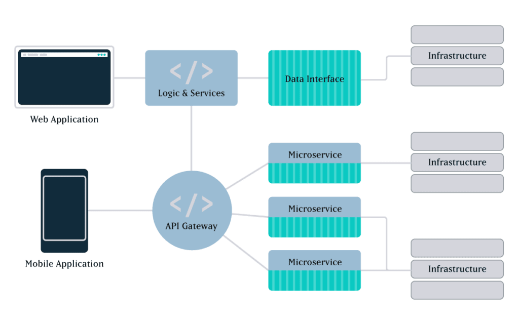
Microservices are small, separately deployable, software units that together form a single, larger application. Specific functions are carried out by individual services. For example, if your platform allows users to log in to an account, search for products, and pay online, those functions could be delivered as separate microservices and served up through one user interface (UI).
In monolithic architecture, all of the functions and UI are interconnected in a single, self-contained application. All code is traditionally written in one language and housed in a single codebase, and all functions rely on shared data libraries.

Essentially, with most off-the-shelf monoliths, you get what you get. It may do everything, but not be particularly great at anything. With microservices, by contrast, you can build or cherry-pick optimal applications from the best a given industry has to offer.
Because of their modular nature, microservices make it easier to deploy new functions, scale individual services, and isolate and fix problems. On the other hand, with less complexity and fewer moving parts, monoliths can be cheaper and easier to develop and manage.
So which one is better? As with most things technological, it depends on many factors. Let’s take a look at the benefits and drawbacks of microservices.
Advantages of Microservices Architecture
Companies that embrace microservices see it as a cleaner, faster, and more efficient approach to meeting business needs, such as managing a growing user base, expanding feature sets, and deploying solutions quickly. In fact, there are a number of ways in which microservices beat out monoliths for speed, scale, and agility.
Shorter time to market
Large monolithic applications can take a long time to develop and deploy, anywhere from months to years. That could leave you lagging behind your competitors’ product releases or struggling to respond quickly to user feedback.
By leveraging third-party microservices rather than building your own applications from scratch, you can drastically reduce time to market. And, because the services are compartmentalized, they can be built and deployed independently by smaller, dedicated teams working simultaneously. You also have greater flexibility in finding the right tools for the job: you can choose the best of breed for each service, regardless of technology stack.
Lastly, microservices facilitate the minimum viable product approach. Instead of deploying everything on your wishlist at once, you can roll out core services first and then release subsequent services later.
Faster feature releases
Any changes or updates to monoliths require redeploying the entire application. The bigger a monolith gets, the more time and effort is required for things like updates and new releases.
By contrast, because microservices are independently managed, dedicated teams can iterate at their own pace without disrupting others or taking down the entire system. This means you can deploy new features rapidly and continuously, with little to no risk of impacting other areas of the platform.
This added agility also lets you prioritize and manage feature requests from a business perspective, not a technology perspective. Technology shouldn’t prevent you from making changes that increase user engagement or drive revenue—it should enable those changes.
Affordable scalability
If you need to scale just one service in a monolithic architecture, you’ll have to scale and redeploy the entire application. This can get expensive, and you may not be able to scale in time to satisfy rising demand.
Microservices architecture offers not only greater speed and flexibility, but also potential savings in hosting costs, because you can independently scale any individual service that’s under load. You can also configure a single service to add capability automatically until load need is met, and then scale back to normal capacity.
More support for growth
With microservices architecture, you’re not limited to a UI that’s tethered to your back end. For growing organizations that are continually thinking ahead, this is one of the greatest benefits of microservices architecture.
In the past, websites and mobile apps had completely separate codebases, and launching a mobile app meant developing a whole new application. Today, you just need to develop a mobile UI and connect it to the same service as your website UI. Make updates to the service, and it works across everything.
You have complete control over the UI — what it looks like, how it functions for the customer, etc… You can also test and deploy upgrades without disrupting other services. And, as new forms of data access and usage emerge, you have readily available services that you can use for whatever application suits your needs. Digital signage, voice commands for Alexa… and whatever comes next.
Optimal programming options
Since monolithic applications are tightly coupled and developed with a single stack, all components typically share one programming language and framework. This means any future changes or additions are limited to the choices you make early on, which could cause delays or quality issues in future releases.
Because microservices are loosely coupled and independently deployed, it’s easier to manage diverse datasets and processing requirements. Developers can choose whatever language and storage solution is best suited for each service, without having to coordinate major development efforts with other teams.
Greater resilience
For complex platforms, fault tolerance and isolation are crucial advantages of microservices architecture. There’s less risk of system failure, and it’s easier and faster to fix problems.
In monolithic applications, even just one bug affecting one tiny part of a single feature can cause problems in an unrelated area—or crash the entire application. Any time you make a change to a monolithic application, it introduces risk. With microservices, if one service fails, it’s unlikely to bring others down with it. You’ll have reduced functionality in a specific capacity, not the whole system.
Microservices also make it easier to locate and isolate issues, because you can limit the search to a single software module. Whereas in monoliths, given the possible chain of faults, it’s hard to isolate the root cause of problems or predict the outcome of any changes to the codebase.
Monoliths thus make it difficult and time-consuming to recover from failures, especially since, once an issue has been isolated and resolved, you still have to rebuild and redeploy the entire application. Since microservices allow developers to fix problems or roll back buggy updates in just one service, you’ll see a shorter time to resolution.
Faster onboarding
With smaller, independent code bases, microservices make it faster and easier to onboard new team members. Unlike with monoliths, new developers don’t have to understand how every service works or all the interdependencies at play in the system.
This means you won’t have to scour the internet looking for candidates who can code in the only language you’re using, or spend time training them in all the details of your codebase. Chances are, you’ll find new hires more easily and put them to work faster.
Easier updates
As consumer expectations for digital experiences evolve over time, applications need to be updated or upgraded to meet them. Large monolithic applications are generally difficult, and expensive, to upgrade from one version to the next.
Because third-party app owners build and pay for their own updates, with microservices there’s no need to maintain or enhance every tool in your system. For instance, you get to let Stripe perfect its payment processing service while you leverage the new features. You don’t have to pay for future improvements, and you don’t need anyone on staff to be an expert in payment processing and security.
Disadvantages of Microservices Architecture
Do microservices win in every circumstance? Absolutely not. Monoliths can be a more cost-effective, less complicated, and less risky solution for many applications. Below are a few potential downsides of microservices.
Extra complexity
With more moving parts than monolithic applications, microservices may require additional effort, planning, and automation to ensure smooth deployment. Individual services must cooperate to create a working application, but the inherent separation between teams could make it difficult to create a cohesive end product.
Development teams may have to handle multiple programming languages and frameworks. And, with each service having its own database and data storage system, data consistency could be a challenge.
Also, when you choose to leverage numerous 3rd party services, this creates more network connections as well as more opportunities for latency and connectivity issues in your architecture.
Difficulty in monitoring
Given the complexity of microservices architecture and the interdependencies that may exist among applications, it’s more challenging to test and monitor the entire system. Each microservice requires individualized testing and monitoring.
You could build automated testing scripts to ensure individual applications are always up and running, but this adds time and complexity to system maintenance.
Added external risks
There are always risks when using third-party applications, in terms of both performance and security. The more microservices you employ, the more possible points of failure exist that you don’t directly control.
In addition, with multiple independent containers, you’re exposing more of your system to potential attackers. Those distributed services need to talk to one another, and a high number of inter-service network communications can create opportunities for outside entities to access your system.
On an upside, the containerized nature of microservices architecture prevents security threats in one service from compromising other system components. As we noted in the advantages section above, it’s also easier to track down the root cause of a security issue.
Potential culture changes
Microservices architecture usually works best in organizations that employ a DevOps-first approach, where independent clusters of development and operations teams work together across the lifecycle of an individual service. This structure can make teams more productive and agile in bringing solutions to market. But, at an organizational level, it requires a broader skill set for developing, deploying, and monitoring each individual application.
A DevOps-first culture also means decentralizing decision-making power, shifting it from project teams to a shared responsibility among teams and DevOps engineers. The goal is to ensure that a given microservice meets a solution’s technical requirements and can be supported in the architecture in terms of security, stability, auditing, etc…
3 Paths Toward Microservices Transformation
In general, there are three different approaches to developing a microservices architecture:
1. Deconstruct a monolith
This kind of approach is most common for large enterprise applications, and it can be a massive undertaking. Take Airbnb, for instance: several years ago, the company migrated from a monolith architecture to a service-oriented architecture incorporating microservices. Features such as search, reservations, messaging, and checkout were broken down into one or more individual services, enabling each service to be built, deployed, and scaled independently.
In most cases, it’s not just the monolith that becomes decentralized. Organizations will often break up their development group, creating smaller, independent teams that are responsible for developing, testing, and deploying individual applications.
2. Leverage PBCs
Packaged Business Capabilities, or PBCs, are essentially autonomous collections of microservices that deliver a specific business capability. This approach is often used to create best-of-breed solutions, where many services are third-party tools that talk to each other via APIs.
PBCs can stand alone or serve as the building blocks of larger app suites. Keep in mind, adding multiple microservices or packaged services can drive up costs as the complexity of integration increases.
3. Combine both types
Small monoliths can be a cost-effective solution for simple applications with limited feature sets. If that applies to your business, you may want to build a custom app with a monolithic architecture.
However, there are likely some services, such as payment processing, that you don’t want to have to build yourself. In that case, it often makes sense to build a monolith and incorporate a microservice for any features that would be too costly or complex to tackle in-house.
A Few Words of Caution
Even though they’re called “microservices”, be careful not to get too small. If you break services down into many tiny applications, you may end up creating an overly complex application with excessive overhead. Lots of micro-micro services can easily become too much to maintain over time, with too many teams and people managing different pieces of an application.
Given the added complexity and potential costs of microservices, for smaller platforms with only one UI it may be best to start with a monolithic application and slowly add microservices as you need them. Start at a high level and zoom in over time, looking for specific functions you can optimize to make you stand out.
Lastly, choose your third party services with care. It’s not just about the features; you also need to consider what the costs might look like if you need to scale a particular service.
Final Thoughts: Micro or Mono?
Still trying to decide which architecture is right for your platform? Here are some of the most common scenarios we encounter with clients:
- If time to market is the most important consideration, then leveraging 3rd party microservices is usually the fastest way to build out a platform or deliver new features.
- If some aspect of what you’re doing is custom, then consider starting with a monolith and either building custom services or using 3rd parties for areas that will help suit a particular need.
- If you don’t have a ton of money, and you need to get something up quick and dirty, then consider starting with a monolith and splitting it up later.
Here at Oomph, we understand that enterprise-level software is an enormous investment and a fundamental part of your business. Your choice of architecture can impact everything from overhead to operations. That’s why we take the time to understand your business goals, today and down the road, to help you choose the best fit for your needs.
We’d love to hear more about your vision for a digital platform. Contact us today to talk about how we can help.