
High-quality content management systems (CMS) and digital experience platforms (DXP) are the backbone of modern websites, helping you deliver powerful, personalized user experiences. The catch? You have to pick your platform first.
At Oomph, we have a lot of love for open-source platforms like Drupal and WordPress. Over the years, we’ve also built applications for our clients using headless CMS tools, like Contentful and CosmicJS. The marketplace for these solutions continues to grow exponentially, including major players like Adobe Experience Manager, Sitecore, and Optimizely.
With so many options, developers and non-developers with a project on the horizon typically start by asking themselves, “Which CMS or DXP is the best fit for my website or application?” While that is no doubt an excellent question to consider, I think it’s equally important to ask, “Who is going to implement the solution?”
CMS/DXP Solutions Are More Alike Than You Might Think
I recently attended the annual Healthcare Internet Conference and spoke with quite a few healthcare marketers about their CMS tools. I noticed a common thread: Many people think their CMS (some of which I mentioned above) is hard to use and doesn’t serve them well.
That may very well be the case. Not all CMS tools are created equal; some are better suited for specific applications. However, most modern CMS and DXP tools have many of the same features in common, they just come at different price points. So here’s the multi-million dollar question: If most of these products provide access to the same or similar tools, why are so many customers displeased with them?
Common Challenges of CMS/DXP Implementation
Often, we find that CMS users get frustrated because the tool they chose wasn’t configured to meet their specific needs. That doesn’t necessarily mean that it was set up incorrectly. That’s the beauty of many of today’s CMS and DXP products: They don’t take a one-size-fits-all approach. Instead, they allow for flexibility and customization to ensure that each customer gets the most out of the product.
While enticing, that flexibility also burdens the user with ensuring that their system is implemented effectively for their specific use case. In our experience, implementation is the make-or-break of a website development project. These are just a handful of things that can derail the process:
- The implementation partner didn’t fully understand how their client works and configure features accordingly.
- The demands of user experience overshadowed the needs of content editors and admins.
- Hefty licensing fees ate away at the budget, leaving behind funds that don’t quite cover a thorough implementation.
- The project was rushed to meet a tight deadline.
- The CMS introduces new features over time that add complexity to the admin or editing experience.
- Old features get sunsetted as new capabilities take their place.
Most of the work we do at Oomph is to help our clients implement new websites and applications using content management systems like Drupal. We have decades of combined experience helping our clients create the ideal user experience for their target audience while also crafting a thoughtful content editing and admin experience that is easy to use.
But what does that look like in practice?
4 Steps for a Successful CMS Implementation
Implementation can be the black box of setting up your CMS: You don’t know what you don’t know. So, we like to get our clients into a demo environment as soon as possible to help them better understand what they need from their CMS. Here’s how we use it to navigate successful CMS implementation:
- Assess the Capabilities of the CMS
The first step can be the most simple at face value. Consider what the CMS needs to do for you, then find a CMS that includes all of those features. Content modeling (more on that below) is a key part of that process, but so is auditing your team’s abilities.
Some teams may be developer-savvy and can handle less templated content-authoring features. Others may need a much more drag-and-drop experience. Either use case is normal and acceptable, but what matters is that you identify your needs and find both a CMS and an implementation process that meets them. That leads us to the next point.
- Test-Drive the CMS Early and Often
You wouldn’t buy a car without test-driving it first. Yet we find that people are often more than willing to license a CMS without looking under the hood.
Stepping into the CMS for a test drive is a huge part of getting the content editing experience right. We’ve been designing and engineering websites and platforms using CMS tools for well over a decade, and we’ve learned a thing or two along the way about good content management and editing experiences.
Even with out-of-the-box, vanilla Drupal, the sky’s the limit for how you can configure it. But that also means that nothing is configured, and it can be difficult to get a sense of how best to configure and use it. Rather than diving into the deep end, we work with our clients to test the waters. We immediately set up a project sandbox that offers pre-configured content types, allowing you to enter content and play with a suite of components within the sleek drag-and-drop interface.
- Align User Experience with Content Authoring
Beyond pre-configured content and components, our sandbox sites include a stylish, default theme. The idea is to give you a taste both of what your live site could look like and what your content authoring experience might be. Since so many teams struggle to balance those two priorities, this can be a helpful way to figure out how your CMS can give you both.
- Finalize Your Features & Capabilities
While a demo gives you a good idea of the features you’ll need, it might include features you don’t. But discovering where our pre-built options aren’t a good fit is a good thing — it helps us understand exactly what YOUR TEAM does and does not need.
Our goal is to give you something tangible to react to, whether that’s love at first type or a chance to uncover capabilities that would serve you better. We’ve found this interactive yet structured process is the CMS silver bullet that leads to a better outcome.
Content Modeling
Another key part of our project workflow is what we call content modeling. During this phase, we work with you to identify the many content types you’ll have on your website or application. Then, we can visualize them in a mapping system to determine things like:
- What relationships exist between these different content types?
- Who should have access to a content type, and what governance should be in place to ensure all content is accurate, on brand, and approved for publishing?
- What features do you need to support content at every level? For example, at the field level, do you need a drop-down with predefined values that only certain people can edit, or do you need an open-text field a content editor can customize?
With a solid content model in place, we can have a higher level of confidence that our CMS implementation will create the right content editing experience for your team. From there, we actually implement the content model in the CMS as soon as possible so that you can test it out and we can make refinements before getting too far along in the process.
Content Moderation & Governance
Many clients tell us they either have too much or too little control over their content. In some cases, their content management system is so templated or rigid that marketing teams can’t quickly spin up landing pages and instead have to rely on development teams to assist. Other teams have too much freedom, allowing employees to easily deploy content that hasn’t been approved by the appropriate team members or strays from company brand standards.
Here at Oomph, our mantra is balance. A good content editing process needs both flexibility and governance, so teams can create content when they need to, but avoid publishing content that doesn’t meet company standards. Through discovery, we work with clients to determine which content types need flexibility and which ones don’t.
If a content type needs to be flexible, we create a framework that allows for agility while still ensuring that users can only select approved colors, font types, and font sizes. We also identify which content needs to be held in moderation and approved before it can be published on the website.
Taking the time to discuss governance in advance creates a CMS experience that strikes the right balance between marketing freedom and brand adherence.
Implementation Turns a Good CMS Into a Great One
Modern CMS/DXP solutions have mind-blowing features, and they will only continue to get more complex over time. But the reality is that while picking a CMS that has the features you need is important, how it’s configured and implemented might matter even more. After all, how helpful is it to have a CMS with embedded artificial intelligence if making simple copy updates to your home page is a nightmare?
Implementation is the “it” factor that makes the difference between a CMS you love and one you’d rather do your job without.
Interested in solving your CMS headaches with better implementation? Let’s talk.
It’s no secret: Higher education institutions are complex.
Between multiple campuses, multiple audiences, and a high volume of content, higher ed marketing and communications teams have a ton to juggle.
And that’s before you throw a new website into the mix.
Not long ago, the team at Oomph partnered with the University of Colorado (CU) and Keene State College (KSC) to redesign sites for each institution. While their asks – and end products – were unique, the processes had a lot in common. So much so that we’re peeling back the curtain on our discovery process to give other higher ed institutions the tools to deliver websites that meet business goals and audience needs.
In this article, we’re turning our lessons learned into a discovery playbook that can help higher education institutions set the stage for a successful site redesign.
The Projects
University of Colorado Giving Platform
The University of Colorado has an active and engaged alumni network that loves supporting all things CU. The university came to Oomph because it needed a donor funds platform that could keep up. The goals of the discovery process were to:
- Document existing conditions, strengths and weaknesses, and stakeholder perceptions.
- Compare the strengths and weaknesses of the current site to similar ones from other colleges and universities.
- Refocus and align on core audiences that visit the site.
- Recommend ways to improve and enhance existing content and storytelling.
- Evaluate and make recommendations for a modern technology stack
While CU had a gut feeling about what it would take to meet internal expectations and keep prospective donors happy, gut feelings aren’t enough to build a website. CU knew that a professional perspective and data-backed analysis would lay a firm foundation for the site redesign.
Keene State College Main Website
KSC, a public liberal arts college in New Hampshire, wanted a refreshed main website that would resonate with prospective students, current students, and alumni alike. For KSC, key goals during discovery were to:
- Better understand the needs and more deeply define their primary audience: prospective students.
- Identify navigation patterns that would make it easier for students and their parents to find the content they need.
- Define design styles that create a more welcoming website experience and support storytelling during the future redesign.
The team came to Oomph with ideas but wanted research validation and guidance to nurture those ideas into a strategic design plan.
The Approach
For both projects, Oomph utilized our in-depth discovery process to validate assumptions, clarify priorities, and gain buy-in across the organizations.
KSC and CU both had a good sense of the work they needed to be done. But having a feel for the floorplan doesn’t mean you’re ready to build your dream house. Whether it’s a home or a website, both projects need an architect: an experienced professional who can consider all the requirements and create a strategic framework that’s able to support them. That work should happen before deciding what paint to put on the walls.
In our initial review, Oomph found that both sites had similar challenges: They struggled to focus on one key audience and to easily guide users through the site to the desired content. Our question was: How do we solve those struggles in a new website?
To answer it, we led KSC and CU through discovery processes that included:
- An intake questionnaire and live sessions with key stakeholders to understand the goals and challenges holding the current sites back.
- Defining strengths and areas for improvement with methods like a UX audit, a content and analytics audit, and a cohort analysis.
- Creating user journey maps that rolled audience, website, and competitive insights into a unified vision for the new user experience.
- Delivering a final set of data-backed recommendations that translated needs and wants into actionable next steps, equipping both teams to secure organizational approval and move the projects forward.
The Insights
Discovery isn’t a one-size-fits-all. However, our experiences with KSC and CU highlighted some common challenges that many higher-ed institutions face. Our insights from these projects offer a starting point for other institutions kicking off their own website redesigns.
- Start with your audience’s needs.
Who is your primary audience? Figure out who they are, then really drill down on their needs, preferences, and desired actions. This can be uniquely challenging for higher education institutions because they serve such a wide range of people.
Data is how you overcome that hurdle. As part of discovery, we:
- Completed a UX audit with tools like the BASIC heuristics framework to see which parts of the user flow are working and which need an overhaul.
- Rounded out those findings with a content audit to understand how users engaged with the site content.
- Completed a cohort analysis to see how the sites stacked up against their higher-ed peers.
When you do that work, you get a birds-eye view into what your audience really needs – and what it’ll take for your website to be up to the challenge.
Take KSC. The existing site attempted to serve multiple audiences, creating a user journey that looked like this:
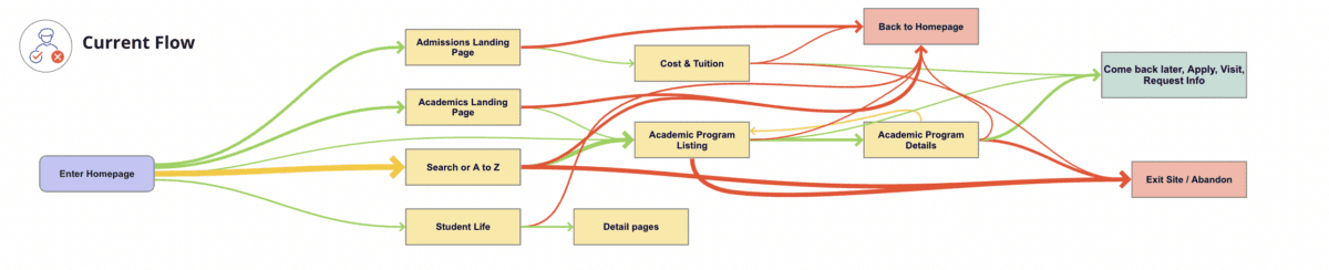
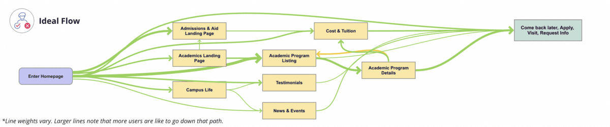
We identified a primary audience of prospective students, specifically local high school students and their parents/guardians. When you speak directly to those students, you get a simpler, cleaner user journey that looks like this:
- Define organized and clear navigation to support user journeys.
Your navigation is like a map. When all the right roads are in place, it should help your users get where they want to go.
That makes your navigation the starting point for your redesign. Your goal is to define where content will live, the actions users can take upon arrival, and, equally important, the content they won’t see at first. This then informs what goes where – the header nav, the footer nav, or the utility nav – because each has unique and complementary purposes.
With both KSC and CU, discovery was our opportunity to start building a navigation that would serve the primary audience we had already uncovered. For CU, the current navigation:
- Made it difficult for donors to find what they need. Search, Write-In Fund, and “Page Not Found” were among the top 20 most visited pages, indicating that users weren’t easily finding their way.
- Didn’t engage donors, which showed up in the low number of returning visits.
- Needed to help donors more quickly find what they need without having to search the entire site.
Current CU navigation:

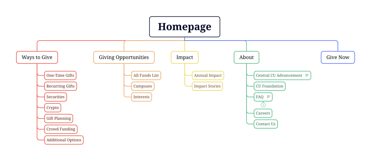
During discovery, we created an updated navigation that would appeal to its primary audience of prospective donors, while still meeting the needs of secondary audiences (returning donors and giving professionals).
Proposed CU navigation:
- Find an optimal blend of branding, design, and content – especially for the home page and other high-visibility areas.
The design and content you choose for your site should resonate with your target audience and enhance the navigation you already defined. In that way, your home page is like your storefront. What will you put on the sign or display in the windows so people will actually walk inside?
That’s the secret sauce behind this part of discovery: deciding what your primary audience really needs to know and how best to showcase it.
To help KSC speak to prospective students, we recommended:
- Using movement, color, and text styles to add visual impact to important content and create a welcoming, curated experience.
- Prioritizing diversity in visuals, so wide a range of students could picture themselves as part of the student body.
- Using stats and testimonials to build trust and foster a feeling of belonging.
CU wanted to connect with prospective donors, so we suggested a design that:
- Incorporated more storytelling and impact stories to show the positive ripple effect of every dollar donated.
- Included strategic calls to action to pull users deeper into the site.
- Added social sharing to enable donors to highlight their generosity and feel a deeper sense of connection.
- Probe additional areas where needed (and skip where it’s not).
Our hot take: There is such a thing as too much data. If you’re wading through pools of information that isn’t relevant to your end user, it can muddy the waters and make it harder to identify what’s worth acting on.
With that in mind, this step will change from project to project. Ask yourself, what else does my audience need to feel like they got what they came for?
For KSC, that involved additional strategy work – like the information architecture – that helped the institution gear up for later design phases. CU, on the other hand, needed significant technical discovery to address the level of custom code required, limited page building capabilities and clunky e-commerce integration. We recommended an updated tech stack, including a new donation platform and payment gateway, that would improve security, simplify maintenance, and enhance the user experience.
- Plan for a system that allows for easy updates later.
As they say, the only constant is change. This rings especially true for higher ed institution websites, where content is plentiful and multiple stakeholders need to make site updates.
To make sure CU and KSC’s sites continued to work for them long after our projects had ended, our discovery included suggestions around:
- Choosing the right content management system (CMS). We ensured each site had CMS capabilities that would allow non-tech-savvy team members to maintain and update the content.
- Establish design systems and templates for ease and consistency. For CU, that involved creating repeatable page layouts for their fund pages for simpler authoring and visual polish.
Start Your Redesign on the Right Foot
A thorough, well-researched, and well-organized discovery is key for designing a website that meets all of your – and your audience’s – needs.
Need a fresh perspective on your higher ed site redesign? Let’s talk about it.
Have you ever waved to someone and they didn’t wave back? Awkward, right? But are you sure they could see you and recognize you? Was the sun in their eyes? Were you too far away? Were you wearing a face mask?
There is a similar situation with your branding on your website. On a smaller mobile device, is your logo legible, or are the words shrunk down and too small? Are the colors high-contrast enough to be seen on a sunny day? Is there consistency between your social media avatar and your website, between your print materials and your digital advertising? Can customers recognize your brand wherever it might be displayed?
For your brand to be the most successful, it takes a little extra effort to think through all of these possible scenarios. But it’s worth it, or your customers will give you the cold shoulder, whether they intended to or not.
This extra bit of strategy and planning around your brand is called “Responsive Branding.” Just like responsive design, where your website’s content adapts to the device a customer is using, responsive branding adapts to the device, the medium, and the platform while also considering situations like low light, high light, animated, or static.
Oomph works with organizations across industries to build or refresh responsive brands that serve and delight their users across the full spectrum of digital experiences. Here’s what we’ve learned about responsive branding and our tips for creating one that works.
What Is Responsive Branding?
Let’s first start with what you’ve probably already heard — responsive web design. Coined by Ethan Marcotte in 2010, the “responsive” part came to mean that a web design responded to the size of the screen, from a phone to a tablet to a widescreen desktop monitor.
Then came responsive logos. These take the elements of the main logo and adapt them for different sizes and use cases. A logo might have too much detail to be legible as a small social media icon, for example.
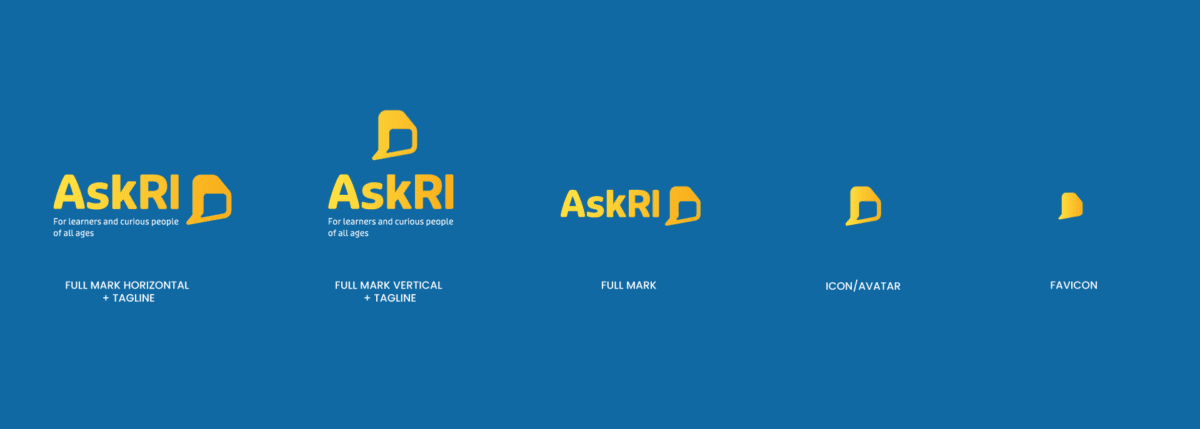
Responsive Branding blends these ideas and looks at the design system holistically. A successful responsive brand may include:
- A logo version for different sizes and applications. Variations might include one with the tagline, one without, one with a mark and typeface, one just the name, one just the mark, the possibilities go on!
- Secondary logo options which may include abbreviations, monograms, or different combinations of the main elements
- When applicable, an internationalized version of the wordmark and tagline
- A color palette that can provide variation while addressing accessibility and situations of low light or high glare
- A fluid typography system that provides contrast between sizes within different size media (including print!)
- A fluid spacing system
- Motion when appropriate, like video intros and outros
Why Responsive Branding Matters
Your business makes a huge investment in building a brand that stands apart from the competition while communicating your personality and value. You are building trust with customers through every interaction. When your brand works well in one situation but not another, it erodes trust.
A strong brand will be clear, understandable, and memorable for all users in all situations. Whether you have physical locations or digital ones, the brand works with the same consistent strength and message every time.
When you invest in a responsive brand, you:
- Make your brand more visible. More users can connect with you when you have a brand that’s both recognizable and responsive. Given that 60% of consumers are more likely to buy from a brand they recognize, the opportunity cost of not getting this right is huge.
- Improve accessibility. Digital accessibility means people of all abilities can use your website and experience your brand. Up to 1 in 4 American adults live with a disability, so a lack of accessibility means fewer customers to reach. For visual brand elements, that means considerations for color blindness, low vision, and cognitive impairments like dyslexia.
- Create a more consistent brand. Responsive branding equips your team with the tools to express your brand effectively across mediums. That means less time involved in building new assets and a more consistent experience that meets your users’ high expectations.
3 Elements of a Responsive Brand
A responsive brand is more than a shape-shifting logo. The most responsive brands make strategic use of these three elements:
1. Logo
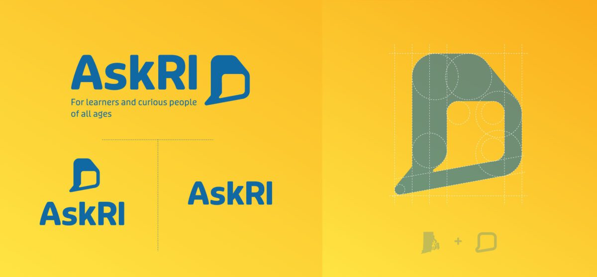
Your logo is the first piece of your brand that customers will recognize. Using a single-state logo can compromise that impression — a logo that looks great at a large scale is often unintelligible as a small icon.
Responsive logo designs help ensure your logomark is clear and impactful no matter where you apply it. Beyond the size considerations we mentioned, it should include different formats like horizontal, vertical, and square to support many different digital, social, and print platforms.
Some other techniques we use to create scalable logos include:
- Dropping words or lettering
- Dropping the icon or image
- Creating an abbreviation version
- Stacking the icon/image and text/lettering
- Combining separate elements into a single icon
- Simplifying details and shapes within logo marks
- Varying thickness and white space to make small logos more legible
Oomph Tip: It’s okay to take several design rounds to get it right. Iterating helps uncover where you’ll use the logo, what it must convey, and which colors and iconography can best support that purpose. We went through several design iterations with our client AskRI before settling on a bold, simple font and clear chat bubble icon that plays off the state of Rhode Island’s distinctive shape.
Color Palette
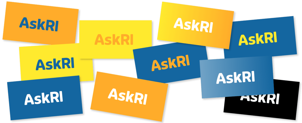
A responsive color palette is less about picking complementary shades on a color wheel and more about creating an experience that works in all situations. People with visual impairments and people on low-lit smartphones, for example, rely on high-contrast color combinations to engage with your brand.
Start by following the Web Content Accessibility Guidelines (WCAG), which include specific recommendations for color contrast ratios. Colors that meet that standard include light text with dark backgrounds, or vice versa.
Depending on where your brand appears, you may need to adjust your color palette for different settings. For example, your full-color logo might look stunning against a solid white background but becomes illegible against bright or dark colors. A single color logo is useful for some digital use cases like Windows web icons and iOS Pinned Tabs. In non-digital spaces, single color logos are great when color printing isn’t an option, such as with engraving or embroidery. Build out alternate color variations where necessary to make sure your palette works with you – not against you – across your materials.
Oomph Tip: If your brand palette is already set in stone, try playing with the brightness or saturation of the values to meet recommendations. Often your brand colors have a little wiggle room when combinations are already close to passing conformance ratios.
Typography and Layouts
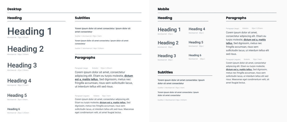
Responsiveness is also important to consider when structuring web pages or marketing collateral. The most legible layouts will incorporate adaptable typography with clear contrast and simple scaling.
When selecting a font, be sure to think about:
- Minimum legible sizes. When is small too small? It depends, of course, but don’t forget older customers, those with low vision, or those in situations that make reading more difficult. Use at least a 16px size for digital products and 12pt size for print. These might change depending on the font, but these sizes are a great place to start.
- Inclusive typefaces. Many designers overlook how understandable certain letterforms appear to be. A way to quickly review is to look at the number 1, lowercase l (L), and uppercase I (i) of any typeface. Then also look at the capital O, the zero, and the lowercase o — 1lI O0o. Can you tell the difference when these characters are out of context? If you can’t, then your customers might have trouble as well. Use your judgment, but also use this trick to expose possible problems with your communication. These five keys to accessible web typography are a great place to start.
- Scaling ratios. Similar to a musical scale of harmonious notes, a typographic scale is a collection of font sizes that work well together. Using a typographic scale helps to make your text visually appealing and readable for different users across different devices. Some examples include exponential scales, where you multiply the previous font size by a ratio to get the next font size, and Fibonacci sequences, where you add a number from the Fibonacci set to the base font value to get a new size in the scale.
Oomph Tip: Don’t go it alone. Tools like Typescale and Material UI’s The Type System can simplify typography selection by recommending font sets that meet usability and scalability requirements. And the U.S. Design System has some suggestions as to which typefaces are the most accessible.
How To Get Started With Responsive Branding
To create a responsive brand that resonates, you first have to identify what elements you need and why you need them. That second part is your secret sauce: finding a balance between a design your users can recognize and one that inspires them.
A design audit can zero in on the needs of your brand and your audience, so you can create a responsive design system that meets both. Not sure where to start? Let’s talk.
Change is the only constant in life, and the same goes for accessibility. Our understanding of how to create truly accessible websites is always evolving, and so are the standards for measuring if we’ve succeeded.
The most recent update to the Website Content Accessibility Guidelines (WCAG) — released on October 5, 2023 — is the latest attempt to help brands make their digital experiences more accessible for all users.
Don’t panic, WCAG 2.2 isn’t an overhaul. But it does shift the previous standards, delivering more specific and, in some cases, more realistic guidelines that make compliance easier (good news, website managers!). While WCAG 2.2 isn’t cause for alarm, it is something to get out in front of. Here’s what to know about WCAG, the ins and outs of the latest updates, and what it all means for your website.
What Is WCAG, Anyway?
The Web Content Accessibility Guidelines set the standard for accessible website design. WCAG first issued design guidance in 1999, but the 2008 WCAG 2.0 laid the groundwork for accessibility today. Those standards created a framework for designing websites that are perceivable, operable, understandable, and robust for people of varying abilities.
2018’s WCAG 2.1 wasn’t a radical departure from its predecessor, but it did add criteria related to mobile devices and users with vision and cognitive impairments. By 2023, accessibility had become widely understood and embraced as essential for inclusive design. That shift helped usher in WCAG 2.2, an update based on multiple years of research and review.
WCAG 2.2 adds nine new success criteria split across three different levels, A, AA, and AAA:
- Level A: This is the WCAG minimum, and it now includes two additional success criteria.
- Level AA: Websites that achieve AA status go beyond the basics. We advise our clients to achieve Level AA as much as possible, depending on their audience.
- Level AAA: Websites that implement all WCAG guidelines to the highest degree can achieve AAA status. We recommend our clients do so when it suits their website and their users’ needs. For example, a healthcare organization serving older patients may need the highest level of color contrast on its site, while a university serving young students may not.
The WCAG 2.2 update didn’t just add criteria; it made some criteria obsolete, others weaker, and still others more essential than ever. Specifically, WCAG 2.2 promoted 2.4.7 Focus Visible from Level AA to Level A, which means all websites will need visual indicators that show which page feature is in focus. It also changed the recommended size of touch targets, making it easier for designers everywhere to comply.
What WCAG Standard Am I Required to Meet?
The standard you’re required to meet depends on your industry:
- State and Local Governments: Organizations in the public sector have the most explicit accessibility requirements. The Department of Justice (DOJ) recently announced a proposed rule that requires state and local governments to meet WCAG 2.1 Level AA standards for their websites and mobile apps.
- Private Sector: Accessibility in the private sector is less regulated, but complying with WCAG guidelines is in your best interest. One reason is that noncompliance could open your company up to a lawsuit. A recent report estimated that 4,220 ADA website lawsuits would be filed by the end of 2023 — almost double the number filed in 2018.
Though there is no official standard in courts, the DOJ has referenced WCAG 2.1 Level AA in past filings. We expect the courts to slowly start referencing 2.2 as cases catch up, but it might take another year for version 2.2 to become the standard.
While wanting to stay out of court is understandable, legal requirements are only one reason to adopt WCAG. Millions of users around the world use screen readers and other assistive devices. Those users have buying power and they want to engage with your organization, whether that’s registering to vote, signing up for a class, or making an appointment with their healthcare provider. When your website is accessible, you’re able to connect with the broadest audience possible — likely earning more loyal users in the process.
WCAG 2.2 Checklist
While achieving inclusive website design is an exciting prospect, the nuts and bolts of getting there can feel anything but. Here, we help you visualize what the new guidelines mean in practice. You might be surprised by how accessible your website already is.
Guideline 2.4: Navigable
The standards under guideline 2.4 address anything that will make it easier for users to move through your website.
2.4.11 Focus Not Obscured (Minimum) (AA)
- What It Means: The indicator that signals which page element is in focus is unobscured. “Sticky” elements on the page that don’t move as the user scrolls are the most common culprits that obscure key features.
- How To Succeed: People who can’t use a mouse need to see where the keyboard has focus. You’ll have succeeded if the item that has keyboard focus is at least partially visible as a user moves from one interactive element to another.
2.4.12 Focus Not Obscured (Enhanced) (AAA)
- What It Means: This also addresses the visibility of the keyboard focus, but it offers a path for organizations that want to go the extra mile.
- How To Succeed: You can satisfy 2.4.11 with partial visibility, but 2.4.12 requires complete visibility of the keyboard focus.
2.4.13 Focus Appearance (AAA)
- What It Means: This is an additional measurement criterion for how a website visually indicates what the keyboard focuses on. WCAG recommends a 3:1 contrast ratio for the colors for the focus state vs. the non-focus state and an outline or border around the entire element that is at least 2 CSS pixels thick. Background colors are acceptable as long as they still satisfy the contrast ratio.
- How To Succeed: WCAG 2.1 was ambiguous about what it meant for a focus indicator to be visible. This update clarifies what’s required with clear benchmarks for contrast and thickness/visibility.
Guideline 2.5: Input Modalities
An “input” is an action a user takes to elicit a response from your website — think clicking a button or dragging and dropping a feature. These standards govern the design of those inputs.
2.5.7 Dragging Movements (AA)
- What It Means: When an interface provides drag-and-drop functionality, there should be a simple pointer alternative that does not require drag-and-drop. This is more relevant for apps and web tools that will need to provide an alternative interface.
- How To Succeed: This standard serves users who can’t use a mouse or touch screen to drag items. You meet the standard by allowing a user to choose not to use the supplied drag-and-drop functionality unless dragging is considered “essential.”
2.5.8 Target Size (Minimum) (AA)
- What It Means: A minimum size and minimum space for an interactive element allows a user to choose one action without accidentally triggering a nearby action.
- How To Succeed: Some people with physical impairments may not be able to click buttons that are close together. For example, they might hit the “Cancel” button instead of “Submit,” forcing them to start the process over again. You can succeed with this guideline by ensuring the size of the target for pointer inputs is at least 24 by 24 CSS pixels, with some exceptions.
Guideline 3.2: Predictable
This guideline covers repeating features that may appear across your web pages, such as email sign-up forms or support widgets.
3.2.6 Consistent Help (A)
- What It Means: When a site or app has a help feature, it appears in the same location consistently.
- How To Succeed: People who need help can find it more easily if it’s in the same place. If a web page contains help mechanisms that repeat across pages, they should occur in the same order relative to other content on the page — unless the user initiates the change. Those help items can include human contact details, human contact mechanisms, self-help options, or a fully automated contact mechanism (i.e., a chat feature).
Guideline 3.3: Input Assistance
Many websites include elements that help users take certain actions. This could include directing a user to re-enter information or to make sure two fields match. Guideline 3.3 addresses this type of assistance, increasing WCAG’s support of those with cognitive disabilities. This puts the onus on developers to provide simple and secure methods for all users.
3.3.7 Redundant Entry (A)
- What It Means: Ask for information only once in the same session.
- How To Succeed: Some people with cognitive disabilities have difficulty remembering what they entered. If you’re asking the user to re-enter information they previously added, the field must either be auto-populated or the previous answer must be available for the user to select. The exception is if the user is re-entering information essential or required for security or the previous information is no longer valid.
3.3.8 Accessible Authentication (Minimum) (AA)
- What It Means: Don’t make people solve, recall, or transcribe something to log in.
- How To Succeed: Some people with cognitive disabilities can’t solve puzzles, memorize a username and password, or retype one-time passcodes. This guideline considers remembering a password or solving a puzzle (like a CAPTCHA) a cognitive function test. Websites that comply won’t require that step unless the step also provides an alternate authentication method, an assistive mechanism, a test with simple object recognition, or a test to identify non-text content the user provided to the website.
3.3.9 Accessible Authentication (Enhanced) (AAA)
- What It Means: This builds upon 3.3.8, offering developers a greater opportunity to include users with cognitive disabilities.
- How To Succeed: The success criteria for 3.3.9 are narrower than for 3.3.8. Websites meet the enhanced standard when a cognitive function test isn’t part of authentication unless the website also offers an alternative authentication method or a mechanism to assist the user with the test.
Walking the Walk of WCAG
A commitment to accessibility is two-fold. It requires understanding what the most recent guidelines are (the talk) and putting those guidelines into practice (the walk).
While it might seem like Level AAA accessibility is the way to go, the reality is that accessible websites are nuanced. Some level of accessibility is non-negotiable, but the ideal level for your site very much depends on your industry, your users, and how mature your website is — all factors we can better assess with an accessibility audit.
If you’re building a new website, embedding WCAG principles is smart. But if you’re WCAG 2.1 compliant and a refresh is a year or two off, WCAG 2.2 may be able to wait. Curious about where your website stands? Let’s talk about it.
The world of digital accessibility can be daunting. There are many regulations and ways in which a website can be accessible or inaccessible. Many of us don’t understand what a good or bad experience looks like, and we think we can’t possibly understand people who rely solely on assistive technology to use the web.
It doesn’t have to be daunting, though. And with anything, the key is to start small. To those who create websites or own/manage one, the first step to understanding accessibility is empathy. If more people used assistive technology, more people would understand the difference between a terrible experience and a great one. Don’t be scared of learning about accessibility tools, because you might already be more familiar with them than you realize.
Have you ever broken your dominant hand and been forced to use a keyboard instead of a mouse or trackpad? Have you tried to complete a payment form really quickly to snag concert tickets, and figured out that using the keyboard can be much faster?
Have you been in loud surroundings and tried to watch a video? How great are captions? Have you realized that captions are assistive technology? There are alternate modes of consuming content and using a digital product that are beneficial to a much wider audience than the audience it was created for.
With some instruction, we hope more people feel comfortable using a keyboard to navigate a website. We also hope that more of you are brave enough to try a screen reader as well, or at least watch our video to experience what that experience can be like.
Video Tutorial
Our video is 37 minutes and we provide a break-down of the different minute-marks below if you’d like to jump to a certain area. (All cookies must be accepted for the video to play. You may also view on YouTube directly.)
Table of Contents
- 00:00 — Using a Keyboard
- 02:00 — The tab key
- 02:20 — A “Skip to Content” link and why that is so useful
- 03:40 — “Focus ring” style
- 04:20 — An example of an inaccessible drop-down menu
- 05:40 — An example of an inaccessible link (no focus ring)
- 07:40 — Common article card patterns and how they work with a keyboard
- 10:45 — The Screen Reader Experience
- 11:10 — Invoking VoiceOver with Command F5
- 12:35 — Tabbing through interactive elements
- 12:54 — Skip to Content link
- 13:07 — Company logo
- 13:55 — Projects link
- 14:31 — Topics
- 15:55 — About Us link, inaccessible to keyboard users
- 16:16 — Reading of non-interactive elements with Control Option arrows
- 16:50 — Reading content, Headings, links
- 18:50 — Visually hidden heading but screen reader accessible
- 19:55 — Alt text image examples
- 20:06 — Kittens, no alt tag present
- 21:06 — Doggos, empty alt tag
- 23:00 — Squirrels, descriptive alt text
- 23:48 — Article content examples
- 23:53 — Article 1 example, too many links
- 25:37 — Article 2 example, too much content
- 26:32 — Article 3 example, hidden content
- 27:44 — Article 4 example, alternate pattern
- 30:02 — Voiceover’s Rotor Feature, control option U
- 30:15 — Headings menu
- 30:55 — Empty heading element
- 31:50 — Other Rotor menus
- 32:18 — Non-visited Links menu
- 33:01 — All Links menu
- 33:40 — “Click here” and “Read more” link text
- 35:09 — Landmarks menu
- 35:25 — Form Controls menu
- 36:06 VoiceOver off and wrap up
For those who want to learn a little more, below we collect a few keyboard command cheatsheets for navigating a webpage or using VoiceOver on a Mac. Links to additional resources for setting up and getting started with VoiceOver are also included.
More Resources
Keyboard User Cheatsheet
- Tab key — Navigate from link to link
- For sighted users who can still use a mouse: Getting started on a page might mean clicking into the top left corner to get the keyboard focus to be within the browser window and not on the desktop or in the browser (URL bar)
- In a Checkbox list in a form, the tab key will move from one element to another
- Return key (Enter) — “Presses” a link to open the destination or perform the one page action (for buttons)
- Spacebar
- When over an interactive element in a navigation, spacebar opens the element. Arrow keys may move up and down through the open list, or the tab key can be used. Spacebar again should toggle the element closed.
- In a Checkbox list in a form, the spacebar chooses the element currently in focus
- Escape key — Close most items that have been opened, like pop-up modal windows
- Arrows Up/Down — Generally, scrolls the page
- In a Radio Button group in a form, Tab will select the group of options while arrow keys will traverse the list
- With a Select list in a form, Tab makes the list active. Arrow keys traverses the list. Enter key selects the option in focus.
- Any letter key — With a Select list in a form, Tab makes the list active. When active and open, a letter key will jump to that letter in the list. Useful for long lists, like States or Countries.
VoiceOver Cheatsheet
These key commands reflect the default set-up for Mac OSX — I have not made any modifications. Of course, power users will modify these commands to fit their needs.
The default VoiceOver key command combination is ^Control ⌥Option. This combination is used to ensure key combinations do not conflict with other quick key commands through the OS and Apps.
Many key commands for navigating a webpage are the same as a Keyboard user. Return, Spacebar, and Arrow keys all work the same.
- ⌘Command F5 — Open and start Voiceover
- ^Control ⌥Option Arrow Right — Read next string of text
- ^Control ⌥Option Arrow Left — Read previous string of text
- ^Control ⌥Option Space — “Presses” a link or button
- For some elements, VoiceOver will announce that there are “Actions available.” Access the Actions menu with ^Control ⌥Option Space, and navigate the menu with the up and down arrow keys; press VO-Space to select a custom action.
- ^Control ⌥Option M — Access the Apple Menu (File, Edit, View, etc.). Escape Key returns to the web page content.
- ^Control ⌥Option H twice quickly — Commands Help menu
- While inside, arrow keys move up and down in lists. Left and Right arrows move from one list to another. Return key chooses an element from a list
- ^Control ⌥Option K — Keyboard Help. Similar to Command Help, but here, keys can be pressed without having any effect on the system (like a practice session). Escape key exits the Keyboard Help session
- ^Control ⌥Option U — Open the Rotor
- While inside, arrow keys move up and down in Rotor lists. Left and Right arrows move from one list to another. Return key chooses an element from a list, closes the Rotor, and moves focus to the selected element. Escape key exits the Rotor
- Traversing the page by Element Type:
- ^Control ⌥Option H — Find next heading
- ^Control ⌥Option L — Find next link (different from the Tab key as it will look for Links only, not buttons that perform on-page actions)
- ^Control ⌥Option J — Find next form control
- ^Control ⌥Option T — Find next table
- ^Control ⌥Option X — Find next list
- ^Control ⌥Option F — Find next frame
Additional Resources to Start Using VoiceOver
- Welcome to VoiceOver, Apple website
- Deep dive into using VoiceOver and customizing the system to work the way you prefer
Conclusion
With some practice, we hope you might find that using a keyboard to navigate can be your superpower. When filling out forms, for example, I use the keyboard almost exclusively to quickly move from one field to another and to find my state in a long drop-down list. Unless, of course, I run into another poorly coded form that is not accessible. Lucky for me, I can go back to using a mouse. But some do not have that option, and for them, our empathy should turn into empowerment and we shall demand better from our design and development practices.
For questions or to discuss how to make your next project more accessible, please contact us anytime.
More in Our Accessibility Series
Notable articles from the Accessibility category:
There’s a new acronym on the block: MACH (pronounced “mock”) architecture.
But like X is to Twitter, MACH is more a rebrand than a reinvention. In fact, you’re probably already familiar with the M, A, C, and H and may even use them across your digital properties. While we’ve been helping our clients implement aspects of MACH architecture for years, organizations like the MACH Alliance have recently formed in an attempt to provide clearer definition around the approach, as well as to align their service offerings with the technologies at hand.
One thing we’ve learned at Oomph after years of working with these technologies? It isn’t an all-or-nothing proposition. There are many degrees of MACH adoption, and how far you go depends on your organization and its unique needs.
But first, you need to know what MACH architecture is, why it’s great (and when it’s not), and how to get started.
What Is MACH?
MACH is an approach to designing, building, and testing agile digital systems — particularly websites. It stands for microservices, APIs, cloud-native, and headless.
Like a composable business, MACH unites a few tried-and-true components into a single, seamless framework for building modern digital systems.
The components of MACH architecture are:
- Microservices: Many online features and functions can be separated into more specific tasks, or microservices. Modern web apps often rely on specialized vendors to offer individual services, like sending emails, authenticating users, or completing transactions, rather than a single provider to rule them all.
- APIs: Microservices interact with a website through APIs, or application programming interfaces. This allows developers to change the site’s architecture without impacting the applications that use APIs and easily offer those APIs to their customers.
- Cloud-Native: A cloud-based environment hosts websites and applications via the Internet, ensuring scalability and performance. Modern cloud technology like Kubernetes, containers, and virtual machines keep applications consistent while meeting the demands of your users.
- Headless: Modern Javascript frameworks like Next.js and Gatsby empower intuitive front ends that can be coupled with a variety of back-end content management systems, like Drupal and WordPress. This gives administrators the authoring power they want without impacting end users’ experience.
Are You Already MACHing?

Even if the term MACH is new to you, chances are good that you’re already doing some version of it. Here are some telltale signs:
- You have one vendor for single sign-on (SSO), one vendor to capture payment information, another to handle email payment confirmations, and so on.
- You use APIs to integrate with tech solutions like Hubspot, Salesforce, PayPal, and more.
- Your website — or any website feature or application — is deployed within a cloud environment.
- Your website’s front end is managed by a different vendor than its back end.
If you’re doing any of the above, you’re MACHing. But the magic of MACH is in bringing them all together, and there are plenty of reasons why companies are taking the leap.
5 Benefits of MACH Architecture
If you make the transition to MACH, you can expect:
- Choice: Organizations that use MACH don’t have to settle for one provider that’s “good enough” for the countless services websites need. Instead, they can choose the best vendor for the job. For example, when Oomph worked with One Percent for America to build a platform offering low-interest loans to immigrants pursuing citizenship, that meant leveraging the Salesforce CRM for loan approvals, while choosing “Click and Pledge” for donations and credit card transactions.
- Flexibility: MACH architecture’s modular nature allows you to select and integrate individual components more easily and seamlessly update or replace those components. Our client Leica, for example, was able to update its order fulfillment application with minimal impact to the rest of its Drupal site.
- Performance: Headless applications often run faster and are easier to test, so you can deploy knowing you’ve created an optimal user experience. For example, we used a decoupled architecture for our client Wingspans to create a stable, flexible, and scalable site with lightning-fast performance for its audience of young career-seekers.
- Security: Breaches are generally limited to individual features or components, keeping your entire system more secure.
- Future-Proofing: A MACH system scales easily because each service is individually configured, making it easier to keep up with technologies and trends and avoid becoming out-of-date.
5 Drawbacks of MACH Architecture
As beneficial as MACH architecture can be, making the switch isn’t always smooth sailing. Before deciding to adopt MACH, consider these potential pitfalls.
- Complexity: With MACH architecture, you’ll have more vendors — sometimes a lot more — than if you run everything on one enterprise system. That’s more relationships to manage and more training needed for your employees, which can complicate development, testing, deployment, and overall system understanding.
- Challenges With Data Parity: Following data and transactions across multiple microservices can be tricky. You may encounter synchronization issues as you get your system dialed in, which can frustrate your customers and the team maintaining your website.
- Security: You read that right — security is a potential pro and a con with MACH, depending on your risk tolerance. While your whole site is less likely to go down with MACH, working with more vendors leaves you more vulnerable to breaches for specific services.
- Technological Mishaps: As you explore new solutions for specific services, you’ll often start to use newer and less proven technologies. While some solutions will be a home run, you may also have a few misses.
- Complicated Pricing: Instead of paying one price tag for an enterprise system, MACH means buying multiple subscriptions that can fluctuate more in price. This, coupled with the increased overhead of operating a MACH-based website, can burden your budget.
Is MACH Architecture Right for You?
In our experience, most brands could benefit from at least a little bit of MACH. Some of our clients are taking a MACH-lite approach with a few services or apps, while others have adopted a more comprehensive MACH architecture.
Whether MACH is the right move for you depends on your:
- Platform Size and Complexity: Smaller brands with tight budgets and simple websites may not need a full-on MACH approach. But if you’re managing content across multiple sites and apps, managing a high volume of communications and transactions, and need to iterate quickly to keep up with rapid growth, MACH is often the way to go.
- Level of Security: If you’re in a highly regulated industry and need things locked down, you may be better off with a single enterprise system than a multi-vendor MACH solution.
- ROI Needs: If it’s time to replace your system anyway, or you’re struggling with internal costs and the diminishing value of your current setup, it may be time to consider MACH.
- Organizational Structure: If different teams are responsible for distinct business functions, MACH may be a good fit.
How To Implement MACH Architecture
If any of the above scenarios apply to your organization, you’re probably anxious to give MACH a go. But a solid MACH architecture doesn’t happen overnight. We recommend starting with a technology audit: a systematic, data-driven review of your current system and its limitations.
We recently partnered with career platform Wingspans to modernize its website. Below is an example of the audit and the output: a seamless and responsive MACH architecture.
The Audit
- Surveys/Questionnaires: We started with some simple questions about Wingspan’s website, including what was working, what wasn’t, and the team’s reasons for updating. They shared that they wanted to offer their users a more modern experience.
- Stakeholder Interviews: We used insights from the surveys to spark more in-depth discussions with team members close to the website. Through conversation, we uncovered that website performance and speed were their users’ primary pain points.
- Systems Access and Audit: Then, we took a peek under the hood. Wingspans had already shared its poor experiences with previous vendors and applications, so we wanted to uncover simpler ways to improve site speed and performance.
- Organizational Structure: Understanding how the organization functions helps design a system to meet those needs. The Wingspans team was excited about modern technology and relatively savvy, but they also needed a system that could accommodate thousands of authenticated community members.
- Marketing Plan Review: We also wanted to understand how Wingspans would talk about their website. They sought an “app-like” experience with super-fast search, which gave us insight into how their MACH system needed to function.
- Roadmap: Wingspans had a rapid go-to-market timeline. We simplified our typical roadmap to meet that goal, knowing that MACH architecture would be easy to update down the road.
- Delivery: We recommended Wingspans deploy as a headless site (a site we later developed for them), with documentation we could hand off to their design partner.
The Output
We later deployed Wingspans.com as a headless site using the following components of MACH architecture:
- Microservices: Wingspans leverages microservices like Algolia Search for site search, Amazon AWS for email sends and static site hosting, and Stripe for managing transactions.
- APIs: Wingspans.com communicates with the above microservices through simple APIs.
- Cloud-Native: The new website uses cloud-computing services like Google Firebase, which supports user authentication and data storage.
- Headless: Gatsby powers the front-end design, while Cosmic JS is the back-end content management system (CMS).
Let’s Talk MACH
As MACH evolves, the conversation around it will, too. Wondering which components may revolutionize your site and which to skip (for now)? Get in touch to set up your own technology audit.
Warning: This article mentions domestic abuse.
You may call your site audience your “users,” but ultimately, they’re just people. Imperfect people with imperfect lives — sometimes to an extreme degree.
During the COVID-19 pandemic, there was a massive rise in domestic violence. This type of violence can take many forms, including technical abuse, where technology is used to control, harass, or intimidate someone. It can look different in various situations, from an abuser constantly sending phone or text messages to controlling the sites or devices their partner can access. Even sharing a store rewards phone number can have unintended consequences. The range of opportunities for abuse is endless.
In the book Design for Safety,” author Eva PenzeyMoog cites an NPR survey that found “85 percent of shelters they surveyed were helping survivors whose abusers were monitoring their activity and location through technology.” This is an alarming statistic. Domestic violence prevention isn’t something that is taught in schools — how would people know how to protect themselves before it’s too late?
As professionals creating digital products, it’s our responsibility to create “for good.” How can we be advocates for safety in design? According to Design for Safety, as an advocate, you must “support vulnerable users to reclaim power and control.” A website could have an easy-to-use interface but still provide pathways for users to experience abuse from domestic perpetrators. Ultimately, this leaves victims vulnerable while giving them a false sense that they have more control than they genuinely do.
During the website creation process, you should aim to design for safety. A key step is to identify “ways your product can be abused, then ways to prevent that abuse.” For example, to help address any abuse or harassment captured while on a call, Google Meet has the function to “report abuse.” You can attach a video clip when you report, and they will investigate and then take action on their end. By proactively planning around safety, your organization can deepen trust with users while doing your part to prevent domestic violence.
Case Study
This past year, Oomph worked with a nonprofit website, which helps the general public understand their legal issues, to perform a user experience discovery and redesign. The site provides individuals with low incomes and limited English with local laws written in plain English. Users visit the site for legal information on various topics, including evictions, government benefits, domestic violence restraining orders and family law. A subsection of the audience uses the website to look for resources dealing with domestic violence.
When designing for this audience, we needed a way to support users who may need to exit a page quickly if they are interrupted by a potential abuser while scrolling through sensitive information, such as divorce or domestic violence resources. The site had previously utilized an “Escape” button on pages that dealt with those sorts of topics. When approaching the redesign, we wanted to ensure this button would always appear but wouldn’t interfere with other audiences, such as someone looking for information about traffic tickets. It had to walk a fine line between in-your-face and too subtle to be helpful to ensure users could see and interact with it.
When dealing with “trauma-informed” design, designers must “prioritize comfort over technological trends” (Design for Safety). Our challenge was amplified by a lack of standards for a quick exit button’s function, especially for a site with multiple audiences. Since these buttons are a relatively new best practice and little research on them exists, we were careful in our strategic approach. A quick exit button is not ingrained in a user’s mental model, making its intended action new to most people. Those who feel they might need it have to recognize its function as soon as possible.
Approach to the Quick Exit Button
While designing the quick exit button, we considered its placement, colors, and typographic style to ensure that:
- The button was easy to understand and used by people who needed it,
- The language was not retraumatizing,
- The button wasn’t so big and distracting that it took away from the overall experience of the site for those who didn’t need it, and
- The button’s position was easily accessible on a range of device sizes and types.
Our first wireframe called the button “Quick Exit.” When we tested the prototype, all five participants did not understand what the exit button meant. This emphasized how important the language on the button is. For those who have dealt with domestic violence, even the word “escape” could be harmful to hear. Additionally, since audiences view the website in different languages, we wanted to ensure that the button’s translation would not adversely affect the layout.
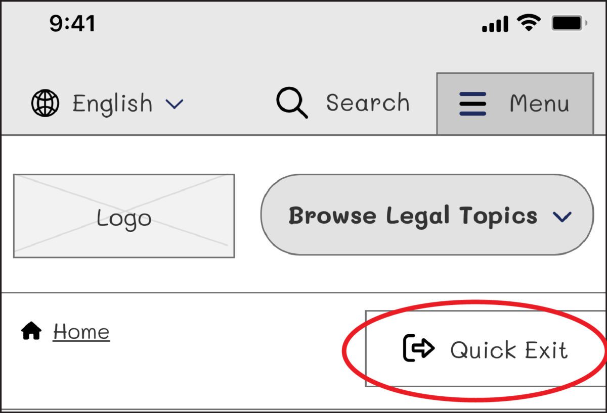
On our next iteration, we tried using the term “Exit” with the icon globally known for “external link.” But this still wasn’t clear enough for our users: Where would the exit bring you? To a page called “Exit”?
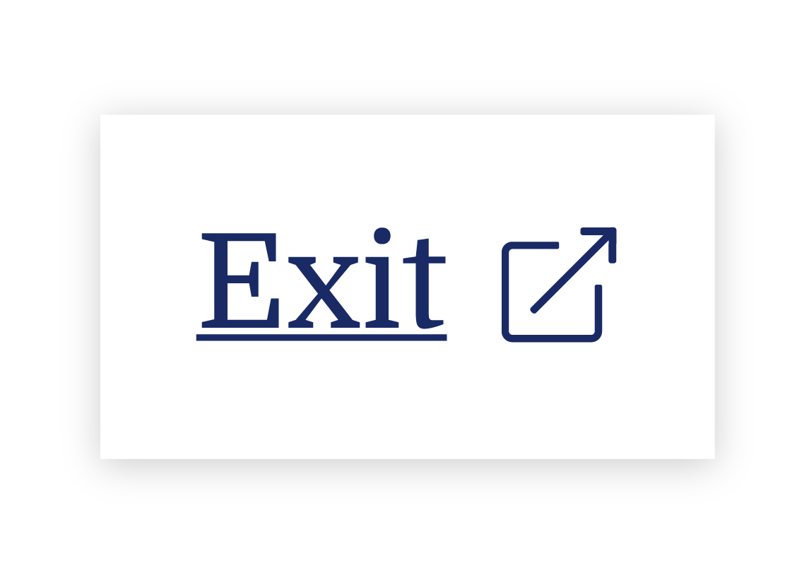
We needed to explain exactly what the button did, so we opted to use the universal external link icon with “Exit Site” as a label to best communicate what the button would do. Although it does not describe where you will end up, it clearly explains that you will leave the website.
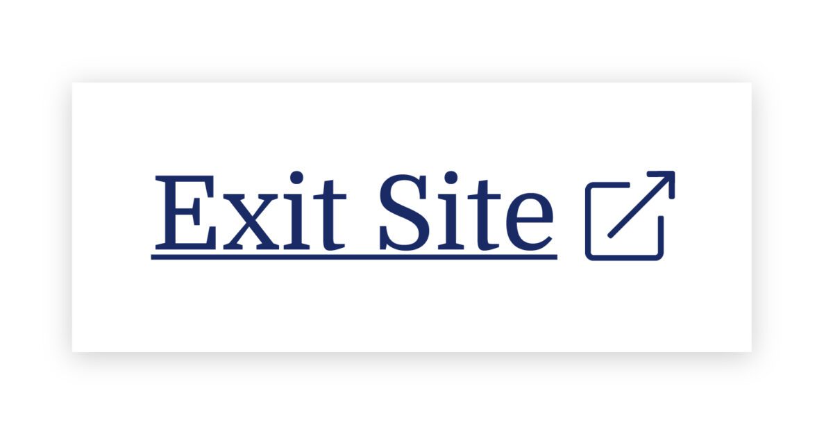
To further help users understand what the button was for, we then created a pop-up at the start of the user’s journey that educates people on the button’s purpose:
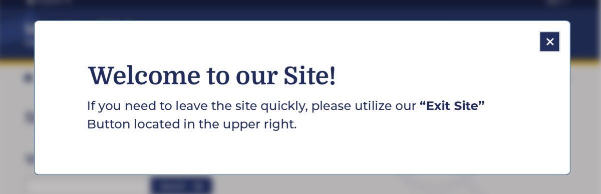
Overall, there was a delicate balance we had to achieve in managing all audiences that typically view the site. We wanted to ensure that we were educating all users but not preventing users from getting help for other topics, such as information about the right to an education or disability. The pop-up, however, had additional considerations we needed to weigh as well: What if their abuser sees it upon landing? What if the user who needs it ignores it?
An alternate approach focused more on domestic violence victims is the California Victims Resource Center’s (CVRC) website, 1800victims.org. When landing on the site, visitors are first educated with a pop-up, which includes reading the website’s Terms of Use and agreeing to the terms before they can enter.
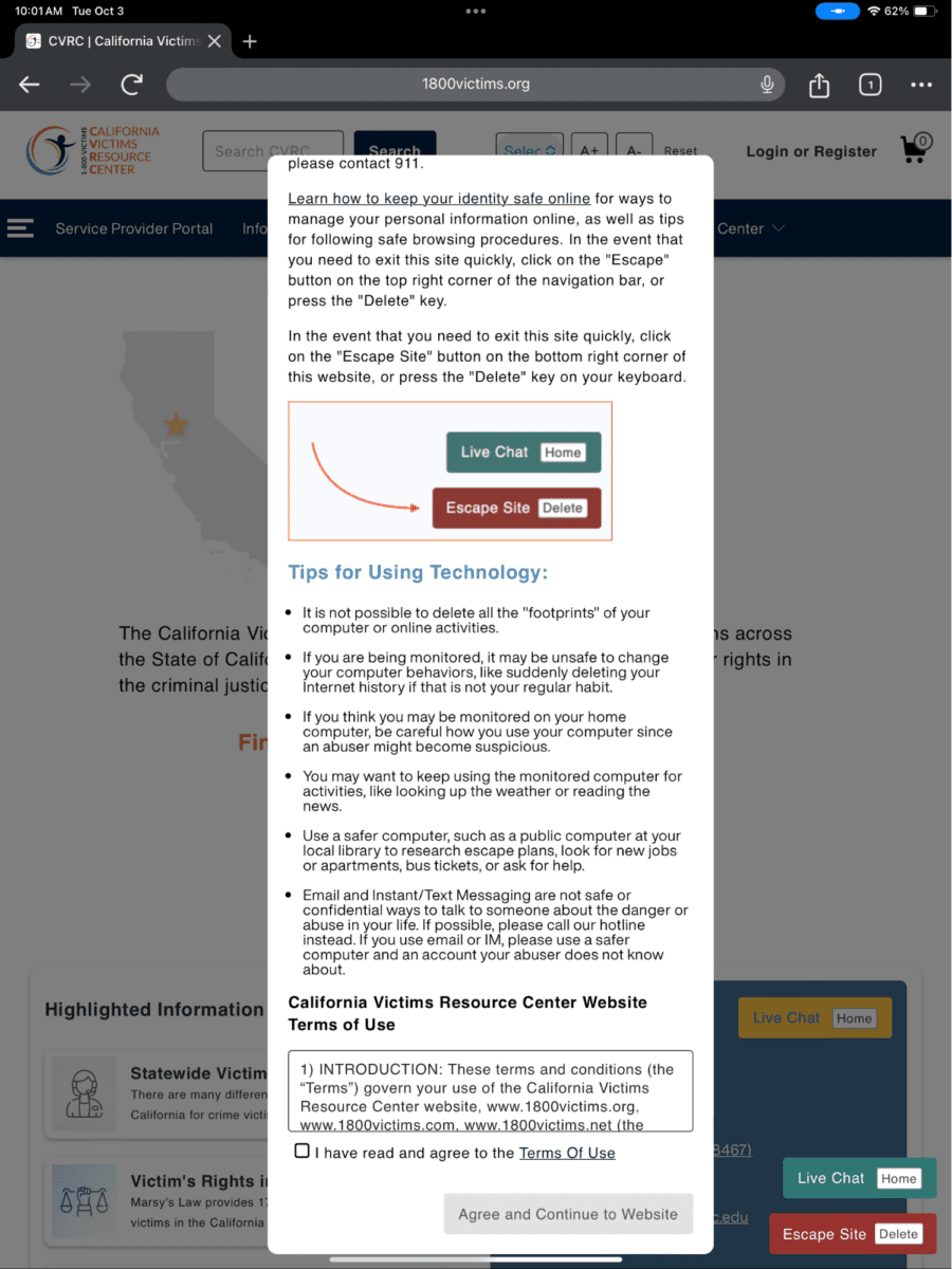
Additionally, when the user clicks the escape button (or uses the keyboard short-cut “Delete”), they are brought to a new tab that displays ABC News. The 1800victims site is changed to Netflix — with all traces of the CVRC gone. According to Columbia Health, this follows best practice because “a blank history can raise suspicion from your abuser.” This would be the safest approach for users.
To give back to the open-source community, the Oomph team turned our approach for this client into the “Quick Exit” Drupal Module. If you would like to add this kind of functionality to your own Drupal website, the module is a great place to start.
Designing for Safety
We must consider how users dealing with domestic violence may feel when they are visiting a site with sensitive content. By including information to educate users upon landing, we can help more people understand how to use a quick exit button if they find themselves in a situation where they need to swiftly leave a website. As an advocate for user safety and domestic violence prevention, you can proactively create a safety net for others by starting to review your work through the lens of how it may be abused prior to releasing it into the world.
This article is just one look at how organizations can design for safety using a quick exit button. By talking about these issues and advocating to protect users in your own design process, we can all take a step toward helping prevent domestic violence. Even if one person is helped or informed by Oomph’s quick exit button design on the website, it will be a success in our eyes.
Need help incorporating safety-focused design into your website or mobile apps? Let’s chat about your needs.
If you or someone you may know is struggling with domestic abuse, please visit or call the National Domestic Violence Hotline at 800-799-7233. For further reading on creating digital products with a safety mindset, we recommend Eva PenzeyMoog’s book Design for Safety available from A Book Apart.
Feel like you’re seeing a lot more website pop-up banners these days asking about your cookie preferences? Those cookie banners are here to stay, and they’re a vital part of compliance for websites of all sizes.
As global standards for consumer privacy and data protection continue to climb, businesses are burning more time and resources to keep up. One VentureBeat article pegged the cost for a business of maintaining data privacy compliance at an eye-popping $31 million — and the costs of non-compliance can be even higher. Failing to stay on top of this complex patchwork of regulations can trigger real consequences, from steep fines and penalties to the indirect costs of reputational harm and lost business.
Cookie consent is one part of a holistic data privacy strategy — and an increasingly important one. Global privacy laws, such as the General Data Protection Regulation (GDPR), California Consumer Privacy Act (CCPA), and Brazil’s General Data Protection Law (LGPD), require companies to inform visitors about the data collected on their website via cookies and provide them with granular choices about what they’re willing to share. Cookie consent management solutions help users manage cookie preferences when they enter your site, presenting a banner that informs users about how cookies are used and letting them decide which information (if any) they want cookies to collect.
Cookie consent management solutions are rapidly evolving to keep up with changing data privacy standards. CookiePro is a solution from OneTrust designed specifically for small to medium businesses, offering a more automated way to ensure website and mobile applications stay compliant with cookie consent and global privacy regulations. At Oomph, we’ve helped several clients integrate CookiePro into their sites in recent months and think it’s on track to become an industry standard for cookie consent management.
For organizations that are already juggling multiple site integrations, does it make sense to add another? To answer that, let’s take a look at why cookie consent matters, how a tool like CookiePro can help, and if it’s right for you.
Why Do I Need a Cookie Consent Solution?
To comply with privacy laws and provide a transparent experience that builds trust, many website owners are rethinking how they manage compliance. Adding a cookie consent tool to your website can improve the experience for you and your users.
Ensure Compliance
Not taking data privacy seriously can cost you. In December 2022, Meta (the parent company of Facebook) agreed to pay $725 million to settle several class-action lawsuits that found Facebook had let third-parties access users’ private data and their friends’ data without user permission. Oracle has been sued for collecting 4.5 billion personal records from consumers who have specifically opted out of sharing, and Starbucks is potentially facing a lawsuit for continuing to “track customers ‘after they’ve declined all but required cookies.’”
While big-name companies get most of the bad press around data privacy, you don’t have to be a global enterprise to face similar consequences. In 2022, the total value of settlements for class-action lawsuits set a new record at $63 billion — and data breach and privacy class action settlements were among the top 10 settlement categories. Instead of risking a costly settlement, a much less expensive approach is to invest in a solution to help manage the work of compliance.
Build Trust
Beyond protecting your organization from legal action, demonstrating that you care about compliance helps your business build trust and long-term relationships with users. Data privacy is becoming more important to consumers of all ages, with 74% of people ranking data privacy as one of their top values.
A cookie consent solution lets users know that they’re in charge of their own data. It clearly discloses which information your business collects and uses, putting the power in their hands to control the data they share. If users want to change what they’re comfortable sharing later, they can easily update their settings. That level of transparency helps set the tone for your customer interactions, turning users into loyal brand advocates.
Optimize Efficiency
If your website serves users in multiple states or countries, keeping up with the patchwork of state, federal, and international laws is virtually impossible without software. Eleven states have unique data privacy laws in place right now, and 16 states introduced privacy bills during the 2022 to 2023 legislative cycle.
Factor in international regulations like GDPR, and it would take more hours than there are in a day to curate the individual preferences of your customer base. Plus, which of your team members is watching in case any regulations change? The most efficient approach is to use an automated cookie solution to curate consent requirements based on the user’s location and more.
What Is CookiePro?
Developed by OneTrust, which offers more robust data privacy solutions for enterprises, CookiePro started as a product in the OneTrust platform. After recognizing the need among small and medium businesses for a turnkey consent tool, OneTrust spun off CookiePro as a standalone solution.
CookiePro offers plans starting at around $40 per month, making it a budget-friendly alternative to enterprise solutions like OneTrust (or the cost of a lawsuit settlement). CookiePro comes with core compliance features like user-level consent management, acceptance customization, data mapping and recordkeeping, support for over 250 user languages, and additional security features.
After helping several of our clients implement CookiePro, there are a few key features that stand out for us:
- Easy installation: It just takes a few minutes to add a snippet of code to your website to enable CookiePro. It’s compatible with Drupal, WordPress, and other major site platforms.
- Automated cookie blocking: CookiePro’s auto-blocking tool scans your website to identify third-party tracking technologies, categorizes the cookies, and automatically blocks all cookies until users have given consent.
- Robust customizations: You can tailor your CookiePro banner to match your branding by customizing colors, content, and consent language. CookiePro also allows you to customize the user experience by choosing your consent approach and giving users granular control over their cookie settings.
- Upgrade path: Whether you have a small site or one with hundreds of thousands of visitors, CookiePro can support growing business needs. If you find that you need more support or functionality, you can upgrade to OneTrust’s Trust Intelligence Platform to unify all your data privacy management activities.
- Tag management system integrations: You can integrate tag management systems with your cookie consent solution if you use analytics and other platform tags on your website. CookiePro has integrations with many major tag management systems, including Google Tag Manager and Tealium, so you don’t have to change your current setup.
Beyond CookiePro, there are a growing number of other cookie consent solutions on the market, such as Termly and Cookiebot by Usercentrics. The right choice for you will depend on your existing tech stack, budget, and goals — the most important step is to put something in place to protect yourself and your users.
Where Should I Start?
Taking a proactive approach is key to ensuring data privacy for your users and avoiding costly consequences. Educate yourself on the different regulations and requirements, figure out the gaps in your compliance approach, and invest in tools that can help reduce risk and manual effort for your team.
Feeling overwhelmed or need a fresh perspective? Oomph’s accessibility and compliance audit is a great place to start. We can help you go beyond cookie consent to meet Web Content Accessibility Guidelines (WCAG), Americans With Disabilities Act (ADA), and other regulatory standards, helping you mitigate risk and deliver on user expectations. Reach out to us to schedule your site audit.
Humans encounter thousands of words every day. As a website owner, that means your site content is vying for your user’s attention alongside emails from their colleagues, the novel on their nightstand, and even the permission slip scrunched at the bottom of their kid’s backpack.
How do you cut through the clutter to create site content that people actually want to read?
While you may already be choosing topics that are the most interesting and relevant for your audience, the structure of your writing may not be optimized for how people read. By understanding your audience’s reading behaviors following best practices for readability and accessibility, you can make sure your content works with people’s natural tendencies – not against them – to create a more engaging digital experience. An added bonus: Google shares many of those same tendencies, so content that’s designed well for humans is also more likely to perform well for organic SEO.
As a digital platform partner to many clients with content-rich sites, Oomph often works with brands to redesign their content for digital success. Here’s a look at the basic principles we apply to any site design – and how you can use them to your advantage.
How People Read Online
When we dive into a book, we typically settle in for a long haul, ready to soak up each chapter one by one. But when we open up a website, it’s more like scanning a newspaper or the entire bookshelf – we’re looking for something specific to catch our eye. We quickly scan, looking for anything that jumps out at us. If we see something interesting, then we’ll slow down and start reading in more detail.
Think of it like an animal following an information “scent,” identifying a mixture of clues that are likely to lead to the content you’re looking for. Most people will decide which pages to visit based on how likely the page will have the answer they’re looking for and how long it’s going to take to get the answer.
Users need to be hooked within a few moments of looking at a website or they’ll move on. They need to be able to identify and understand key factors like:
- The point of the information and why they should keep reading
- Whether they can trust the information and the source
- The type of content provided and any action expected from them, like signing up for an event
- How visually engaging and readable the content is
The takeaway for brands? Writing with your readers’ needs in mind is a way to show them you care and want to help them solve their problem. It’s also the key to achieving your site goals.
Your site content does more than just convey information – it’s about building trust, establishing rapport, and creating a connection that goes beyond the page. Whether you’re trying to sell a product or promote a cause, crafting content around your audience’s needs, desires, and preferences is the most effective way to compel them to take action. Here are four ways to set your website content up for success.
1. Put your data to work.
If you’re looking to refresh your current site, data can help you make informed choices about everything from your content strategy to your layout and design. Use digital reporting tools to answer questions like:
- Is our target audience visiting our site – and are other audiences visiting that we don’t know about yet?
- Which content do visitors download or engage with most frequently?
- What does a typical site visit look like? Are there places where users are getting stuck or bouncing off?
Google Analytics is a go-to tool for understanding the basics of who is visiting your site and how they’re engaging with your content. You can track metrics like session duration, traffic sources, and top-performing pages, all of which can help you better understand what your audience is looking for and what you want to tell them.
Additional tools like Screaming Frog and Hotjar can give you even deeper insights, helping you track content structure and real-time user interactions.
2. Create a simple and consistent content structure.
When it comes to site content, consistency is like the foundation of a house (minus the power tools and hard hats).
A well-structured site not only helps users navigate and understand your content more easily, but also enhances the visual appeal and flow of the site. Think of it like a dance floor – you want your users to be able to move smoothly from one section to the next, without any awkward missteps.
That means focusing on shorter sentences, bullet points, and clear subheadings, all backed up by engaging visuals that serve as resting points for the eye. And while you’re at it, don’t forget to declutter your content — users don’t want to wade through a sea of unnecessary words just to find the nuggets of gold.
Ask yourself: Does this content flow smoothly, is it easy to scan, and does it make my key messages stand out? If the answer is yes, then you’re on your way to successful content.
3. Make sure visuals and content play nicely together.
When it comes to enhancing your content with visuals, the key is to strike a balance between style and substance. Your design should complement your content, not compete or distract from it.
Beyond their aesthetic appeal, well-designed visuals are important for creating a sense of credibility with users. Think back to the concept of information scent: If your design looks sloppy or inconsistent, users are less likely to trust the information you’re presenting. So make sure you’re using design elements wisely, creating ample white space, and avoiding anything that makes your content feel like a sales pitch.
4. Focus on accessibility.
When it comes to site content, accessibility can’t be ignored. Content should be engaging and informative and also conform to the , Website Content Accessibility Guidelines (WCAG). Tools like SortSite can help identify these issues and guide you toward accessibility success.
There are a number of things all sites need to consider:
- Using consistent text stylings, including text color, leading, kerning, and tracking.
- Design to support individuals with visual impairments, assistive technology like screen readers, and those that require navigation via the keyboard only
- Following heading orders and grouping content together to make it easier to scan. For example: Following a heading level 2 with a heading level 3 when the ideas are related, but starting with a new heading 2 if changing to a new section of thought.
- Using multiple methods to indicate action items and descriptive text for buttons and alternative text.
- PDFs can be useful, but are also big accessibility red flags, so it’s best to avoid using them when possible. If a PDF is a must, make sure it follows accessibility best practices.
Designing Engaging Content Doesn’t Need To Be a Full-Time Job
If you already have a library of content, auditing the content that already exists can be daunting. And sometimes, you need a little help from your friends. That’s where third-party experts (like us!) come in.
During our website discovery process, we use strategies like content and analytics audits, UX heuristics, and user journey mapping to help position client sites for success. We’ll help you identify areas for improvement, highlight opportunities for growth, and guide you toward achieving content greatness.
Ready for a fresh perspective on your content? We’d love to talk about it.
Have you ever tried to buy tickets to a concert and experienced the frustration and eventual rage of waiting for pages to load, unresponsive pages, unclear next steps, timers counting down, or buttons not working to submit — and you probably still walked away with zero tickets? Yeah, you probably had some choice words, and your keyboard and mouse might have suffered your ire in the process.
As a website owner, you strive to create a seamless user experience for your audience. Ideally, one that doesn’t involve them preparing to star in their own version of the printer scene in Office Space. Despite your best efforts, there will be times when users get frustrated due to slow page loads, broken links, navigation loops, or any other technical issues. This frustration can lead to what the industry calls “rage clicks” and “thrashed cursors.” When your users are driven to these actions, your website’s reputation, engagement, and return visits can be damaged. Let’s dig in to discuss what rage clicks and thrashed cursors are and how to deal with frustrated users.
First of all, what are Rage Clicks?
Rage clicks are when a user repeatedly clicks on a button or link when it fails to respond immediately — the interface offers no feedback that their first click did something. This bad user experience doesn’t motivate them to return for more. These clicks are likely often accompanied by loud and audible sighs, groans, or even yelling. “Come on, just GO!” might ring a bell if you’ve ever been in this situation. Rage clicks are one of the most frustrating things a user can experience when using a website or app.
Rage Clicks are defined technically by establishing that:
- At least three clicks take place
- These three clicks happen within a two-second time frame
- All clicks occur within a 100px radius

Similarly, what is a Thrashed Cursor?
A thrashed cursor is when a user moves the cursor back and forth over a page or element, indicating impatience or confusion. Various issues, including slow page load times, broken links, unresponsive buttons, and unclear navigation, can cause users to exhibit these digital behaviors. It can also indicate the user is about to leave the site if they cannot find that solution quickly.
Thrashed cursors are defined technically by establishing that:
- There is an area on the page where a user was moving their mouse erratically
- An established pattern of “thrashing” occurs around or on specific elements or pages
- Higher rate of user exits from the identified pages
Why do Rage Clicks and Thrashed Cursor happen?
Common reasons rage clicks and thrashed cursors happen are:
- Poor Design: Poor design is one of the most common reasons for rage clicks and thrashed cursors. If the website has a confusing layout or navigation structure, it can be frustrating for users to find what they’re looking for. Or, they may assume an element is clickable; when it’s not, it can be irksome. Underlined text is an excellent example, as users often associate underlines with links.
- Technical Issues: Technical issues such as slow loading times, broken links, or non-responsive buttons can cause rage clicks and thrashed cursors. Users expect the website to work correctly; when it doesn’t, they can become annoyed or frustrated. If they click a button, they expect the button to do something.
- Lack of Clarity: If the website’s content is unclear or poorly written, it can cause confusion and frustration for users. They may struggle to understand the information provided or find it challenging to complete the intended action. Content loops can be a good example of this. Content loops happen when users repeatedly go back and forth between pages or sections of a website, trying to find the information they need. Eventually, they’ll become frustrated, leading to this user leaving the website.

How do you resolve issues that lead to Rage Clicks and Thrashed Cursors?
Now that we know what rage clicks and thrashed cursors are and why they happen, how do you resolve it, you may be asking. Here are a few things a digital partner can help you with that can significantly reduce the risk of your users resorting to these behaviors.
Use Performance Measuring Tools
By employing performance measuring, you can analyze the data collected, gain valuable insights into how users interact with your platform, and identify areas for improvement. For example, if you notice a high number of rage clicks on a specific button or link, it may indicate that users are confused about its functionality or that it’s not working correctly. Similarly, if you see a high number of thrashed cursors on a particular page, it may suggest that users are struggling to navigate or find the information they need.
Tools that support Friction or Frustration measurement:
- Clarity (from Microsoft)
- ContentSquare
- Heap
- HotJar
- Mouseflow
- Quantum Metric
Conduct User Experience Exercises and Testing
Identifying the root causes of rage clicks and thrashed cursors can be done through a UX audit. A partner can examine your website design, functionality, and usability, identifying areas of improvement.
- User Journey Mapping: User journey mapping involves mapping the user’s journey through your website from a starting point to a goal, identifying pain points along the way, and determining where users may get stuck or frustrated.
- Usability Testing: Usability testing involves putting the website in front of real users and giving them tasks to complete. The tester then looks to identify issues, such as slow loading times, broken links, or confusing navigation.
- User Surveys: User surveys can be conducted in various ways, including online surveys, in-person interviews, and focus groups. These surveys can be designed to gather information about users’ perceptions of the website, interactions with the website, and satisfaction levels. Questions can be designed to identify areas of frustration, such as difficult-to-find information, slow page load times, or confusing navigation. It’s wise to keep surveys short, so work with your partner to select the questions to garner the best feedback.
- Heat Mapping: Heat mapping involves analyzing user behavior on your website, identifying where users are clicking, scrolling, and spending their time. This can identify areas of the website that are causing frustration and leading to rage clicks and thrashed cursors.
Focus on Website Speed Optimization
A digital experience consultancy can synthesize findings from UX research and performance-measuring tools and work to optimize your website for quicker page loads and buttons or links that respond immediately to user actions.
- Image Optimization: Optimizing images on your website will significantly improve page loading times. A partner can help you optimize server settings and compress images to reduce their size without sacrificing quality.
- Minification: Minification involves reducing the size of HTML, CSS, and JavaScript files by removing unnecessary characters such as white space, comments, and line breaks. This can significantly improve page loading times.
- Caching: Caching involves storing frequently accessed website data on a user’s device, reducing the need for data retrieval and improving website speed.
- Content Delivery Network (CDN): A CDN is a network of servers distributed worldwide that store website data, improving website speed by reducing the distance between the user and the server.
- Server Optimization: Server optimization involves optimizing server settings and configurations, such as increasing server resources, using a faster server, and reducing request response time. Website owners frequently skip this step and don’t select the right hosting plan, which can cost more money through lost users and lower conversions.
Resolve Technical Issues
A digital experience partner can help resolve any technical issues that may be causing frustration for your users. These issues may include broken links or buttons, 404 errors, slow page load times, and server errors. Technical issue resolution can involve various activities, including code optimization, server maintenance, and bug fixes that work to ensure that everything is working correctly and address any issues that arise promptly. The resolution of technical issues will improve website performance, reducing the likelihood of user frustration and rage clicks.
Next Steps
User frustration can negatively impact user satisfaction and business outcomes. Partnering with a digital experience firm can be a valuable investment to mitigate these issues. Through the use of tools, UX audits, user surveys, website speed optimization, and technical issue resolution, a partner can identify and address the root causes of user frustration, improving the overall user experience — leading to an increase in user engagement, satisfaction, and loyalty, which means improved conversion rates, higher customer retention, and ultimately, increased revenue for your business.
If your customers are hulking out, maybe it’s time to call us!
In our previous post we broadly discussed the mindset of composable business. While “composable” can be a long term company-wide strategy for the future, companies shouldn’t overlook smaller-scale opportunities that exist at every level to introduce more flexibility, longevity, and reduce costs of technology investments.
For maximum ROI, think big, then start small
Many organizations are daunted by the concept of shifting a legacy application or monolith to a microservices architecture. This is exacerbated when an application is nearing end of life.
Don’t discount the fact that a move to a microservices architecture can be done progressively over time, unlike the replatform of a monolith which is a huge investment in both time and money that may not be realized for years until the new application is ready to deploy.
A progressive approach allows organizations to:
- Move faster and allow for adjustments as needed
- Begin realizing returns on investments faster
- Reduce risk by making smaller investments and deployments
- Ease budgeting process by funding an overhaul in stages
- Improve quality by minimizing the scope of tests
- Save money on initial investment and maintenance where services are centralized
- Benefit from longevity of a component-based system
Prioritizing the approach by aligning technical architecture with business objectives
As with any application development initiative, aligning business objectives with technology decisions is essential. Unlike replatforming a monolith, however, prioritizing and planning the order of development and deployments is crucial to the success of the initiative.
Start with clearly defining your application with a requirements and feature matrix. Then evaluate each using three lenses to see priorities begin to emerge:
- With a current state lens, evaluate each item. Is it broken? Is it costly to maintain? Is it leveraged by multiple business units or external applications?
- Then with a future state lens, evaluate each item. Could it be significantly improved? Could it be leveraged by other business units? Could it be leveraged outside the organization (partners, etc…)? Could it be leveraged in other applications, devices, or locations?
- Lastly, evaluate the emerging priority items with a cost and effort lens. What is the level of effort to develop the feature as a service? What is the likely duration of the effort?
Key considerations when planning a progressive approach
Planning is critical to any successful application development initiative, and architecting a microservices based architecture is no different. Be sure to consider the following key items as part of your planning exercises:
- Remember that rearchitecting a monolith feature as a service can open the door to new opportunities and new ways of thinking. It is helpful to ask “If this feature was a stand alone service, we could __”
- Be careful of designing services that are too big in scope. Work diligently to break down the application into the smallest possible parts, even if it is later determined that some should be grouped together
- Keep security front of mind. Where a monolith may have allowed for a straightforward security management policy with everything under one roof, a services architecture provides the opportunity for a more customized security policy, and the need to define how separate services are allowed to communicate with each other and the outside world
In summary
A microservices architecture is an approach that can help organizations move faster, be more flexible and agile, and reduce costs on development and maintenance of software applications. By taking a progressive approach when architecting a monolith application, businesses can move quickly, reduce risk, improve quality, and reduce costs.
If you’re interested in introducing composability to your organization, we’d love to help! Contact us today to talk about your options.
Digital customer experience (DCX) is fast becoming a key factor in how consumers choose whom to do business with. Every digital interaction contributes to an overall feeling about your brand — which means digital touchpoints like apps and chatbots can play a big part in what customers think of your company.
What story do you want those interactions to tell? What kind of experiences do you want people to share with others?
This article covers five ways to assess and improve your digital customer experience so you can attract, delight, and retain your target customers.
But First – What IS Digital Customer Experience?
Customer experience, or CX, is the perception that customers form based on all of their interactions, in-person or online, with your brand. If CX is about carefully and consistently meeting your customers’ needs, Digital Customer Experience is the online expression of those efforts.
Digital customer experience is the part of your CX journey that involves digital interactions via your website, mobile app, social media accounts, digital kiosks, etc. Wherever your customers are engaging with your people, products, or services through the internet, it’s a digital experience.
DCX is their perception of those moments.
Brands with a great DCX provide a personalized and consistent online experience throughout the customer journey. Whether someone is considering becoming a client, placing an order, or searching for information, every digital interaction has to be easy and enjoyable.
5 Ways to Improve Your Digital Customer Experience
Technology is a wonderful tool for improving the customer experience, whether mining data for customer insights or leveraging AI for personalization. But technology alone can’t deliver an exceptional digital customer experience. Your DCX strategy must include a human component — one that focuses on customer care through empathy and authenticity. Here’s how to ensure your digital customer experience lives up to your users’ expectations.
Know your target audience
To deliver the kind of digital experience your customers will love, you have to know what they want. Who’s buying your product, and why? When they visit your website or app, what are they hoping to accomplish?
Delighting your customers requires knowing their goals, understanding their pain points, and providing interactions that meet their specific needs. The upshot? 68% of customers will spend more money with a brand that understands and treats them like an individual.
Here are three crucial steps:
- Use qualitative and quantitative analyses to learn about your audience. The more you understand their preferences and behaviors, the better you can create an experience that meets their needs.
- Apply a user-centered design process, which relies on deeply understanding your audience to craft usable, accessible digital interfaces.
- Incorporate personalization techniques to adapt the digital experience for individual users. More than anything else, this will help make the customer journey smooth and enjoyable.
Adopt an omnichannel mindset
Customers expect seamless interactions from brands throughout their journey, whether through digital or non-digital channels. In fact, brands with the strongest omnichannel customer engagement strategies retain an average of 89% of their customers, in comparison to 33% of companies with weak strategies.
Knowing that today’s consumers often jump from channel to channel as they browse, buy, or get in touch, DCX leaders embrace an omnichannel strategy. Note that this is different from a multichannel approach, where customers access multiple channels in separate interactions. An omnichannel approach integrates all digital touchpoints to create a seamless, personalized experience.
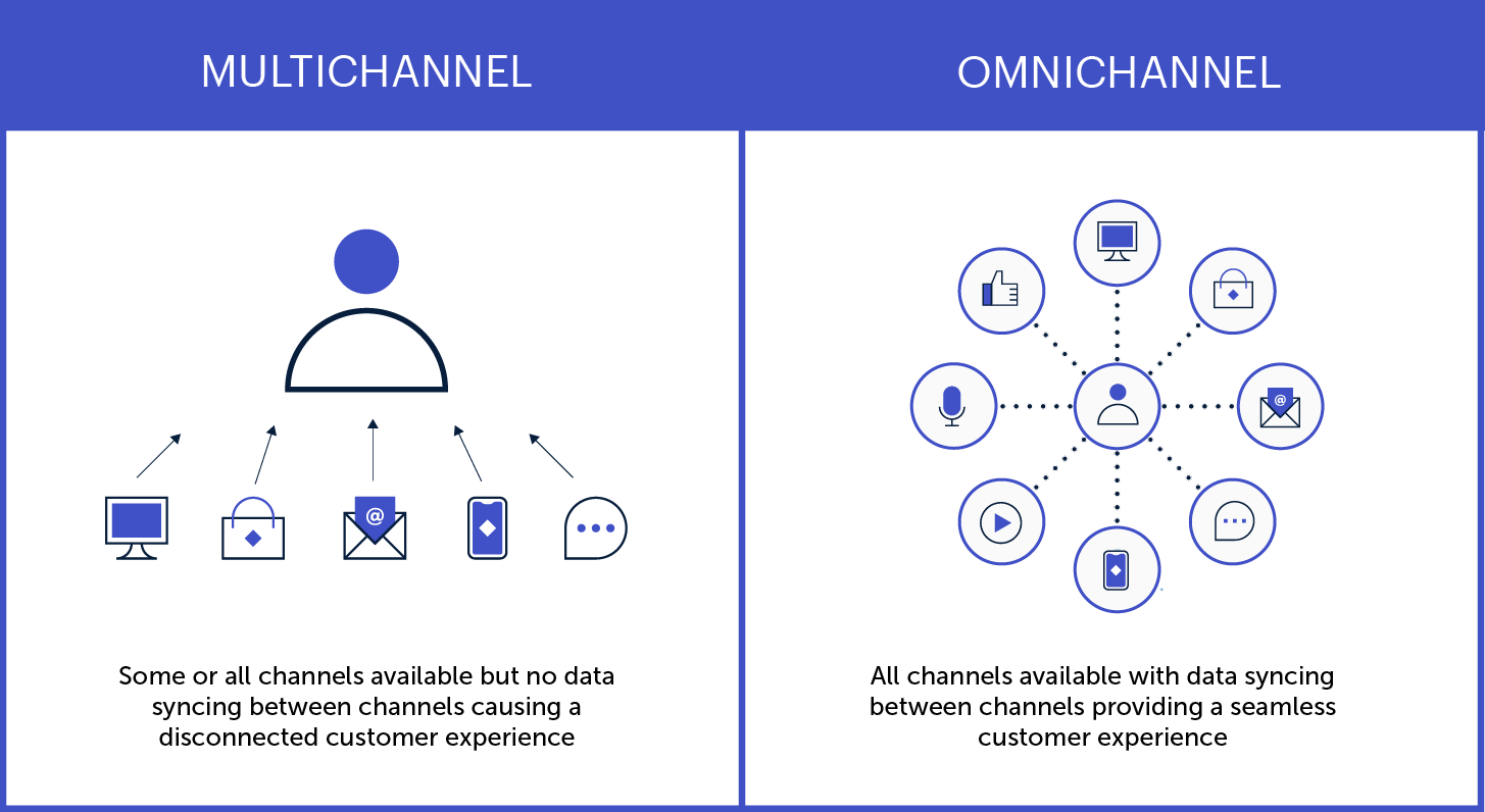
Here are a few key ways to create personalized experiences that resonate across all your digital channels:
- Use instantly recognizable brand elements and visual designs
- Make the transition from one channel to another easier
- Save search history and preferences across devices
- Synchronize ads and other promotional content
Get help from experts
Expert assessments can remove the guesswork around optimizing your digital customer experience. A digital CX audit, for instance, will show you what’s working and what could be better, as well as providing actionable insights and a prioritized roadmap.
CX specialists will look beyond the basic digital experience (clunky design, system bugs, etc…) to assess whether your digital channels are effectively serving your customers’ needs. A professional audit can help determine things like:
- Are there critical issues affecting usability and access?
- What elements of the journey most impact users’ experience?
- What are your competitors doing, and how can you differentiate?
- Where are your greatest strengths and growth opportunities?
Make customer feedback easy
Most companies know that customer feedback is crucial for improving the customer experience. But many fall short in providing easy, effective options for people to reach them.
Offering multiple, easy-to-use communication options across your digital channels is one more way to delight your customers. Help people engage with you via the medium of their choice, so they can communicate through the interface they’re most comfortable with.
That could be a chat function or contact form on your website, or the commenting and messaging features on your social profiles. Or, maybe it’s good old-fashioned phone calls and emails. Whatever the avenue, make it easy to find and intuitive to use.
One more thing: when someone does reach out, respond quickly. The faster a problem is resolved, the better the experience.
Plan for the post-launch reality
You might design and launch an amazing new website, app, or service that delights your customers and sends revenue through the roof. But, without a long-term plan to keep it effective and relevant, your digital CX will likely diminish over time.
To maintain the quality of customer experience across all your digital touchpoints, apply a measurement framework based on the principles above:
- Are you meeting users’ current and evolving needs?
- Do you provide a seamless omnichannel experience?
- Are you gathering — and implementing — user feedback?
Remember, too, that new technological trends are going to keep emerging and influencing consumer expectations. Be prepared to evolve what digital CX looks like for your business, especially if it means extending your digital services to new platforms or devices.
Putting the “C” in Digital CX
Technology has made so many things possible for today’s consumers that, ultimately, the power is in their hands. As digital capabilities continue to evolve, people may become increasingly selective about which brands earn their trust and business — and companies will need to make the digital customer experience more beneficial for both sides.
As you can see from the steps above, the key is putting your customers’ needs above all else.
If you’re not sure where to start, you’re not alone! We’ve helped dozens of clients dive into customer research, omnichannel strategies, and strategic planning for digital platforms. Reaching out to a digital CX expert (like Oomph) can help you do things right the first time, saving you time and money and, most importantly, building a foundation to get results.
Excited about crafting an exceptional DCX? So are we. Check out our DCX audit service to learn how we can help set you up for success.