BCBS.com: Modular Page Building with Drupal Paragraphs
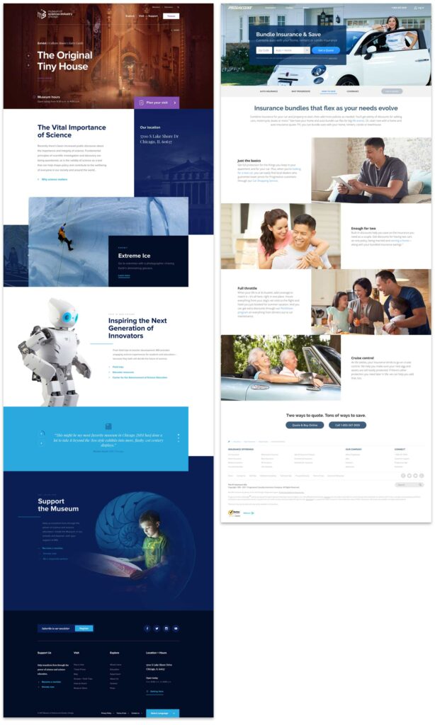
Traditional pages should be a thing of the past. The modern web experience is composed of small pieces of content arranged into a cohesive story. For an author, a single content area is fine for a blog post—a single story that expounds upon one thought. But for a modern website with many landing pages—places where the user needs to decide what they want to do next—a single content column will no longer suffice. We need modular content and a better way to manage its creation.
At An Event Apart this April, Ethan Marcotte was talking about the future of design and User Experience in a multi-device world. Specifically, he said that we should:
[…] design networks of content that are composed of patterns. These patterns, which are small responsive patterns themselves, can be stitched together to create composite experiences like pages.
In other words, the idea of “pages” needs to be blown apart into smaller patterns. Break free from the single content area and create compelling experiences for a modern audience!
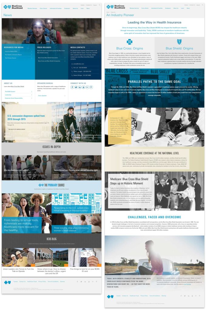
We at Oomph agree, and the roadmap that we drew last summer while designing and developing the new BCBS.com (launched in November, 2016) was already blowing the old idea of pages apart with a modular content system.
How did we get here?
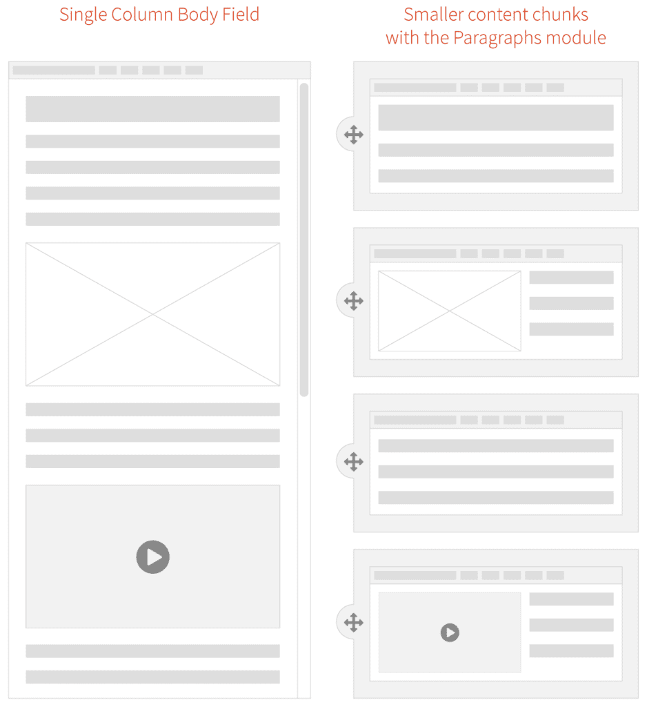
Why have we been bound by a single content area? This all goes back to the prevalence of blogs and content management systems (CMSs), which, for ease of use, created just one main content area. For an author of a blog post, one content area is enough as they are writing a single story. But for business sites that need to market a product or service, it is usually not enough.
For Blue Cross and Blue Shield Association, when we were discovering ways in which we could redesign their site, we recognized that they needed to break out from the constraints of the single content area provided by CMSs. The new BCBS.com was going to be built on Drupal 8, so we needed to think about solutions within that ecosystem.
Why we Chose the Drupal Paragraphs Module
Modern CMSs have started to handle multiple chunks of content, and within the Drupal community there are a few ways to address it. The downfall—in our minds—with a few of these solutions is that they put all of the power into the hands of the authors. If you have a team of savvy people that understand interface design, responsive design, and are not afraid to get their hands dirty with some HTML, that can work. In our experience, though, it is too much power and authors are more liable to break something—either break the rendering of the page or break too far outside the brand guidelines. These solutions are difficult to use and typically get abandoned by the author.
Instead of unlimited options, what we as the design and development team wanted was the ability to define our own set of options that we could then expose to the authors. We’d build each set of options into a small responsive pattern, which allows the author to concentrate on their content and how they want to tell a story.
The Paragraphs Module can do exactly that. It adds a new field type that works like Entity References, and with it, we can define all sorts of Paragraph Types and configurable options to give to authors. For the end viewer, the experience has visual variety, but it never veers off brand or looks broken. For the author, they have many options but do not need to think about what happens to their content for mobile or tablet. Those decisions have been baked into each Paragraph Type.
What we Built for BCBSA
We based our modular design patterns on a simple “card” consisting of an optional icon, an optional background (could be color, image, or gradient), and a WYSIWYG content field. These elements had many, many options associated with them:
- 300+ icons to choose from
- 6 buttons styles in 3 different sizes
- 20 background colors
- 3 background gradients
- 11 Header styles
- 5 sizes for body copy with fluid responsive sizing
- 6 body copy colors
- Width pairings for multi-card rows
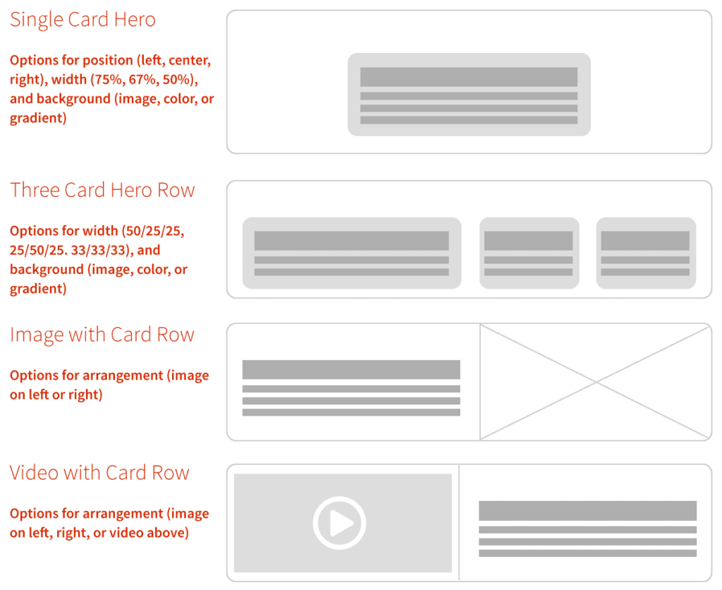
From here, we defined 10 different Paragraph “Rows” of cards and other types of content. Each of these bundles have responsive design built in — they are small responsive patterns that can be stitched together to create pages:
- Single, Two and Three Card “Heros” — text over a background color or image
- Two, Three, and Four Card Rows
- Image Card Row
- Video Card Row
- Image Gallery Row
- iFrame Row
- Wayfinding Row—a way to insert and control jump links (anchors) on a page
With these options and rows together, the BCBSA team can create fantastic long-form content pages as well as complex landing pages that can still use Drupal’s Body Content area, Featured Images, and even Blocks and Views.
Oomph & BCBSA ❤ Paragraphs
With Drupal and Paragraphs, both the Oomph and BCBSA teams are very excited about the extensive possibilities of a curated system of modular components, options, and rows. Authors have a large but controlled set of options which makes every page feel unique but on brand, and the viewers get a fully responsive experience without any additional work.
We’ve become believers in this kind of system and have already started adapting it to other clients who need to solve a similar problem. We could design a custom system of Paragraphs and options for you, too.
Resources:
- A joint presentation at Drupalcon North America, 2017 by John Eckroth, Director of Digital Experience and Strategy at Blue Cross Blue Shield Association and J. Hogue, Director of Design & UX at Oomph, Inc. (with video)
- Video of the presentation on YouTube (voiceover on top of the slide deck)
- Drupal’s Paragraphs Module page
- Psychological statistics about reading and visual comprehension, in a marketing context
- Jason Santa Maria musing on the growing prevalence of long-form content back in 2014


