A11y, Chatbots, and AI, Oh My! User-Centered Design Trends for 2018
The world of UX and UI has been rapidly expanding in 2017 and is ready to continue to grow beyond our expectations. These yearly look-backs peppered with predictions for the future are getting harder and harder to write because of the sheer pace of change in the industry. The products that help designers design and the new talent that turns tried and true design patterns on their head will continue to drive new ideas to market in 2018. People — real users — are the ones who ultimately decide if an idea fails or sets a new set of trends the rest of the marketplace will aspire to.
The bots are rising
Chatbots and AI were on the rise in 2016 and 2017 cemented their place in new product design and drove new devices to dominance. Amazon and Google sold about 7.5 million voice-activated assistants in 2016 and have sold more than 25 million units this year, with more personal assistants in development from Apple, Samsung, Alibaba, and Microsoft.
Consider this: the rapid growth of chatbots is akin to another bit of technology that changed the game — the iPhone sold about 11 million devices in 2008, the year after its release in 2007, and 20 million in 2009. There is no question that Chatbots (another way to describe these voice-activated personal assistants) are going to be the next digital device that everyone will have in the home.
The inevitable rise of devices that have no visual user interface is a challenge that many design teams have already taken on. The need to understand “no-UI” continues to present challenges, but with a number of successful models to look at, it is an area that will continue to mature in 2018.
A11y will be your ally
Accessibility (a11y) continues to be at the top of many designers’ minds, as it should. More and more UX professionals recognize the need to stop creating products and interfaces that can be used by a smaller percentage of the population than the whole. The investment in better a11y pays off very quickly when it is done correctly.
That said, many large product groups, start-ups, and design agencies are still figuring out how to make a11y an integrated part of their process — not a stand-alone service or add-on. Some are grappling with how to price projects with a11y added, how to ensure that it is included early in the design process (and how to change the habits of designers to check color contrast more often instead of relying on their instincts).
Making a11y your true ally will take conscious practice to break out from bad habits, but the desire to get there exists and is widespread.
Design tools in the cloud = more collaboration
Design tools are coming off of the desktop and onto mobile devices and tablets via web apps. This is not a new trend either, but 2017 saw the widespread acceptance of these types of tools in agencies and internal product teams. Tools like Figma and UXPin are gaining ground, while other platforms like InVision are set to roll out their own authoring tools in 2018.
The benefit that these tools offer is much like the open source collaboration tools that engineers take for granted — think code reviews à la GitHub for visual design. Multiple authors can contribute to a single file, revisions are tracked on the fly, team members can review and offer feedback, and the all important hand-off documentation is stored alongside external assets, ready to be implemented into a coded site.
Designers don’t have to hole themselves up in a room with a disconnected application like Photoshop, churning out visuals that have to be emailed or posted in chat rooms for team review. An art director doesn’t have to come and sit over someone else’s shoulder for real time feedback and collaboration. Its an exciting landscape with various options for your own team’s needs.
Design systems aren’t for big brands anymore
It used to be that only large brands or product groups had the luxury of cataloguing their design system and exposing it to the world. A properly documented system will make the user experience more consistent and keep both the design teams and the developer teams on the same page. As tools move into this space to make the management of large design systems easier, the luxury of maintaining a design system becomes more and more accessible to smaller and smaller teams.
Again, not a new concept in 2017, but one that has really staked a claim in the UX space. Many teams aspire to have design and front-end developer guides as impressive and comprehensive as the big brands, and it is easier to achieve. See styleguides.io for some design system inspiration.
What about visual trends?
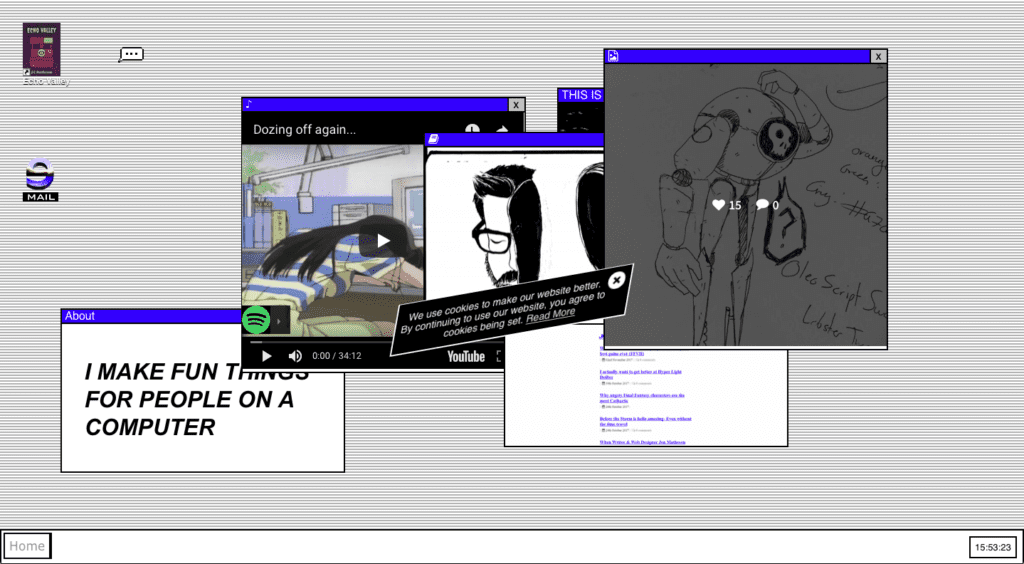
Visual trends come and go so quickly these days, as influenced by tools, peers, and the capabilities of our front-end stack. 2017 saw Brutalism appear, get co-opted rather quickly, and perhaps start to die off before the next trend appeared — which might be Mondrianism. Flat design was cool again, then it wasn’t, now it is again. Tastes change and, more than anything, I think people are ready for variety when it does not get in the way of the tools and sites that we rely on for work and entertainment.
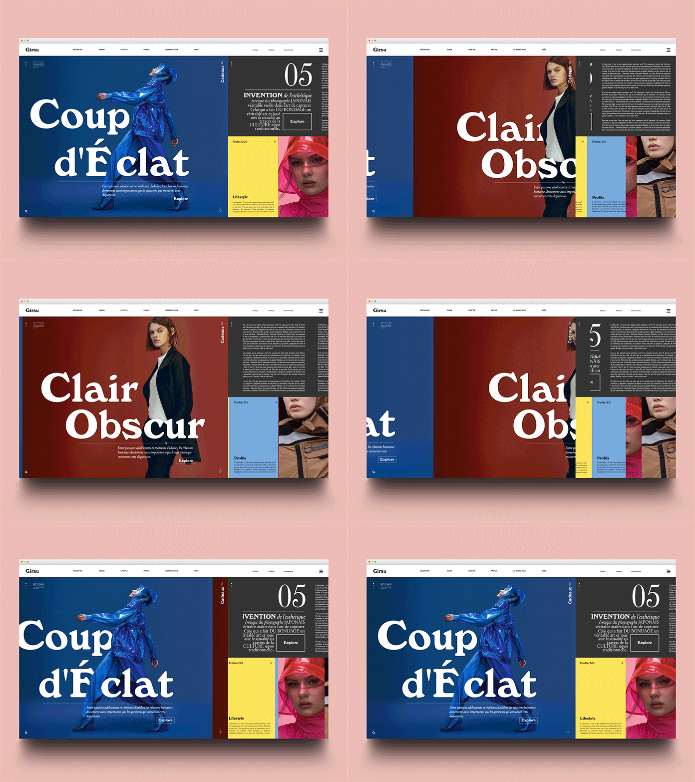
Generally, I see the same trends moving forward with variations spreading wide and far — larger typography, more animation, more video, maybe VR will become even more mainstream in 2018 (not just for games, but for generally immersive experiences). The web is becoming more diverse as our front-end stack becomes more reliable across browsers.
On the more technical side, a new method of layout in web browsers called CSS-Grid will continue to gain ground in 2018. With it comes a lot more flexibility with row and column-based layouts, and we are likely to see more and more experiments in legibility for the web because of this flexibility. Designers might start to look back at groundbreaking print design in the 70s, 80s, and 90s as inspiration for what can be done on the web. Need a better understanding of what CSS-Grid can do? Check out this great little game that goes through the basics.
AI creeps into design tools (oh my!)
Pervasive AI has already come to our devices, but mostly in the form of personal assistants. They are here to help, they say. Many companies are built upon or are experimenting with AI to do any number of things, from recommending what shows to watch to predicting daily traffic patterns and recommending alternate routes.
Of course, there are many applications for AI, but the creative art of visual problem-solving is one which I hope machine learning methods stay away from. This prediction from Scott Belsky of Adobe, for example, made me cringe:
[…] imagine if your tools could guess what you’re trying to do and proactively suggested short-cuts, preventing repetitive and mundane tasks; you’d be 10x more productive!
Umm, no thanks.
There is something to be said for trying things, sketching, reframing, and iterating that goes into understanding a problem before creating the right solution. I don’t want a machine to do that work for me. Will I be able to see the value of their recommendation if I didn’t go through all the work myself? Will “happy accidents” be removed completely? I’d like to make executing the solution faster and easier, but coming up with the solution needs to be a slower process.
A failed AI intrusion into UX design was The Grid. Using AI to layout visual elements has some merit, and the project is still active with a number of users, but the layouts that are produced are not better, or even interesting. They are simply done without a human involved. What it is missing is the ability for individuals to express their individuality, which seems like it should have been more obvious. Instead, the algorithms make everyone look basically the same.
While there will continue to be a need for AI to make processes more efficient behind the scenes, for now I think the job of a strategist, designer, or developer is still best left in the hands of a human. Which leads me to the last trend for 2018 that (hopefully) will continue far beyond…
Communication, luckily, has not gone out of style
I’d like to end on a value that has not changed in 2017, and will continue to drive ground-breaking products and interfaces in 2018. While the tools have made collaboration easier, while bots are ready to listen for our next command, and while data drives design more than opinion, we all still have to communicate person to person.
We need to explain this evolving landscape to clients, we need to set expectations, and we need to help everyone figure out what users should be able to do (and how to do it). We need to educate everyone about the importance of a11y, when a chatbot or AI solution is right for their product and their audience, and what the ethical or social ramifications of these decisions might be.
All of this needs to be done human to human, in plain language, by listening, asking, and balancing the needs of the business and the people they want to entertain, assist, or inspire.
With that in mind, make sure that your business relationships are true partnerships, and continue to nurture them — because we can make great things together.
