An Introduction to Creating Inclusive Design for Digital Platforms
“Inclusive design” may sound like vague, trendy, technical jargon. But inclusive design isn’t a trend — it’s the world catching up on the kind of digital experiences that should have been part of the web from the beginning.
Inclusive design is a crucial part of nearly every digital platform, be it website, app, or intranet.
Inclusive design as a concept and practice is broad and deep — this article barely scratches the surface, but will help you understand the mindset required. We’ll cover what it is, why it matters for your business, and some ways to assess whether your digital platform could be more inclusive.
- What does “inclusive design” mean?
- What are the benefits of inclusive design?
- How are inclusive design and accessibility different?
- How can you make your platform more inclusive?
What does “inclusive design” mean?
The Inclusive Design Research Center defines inclusive design as “design that considers the full range of human diversity with respect to ability, language, culture, gender, age and other forms of human difference.” Adding to that, Nielsen Norman calls it creating products that “understand and enable people of all backgrounds and abilities,” including economic situation, geography, race, and more.
Essentially, you’re aspiring to create interfaces that reflect how people from all walks of life interact with the world.
Inclusive design allows people to use a digital platform with ease, whatever their needs or point of view. Looking at characteristics like race, abilities, or geography helps us identify key areas where friction can occur between humans and the web.
In the end, it’s about designing for everyone.
What are the benefits of inclusive design?
Inclusive design isn’t just about recognizing and accommodating diversity; it also creates business advantages for organizations that are willing to invest in an inclusive approach. Here are a few key areas where inclusive design can give your digital platform an edge:
Grow your customer base. By understanding the best way to connect with a wider target audience, your team can create digital experiences that attract the most possible users.
Increase user engagement. Engagement goes up when platforms are welcoming and easy to use. Inclusive web design removes barriers and creates motivation for people to engage with your brand.
Spark innovation. Inclusive solutions have a history of spawning innovation that goes beyond the initial intended audience (think closed-captioning-turned-subtitles on Netflix). Sometimes, when you aim to solve a specific usability issue, you end up creating an entirely new market solution.
Motivate your team. The way a digital platform is designed affects all audiences, even employees. Designing with inclusivity in mind can also have a positive influence on your own team. Engaging employees in your efforts to build an inclusive digital platform can help create a sense of shared purpose — one many people are likely to rally around.
How are inclusive design and accessibility different?
You may have heard these terms used in similar contexts. While they overlap in meaning, they’re not the same thing.
By definition, accessibility focuses on accommodating people with varying physical and mental abilities. Accessible websites are measured by their conformance with Web Content Accessibility Guidelines, which pertain to things like auditory, cognitive, physical, and visual disabilities. Accessibility tests typically cover code-level issues that can be fixed in the source code of a site.
Inclusive design is about accommodating the entire spectrum of human diversity. It involves a variety of viewpoints, including those of people with disabilities. Inclusive solutions can involve anything from back-end coding to the way headlines are worded.
In a nutshell: An accessible site is one of the outcomes of an inclusive design, whereas inclusive design is the overall approach to creating accessibility.
Consider these examples:
- You’re filling out a form, and because you have a visual impairment, you’re using the keyboard to move through it. When you get to the end, you discover the form can’t be submitted because you left a few areas blank — even though you filled out every question asked. Turns out the keyboard had skipped past a few required fields. What a pain!
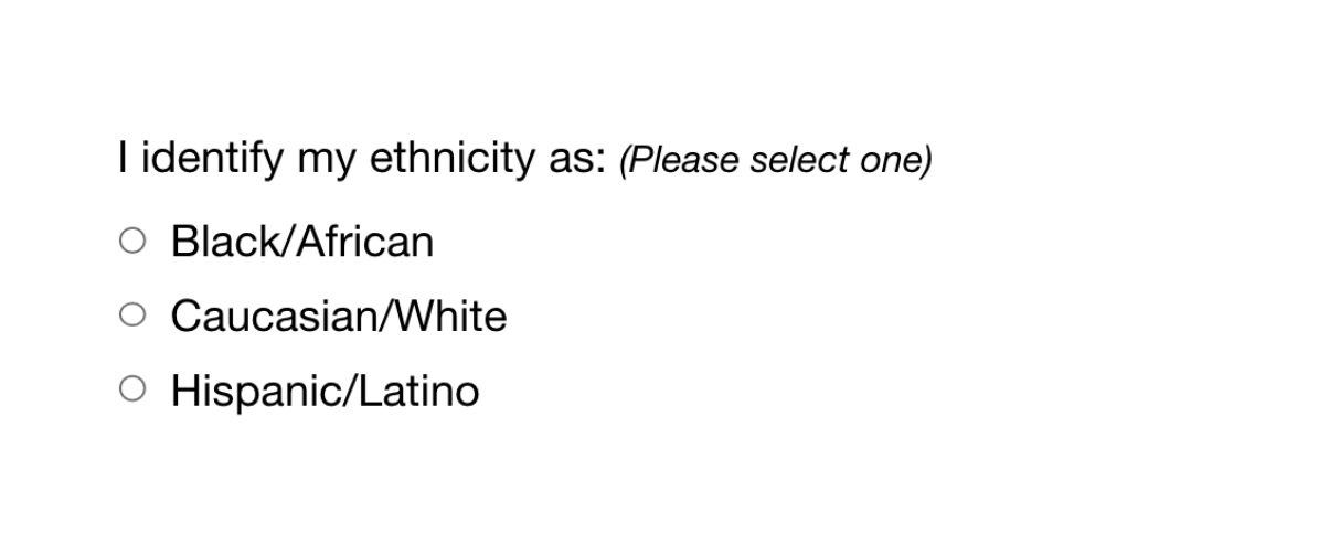
- While filling out a form, you’re asked to select your ethnicity from a list. As you read the options, you discover that yours is not listed, or that you identify with more than one. You feel like the “other,” compared to everyone else, leaving you frustrated about the task and… maybe even about the company too.

While both issues are addressed by inclusive design, the first issue relates to ability and can be fixed within the code, while the second relates to diversity and will take additional measures to address.
How Can You Make Your Platform More Inclusive?
The ethnicity example raises some interesting questions, such as:
- How do you know which ethnicities to add?
- How many do you need to account for?
- Should you just change the way the question is worded?
- Do you need to ask the question at all?
Mainly, this raises a bigger question: how do you maintain an inclusive site when there are so many important and broad variables (ability, language, culture, gender, age, etc.) — especially when that list of variables continues to grow and change?
The best way to get started is to arm yourself with knowledge and create a plan.
1. Identify the problems to solve.
Start by identifying opportunities for improvement in your current user experience (UX) by collecting quantitative and qualitative research with tools like UX audits, user interviews, user recordings, and heatmaps. Keep an eye out for areas where users seem confused, backpedal, or struggle to complete tasks. The more information you gather, the better!
2. Determine the best solutions.
Your user research will likely uncover many possible paths to change. This may include adding more categories to a list, creating an “Other” field users can type any answer into, or adding options to gather additional information.
Note: It’s common for areas that need improvement to hit on sensitive topics, things you may not fully figure out through data and research. Remember that the goal is understanding. Don’t be afraid to reach out to others for their thoughts and opinions.
3. Measure the results.
Some measures of success are easy to determine from user data in Google Analytics or changes in heatmaps and user recordings. Further data can come from users via surveys asking how your audience feels about the changes. The key is to stay continuously informed and aware of what your users are experiencing.
Note: One helpful tool for checking whether your design is, in fact, inclusive is Cards for Humanity. It offers a fun way to make sure you’re not missing anyone or anything in the spectrum of inclusivity.
Remember that the process of creating an inclusive design doesn’t end with implementation. Inclusive design is a work in progress. As a field, inclusive design is always evolving and requires continuous research to develop best practices.
We can’t predict what kind of mismatched interactions users will face in the years to come. But, with an open mind and a desire to learn and grow, we can continually adapt to meet them.
We’ve only scratched the surface of inclusive design! If you have any questions about inclusive design, we’d love to chat. Contact us anytime.


