AVMA
Enhancing AVMA’s Digital Experience to Elevate Member Engagement
view live site
category
Design & UI
Digital Engineering
Research & Strategy
User Experience
capability
Design Systems
Drupal
Mobile & Responsive
Technical Architecture
User Research
industry
Environmental & Non-profits
Communicating the value of membership to prospective and existing veterinarians was the key goal of this redesign and replatform. Members need to know how the American Veterinary Medical Association works on their behalf to advance policies, guidelines, and support animal and human health and well-being.
THE BRIEF
The American Veterinary Medical Association (AVMA) advocates on behalf of 91,000+ members — mostly doctors but some veterinary support staff as well. With roots as far back as 1863, their mission is to advance the science and practice of veterinary medicine and improve animal and human health. They are the most widely recognized member organization in the field.
Make the Brand Shine
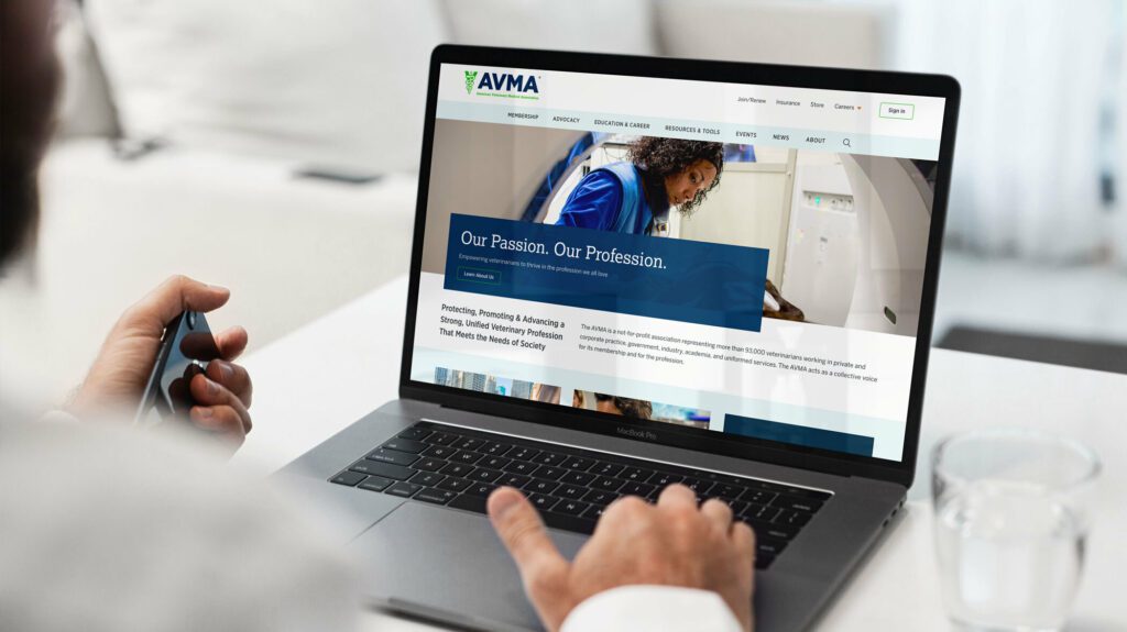
The AVMA website is the main communications vehicle for the organization. But the framework was very out of date — the site was not mobile-friendly and some pages were downright broken. The brand was strong, but the delivery on screen was weak and the tools reflected poorly.
Our goals were to:
IMPROVE THE SITE MAP
Content bloat over the years created a site tree that was in bad need of pruning.
IMPROVE SEARCH
When a site has so much content to offer, search can be the quickest way to find relevant information for a motivated user. Our goals were to make search more powerful while maintaining clarity of use.
COMMUNICATE THE VALUE OF MEMBERSHIP
Resources and benefits that come with membership were not clearly illustrated and while members were renewing regularly, they were not interacting with the site as a resource as often as they could.
STRENGTHEN THE BRAND
If the site was easier to navigate and search, if it had a clear value proposition for existing and prospective members, and if the visual design were modern and device-friendly, the brand would be stronger.
THE APPROACH
Put Members First
Oomph embarked on an extensive research and discovery phase which included:
- A competitor Analysis of 5 groups in direct competition and 5 similar membership-driven organizations
- An online survey for the existing audience
- A content and SEO audits
- Several in-person workshops with stakeholder groups, including attendance at their annual convention to conduct on-the-spot surveys
- More phone interviews with volunteers, members, and additional stakeholders
With a deep bed of research and personal anecdotes, we began to architect the new site. Communication was high as well, with numerous marketing, communications, and IT team check-ins along the way:
- An extensive card sort exercise for information architecture improvements — 200+ cards sorted by 6 groups from throughout the organization
- A new information architecture and audience testing
- A content modeling and content wireframe exercises
- A brand color accessibility audit
- Over a dozen wireframes
- Three style tiles (mood boards) with revisions and refinements
- Wireframe user testing
- A set of deep-dive technical audits
- Several full design mockups with flexible component architecture
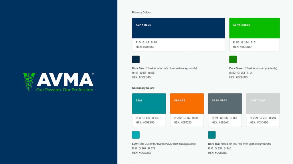
Several rounds of style tiles explored a new set of typefaces to support a modern refresh of the brand. Our ideas included darkening colored typography to meet WCAG thresholds, adding more colored tints for design variability, and designing a set of components that could be used to create marketing pages using Drupal’s Layout Builder system.
THE RESULTS
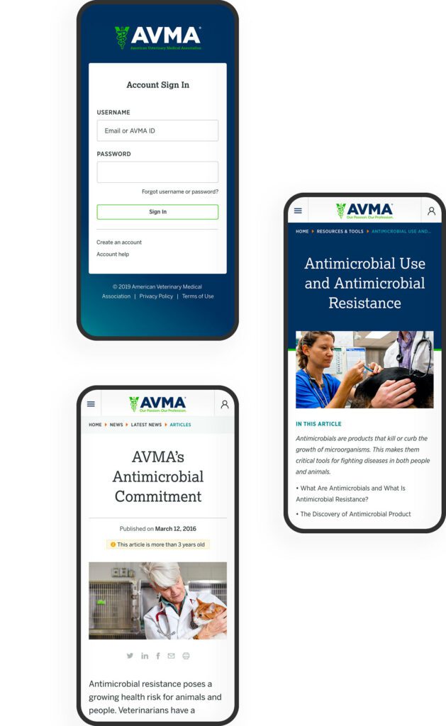
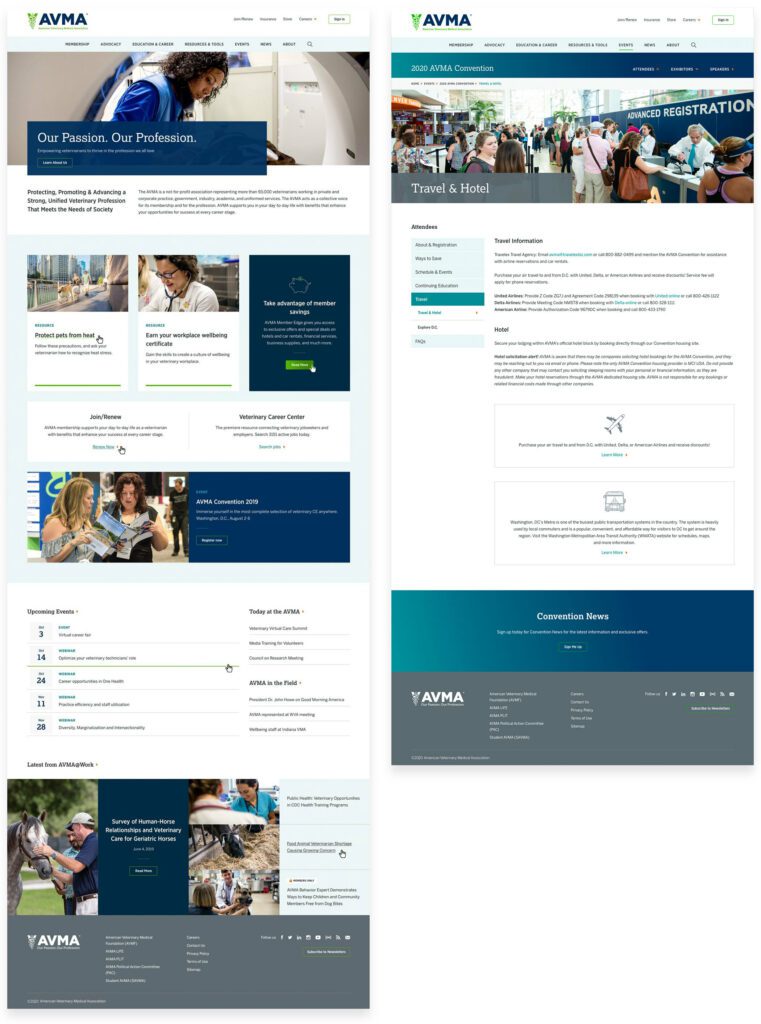
The design update brought the main brand vehicle fully into the modern web. Large headlines and images, chunks of color, and a clearer hierarchy of information makes each pages’ purpose shine. A mega-menu system breaks complex navigation into digestible parts, with icons and color to help differentiate important sections. The important yearly convention pages got a facelift as well, with their own sub-navigation system.
FINAL THOUGHTS
Supporting Animals & Humans Alike
Membership to the AVMA for a working veterinary doctor is an important way to keep in touch with the wider community while also learning about the latest policy changes, health updates, and events. The general public can more easily find information about common pet health problems, topical issues around animal well-being during natural disasters, and food and toy recalls. The goal of supporting members first while more broadly providing value to prospective members and non-members alike has coalesced into this updated digital property.
We look forward to supporting animal health and human safety as we continue to support and improve the site over the next year.
AWARDS & RECOGNITION


