Massachusetts Law Reform Institute
Connecting Citizens to Essential Legal Support and Resources
Visit Site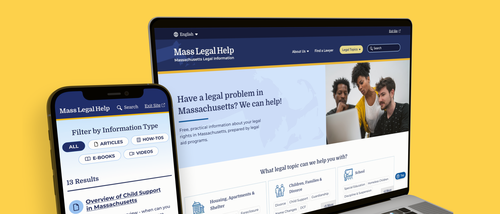
category
Accessibility
Design & UI
Research & Strategy
User Experience
capability
Design Systems
Information Architecture
Mobile & Responsive
User Research
industry
Municipalities & Government
Mass Legal Help (MLH) is a website dedicated to supplying trustworthy information about legal issues throughout the state of Massachusetts. They provide easy to understand and easy to find resources for those who might be stressed and surprised by a legal notification. Its parent organization, the nonprofit Massachusetts Law Reform Institute, needed to modernize the site to increase usability, navigation, and accessibility. Oomph was ready to discover, strategize, and redesign the entire experience from architecture and taxonomy to page designs and safety features.
The Brief
Powering Design With User Feedback
MLH exists to help Massachusetts residents find information to solve common legal issues, like securing public benefits or fighting an eviction. To ensure every aspect of the site was grounded in the audiences’ needs, MLH wanted to incorporate feedback during the discovery and design phases from real people who fit MLH’s primary and secondary audience profiles.
By performing a thorough discovery process — including working group interviews, visitor interviews, cohort site analysis, and wireframe and prototype testing — Oomph was able to create a successful site design dedicated to the needs of visitors.
The Approach
Helping the Audience by Understanding Them
MLH shares insights on heavy topics ranging from housing and homelessness to money, debt, and immigration. The site contains sensitive information that could change their visitors’ lives; by connecting them to domestic violence help or resources to get their children back, for example. When Oomph first jumped into the project, our main goal was to step into the shoes of their user groups to better understand their needs when they seek legal information.
The main audience of MLH is Massachusetts residents who are primarily low-income and may not speak English as a first language. They use the site to become informed about legal issues they’re facing quickly and efficiently. As one visitor stated:
“I’m coming here because I have a problem. I want to know, where’s the search? What can I do here? What can I not do? Don’t waste my time making me read [fluff]…”
To meet this need, the MLH team provides information in plain English at a fourth to sixth-grade reading level, rather than using complicated lawyer jargon, which makes it accessible to a wider group of people. Additionally, many resources have been professionally translated into other languages, such as Spanish.
The secondary audience that visits the site is those who help the primary audience, such as social service providers, legal aid lawyers, and legal librarians. Oomph had to walk a fine line by getting feedback from the secondary audience to help inform information about the primary audience; however, our main goal was to ensure that low-income and non-English-speaking people could find the answers they needed.
Gaining the Audience’s Trust with Thoughtful Design Details
We learned that many visitors found the MLH website by searching Google with their questions. Many primary audience members would visit the site on their mobile phones, perhaps even listening to its content with their text-to-speech tool. This increased the importance of a mobile-first design so the pages loaded quickly, the information was clear, and the experience made sense for mobile browsing.
A Modernized Design
The site’s look was outdated, making some visitors feel that it either lacked credibility or didn’t contain the latest legal rules and laws (even though it’s been actively maintained and added to for the past 15+ years!). For the Oomph team, the final designs had to walk a fine line between being authoritative, trustworthy, and comforting. To achieve this, we retained the blue color palette but created slightly softer tones to help create a calming aesthetic.
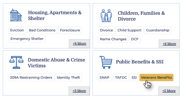
Our team also limited the amount of photography on the site but ensured that any photos we used represented the diverse groups MLH serves. Icons became a tool to guide the visitor through different topics; regardless of the visitor’s language, the icon could help them understand what information may be within that particular topic.
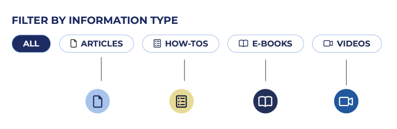
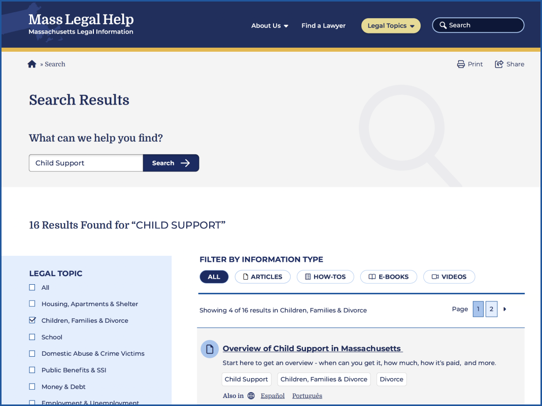
MLH has also accumulated a lot of content over the years. To help organize its search and topic organization feature, we incorporated content filters according to the information type: articles, how-tos, e-books, and videos. Each category has its own icon, and each icon is represented by a color. This helps unify the search based on the type of content the visitor is seeking.
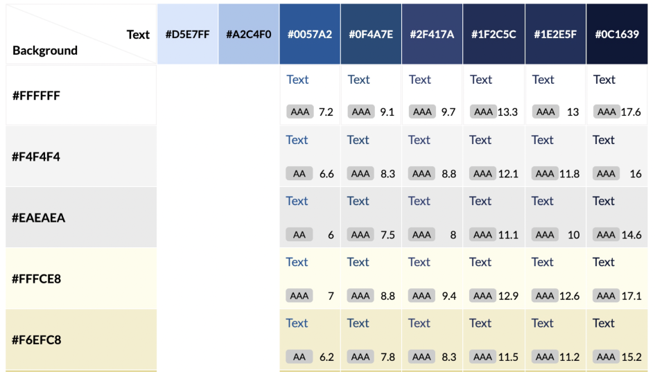
Color Contrast and Accessibility
From the start, MLH made it very clear that their new designs should comply with both 508 and WCAG 2.1 guidelines — ideally conforming to the highest level of contrast, level AAA. As Oomph created the color palette, we were careful to use only high-contrast colors and document how to use them in a system to ensure that the palette satisfied accessibility guidelines.
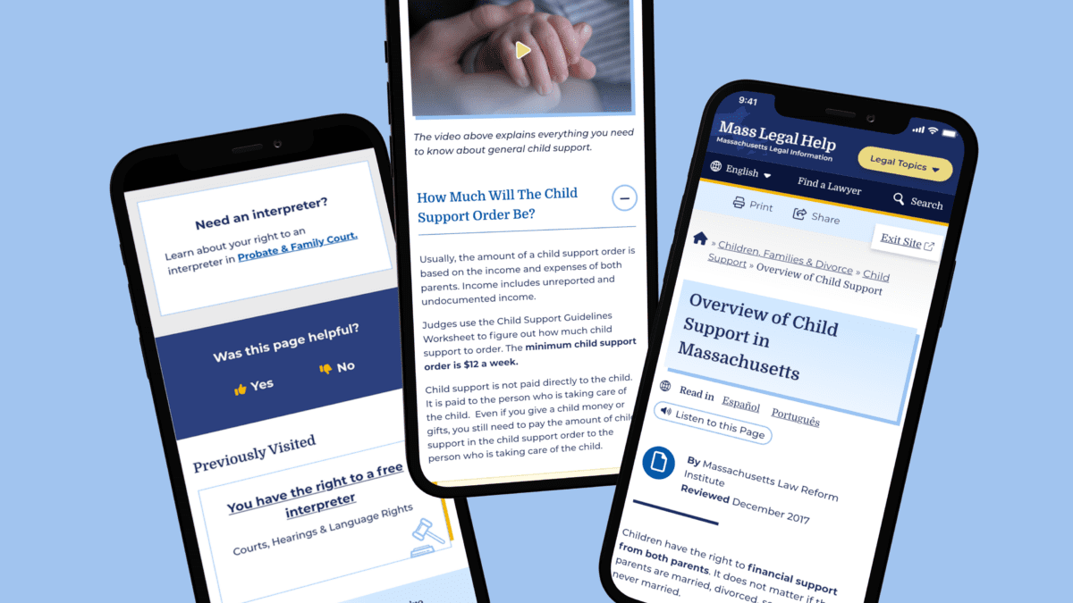
Supporting the Content With Tools
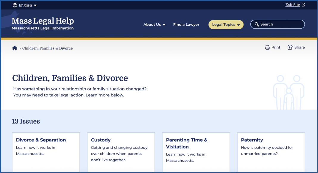
MLH had several existing tools to assist in digesting content. During our discovery phase, we validated the need for these tools and upgraded them. For example, on the content pages, there are options to print, share, listen to the content, and even switch the language as the visitor lands on the page.
Within the main navigation menu, the design included a “Quick Exit” button. This supports visitors who need to abandon the page when, for example, a domestic violence survivor’s abuser re-entered the room.
We cultivated a passion for this feature through our research and have written an article detailing our best practices for implementing a quick exit button. Additionally, we have created a Drupal Module for this feature so that more people can implement this important tool for sites with sensitive content.
Findability of Content Through the Main Menu Navigation
On a larger scale, the primary and secondary navigation menus needed an upgrade. As it stood, the main categories were wall-to-wall across the desktop, and it was hard to determine where a visitor needed to go. The secondary navigation menu read like a table of contents in a chapter book and didn’t allow the visitor to return to other categories.
We solved for this by creating a survey to test a proposed navigation structure and revised the information architecture (IA). This included a new top menu that supported every step of our primary audience’s journey. We also created a level of navigation that directed visitors to the information they were looking for, no matter how they entered the site.
Search
For search, we used a multi-filter approach which allows visitors to search both by topic and by content type. This filtering allowed them to find questions that might belong to multiple categories, and to narrow down content to the types they are willing to review.
Proactive vs. Reactive Enhancements
Analytics and user interview results showed that most visitors start their journey on either the homepage or pages that are three or more levels down the navigation. Many also reach the site via a specific Google search. While it is likely they found what they needed, they may not be aware of other information that can help them. To mitigate the risk of bouncing away from the website, we created a “Viewers also reviewed…” component on answer pages that showcased related content more naturally.
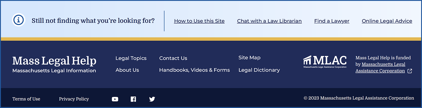
Repeating Help Footer
Above the footer, we created a “safety net” to help visitors who have browsed the site for a long time but have not found what they are looking for. If they reached the end of the page, this footer would direct them to more content that may hold their answers.
Previously Viewed
We added a “Previously Viewed” section at the bottom of content pages to remind visitors of the content they have already reviewed. This reduces the burden on the visitor when they ask themselves, “I think I’ve seen that already, but I can’t remember where I saw it.”
The Results
A Modern, Helpful Website Design
Through prototype testing with our first design mock-up with real visitors, the participants individually determined that the new site’s design and content organization was easy to navigate, gave them a trustworthy impression, and looked appealing. Today, the MLH website is live with a fresh Oomph design. We hope the structure and design will continue to not only keep visitors on the site longer but also help those visitors find the legal answers that they need.
Have a project that requires a human-first, empathetic approach? Consider talking to Oomph about incorporating user feedback into a user experience-focused design project for your next website refresh.
AWARDS & RECOGNITION