American Foundation for Suicide Prevention
Turning Health Data Into Action: Visualizing the Impact of Suicide Prevention Efforts
view live site
category
Design & UI
Digital Engineering
Research & Strategy
User Experience
capability
Gatsby
Mobile & Responsive
React
industry
Health & Wellness
Research matters — especially when it comes to messaging. We all can better understand the attitudes, beliefs, and perceptions about mental health and suicide prevention and spread a positive message of hope. That’s where Suicide Prevention Now comes in… this project was completed from design conception to live website in twelve weeks and helps advocate for prevention and awareness with data collected from four surveys over the past eight years.
THE BRIEF
Three Organizations Working Towards One Goal
The American Foundation for Suicide Prevention (AFSP), the National Action Alliance for Suicide Prevention (Action Alliance), and the Suicide Prevention Resource Center (SPRC) have been commissioning The Harris Poll to conduct a bi-annual, nationally representative survey of adults in the U.S. to understand the public’s beliefs and attitudes about mental health and suicide.
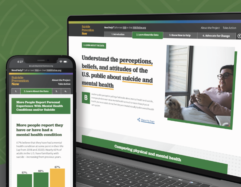
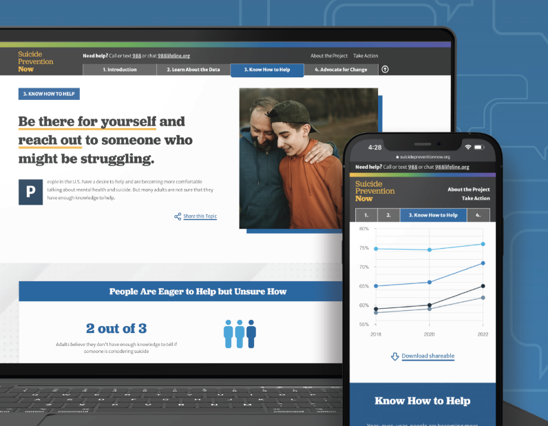

This year, 2022, all three suicide prevention organizations teamed up with Oomph to take that data and distill it into a microsite for easy consumption among professionals and the general public who visit the site.
The data from the poll shows that progress has been made, but there is still more to do. We all must continue to learn more about suicide and mental health, particularly through increased research efforts, teaching everyone how to help prevent suicide and strengthen mental health, and advocate for improved access to care and robust crisis services.
Oomph made sure our approach to information design, branding, and messaging came across effectively and clearly. How could we use data to show people which actions they could personally take to affect positive change?
THE APPROACH
Design Sprint to E-Learning Microsite
Our initial idea of the audience was more public facing rather than a specific audience. We started our design approach to be stylized and playful.
Taking a step back, we regrouped and determined that the audience was more academic and administrative, therefore it was to lean towards a professional tone. A new idea clicked — we could present this microsite as an e-learning experience.

The new design direction features four key chapters: the Introduction, Learn About the Data, Know How to Help, and Advocate for Change. By implementing a tab-like navigation, it allows for users to hop to each section they may be most interested in, and reads as if it is an eBook.
Each section is color coded, and the navigation has a gradient that brings in all of the sections together in unity to showcase that message throughout. Each section follows a similar pattern: an introduction, data from the Harris Poll, an opportunity to find resources about the chapter, and shareable resources to help spread the message on the viewer’s own social channels. We hope that by the end of the microsite, the user is ready to inform themselves further by finding resources or sharing about the current perceptions of suicide.

THE RESULTS
Ongoing Public-education Impact
While Suicide Prevention Now is just one step of many, we hope that this project will help more people to become an advocate, or help spread awareness about suicide prevention. We hope it helps to save lives.
While working on this project, we became aware of a national suicide hotline number that is quick to dial and easy to remember, just like 911. Dial 988 to be connected to a friendly and helpful advocate if you or someone you know are having thoughts of suicide.
Working with Oomph was a great experience all the way around. From exploration to delivery, Oomph provided excellent guidance, and the quality of the final site is fantastic! I look forward to working with the team again in the future.
JONATHAN DOZIER-EZELL Director of Digital Communications,
American Foundation for Suicide Prevention
AWARDS & RECOGNITION


