Visit California
Optimizing Visit California’s Digital Experience for Speed and Efficiency
Visit Site
capability
Design Consultation
Design Systems
Drupal
Gatsby
Migration
React
Technical Architecture
category
Digital Engineering
Research & Strategy
User Experience
industry
Other
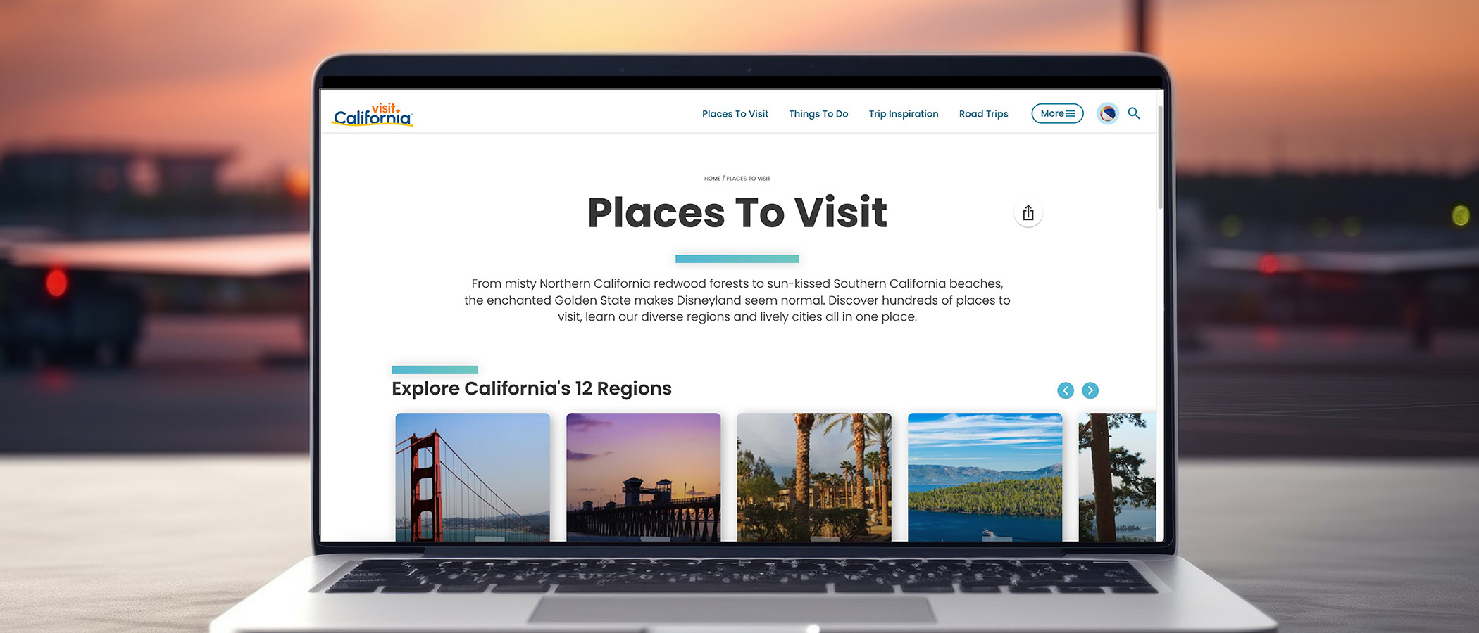
Nearly 270 million people visited California in 2023, many of whom were likely inspired by Visit California. The state’s official tourism website drives travel to and within the Golden State through engaging articles, trip inspiration, and tips from local Californians — but the site’s authoring experience presented several challenges. Oomph overhauled the site’s decoupled back-end and Gatsby front-end integration, so Visit California could continue delivering the content and creativity travelers love while transitioning to a content management experience and website build performance that kept up with their team.
THE BRIEF
Same Look, Better Build
Ordinarily, when we embark on rearchitecting a site, it happens as part of a complete front-end and back-end overhaul. This was a unique situation. Visit California users enjoyed the site’s design and helpful content features, so we did not want to disrupt that. At the same time, we needed to upgrade the frustrating back-end experience, look for broken templates, and find optimizations in content and media along the way.
An underperforming API (which functions like an information pipeline to move content from one part of the site to another) and bloated data/code resulted in sluggish site performance and slow content updates/deployments. If the Visit California team wanted to change a single sentence on the site, pushing it live took well over an hour, sometimes longer — and often the build failed. Poorly optimized images slowed the site down even further, especially for the mobile visitors who make up the majority of site traffic.
They were in dire need of a decoupled site connection overhaul so they could:
- Reduce time and effort spent on updating site content
- Implement a more reliable build process decreasing frustration and delays
- Create a better, faster browsing experience for users
THE APPROACH
Oomph started by looking under the hood — or, in this case, under the APIs. While APIs are supposed to make sites perform better, an outdated API was at the root of Visit California’s problem. Over the course of the project, Oomph integrated a new API, optimized images, and corrected bottlenecks across the site to make updates a breeze.
Putting Visit California in the Fast Lane
Implemented a New API
Visit California needed an API that could more quickly move data from the back end to the front. Two previous clients shared Visit California’s back-end architecture but used a modern JSON API Drupal module successfully. Switching from the GraphQL module to JSON API on the back end streamlined the amount of data, resulting in the team updating content or code in minutes instead of hours or days.
Streamlined Data During Deployments
On the front end, a Gatsby Source GraphQL plugin contributed to the issue by pulling and refreshing all data from the entire system with each content update. Oomph replaced the faulty plugin, which had known limitations and lacked support, with the Gatsby Source Drupal plugin. On the back end, the Gatsby Integration module was configured to work with JSON API to provide incremental builds — a process that pulls only updated content for faster deployments.
Avg. full build time
Unexplained failure rate Before
Avg. incremental build time
Unexplained failure rate After
Fixed Image Processing Bottlenecks
Because we were already in the code, both teams agreed this was a great opportunity to identify improvements to boost page performance. We found that image processing was a drag — the site previously processed images during deployment rather than processing them ahead of time on the back-end. Oomph used the JSON API Image Styles module to create image derivatives (copies) in different sizes, ultimately decreasing build times.
Lightened the Load on the Back-End
As Oomph configured the new architecture, we scoured the site for other opportunities to reduce cruft. Additional improvements included removing deprecated code and rewriting code responsible for creating front-end pages, eliminating static queries running thousands of times during page creation. We also resized large images and configured their Drupal site to set sizing guardrails for photos their team may add in the future.
Home page weight before and after:
| Page Weight | Before | After | % Change |
|---|---|---|---|
| Desktop | 25.41 MB | 3.61 MB | Down 85.79% |
| Mobile | 12.07 MB | 3.62 MB | Down 70.01% |
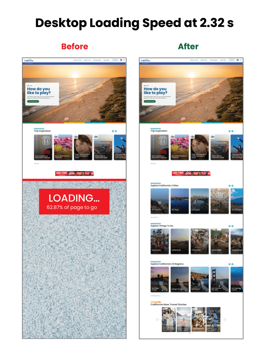
Visualizing the improvements to loading speed:

Core Web Vitals Improvements:
| Overall Score | First Contentful Paint | Largest Contentful Paint | Total Blocking Time | Cumulative Layout Shift | Speed Index | |
|---|---|---|---|---|---|---|
| Mobile before | 3 | 3.4s | 15.7s | 8980ms | 0.043s | 22.9s |
| Mobile after | 31 | 4.4s | 21.1s | 2140ms | 0.503s | 9.5s |
| CHANGE | +28 | +1s | +5.4 | -6840 ms | +0.43 | -13.4 |
| Desktop before | 38 | .9s | 4.5s | 1600ms | 0.043s | 3.9s |
| Desktop after | 63 | 1.2s | 4.5s | 420ms | 0.207s | 2.6s |
| CHANGE | +25 | +.3 s | 0 | -1180ms | +0.164 | -1.3 |
THE RESULTS
Exploring the Golden State, One Story at a Time
Once Oomph was done, the Visit California site looked the same, but the load times were significantly faster, making the site more easily accessible to users. By devising a strategy to pull the same data using completely different methods, Oomph created a streamlined deployment process that was night and day for the Visit California team.
The massive initiative involved 75,000 lines of code, 23 front-end templates, and plenty of collaboration, but the results were worth it: a noticeably faster site, a markedly less frustrating authoring experience, and page performance that would make any Californian proud.


