State of Rhode Island
Building a Scalable, Accessible, and High-Performance Digital Services Platform
view live site
category
Accessibility
Design & UI
Digital Engineering
Research & Strategy
User Experience
capability
Acquia
APIs
Design Systems
Drupal
Migration
Mobile & Responsive
Technical Architecture
industry
Municipalities & Government
Trust in government can be eroded quickly enough. Throw in a host of websites with out-of-date, inconsistent, and poorly structured information, and it’s even easier to lose the public’s confidence. To convey a clear and consistent “Voice of Truth,” the State of Rhode Island and its over 100 governmental agencies needed to modernize its fractured network of digital properties. By developing a bespoke design system, we provided the tools for them to deliver timely and informative content that reinforces constituents’ trust.
From code to launch
Sites launched within a year
Performance improvement
THE BRIEF
A Fractured System
With a network of websites mired in old, outdated platforms, Rhode Island was already struggling to serve the communication needs of government agencies and their constituents. And then the pandemic hit.
COVID accelerated the demand for better, faster communication and greater efficiency amid the rapidly changing pandemic. It also spotlighted an opportunity to create a new centralized information hub. What the government needed was a single, cohesive design system that would allow departments to quickly publish and manage their own content, leverage a common and accessible design language, and use a central notification system to push shared content across multiple sites.
With timely, coordinated news and notifications plus a visually unified set of websites, a new design system could turn the state’s fragmented digital network into a trusted resource, especially in a time of crisis.
THE APPROACH
Custom Tools Leveraging Site Factory
A key goal was being able to quickly provision sites to new or existing agencies. Using Drupal 9 (and updated to Drupal 10) and Acquia’s Site Factory, we gave the state the ability to stand up a new site in just minutes. Batch commands create the site and add it to necessary syndication services; authors can then log in and start creating their own content.
We also created a set of custom tools for the state agencies, to facilitate content migration and distribution. An asynchronous hub-and-spoke syndication system allows sites to share content in a hierarchical manner (from parent to child sites), while a migration helper scrapes existing sites to ensure content is properly migrated from a database source.
Introducing Quahog: A RI.gov Design System
For organizations needing agility and efficiency, composable technology makes it easier to quickly adapt digital platforms as needs and conditions change. We focused on building a comprehensive, component-based visual design system using a strategy of common typography, predefined color themes and built-in user preferences to reinforce accessibility and inclusivity.
The Purpose of the Design System
The new, bespoke design system had to support four key factors: accessibility, user preferences, variation within a family of themes, and speedy performance.
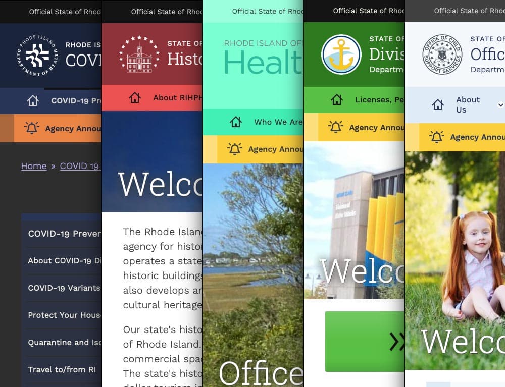
Multiple color themes
Site authors choose from five color themes, each supporting light and dark mode viewing. Every theme was rigorously tested to conform with WCAG AA (and sometimes AAA), with each theme based on a palette of 27 colors (including grays) and 12 transparent colors.
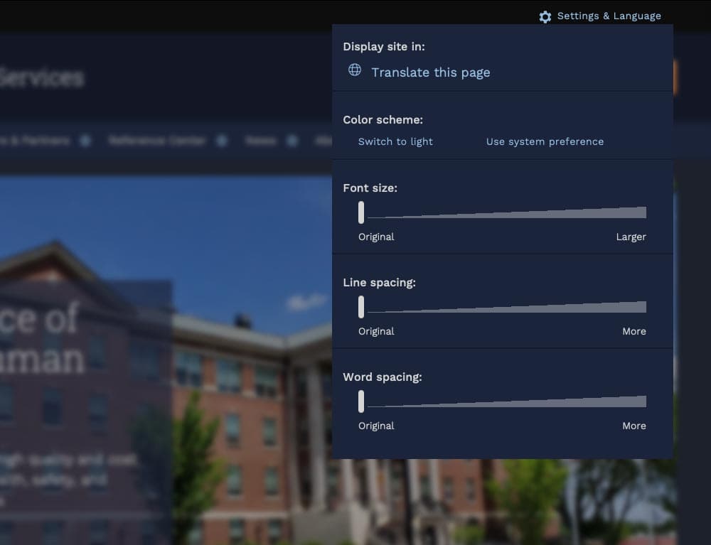
User preferences
Site visitors can toggle between light or dark mode or use their own system preference, along with adjusting font sizes, line height, word spacing, and default language.
Mobile first
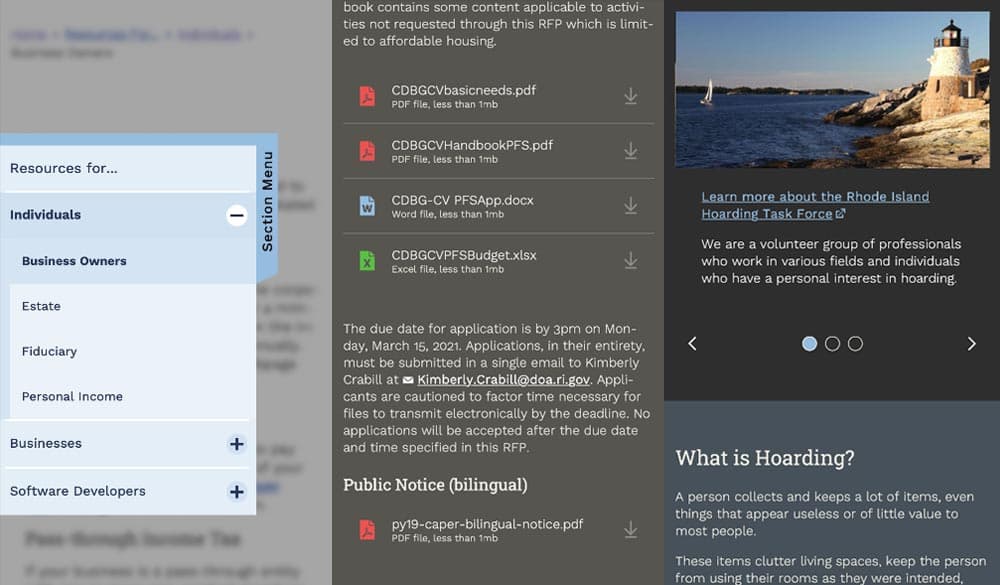
Knowing that many site visitors will be on mobile devices, each design component treats the mobile experience as a first-class counterpart to desktop.
Examples: The section menu sticks to the left side of the view port for easy access within sections; Downloads are clearly labelled with file type and human-readable file sizes in case someone has an unreliable network connection; galleries appear on mobile with any text labels stacked underneath and support swipe gestures, while the desktop version layers text over images and supports keyboard navigation.
High Accessibility
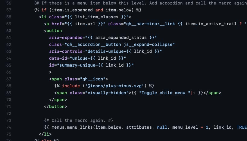
Every design pattern is accessible for screen readers and mobile devices. Color contrast, keyboard navigation, semantic labeling, and alt text enforcement all contribute to a highly accessible site. Extra labels and help text have been added to add context to actions, while also following best practices for use of ARIA attributes.
Performance aware
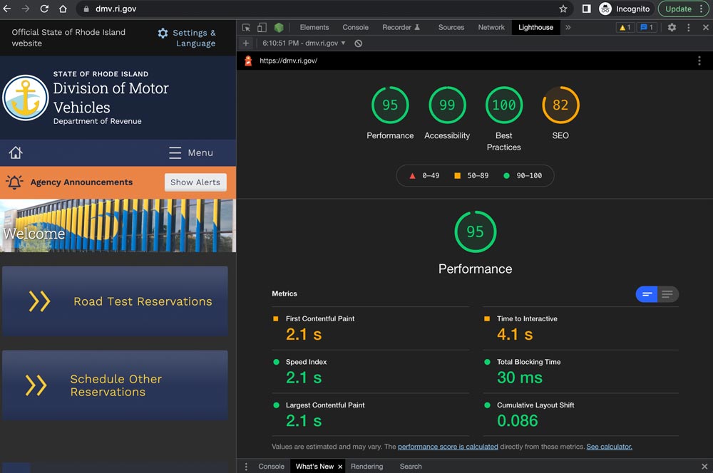
Each page is given a performance budget, so design components are built as lightly as possible, using the least amount of code and relying on the smallest visual asset file sizes possible.
THE RESULTS
Efficient and Effective Paths to Communication
The first sites to launch on the new system, including covid.ri.gov, went live four and a half months after the first line of code was written. A total of 15 new sites were launched within just 8 months, all showing a 3-4x improvement in speed and performance compared with previous versions.
Every site now meets accessibility guidelines when authors adhere to training and best practices, with Lighthouse accessibility and best practice scores consistently above 95%. This means the content is available to a larger, more diverse audience. In addition, a WAF/CDN provider increases content delivery speeds and prevents downtime or slowdowns due to attacks or event-driven traffic spikes.
State agencies have been universally pleased with the new system, especially because it provides authors with an improved framework for content creation. By working with a finite set of tested design patterns, authors can visualize, preview, and deploy timely and consistent content more efficiently and effectively.
We were always impressed with the Oomph team’s breadth of technical knowledge and welcomed their UX expertise, however, what stood out the most to me was the great synergy that our team developed. All team members were committed to a common goal to create an exceptional, citizen-centered resource that would go above and beyond the technical and design expectations of both agencies and residents .
ROBERT MARTIN ETSS Web Services Manager, State of Rhode Island
AWARDS & RECOGNITION


