One Percent for America
Empowering New Americans: A Trust-Driven Digital Platform for Affordable Citizenship Loans
view live site
category
Design & UI
Digital Engineering
Research & Strategy
User Experience
capability
Design Systems
Drupal
Microservices
Mobile & Responsive
Technical Architecture
User Research
industry
Environmental & Non-profits
Of the 9 million citizenship-eligible U.S. immigrants, as many as 8 million do not apply. The $500 to $1200 application fees force some turn to credit cards or other high interest options. This new online platform offers loans at 1% interest to cover citizenship application fees, as well as financial education, & community support. Crowd-funded and community supported, this project makes citizenship more attainable for millions of new Americans.
THE BRIEF
While One Percent for America (OPA) had an admirable goal of helping eligible immigrants become U.S. citizens, the project faced a major stumbling block. Many immigrants had already been misled by various lending institutions, payday loans, or high-interest credit cards. As a result, the OPA platform would need a sense of trustworthiness and authority to shine through.
The platform also had to handle a broad array of tasks through a complex set of workflows, backstops, and software integrations. These tasks included delivering content, signing up users, verifying eligibility, connecting to financial institutions, managing loan data and investment balances, and electronically sending funds to U.S. Citizenship and Immigration Services.
THE APPROACH
Given the challenges, our work began with a month-long discovery process, probing deeper into the audience, competitive landscape, customer journeys, and technological requirements for the platform. Here’s what we learned.

The Borrower Experience
Among those deep in the citizenship process and close to finishing the paperwork, many are simply waiting to have the funds to conclude their journey. For them, we designed as simple a workflow as possible to create an account, pass a security check, and apply for a loan.
Other users who are just starting the process need to understand whether they’re eligible for citizenship and what the process entails. We knew this would require smart, in-depth content to answer their questions and provide guidance — which was also a crucial component in earning their trust. Giving away genuinely helpful information, combined with carefully chosen language and photography, helped lend authenticity to OPA’s stated mission.
The Investor Experience
OPA sought to crowdfund capital from small investors, not institutions, creating a community-led funding source that could scale to meet borrowers’ needs. A key innovation is that funders can choose between two options: making tax-deductible donations or short-term loans.
If an investor makes a loan, at the end of the term they can decide to reinvest for another term, turn the money into a donation, or withdraw the funds. To reinforce the circular nature of the platform, we designed the experience so that borrowers could become investors themselves. The platform makes it easy for borrowers to change their intent and access different tools. Maturity dates are prominently displayed alongside “Lend Again” and “Donate” actions. Testimonials from borrowers on the dashboard reinforce the kinds of people who are helped by an investment.
The Mobile Experience
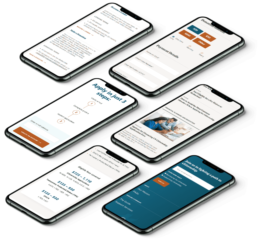
Our research made it clear the mobile experience had to be best in class, as many users would either prefer using a phone or didn’t have regular access to a tablet or computer. But, that didn’t mean creating a mobile app in addition to a desktop website. Instead, by designing a universal web app, we built a more robust experience — more powerful than most mobile apps — that can be used anywhere, on any device.
However, tasks like signing up for an account or applying for a loan need to be as easy on a mobile device as on a desktop. Key UX elements like step-by-step workflows, large touch targets, generous spacing on form fields, soft colors, and easy-to-read fonts produced a highly user-friendly interface.
THE RESULTS
Together with our technology partners, Craftsman, Motionpoint, and Platform.sh, we built an innovative digital platform that meets its users exactly where they are, from both a technological and cultural standpoint.
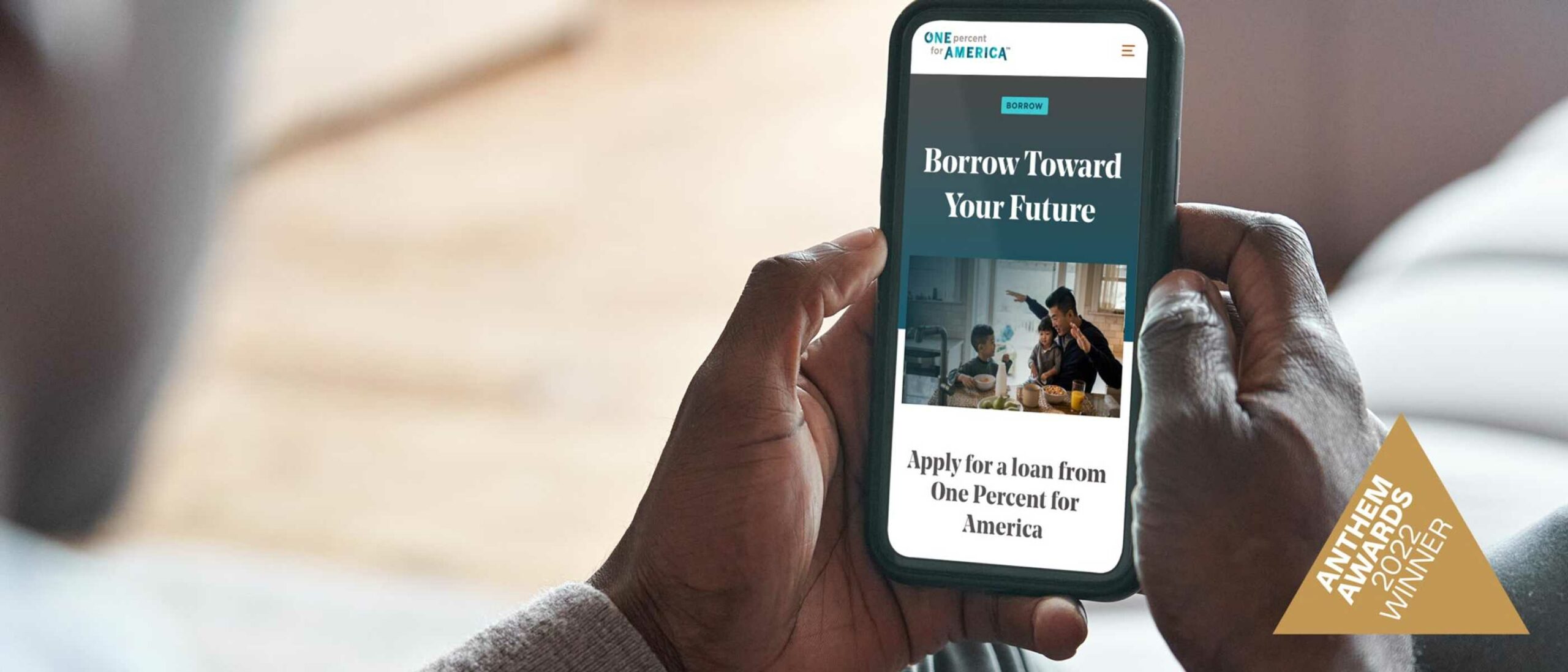
This groundbreaking work earned us a Gold Medal from the inaugural 2022 Anthem Awards, in the Innovation in Human and Civil Rights category. The award recognizes new techniques and services that advance communities and boost contributory funds.
In our ongoing partnership with OPA, Oomph will continue working to expand the business model with new features. We’re proud to have helped build this impactful resource to support the community of new Americans.
AWARDS & RECOGNITION


