
Contentful is no longer just an alternative CMS—it’s become a foundational platform for organizations navigating complexity, regulation, and rapid digital change. In 2026, the question isn’t what is Contentful? It’s why are so many organizations rebuilding their digital ecosystems around it? The answer lies in how digital experiences are built, managed, and scaled today.
Contentful Is Built for Systems, Not Pages
Traditional CMS platforms were designed around pages and templates. That model breaks down when content needs to move faster, live in more places, and remain consistent across teams and channels.
Contentful takes a different approach. It treats content as structured data, not static pages. That means teams create content once and deliver it anywhere—websites, apps, portals, email, or future channels that don’t yet exist.
In 2026, this isn’t a “nice to have.” It’s how modern digital platforms operate.
Composable Architecture Is Now the Default
Composable architecture has moved from trend to standard. Organizations want the freedom to choose best-in-class tools without being locked into monolithic platforms.
Contentful fits cleanly into this model. It integrates with design systems, analytics platforms, personalization tools, consent managers, and AI services through APIs—without forcing teams into rigid workflows.
This flexibility allows organizations to evolve their stack over time instead of rebuilding every few years.
AI Depends on Structured Content
AI-driven experiences are only as good as the content behind them. In 2026, organizations are using AI to support personalization, search, localization, content optimization, and automation.
Contentful’s structured content model makes this possible. Clean, well-defined content enables AI tools to understand, reuse, and adapt content accurately—without introducing risk or inconsistency.
For teams exploring AI responsibly, Contentful provides the infrastructure needed to scale with confidence.
Governance and Compliance Are Built In, Not Bolted On
For regulated and mission-driven organizations, governance isn’t optional. Publishing controls, audit trails, permissions, and review workflows are essential.
Contentful supports these needs at scale. Teams can define roles, control who edits or publishes content, and maintain visibility into changes across environments. This level of governance is critical in industries like healthcare, legal, finance, and the public sector.
In 2026, compliance isn’t something teams add later—it’s designed into the platform from day one.
Marketing and Development Work Better Together
One of Contentful’s biggest advantages is how it aligns marketing and engineering teams. Developers maintain design systems and integrations. Content teams manage content without breaking layouts or workflows.
This separation of concerns reduces friction, speeds up delivery, and minimizes production errors—especially as digital ecosystems grow more complex.
Ready to explore what Contentful could do for your organization? Whether you’re evaluating platforms, planning a migration, or looking to optimize your current setup, Oomph can help you build a content infrastructure designed for the long term. Let’s talk about your next move.

Why Organizations Move to Contentful Now
Organizations typically migrate to Contentful when legacy systems start holding them back. Common triggers include:
- Slow publishing workflows
- Heavy developer dependency
- Difficulty scaling across channels
- Growing compliance requirements
- The need to support AI and personalization
In 2026, Contentful isn’t chosen because it’s new. It’s chosen because it’s resilient.
For organizations new to the platform, getting started doesn’t have to mean a complete rebuild. Oomph’s Contentful Kickstart Package helps teams move from decision to deployment with a structured, low-risk approach—giving you the foundation to scale as your needs evolve.
The Takeaway
Contentful has evolved alongside the modern digital landscape. It’s not just a CMS—it’s a content platform designed for scale, governance, and change.
For organizations planning beyond their next website launch and toward long-term digital maturity, Contentful provides the flexibility and confidence needed to move forward.
Ready to explore what Contentful could do for your organization? Whether you’re evaluating platforms, planning a migration, or looking to optimize your current setup, Oomph can help you build a content infrastructure designed for the long term. Let’s talk about your next move.
For many organizations, privacy regulations like GDPR and CCPA seem like distant legal concerns rather than operational priorities. In practice, however, websites serve as the primary point of data collection—making compliance far more relevant than most teams assume. If your site collects user data in any form, privacy compliance isn’t optional.
Understanding When GDPR and CCPA Apply
GDPR governs the collection of personal data from users in the European Union, while CCPA applies to personal data collected from California residents.
Crucially, these regulations are triggered by user location, not company headquarters. A U.S.-based organization serving a global audience may be subject to both frameworks.
Why Websites Are at the Center of Compliance
Most modern websites collect data through multiple channels:
- Contact and intake forms
- Newsletter subscriptions
- Analytics and tracking tools
- Cookies and personalization technologies
- Third-party embeds and integrations
Each of these collection points creates compliance obligations around consent, transparency, and user control.
Moving Beyond Cookie Banners
Meaningful compliance extends well beyond footer disclaimers. Effective privacy management requires:
- Clear consent and opt-out mechanisms
- Transparent communication about data usage
- The ability to update policies efficiently
- Controlled publishing workflows
- Comprehensive auditability for content and data modifications
Legacy CMS platforms frequently lack the flexibility and governance capabilities needed to meet these requirements.
The Role of Your CMS in Privacy Compliance
Your content management system is instrumental in supporting privacy obligations. A modern, composable CMS enables organizations to:
- Decouple content from data logic
- Integrate consent and privacy tools seamlessly
- Manage access and publishing permissions effectively
- Deploy compliance updates across all channels instantly
- Minimize risk by limiting unnecessary data exposure
For regulated and mission-driven organizations, CMS limitations can translate directly into compliance vulnerabilities.
The Cost of Non-Compliance
While regulatory penalties are a concern, the greater risk lies in eroding user trust.
Today’s users expect transparency and control over their personal information. Organizations unable to deliver on these expectations risk damaging their reputation with customers, donors, and partners.
Final Thoughts
GDPR and CCPA represent more than legal obligations—they present fundamental digital experience challenges. Websites built on flexible, compliance-ready platforms are better positioned to adapt as privacy expectations continue to evolve.
In today’s environment, privacy compliance shouldn’t be viewed as a constraint. It’s an essential component of delivering a modern, trustworthy digital experience.
Need help ensuring your website meets modern privacy standards? Our team specializes in building compliance-ready digital platforms that protect your users and your organization. Let’s discuss your requirements.
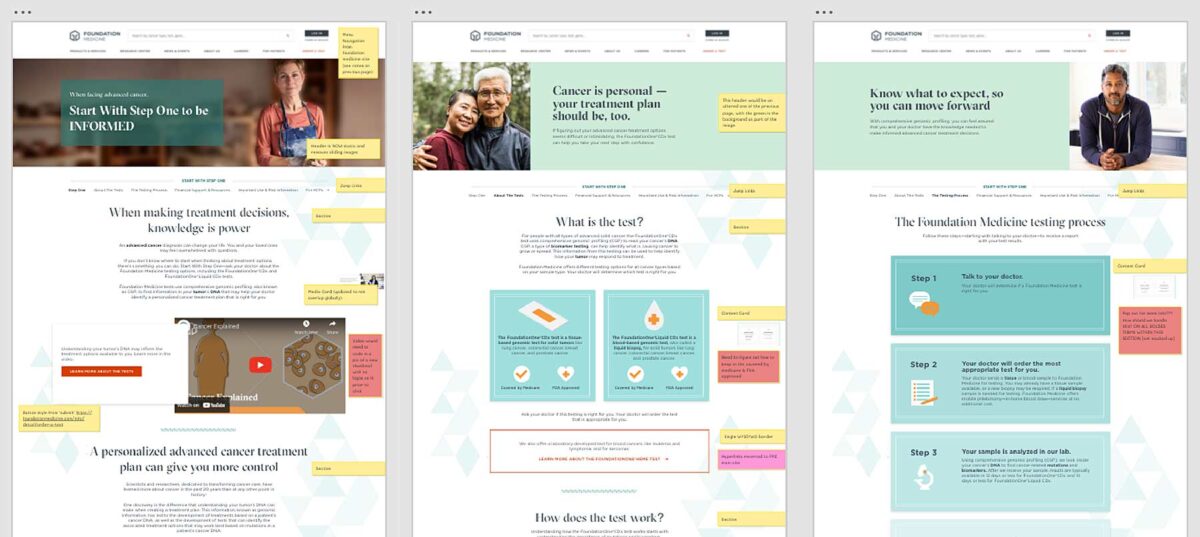
The Brief
Less can be Much More
The previous Foundation Medicine (FMI) team built their marketing platform on a decoupled content management architecture. Oomph has used decoupled and micro-service architecture for projects such as Leica Geosystems and Wingspans.
But decoupled is not right for every organization, and a decoupled approach can be architected in many different ways. FMI had found their implementation created more headaches than high-fives:
- The flat hierarchy of Contentful created 158 content types, most of which were not useful for creating content.* Therefore, authors had to sift through long lists to find the actual content they needed to edit or create.
- Not everything in their front-end templates was accessible through the CMS. (That would have created even more content types!) So the team was beholden to an engineer to make text edits within some areas.
- Previewing new pages before publishing was not added to their implementation. Authors struggled to predict how content in the admin would display as the published page, and spent much time toggling back and forth.
In short, publishing new content or making content edits was too slow. Responding quickly to changing market conditions or new announcements in the cancer treatment space was not possible, eroding reliance and trust in what should be a cutting-edge brand.
* It should be noted that Contentful uses a “Content Type” for almost everything, from content to taxonomy to design components.
The Approach
Moving away from Decoupled
Based on their current pain points, Oomph verified that switching to a traditional “monolithic” architecture would solve their problems and provide additional benefits:
- Reduce cognitive overload and maintenance overhead by drastically reducing content types
- Empower authors to update all content anywhere
- Accelerate content publishing with an accurate visual preview
Oomph completed an extensive audit and reduced content types from 158 down to 30. We created a tight, flexible system in Drupal of just 14 content types — news item, event page, product page, etc. — and 16 design components — text blocks, accordions, etc.
How did we achieve such a reduction? Our consolidation approach moved from fewer specific options (one thing for a small number of very specific pieces of content) to flexibility within general ones (one thing to support many pieces of content with specific options).
Retaining Key Functionality
Foundation Medicine exists to help people with cancer and those who treat them. To accomplish this, the website features intricate tools for providers to navigate essential cancer resources and patients to find a specialist. None of these tools were compromised by switching to Drupal. In fact, with efficiency gains and more timely content governance, these resources became more valuable.
The Results
Connecting Providers with Genomic Data and Patients with Personalized Care
The upgrade to Foundation Medicine’s digital platform has been invisible by design. The brand and the visuals were performing well for their business and were comfortable for their audience. The outward appearance didn’t need an update, but the internal workflows that support continued trust certainly did.
The Foundation Medicine team now has the autonomy to make content updates quickly, the architecture and design components to confidently curate each page build, and the infrastructure to create clear and consistent content — a win for the team and for the many people who turn to Foundation Medicine in their time of need.
Page Views
Scroll Depth
User Engagement
In recent months, Generative Engine Optimization (GEO) has been gaining attention, often positioned as the next evolution beyond traditional Search Engine Optimization (SEO). For some clients, this presents an exciting opportunity to rethink and restructure their digital content. For others, it can feel overwhelming, raising more questions than answers. As AI-powered search tools like ChatGPT, Perplexity, and Gemini change how people discover content online, clients increasingly ask: What is GEO, and how can we prepare our sites for it?
The following handy Q&A guide aims to demystify Generative Engine Optimization (GEO), explain why it matters, and provide practical steps your team can take to get started.
Q: What is GEO and how is it different from SEO?
A: GEO stands for Generative Engine Optimization. While SEO (Search Engine Optimization) focuses on getting your content to rank in traditional search engines like Google (via keywords, backlinks, and site performance), GEO focuses on getting your content mentioned, referenced, summarized, or cited in AI-generated answers from tools like ChatGPT, Gemini, and Perplexity.
Think of SEO as getting your content listed, whereas GEO is about making your brand and its content the answer.
Q: Why should my organization care about GEO?
A: AI platforms are rapidly becoming the first stop for users looking for answers, especially younger audiences and professionals. If an answer appears via Gemini on the top of a Google search, fewer people may scroll further down the page to look for other sources. They got the answer they needed from just one search. If your content isn’t optimized for these tools, you’re missing out on certain traffic data, visibility, and an opportunity to build trust.
In 2026, ChatGPT alone sees over 4.5 billion visits per month, and Perplexity handles nearly 500 million monthly queries.
Q: How is GEO impacting my site’s analytics?
A: Likely a lot. Generative engines often summarize content without requiring a click. That means you may see fewer impressions and clicks, even if your content is powering the AI’s answer. Most websites are seeing direct traffic declining across the board. With that said, users who do click through to sites are often engaging more deeply, leading to longer session durations and higher conversion rates.
Because of this, it’s crucial to learn these new patterns and recognize them within your site’s analytics by setting up new reports.
Q: How do AI engines choose which content to cite?
A: AI tools evaluate a number of factors, with the most important being:
- Authority: Are you a trusted source? Do you have backlinks, credentials, or media citations?
- Structure: Do you use schema markup, headings, and clear Q&A formatting?
- Freshness: Is your content updated regularly?
- Relevance: Does your content align with how users ask questions in natural language?
Each tool has its own algorithm, but clear, factual, structured content with recent updates from trusted sources performs best.
Q: What kind of content works best for GEO?
A: Content that answers questions directly, especially with a conversational tone, tends to work well. Additionally, you want your content to explain not just the what, but also the why and how, since generative engines often expand on user intent. Content structures that perform well for GEO include:
- Q&A sections
- “Top” or “Best” lists (Examples: Top Restaurants in Providence, Rhode Island or Best fall events in California)
- Evergreen guides that are updated annually
- Content that is organized for machines and humans (aka clear headings, mobile-friendly, structured data and metadata)
Q: How can we tell if our content is being featured in AI tools?
A: While most AI platforms don’t yet provide native analytics, you can track GEO success through:
- GA4 segmentation: Filter referral traffic by sources like chat.openai.com or perplexity.ai
- Landing page patterns: AI-driven referrals often land users deep into your site (e.g., specific blogs, not just the homepage)
- Google Search Console: Look for queries with high impressions but low click-through rates, these may indicate your content is being shown in AI Overviews
- Manual Testing: In an incognito window, search for the types of queries you want your site’s content to appear for and see what answers are returned. These might be simple questions like “What does [your organization] do?” or more in-depth research questions that your popular articles have addressed.
- Third Party Tools: As the field continues to develop, more third party tools are becoming available or adapting their analytics to provide insight into GEO success. SEMrush in particular is a tool that we recommend for clients interested in uncovering more data.
Q: Is there a way to make our site more “AI-friendly”?
A: Yes! Here are key GEO best practices:
- Use schema markup: Help AI models understand your content’s structure and intent. You can use schema.org to help guide you through improving your site’s markup.
- Write in a Q&A or conversational format: More people are asking full questions or prompts in ChatGPT—rather than just listing keywords. Match your content with how users phrase queries in AI tools.
- Optimize your About page: Make sure that your About page is thoughtfully written to answer who you are, what you do, and why. ChatGPT, for example, pulls from these pages to assess trustworthiness and authority.
- Refresh content: Update existing articles with new data and a clear structure (aka headings, bullets, FAQ sections, summaries). Note: You don’t need to create new URLs, just refresh the content to make sure it is relevant and current for today.
- Include citations and data points: Wherever possible, add data and sources. These increase your authority and credibility.
Q: Do we need to optimize differently for each AI tool?
A: The core strategies (trustworthiness, schema, natural language, performant) apply across all platforms, but there are nuances:
- Gemini: Heavily tied to Google’s ecosystem. Focus on crawlability and Core Web Vitals.
- Perplexity: Prefers cited, factual content and uses real-time web data.
- ChatGPT: Draws from authoritative sources like Wikipedia, news outlets, and Reddit. Strong personalization and structured content help here.
Q: Can we block AI tools from using our content?
A: Yes, but be thoughtful about what you are blocking. Adding a file like robots.txt can block AI crawlers, but doing so may reduce your visibility and lead to attribution from AI tools. It could also block legitimate crawlers and thus negatively impact both SEO and GEO, so be thoughtful about how you compose and format that file.
Note: If your brand has legal or content ownership concerns, we can help you assess what should or shouldn’t be available for AI training or citation.
Q: Do AI Tools honor authenticated access?
A: Yes, but remain mindful. Models like ChatGPT can’t “log in” or bypass authentication. If full research content is only available behind a user login, it won’t be included in training data or scraped summaries. But still pay attention to how content is displayed. If your research is behind a login or subscription paywall, ensure that:
- No full-text content is available to crawlers
- Abstracts or summaries shown publicly are limited in detail
Q: What is llms.txt and should I add it to my site?
A: llms.txt is a proposed convention for websites to provide a lightweight, machine- & human-readable summary (in Markdown) of the “important” parts of the site, to help large language models (LLMs) more easily crawl, interpret, and use content. More sites are starting to add it to their sites to help guide which pages AI should pay attention to. However, it is not yet a universally supported or enforced standard. Many LLMs or AI platforms do not currently yet automatically look for or honor llms.txt. As of now, you can think of it as a nice-to-have, not a requirement.
Q: How often should we update content for GEO?
A: Best practice recommends updating at least once a year for evergreen content. Prioritize updates for:
- Posts using phrases like “top,” “best,” or “recommended”
- Pages that receive seasonal traffic or include stats
- Key content that’s losing impressions or traffic in Google Search Console
Even simple updates like reordering information, adding new facts, or improving layout can go a long way with AI engines.
Q: Is GEO just another passing trend?
A: Not at all. GEO is a direct response to how AI is changing digital search and content discovery. Platforms like Google are rethinking their search experience through tools like Gemini, as more people turn to these tools for answers. GEO is how brands stay visible in this new AI landscape.
Q: What’s the first step we should take for GEO Optimization?
A: Start with a content and schema audit of your top-performing pages. From there, apply structured markup, rewrite headlines for clarity, add Q&A sections where applicable, and refresh key posts. A phased approach focused on high-value content will have the biggest immediate impact.
Need help figuring out what content to prioritize for GEO? Our team at Oomph can assess your current visibility and build a roadmap tailored to AI performance.
For more insights into GEO optimization, read…
- Everything You Should Know About Optimizing for GEO in 2026
- How LLMs Index Your Site — and How Accessibility Improves Their Answers and Your GEO
Generative Engine Optimization (GEO) is making organizations scramble — our clients have been asking “Are we ready for the new ways LLMs crawl, index, and return content to users? Does our site support evolving GEO best practices? What can we do to boost results and citations?”
Large language models (LLMs) and the services that power AI summaries don’t “think” like humans but they do perform similar actions. They seek content, split it into memorable chunks, and rank the chunks for trust and accuracy. If pages use semantic HTML, include facts and cite sources, and include structured metadata, AI crawlers and retrieval systems will find, store, and reproduce content accurately. That improves your chance of being cited correctly in AI overviews.
While GEO has disrupted the way people use search engines, the fundamentals of SEO and digital accessibility continue to be strong indicators of content performance in LLM search results. Making content understandable, usable, and memorable for humans also has benefits for LLMs and GEO.
How LLM systems (and AI-driven overviews) get their facts
Understanding how LLMs crawl, process, and retrieve web content helps us understand why semantic structure and accessibility best practices have a positive effect. When an AI system generates an answer that cites the web, several distinct back-end steps usually happen:
- Crawling — Bots visit URLs and download page content. Some crawlers execute javascript like a browser (Googlebot) while others prefer raw HTML and limit their rendering.
- Chunking — Large documents are split into small, logical “chunks” of paragraphs, sections, or other units. These chunks are the pieces that are later retrieved for an answer. How a page’s content is structured with headings, paragraphs, and lists determines the likely chunk boundaries for storage.
- Vectorization — Each chunk is then converted into a numeric vector that captures its semantic meaning. These embeddings live in a vector database and enable systems to find chunks quickly. The quality of the vector depends on the clarity of the chunk’s text.
- Indexing — Systems will store additional metadata (URL, title, headings, metadata) to filter and rank results. Structured data like schema metadata is especially valuable.
- Retrieval — A user asks a question or performs a search and the system retrieves the most semantically similar chunks via a vector search. It re-ranks those chunks using metadata and other signals and then composes its answer while citing sources (sometimes).
The Case for Human-Accessible Content
There are many more reasons why digital accessibility is simply the right thing to do. It turns out that in addition to boosting SEO, accessibility best practices help LLMs crawl, chunk, store, and retrieve content more accurately.
During retrieval, small errors like missing text, ambiguous links, or poor heading order can fail to expose the best chunks. Let’s dive into how this can happen and what common accessibility pitfalls contribute to the confusion.
For Content Teams — Authors, Writers, Editors
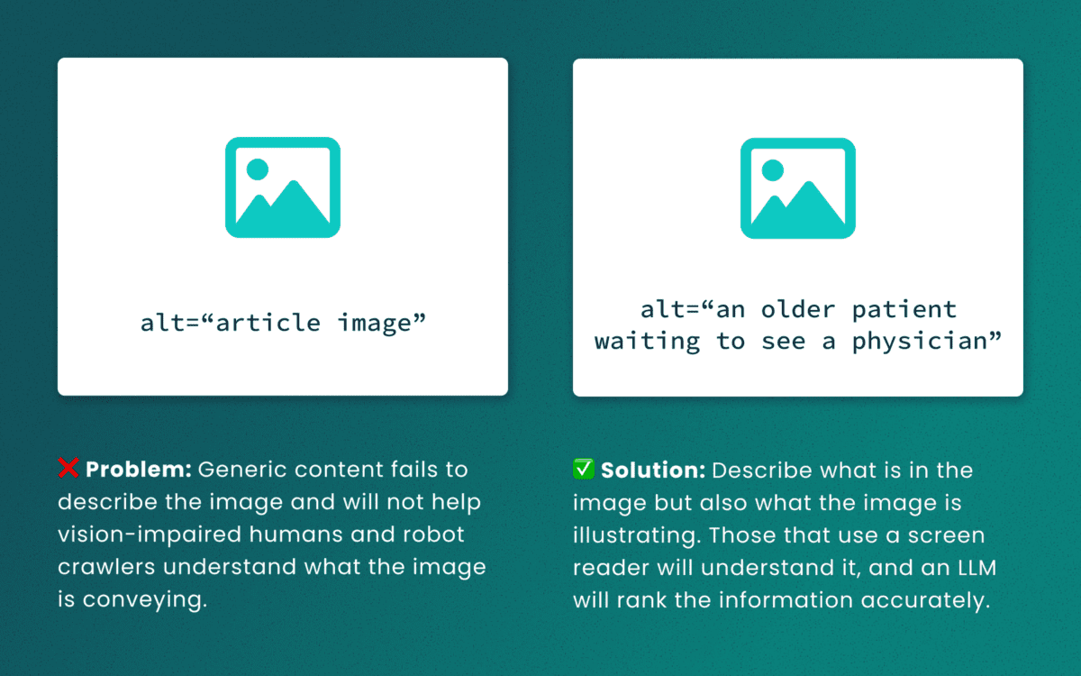
Lack of descriptive “alt” text
While some LLMs can employ machine-vision techniques to “see” images as a human would, descriptive alt text verifies what they are seeing and the context in which the image is relevant. The same best practices for describing images for people will help LLMs accurately understand the content.
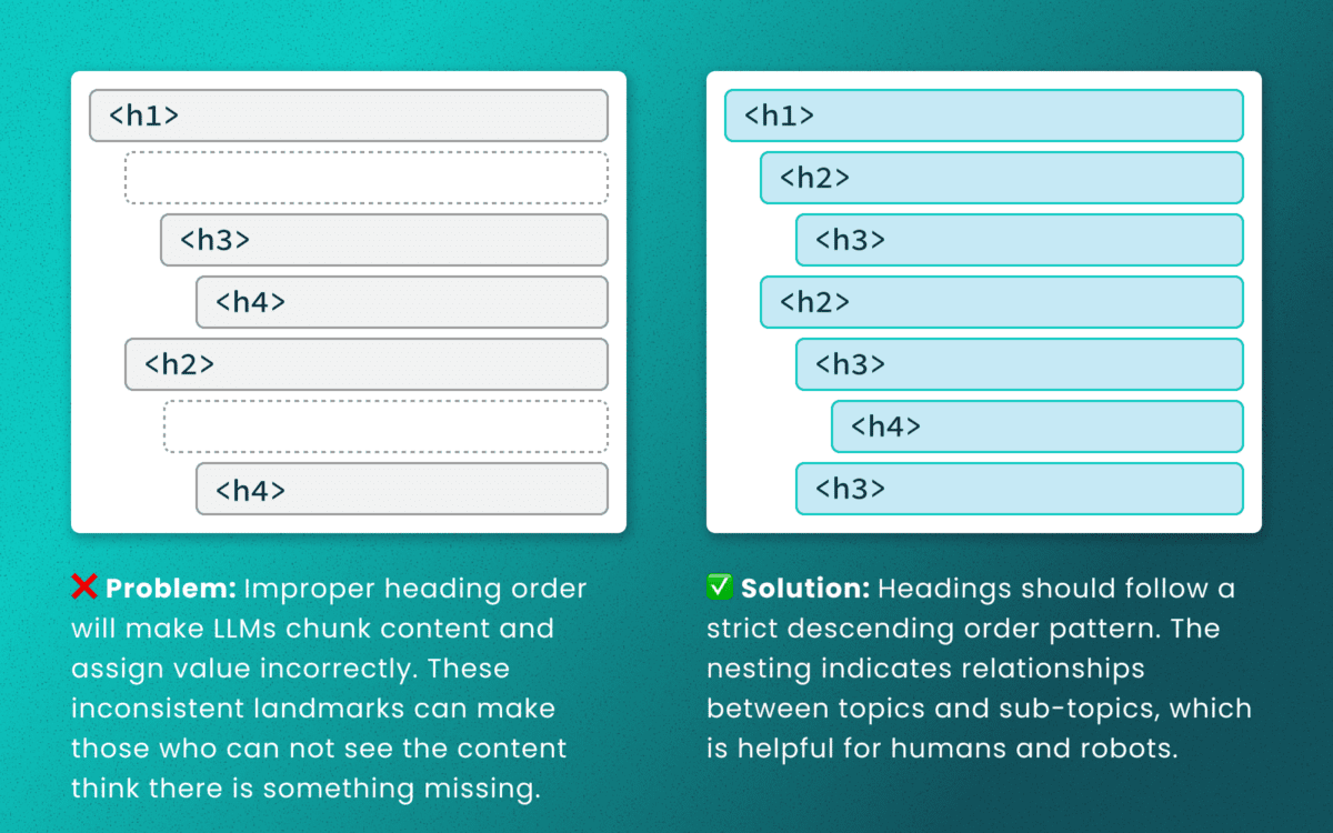
Out-of-order heading structures
Similar to semantic HTML, headings provide a clear outline of a page. Machines (and screen readers!) use heading structure to understand hierarchy and context. When a heading level skips from an <h2> to an <h4>, an LLM may fail to determine the proper relationship between content chunks. During retrieval, the model’s understanding is dictated by the flawed structure, not the content’s intrinsic importance. (Source: research thesis PDF, “Investigating Large Language Models ability to evaluate heading-related accessibility barriers”)
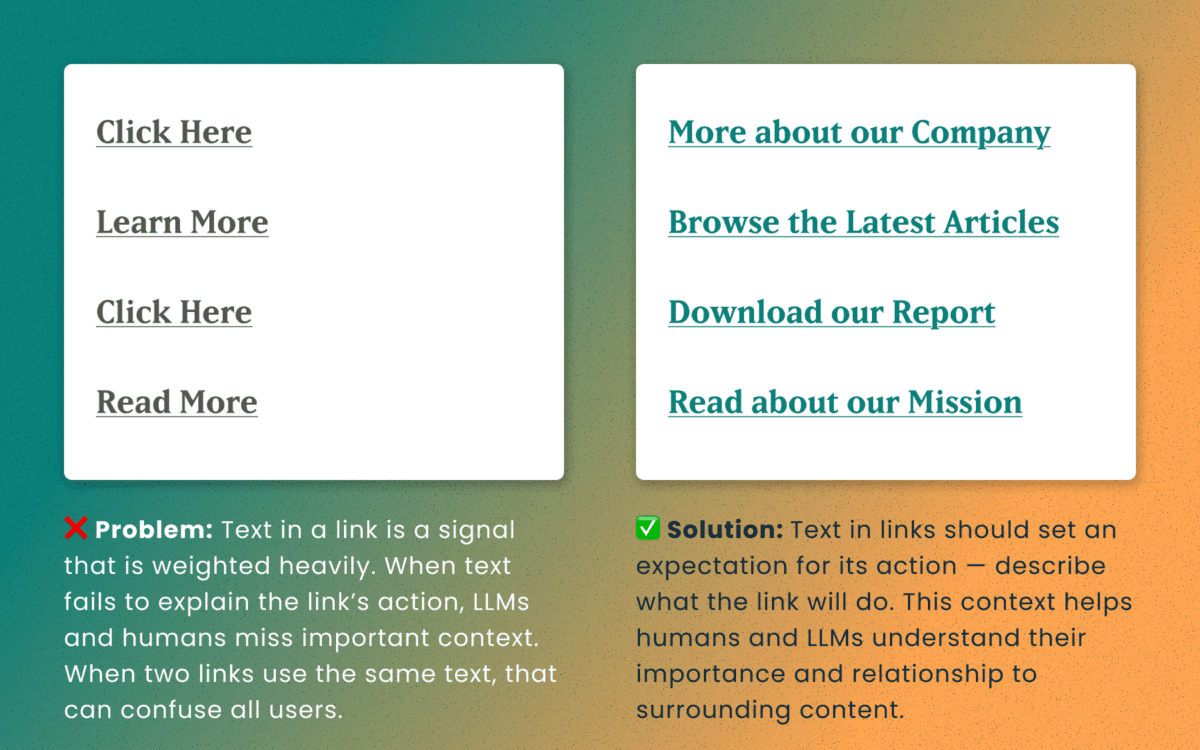
Descriptive and unique links
All of the accessibility barriers surrounding poor link practices affect how LLMs evaluate their importance. Link text is a short textual signal that is vectorized to make proper retrieval possible. Vague link text like “Click here” or “Learn More” does not provide valuable signals. In fact, the same “Learn More” text multiple times on a page can dilute the signals for the URLs they point to.
Using the same link text for more than one destination URLs creates a knowledge conflict. Like people, an LLM is subject to “anchoring bias,” which means it is likely to overweight the first link it processes and underweight or ignore the second, since they both have the same text signal.
Example of the duplicate link problem: <a href=“[URL-A]”>Duplicate Link Text</a>, and then later in the same article, <a href=“[URL-B]”>Duplicate Link Text</a>. Conversely, when the same URL is used more than once on a page, the same link text should be repeated exactly.
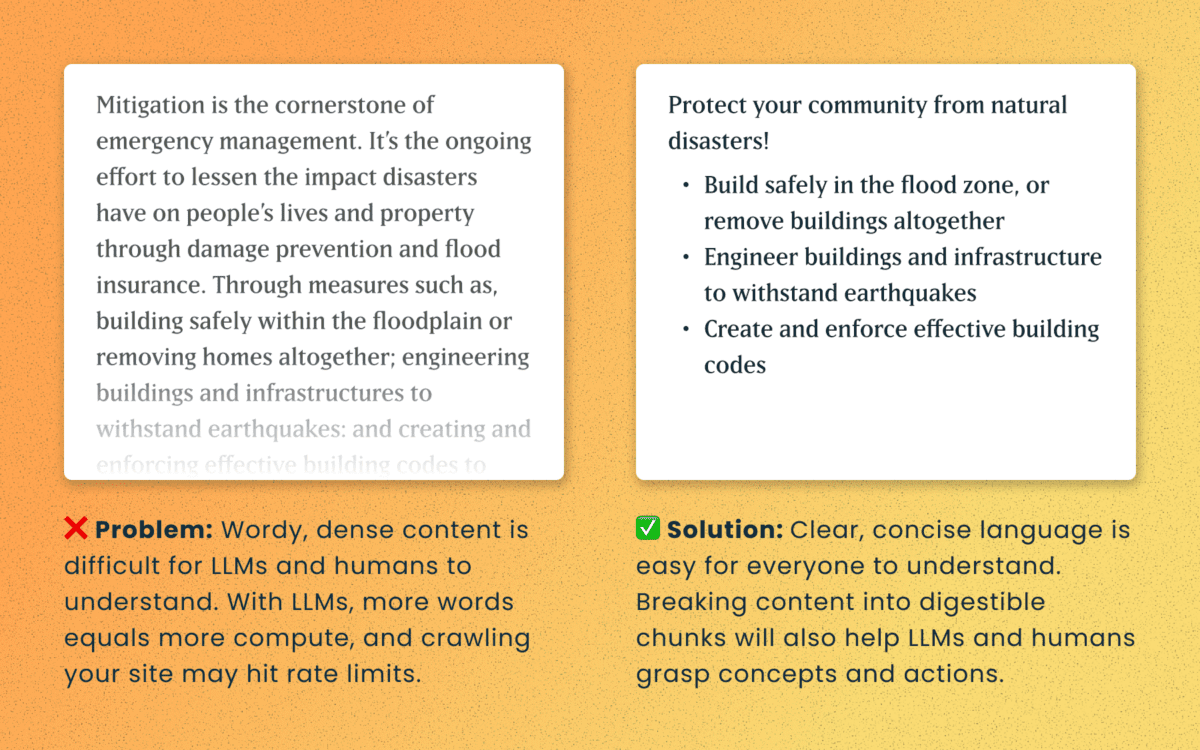
Logical order and readable content
Simple, direct sentences (one fact per sentence) produce cleaner embeddings for LLM retrieval. Human accessibility best practices of plain language and clear structure are the same practices that improve chunking and indexing for LLMs
For Technical Teams — IT, Developers, Engineers
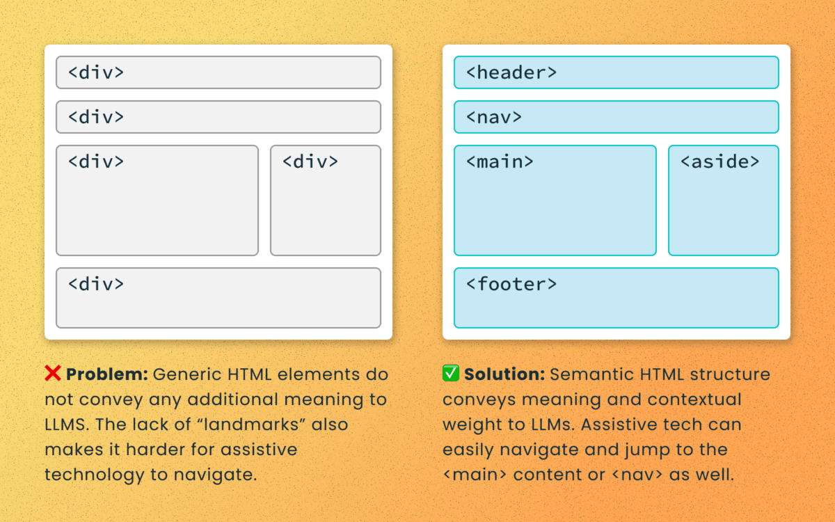
Poorly structured semantic HTML
Semantic elements (<article>, <nav>, <main>, <h1>, etc.) add context and suggest relative ranking weight. They make content boundaries explicit, which helps retrieval systems isolate your content from less important elements like ad slots or lists of related articles.
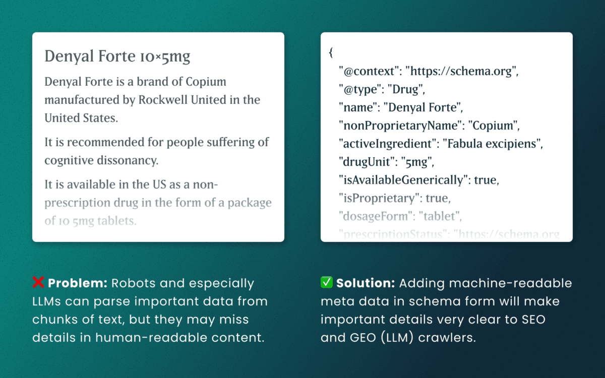
Lack of schema
This is technical and under the hood of your human-readable content. Machines love additional context and structured schema data is how facts are declared in code — product names, prices, event dates, authors, etc. Search engines have used schema for rich results and LLMs are no different. Right now, server-rendered schema data will guarantee the widest visibility, as not all crawlers execute client-side Javascript completely.
How to make accessibility even more actionable
The work of digital accessibility is often pushed to the bottom of the priority list. But once again, there are additional ways to frame this work as high value. While this work is beneficial for SEO, our recent research uncovers that it continues to be impactful in the new and evolving world of GEO.
If you need to frame an argument to those that control the investments of time and money, some talking points are:
- Accurate brand representation — Poor accessibility hides facts from LLMs. When customers ask an AI assistant for “best X for Y,” your content may not be shown — or worse, misrepresented. Fixing accessibility reduces brand risk and increases content authority.
- Engagement boost — Improvements that increase accurate citations and AI visibility can increase referral traffic, feature mentions, and lead quality. In a landscape where AI Answers are reducing click-through rates, keeping the traffic you have on your site for longer and building brand trust becomes vital.
- Increased exposure — Digital inclusion makes your content widely accessible to machines and the machines that assist humans. Think about a search engine as another human-assistive device, just like a keyboard or screen reader.
- Multi-pronged benefits — Accessibility improvement improves traditional SEO, can benefit mobile performance, and reduces the risks associated with accessibility compliance policies.
Staying steady in the storm
Let’s be clear — this summer was a “generative AI search freak out.” Content teams have scrambled to get smart about LLM-powered search quickly while search providers rolled out new tools and updates weekly. It’s been a tough ride in a rough sea of constant change.
To counter all that, know that the fundamentals are still strong. If your team has been using accessibility as a measure for content effectiveness and SEO discoverability, don’t stop now. If you haven’t yet started, this is one more reason to apply these principles tomorrow.
If you continue to have questions within this rapidly evolving landscape, talk to us about your questions around SEO, GEO, content strategy, and accessibility conformance. Ask about our training and documentation available for content teams.
Additional Reading
- AHREFs.com: Is SEO Dead? Real Data vs. Internet Hysteria
- SearchEngineJournal.com: How LLMs Interpret Content: How To Structure Information For AI Search
- InclusionHub.com: SEO and Web Accessibility: What You Need to Know (from 2020, but still relevant)
One question we frequently hear from clients, especially those managing web content, is “How can we implement accessibility best practices without breaking the bank or overwhelming our editorial team?”
It’s a valid concern. As a content editor, you’re navigating the daily challenge of maintaining quality while meeting deadlines and managing competing priorities.
When your team decides to prioritize website accessibility, the initial scope can feel daunting. You might wonder “Does this really make a difference?” or “Is remediation worth the effort?” The answer is always a resounding yes.
Whether you’re working on a small site or managing thousands of pages, accessible content improves user experience, ensures legal compliance, boosts SEO performance, and reinforces your brand as inclusive and responsible. As a content editor, you have the power to make steady, meaningful progress with the content you touch every day.
Why Accessibility Creates Business Impact
Accessible content delivers measurable outcomes across multiple business objectives:
Expanded Market Reach: When your content is inaccessible to users with disabilities, you’re limiting your potential audience. Consider that disabilities can be temporary, like a broken arm, and 70% of seniors are now online—a demographic that often benefits from accessible design principles.
Risk Mitigation: Inaccessible websites can lead to legal complaints under the ADA and other regulations, creating both financial and reputational risks.
Enhanced User Experience: Clear structure, descriptive alt text, and keyboard-friendly navigation improve usability for all users while boosting SEO performance.
Brand Differentiation: Demonstrating commitment to accessibility positions your organization as inclusive and socially responsible.
Implementing Accessibility in Your Editorial Workflow
The challenge isn’t whether to implement accessibility—it’s how to do it efficiently without overwhelming your team or budget.
The Fix-It-Forward Approach
Rather than attempting to overhaul your entire site overnight, we recommend a “fix-it-forward” strategy. This approach ensures all new and updated content meets accessibility standards while gradually improving legacy content. The result? Steady progress without resource strain.
Leverage Open Source Tools
Many CMS platforms offer free accessibility tools that integrate directly into your editorial workflow:
Drupal: Editoria11y Accessibility Checker, Accessibility Scanner, CKEditor Accessibility Auditor
WordPress: WP Accessibility, Editoria11y Accessibility Checker, WP ADA Compliance Check Basic
These tools scan your content and flag common WCAG 2.2 AA issues before publication, transforming accessibility checks into routine quality assurance.
Prioritize High-Impact Changes
Focus your efforts on fixes that significantly improve usability for screen reader and keyboard users:
- Missing image alt text
- Poor heading structure
- Duplicate or unclear link text
- Links that open new windows without warning
- Insufficient color contrast (may require developer collaboration)
Less critical issues can be addressed during routine content updates, spreading the workload over time.
Manage Legacy Content Strategically
Don’t let your content backlog create paralysis. Prioritize high-traffic pages and those supporting key user journeys. Since refreshing legacy content annually is already an SEO best practice, use these updates as opportunities to implement accessibility improvements.
Build Team Capabilities
Make accessibility part of your content culture through targeted education and resources. Provide internal training, quick reference guides, and trusted resources to keep editors confident and informed.
Recommended Learning Resources:
Track Progress and Celebrate Wins
Measure success by tracking pages published with zero critical accessibility issues. Share achievements in editorial meetings to reinforce your team’s impact and maintain momentum.
Scaling Your Accessibility Program
While regular content checks provide immediate value, sustainable accessibility success requires periodic comprehensive assessments and usability testing. If your team lacks bandwidth for advanced testing, consider adding this to your 1-2 year digital roadmap. Consistent attention over time proves more sustainable and cost-effective than attempting massive one-time remediation.
Start with Free Tools: Google Lighthouse provides immediate insights into accessibility issues and actionable remediation guidance.
Advanced Assessment Options: For teams ready to expand their program, tools like SortSite, SiteImprove, and JAWS screen reader testing offer comprehensive assessments. These advanced tools can uncover complex issues beyond content-level checks, though they may require developer collaboration for implementation.
Quarterly Program Goals:
- Regular Google Lighthouse assessments for incremental improvements
- Full-site scans or top-page audits with developer support
- Remediation prioritization based on traffic and business value
- Ongoing WCAG 2.2 AA compliance tracking
Consider engaging someone who navigates the web differently than your team does. This perspective will expand your understanding of accessibility’s real-world impact and inform more effective solutions.
Accessibility as Continuous Improvement
Accessibility isn’t a one-time project—it’s an ongoing commitment to inclusive digital experiences.
By integrating accessibility best practices into your publishing workflow, you’ll build a stronger, more inclusive website that protects your brand, empowers your users, and demonstrates digital leadership.
The fix-it-forward approach transforms what seems like an overwhelming challenge into manageable, sustainable progress.
Ready to Accelerate Your Accessibility Journey?
Explore additional insights from our team:
- More than Mouse Clicks: A Non-Disabled User’s Guide to Accessible Web Navigation
- How Does the European Accessibility Act Affect Your Business?
Ready to take action? Contact Oomph to see how we can support your accessibility journey. We start with targeted accessibility audits that identify your highest-impact opportunities, then collaborate with your team to develop a strategic roadmap that aligns with your internal goals while respecting your resources and team size.
When you’re responsible for your organization’s digital presence, it’s natural to focus on what’s visible: the design, the content, the user experience. But beneath every modern website lies a complex ecosystem of technologies, integrations, and workflows that can either accelerate your team’s success or create hidden friction that slows everything down.
That’s where a technical audit becomes invaluable. It’s not just a diagnostic tool—it’s a strategic opportunity to understand the foundation of your platform and make informed decisions about your digital future.
It’s Like a Home Inspection for Your Website
Think about buying a house. You walk through focusing on the big picture—does the kitchen work for your family? Is there enough space? But a good home inspector looks deeper, checking the foundation, examining the electrical system, and spotting that small leak under the bathroom sink that could become a major problem later.
A technical audit takes the same comprehensive approach to your digital platform. We examine not just what’s working today, but what might impact your team’s ability to execute tomorrow. The goal isn’t to find problems for the sake of finding them—it’s to give you the complete picture you need to plan strategically.
Creating Shared Understanding Across Your Entire Team
One of the most powerful outcomes of a technical audit is alignment. Whether you’re managing internal developers, partnering with an agency, or preparing to issue an RFP, having a clear baseline allows everyone to ask better questions and make more accurate decisions.
A strategic technical audit delivers:
Proactive Problem-Solving: Surface technical issues before they become roadblocks to important campaigns or launches.
Performance Optimization: Identify specific improvements that will measurably enhance user experience and conversion rates.
Workflow Enhancement: Reveal friction points that slow down content updates, campaign launches, or day-to-day management tasks.
Vendor Enablement: Provide partners and potential vendors with the context they need to scope work accurately and ask intelligent questions.
Strategic Planning: Create a foundation for long-term digital strategy decisions, from infrastructure investments to editorial tooling.
The organizations we work with often tell us that a technical audit helped them transition from reactive maintenance to proactive digital platform management—a shift that pays dividends across every initiative.
What We Typically Discover
While every platform is unique, certain patterns emerge across industries and organization types. Technical audits frequently reveal:
Security and Maintenance Opportunities: Outdated software, plugins requiring updates, or access configurations that can be strengthened with minimal effort. This often includes ensuring accessibility compliance meets current standards.
Performance Enhancements: Specific optimizations in areas like image compression, caching strategies, or database queries that directly impact user experience. Modern audits also examine search visibility and performance optimization.
Scalability Considerations: Code or architectural decisions that work fine today but could limit growth or flexibility as your needs evolve. This includes evaluating search infrastructure and international expansion capabilities.
Process Improvements: Gaps in version control, deployment workflows, or change management that create unnecessary risk or slow down development cycles.
Editorial Workflow Optimization: Content management processes that feel cumbersome or inconsistent, often because they evolved organically rather than being designed strategically. For global organizations, this includes reviewing translation and localization systems.
Many of these findings aren’t urgent fixes—they’re strategic insights that become incredibly valuable when you’re planning a redesign, launching a major campaign, or evaluating new partnerships.
When a Technical Audit Delivers Maximum Value
You don’t need to wait for problems to emerge. Technical audits are particularly valuable when:
Taking Over Digital Responsibility: You’ve inherited a platform and need a comprehensive understanding of what you’re working with and where the opportunities lie.
Planning Major Initiatives: Before investing in a redesign, platform migration, or significant feature development, understanding your current foundation prevents costly surprises.
Preparing for Vendor Selection: Whether you’re issuing an RFP or evaluating agencies, giving potential partners accurate technical context leads to better proposals and more realistic timelines.
Developing Digital Strategy: When you’re ready to create a roadmap for digital growth, grounding decisions in technical reality rather than assumptions leads to better outcomes. This is especially important when considering AI integration or generative engine optimization strategies.
Our Approach to Technical Audits
We design our audits to build clarity and confidence, not overwhelm you with technical jargon. Rather than simply delivering a report, we walk through findings with your team, prioritize recommendations based on your specific goals, and translate technical insights into actionable business language you can share with stakeholders.
Our methodology goes beyond code analysis. We examine how your platform supports your current workflows, aligns with your organizational objectives, and positions you for future growth. This combination of technical depth and strategic perspective ensures you get insights that drive real business outcomes.
The audit process focuses on partnership, not judgment.
We’re not looking for flaws to criticize—we’re identifying opportunities to help you and your partners make smarter decisions. The result is visibility into the hidden layers of your digital platform and a foundation for more strategic planning, better technology investments, and sustainable long-term success.
Ready to understand what’s really happening under the hood of your digital platform? Let’s talk about how a technical audit could support your goals and strengthen your team’s ability to execute on your digital vision.
If your Drupal site relies on Acquia Search leveraging Solr, you’re likely facing a migration from Acquia Search to SearchStax. We’ve guided numerous organizations through this transition and want to share our proven approach to help you navigate this change successfully.
Before diving into the migration process, this transition presents an excellent opportunity to reassess your search strategy entirely. While Solr remains a powerful and robust solution, the search landscape has evolved significantly with innovative alternatives now available. For organizations considering broader platform transitions, this moment offers strategic value beyond search improvements. Modern React-based solutions can deliver dramatically faster user experiences. Our recent work with ONS demonstrates this potential—by replacing their Solr solution with Algolia Instant Search, we helped them achieve a 40% improvement in search response times while creating a more intuitive experience for their members.
Why the Move to SearchStax?
Acquia announced earlier this year that they’re sunsetting their Acquia Search offering in 2026, positioning SearchStax as the recommended migration path through their new partnership. This transition offers enhanced search capabilities and more direct control over your search environment through SearchStax’s comprehensive dashboard, providing visibility into Solr server performance, data analysis tools, search preview functionality, and advanced configuration options.
The architectural similarity ensures a seamless end-user experience—Solr remains the foundation, requiring no front-end changes for this migration path while delivering improved administrative control.
Our Proven Migration Framework
Through multiple successful migrations, we’ve developed a structured approach that minimizes risk and ensures smooth transitions. Here’s our step-by-step framework:
Phase 1: Foundation Setup
- Secure access to the SearchStax dashboard for complete environment management
- Install the SearchStax modules, including the critical “Solr to SearchStax Site Search Migration” module
- Configure and commit your basic settings to establish the foundation
Phase 2: Testing and Validation
- Deploy changes to DEV or STAGE environments for comprehensive testing
- Validate search functionality, performance, and user experience
- Identify and resolve any configuration issues before production deployment
Phase 3: Production Implementation
- Push validated changes to production environment
- Execute core migration steps including server migration (Drupal’s SearchStax authentication automatically generates endpoint and token configurations), index migration to transfer existing search indexes, and view switching to activate SearchStax indexes across your site
Phase 4: Configuration Management
- Implement configuration overrides and ignores to ensure environment-specific settings
- Secure sensitive data while maintaining dedicated SearchStax server settings per environment
- Export SearchStax indexes and updated views from production to feature branch
- Commit and deploy changes in your next release cycle
Phase 5: Transition Management
- Maintain Acquia search indexes temporarily for rollback capability
- Monitor performance and user experience during initial transition period
- Complete final cleanup by disabling Acquia search module and migration tools once stability is confirmed
Addressing Technical Challenges
Our experience across multiple migrations has revealed common technical hurdles that require proactive attention. Configuration issues with Boost by Date Processor settings, Highlighted Fields errors during index rebuilding, and Facet configuration mismatches between environments are frequent challenges. The key to success lies in early identification during lower environment testing and leveraging Acquia support resources to resolve issues before they impact production.
Each migration presents unique challenges based on your specific configuration and content structure. Our approach prioritizes thorough testing and validation to surface these issues early, ensuring smooth production deployment.
Strategic Search Optimization
Successful migration extends beyond technical implementation. Understanding your content architecture, user behavior patterns, and business objectives enables you to optimize search effectiveness during the transition. This migration provides an ideal opportunity to evaluate search performance metrics, refine content indexing strategies, and enhance user experience design.
By following this proven framework and preparing for potential challenges, your organization can successfully transition to SearchStax while improving both administrative capabilities and user search experience. The result is a more robust, manageable search solution that positions your site for future growth and enhanced user engagement.
Our comprehensive migration expertise extends beyond search implementations to complete platform transformations, ensuring your digital infrastructure supports your long-term strategic objectives.
Ready to begin your SearchStax migration? Don’t wait until the 2026 deadline creates a migration rush. Our fixed-price SearchStax migration service ($2,500) provides the structured, proven approach outlined in this guide—from foundation setup through transition management. Get started with your SearchStax migration today.
In 2026, the way people discover and engage with digital content has shifted. Traditional Search Engine Optimization (SEO) is no longer the only strategy that brings people to your website. Meet Generative Engine Optimization (GEO), the emerging frontier for organizations looking to earn visibility through AI-driven platforms like ChatGPT, Google’s Gemini, and Perplexity.
If your organization hasn’t begun adapting its content strategy for GEO, now is the time. Here’s what GEO is, why it matters, and how to start optimizing for it.
What is GEO and How Is It Different From SEO?
While SEO focuses on improving your visibility on traditional search engine results pages (SERPs) through keywords, backlinks, and technical performance, GEO is about making your content the answer in AI-generated responses.
Rather than presenting users with a list of links, GEO centers on AI tools that synthesize information. These platforms use large language models (LLMs) to provide direct answers to questions. Instead of competing for a top 10 ranking on Google, you’re aiming to be cited, summarized, or linked to by tools like Gemini or ChatGPT.
In short: SEO gets you found, GEO gets you featured.
Why GEO Matters in 2026
AI tools are no longer sidekicks to Google—they’re central to how people research, compare options, and make decisions. As of late 2025, ChatGPT receives over 4.5 billion monthly visits, while Perplexity processes over 500 million searches per month. Google remains the dominant force in online search with billions of daily visits, but with the direct integration of Gemini into search results, the way people find information is changing. Users can now get answers without ever clicking through to your website—a “zero-click search result.”
If your content isn’t showing up in AI answers, you’re missing visibility with a massive and growing segment of your audience. Depending on what your digital experience delivers, this affects brand recognition, traffic and lead potential, and your credibility as an authority in your space.
In 2026, AI summaries are the new front page of search.
How GEO Works: What AI Tools Are Looking For
Each generative engine has its quirks, but several patterns are emerging across platforms:
1. Structure Matters More Than Ever
AI tools rely on clear, structured content. Use schema markup generously—particularly FAQPage, Organization, Article, and Product types. Structured data helps AI understand your content contextually, making it easier to reference in generated answers.
Tip: Google’s Structured Data Markup Helper is a great place to start reviewing your schema.
2. E-E-A-T Principles Still Rule
Google’s Expertise, Experience, Authoritativeness, and Trustworthiness (E-E-A-T) framework, a core concept for SEO, now extends to AI tools like Gemini. Show credentials, cite data, link to reputable sources, and provide content authored by credible experts.
If you have certifications, awards, partnerships, or original research, feature them clearly.
3. Conversation > Keywords
GEO is less about keywords and more about natural language. Write in a conversational tone and frame your content in terms of questions and answers. Think: “What are the best family vacation spots in California?” instead of “California vacation destinations.”
4. Content Freshness is Key
AI platforms—especially Perplexity, which indexes content daily—prioritize content that’s up to date. Refresh evergreen posts annually and use a content calendar to track when to review content. Prioritize articles with titles like “Top” or “Best,” as these perform well in answer generation, particularly on ChatGPT.
5. Visuals Are Increasingly Important
Gemini and Perplexity are both investing in multimodal search. Media assets like charts, videos, and well-optimized images can increase the chance of being featured. Also make sure your image alt text, captions, and surrounding content are descriptive.
6. Prioritize Performance & Mobile-Responsiveness
A site that performs well on mobile loads quickly, displays clearly on small screens, and avoids frustrating interactions like unclickable buttons or pop-ups. Poor mobile performance—including slow Core Web Vitals—can hurt your rankings, which in turn reduces your visibility to LLMs that rely on search results as input sources.
Tool-Specific GEO Tips
Gemini (Google)
- Optimize for the Search Generative Experience (SGE) with crawlable content and Core Web Vitals in check.
- Use a hub and spoke content model to build topical authority. This model organizes content around a central “hub” topic page that then links to related and more detailed “spoke” pages.
- Regularly monitor impressions and click-through rates in Google Search Console. A dip in clicks with high impressions could signal that your content is being used in AI answers.
Perplexity
- With an emphasis on factual accuracy, source transparency, and user control over search scope, sources are essential. Focus on citations and factual, digestible content.
- Use Question & Answer formatting to align with Perplexity’s research focus.
- Include multimedia assets and data points that back up your authority—charts, diagrams, and maps in addition to video and images.
ChatGPT
- Embrace personalization. ChatGPT seeks out phrases like “top” or “best” that give users the feeling of receiving personalized insights.
- Optimize your About Us page to clearly articulate your mission and values. ChatGPT often uses this to evaluate trustworthiness and authority.
- Strengthen your backlink profile to compete with high-authority sources like Wikipedia, Reddit, and news outlets frequently cited by the model.
Tracking GEO Performance
A consequence of AI summaries is that websites may see a drop in clicks and visits within their analytics, particularly a decrease in organic traffic month over month. With users getting answers from AI-generated search responses, they may no longer need to visit your website for information. However, those users who do click through often stay longer and discover more pages than they did previously.
Websites may also see an increase in impressions or referrals from AI assistants. This data is increasingly important to track.
Even if AI tools don’t always send traffic directly, you can still measure their impact:
- Google Analytics 4 (GA4) Segmentation: Create segments by referral source (e.g., chat.openai.com, perplexity.ai, gemini.google.com) to track AI-specific sessions.
- Landing Page Analysis: AI tools often link deep into your site. Use GA4 to monitor which long-tail pages are receiving AI-generated traffic.
- Google Search Console: Identify FAQ-style queries with high impressions but low CTR. These may indicate your content is being summarized in AI answers.
What This Makes Possible
For organizations investing in GEO, the shift isn’t just about traffic—it’s about creating the foundation for how your brand shows up when decisions are made. When your content is structured, current, and authoritative, you’re positioned to be the answer AI platforms cite. That visibility translates into trust, consideration, and the ability to shape how your expertise is perceived across the platforms your audiences use most.
Organizations that optimize for GEO now are building systems that can adapt as AI search continues to evolve, ensuring their digital presence performs across both traditional and emerging channels.
Action Items for Digital Teams
- Audit your existing content with these optimization strategies in mind. You can use AI tools like Gemini to identify optimization opportunities for particular pages.
- Update schema across all major content types, especially Q&A and organizational pages.
- Refresh your high-performing or evergreen content regularly, especially pieces tied to seasons, events, or top lists.
- Revise your content strategy to include multimedia assets, structured data, and topic clustering.
- Optimize your About page and author bios to strengthen trust signals for LLMs.
Final Thoughts
Optimizing for GEO is a fundamental shift in how people find and interact with content. As AI-generated answers become a dominant part of the discovery experience, your organization’s ability to show up in these spaces affects whether you gain trust or go unnoticed.
By embracing schema, writing conversationally, and refreshing content with purpose, your digital presence can evolve to meet the moment—one where the best answer often wins over the best ranking.
Ready to optimize your content for AI-powered search? Let’s talk about what that looks like for your organization.
Drupal has long been known for its flexibility, robustness, and scalability. But for many marketers and content creators, that flexibility can come with a steep learning curve — especially when it comes to building layouts and managing design without the help of a developer. That’s about to change in a big way.
Enter Drupal Canvas (previously called Experience Builder), a new initiative in Drupal that promises to radically streamline and simplify how we build and design pages. While still in its early stages, Experience Builder is ready for testing and experimentation — and it’s something marketers should absolutely have on their radar.
What is Drupal Canvas?
Drupal Canvas is the evolution of Drupal’s current method of flexible page building called Layout Builder. It takes what we know from layout builder and expands it into a unified, user-friendly tool that allows non-developers to build and theme websites directly in the browser. It’s a huge leap toward making Drupal more accessible for site builders, marketers, and content creators alike.
Unlike other page builders, Canvas doesn’t just provide drag-and-drop layout tools. It leverages Drupal’s core strengths — structured data, fine-grained access controls, and reusable components — to ensure consistency across channels and scalability across enterprise-level websites. This makes it uniquely powerful for large organizations managing multiple digital properties.
Dries Buytaert, Drupal’s founder, described it as a response to the fragmented landscape of site-building options in Drupal today. The vision is to consolidate functionality from tools like Paragraphs and Layout Builder into a single, cohesive solution. One that’s intuitive, efficient, and packed with modern capabilities.
Here is a fantastic video demo from DrupalCon Atlanta that was shown by Dries during the keynote address:
Why Now?
The timing couldn’t be better. While Layout Builder was a step in the right direction when it launched in 2018, its limitations became clear as more site builders demanded easier workflows, styling tools, and richer content composition features.
At recent Drupal conventions, the community has rallied around the idea of enhancing user experience across the board. As part of the broader Drupal CMS, Canvas is a key component in bringing Drupal’s usability in line with the expectations of modern content teams.
Why I’m Excited About It
As an engineer who has worked closely with Drupal for years, what excites me most is how Canvas can bridge the many gaps in Drupal’s current page-building ecosystem. Today, there are so many ways to structure content — Blocks, Paragraphs, Layout Builder, Panels — that choosing the right one can be overwhelming.
Drupal Canvas is shaping up to be that “one-stop-shop” we’ve needed. It reduces decision fatigue and gives teams a faster way to get projects off the ground without needing to architect every page structure from scratch.
Even better, it supports creating single-page overrides, component-level editing, and even React-based components right in the editor. That’s something I’ve personally looked forward to for a long time. The ability to build and save reusable components that can be dropped into any page makes this a tool that truly enhances productivity — not just for developers, but for marketers and content creators, too.
My First Look
I had the chance to see Drupal Canvas in action at DrupalCon Atlanta this year. The live demos were impressive and really opened my eyes to what this tool could do, both for newcomers to Drupal and seasoned site builders. Along with Drupal CMS, and recipes, Canvas is easily one of the hottest topics in the Drupal ecosystem right now.
The energy in the room during the sessions was palpable — people are genuinely excited about this. It’s not just another experimental module; it’s a shift in how we think about building on Drupal.
A Game-Changer for Marketers
One of the biggest barriers for marketing teams has always been reliance on developers to make even small layout edits. That’s starting to change.
With Canvas, non-developers will be able to build out dynamic, visually engaging pages — without needing to dive into code. That’s a massive win, especially for small teams in government, education, or nonprofit sectors, where resources are limited and time is of the essence.
Being able to make changes quickly, reuse content intelligently, and maintain a consistent brand without touching a template file is something many organizations have wanted for years. Drupal Canvas delivers on that promise.
Want to Try It Yourself?
If you’re curious to see what the buzz is about, you have two great options to get started:
- Try it yourself: Head to Drupal.org and download the latest version of Drupal CMS. It now comes with an optimized installer that makes getting started faster than ever. Once you’re up and running, you can add the Drupal Canvas module and start exploring.
- See it in action: Not ready to dive in alone? Schedule an implementation consultation with our team for a live demo and personalized guidance on how Drupal CMS can work for your organization.
Looking Ahead
It’s important to note that this is just the alpha version of the Canvas initiative. The team behind it is committed to rapid iteration and community feedback, which means what we’re seeing today is just the beginning.
If this is the foundation, I can only imagine how powerful the tool will become in the next year or two. The Drupal community is known for its collaborative spirit and constant innovation — and Canvas is shaping up to be one of the most important steps forward in years.
So if you’re a marketer, content strategist, or anyone who’s ever been frustrated by the limits of page building in Drupal — now’s the time to dive in. Drupal Canvas is here, and it’s ready to change the game. Ready to explore Drupal Canvas for your organization? Contact us for a complimentary consultation.
Today I learned about a military term that has come into the culture: VUCA, which stands for volatility, uncertainty, complexity, and ambiguity. That certainly describes our current times.
All of this VUCA makes me concentrate on what is stable and slow to change. Its easy to get distracted by that which changes quickly and shines in the light. Its harder to be grateful for what changes slowly. Its harder to see what those things might even be.
In the face of AI and the way it will transform all industries (if not now, very soon), its important to remember what AI can not yet do well. Maybe it will learn how to create a facsimile of these traits in the future as it becomes more “human” (trained on human data with all its flaws might mean it has embedded within it those traits we find undeniably human). However, these skills seem like the ones that can help us navigate the VUCA that is life today.
Be Curious
AI can ask follow-up questions for clarification, but it does not (yet) ask questions for its own curiosity. It asks when it has been directed to do something. It does not sit idle and wonder what the world is like beyond the walls of the chat window.
Humans and high-order animals have curiosity. We seek information and naturally have questions about our world — why is the sky blue? why does the wind blow? why do waves crash onto the shore?
In our operations, Oomph prides itself on Discovery. This is our chance to ask the big questions — why does your business work the way it does? why are those your goals? who is your audience you have vs. the audience you want?
In life and work, curiosity is one of our best traits. This means trying new tools, changing our processes and habits for improved outcomes, and exploring something new just to see what it can do. Even with all the VUCA in the world, approaching uncertainty with curiosity keeps us open and engaged with what we can learn next.
Use Judgement
Another important human trait is judgement, and this continues to be invaluable as humans are needed to evaluate AI outputs.
AI is very good at creating dozens, if not hundreds of outputs. In fact, probabilistic (not deterministic) output is the strength and sometimes weakness of AI — you almost never get the same answer twice.
Our human expertise is needed to curate these outputs. We need to discard what is average and unremarkable to find the outputs that are surprising and valuable. We need to use our judgement and experience to find the ideas that are applicable to the client, the project, and the moment. Given the same 100 outputs, the right ones might be a different selection depending on the problem we want to solve and the industry in which it will be applied.
Exude Empathy
In the world of design and creating software for humans, empathy is what drives the decisions we need to make. In the flow of vibe coding, our judgments will drive technical and architectural decisions while empathy drives interface design and product feature decisions. Humans are still the ones who need to find the problems that are worth solving.
The language on the page, the helpfulness of the tooltip, and the order in which the form elements appear are some examples of how empathy drives interactions. Empathy helps team members identify confusion and redundancy.
Further, until we are designing for AI Agents and robots as our product’s primary users, we are designing for humans. This means we need to continue to ask humans for feedback, monitor human behavior on our sites and in our apps, and understand why they make the decisions they make. All of this continues to make empathy an important human trait to cultivate.
Make Connections
Mike Bechtel, Chief Futurist at Deloitte Consulting, gave a talk at SXSW this year about how the future favors polymaths instead of specialists. His argument boils down to this: AI is a specialist at almost anything but what humans have shown over time is that the greatest inventions and insights come from disparate teams putting their expertise together or individuals making new connections between disciplines.
Novel ideas are mash-ups of existing ideas more than brand-new ideas that have never been thought of. And these mash-ups come from curious humans who have broad experience, not deep specialization. They are the ones who can identify and bring the specialists together if need be, but most of all, they can make the connections and see the bigger picture to create new approaches.
Support Culture
No matter how smart AI gets, it doesn’t “read the room.” It doesn’t build relationships between others, react to group dynamics, or pick up on body language. In an ambiguous human way, it does not sense when something “feels off.”
In group settings, humans command culture. AI won’t directly help you build trust with a client. It won’t read the faces in the room or over Zoom and pause for questions. It won’t sense that people are not engaging and reacting, and therefore you need to change a tactic while speaking. AI is interested in the facts and not the feelings.
Broad team culture and the culture that exists between individuals is built and nurtured by the humans within them. AI might help you craft a good sales pitch, internal memo, or provide ice breaker ideas, but in the end, humans deliver it. Mentoring, supporting culture, collaborating, and building trust continue to be human endeavors.
Break Patterns
AI is very good at replicating patterns and what has already been created. AI is very good at using its vast amount of data to emphasize best practices with patterns that are the most prevalent and potentially the most successful. But it won’t necessarily find ways to break existing patterns to create new and disruptive ones.
Asking great questions (being curious), applying our experience and judgement, and doing it all with empathy for the humans we support leads to creative, pattern-breaking solutions that AI has not seen before. Best practices don’t stay the best forever. Changes in technology and our interface with it create new best practices.
The easiest answer (the common denominator that AI may reach for) is not always the best solution. There is a time and a place to repeat common patterns for efficiency, but then there are times when we need to create new patterns. Humans will continue to be the ones who can make that judgement.
Be Human
AI will continue to evolve. It may get better at some of the attributes I mention — or at best, it may get better at looking like it has empathy, supports culture, and mashes existing patterns together to create new ones. But for humans, these traits come more naturally. They don’t have to be trained or prompted to use these traits.
Of all these traits, curiosity may be the most important and impactful one. AI has become our answer-engine, making it less necessary to know it all. But we need to continue to be curious, to wonder about “what if?” AI shouldn’t tell us what to ask, but it should support us in asking deeper questions and finding disparate ideas that could create a new approach.
We no longer need to learn everything. All the answers to what is already known can be provided. It is up to humans to continue with curiosity into what we do not yet know.
Search and SEO are evolving rapidly in the wake of new AI options. Many of our clients are concerned about continuing to receive a return on their SEO investment. They worry about putting effort into the right places. And they worry about how to prepare for a drastic shift in the landscape, should it come.
The speed of evolution has made these questions difficult to answer with authority. But we conducted research, asked some experts, and have some theories that put these fears into context. Hopefully, they can help your organization navigate these uncharted waters.
Do AI Overviews reduce click-through rates?
In 2024, Google introduced AI-generated answers to queries in its search results. These “AI Overviews” are more likely to appear when a visitor phrases their search query like a question, using “what,” “how,” or “why” language. These overviews provide citations to their sources and a right sidebar (on laptops) with other references. Some are calling the traffic these overviews generate “zero-click” searches.

While the answer is yes, click-through rates have reduced by as much as 10%, others argue that most websites will be unaffected. For one, Google has scaled back their AI Overviews to only 1.28% of its billions of daily searches. This will likely increase now that AI has become less likely to provide incorrect answers, but the misconception that AI Overviews are everywhere is overblown.
Further, the same article goes on to assert that 96.5% of all AI Overviews appear for informational keywords — meaning very few overviews are created for transactional, navigational, and local searches. Informational questions are much easier and safer for AI to answer and will likely remain the dominant use case.
Others argue that AI Overviews keep low-performing traffic away from your site. For many years, Google has already been answering queries with information cards. When you Google a business, you are likely to get a card with the business name, phone number, web address, and even a map with their location. Popular businesses might include reviews and specific details like daily open hours. These information cards have already been taking traffic away from your site. But was that the traffic that you wanted?
These folks argue, if the searcher just wanted to know an answer to a question they had while having a conversation with a friend, they would have come to your site for that information and then left. Their visit would have counted as a bounce and negatively affected your monthly traffic data. Same with the ones that just needed a phone number or wanted to know what time you close. They would have come to your website for that one thing and then left.
Google’s own research says that when people use AI Overviews to start understanding a topic, they end up searching more frequently and express higher satisfaction with the results. Their position is that these overviews scratch the surface and help visitors ask more in-depth follow-up questions. Other recent studies have found that click-through increased for companies featured in AI Overviews, while those without an AI Overview lost traffic.
One thing is for sure: AI Overviews’ prominent position at the top of the results have pushed down organic results and made it harder for high-ranking organic websites to get noticed.
Takeaway:
Mixed. Yes, it is possible that AI Overviews are preventing click-through. It is also possible this traffic was not going to convert. And depending on your product and position in the market, AI Overviews might drive slightly more traffic than organic search. Either way, the result is an even more competitive search landscape than before.
Should I optimize my content for AI Overviews?
The most obvious next question is “How can my brand rank for AI Overviews?” While this is an important question, remember that AI Overviews often include citations from multiple sources. So while your business may rank for an overview, it is likely not going to be alone.
The answer to this question is more of the same things you should already know. In order to rank highly, you should:
- Follow SEO best practices
- Be authentic (leverage first-hand experiences like anecdotes, reference data sources, and be as unique as possible with your perspective)
- Anticipate next steps (what does someone need to learn and in which order)
- Use structured data (schema, JSON, etc.)
- Include multimedia (images, video, gifs)
Lots of SEO companies want to help your business rank, and AI Overviews is the next frontier. But from all the articles we have reviewed (and there were many), the same best practices apply — there are no shortcuts to great content.
Takeaway
Yes, optimize your content for AI Overviews, but this does not mean you need to do more than what you are already doing. To be a highly quoted source within your industry has benefits for brand recognition and trust, but just like long-tail keywords, these searches may have low volume. In the end, it is an investment vs. return question. There is a significant overlap between the sources cited in AI Overviews and the top organic search results, therefore, if your site already ranks well, you can’t do much more to get into an AI Overview.
Should I continue investing in SEO for Google?
Some clients worry that Google will be unseated as the dominant search engine now that tools like OpenAI’s ChatGPT have seen an explosion of millions of users. While these tools are indeed experiencing hockey-stick growth, Google completely dominates search volume.
SparkToro charted a 20% growth in search queries for Google in 2024, and crunched the numbers to conclude Google receives 373 times more searches than ChatGPT.
To put that into context, Google handles 14 billion searches per day. The next closest competitor is Bing search with 613.5 million per day, followed by Yahoo, DuckDuckGo, and then Chat GPT. In other words, your investment would see a larger return if your team optimized content for Bing.com than for ChatGPT.
These numbers are fresh from March 2025. Things can change, of course, but AI tools are not used only for search, have a relatively small market share, and do not get used daily. They suffer from not being the default tool at hand, which for most people, is a web browser. Google remains synonymous with search for a large percent of the population.
Takeaway
Yes, continue to invest in SEO for Google specifically. Google is still the biggest player in the search market, and their share is gaining, not decreasing (yet).
If we don’t implement structured data, are we losing out on AI crawler traffic?
Structured data is great for all SEO, so actually, you should implement structured data like Schema.org for across-the-board SEO value.
For those of you using Google Tag Manager (GTM), you might know that you get some structured data for free. When a Googlebot crawls your site, it includes structured JSON data that it creates client-side, which means that Google gets the structured data but it is inaccessible to any other crawler. If the data existed server-side, other bots could access it.
Most non-Google robot crawlers do not execute Javascript, therefore, they miss out on anything rendered in the browser. These crawlers include Bing, Yahoo, ChatGPT, Claude, and Perplexity. So again, server-side structured data would benefit all the search engine crawlers that are not Google.
But do LLMs really need structured data?
Large Language Models (LLMs) use statistical analysis to predict what word will follow the previous set of words. They do not understand language as much as they can mathematically reproduce its patterns. Therefore, they create structure from unstructured data all the time.
But while LLMs process and understand unstructured text, providing structured data would significantly help interpret and categorize your content effectively and accurately.
Takeaway
The short answer is no, LLMs do not require structured data to create meaningful connections between content and search intent. But structured data would help them and any other search service to correctly label, tag, and organize your data. The longer answer is an investment in structured metadata would pay off in dividends for all search engines and crawlers.
How can we prepare for SEO’s evolving future?
In mid-2024, when Google first introduced AI Overviews, some in the SEO/SERP industry claimed sites could lose up to 25% of their traffic. That has not come to pass, with some sites reporting as high as 12% and others lows of 8.9% and 2.6% — not insignificant, but lower than expected. And the data is still coming in, with others reporting increases in traffic with specific kinds of intent.
While AI increasingly shapes search results, content strategy will need to shift for sites to remain visible and relevant. High-quality, authoritative, and authentic content that offers depth, accuracy, and unique insights is still valuable currency. AI algorithms are designed to identify and prioritize quality, trustworthy, and well-researched content for inclusion in their summaries.
Sites should continue to target long-tail and question-based keywords to align content with visitor’s increase in natural language queries. This type of content is often more challenging for AI to fully synthesize and may still necessitate user click-through for a comprehensive understanding. Going deeper to investigate specific intents behind longer conversational queries could also be crucial for attracting relevant traffic.
Finally, diversifying content formats by incorporating video, infographics, and interactive elements will continue to enhance engagement and provide unique value that text-based AI summaries don’t fully replicate. And optimizing content for featured snippets remains important, as appearing in these snippets increases the likelihood of a website’s content being cited within AI Overviews.
Takeaway
The fundamentals of great content and best-practice SEO has not changed as dramatically as the tools that crawl your site and serve your content have.
Final Thoughts
Anything in the tech space evolves rapidly, and SEO is no exception. While the methods and the tools we leverage might change, the fundamentals remain strong. Keep doing what you have been doing, keep being curious, and keep asking these important questions of those in your circle whom you trust. We’re all figuring these things out in real time and can benefit from each other’s expertise.
If you have in-depth questions about SEO, content management, and the evolving AI-powered landscape, reach out to our team and we’ll always do our best to answer them thoughtfully and from multiple angles.
AI disclaimer: Google’s Deep Research was used for initial exploration and source gathering. All sources cited in this article were reviewed by the author. ChatGPT was used for follow up questions, as well as AI Overviews for examples of common questions. This article synthesizes these sources and was written by a human.