
Digital accessibility can be difficult to stay ahead of. The laws have been evolving and now the European Union (EU) has entered the arena with their own version of the Americans with Disabilities Act (ADA).
If your business sells products, services, and/or software to European consumers, this law will apply to you.
The good news:
- The EU enacted this legislation to make it easier for businesses to comply across its various member states.
- Just like the ADA, many EU member states have specified the Web Content Accessibility Guidelines (WCAG) as their basis for measuring conformance.
The bad news:
- Each member country can define its regulations and its penalties. One infraction within the EU could accumulate fines from multiple countries.
Keep reading for a breakdown of how the Act works and what your business needs to prepare.
What is the European Accessibility Act?
In 2019, the EU formally adopted the European Accessibility Act (EAA). The primary goal is to create a common set of accessibility guidelines for EU member states and unify the diverging accessibility requirements in member countries. The EU member states had two years to translate the act into their national laws and four years to apply them. The deadline of June 28, 2025 is now looming.
The EAA covers a wide array of products and services, but for those that own and maintain digital platforms, the most applicable items are:
- Computers and operating systems
- Banking services and bill payments
- E-books
- Online video games
- Websites and mobile services, including e-commerce, bidding (auction) services, accommodations booking, online courses and training, and media streaming services
Who Needs to Comply?
The EAA requires that all products and services sold within the EU be accessible to people with disabilities. The EAA applies directly to public sector bodies, ensuring that government services are accessible. But it goes further as well. In short, private organizations that regularly conduct business with or provide services to public-facing government sites should also comply.
Examples of American-based businesses that would need to comply:
- Ecommerce platforms with customers who may reside in Europe. Ecommerce is typically worldwide, so this category is particularly important
- Companies that provide healthcare support via Telehealth services if offered to travelers from Europe. Drug manufacturers who offer products available to a European audience and are required to post treatment guidelines and side effects
- Hospitality platforms that attract European tourists. This includes hotels, cruise lines, tour guides and groups, and destinations such as theme parks and other amenities
- Universities and colleges who attract foreign students from Europe and elsewhere
- Banking and financial institutions who have European customers
There are limited exemptions. Micro-enterprises are exempt, and they are defined as small service providers with fewer than 10 employees and/or less than €2 million in annual turnover or annual balance sheet total.
What is required?
Information about the service
Service providers are required to explain how a service meets digital accessibility requirements. We recommend providing an accessibility statement that outlines the organization’s ongoing commitment to accessibility. It should include:
- A broad overview of the service in plain (non-technical) language
- Detailed guidelines and explanations on using the service
- An explanation of how the service aligns with the digital accessibility standards listed in Annex I of the European Accessibility Act
Compatibility and assistive technologies
Service providers must ensure compatibility with various assistive technologies that individuals with disabilities might use. This includes screen readers, alternative input devices, keyboard-only navigation, and other tools. This is no different than ADA compliance in the United States.
Accessibility of digital platforms
Websites, online applications, and mobile device-based services must be accessible. These platforms should be designed and developed in a way that makes them perceivable, operable, understandable, and robust (POUR) for users with disabilities. Again, this is no different than ADA compliance in the United States.
Accessible support services
Communication channels for support services related to the provided services must also be accessible. This includes help desks, customer support, training materials, self-serve complaint and problem reporting, user journey flows, and other resources. Individuals with disabilities should be able to seek accessible assistance and information.
What are the metrics for compliance?
The EAA is a directive, not a standard, which means it does not promote a specific accessibility standard. Each member country can define its regulations for standards and conformance and define their penalties for non-compliance. Each country in which your service is determined to be non-compliant can apply a fine, which means that one infraction could accumulate fines from multiple countries.
Just like the Americans with Disabilities Act, most EU member states are implementing Web Content Accessibility Guidelines 2.1 AA as their standard, which is great news for organizations that already invest in accessibility conformance.
If a member country chooses to use the stricter EN 301 549, which still uses WCAG as its baseline, there are additional standards for PDF documents, the use of biometrics, and technology like kiosks and payment terminals. These standards go beyond the current guidelines for business in the United States.
Accessibility overlays (3rd Party Widgets)
It should be noted that the EAA specifically recommends against accessibility overlay products and services — a third-party service that promises to make a website accessible without any additional work. Oomph has said for a long time that plug-ins will not fix your accessibility problem, and the EAA agrees, stating:
“Claims that a website can be made fully compliant without manual intervention are not realistic, since no automated tool can cover all the WCAG 2.1 level A and AA criteria. It is even less realistic to expect to detect automatically the additional EN 301549 criteria.”
The goals for your business
North American organizations that implemented processes to address accessibility conformance are well-positioned to comply with the EAA by June 28, 2025. In most cases, those organizations will have to do very little to comply.
If your organization has waited to take accessibility seriously, the EAA is yet another reason to pursue conformance. The deadline is real, the fines could be significant, and the clock is ticking.
Need a consultation?
Oomph advises clients on accessibility conformance and best practices from health and wellness to higher education and government. If you have questions about how your business should prepare to comply, please reach out to our team of experts.
Additional Reading
Deque is a fantastic resource for well-researched and plain English articles about accessibility: European Accessibility Act (EAA): Top 20 Key Questions Answered. We suggest starting with that article and then exploring related articles for more.
The tech industry has never been accused of moving slowly. The exponential explosion of AI tools in 2024, though, sets a new standard for fast-moving. The past few months of 2024 rewrote what happened in the past few years. If you have not been actively paying attention to AI, now is the time to start.
I have been intently watching the AI space for over a year. I started from a place of great skepticism, not willing to internalize the hype until I could see real results. I can now say with confidence that when applied to the correct problem with the right expectations, AI can make significant advancements possible no matter the industry.
In 2024, not only did the large language models get more powerful and extensible, but the tools are being created to solve real business problems. Because of this, skepticism about AI has shifted to cautious optimism. Spurred by the Fortune 500’s investments and early impacts, companies of every shape and size are starting to harness the power of AI for efficiency and productivity gains.
Let’s review what happened in Quarter Four of 2024 as a microcosm of the year in AI.
New Foundational Models in the AI Space
A foundational large language model (LLM) is one which other AI tools can be built from. The major foundational LLMs have been Chat GPT, Claude, Llama, and Gemini, operated by OpenAI & Microsoft, Anthropic, Meta, and Google respectively.
In 2024, additional key players entered the space to create their own foundational models.
Amazon
Amazon has been pumping investments into Anthropic as their operations are huge consumers of AI to drive efficiency. With their own internal foundational LLM, they could remove the need to share their operational data with an external party. Further, like they did with their AWS business, they can monetize their own AI services with their own models. Amazon Nova was launched in early December.
xAI
In May of 2024, X secured funding to start to create and train its own foundational models. Founder Elon Musk was a co-founder of OpenAI. The company announced they would build the world’s largest supercomputer in June and it was operational by December.
Nvidia
In October, AI chip-maker Nvidia announced it own LLM named Nemotron to compete directly with OpenAI and Google — organizations that rely on its chips to train and power their own LLMs.
Rumors of more to come
Apple Intelligence launched slowly in 2024 and uses OpenAI’s models. Industry insiders think it is natural to expect Apple to create its own LLM and position it as a privacy-first, on-device service.
Foundational Model Advancements
While some companies are starting to create their own models, the major players have released advanced tools that can use a range of inputs to create a multitude of outputs:
Multimodal Processing
AI models can now process and understand multiple types of data together, such as images, text, and audio. This allows for more complex interactions with AI tools.
Google’s NotebookLM was a big hit this year for its ability to use a range of data as sources, from Google Docs to PDFs to web links for text, audio, and video. The tool essentially allows the creation of small, custom RAG databases to query and chat with.
Advanced Reasoning
OpenAI’s 01 reasoning model (pronounced “Oh One”) uses step-by-step “Chain of Thought” to solve complex problems, including math, coding, and scientific tasks. This has led to AI tools that can draw conclusions, make inferences, and form judgments based on information, logic, and experience. The queries take longer but are more accurate and provide more depth.
Google’s Deep Research is a similar product that was released to Gemini users in December.
Enhanced Voice Interaction
More and more AI tools can engage in natural and context-aware voice interactions — think Siri, but way more useful. This includes handling complex queries, understanding different tones and styles, and even mimicking personalities such as Santa Claus.
Vision Capabilities
AI can now “see” and interpret the world through cameras and visual data. This includes the ability to analyze images, identify objects, and understand visual information in real-time. Examples include Meta’s DINOv2, OpenAI’s GPT-4o, and Google’s PaliGemma.
AI can also interact with screen displays on devices, allowing for a new level of awareness of sensory input. OpenAI’s desktop app for Mac and Windows is contextually aware of what apps are available and in focus. Microsoft’s Co-pilot Vision integrates with the Edge browser to analyze web pages as users browse. Google’s Project Mariner prototype allows Gemini to understand screen context and interact with applications.
While still early and fraught with security and privacy implications, the technology will lead to more advancements for “Agentic AI” which will continue to grow in 2025.
Agentic Capabilities
AI models are moving towards the ability to take actions on behalf of users. No longer confined to chat interfaces alone, these new “Agents” will perform tasks autonomously once trained and set in motion.
Note: Enterprise leader SalesForce launched AgentForce in September 2024. Despite the name, these are not autonomous Agents in the same sense. Custom agents must be trained by humans, given instructions, parameters, prompts, and success criteria. Right now, these agents are more like interns that need management and feedback.
Specialization
2024 also saw an increase in models designed for specific domains and tasks. With reinforcement fine-tuning, companies are creating tools for legal, healthcare, finance, stocks, and sports.
Examples include Sierra, who offers a specifically trained customer service platform, and LinkedIn agents as hiring assistants.
What this all means for 2025
It’s clear that AI models and tools will continue to advance, and businesses that embrace AI will be in a better position to thrive. To be successful, businesses need an experimental mindset of continuous learning and adaptation:
- Focus on AI Literacy — Ensure your team understands AI and its capabilities. Start with use cases that add value immediately.
- Prioritize Data Quality — AI models need high-quality, relevant data to be effective. Start cleaning and preparing your internal data before implementing AI at scale.
- Combine AI and Human Expertise — Use AI to augment human capabilities, not replace them. Think of AI as a junior employee who will require input, alignment, and reinforcement.
- Experiment and Iterate — Be willing to try new approaches and adapt based on results. Include measurement in your plans — collect data before and after to benchmark progress.
- Embrace Ethical AI — Implement policies to ensure AI is used responsibly and ethically. Investigate ways the company can offset carbon and support cleaner energy, as AI tools require more electricity than non-AI tools. Understand hallucinations and the new, more complex “scheming” in reasoning models problem.
- Prepare for Change — Understand that technology is constantly evolving, and business models will need to adapt.
While the models will continue to get better into 2025, don’t wait to explore AI. Even if the existing models never improve, they are powerful enough to drive significant gains in business. Now is the time to implement AI in your business. Choose a model that makes sense and is low-friction — if you are an organization that uses Microsoft products, start with a trial of AI add-ons for office tools, for example. Start accumulating experience with the tools at hand, and then expand to include multiple models to evaluate more complex AI options that may have greater business impact. It almost doesn’t matter which you choose, as long as you get started.
Oomph has started to experiment with AI ourselves and Drupal has exciting announcements about integrating AI tools into the authoring experience. If you would like more information, please reach out for a chat.
From code to launch
Sites launched within a year
Performance improvement
THE BRIEF
A Fractured System
With a network of websites mired in old, outdated platforms, Rhode Island was already struggling to serve the communication needs of government agencies and their constituents. And then the pandemic hit.
COVID accelerated the demand for better, faster communication and greater efficiency amid the rapidly changing pandemic. It also spotlighted an opportunity to create a new centralized information hub. What the government needed was a single, cohesive design system that would allow departments to quickly publish and manage their own content, leverage a common and accessible design language, and use a central notification system to push shared content across multiple sites.
With timely, coordinated news and notifications plus a visually unified set of websites, a new design system could turn the state’s fragmented digital network into a trusted resource, especially in a time of crisis.
THE APPROACH
Custom Tools Leveraging Site Factory
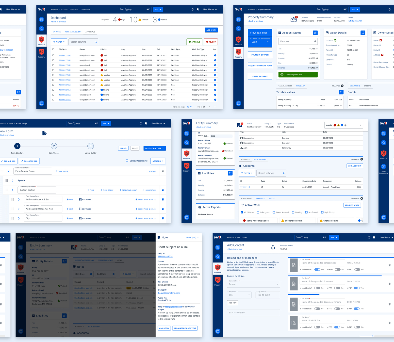
A key goal was being able to quickly provision sites to new or existing agencies. Using Drupal 9 (and updated to Drupal 10) and Acquia’s Site Factory, we gave the state the ability to stand up a new site in just minutes. Batch commands create the site and add it to necessary syndication services; authors can then log in and start creating their own content.
We also created a set of custom tools for the state agencies, to facilitate content migration and distribution. An asynchronous hub-and-spoke syndication system allows sites to share content in a hierarchical manner (from parent to child sites), while a migration helper scrapes existing sites to ensure content is properly migrated from a database source.
Introducing Quahog: A RI.gov Design System
For organizations needing agility and efficiency, composable technology makes it easier to quickly adapt digital platforms as needs and conditions change. We focused on building a comprehensive, component-based visual design system using a strategy of common typography, predefined color themes and built-in user preferences to reinforce accessibility and inclusivity.
The Purpose of the Design System
The new, bespoke design system had to support four key factors: accessibility, user preferences, variation within a family of themes, and speedy performance.
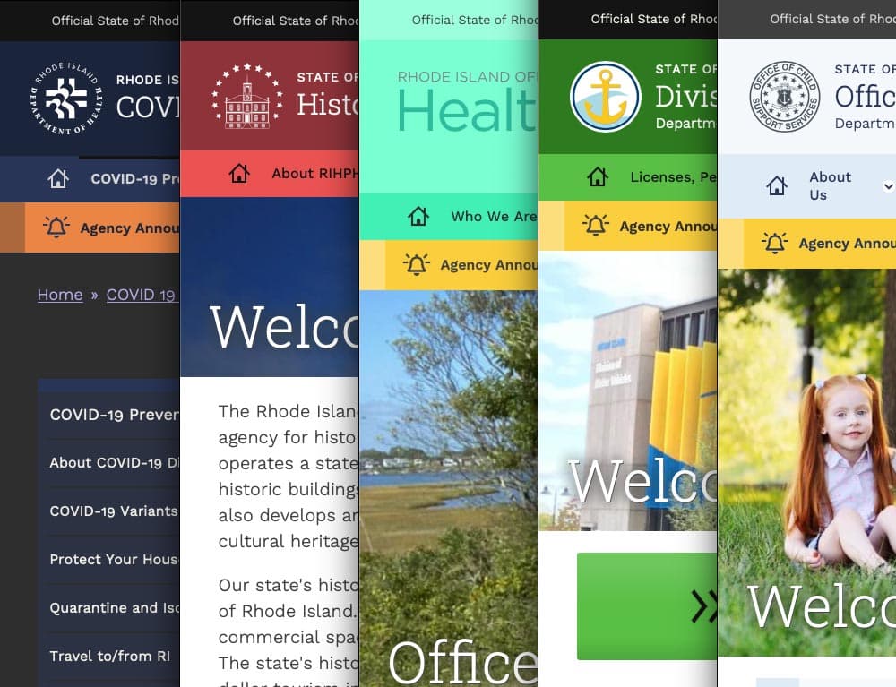
Multiple color themes
Site authors choose from five color themes, each supporting light and dark mode viewing. Every theme was rigorously tested to conform with WCAG AA (and sometimes AAA), with each theme based on a palette of 27 colors (including grays) and 12 transparent colors.
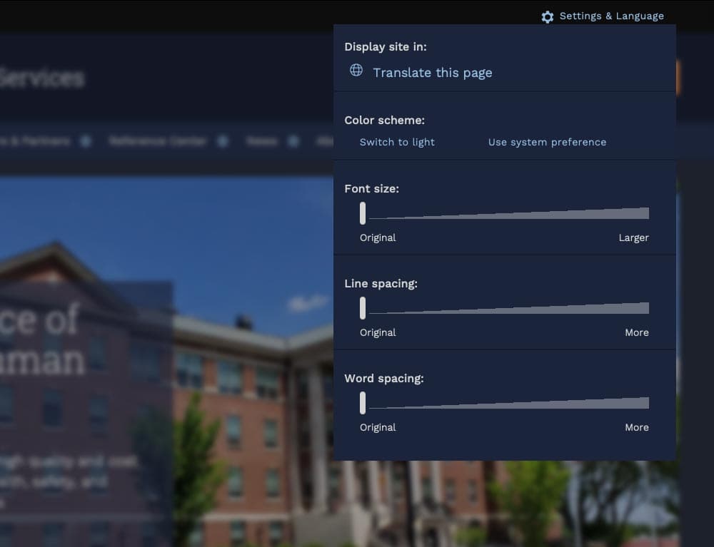
User preferences
Site visitors can toggle between light or dark mode or use their own system preference, along with adjusting font sizes, line height, word spacing, and default language.
Mobile first
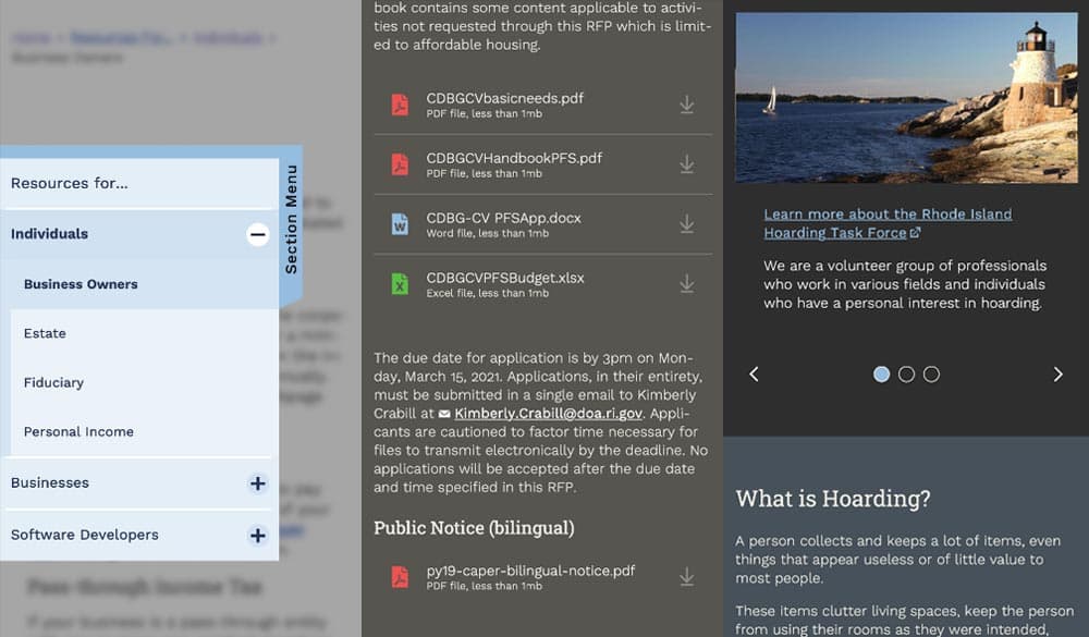
Knowing that many site visitors will be on mobile devices, each design component treats the mobile experience as a first-class counterpart to desktop.
Examples: The section menu sticks to the left side of the view port for easy access within sections; Downloads are clearly labelled with file type and human-readable file sizes in case someone has an unreliable network connection; galleries appear on mobile with any text labels stacked underneath and support swipe gestures, while the desktop version layers text over images and supports keyboard navigation.
High Accessibility
Every design pattern is accessible for screen readers and mobile devices. Color contrast, keyboard navigation, semantic labeling, and alt text enforcement all contribute to a highly accessible site. Extra labels and help text have been added to add context to actions, while also following best practices for use of ARIA attributes.

Performance aware
Each page is given a performance budget, so design components are built as lightly as possible, using the least amount of code and relying on the smallest visual asset file sizes possible.
THE RESULTS
Efficient and Effective Paths to Communication
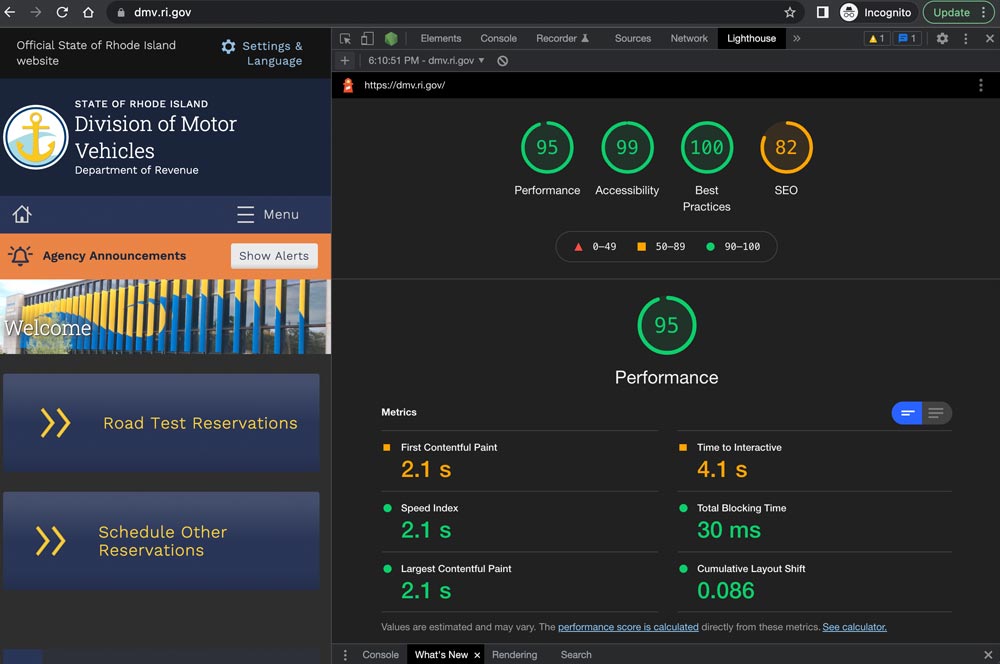
The first sites to launch on the new system, including covid.ri.gov, went live four and a half months after the first line of code was written. A total of 15 new sites were launched within just 8 months, all showing a 3-4x improvement in speed and performance compared with previous versions.
Every site now meets accessibility guidelines when authors adhere to training and best practices, with Lighthouse accessibility and best practice scores consistently above 95%. This means the content is available to a larger, more diverse audience. In addition, a WAF/CDN provider increases content delivery speeds and prevents downtime or slowdowns due to attacks or event-driven traffic spikes.
State agencies have been universally pleased with the new system, especially because it provides authors with an improved framework for content creation. By working with a finite set of tested design patterns, authors can visualize, preview, and deploy timely and consistent content more efficiently and effectively.
We were always impressed with the Oomph team’s breadth of technical knowledge and welcomed their UX expertise, however, what stood out the most to me was the great synergy that our team developed. All team members were committed to a common goal to create an exceptional, citizen-centered resource that would go above and beyond the technical and design expectations of both agencies and residents .
ROBERT MARTIN ETSS Web Services Manager, State of Rhode Island
THE BRIEF
The Virtual Lab School (VLS) supports military educators with training and enrichment around educational practices from birth through age 12. Their curriculum was developed by a partnership between Ohio State University and the U.S. Department of Defense to assist direct-care providers, curriculum specialists, management personnel, and home-based care providers. Because of the distributed nature of educators around the world, courses and certifications are offered virtually through the VLS website.
Comprehensive Platform Assessment
The existing online learning platform had a deep level of complexity under the surface. For a student educator taking a certification course, the site tracks progress through the curriculum. For training leaders, they need to see how their students are progressing, assign additional coursework, or assist a student educator through a particular certification.
Learning platforms in general are complex, and this one is no different. Add to this an intertwined set of military-style administration privileges and it produces a complex tree of layers and permutations.
The focus of the platform assessment phase was to catalog features of the largely undocumented legacy system, uncover complexity that could be simplified, and most importantly identify opportunities for efficiencies.
THE RESULTS
Personalized Online Learning Experience
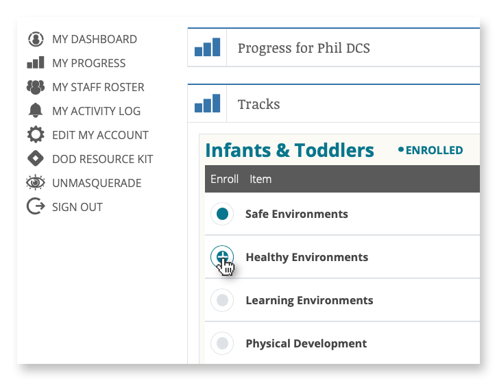
Enrollment and Administration Portal
Administrators and instructors leverage an enrollment portal to manage the onboarding of new students and view progress on coursework and certifications.
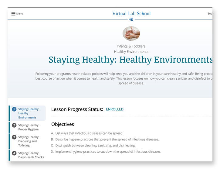
Course Material Delivery
Students experience the course material through a combination of reading, video, and offline coursework downloads for completion and submission.
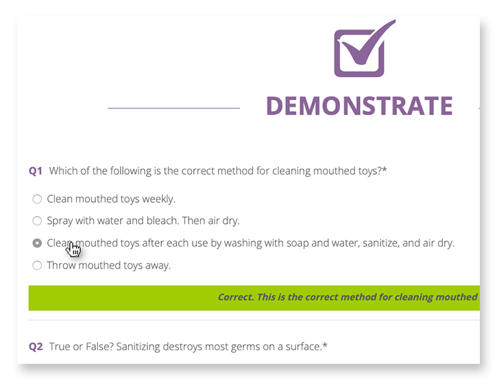
Learning Assessments & Grading
Students are tested with online assessments, where grading and suggestions are delivered in real time, and submission of offline assignments for review by instructors.
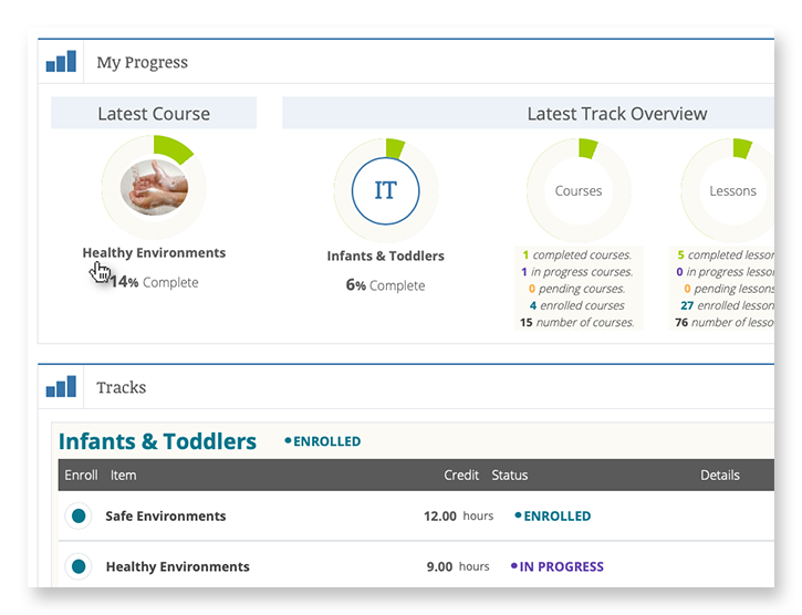
Progress Pathways
A personalized student dashboard is the window into progress, allowing students to see which courses have been started, how much is left to complete, and the status of their certifications.
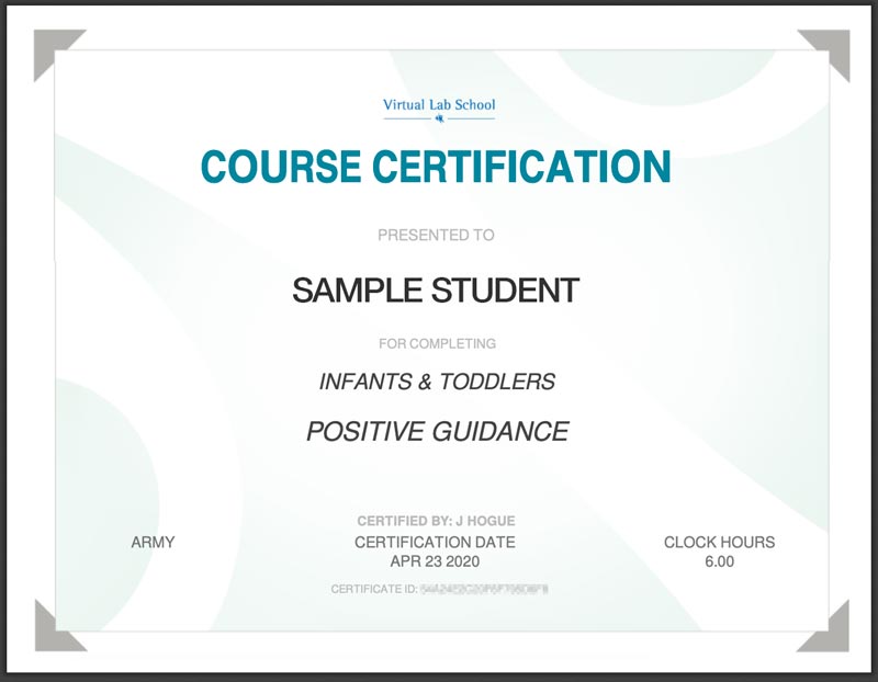
Certification
Completed coursework and assessments lead students to a point of certification resulting in a printable Certificate of Completion.
FINAL THOUGHTS
Faster and More Secure than Ever Before
When building for speed and scalability, fully leveraging Drupal’s advanced caching system is a major way to support those goals. The system design leverages query- and render-caching to support a high level of performance while also supporting personalization to an individual level. This is accomplished with computed fields and auto-placeholdering utilizing lazy builder.
The result is an application that is quicker to load, more secure, and able to support hundreds more concurrent users.
Why Drupal?
When building for speed and scalability, fully leveraging Drupal’s advanced caching system is a major way to support those goals. The system design leverages query- and render-caching to support a high level of performance while also supporting personalization to an individual level. This is accomplished with computed fields and auto-placeholdering utilizing lazy builder.
The result is an application that is quicker to load, more secure, and able to support hundreds more concurrent users.
The U.S. is one of the most linguistically diverse countries in the world. While English may be our official language, the number of people who speak a language other than English at home has actually tripled over the past three decades.
Statistically speaking, the people you serve are probably among them.
You might even know they are. Maybe you’ve noticed an uptick in inquiries from non-English speaking people or tracked demographic changes in your analytics. Either way, chances are good that organizations of all kinds will see more, not less, need for translation — especially those in highly regulated and far-reaching industries, like higher education and healthcare.
So, what do you do when translation becomes a top priority for your organization? Here, we explain how to get started.
3 Solutions for Translating Your Website
Many organizations have an a-ha moment when it comes to translations. For our client Lifespan, that moment came during its rebrand to Brown Health University and a growing audience of non-English speaking people. For another client, Visit California, that moment came when developing their marketing strategies for key global audiences.
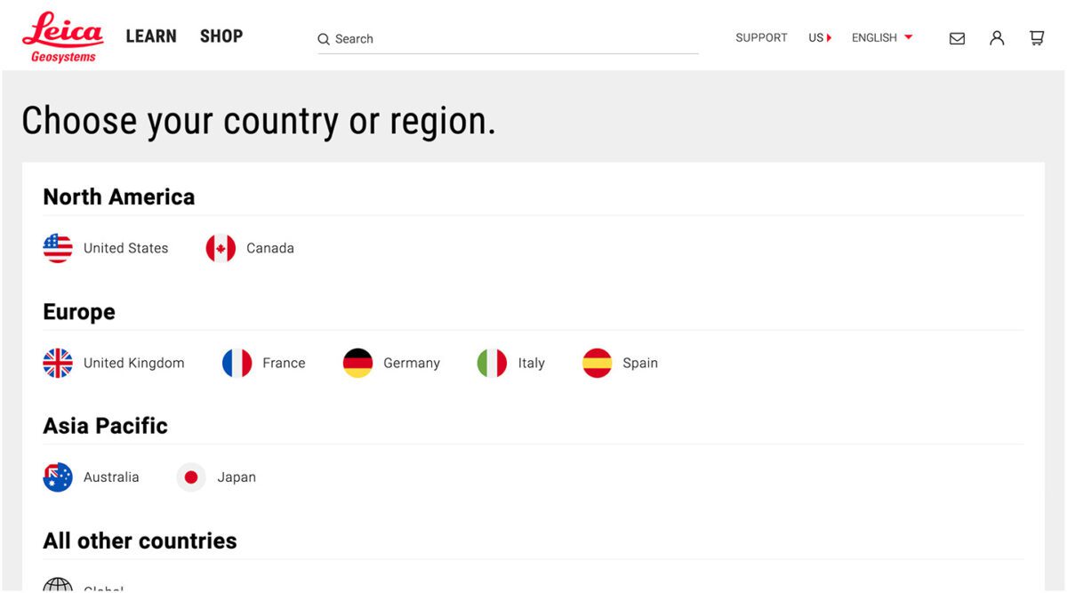
Or maybe you’re more like Leica Geosystems, a longtime Oomph client that prioritized translation from the start but needed the right technology to support it.
Whenever the time comes, you have three main options:
Manual translation and publishing
When most people think of translating, manual translation comes to mind. In this scenario, someone on your team or someone you hire translates content by hand and uploads the translation as a separate page to the content management system (CMS).
Translating manually will offer you higher quality and more direct control over the content. You’ll also be able to optimize translations for SEO; manual translation is one of the best ways to ensure the right pages are indexed and findable in every language you offer them. Manual translation also has fewer ongoing technical fees and long-term maintenance attached, especially if you use a CMS like Drupal which supports translations by default.
“Drupal comes multi-lingual out of the box, so it’s very easy for editors to publish translations of their site and metadata,” Oomph Senior UX Engineer Kyle Davis says. “Other platforms aren’t going to be as good at that.”
While manual translation may sound like a winning formula, it can also come at a high cost, pushing it out of reach for smaller organizations or those who can’t allocate a large portion of their budget to translate their website and other materials.
Integration with a real-time API
Ever seen a website with clickable international flags near the top of the page? That’s a translation API. These machine translation tools can translate content in the blink of an eye, helping users of many different languages access your site in their chosen language.
“This is different than manual translation, because you aren’t optimizing your content in any way,” Oomph Senior UX Engineer John Cionci says. “You’re simply putting a widget on your page.”
Despite their plug-and-play reputation, machine translation APIs can actually be fairly curated. Customization and localization options allow you to override certain phrases to make your translations appropriate for a native speaker. This functionality would serve you well if, like Visit California, you have a team to ensure the translation is just right.
Though APIs are efficient, they also do not take SEO or user experience into account. You’re getting a direct real-time translation of your content, nothing more and nothing less. This might be enough if all you need is a default version of a page in a language other than English; by translating that page, you’re already making it more accessible.
However, this won’t always cut it if your goal is to create more immersive, branded experiences — experiences your non-English-speaking audience deserves. Some translation API solutions also aren’t as easy to install and configure as they used to be. While the overall cost may be less than manual translation, you’ll also have an upfront development investment and ongoing maintenance to consider.
Use Case: Visit California
Manual translation doesn’t have to be all or nothing. Visit California has international marketing teams in key markets skilled in their target audiences’ primary languages, enabling them to blend manual and machine translation.
We worked with Visit California to implement machine translation (think Google Translate) to do the heavy lifting. After a translation is complete, their team comes in to verify that all translated content is accurate and represents their brand. Leveraging the glossary overrides feature of Google Cloud Translate V3, they can tailor the translations to their communication objectives for each region. In addition, their Drupal CMS still allows them to publish manual translations when needed. This hybrid approach has proven to be very effective.
Third-party translation services
The adage “You get what you pay for” rings true for translation services. While third-party translation services cost more than APIs, they also come with higher quality — an investment that can be well worth it for organizations with large non-English-speaking audiences.
Most translation services will provide you with custom code, cutting down on implementation time. While you’ll have little to no technical debt, you will have to keep on top of recurring subscription fees.
What does that get you? If you use a proxy-based solution like MotionPoint, you can expect to have content pulled from your live site, then freshly translated and populated on a unique domain.
“Because you can serve up content in different languages with unique domains, you get multilingual results indexed on Google and can be discovered,” Oomph Senior Digital Project Manager Julie Elman says.
Solutions like Ray Enterprise Translation, on the other hand, combine an API with human translation, making it easier to manage, override, moderate, and store translations all within your CMS.
Use Case: Leica Geosystems
Leica’s Drupal e-commerce store is active in multiple countries and languages, making it difficult to manage ever-changing products, content, and prices. Oomph helped Leica migrate to a single-site model during their migration from Drupal 7 to 8 back in 2019.
“Oomph has been integral in providing a translation solution that can accommodate content generation in all languages available on our website,” says Jeannie Records Boyle, Leica’s e-Commerce Translation Manager.
This meant all content had one place to live and could be translated into all supported languages using the Ray Enterprise Translation integration (formerly Lingotek). Authors could then choose which countries the content should be available in, making it easier to author engaging and accurate content that resonates around the world.
“Whether we spin up a new blog or product page in English or Japanese, for example, we can then translate it to the many other languages we offer, including German, Spanish, Norwegian Bokmål, Dutch, Brazil Portuguese, Italian, and French,” Records Boyle says.
Taking a Strategic Approach to Translation
Translation can be as simple as the click of a button. However, effective translation that supports your business goals is more complex. It requires that you understand who your target audiences are, the languages they speak, and how to structure that content in relation to the English content you already have.
The other truth about translation is that there is no one-size-fits-all option. The “right” solution depends on your budget, in-house skills, CMS, and myriad other factors — all of which can be tricky to weigh.
Here at Oomph, we’ve helped many clients make their way through website translation projects big and small. We’re all about facilitating translations that work for your organization, your content admins, and your audience — because we believe in making the Web as accessible as possible for all.
Want to see a few recent examples or dive deeper into your own website translation project? Let’s talk.
The Brief
Simplifying Complexity without Losing Power
The biggest challenge as Oomph acclimated to the tax-collection world was rapidly learning enough about the complex regulations and requirements of municipalities in the industry to provide sound advice and recommendations. We started by examining their systems — the workflow of documenting and planning new product features and adding them to the roadmap, of designing the UX of those features, and of leveraging their in-house design system to build and support those features.
RSI’s main product, GOVERNMENT PREMIER, are highly customizable and configurable. Every single screen has options that would display depending on the authenticated user’s role and privileges and the tenant’s own back-office processes. User stories included many requirements based on permissions and configuration. This added challenges when imagining potential interface solutions that need to accommodate growth in multiple directions.
Oomph’s purposefully used our outside perspective to ask many questions about GOVERNMENT PREMIER’s processes. We took our years of experience designing interfaces for a wide range of consumers and applied them here. In this typically slow-to-evolve space, a user-focused experience coupled with GOVERNMENT PREMIER’s technical expertise would revolutionize tax collection as a friendlier, more intuitive, and highly customizable experience.
Our Approach
Maintaining Consistency in a Rapidly Evolving Product
Our findings and recommendations indicated previous UX teams did not create a rulebook that governed their decisions, and so, the system lacked consistency. Quality Assurance reviews would suffer from this lack of governance as well. Therefore, the first thing we did was to establish rules to design by:
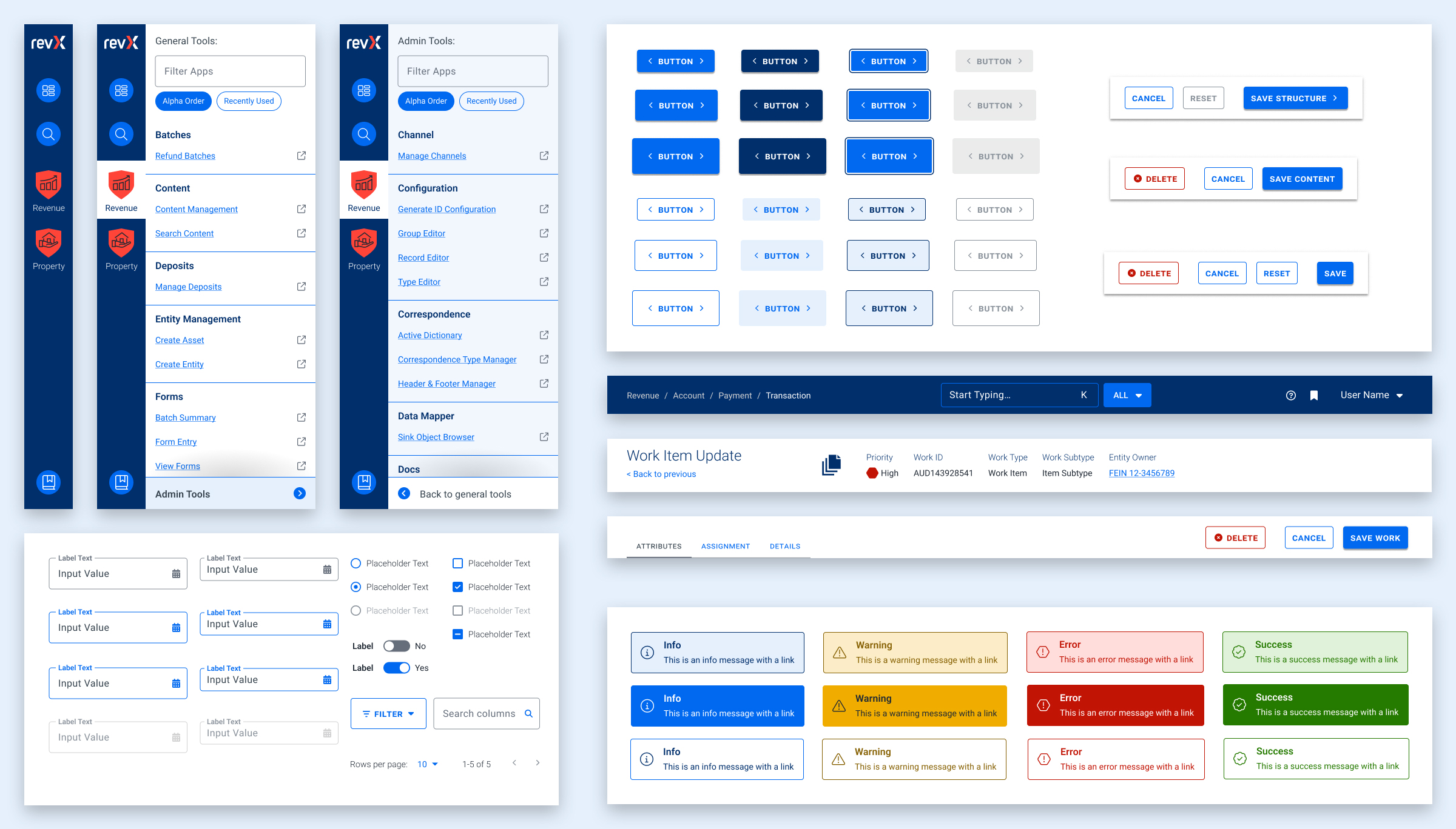
- Use Storybook as a source of truth, and expand atomic elements with larger patterns (called molecules in Atomic-design-speak).
- Enforce a global design token system for colors, typography, stateful user feedback, and spacing.
- Use Material UI (MUI) from Google as our foundation. This was a previous decision that was not fully enforced, which led elements to become over-engineered or duplicated. This became known as the “Build on the shoulders of giants” rule.
- Destructive actions (like Delete or Cancel) are placed to the left of creative actions, like “Save” or “Next.”
- Every screen has one primary focus. Complex screens need a focal point for the task and user’s need to feel confident they are using the interface correctly. When long forms are required, break them down into smaller chunks. Users can save their progress and concentrate on smaller groups of tasks. Color should be used to focus users on the most important actions, and to alert them when data errors need to be addressed.
Ultimately, these rules are flexible and have served well as a starting point. Any new screen can adhere to these rules, and when we find cases where these rules are preventing users from completing their tasks or are frequently confusing users, we revisit them to make updates or clarifications. Oomph has continued to consult on new screen design and UX workflows after more than a year of working together.
The Results
Setting a New North Star to Align Our Compasses
To continue to move the product forward without increasing UX and technical debt, the teams needed a well-defined shared understanding for the user experience. Internal teams were moving forward, but not always in the same direction. Within the first month, our teams agreed upon a playbook and then continued to expand it during our engagement. We met twice weekly with product owners across the company and became a sought-after resource when teams were planning new features.
During our time together, we have celebrated these outcomes:
- Oomph consolidated the color palette from 55 colors to just 24 without losing any necessary distinctions. All colors are contrast conformant with WCAG 2.2 Level AA as a baseline.
- Colors, typographic sizes, spacing values, form elements, buttons, icons, and shadows have all been converted to design tokens.
- Figma has been used as the design system record, while Storybook has been strengthened and updated to smartly leverage Material UI. The success of Storybook is largely due to its inclusion as a GOVERNMENT PREMIER project dependency — it has to be used and the latest version is often pinned as the product evolves.
- An internal Design Manager at RSI was established as someone to lead the engineering team and maintain quality oversight as it pertains to the design system.
- Oomph completed designs for 15 features for GOVERNMENT PREMIER, many of which involve designs for three or more screens or modals. Oomph also designed workflows for over a dozen Online Services workflows with a heavier emphasis on mobile-responsive solutions.
As Oomph moves into our second year collaborating with the GOVERNMENT PREMIER teams, we plan to fully investigate user personas on both the admin and taxpayer side of the platform, add more context and governance to the project designs, and provide quality assurance feedback on the working application. We value our partnership with this unique team of experts and look forward to continuing the tax software revolution.
The Brief
Powering Design With User Feedback
MLH exists to help Massachusetts residents find information to solve common legal issues, like securing public benefits or fighting an eviction. To ensure every aspect of the site was grounded in the audiences’ needs, MLH wanted to incorporate feedback during the discovery and design phases from real people who fit MLH’s primary and secondary audience profiles.
By performing a thorough discovery process — including working group interviews, visitor interviews, cohort site analysis, and wireframe and prototype testing — Oomph was able to create a successful site design dedicated to the needs of visitors.
The Approach
Helping the Audience by Understanding Them
MLH shares insights on heavy topics ranging from housing and homelessness to money, debt, and immigration. The site contains sensitive information that could change their visitors’ lives; by connecting them to domestic violence help or resources to get their children back, for example. When Oomph first jumped into the project, our main goal was to step into the shoes of their user groups to better understand their needs when they seek legal information.
The main audience of MLH is Massachusetts residents who are primarily low-income and may not speak English as a first language. They use the site to become informed about legal issues they’re facing quickly and efficiently. As one visitor stated:
“I’m coming here because I have a problem. I want to know, where’s the search? What can I do here? What can I not do? Don’t waste my time making me read [fluff]…”
To meet this need, the MLH team provides information in plain English at a fourth to sixth-grade reading level, rather than using complicated lawyer jargon, which makes it accessible to a wider group of people. Additionally, many resources have been professionally translated into other languages, such as Spanish.
The secondary audience that visits the site is those who help the primary audience, such as social service providers, legal aid lawyers, and legal librarians. Oomph had to walk a fine line by getting feedback from the secondary audience to help inform information about the primary audience; however, our main goal was to ensure that low-income and non-English-speaking people could find the answers they needed.
Gaining the Audience’s Trust with Thoughtful Design Details
We learned that many visitors found the MLH website by searching Google with their questions. Many primary audience members would visit the site on their mobile phones, perhaps even listening to its content with their text-to-speech tool. This increased the importance of a mobile-first design so the pages loaded quickly, the information was clear, and the experience made sense for mobile browsing.
A Modernized Design
The site’s look was outdated, making some visitors feel that it either lacked credibility or didn’t contain the latest legal rules and laws (even though it’s been actively maintained and added to for the past 15+ years!). For the Oomph team, the final designs had to walk a fine line between being authoritative, trustworthy, and comforting. To achieve this, we retained the blue color palette but created slightly softer tones to help create a calming aesthetic.
Our team also limited the amount of photography on the site but ensured that any photos we used represented the diverse groups MLH serves. Icons became a tool to guide the visitor through different topics; regardless of the visitor’s language, the icon could help them understand what information may be within that particular topic.
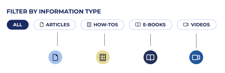
MLH has also accumulated a lot of content over the years. To help organize its search and topic organization feature, we incorporated content filters according to the information type: articles, how-tos, e-books, and videos. Each category has its own icon, and each icon is represented by a color. This helps unify the search based on the type of content the visitor is seeking.
Color Contrast and Accessibility
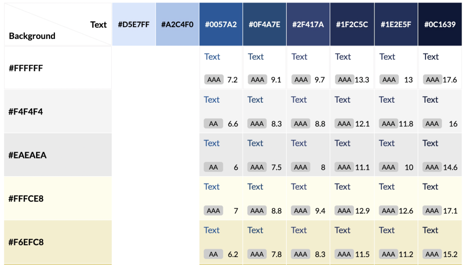
From the start, MLH made it very clear that their new designs should comply with both 508 and WCAG 2.1 guidelines — ideally conforming to the highest level of contrast, level AAA. As Oomph created the color palette, we were careful to use only high-contrast colors and document how to use them in a system to ensure that the palette satisfied accessibility guidelines.
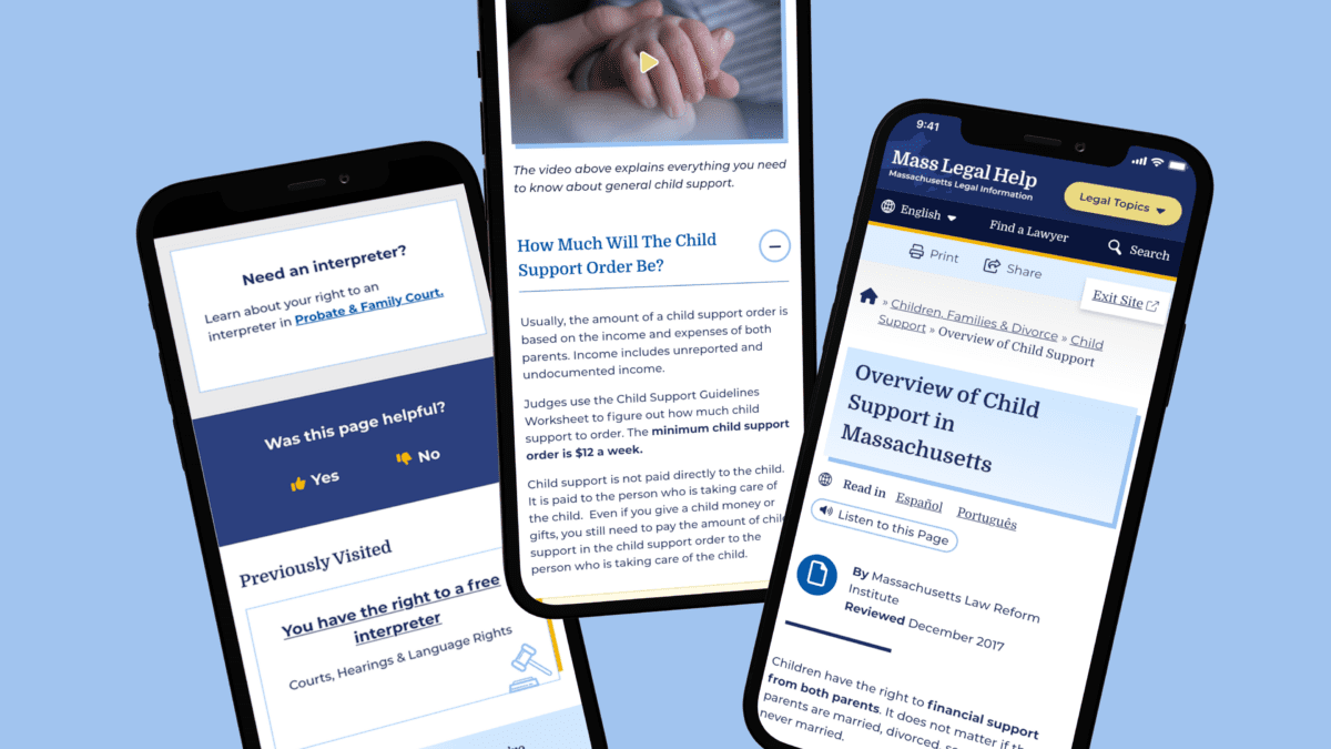
Supporting the Content With Tools
MLH had several existing tools to assist in digesting content. During our discovery phase, we validated the need for these tools and upgraded them. For example, on the content pages, there are options to print, share, listen to the content, and even switch the language as the visitor lands on the page.
Within the main navigation menu, the design included a “Quick Exit” button. This supports visitors who need to abandon the page when, for example, a domestic violence survivor’s abuser re-entered the room.
We cultivated a passion for this feature through our research and have written an article detailing our best practices for implementing a quick exit button. Additionally, we have created a Drupal Module for this feature so that more people can implement this important tool for sites with sensitive content.
Findability of Content Through the Main Menu Navigation
On a larger scale, the primary and secondary navigation menus needed an upgrade. As it stood, the main categories were wall-to-wall across the desktop, and it was hard to determine where a visitor needed to go. The secondary navigation menu read like a table of contents in a chapter book and didn’t allow the visitor to return to other categories.
We solved for this by creating a survey to test a proposed navigation structure and revised the information architecture (IA). This included a new top menu that supported every step of our primary audience’s journey. We also created a level of navigation that directed visitors to the information they were looking for, no matter how they entered the site.
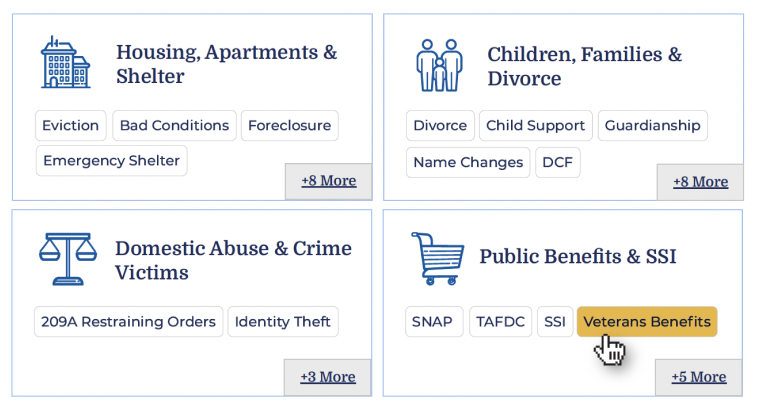
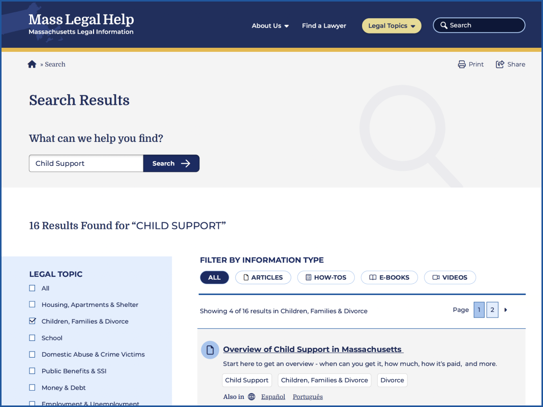
Search
For search, we used a multi-filter approach which allows visitors to search both by topic and by content type. This filtering allowed them to find questions that might belong to multiple categories, and to narrow down content to the types they are willing to review.
Proactive vs. Reactive Enhancements
Analytics and user interview results showed that most visitors start their journey on either the homepage or pages that are three or more levels down the navigation. Many also reach the site via a specific Google search. While it is likely they found what they needed, they may not be aware of other information that can help them. To mitigate the risk of bouncing away from the website, we created a “Viewers also reviewed…” component on answer pages that showcased related content more naturally.
Repeating Help Footer
Above the footer, we created a “safety net” to help visitors who have browsed the site for a long time but have not found what they are looking for. If they reached the end of the page, this footer would direct them to more content that may hold their answers.
Previously Viewed
We added a “Previously Viewed” section at the bottom of content pages to remind visitors of the content they have already reviewed. This reduces the burden on the visitor when they ask themselves, “I think I’ve seen that already, but I can’t remember where I saw it.”
The Results
A Modern, Helpful Website Design
Through prototype testing with our first design mock-up with real visitors, the participants individually determined that the new site’s design and content organization was easy to navigate, gave them a trustworthy impression, and looked appealing. Today, the MLH website is live with a fresh Oomph design. We hope the structure and design will continue to not only keep visitors on the site longer but also help those visitors find the legal answers that they need.
Have a project that requires a human-first, empathetic approach? Consider talking to Oomph about incorporating user feedback into a user experience-focused design project for your next website refresh.
Oomph has been quiet about our excitement for artificial intelligence (A.I.). While the tech world has exploded with new A.I. products, offerings, and add-ons to existing product suites, we have been formulating an approach to recommend A.I.-related services to our clients.
One of the biggest reasons why we have been quiet is the complexity and the fast-pace of change in the landscape. Giant companies have been trying A.I. with some loud public failures. The investment and venture capitalist community is hyped on A.I. but has recently become cautious as productivity and profit have not been boosted. It is a familiar boom-then-bust of attention that we have seen before — most recently with AR/VR after the Apple Vision Pro five months ago and previously with the Metaverse, Blockchain/NFTs, and Bitcoin.
There are many reasons to be optimistic about applications for A.I. in business. And there continue to be many reasons to be cautious as well. Just like any digital tool, A.I. has pros and cons and Oomph has carefully evaluated each. We are sharing our internal thoughts in the hopes that your business can use the same criteria when considering a potential investment in A.I.
Using A.I.: Not If, but How
Most digital tools now have some kind of A.I. or machine-learning built into them. A.I. has become ubiquitous and embedded in many systems we use every day. Given investor hype for companies that are leveraging A.I., more and more tools are likely to incorporate A.I.
This is not a new phenomenon. Grammarly has been around since 2015 and by many measures, it is an A.I. tool — it is trained on human written language to provide contextual corrections and suggestions for improvements.
Recently, though, embedded A.I. has exploded across markets. Many of the tools Oomph team members use every day have A.I. embedded in them, across sales, design, engineering, and project management — from Google Suite and Zoom to Github and Figma.
The market has already decided that business customers want access to time-saving A.I. tools. Some welcome these options, and others will use them reluctantly.
Either way, the question has very quickly moved from should our business use A.I. to how can our business use A.I. tools responsibly?
The Risks that A.I. Pose
Every technological breakthrough comes with risks. Some pundits (both for and against A.I. advancements) have likened its emergence to the Industrial Revolution of the early 20th century. And a high-level of positive significance is possible, while the cultural, societal, and environmental repercussions could also follow a similar trajectory.
A.I. has its downsides. When evaluating A.I. tools as a solution to our client’s problems, we keep this list of drawbacks and negative effects handy, so that we may review it and think about how to mitigate their negative effects:
- A.I. is built upon biased and flawed data
- Bias & flawed data leads to the perpetuation of stereotypes
- Flawed data leads to Hallucinations & harms Brands
- Poor A.I. answers erode Consumer Trust
- A.I.’s appetite for electricity is unsustainable
We have also found that our company values are a lens through which we can evaluate new technology and any proposed solutions. Oomph has three cultural values that form the center of our approach and our mission, and we add our stated 1% For the Planet commitment to that list as well:
- Smart
- Driven
- Personal
- Environmentally Committed
For each of A.I.’s drawbacks, we use the lens of our cultural values to guide our approach to evaluating and mitigating those potential ill effects.
A.I. is built upon biased and flawed data
At its core, A.I. is built upon terabytes of data and billions, if not trillions, of individual pieces of content. Training data for Large Language Models (LLMs) like Chat GPT, Llama, and Claude encompass mostly public content as well as special subscriptions through relationships with data providers like the New York Times and Reddit. Image generation tools like Midjourney and Adobe Firefly require billions of images to train them and have skirted similar copyright issues while gobbling up as much free public data as they can find.
Because LLMs require such a massive amount of data, it is impossible to curate those data sets to only what we may deem as “true” facts or the “perfect” images. Even if we were able to curate these training sets, who makes the determination of what to include or exclude?
The training data would need to be free of bias and free of sarcasm (a very human trait) for it to be reliable and useful. We’ve seen this play out with sometimes hilarious results. Google “A.I. Overviews” have told people to put glue on pizza to prevent the cheese from sliding off or to eat one rock a day for vitamins & minerals. Researchers and journalists traced these suggestions back to the training data from Reddit and The Onion.
Information architects have a saying: “All Data is Dirty.” It means no one creates “perfect” data, where every entry is reviewed, cross-checked for accuracy, and evaluated by a shared set of objective standards. Human bias and accidents always enter the data. Even the simple act of deciding what data to include (and therefore, which data is excluded) is bias. All data is dirty.
Bias & flawed data leads to the perpetuation of stereotypes
Many of the drawbacks of A.I. are interrelated — All data is dirty is related to D.E.I. Gender and racial biases surface in the answers A.I. provides. A.I. will perpetuate the harms that these biases produce as they become easier and easier to use and more and more prevalent. These harms are ones which society is only recently grappling with in a deep and meaningful way, and A.I. could roll back much of our progress.
We’ve seen this start to happen. Early reports from image creation tools discuss a European white male bias inherent in these tools — ask it to generate an image of someone in a specific occupation, and receive many white males in the results, unless that occupation is stereotypically “women’s work.” When AI is used to perform HR tasks, the software often advances those it perceives as males more quickly, and penalizes applications that contain female names and pronouns.
The bias is in the data and very, very difficult to remove. The entirety of digital written language over-indexes privileged white Europeans who can afford the tools to become authors. This comparably small pool of participants is also dominantly male, and the content they have created emphasizes white male perspectives. To curate bias out of the training data and create an equally representative pool is nearly impossible, especially when you consider the exponentially larger and larger sets of data new LLM models require for training.
Further, D.E.I. overflows into environmental impact. Last fall, the Fifth National Climate Assessment outlined the country’s climate status. Not only is the U.S. warming faster than the rest of the world, but they directly linked reductions in greenhouse gas emissions with reducing racial disparities. Climate impacts are felt most heavily in communities of color and low incomes, therefore, climate justice and racial justice are directly related.
Flawed data leads to “Hallucinations” & harms Brands
“Brand Safety” and How A.I. can harm Brands
Brand safety is the practice of protecting a company’s brand and reputation by monitoring online content related to the brand. This includes content the brand is directly responsible for creating about itself as well as the content created by authorized agents (most typically customer service reps, but now AI systems as well).
The data that comes out of A.I. agents will reflect on the brand employing the agent. A real life example is Air Canada. The A.I. chatbot gave a customer an answer that contradicted the information in the URL it provided. The customer chose to believe the A.I. answer, while the company tried to say that it could not be responsible if the customer didn’t follow the URL to the more authoritative information. In court, the customer won and Air Canada lost, resulting in bad publicity for the company.
Brand safety can also be compromised when a 3rd party feeds A.I. tools proprietary client data. Some terms and condition statements for A.I. tools are murky while others are direct. Midjourney’s terms state,
“By using the Services, You grant to Midjourney […] a perpetual, worldwide, non-exclusive, sublicensable no-charge, royalty-free, irrevocable copyright license to reproduce, prepare derivative works of, publicly display, publicly perform, sublicense, and distribute text and image prompts You input into the Services”
Midjourney’s Terms of Service Statement
That makes it pretty clear that by using Midjourney, you implicitly agree that your data will become part of their system.
The implication that our client’s data might become available to everyone is a huge professional risk that Oomph avoids. Even using ChatGPT to provide content summaries on NDA data can open hidden risks.
What are “Hallucinations” and why do they happen?
It’s important to remember how current A.I. chatbots work. Like a smartphone’s predictive text tool, LLMs form statements by stitching together words, characters, and numbers based on the probability of each unit succeeding the previously generated units. The predictions can be very complex, adhering to grammatical structure and situational context as well as the initial prompt. Given this, they do not truly understand language or context.
At best, A.I. chatbots are a mirror that reflects how humans sound without a deep understanding of what any of the words mean.
A.I. systems are trying its best to provide an accurate and truthful answer without a complete understanding of the words it is using. A “hallucination” can occur for a variety of reasons and it is not always possible to trace their origins or reverse-engineer them out of a system.
As many recent news stories state, hallucinations are a huge problem with A.I. Companies like IBM and McDonald’s can’t get hallucinations under control and have pulled A.I. from their stores because of the headaches they cause. If they can’t make their investments in A.I. pay off, it makes us wonder about the usefulness of A.I. for consumer applications in general. And all of these gaffes hurt consumer’s perception of the brands and the services they provide.
Poor A.I. answers erode Consumer Trust
The aforementioned problems with A.I. are well-known in the tech industry. In the consumer sphere, A.I. has only just started to break into the public consciousness. Consumers are outcome-driven. If A.I. is a tool that can reliably save them time and reduce work, they don’t care how it works, but they do care about its accuracy.
Consumers are also misinformed or have a very surface level understanding of how A.I. works. In one study, only 30% of people correctly identified six different applications of A.I. People don’t have a complete picture of how pervasive A.I.-powered services already are.
The news media loves a good fail story, and A.I. has been providing plenty of those. With most of the media coverage of A.I. being either fear-mongering (“A.I. will take your job!”) or about hilarious hallucinations (“A.I. suggests you eat rocks!”), consumers will be conditioned to mistrust products and tools labeled “A.I.”
And for those who have had a first-hand experience with an A.I. tool, a poor A.I. experience makes all A.I. seem poor.
A.I.’s appetite for electricity is unsustainable
The environmental impact of our digital lives is invisible. Cloud services that store our lifetime of photographs sound like featherly, lightweight repositories that are actually giant, electricity-guzzling warehouses full of heat-producing servers. Cooling these data factories and providing the electricity to run them are a major infrastructure issue cities around the country face. And then A.I. came along.
While difficult to quantify, there are some scientists and journalists studying this issue, and they have found some alarming statistics:
- Training GPT-3 required more than 1,200 MWh which led to 500 metric tons of greenhouse gas emissions — equivalent to the amount of energy used for 1 million homes in one hour and the emissions of driving 1 million miles. GPT-4 has even greater needs.
- Research suggests a single generative A.I. query consumes energy at four or five times the magnitude of a typical search engine request.
- Northern Virginia needs the equivalent of several large nuclear power plants to serve all the new data centers planned and under construction.
- In order to support less consumer demand on fossil fuels (think electric cars, more electric heat and cooking), power plant executives are lobbying to keep coal-powered plants around for longer to meet increased demands. Already, soaring power consumption is delaying coal plant closures in Kansas, Nebraska, Wisconsin, and South Carolina.
- Google emissions grew 48% in the past five years in large part because of its wide deployment of A.I.
While the consumption needs are troubling, quickly creating more infrastructure to support these needs is not possible. New energy grids take multiple years and millions if not billions of dollars of investment. Parts of the country are already straining under the weight of our current energy needs and will continue to do so — peak summer demand is projected to grow by 38,000 megawatts nationwide in the next five years.
While a data center can be built in about a year, it can take five years or longer to connect renewable energy projects to the grid. While most new power projects built in 2024 are clean energy (solar, wind, hydro), they are not being built fast enough. And utilities note that data centers need power 24 hours a day, something most clean sources can’t provide. It should be heartbreaking that carbon-producing fuels like coal and gas are being kept online to support our data needs.
Oomph’s commitment to 1% for the Planet means that we want to design specific uses for A.I. instead of very broad ones. The environmental impact of A.I.’s energy demands is a major factor we consider when deciding how and when to use A.I.
Using our Values to Guide the Evaluation of A.I.
As we previously stated, our company values provide a lens through which we can evaluate A.I. and look to mitigate its negative effects. Many of the solutions cross over and mitigate more than one effect and represent a shared commitment to extracting the best results from any tool in our set
Smart
- Limit direct consumer access to the outputs of any A.I. tools, and put a well-trained human in the middle as curator. Despite the pitfalls of human bias, it’s better to be aware of them rather than allow A.I. to run unchecked
- Employ 3rd-party solutions with a proven track-record of hallucination reduction
Driven
- When possible, introduce a second proprietary dataset that can counterbalance training data or provide additional context for generated answers that are specific to the client’s use case and audience
- Restrict A.I. answers when qualifying, quantifying, or categorizing other humans, directly or indirectly
Personal
- Always provide training to authors using A.I. tools and be clear with help text and microcopy instructions about the limitations and biases of such datasets
1% for the Planet
- Limit the amount of A.I. an interface pushes at people without first allowing them to opt in — A.I. should not be the default
- Leverage “green” data centers if possible, or encourage the client using A.I. to purchase carbon offset credits
In Summary
While this article feels like we are strongly anti-A.I., we still have optimism and excitement about how A.I. systems can be used to augment and support human effort. Tools created with A.I. can make tasks and interactions more efficient, can help non-creatives jumpstart their creativity, and can eventually become agents that assist with complex tasks that are draining and unfulfilling for humans to perform.
For consumers or our clients to trust A.I., however, we need to provide ethical evaluation criteria. We can not use A.I. as a solve-all tool when it has clearly displayed limitations. We aim to continue to learn from others, experiment ourselves, and evaluate appropriate uses for A.I. with a clear set of criteria that align with our company culture.
To have a conversation about how your company might want to leverage A.I. responsibly, please contact us anytime.
Additional Reading List
- “The Politics of Classification” (YouTube). Dan Klyn, guest lecture at UM School of Information Architecture. 09 April 2024. A review of IA problems vs. AI problems, how classification is problematic, and how mathematical smoothness is unattainable.
- “Models All the Way Down.” Christo Buschek and Jer Thorp, Knowing Machines. A fascinating visual deep dive into training sets and the problematic ways in which these sets were curated by AI or humans, both with their own pitfalls.
- “AI spam is already starting to ruin the internet.” Katie Notopoulos, Business Insider, 29 January 2024. When garbage results flood Google, it’s bad for users — and Google.
- Racial Discrimination in Face Recognition Technology, Harvard, 24 October 2020. The title of this article explains itself well.
- Women are more likely to be replaced by AI, according to LinkedIn, Fast Company, 04 April 2024. Many workers are worried that their jobs will be replaced by artificial intelligence, and a growing body of research suggests that women have the most cause for concern.
- Brand Safety and AI, Writer.com. An overview of what brand safety means and how it is usually governed.
- AI and designers: the ethical and legal implications, UX Design, 25 February 2024. Not only can using training data potentially introduce legal troubles, but submitting your data to be processed by A.I. does as well.
- Can Generative AI’s Hallucination Problem be Overcome? Louis Poirier, C3.ai. 31 August 2023. A company claims to have a solution for A.I. hallucinations but doesn’t completely describe how in their marketing.
- Why AI-generated hands are the stuff of nightmares, explained by a scientist, Science Focus, 04 February 2023. Whether it’s hands with seven fingers or extra long palms, AI just can’t seem to get it right.
- Sycophancy in Generative-AI Chatbots, NNg. 12 January 2024. Human summary: Beyond hallucinations, LLMs have other problems that can erode trust: “Large language models like ChatGPT can lie to elicit approval from users. This phenomenon, called sycophancy, can be detected in state-of-the-art models.”
- Consumer attitudes towards AI and ML’s brand usage U.S. 2023. Valentina Dencheva, Statistica. 09 February 2023
- What the data says about Americans’ views of artificial intelligence. Pew Research Center. 21 November 2023
- Exploring the Spectrum of “Needfulness” in AI Products. Emily Campbull, The Shape of AI. 28 March 2024
- AI’s Impact On The Future Of Consumer Behavior And Expectations. Jean-Baptiste Hironde, Forbes. 31 August 2023.
- Is generative AI bad for the environment? A computer scientist explains the carbon footprint of ChatGPT and its cousins. The Conversation. 23 May 2023
THE BRIEF
The goal of the site was to create a well-organized hub for a trove of resources that had been previously provided in one-off conversations. He also knew that those resources would only continue to grow, making it important to build a living site that appealed to public officials and future funders alike.
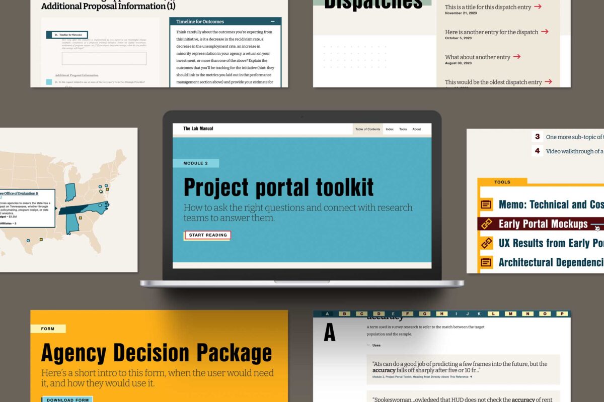
Together, we architected a vision for The Lab Manual website, identifying the essentials for launch and features to phase in later. Key goals included:
- Creating an interactive experience with tools that readers could use directly in their work
- Infusing the site with visual creativity and storytelling elements to make complex research topics more digestible
- Launching a minimum viable product (MVP) site within the desired timeline and budget, while planning for future growth
THE APPROACH
Oomph knew we had to look beyond traditional government and research sites to achieve The Lab Manual’s unique digital goals. We conducted in-depth stakeholder discovery sessions and scoured websites across industries, from data-rich websites like FiveThirtyEight to e-reader apps like Kindle, to gather inspiration for the features The Lab Manual needed: engaging long-form content, strong visual storytelling, and interactive data. Then, we engineered a website for The Lab Manual that felt like a dynamic guided journey.
Telling a Story Through Design & Development
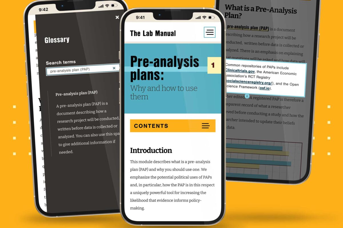
A Narrative-Driven Homepage
To captivate users from their first click, we created a storytelling-focused homepage that concisely explained The Lab Manual’s mission and resources. Animated elements also helped make the page feel more immersive than a traditional linear scroll. We mocked up the animations directly in Figma so the client could see, rather than imagine, the user experience — saving time and effort during the development process.
Custom Educational Features
Oomph designed the website to be thought-provoking, but The Lab Manual wanted to leave readers with answers — not more questions. Our designers and developers collaborated to build features that helped readers understand content without interrupting the story. Key features included a linked glossary to expand on key terms used throughout the site; a pop-up search for other terms and topics, rather than relegating additional information to the footnotes; and a map created with Mapbox to help visitors find nearby policy labs.
Simplified Content Management
Despite the complexity of its content, The Lab Manual needed to be simple to manage. Our developers built a CMS-less solution the client could edit using Markdown, making it easier and more cost-effective to update content as The Lab Manual grows.
THE RESULTS
Bridging Science and Policy, Now & For the Future
With a solid MVP in place, we are already seeking new features and content opportunities to serve The Lab Manual’s growing user base. The website has quickly caught the eye of the industry, winning a GDUSA Digital Design Award. For The Lab Manual, though, the real win is bringing what was once a lofty vision into reality — a resource that provides government officials with the tools to create effective, evidence-based policies.
Everyone’s been saying it (and, frankly, we tend to agree): We are currently in unprecedented times. It may feel like a cliche. But truly, when you stop and look around right now, not since the advent of the first consumer-friendly smartphone in 2008 has the digital web design and development industry seen such vast technological advances.
A few of these innovations have been kicking around for decades, but they’ve only moved into the greater public consciousness in the past year. Versions of artificial intelligence (AI) and chatbots have been around since the 1960s and even virtual reality (VR)/augmented reality (AR) has been attempted with some success since the 1990s (That Starner). But now, these technologies have reached a tipping point as companies join the rush to create new products that leverage AI and VR/AR.
What should we do with all this change? Let’s think about the immediate future for a moment (not the long-range future, because who knows what that holds). We at Oomph have been thinking about how we can start to use this new technology now — for ourselves and for our clients. Which ideas that seemed far-fetched only a year ago are now possible?
For this article, we’ll take a closer look at VR/AR, two digital technologies that either layer on top of or fully replace our real world.
VR/AR and the Vision Pro
Apple’s much-anticipated launch into the headset game shipped in early February 2024. With it came much hype, most centered around the price tag and limited ecosystem (for now). But after all the dust has settled, what has this flagship device told us about the future?
Meta, Oculus, Sony, and others have been in this space since 2017, but the Apple device has debuted a better experience in many respects. For one, Apple nailed the 3D visuals, using many cameras and low latency to reproduce a digital version of the real world around the wearer— in real time. All of this tells us that VR headsets are moving beyond gaming applications and becoming more mainstream for specific types of interactions and experiences, like virtually visiting the Eiffel Tower or watching the upcoming Summer Olympics.
What Is VR/AR Not Good At?
Comfort
Apple’s version of the device is large, uncomfortable, and too heavy to wear for long. And its competitors are not much better. The device will increasingly become smaller and more powerful, but for now, wearing one as an infinite virtual monitor for the entire workday is impossible.
Space
VR generally needs space for the wearer to move around. The Vision Pro is very good at overlaying virtual items into the physical world around the wearer, but for an application that requires the wearer to be fully immersed in a virtual world, it is a poor experience to pantomime moving through a confined space. Immersion is best when the movements required to interact are small or when the wearer has adequate space to participate.
Haptics
“Haptic” feedback is the sense that physical objects provide. Think about turning a doorknob: You feel the surface, the warmth or coolness of the material, how the object can be rotated (as opposed to pulled like a lever), and the resistance from the springs.
Phones provide small amounts of haptic feedback in the form of vibrations and sounds. Haptics are on the horizon for many VR platforms but have yet to be built into headset systems. For now, haptics are provided by add-on products like this haptic gaming chair.
What Is VR/AR Good For?
Even without haptics and free spatial range, immersion and presence in VR is very effective. It turns out that the brain only requires sight and sound to create a believable sense of immersion. Have you tried a virtual roller coaster? If so, you know it doesn’t take much to feel a sense of presence in a virtual environment.
Live Events
VR and AR’s most promising applications are with live in-person and televised events. In addition to a flat “screen” of the event, AR-generated spatial representations of the event and ways to interact with the event are expanding. A prototype video with Formula 1 racing is a great example of how this application can increase engagement with these events.
Imagine if your next virtual conference were available in VR and AR. How much more immersed would you feel?
Museum and Cultural Institution Experiences
Similar to live events, AR can enhance museum experiences greatly. With AR, viewers can look at an object in its real space — for example, a sarcophagus would actually appear in a tomb — and access additional information about that object, like the time and place it was created and the artist.
Museums are already experimenting with experiences that leverage your phone’s camera or VR headsets. Some have experimented with virtually showing artwork by the same artist that other museums own to display a wider range of work within an exhibition.
With the expansion of personal VR equipment like the Vision Pro, the next obvious step is to bring the museum to your living room, much like the National Gallery in London bringing its collection into public spaces (see bullet point #5).
Try Before You Buy (TBYB)
Using a version of AR with your phone to preview furniture in your home is not new. But what other experiences can benefit from an immersive “try before you buy” experience?
- Test-drive a new car with VR, or experience driving a real car on a real track in a mixed-reality game. As haptic feedback becomes more prevalent, the experience of test-driving will become even closer to the real thing.
- Even small purchases have been using VR and AR successfully to trial their products, including AR for fashion retail, eyeglass virtual try-ons, and preview apps for cosmetics. Even do-it-yourself retailer Lowe’s experimented with fully haptic VR in 2018. But those are all big-name retailers. The real future for VR/AR-powered TBYB experiences will allow smaller companies to jump into the space, like Shopify enabled for its merchants.
- Visit destinations before traveling. With VR, you could visit fragile ecosystems without affecting the physical environment or get a sense of the physical space before traveling to a new spot. Visitors who require special assistance could preview the amenities beforehand. Games have been developed for generic experiences like deep sea diving, but we expect more specific travel destinations to provide VR experiences of their own, like California’s Redwood Forest.
What’s Possible With VR/AR?
The above examples of what VR/AR is good at are just a few ways the technology is already in use — each of which can be a jumping-off point for leveraging VR/AR for your own business.
But what are some new frontiers that have yet to be fully explored? What else is possible?
- What if a digital sculptor or 3D model maker could create new three-dimensional models in a three-dimensional virtual space? The application for architects and urban planners is just as impactful.
- What if medical training could be immersive, anatomically accurate, and reduce the need for cadavers? What if rare conditions could be simulated to increase exposure and aid in accurate diagnoses?
- What if mental health disorders could be treated with the aid of immersive virtual environments? Exposure therapy can aid in treating and dealing with anxiety, depression, and PTSD.
- What if highly skilled workers could have technical mentors virtually assist and verify the quality of a build? Aerospace, automotive, and other manufacturing industry experts could visit multiple locations virtually and go where they’re needed most.
- What if complex mathematic-based sciences could provide immersive, data-manipulative environments for exploration? Think of the possibilities for fields like geology, astronomy, and climate change.
- What if movies were told from a more personal point of view? What if the movie viewer felt more like a participant? How could someone’s range of experiences expand with such immersive storytelling?
Continue the AR/VR Conversation
The Vision Pro hasn’t taken the world by storm, as Apple likely hoped. It may still be too early for the market to figure out what AR/VR is good for. But we think it won’t go away completely, either. With big investments like Apple’s, it is reasonable to assume the next version will find a stronger foothold in the market.
Here at Oomph, we’ll keep pondering and researching impactful ways that tomorrow’s technology can help solve today’s problems. We hope these ideas have inspired some of your own explorations, and if so, we’d love to hear more about them.
Drop us a line and let’s chat about how VR/AR could engage your audience.
Portable Document Format, or PDF, files have been around since 1992, offering a software-agnostic solution for presenting and sharing digital documents. For organizations that existed before the ’90s, PDFs became an easy way to move from physical to digital; they could take the same documents they used to print and now share them digitally as PDFs.
A few years after PDFs were officially launched, CSS came onto the scene as the preferred computer language for styling web pages. Over the following three decades, PDF capabilities grew alongside CSS and other digital technologies, giving creators new ways to lay out and publish their content.
Fast forward to today. Developers worldwide (Oomph among them) have been making websites for a while. We have online forms, interactive databases, and of course, plain old text on a webpage. And yet, PDFs persist.
What’s So Bad About PDFs?
Mobile Phones
Think of the last time you tried looking at a PDF on your phone. First off, there’s the issue of finding it. Depending on your operating system and browser, the file might open right in a new browser tab, or it might download and disappear into some folder you forgot about until this exact moment. (And of course, when you find the folder, you realize this is the fifth time you’ve downloaded this same file.)
Now that you’ve opened the file, you see the tiny text of an 8.5” x 11” page shrunk to a quarter of its intended size. So you pinch, zoom, and drag the page around your screen. You might rotate your phone to the dreaded horizontal orientation to fit a whole line of text at once. If this PDF is a fillable form, you may be simply out of luck on your mobile device unless you’re ready to go down a rabbit hole of separate apps and workarounds.
If, for just a minute, we want to ignore the massive amount of mobile usage — including the 15% of American adults who fully depend on phones for internet access — there’s plenty more cause for PDF concern.
Accessibility
Let’s talk about accessibility. There’s a good chance that your digital properties, including PDFs, are legally required to conform to accessibility standards. This is true for government entities — both federal and more recently, state, local, and district governments, thanks to a Title II update — as well as businesses and nonprofit organizations.
Beyond the legalities, the CDC reports that about 27% of American adults have a disability. While not all 70 million of these people use a screen reader, we know some people use assistive technology even if they don’t identify as having a disability. (When’s the last time you pressed a button to open a door just because your hands were full or to let a large group of people pass through?) Improvements for the sake of accessibility, more often than not, lead to a more effortless, more intuitive experience for everyone.
While it’s possible to make a PDF accessible, the process for doing so is extensive and involves several manual checks. This can be so time-consuming and specialized that businesses and professionals dedicate themselves entirely to remediating PDFs for accessibility.
Of course, making a website accessible isn’t as easy as plug-and-play, but accessibility should already be built into the system. Content editors who are not technical professionals can publish accessible content with relative ease on an accessible website platform (as long as we can all remember not to link “click here”) but are typically left to their own devices when it comes to documents.
Brand Reputation
Beyond these critical issues, there are a few more problems that are less vital to users but could have a negative business impact.
For one, documents like PDFs open up a whole world of styling possibilities. The flexibility might feel like a benefit at first, but give it a little time and I’m certain you’ll start seeing inconsistencies from one document to the next. Add in a few more people preparing these files, and those small differences will pile up, giving users an impression that maybe the business is not quite as put together as they thought. (Not to mention that every change in presentation is asking users to understand a new format, slowing them down or confusing them.) Consistency is key to building a trustworthy brand; every unnecessary variation erodes that trust.
There’s also the near certainty that the information provided in PDFs will need updating. When that happens, you’d better make sure to delete the old file in favor of the new one and update all your links. Since the file format made it easy (or necessary) for users to download the content to their devices, there’s a greater chance that they’ll hold onto old information, even though a newer version is now on the website.
Finally, storing important information in PDFs gives you less control over optimizing for search engines. Google has a tough time reading PDF content (though proper tagging and metadata will help), so these files often rank lower in search results than webpages with similar content. The more that content lives in PDFs and not webpages, the more your SEO will suffer, and the less likely people will be to find and consume your content.
What You Can Do Instead
Like I said, PDFs solved a real problem… 30 years ago. They still have their place today, but more often than not, there’s a better way.
Does It Need To Be a PDF?
When the PDF is just a basic document of text, we recommend turning that into a basic webpage of text. It’s easy to say, but making it happen might mean taking a fresh look at why that information is in a PDF in the first place.
Custom Layout
If you’re using PDFs to create a certain layout, consider how you can achieve something similar through CSS. You might be able to build something you like using the layout and style options already available in your CMS, but you probably won’t create a perfect 1:1 match.
Any design in a Word or Google document can also exist on a webpage. If there’s a certain design you use time and time again in your PDFs that you just can’t recreate with the web editing tools, you might need some new code. It becomes an exercise in prioritization to weigh the benefits of building a custom layout against the time and cost of doing so.
Also, remember that a design that works well for a printed page may not be the best design for a responsive webpage. Rather than recreating the exact layout digitally, ask yourself what you’re trying to achieve with the layout and whether there’s a better way to meet that same goal. While unique designs may be more difficult to create on a webpage than a PDF, I’d urge you to consider this a benefit in most cases. Limitations create consistency, which will most likely simplify the experience for both content editors and users.
Designing for Print
Speaking of print, that might be another reason for including PDFs. You may know that a portion of your audience will want to print out the page, maybe to annotate it or to have it on hand as they complete a related task.
In reality, you can serve this user without sacrificing everyone else’s online experience. Developers can use targeted CSS to customize how a webpage will print or export — including what content will display and its styling. Going this route affects how the page will print with the browser tool, and you could even provide a “Print” link if that’s a common need. Ultimately, targeted CSS means the printed content can look as similar or different from the webpage as needed.
Process
Another common cause for PDFs is that they’re simply baked into the content publishing process. Whether from fear of changing approved content or a lack of knowledge around what’s possible in the CMS, content teams may use PDF uploads as a fallback for publishing the information quickly and moving on.
A solution here may be to bring your site editor into the process sooner. As the web expert, they can speak to what will work well and what might need to change when moving the content to a webpage. The site editor may need to be heavily involved at first, but their load should lighten as the writers and other team members learn the website’s needs.
In some cases, it might also be worth building new CMS templates, such as content types. This can be especially helpful for reinforcing consistency when several people manage the website. If the content needs to follow a specific format, a highly structured edit form can act as an outline. You can share this template with the original content creators so that everyone is working toward a shared goal.
Repurposed Content
Most likely, your organization does more than manage a website. Maybe you have a brick-and-mortar office with brochures and paperwork, or you host webinars with branded slide decks. There are plenty of reasons you might create and share documents other than uploading them onto your website, but you still want the same information available online. And since it’s already put together, the easiest way to share it could be to upload the PDF.
Unfortunately, this is a situation where easy doesn’t cut it. The same tri-fold brochure that looks professional and appealing on a reception desk can be confusing and annoying on a computer or phone. A printed form works great for in-office visitors, but a web form can give users the benefits of autocomplete and progressive disclosure they’ve come to expect online.
The best experience for your users requires attention to their context. Ultimately, we need to be intentional and thoughtful about what users need in their current situation, which may require different presentations of the same content.
Embrace Digital
We’re not expecting to see the end of PDFs on websites anytime soon. For one, sometimes it’s simply out of your control. Maybe you’re providing an official government form that only exists as a fillable PDF. Even if the document is internally produced, change may be lengthy and involved, requiring buy-in from those who hold the purse strings.
While we wait for the world to change, we can advocate for a better user experience. If a PDF “needs” to stay, maybe you can duplicate the most important content onto the page linking to it. If you have any control over the document itself, you can test for accessibility and make sure it’s properly tagged. Get started with the tools and guidance we’ve collected in this accessibility resources document.
How easily your audience can access your information and services sets the tone for how they perceive your organization. The good news is that there’s so much you can do to make their experience positive, no matter how they choose to interact with your content. If you need help, let us know.
A world without third-party cookies is fast approaching. Big-name browsers like Safari and Firefox already block them by default, and Google Chrome — the biggest browser of them all — is set to follow.
First, a quick refresher: Websites use cookies to store data in your browser specific to that website and other sites. The question, though, is who the website is storing the data for. Third-party cookies store data that allows advertising services to track your behavior on any given site, while first-party cookies are those a website uses for its own purposes.
Like most things, not all cookies are created equal. As browsers transition to these new defaults, some will make the grade, while others will be blocked for good. What does this mean for your website, and how can you get ahead of the change? We’ll walk you through it.
Are Cookies Really Going Away?
That depends on the type of cookies your site uses. Browsers are slowly blocking third-party cookies by default — those associated with cross-site tracking for ad networks like Facebook or LinkedIn — but first-site, or same-site, cookies will remain.
That means that if retargeting is essential to your paid marketing strategy, you may need to rethink your approach. But any cookies you use to support your site features and functionality can keep on keeping on, assuming your users have agreed to the use of those cookies on your site. For example, you may be able to keep track of previously viewed content and use that information to suggest other relevant content to that user. So don’t say goodbye to your cookie consent services either; you still have to give users the chance to opt out of any first-party cookies.
Why Now? Haven’t We Been Using Cookies Forever?
While cookies have been a web-surfing staple for almost as long as we’ve been using the internet, that’s not necessarily a good thing.
Legislation like GDPR in Europe, the California Consumer Privacy Act, and the New York Privacy Act are tightening restrictions on the use of consumer data, and rapidly increasing cybersecurity threats in recent years have illuminated the risks of large-scale data storage. Consumers have also begun to prize their privacy, realizing that their information is valuable and no organization should be looking over their shoulder as they browse.
Ultimately, phasing out third-party cookies is about doing what’s best for your users. Making the move now can help instill trust in your website, since users know you aren’t capturing their data behind the scenes. Cookie consent forms also put the data you do use out in the open, showing users that your organization takes their privacy seriously and is prepared to protect it.
How Will The End of Third-Party Cookies Impact My Industry?
Not all organizations will feel the shift equally. We’ve seen some verticals get ahead of the curve, while others are naturally less reliant on third-party cookies. Here are some key industry-specific areas to consider.
Healthcare
Strict privacy laws and regulations like the Health Insurance Portability and Accountability Act (HIPAA) have turned healthcare organizations into pioneers in this area. The Office of Civil Rights even published a bulletin warning organizations about third-party cookies.
Many of the healthcare brands we support at Oomph are already focused on safeguarding user privacy because they’re used to doing it with medical records. One of our clients, for example, is already exploring adopting an in-house analytics tool hosted on their own server. If your healthcare organization is relying on third-party cookies for any marketing efforts, analytic insights, or other website features, start thinking now about the best way to phase them out.
Higher Education
Many institutions we work with are using third-party cookies because of digital efforts to drive student enrollment. When implementing personalization cookies, be sure they are implemented with the proper “SameSite” attribute value. Then be sure to engage your vendors; we’ve encouraged many of our higher education clients to explore how their vendors are preparing for this transition.
Nonprofits
Like higher education, nonprofits should review the vendors and larger ad networks they rely on to build their volunteer base or drive donations. Many nonprofits don’t use these services, but those that do should get ahead of the change, otherwise you may stand to lose an important fundraising channel.
4 Steps To Prepare for the End of Third-Party Cookies
Cookies, analytics, and cross-site tracking might all sound like areas best left to the pros. But there’s a lot you can do to prepare your organization for the move away from cookies, as well as critical opportunities to pull in a vendor to maintain the functionality you need.
Audit Your Site
A website audit should always be your first step. Taking stock of the cookies you use is the best way to get a handle on the changes you’ll need to make. Tapping your web partner is a great idea here, too. Your vendor should be able to identify existing third-party cookie warnings, which can help shape your audit.
For example, while we were updating a client’s email marketing integration recently, Chrome notified our developer that our client’s vendor was sending third-party cookies. We then reached out to the vendor to continue the conversation, knowing that those cookies had to be addressed.
Identify Affected Cookies
The goal of your audit is to identify all third-party cookies that won’t make the cut. Don’t stop by just listing the cookie, either. Review what function it serves and the role it plays in your organization’s digital footprint. You may have to get rid of the cookie, but that doesn’t mean you have to ditch the strategy it’s tied to.
Reach Out to Your Vendors
Ask vendors about their plans to handle the transition away from third-party cookies, and feel out whether they’ll still be able to offer the service they currently provide. Consider it a red flag if the vendor is uninformed or unprepared; you might have to seek out alternatives if there’s even the slightest chance your current vendor will be defunct by the end of the year.
Design Alternatives
The end of third-party cookies is daunting, but it’s also exciting. Take this opportunity to innovate on your users’ behalf. How can you design engaging new experiences that still exceed their expectations? That’s more than possible, so long as you have the right tools in place.
This could be a self-hosted analytics tool you build yourself or new local storage solutions to replace the role of cookies. You might also consider a fully authenticated experience for the users of your site. Lean on a trusted partner here, too. Vendors with website expertise can guide you toward the right solution for you and your users.
Cookies on the Brain?
For many organizations, this is the most they’ve thought about cookies in years. Third-party cookies have become so essential to building a business online, and yet they’ve largely flown under our radar. But while this change may feel overwhelming, making the switch doesn’t have to be.
Here at Oomph, we see this as a golden opportunity for organizations to put their users first, and we’re already taking steps to help our clients do just that.
Need a hand bringing your website into a world beyond third-party cookies? Let’s talk about it.